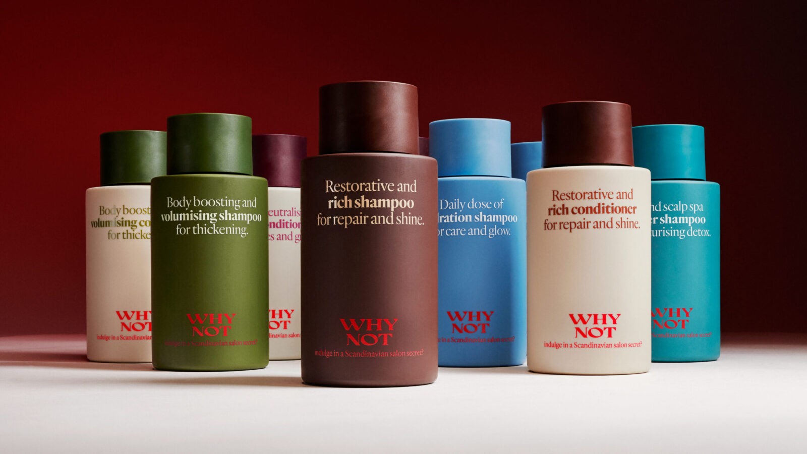
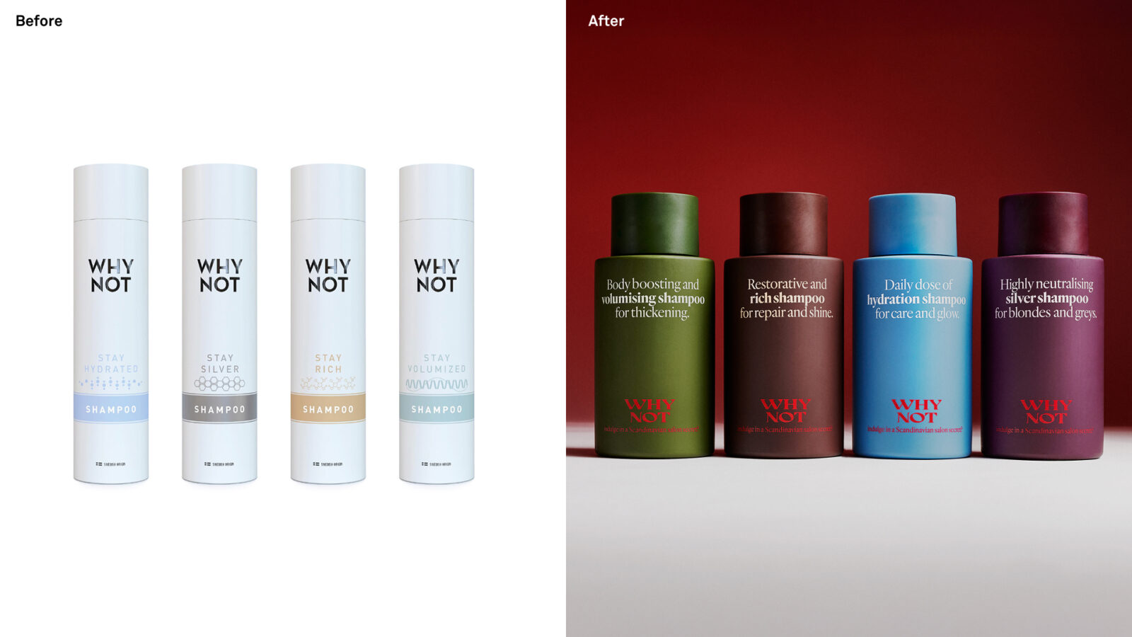
“WHY NOT Indulge in a Scandinavian Salon Secret”: WHY NOT is a Swedish salon-exclusive haircare brand with international ambitions. Despite its luxurious formulas, the packaging and storytelling failed to reflect the brand’s true character. The WHY NOT logo felt less like a brand and more like an unanswered question – why not what? While stylists adored the products, they hesitated to display the bottles. It was clear the brand needed a transformation, one that elevated the outside to match the inside. Building on the brand’s Nordic roots and the essence of Scandinavian wellbeing, we reinterpreted it through a lens of modern luxury and quiet indulgence.
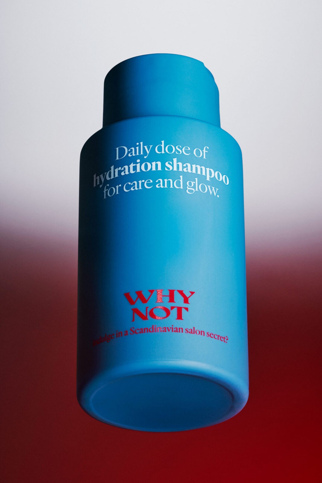
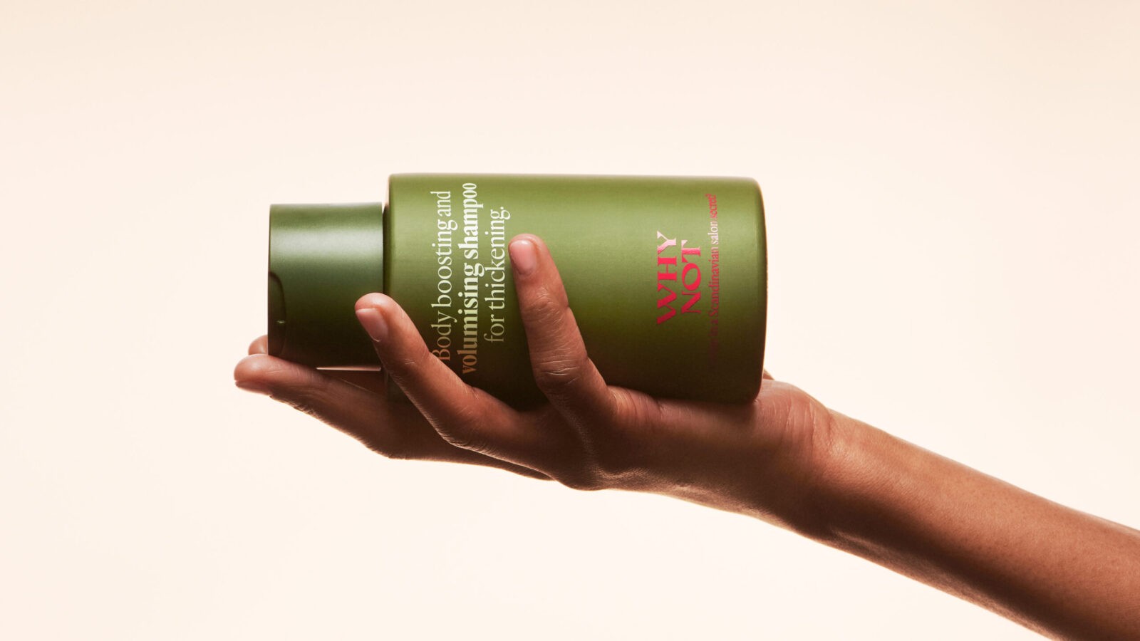
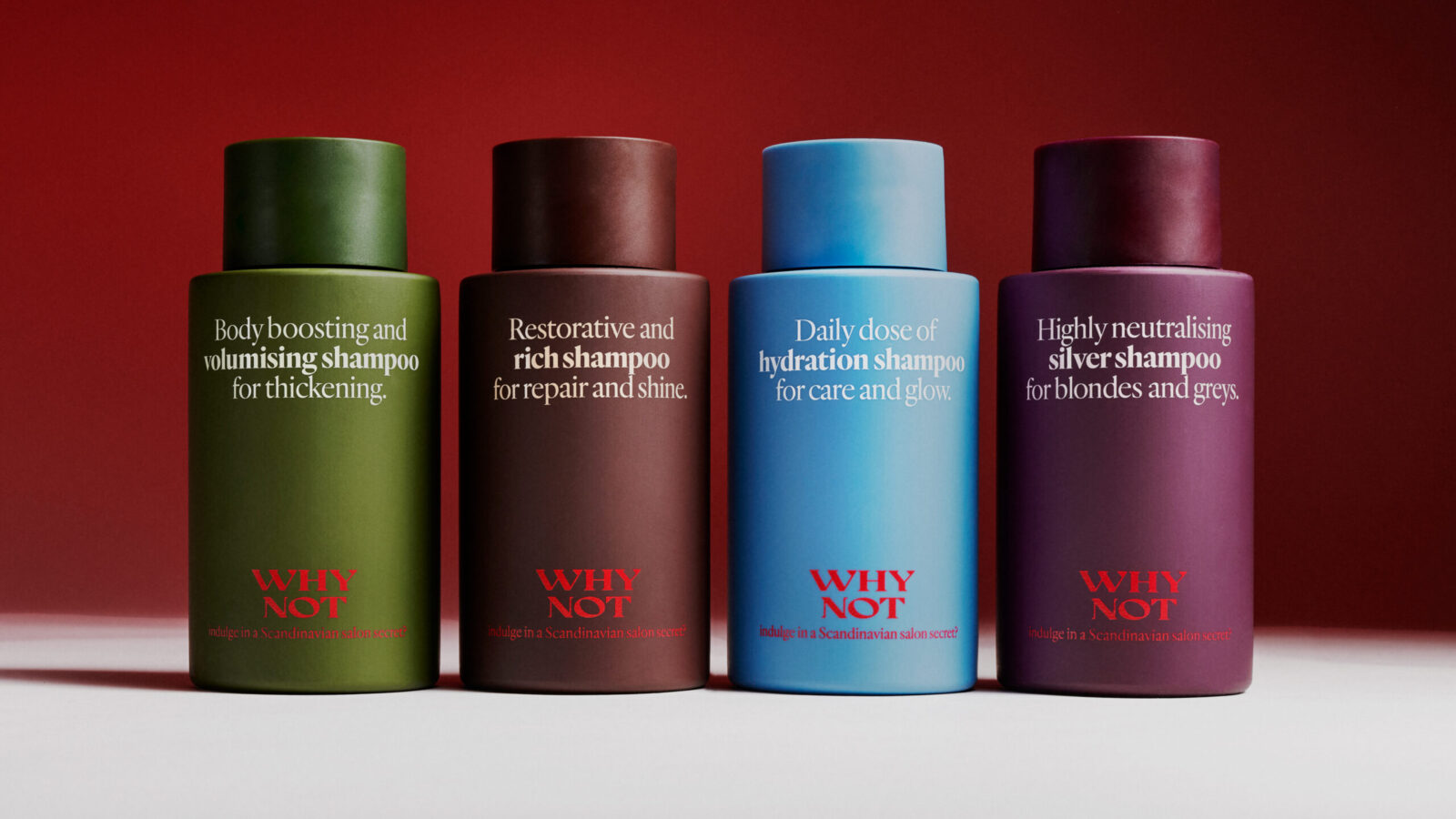
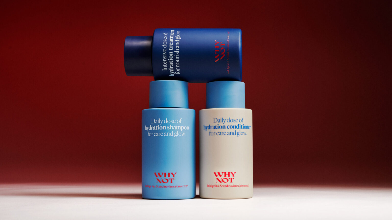
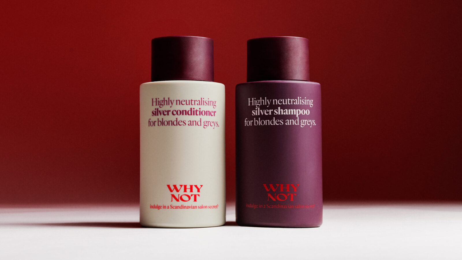
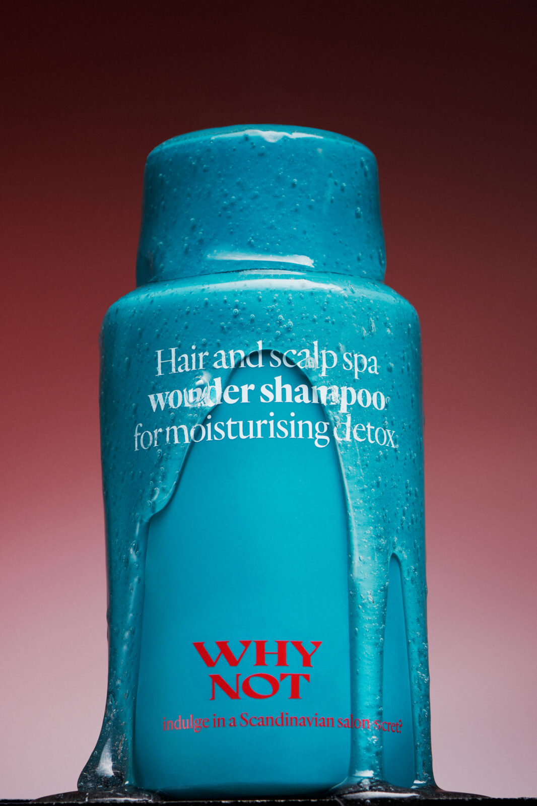
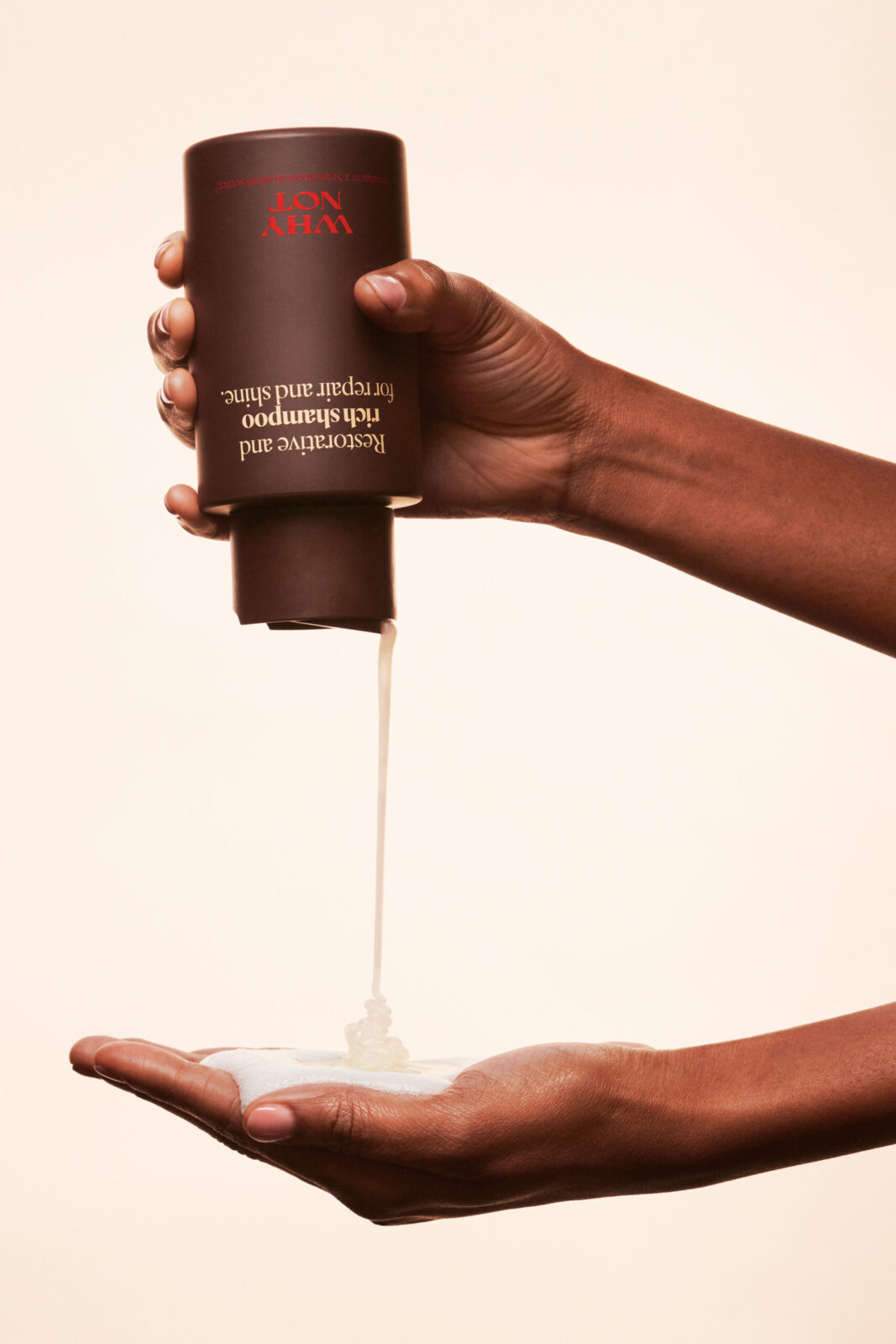
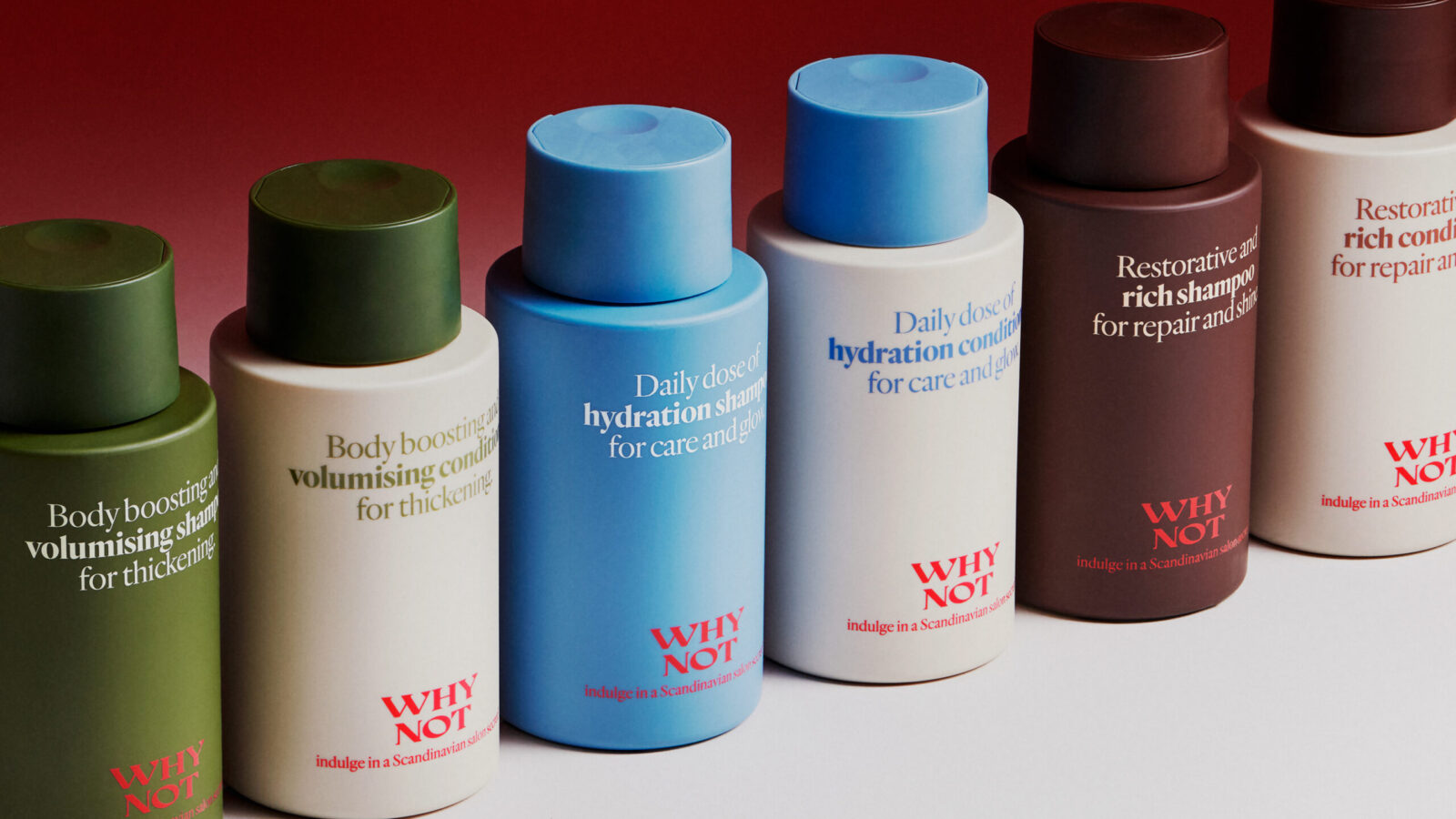
At the heart of the redesign is a custom, generous bottle silhouette – soft to the touch yet confident in form. It almost whispers, “Take more. Indulge.” Glossy typography meets velvety matte surfaces, creating tactile contrasts that elevate every use. Forget the clutter of conventional shampoo and conditioner claims. Product naming and function are woven together in full sentences, adding a voice that takes centre stage like fragments of poetry. Clear, transparent – yet they read like miniature stories, whispering a Scandinavian tale of indulgence and self-assurance.
The logotype is drenched in red. Paired with a statement, the once-disconnected brand name becomes an invitation to give in, to treat yourself: “WHY NOT indulge in a Scandinavian salon secret?” This seductive red message rests on a rich, moody palette of burgundy, sage, and blue – blending Nordic minimalism with international elegance. Quiet luxury, made loud.
The revitalised design and storytelling are now proudly displayed on salon shelves across Sweden – and attracting distributors in Britain, Norway, Slovakia, and Belgium. WHY NOT now steps confidently onto the global stage as a modern expression of Scandinavian indulgence. And the results speak volumes: sales more than tripled within months, while social engagement soared. Luxury haircare that feels like sophisticated rebellion. A Scandi secret too good to keep. So go on – give in. WHY NOT?

CREDIT
- Agency/Creative: Pond Design
- Article Title: Pond Design Elevates WHY NOT Into a Scandinavian Luxury Haircare Statemen
- Organisation/Entity: Agency
- Project Status: Published
- Agency/Creative Country: Sweden
- Agency/Creative City: Stockholm
- Market Region: Sweden
- Project Deliverables: Brand Design, Brand Experience, Brand Identity, Brand Naming, Brand Redesign, Brand Strategy, Brand Tone of Voice, Brand World, Branding, Copywriting, Creative Direction, Design, Graphic Design, Label Design, Logo Design, Packaging Design, Packaging Guidelines, Product Design, Product Naming, Structural Design, Tone of Voice
- Industry: Beauty/Cosmetics
- Keywords: WBDS Agency Design Awards 2025/26 Haircare, Treatment, Conditioner, Packaging Design, Shampoo, Beauty


