


Gry Leadership development & training
In a crowded leadership development space filled with corporate sameness and predictable visual language, Gry needed an identity that would truly express its human-centred, emotionally intelligent approach. The challenge was to create something confident yet empathetic; a brand that stands tall, puts people first, and opens doors to transformation.
Gry, a Swedish leadership and organisational development consultancy, approached me with a clear goal: reposition the brand to reflect its deep, people-first philosophy while standing out in a largely traditional and conservative market. The brief called for a brand identity that felt warm, professional, and original capable of connecting with both individuals and organisations navigating change.
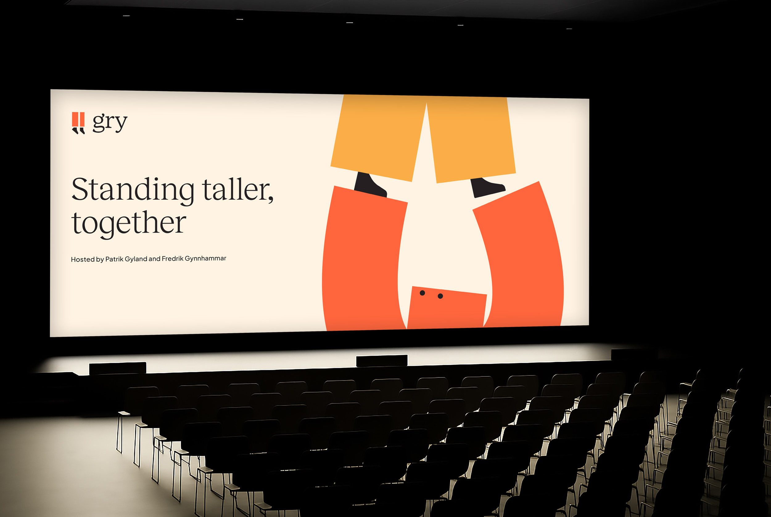
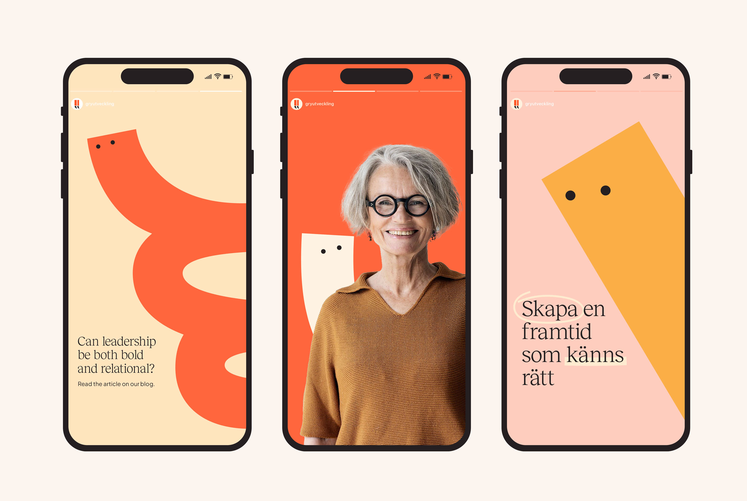
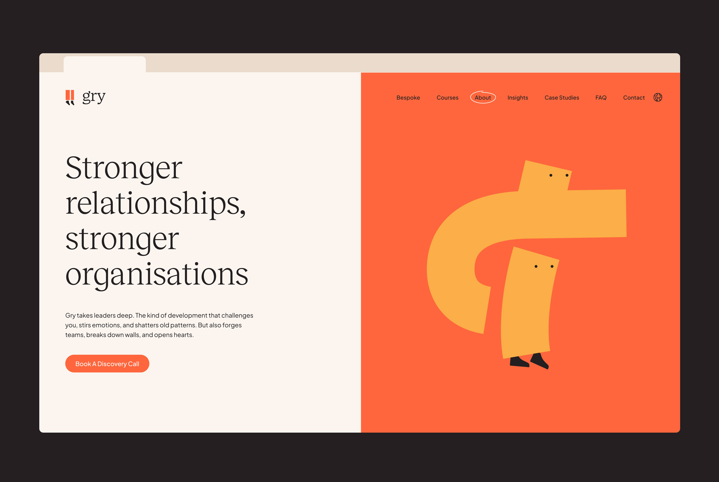
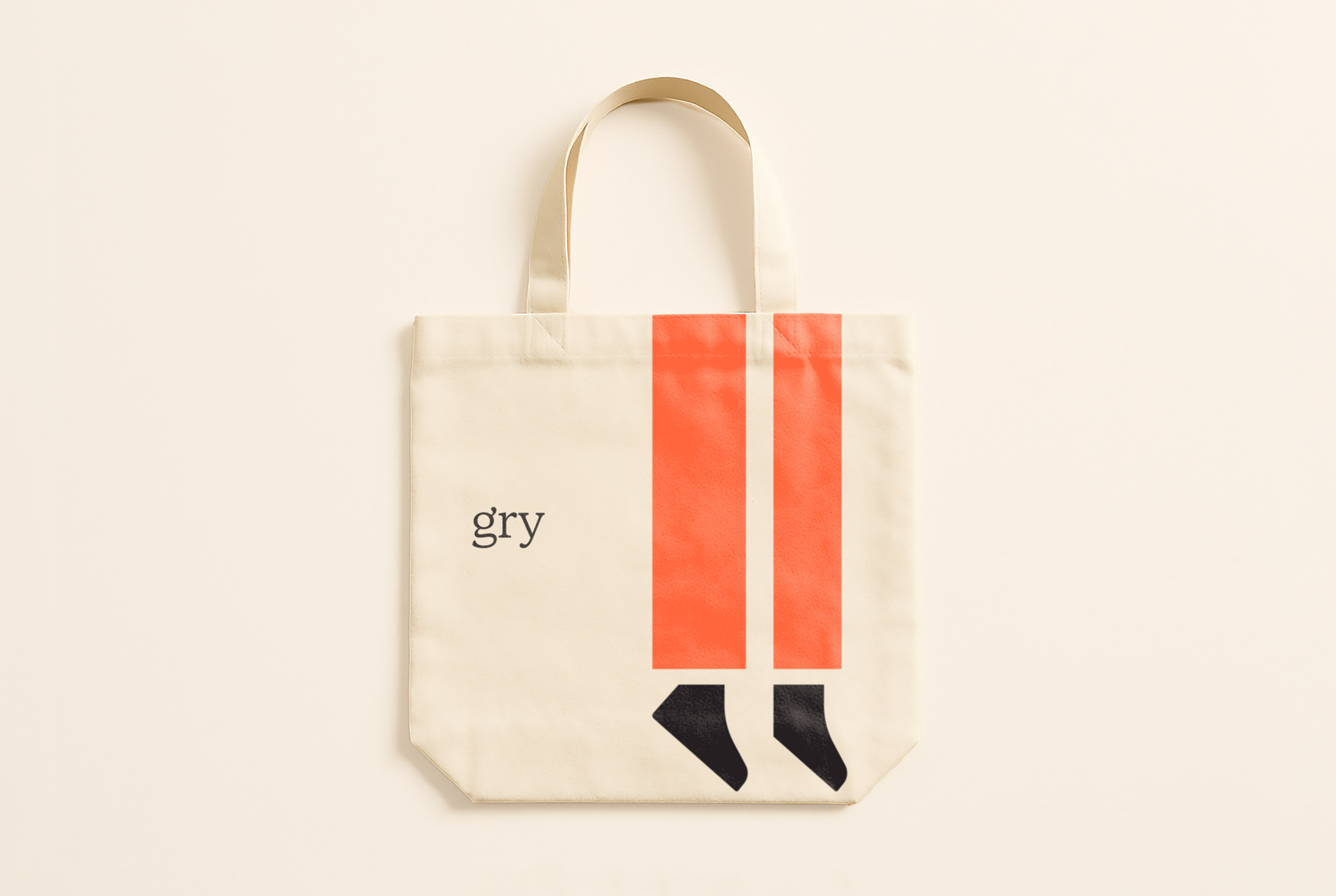
The outcome is a cohesive visual language centred around a distinctive logo symbol and an expressive illustration system. The identity leans on strong personality, strategic clarity, and a high degree of flexibility, ensuring it performs consistently from the website to social content, course material and internal tools.
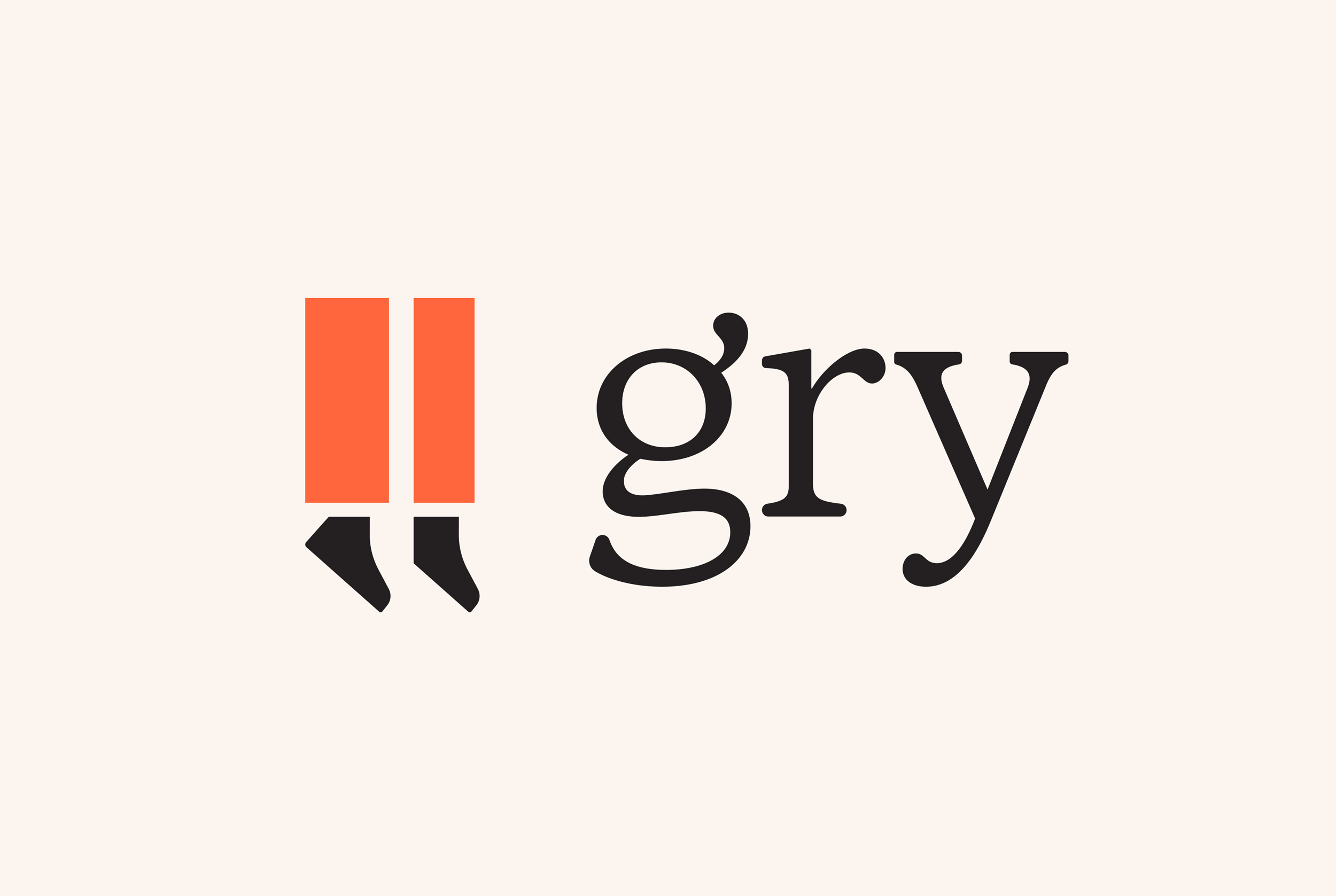
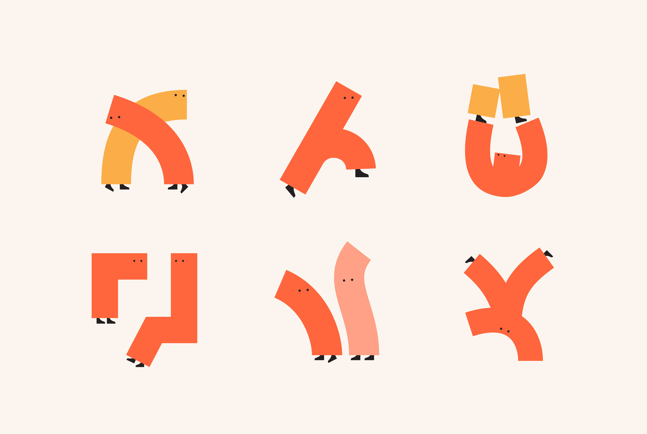
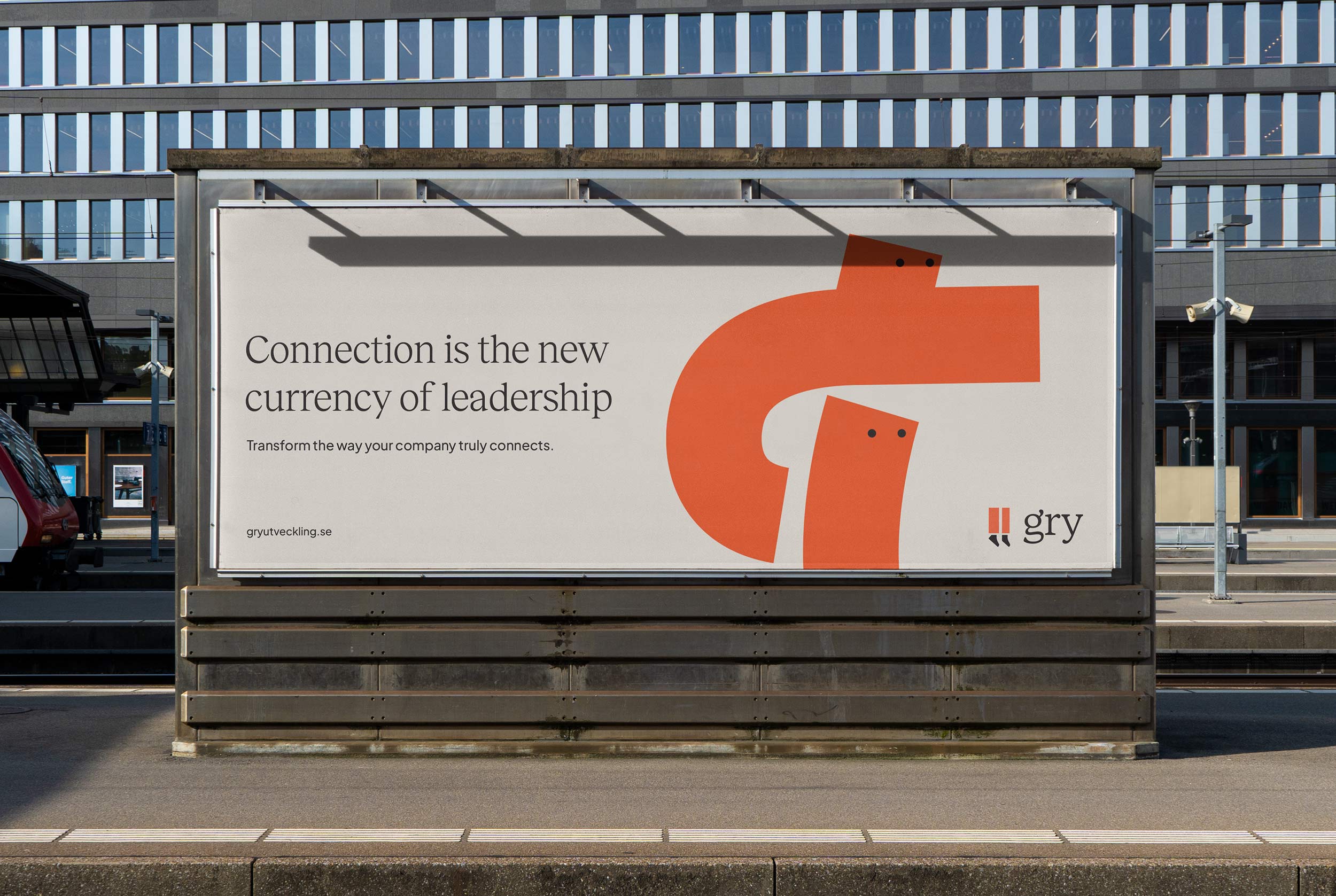
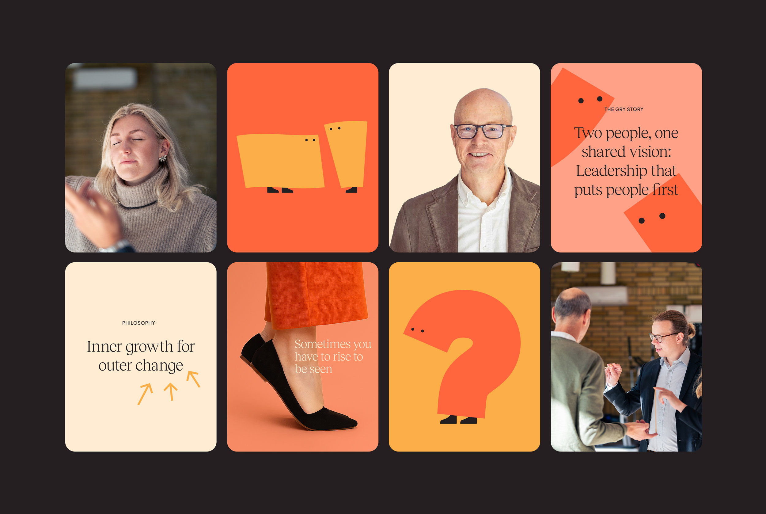
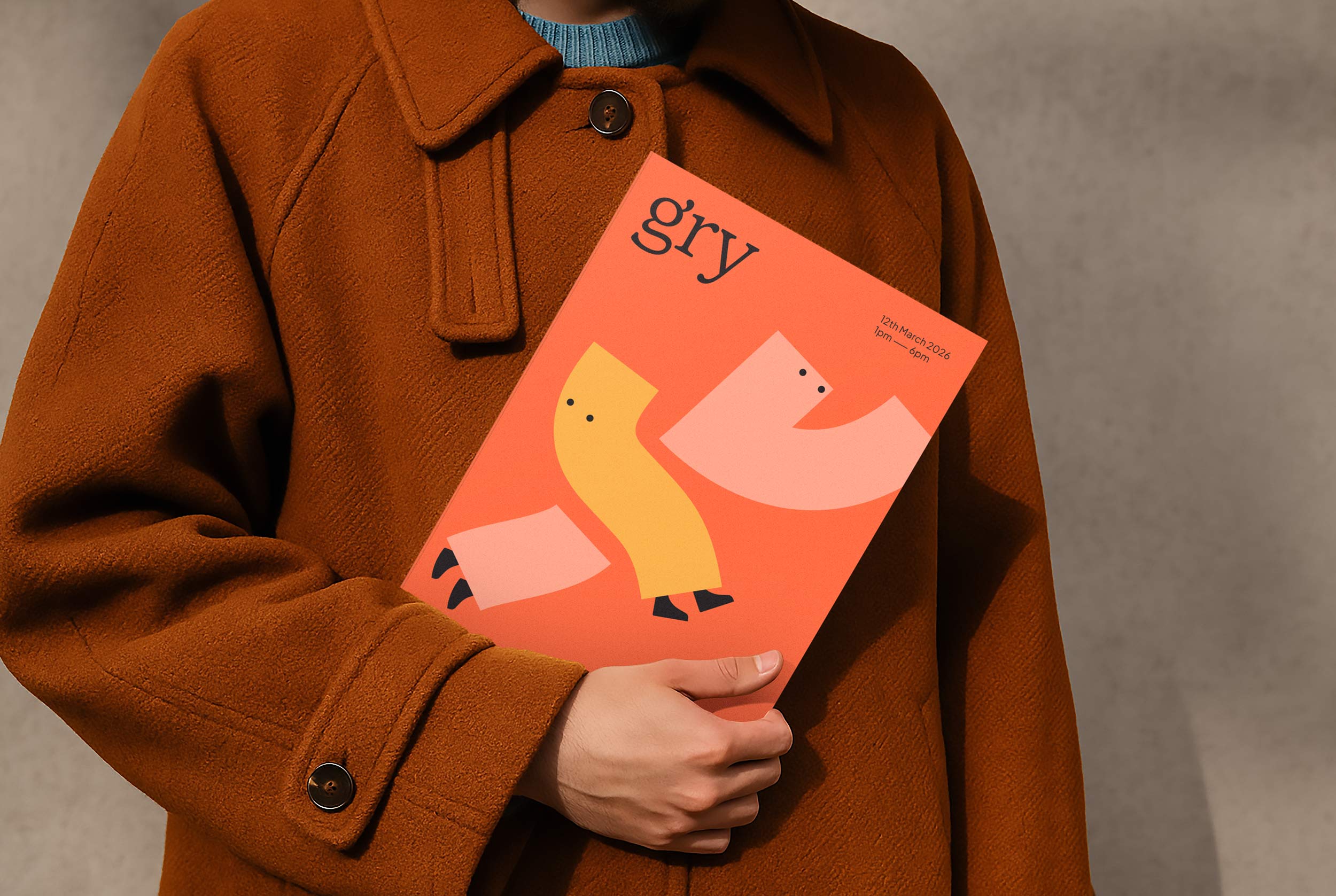
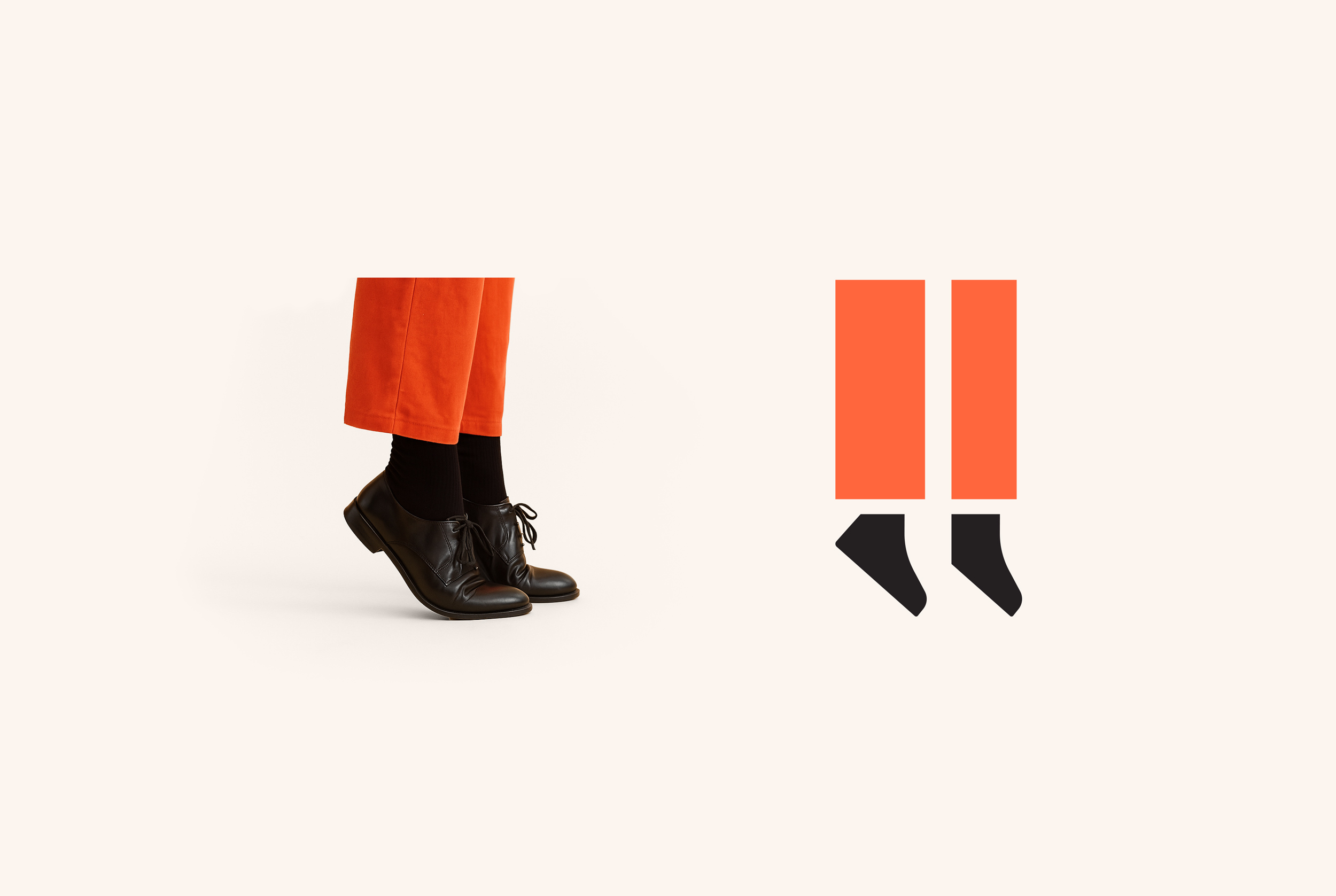
The logo features a bold symbol inspired by the idea of “standing on your toes”, a subtle nod to visibility, growth, and confidence. This metaphor resonates deeply with Gry’s services, which help people find their voice, become better communicators, and emerge as authentic leaders. Expanding from this idea, I developed a bespoke suite of over 20 playful illustrations. Each character is born from the logo shape, personified into scenes of interaction, growth, conflict or collaboration. They add warmth and humanity to the brand, making abstract leadership concepts more accessible and memorable.
The colour palette blends approachability and originality. Orange signals creativity, movement, and action, balanced by soft neutral backgrounds and subtle pastel shades that provide a sense of calm and warmth. This direction intentionally distances the brand from the cold blues and greys typical in the Swedish category.
Typography plays a grounding role. The chosen typeface introduces a layer of refinement and trust, ensuring the visual system feels polished and confident, without ever becoming stiff or corporate.
The result is a brand identity that feels fresh, innovative, and full of personality. It’s designed to engage, adapt, and evolve. Whether it’s used across stationery, websites, social templates, or advertising, the system ensures consistency without monotony.
CREDIT
- Agency/Creative: Michele Verze
- Article Title: Helping Gry Stand Taller With a Bold, Character-led Brand Identity by Michele Verze
- Organisation/Entity: Freelance
- Project Type: Identity
- Project Status: Published
- Agency/Creative Country: Australia
- Agency/Creative City: Sydney
- Market Region: Europe
- Project Deliverables: Art Direction, Brand Design, Brand Identity, Character Design, Illustration, User Experience, Web Design
- Industry: Professional Services
- Keywords: Leadership, development, training executives, corporate, identity, logo design, illustrations, character design
-
Credits:
Design Director: Michele Verze


