


ACG World — Brand Transformation
ACG World is a global leader in nutraceutical and pharmaceutical manufacturing, providing capsules, films, foils, packaging, machinery, and engineering solutions across more than 100 countries. Despite its scale and influence, the brand had grown fragmented across regions and business units, resulting in inconsistent communication, a diluted visual identity, and a lack of cohesive narrative. A company operating at the forefront of global wellness required a brand that reflected its precision, humanity, and innovation. Our mission was to unify and modernise ACG’s entire brand ecosystem — strategically, visually, and experientially — while preserving the heritage and recognition the company had established over decades.
Strategic Foundation
The overhaul began with a comprehensive audit across identity, messaging, and applications. A key insight emerged early: ACG’s core product, the capsule, contains the visual and structural DNA the brand needed. The capsule is universal, instantly recognisable, and symbolically tied to wellness. It embodies engineering precision, scientific control, and human purpose.
Through this insight, we built a new brand system rooted in the 3:1 capsule proportion — the exact ratio used in capsule manufacturing and blister-pack alignment. This proportion became the anchor for the redesigned logotype, layout grids, spatial architecture, and graphic devices. It gave the brand a mathematically grounded visual structure that reflects the discipline and consistency of ACG’s production world.
Logotype Refinement: The 3:1 Engineering Ratio
The ACG logotype was refined rather than replaced. Its new 3:1 proportion mirrors the core business of capsule production — a subtle but deeply meaningful evolution. This ratio brings balance, harmony, and recognisable geometric rhythm to the identity while ensuring consistency in small and large-scale applications. We wanted to make sure the type stayed clear of any potential noise, needed to reduce well, and needed to be nestled within a shape that is timeless and sits well in isolation, particularly within a blank page. No secondary or supporting elements needed to carry the visual cohesion. We also introduced a custom contextual ligature that connects the letters A–C–G with capsule-inspired geometry. This ligature adds personality, recognisability, and a crafted typographic signature unique to the brand within long form copy for rapid recognisability of all things related to ACG.
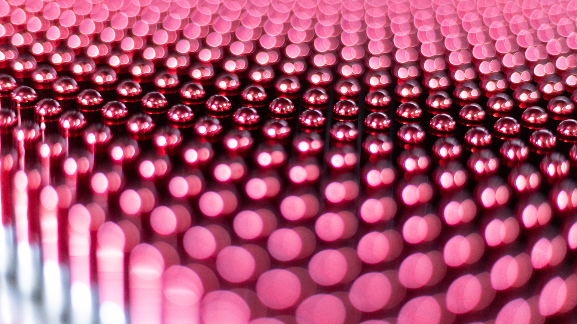
Redefining the Pharmaceutical Palette
Where the majority of pharmaceutical and nutraceutical brands sit comfortably — almost predictably — within a spectrum of clinical blues, greens, and sterile whites, ACG’s new identity deliberately breaks from convention. The category has historically relied on cold, hygienic palettes to signal purity and scientific rigour. But in doing so, most brands have blended into one homogenised visual landscape, making differentiation nearly impossible and emotional resonance unlikely.
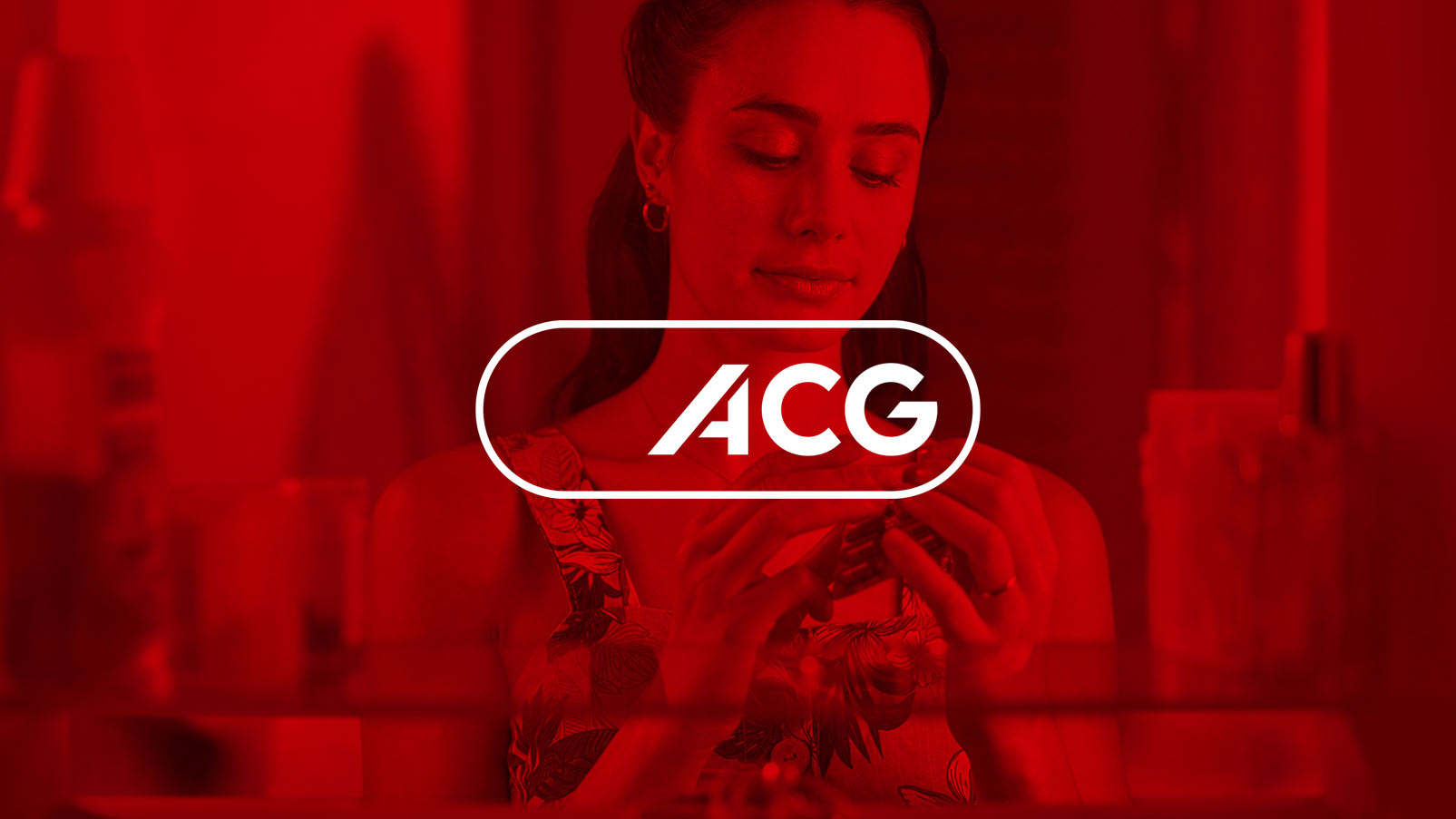
We carved out a bold new colour niche for ACG by centering the brand in red — a choice that is both strategically disruptive and deeply human. Red carries multiple layers of meaning relevant to ACG’s world: vitality, life, energy, care, protection, and human warmth. It introduces a sense of approachability and emotional connection in a category that often feels distant and clinical.
This shift positions ACG as a company that is not only technically precise, but empathetic, human-centred, and committed to improving global wellbeing. Red allows the brand to stand apart visually, to feel alive and contemporary, and to build stronger associations with wellness rather than sterility.
Typographic Overhaul: Humanist + Noto Sans
Typography became a central pillar of the redesign. ACG communicates across scientific, regulatory, and commercial contexts, and in multiple global languages. The previous system lacked both warmth and scalability. The new typographic ecosystem is intentionally dual-layered:
A Humanist Primary Typeface
This became the “friendly face” of ACG. Its approachable, organic forms bring humanity to a highly technical category. It modernises the brand’s tone, improves legibility, and supports the renewed emphasis on people, wellness, and clarity.
Noto Sans as the Global Workhorse
Noto Sans brings unmatched multilingual coverage, supporting over 800 languages. It is clean, neutral, highly legible and pairs harmoniously with the Humanist primary. This ensures consistency across ACG’s global footprint, from India to China to the EU and LATAM. The new type system unifies all divisions and markets with a tone that is warm, clear, confident, and scientifically credible.
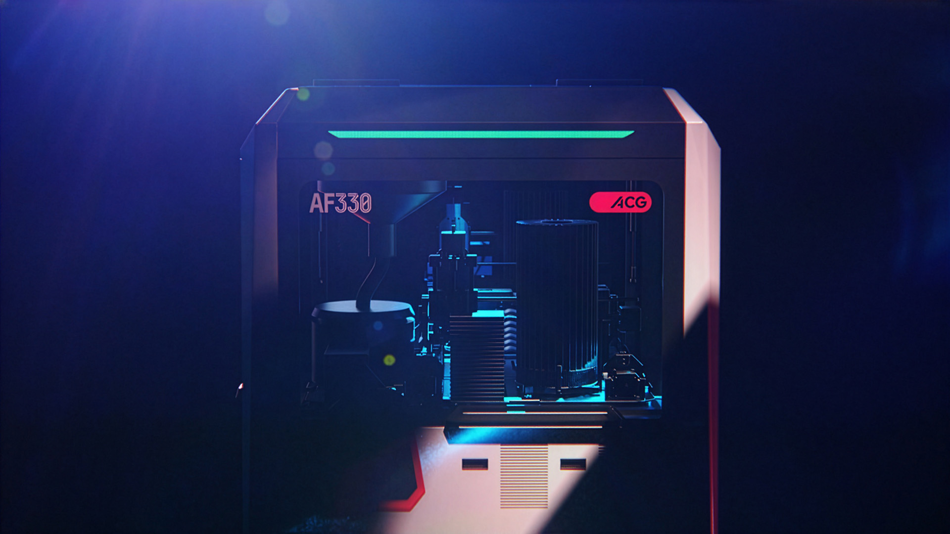
Films and Foils as structural and compositional backbone
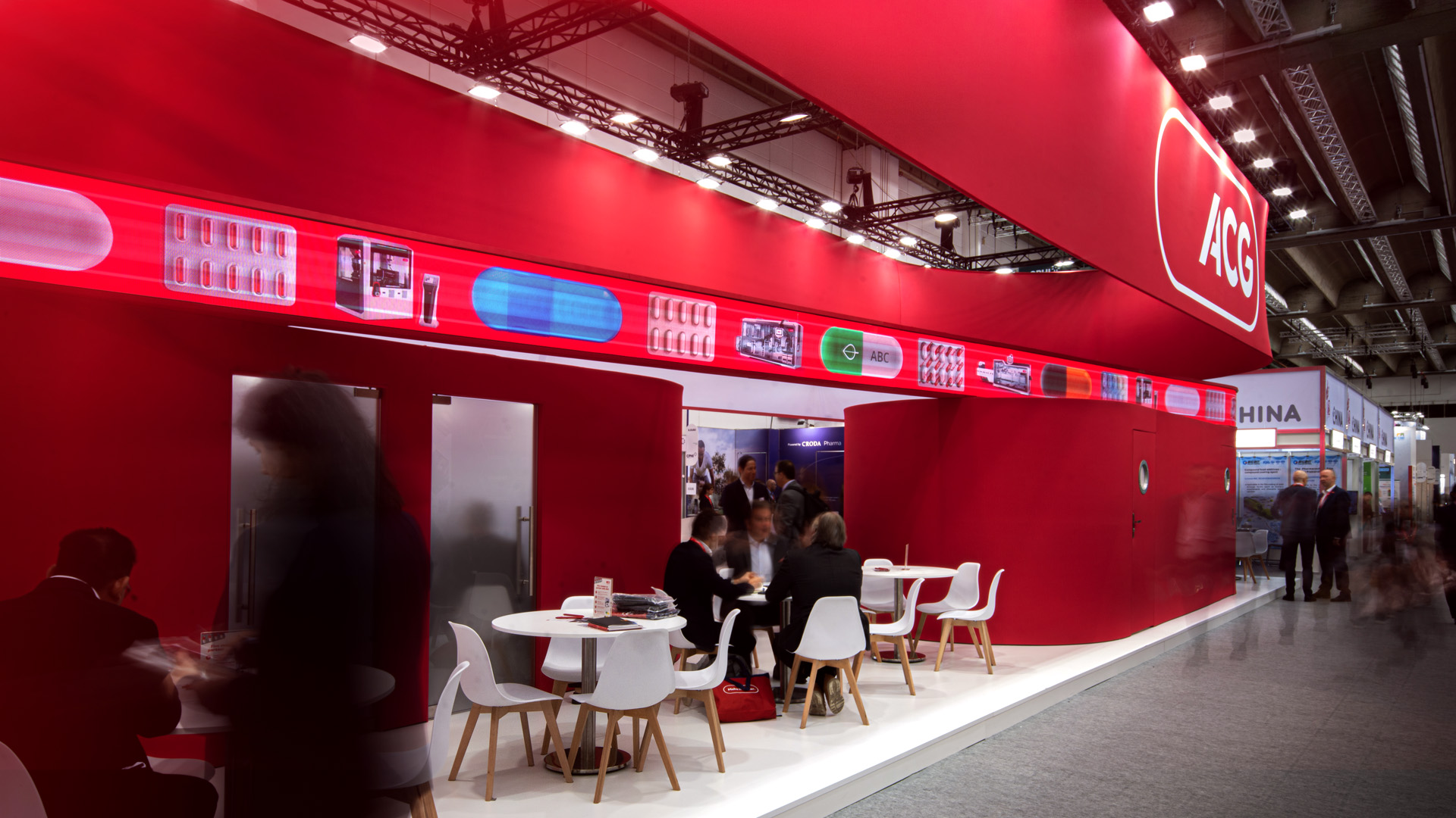
Beyond capsules, ACG’s packaging materials — the films and foils used in blister packs — became a second structural foundation for the brand. Their inherent linear grid, rhythmic repetition, and modular spacing offered a natural architectural logic that could be translated directly into design. These patterns informed everything from layout frameworks and page divisions to display hierarchies, graphic rhythms, and large-scale architectural surfaces. Even the exhibition environments adopted the same spatial cadence, creating a seamless relationship between product and brand experience. The result is an identity system that is not decorative or arbitrary, but one that emerges authentically from ACG’s own manufacturing reality — every graphic choice grounded in something physical, tactile, and operational.
360 Design
A no-fuss, simplified, and unified identity that could operate beyond the shifting trends of “what’s currently in” was essential. From the outset, the goal was to engineer a system that was inherently modular — a brand language built on clarity, proportion, and structural logic rather than stylistic decoration. This modular foundation allowed us to create assets that all traced back to the core identity, ensuring cohesion and recognisability regardless of scale, medium, or context.
Because the system was built on the capsule’s geometry and proportion, it translated effortlessly across every design discipline. The capsule shape became a functional design unit: a container, a frame, a motif, a window, an architectural aperture, a navigation device, a sculptural form. It worked as seamlessly in micro-typographic details as it did in large-scale exhibition structures.
This 360° adaptability gave the brand a rare sense of continuity, simplicity and above all a inherent utility.
The result was a brand system that not only unified communications but also accelerated creation. Teams could move fluidly from print to spatial design, from graphic to industrial form, without reinventing the visual language each time. The underlying capsule logic provided both freedom and discipline — a toolkit expansive enough for complex compositions, yet controlled enough to remain in the pharmaceutical industry, unmistakably ACG.
By ensuring that the capsule shape worked across all mediums and applications, the identity became truly holistic. It is not a logo with supporting graphics; it is a design ecosystem. One that behaves consistently, scales intelligently, and reinforces ACG’s core truth at every touchpoint.


CREDIT
- Agency/Creative: Billion Design
- Article Title: Billion Design Unifies a Global Pharmaceutical Brand System for ACG World
- Organisation/Entity: Agency
- Project Type: Identity
- Project Status: Published
- Agency/Creative Country: Croatia
- Agency/Creative City: ZAGREB
- Market Region: Global
- Project Deliverables: 2D Design, 3D Design, Animation, Art Direction, Brand Architecture, Brand Design, Brand Guidelines, Brand Identity, Brand Redesign, Creative Direction, Design, Environmental Graphics, Exhibition Design
- Industry: Pharmaceutical
- Keywords: WBDS Agency Design Awards 2025/26 , Branding, Re-Brand, Red, Pharmaceutical, Making it Better, Typography, Design, Humanist, Motion Design,
-
Credits:
Creative Direction, Graphic Design, Typography, Animation, Product Design, Environmental Design: Petar Popovic
Animation: Dominik Budimir
Animation: Rod Jorge
Exhibition Design and Brand Activation: Adrian Whines


