


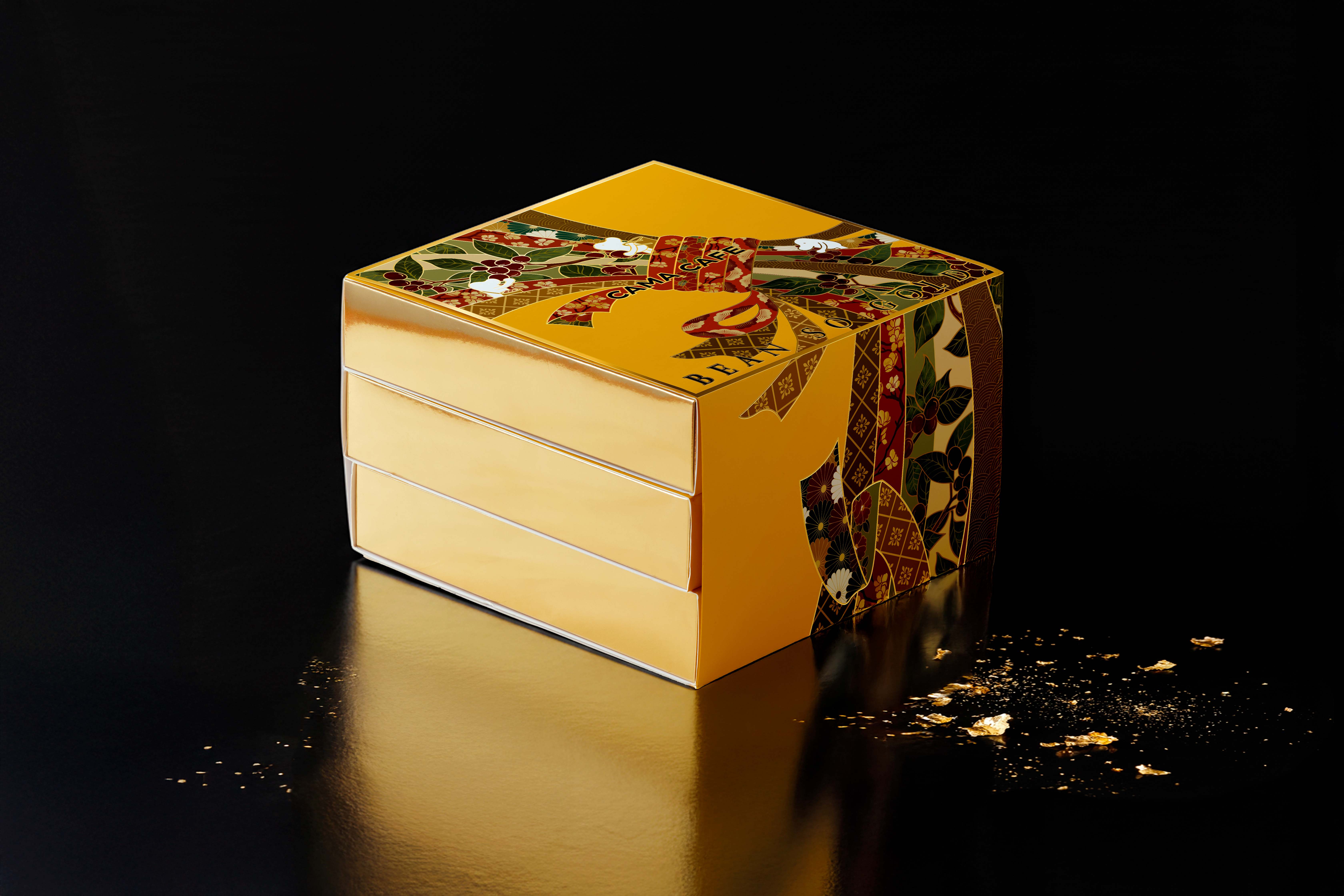
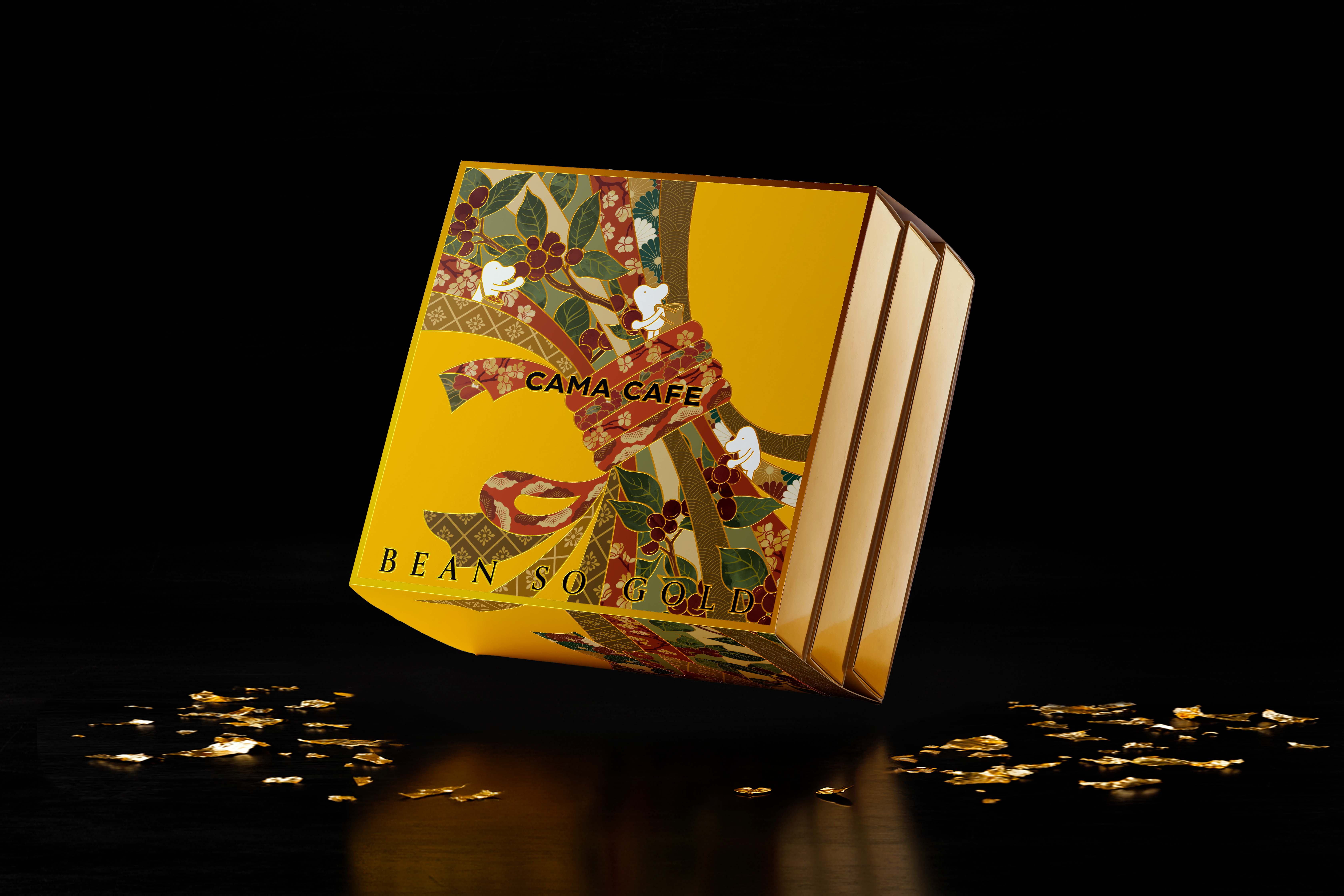
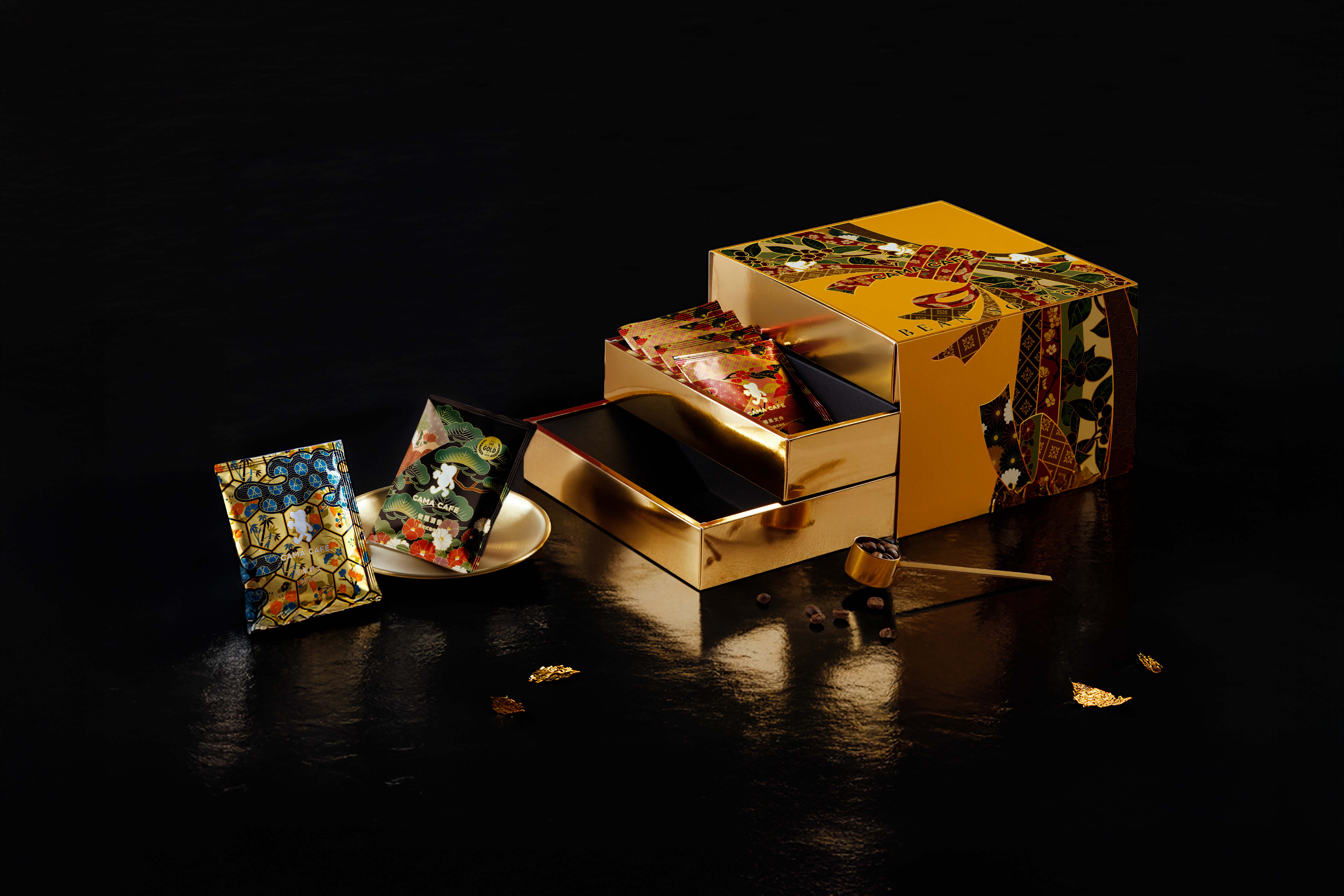
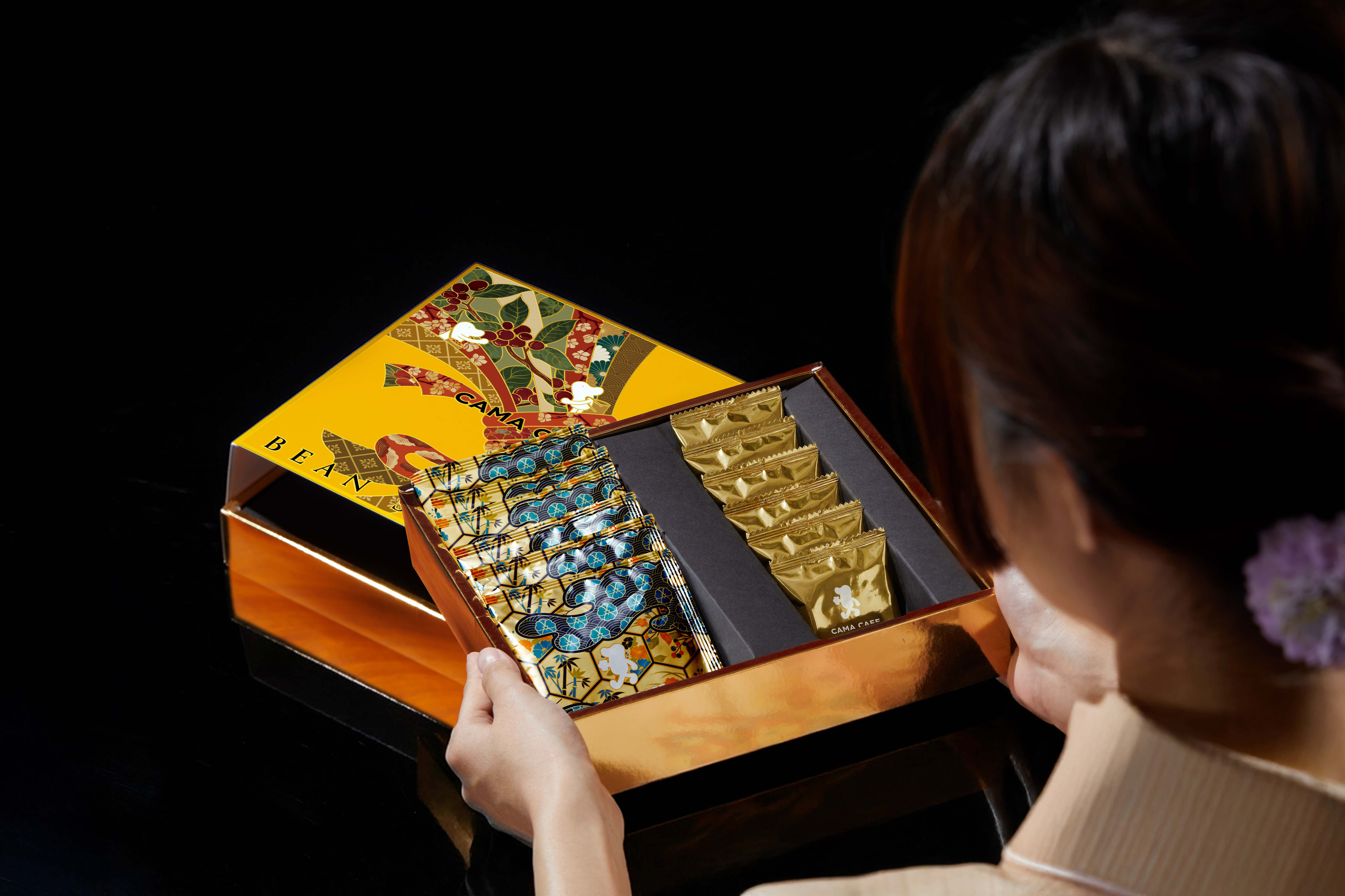
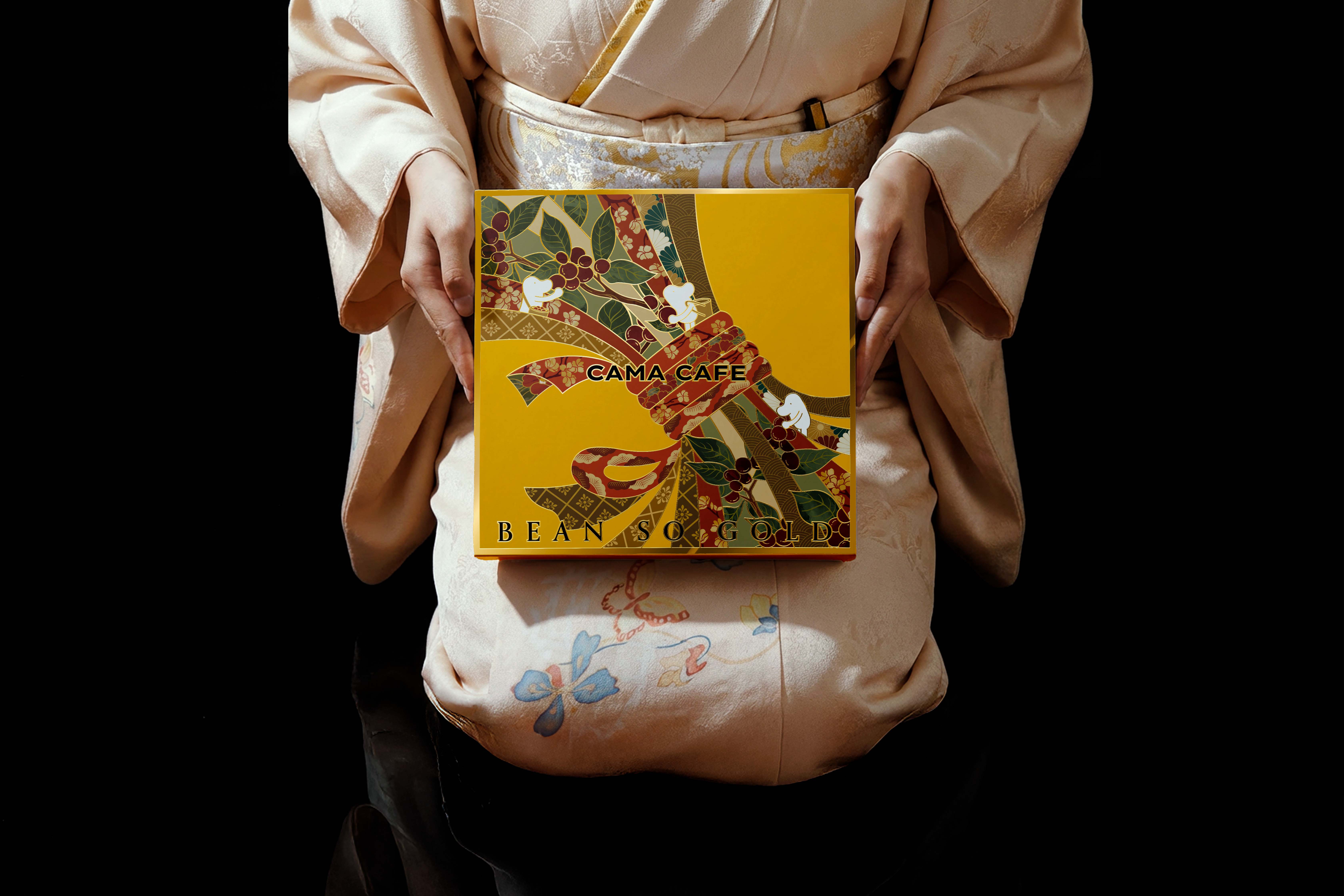
Bean So Gold is built on a simple idea: value doesn’t need to raise its voice.
A coffee bean is small, almost forgettable, yet it carries the entire story of origin, climate, soil, and human hands. When treated with care, it becomes something unmistakably meaningful—not because it tries to impress, but because it’s shaped with intention. Gold, in this context, isn’t a symbol of luxury; it’s a metaphor for clarity, purity, and the quiet weight of something crafted with purpose.
This belief guides how we roast, how we design, and how we show up as a brand. We strip away anything that feels decorative without reason. Every decision—temperature curves, typography choices, color, pacing—is selected to hold its own ground without relying on noise. We want the work to feel calm but confident, minimal but not empty, refined without ever crossing into pretension. Good coffee and good design share the same discipline: they reveal themselves slowly, but honestly, as long as you give them space.
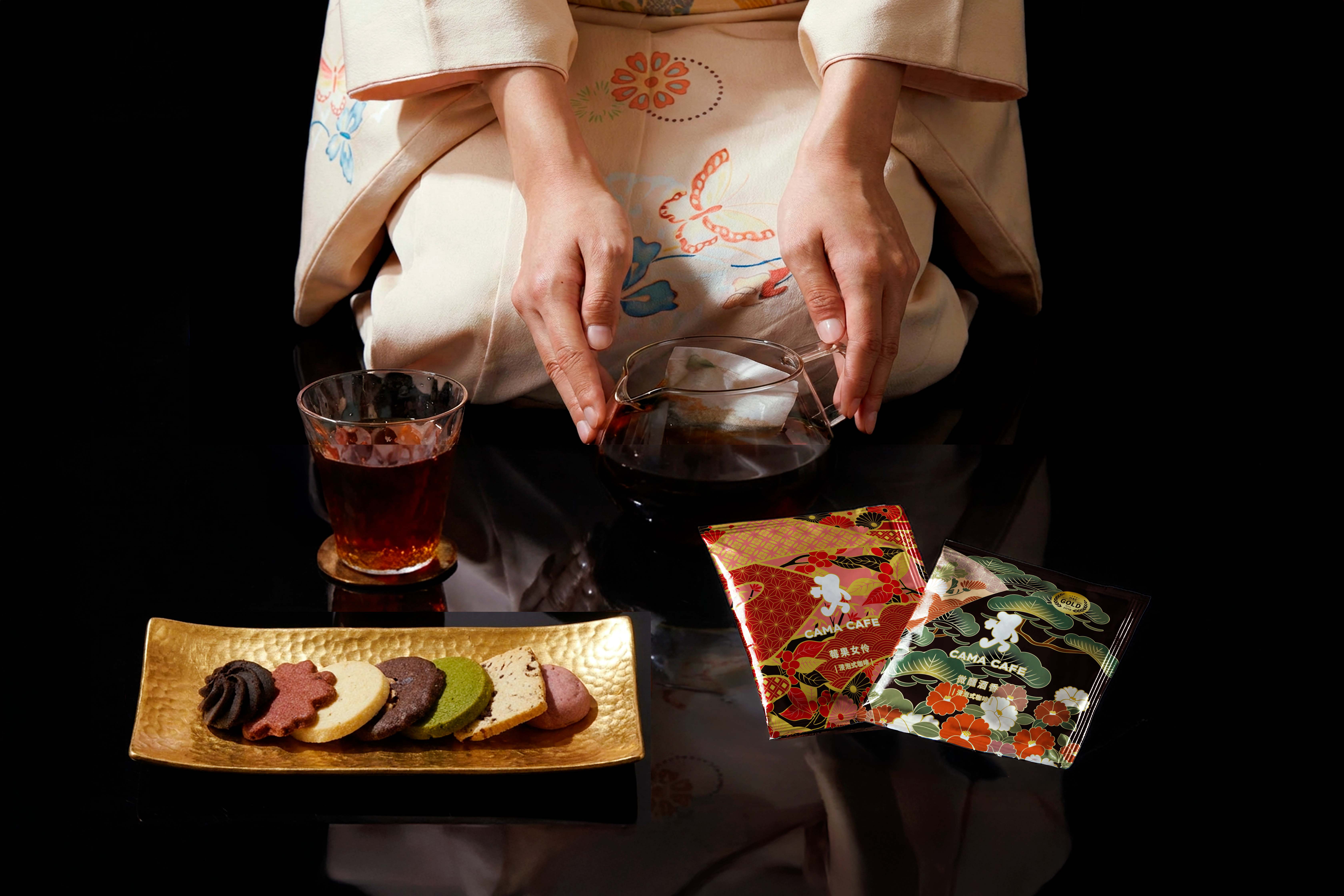
Bean So Gold is also an exercise in restraint. In a culture obsessed with speed and novelty, we take the opposite route. We study the bean before we roast it. We listen before we speak. We edit more than we add. The goal is not to appear perfect, but to be deliberate. When something looks simple, it often means someone took the time to understand what shouldn’t be there. That’s the kind of simplicity we believe in—earned, not decorative.
At its core, this philosophy is about presence. The presence of attention, the presence of craft, the presence of choices made by hand rather than automation. We want every touchpoint—bag, cup, image, word—to carry a sense of human judgment. Not forced warmth, but real consideration. Not grand gestures, but the steady consistency that builds trust.
In the end, Bean So Gold stands for the kind of quality you can feel without needing it explained.
A quiet confidence.
A clear intention.
A reminder that when something is made with care, it speaks for itself—softly, but undeniably.
CREDIT
- Agency/Creative: Lung-Hao Chiang
- Article Title: Bean So Gold Coffee Visual Identity Design by Lung-hao Chiang
- Organisation/Entity: Agency
- Project Type: Packaging
- Project Status: Published
- Agency/Creative Country: Taiwan
- Agency/Creative City: Taipei
- Market Region: Asia
- Project Deliverables: Packaging Design
- Format: Box
- Industry: Food/Beverage
- Keywords: coffee
-
Credits:
Art Director: Lung-Hao Chiang


