


The Problem
Color is often treated as fixed and objective, but its meaning shifts dramatically depending on perception, culture, and context. In visual communication, this complexity is frequently overlooked—leading to oversimplified uses of color that ignore its symbolic and emotional depth. There’s a need to re-express color as a relational, cultural, and perceptual experience rather than a static visual property.
The Idea
To start, my project is based on Johann Wolfgang von Goethe’s Theory of Colours, which serves as the manifesto behind this project.
Unlike Newton’s scientific explanation of color, Goethe believed that color is not objective—it’s shaped by perception, emotion, and even cultural background. He argued that what we see is influenced by light, shadow, and experience—not just physical data.
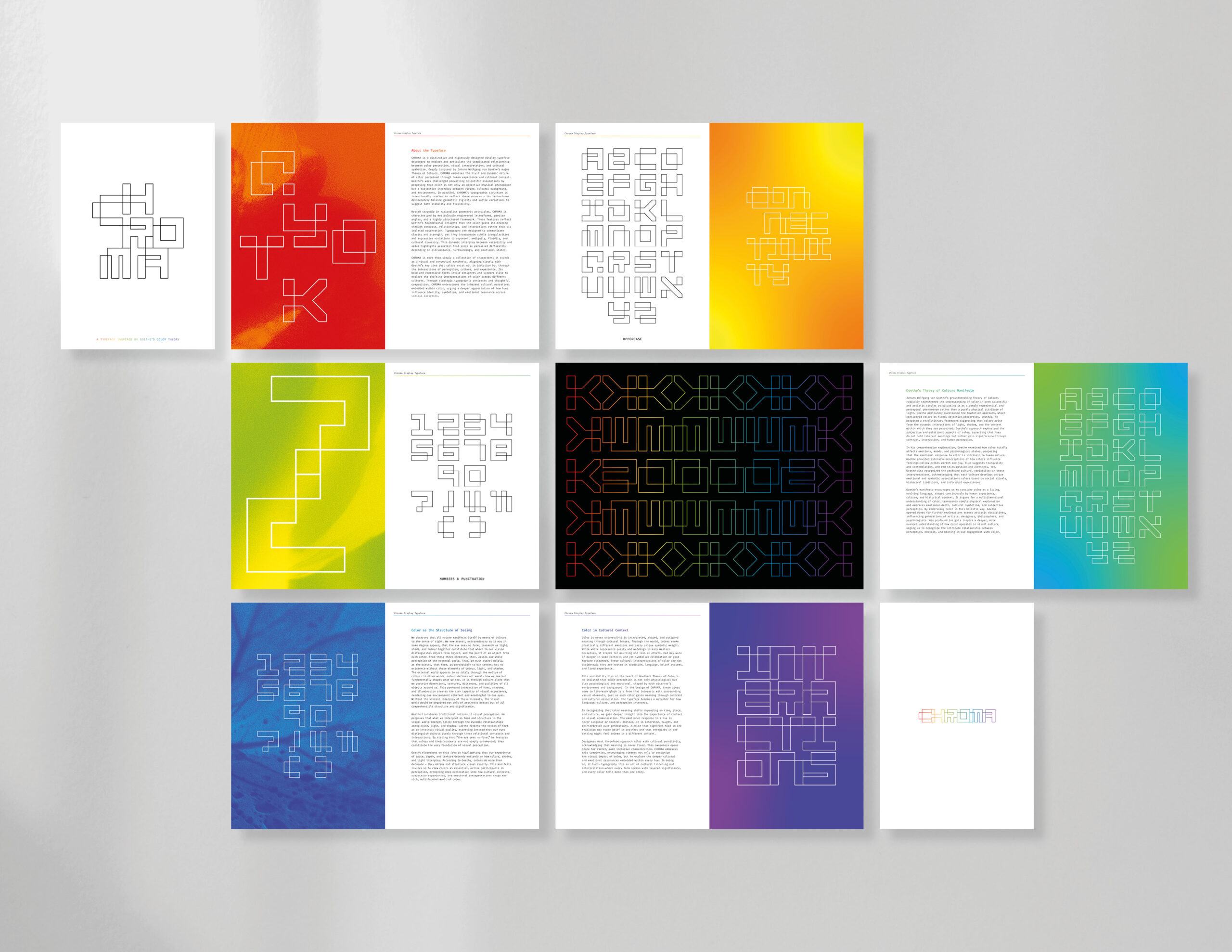
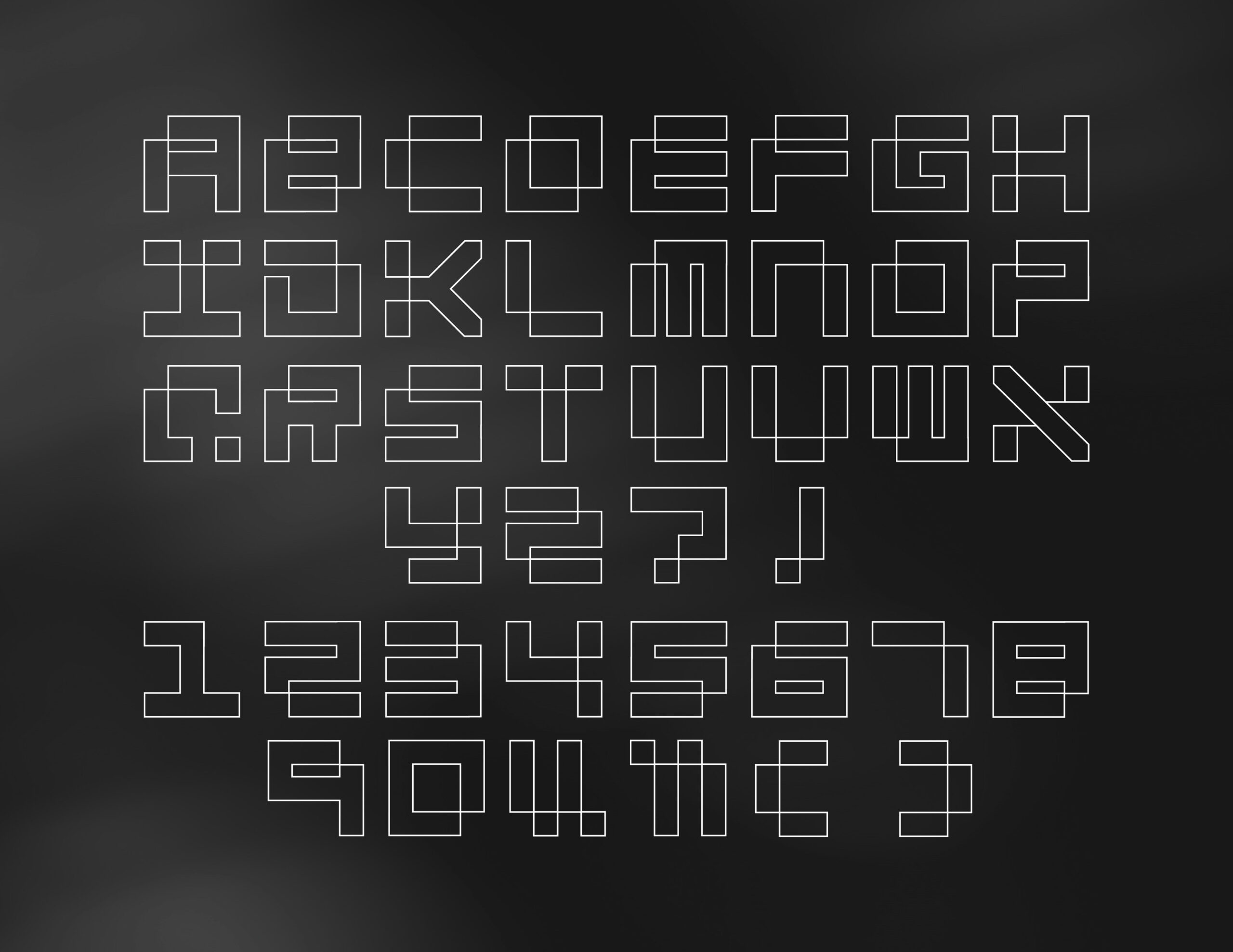
Typeface
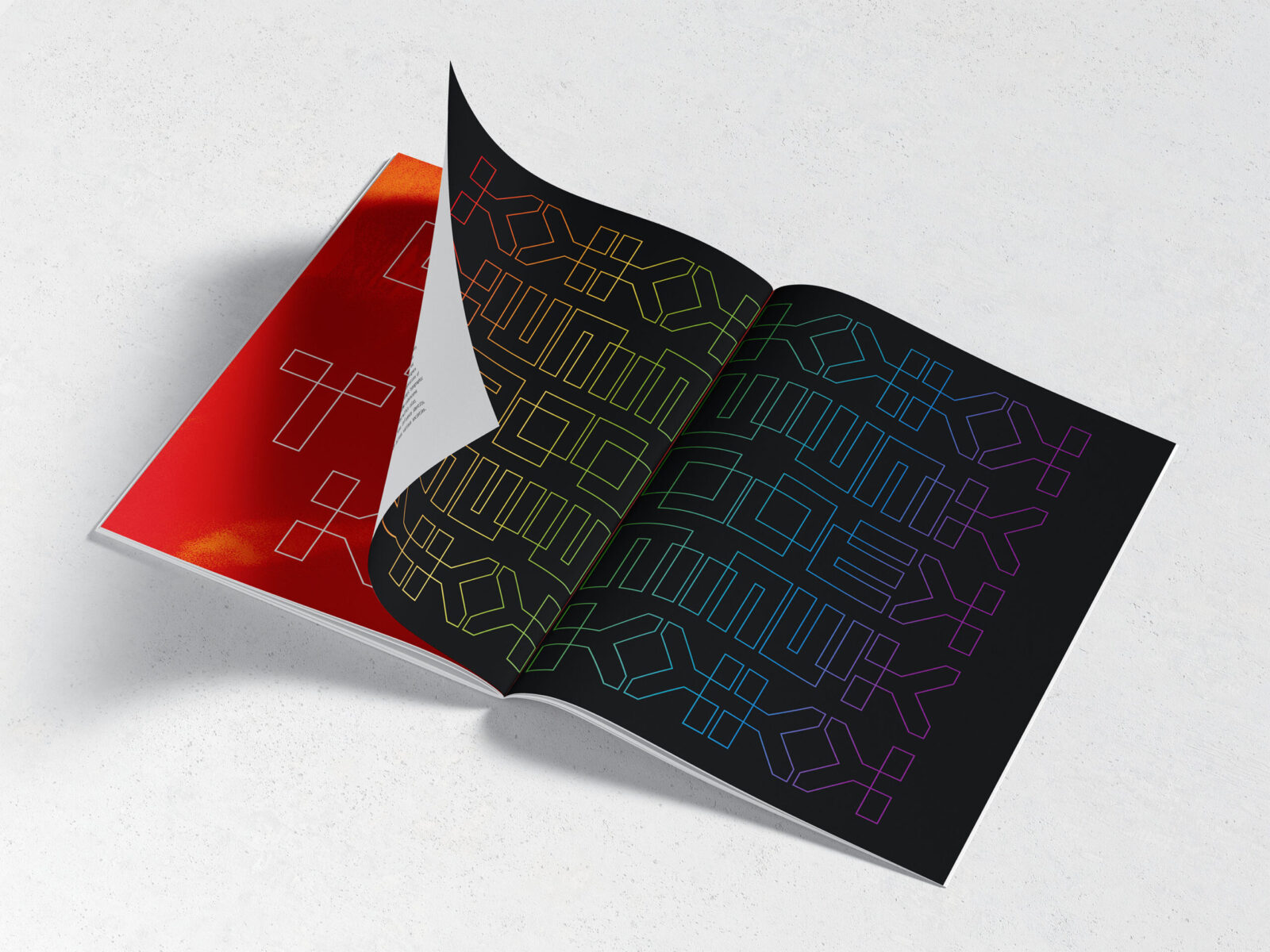
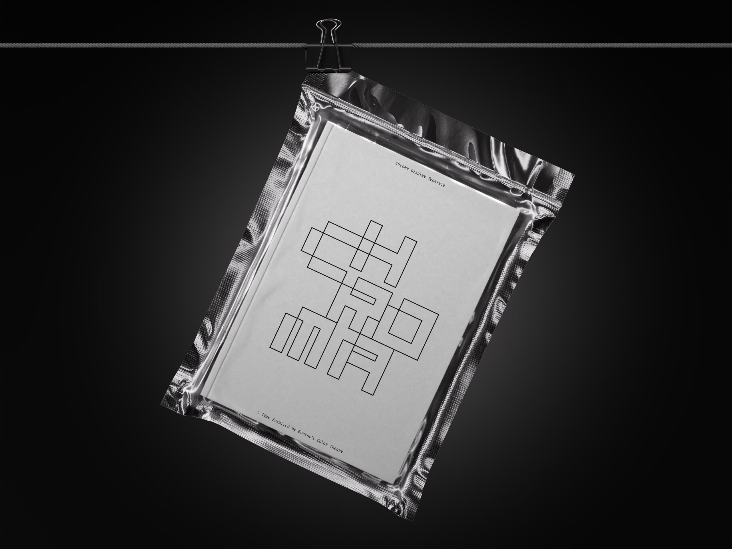
CHROMA is a custom typeface I designed based on Goethe’s manifesto. Goethe believed that color doesn’t exist on its own—it’s shaped by how we perceive it in context. So, color is always changing depending on light, shadow, and cultural interpretation.
I brought that same idea into the typeface. Each letter is built from lines that connect and interact with one another. It’s not just about a continuous stroke—it’s about how the lines relate and overlap. That interaction reflects how meaning comes from relationships, not isolated parts.
Instead of filled shapes, the outline structure makes the letterforms feel open and flexible—like a framework. Goethe said we don’t just see color—we experience it depending on where and how it appears. These letters work the same way. Their meaning and visual weight come from how they exist in space, not from being solid.
So CHROMA is designed to feel structured, but also interpretive. Just like color, it shifts depending on how you look at it.
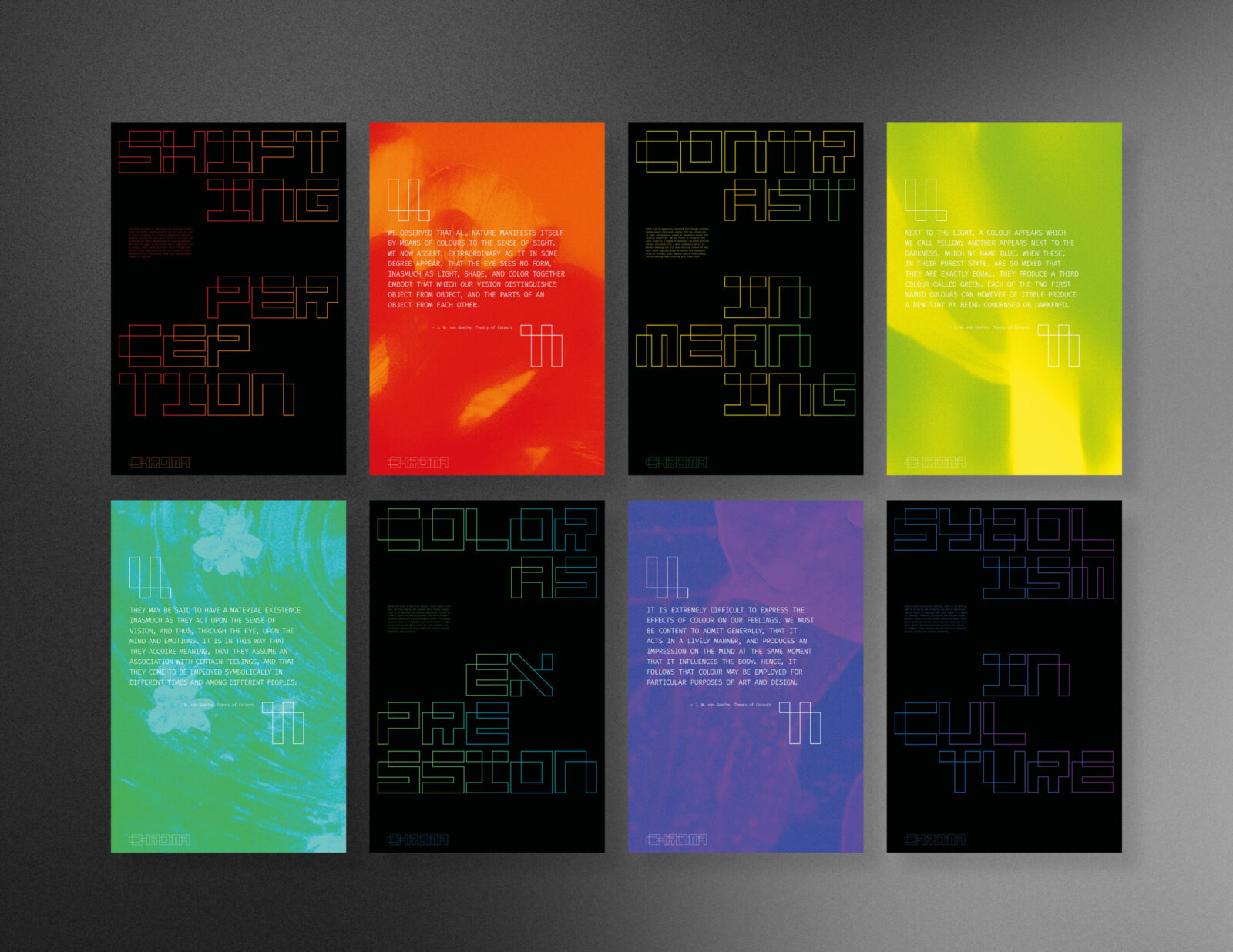
Color
I chose to use gradients as a visual representation of Goethe’s idea that color exists in transition, not as a fixed property. Rather than using flat, solid colors, I shifted tones within the same family to suggest blurred boundaries—reinforcing the idea that color’s meaning is never absolute, always in motion.
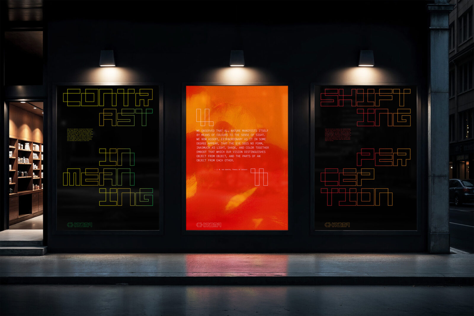
Posters
The series includes two sets of posters that work together:
The first set—on black backgrounds—features thematic titles inspired by Goethe, using the CHROMA typeface as the main graphic voice.
The second set pairs each theme with a direct quote from Goethe’s Theory of Colours to reinforce the conceptual message.
Each poster explores one of four core themes:
Shifting Perception — how color meanings change across cultures
Contrast in Meaning — how colors exist in opposition (e.g. light/dark, joy/grief)
Color as Expression — how color communicates emotional and cultural identity
Symbolism in Culture — how belief systems and tradition shape color meaning
Imagery
Each background image is taken from nature because Goethe believed color is rooted in the natural world. These organic forms interact with both the type and the color gradients—reminding us that our perception of color is never fixed, but shaped by environment, emotion, and cultural context.
The Result
Chroma invites viewers to reflect on color not as a universal language, but as a perceptual and cultural one. It uses a custom type system, shifting gradients, and natural imagery to visualize the complexity of color meaning
CREDIT
- Agency/Creative: Phoebee Lin (Yi-Hsuan)
- Article Title: Phoebee Lin Explores Perception and Culture Through Chroma Typeface and Dynamic Color Identity
- Organisation/Entity: Student
- Project Status: Non Published
- Agency/Creative Country: United States of America
- Agency/Creative City: Pasadena
- Project Deliverables: Editorial Design, Graphic Design, Poster Design, Research, Type Design, Typography
- Industry: Information
- Keywords: WBDS Student Design Awards 2025/26 , Typography, Typeface Design, Poster Design, Graphic Design


