


Briefing
The design of an experimental typeface and its Basic and Western European glyphs accompanied by two posters: a type specimen and an experimental one.
Proposal
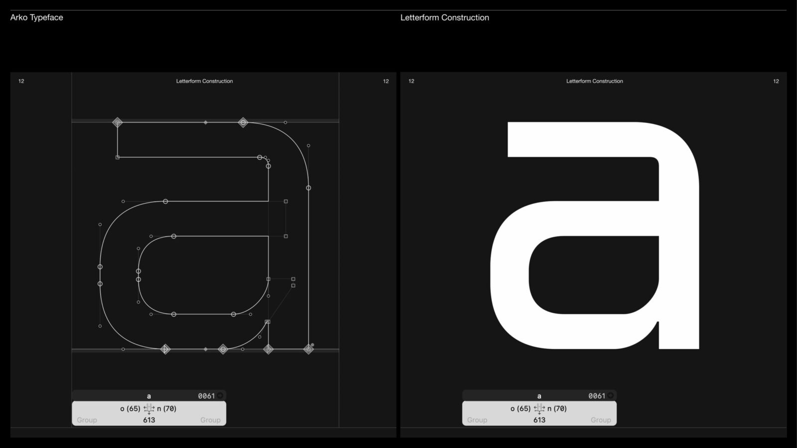
Arko is a geometric sans-serif typeface born from the coexistence of humanity and technology. Inspired by the quiet yet exponential breakthrough of Artificial Intelligence, it criticizes the growing and worrying fusion between robot and human. This duality is embedded in Arko’s design: its generous curves suggest humanity and emotion while its sharp ends impose a robot-like rationality and logic.
At once human and artificial, Arko stands as a strong statement about society as it is today. It is designed for those who recognize the importance of AI’s evolution, opening the possibility for debate and perhaps even change. Ideal for digital projects, Arko walks the line between human softness and robotic precision.
Contribution
To raise awareness of the growing and worrying fusion between robot and human, caused by the quiet yet exponential breakthrough of AI.
Production
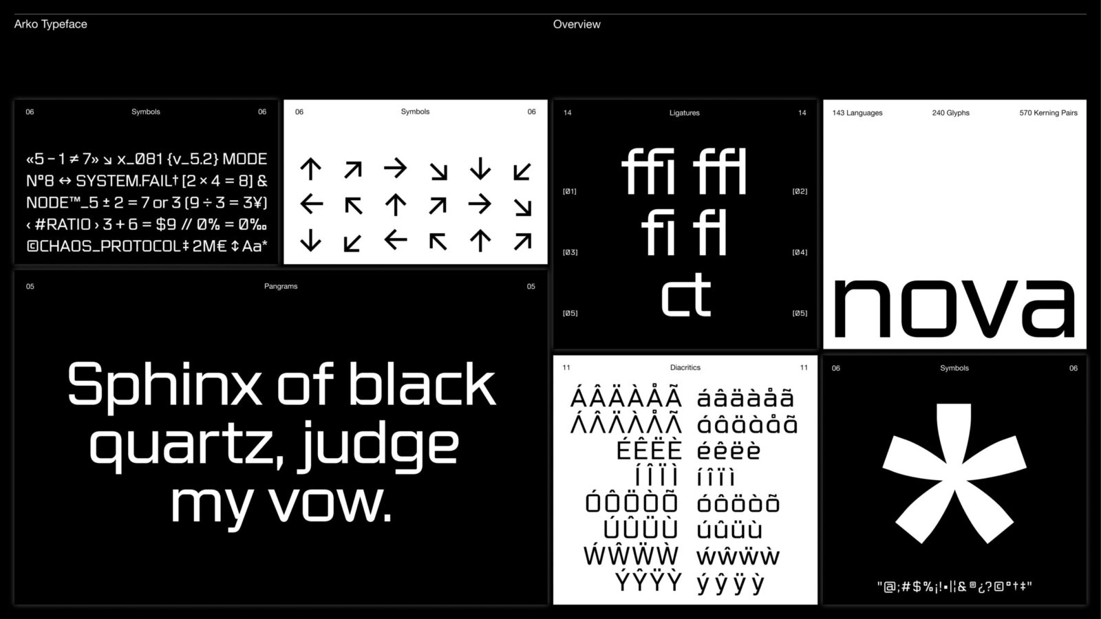
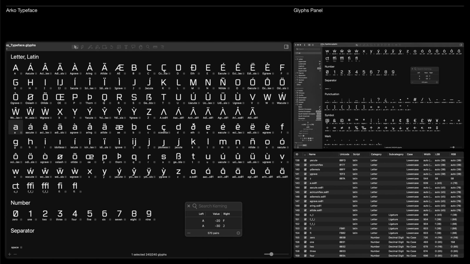
Display typeface featuring 240 glyphs & 570 kerning pairs, supporting 143 languages. Two A3 posters, a 34-page printed specimen and an experimental specimen laser-engraved on a 1.5 mm stainless steel plate.
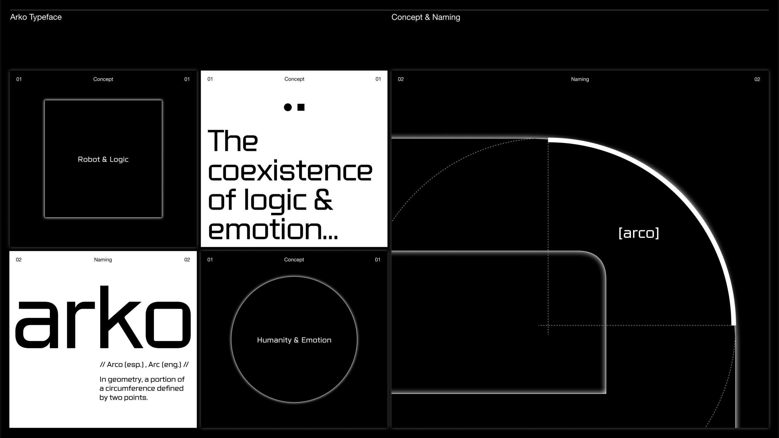
Concept and Naming
As mentioned earlier, Arko’s curves suggest emotion while its sharp ends impose logic. Its name is an alteration of the Spanish word “Arco”. In geometry, an arc is a portion of a circumference defined by two points. This element is the foundation of Arko’s design.
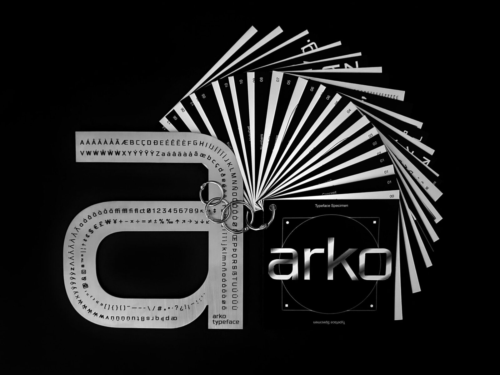
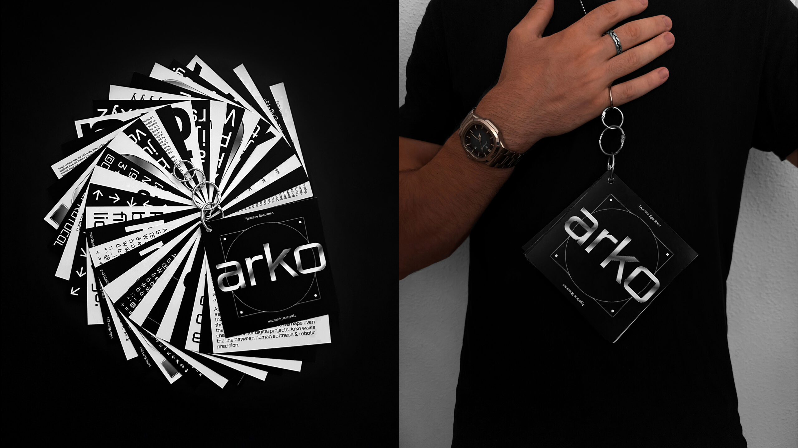
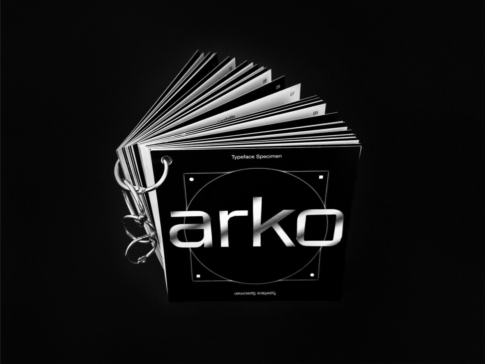
Specimen 01
This editorial piece encapsulates Arko’s concept, inspiration and visuals. Its square-to-round format reveals the two core graphic elements, while the binding—4 metal rings, one for each letter of “Arko”—embodies its futuristic character.
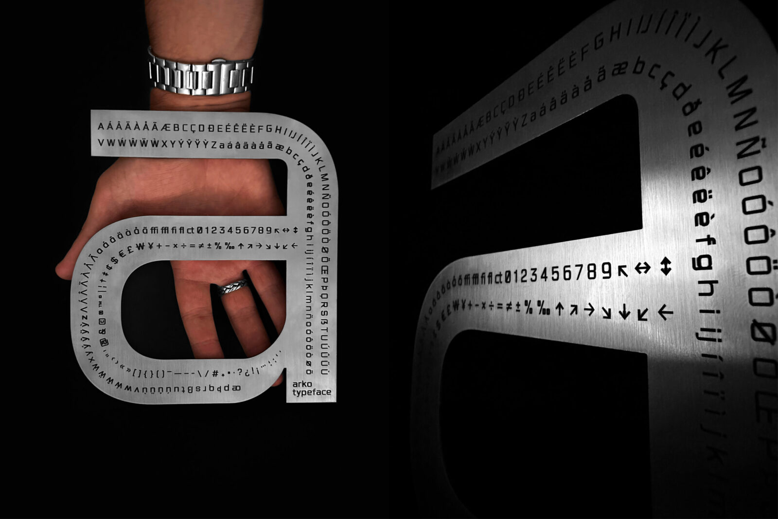
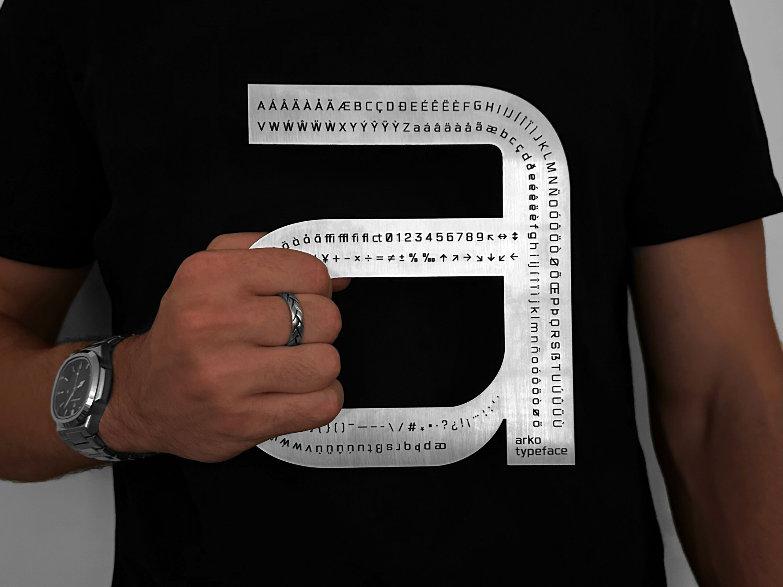
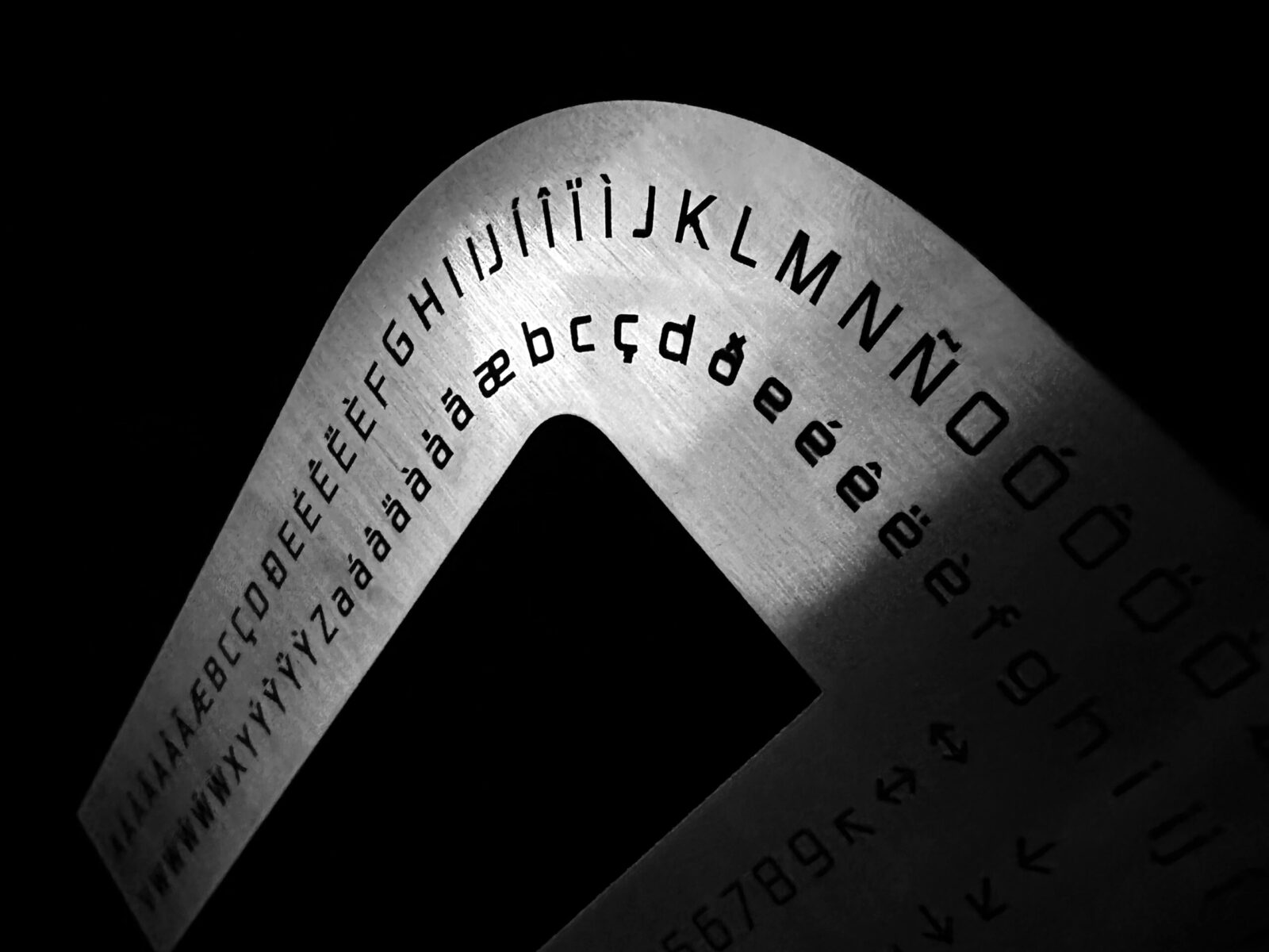
Specimen 02
The decision to create two specimens was directly tied to the duality present in Arko’s narrative. While the paper editorial piece represents the human side, this metallic 3D specimen embodies its robotic aspect.
Given that the printed specimen was already quite detailed, this piece focuses exclusively on the character map. It features the lowercase “a” cut from a 1.5mm stainless steel plate, with the full character map etched onto the metal surface.
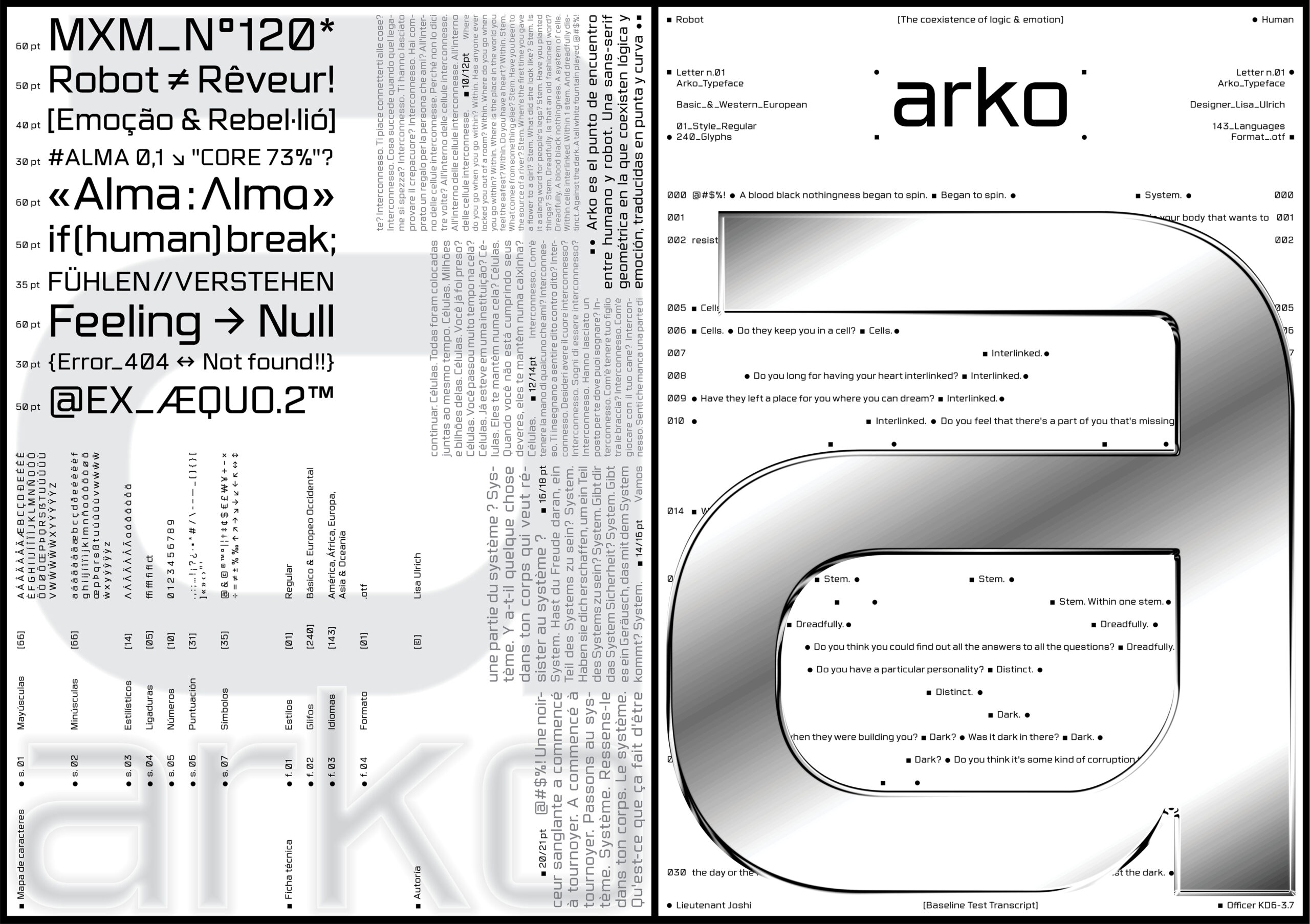
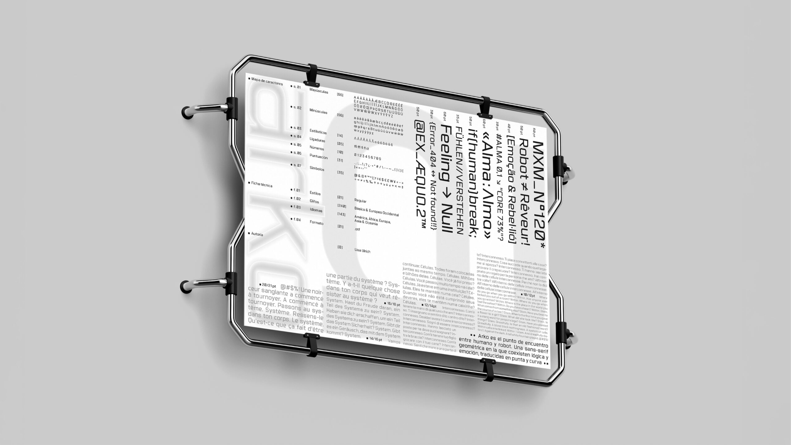
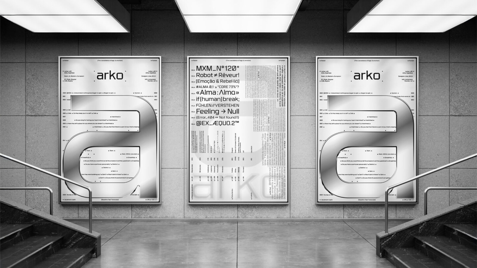
Poster 01
This first poster was designed as a compact type specimen, showcasing Arko in different sizes, languages and applications while preserving its futuristic tone.
It was intentionally designed to work both horizontally and vertically. This is a direct reference to the duality at the core of Arko’s concept and narrative. Once again, the contradiction between human and robot emerges, this time through the composition of the poster itself.
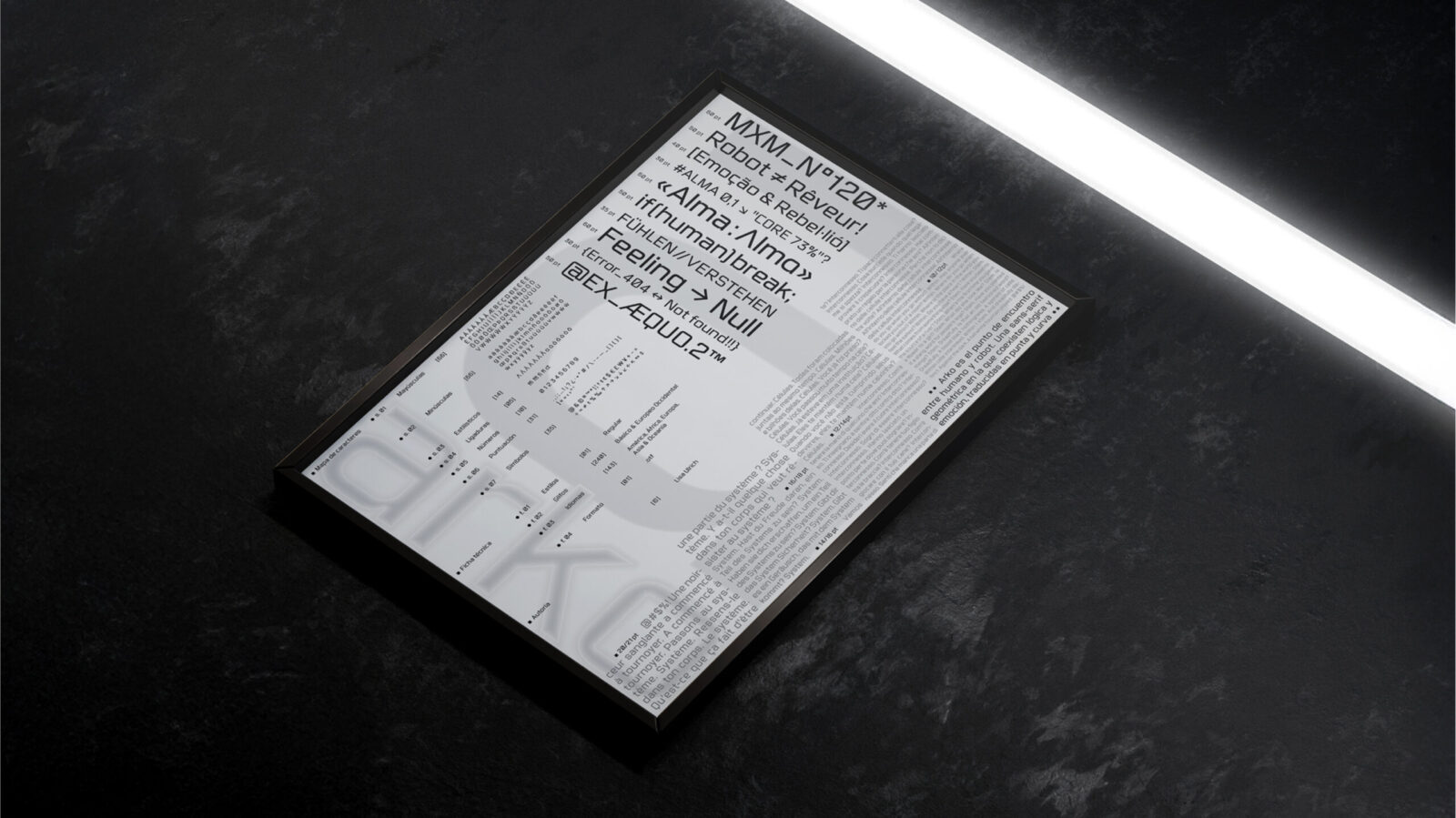
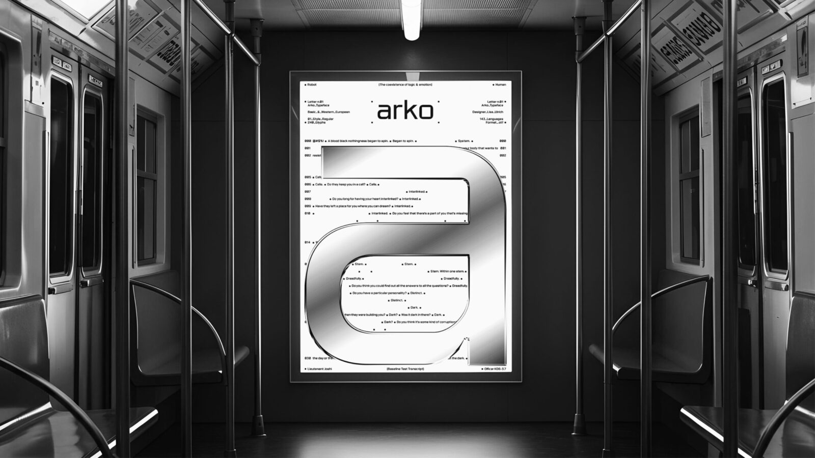
Poster 02
The second poster was an experimental piece in which we had complete creative freedom. Its design was based on the original Baseline Test Transcript from the movie Blade Runner 2049. This evaluation, taken by the replicant (robot), is essentially an empathy test. Since the dialogue explores the interaction between human and robot, focusing on emotions and empathy, I saw it as a perfect match for Arko’s narrative.
The design also represents the robot and human figures through the two established graphic elements: the square and the circle. At the center, a metallic “a” serves as the focal point, reinforcing the overall futuristic aesthetic.
CREDIT
- Agency/Creative: Lisa Ulrich
- Article Title: Arko by Lisa Ulrich Examines Artificial Intelligence Through a Contemporary Display Typeface
- Organisation/Entity: Student
- Project Status: Non Published
- Agency/Creative Country: Spain
- Agency/Creative City: Barcelona
- Project Deliverables: Design, Editorial Design, Graphic Design, Type Design, Typography
- Industry: Technology
- Keywords: WBDS Student Design Awards 2025/26 , Type Design, Graphic Design, Typography, Editorial Design


