


Onosi Cosmetic is a skincare brand driven by the idea of “Uncomplicated Beauty,” interpreted not as a visual style alone, but as a design philosophy that guides every decision—from typography and material selection to structural packaging and interface behavior. This project explores how quiet design can be robust and how elegance can emerge from deliberate restraint.
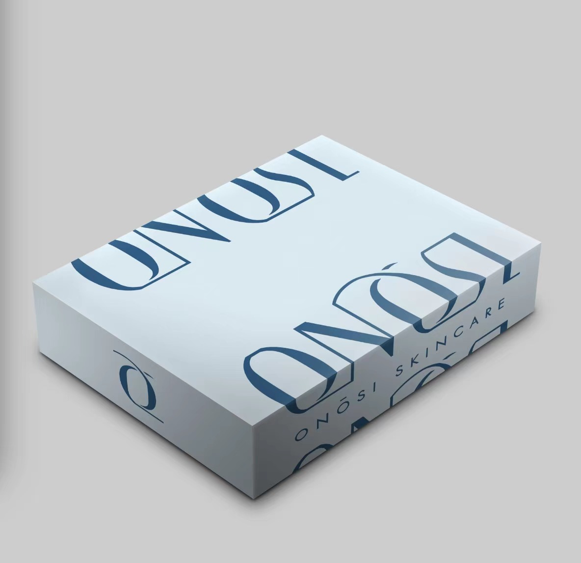
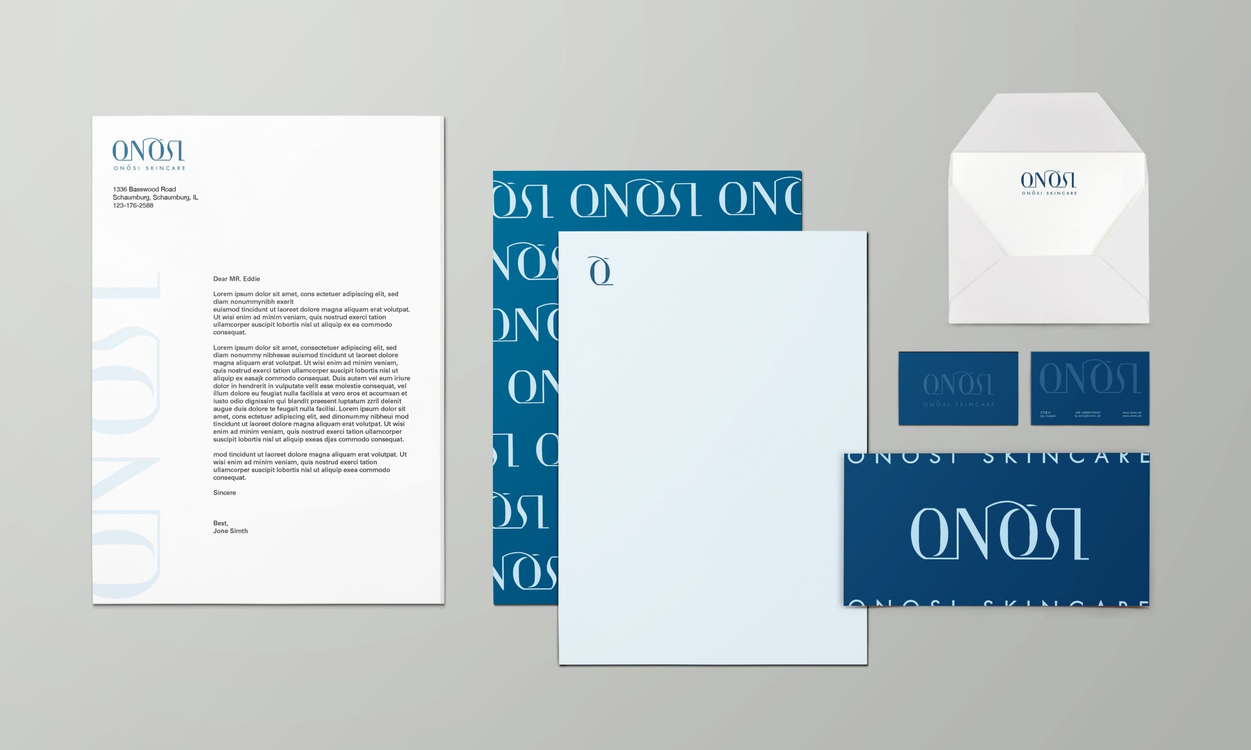
At its foundation is a cohesive visual identity system—a customized logotype anchors the brand, paired with a humanist sans-serif typeface that conveys warmth and trust. The color palette is intentionally soft and neutral, allowing the product to speak clearly and consistently across all applications. Ample white space and grid-based layout choices promote readability while simultaneously aligning with the brand’s sense of calm and considered minimalism.
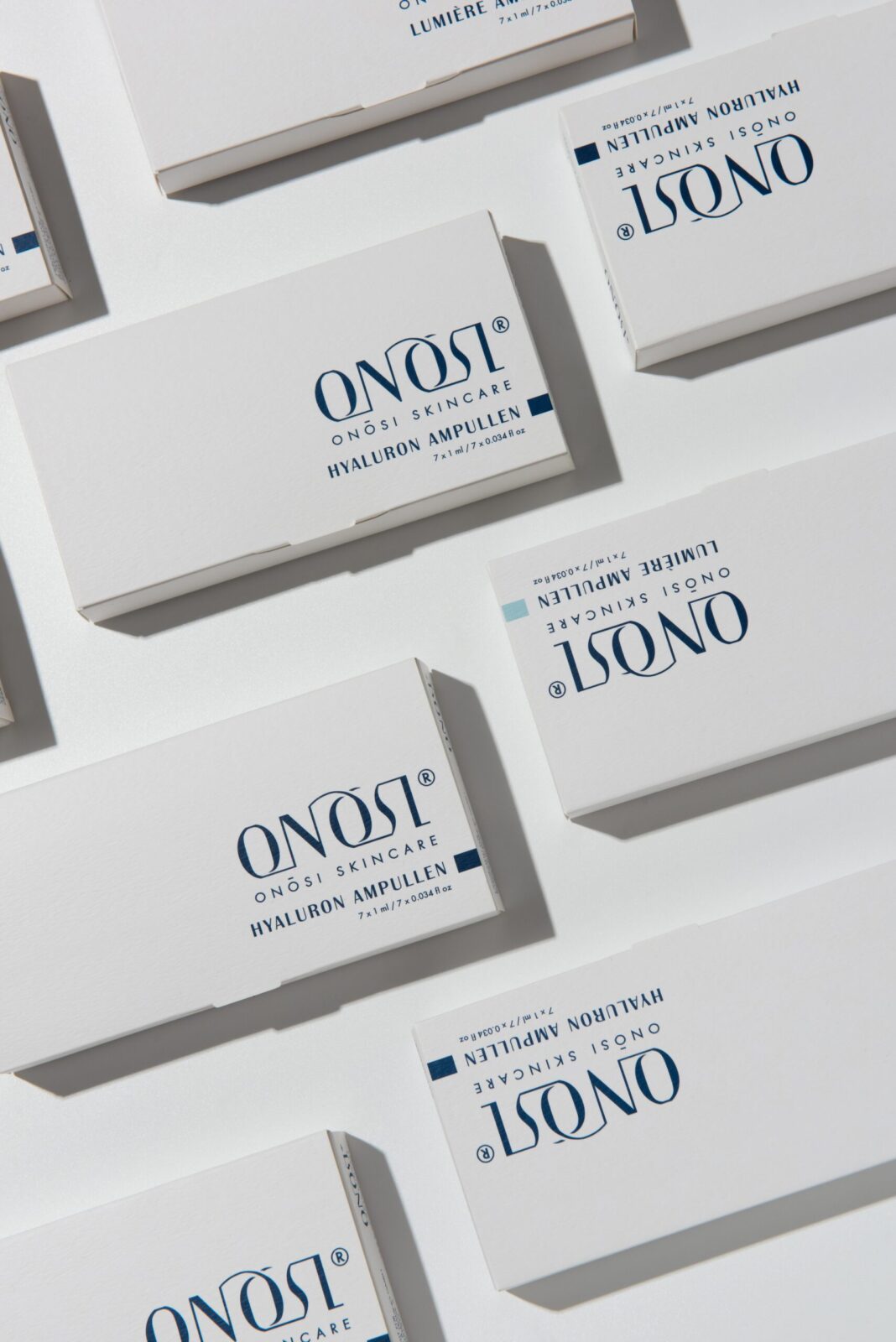
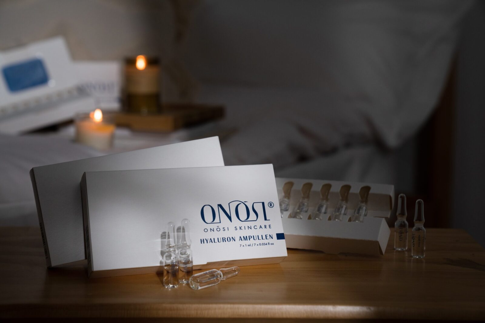
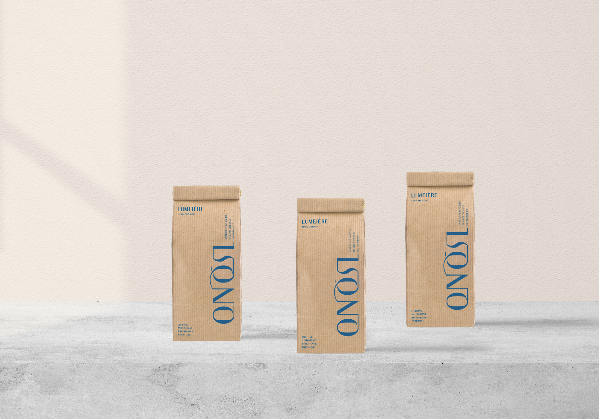
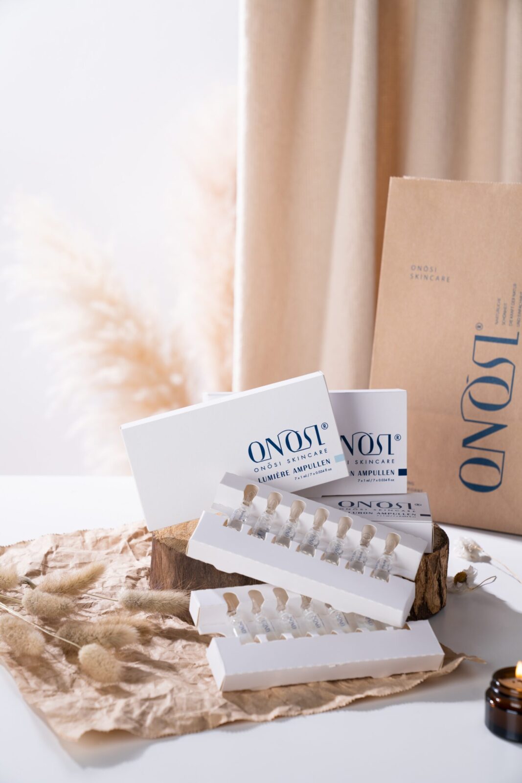
The packaging design is central to Onosi’s story. A modular system of primary containers and secondary boxes was developed with stackability, functionality, and material efficiency in mind. Soft-touch matte finishes create a tactile quality that encourages interaction and engagement. The labeling is positioned with precision, using centered hierarchy and minimal text to maintain balance. Each touchpoint—from the feel of the material to the weight of the box—was treated as an opportunity to enhance the user’s sensory experience.
Sustainability was not just an aesthetic choice but a strategic driver. The entire structure utilizes recyclable components and a reduced color printing process, thereby lowering production complexity without compromising visual refinement. The design takes into account how packaging performs in both online and physical retail environments, ensuring adaptability and consistency.
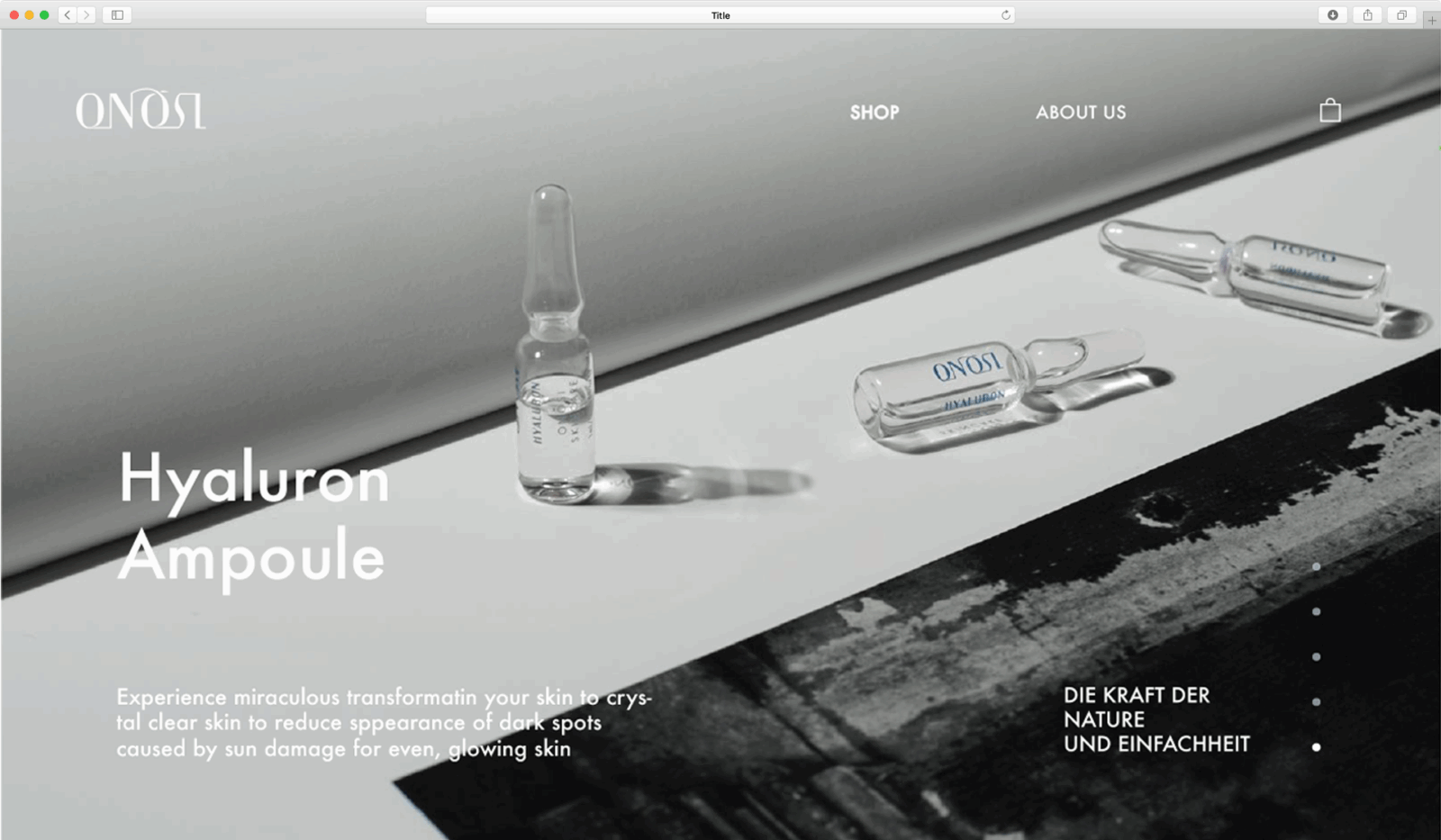
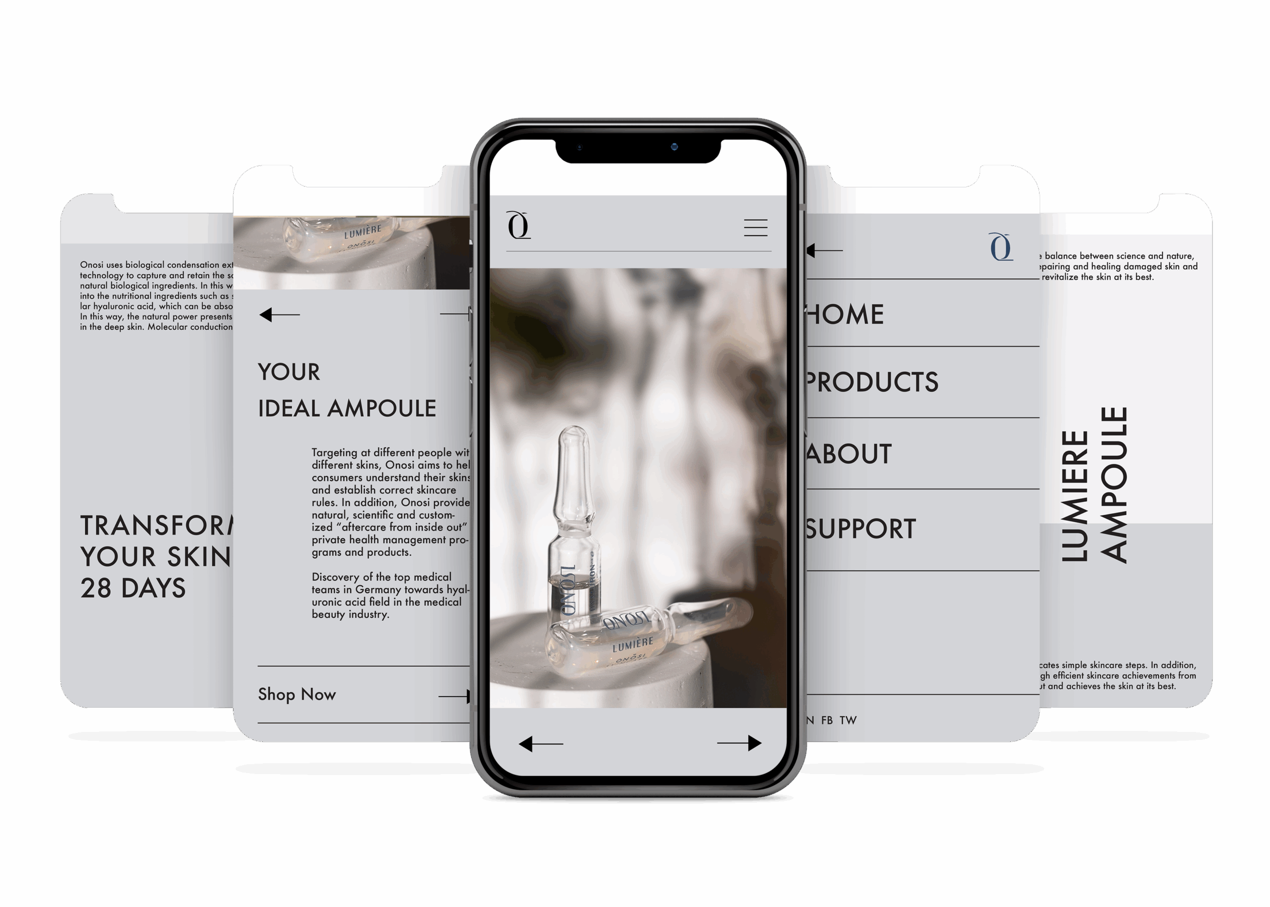
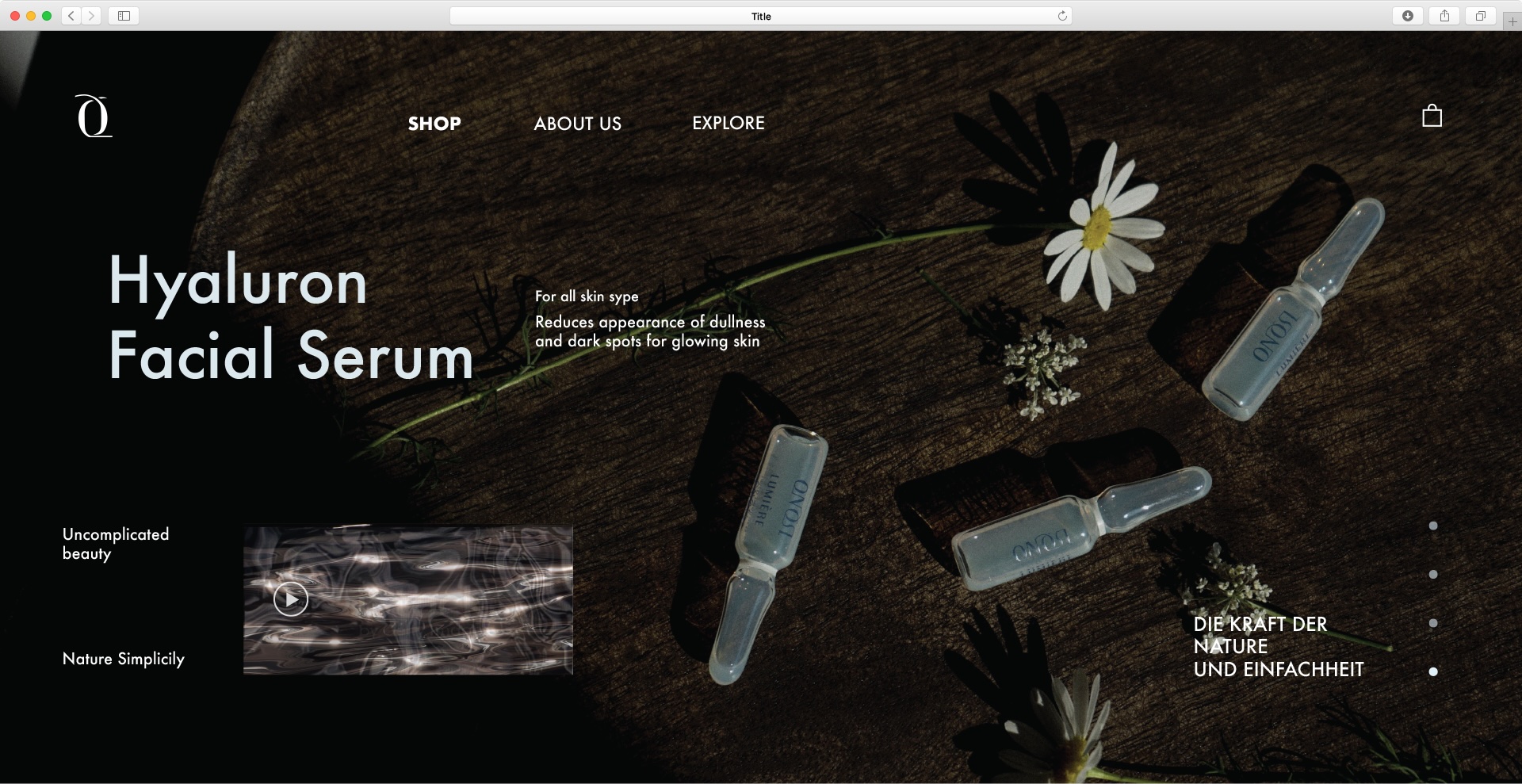
Beyond the physical product, Onosi extends into digital space with a mobile interface and website design that mirrors the physical experience. Designed with the same principles of quiet clarity, the digital experience relies on precise navigation, consistent typographic rhythm, and open spacing. The UI avoids unnecessary features, instead offering a calming, goal-oriented interaction that reflects the brand’s tone of voice.
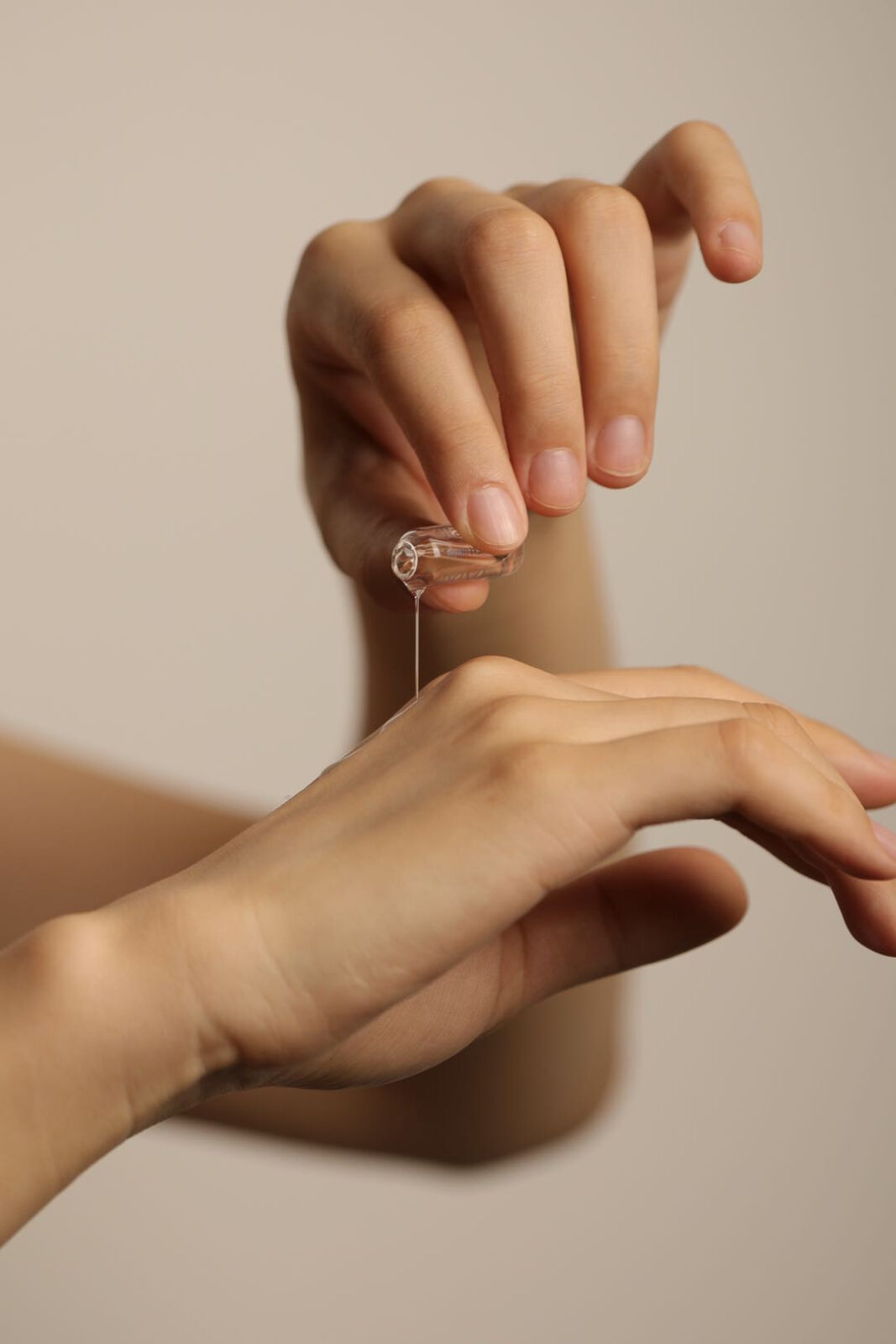
Photography was art-directed to evoke warmth and closeness. Products are shown in context—on vanities, next to linens, or held in hand—always grounded in daily routine. These real-world visuals reinforce the brand’s intention: to offer skincare that feels intuitive, honest, and intimately personal.
Onosi is not about disruption or novelty for its own sake. It’s about clarity, trust, and timeless softness. The design does not seek to impress loudly, but to stay with the user quietly, and to be noticed through care rather than spectacle.


CREDIT
- Agency/Creative: Carla Pan
- Article Title: Carla Pan Designs Onosi Cosmetic With a Refined Minimal Identity Built for Clarity and Trust
- Organisation/Entity: Creative
- Project Status: Published
- Agency/Creative Country: United States of America
- Agency/Creative City: Jersey City
- Market Region: New Jersey
- Project Deliverables: Advertising Photography, App Design, Brand Creation, Brand Design, Brand Identity, Brand Naming, Branding, Creative Direction, Design, Digital Art, Illustration, Logo Design, Packaging Design, Pattern Design, Product Design, User Experience, User Interaction, Web Design
- Industry: Beauty/Cosmetics
- Keywords: WBDS Creative Design Awards 2025/26 , Packaging Design,Brand Identity,Beauty Packaging,Typography,UI/UX Design, Product Labeling


