


Background:
CITY Brewing Beverage is one of the largest independent beverage manufacturers in the United States, producing a wide portfolio of alcoholic and non-alcoholic drinks for national and international brands. With multiple large-scale facilities across the country and a rapidly growing client base, the company needed a brand identity that would reflect its evolution, scale, and ambition.
Despite their industry-leading capabilities, CITY’s visual identity hadn’t kept pace with the company’s expansion. The previous logo and corporate materials lacked consistency, modernity, and the clarity needed for a business operating at this scale. The need for a strategic, future-proof redesign was clear.
The Challenge:
Our task was to completely redesign CITY’s corporate identity – modernizing the brand while preserving the company’s heritage as a trusted, high-volume beverage partner. The new identity needed to:
• Replace an outdated logo with a bold, contemporary mark.
• Build a flexible visual system capable of representing multiple company locations.
• Improve recognition and clarity across all touchpoints, from corporate communication to digital presence.
• Bring consistency and structure to a complex ecosystem of facilities, services, and capabilities.
• Transform CITY’s digital presence through a fully redesigned website aligned with the new identity.
Strategy:
We defined a strategy focused on three core principles: clarity, scalability, and cohesion.
1. Clarity – making the brand instantly understandable, legible, and recognizable across all platforms.
2. Scalability – building an identity system that adapts to multiple locations, formats, digital environments, and physical applications.
3. Cohesion – unifying the company’s corporate expression to reflect its position as a major, reliable partner for global beverage brands.
This approach guided both the visual redesign and the digital ecosystem.
Design Process:
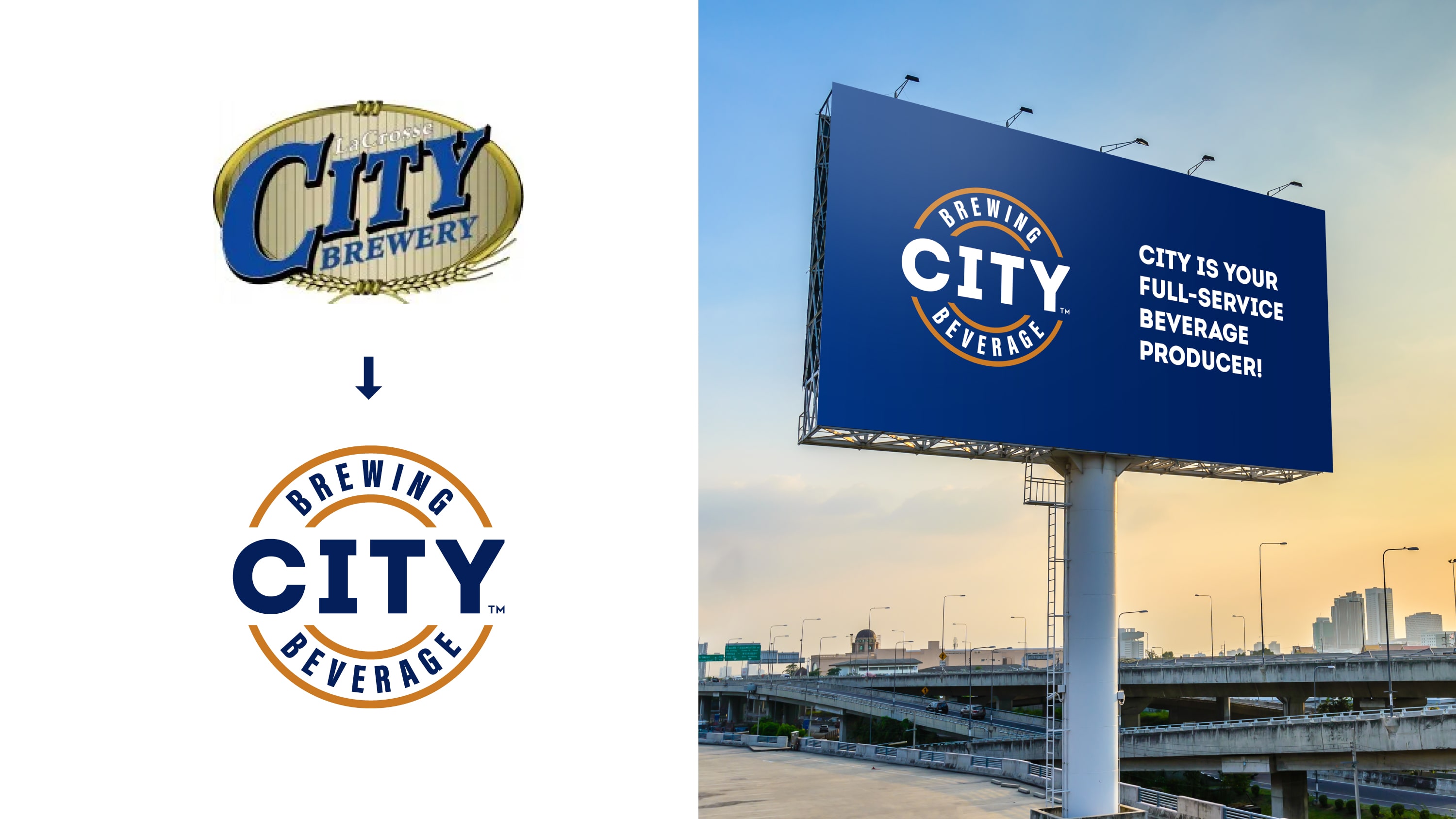
1. From Old to New: Logo Transformation
We began by analyzing the previous logo, identifying visual weaknesses and inconsistencies that limited its use.
The redesign focused on creating a logo with strong geometry, improved legibility, and a contemporary presence – something capable of representing an industry leader. The new mark combines precision with approachability, ensuring it performs at every scale from machinery labeling to digital applications.
2. Typography and Visual Language
We introduced a new typographic system that expresses CITY’s confidence and technical expertise. The selected fonts support clear hierarchy, strong readability, and functional elegance across both digital and print communication.
The broader identity system uses structured layouts, defined spacing, and a streamlined color palette to create a consistent and modern corporate tone.
3. Location-Based Ecosystem
One of CITY’s strategic needs was the ability to clearly differentiate its multiple U.S. production sites.
We developed a flexible visual ecosystem where each location receives its own identity variation within a unified framework. This system allows for individuality while maintaining brand cohesion — crucial for both internal clarity and external communication.
4. Digital Transformation: New Website
To bring the new brand to life, we redesigned CITY’s entire website from structure to final interface.
Built on WordPress using Elementor for ease of management, the site translates the new identity into an intuitive, engaging digital experience.
A key feature is an interactive map showcasing CITY’s brewing locations across the country. This map visually communicates scale, capability, and geographic reach in a dynamic and user-friendly way.
Beyond functionality, we shaped the website to feel corporate yet social – professional, but with a human touch. It reflects CITY not only as an industry powerhouse, but also as an open, collaborative partner and an attractive workplace.
Results:
The rebrand delivers a unified and future-ready identity that captures CITY Brewing Beverage’s scale, expertise, and leadership.
The new logo brings instant modernity and strength.
The structured identity system ensures clarity across all communication.
The digital ecosystem – culminating in the redesigned website and interactive location system -reinforces CITY’s position as a major player in the U.S. beverage industry.
The redesign provides CITY with a strong platform for growth, recruitment, client communication, and expansion into new opportunities.


CREDIT
- Agency/Creative: DDH Branding Consultancy
- Article Title: City Brewing Beverage Rebranding by DDH Branding Consultancy
- Organisation/Entity: Agency
- Project Type: Identity
- Project Status: Published
- Agency/Creative Country: Netherlands
- Agency/Creative City: Amsterdam
- Market Region: North America
- Project Deliverables: Brand Architecture, Brand Identity, Brand Redesign, Logo Design, Web Design
- Industry: Food/Beverage
- Keywords: brand identity, logo redesign, web design, corporate identity
-
Credits:
DDH Branding Consultancy: DDH Branding Consultancy


