


Super Studio collaborates with over forty brands worldwide, offering a curated selection of furniture, lighting, and home accessories from high-end international names to its audience. More than a rebranding, the Super Studio identity design was an act of redefinition. Super Studio has long embraced the idea of being “super.” For us, this wasn’t just a name; it was an invitation. Our challenge was to create an identity that could truly live up to that label; a super-dynamic system, both conceptually and visually.
At its core, Super Studio acts as a curator of exceptional product design; a platform where the world’s most distinctive brands meet. Each with its own voice and aesthetic. In such an ever-shifting landscape of trends, an identity can easily be either too generic or too decorative. Yet, our task was to build not just a look, but a language that could remain timeless and flexible enough to speak in many tones.
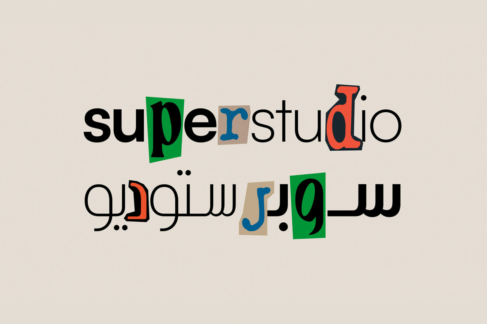
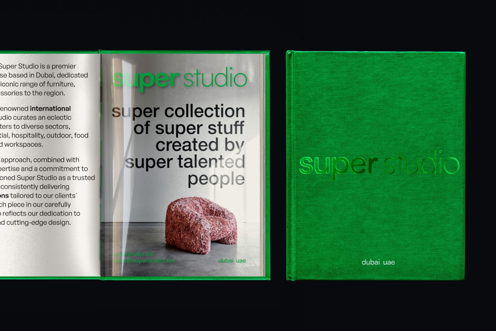
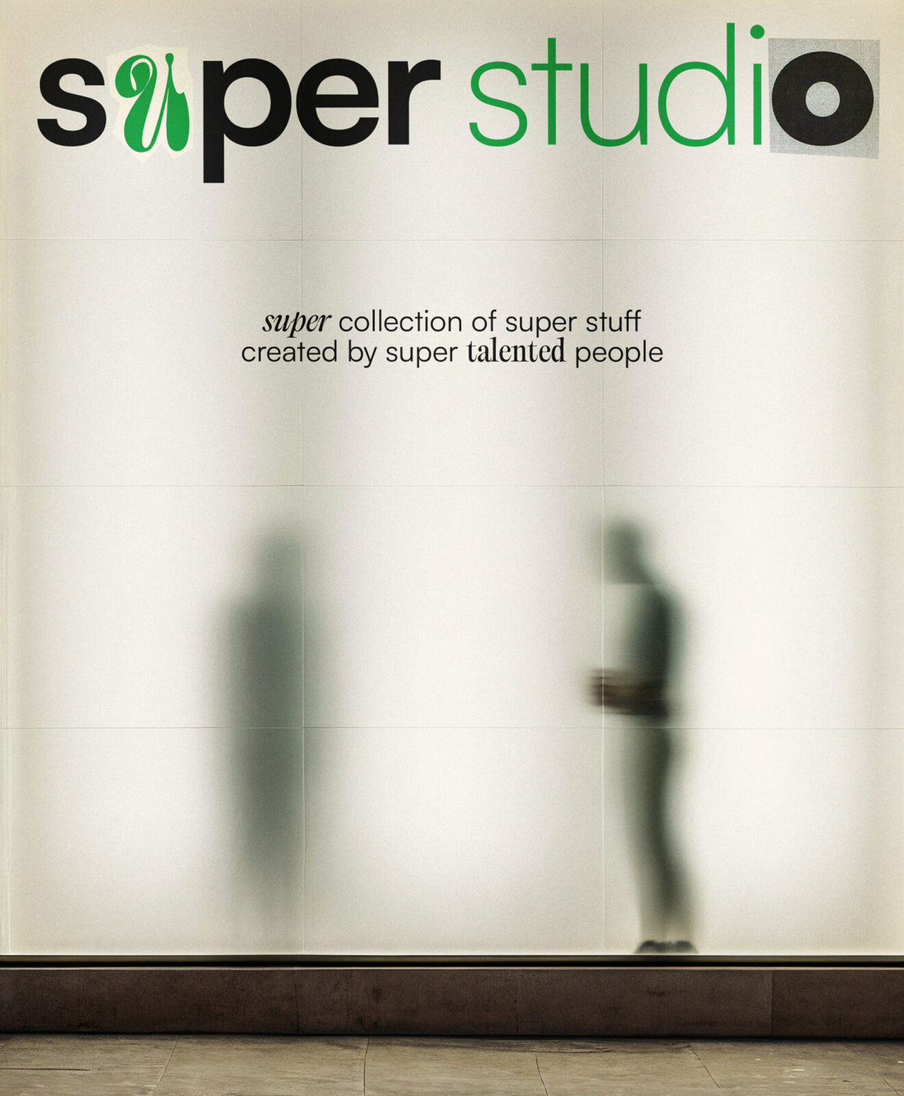
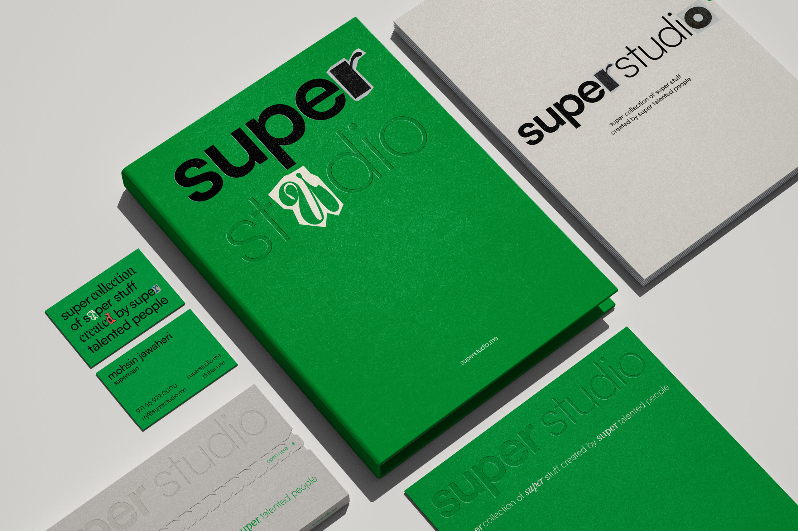
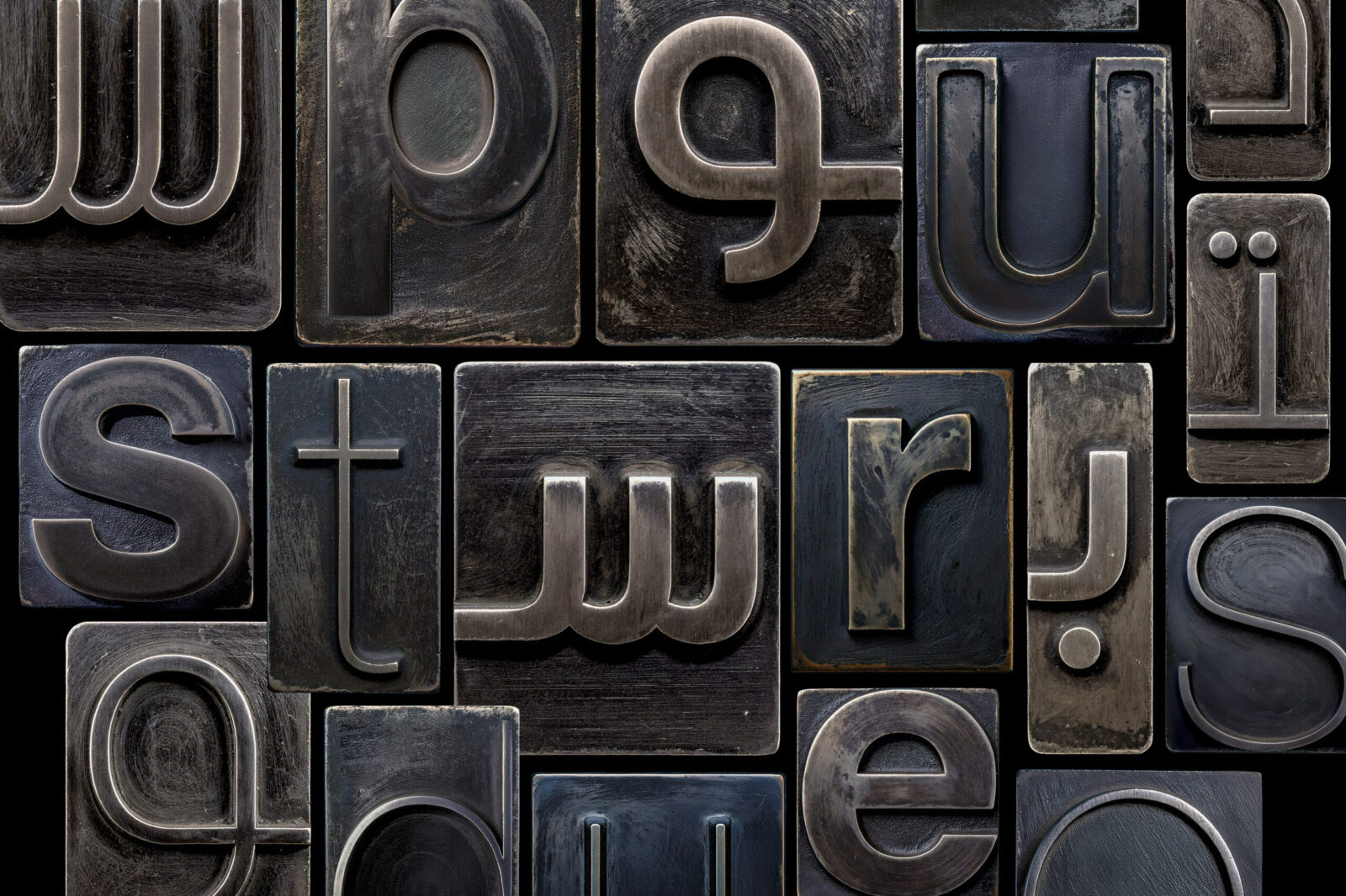
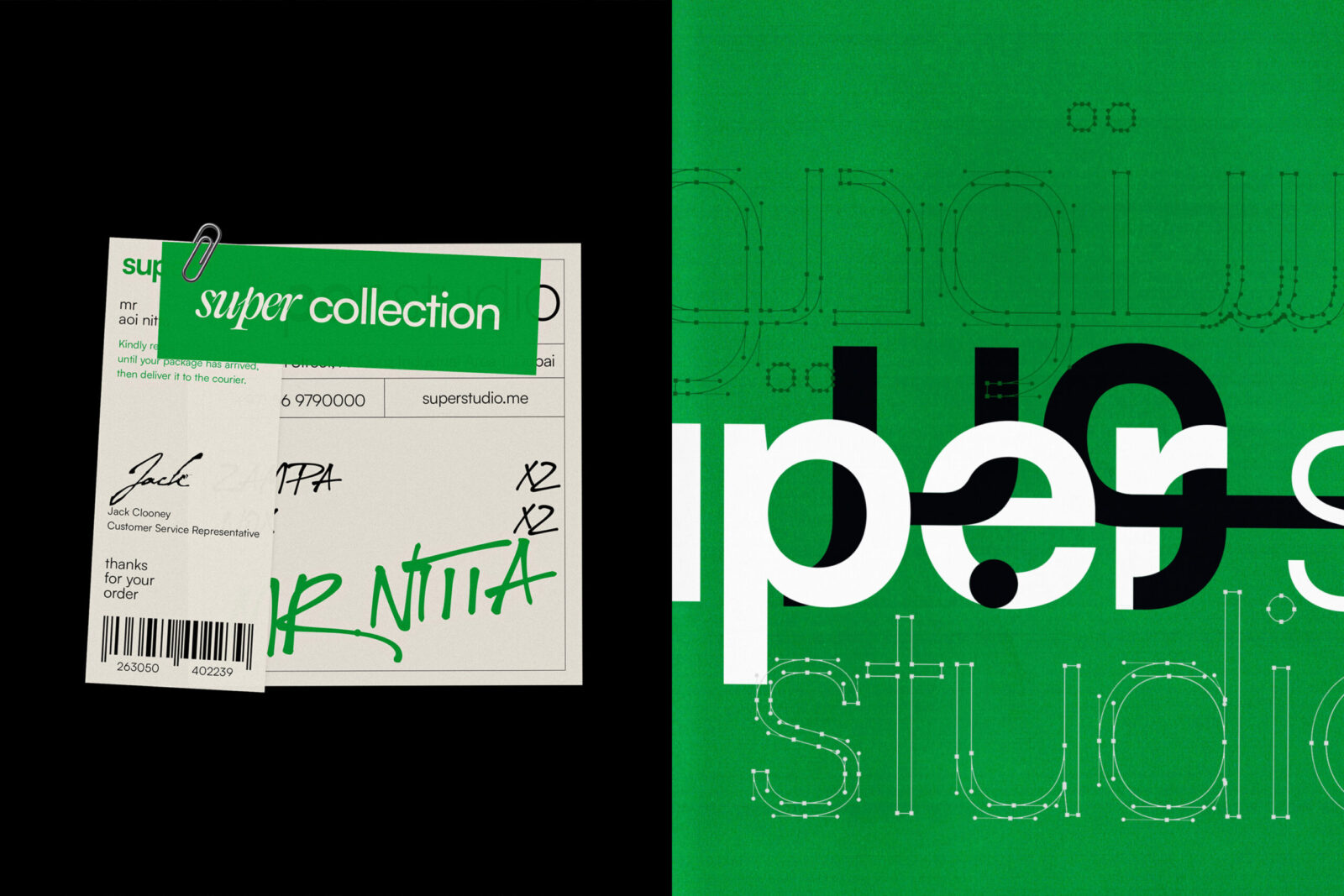
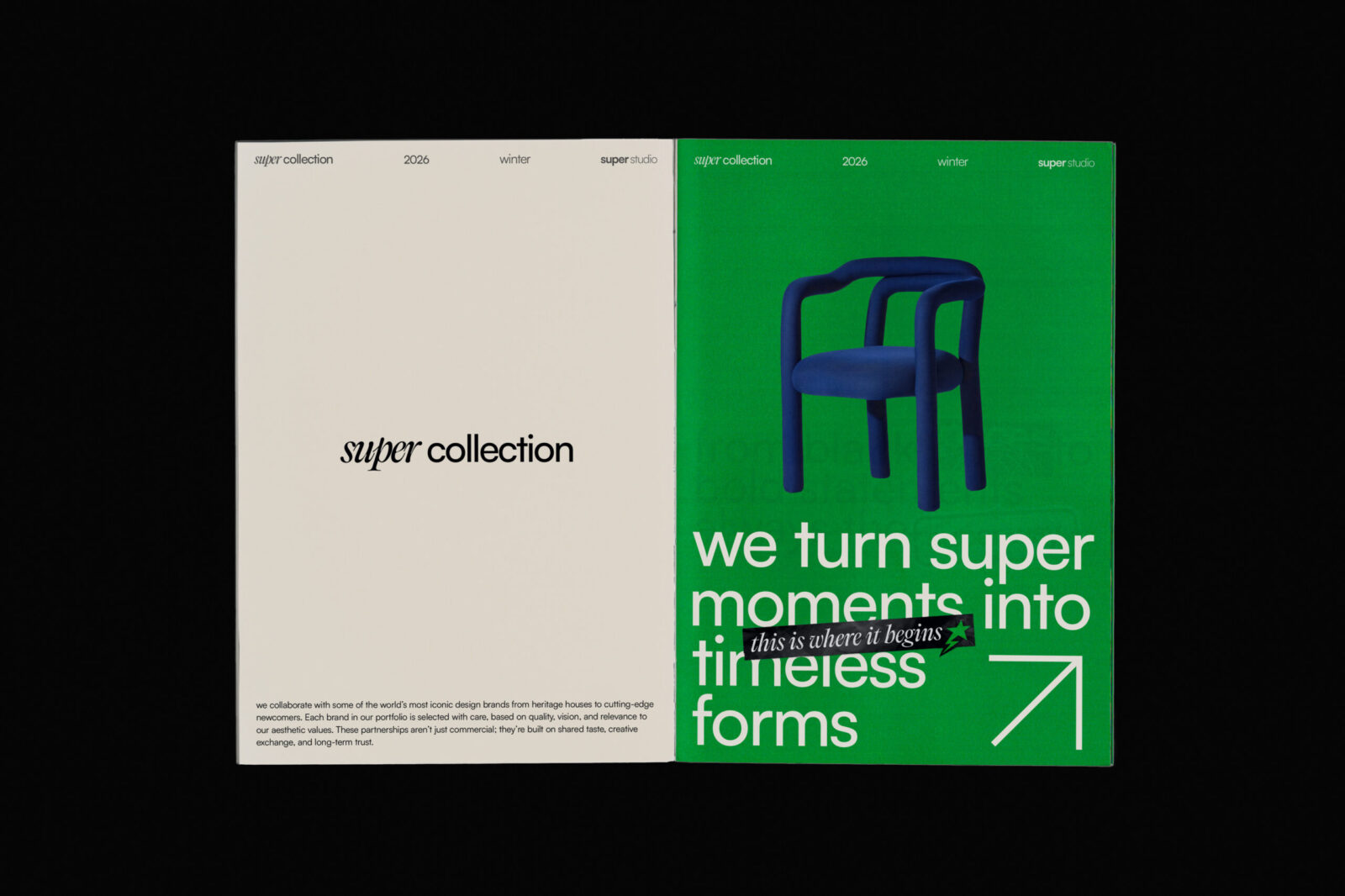
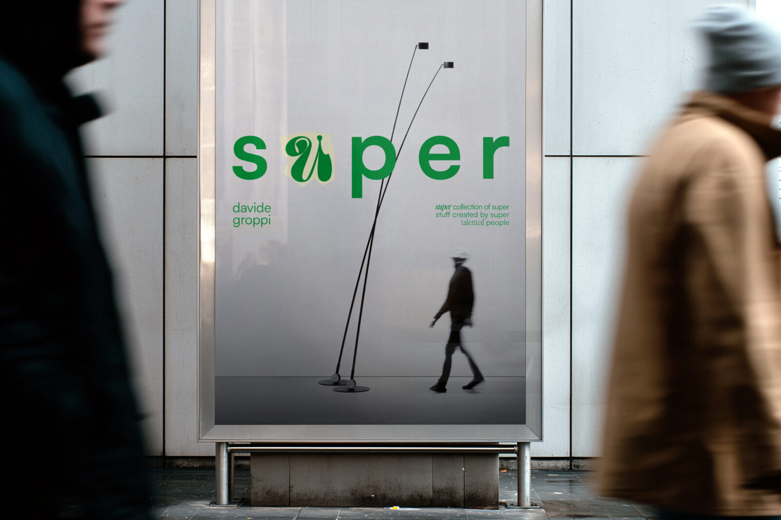
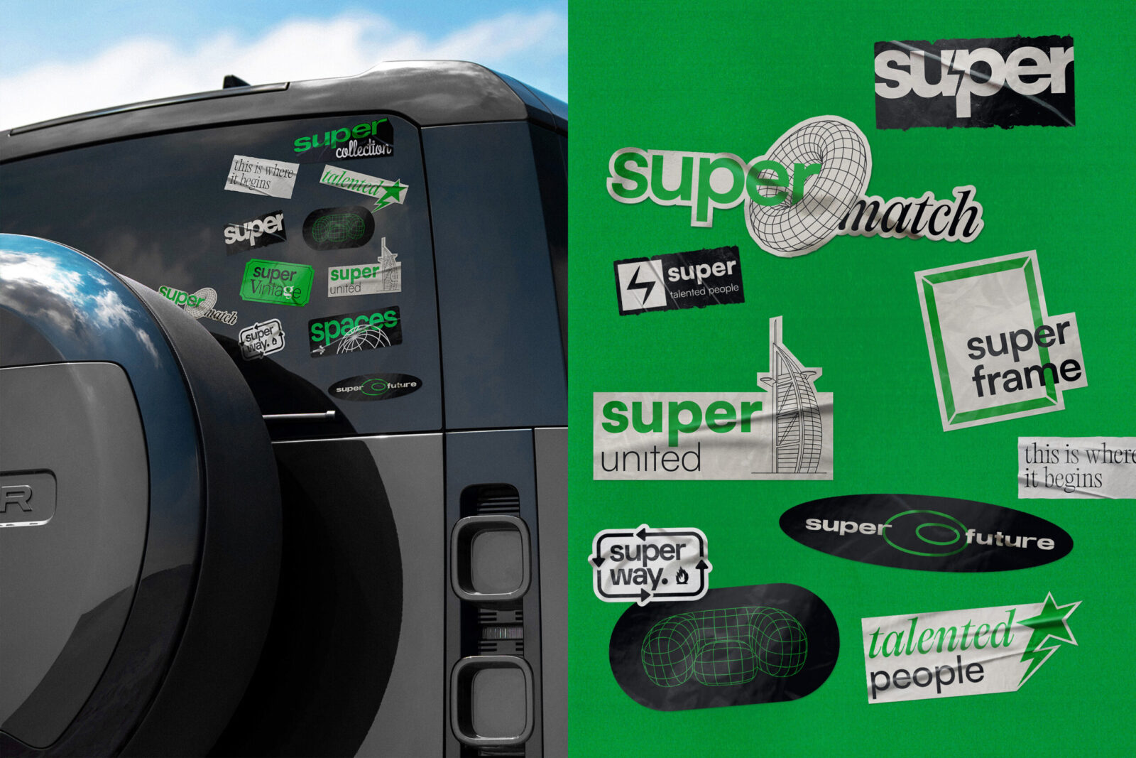
To translate the curatorial spirit of the brand into a visual form, we asked ourselves: What does endless storytelling look like? Our answer was the alphabet. We built the visual identity by extracting individual letterforms from newspapers and magazines, assembling them into a cohesive typographic system. All created through a simple collage; a familiar technique we all intuitively understand. The mosaic of letters creates a moment of instant recognition, a small “Aha moment” that symbolizes the vastness of choice the brand offers.
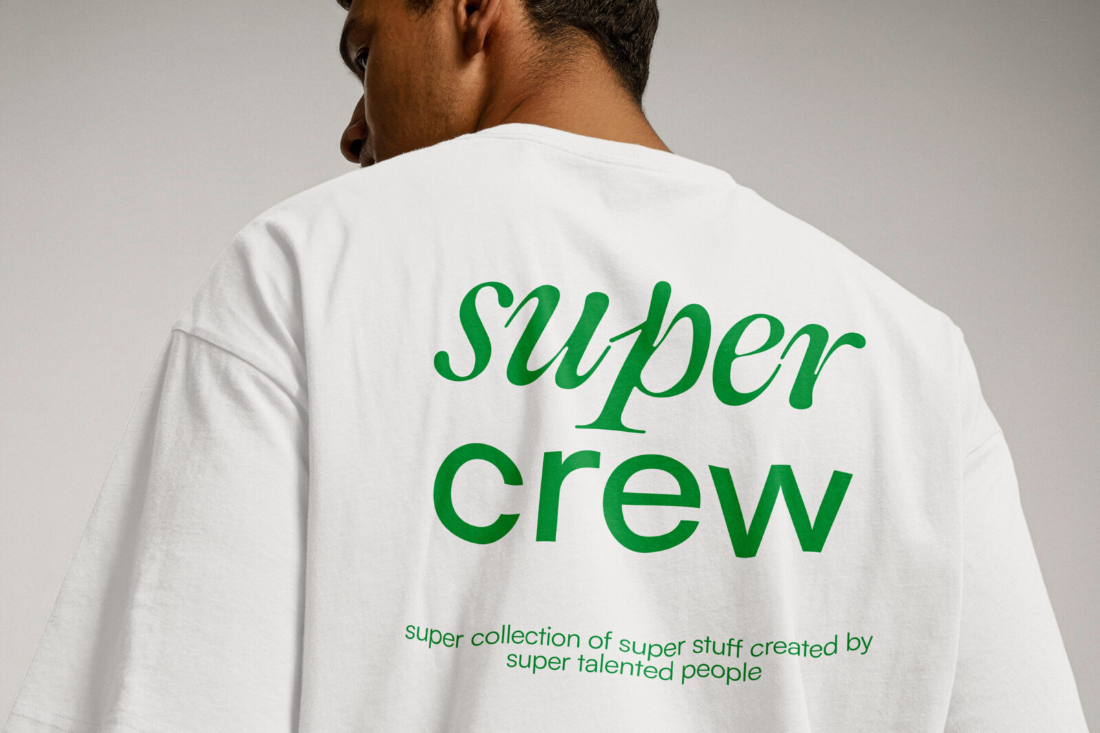
As for the logotype, we decided to keep the Helvetica(ish) typeface to maintain structure, while surrounding it with the collage of letterforms. The result was not only a design system but a visual translation of the brand’s very function: curated diversity.
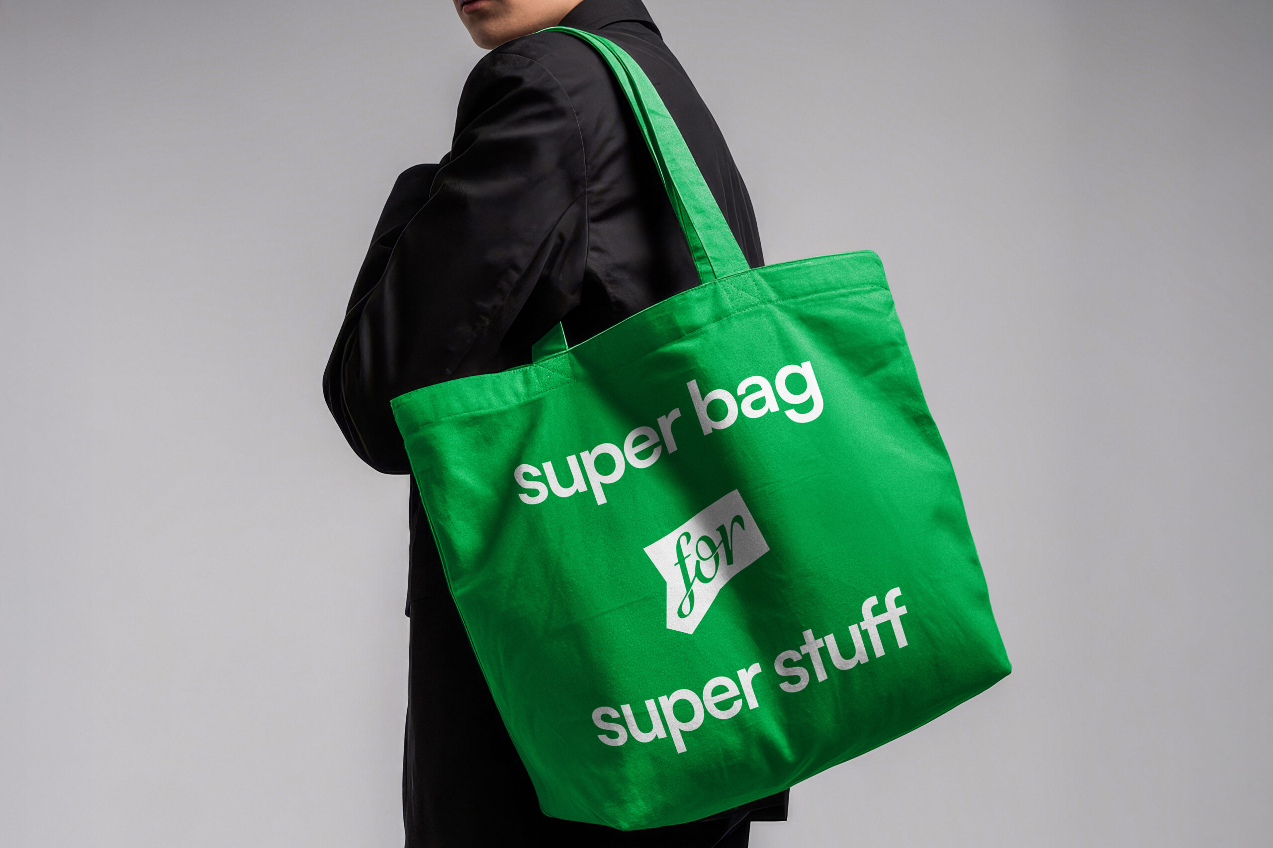
For Super Studio we focused on creating a practical, sustainable, and accessible visual system. By upcycling existing printed materials, such as magazines, we avoided new production waste. Once digitized, the collages became a modular, reusable system. Thanks to the diversity of typefaces in the identity, designers can generate new visuals using any font from the system with minimal resources, while keeping the identity flexible and adaptable.
We didn’t just redesign Super Studio; we rebuilt its very way of expressing and presenting itself.


CREDIT
- Agency/Creative: A4DH Branding Services
- Article Title: A4DH Branding Services Reimagines Super Studio with a Collage-Driven Identity of Curated Diversity
- Organisation/Entity: Agency
- Project Status: Published
- Agency/Creative Country: United Arab Emirates
- Agency/Creative City: Dubai
- Market Region: GCC
- Project Deliverables: Art Direction, Brand Design, Brand Guidelines, Brand Identity, Brand Mark, Brand Redesign, Brand Strategy, Branding, Creative Direction, Design, Logo Design, Rebranding
- Industry: Retail
- Keywords: WBDS Agency Design Awards 2025/26 , Brand identity, Branding, Brand Redesign, Creative Design, Visual Identity, Visual Language, Logo Design, Graphic Design
-
Credits:
Creative Director: Mehdi Javadin
Design Director: Amir Asgharzadeh
Designer: Mehdi Javadinasab
Designer: Amir Asgharzadeh
Designer: Mohammad Rajabi
Designer: Mohammad Reza Rad
Designer: Sepideh Chamani
Designer: Matin Etedal
Designer: Vida Valizadeh
Motion Designer: Pariya Tabrizi
Ui Designer: Fatemeh Abbasi
Account Director: Baha Khatambakhsh
Account Manager: Pegah Tofighi
Public Relations: Ghazal Babajani
Arabic Logotype Design:: Wissam Shawkat


