


Black Scott Whiskey design – THE DARK KING
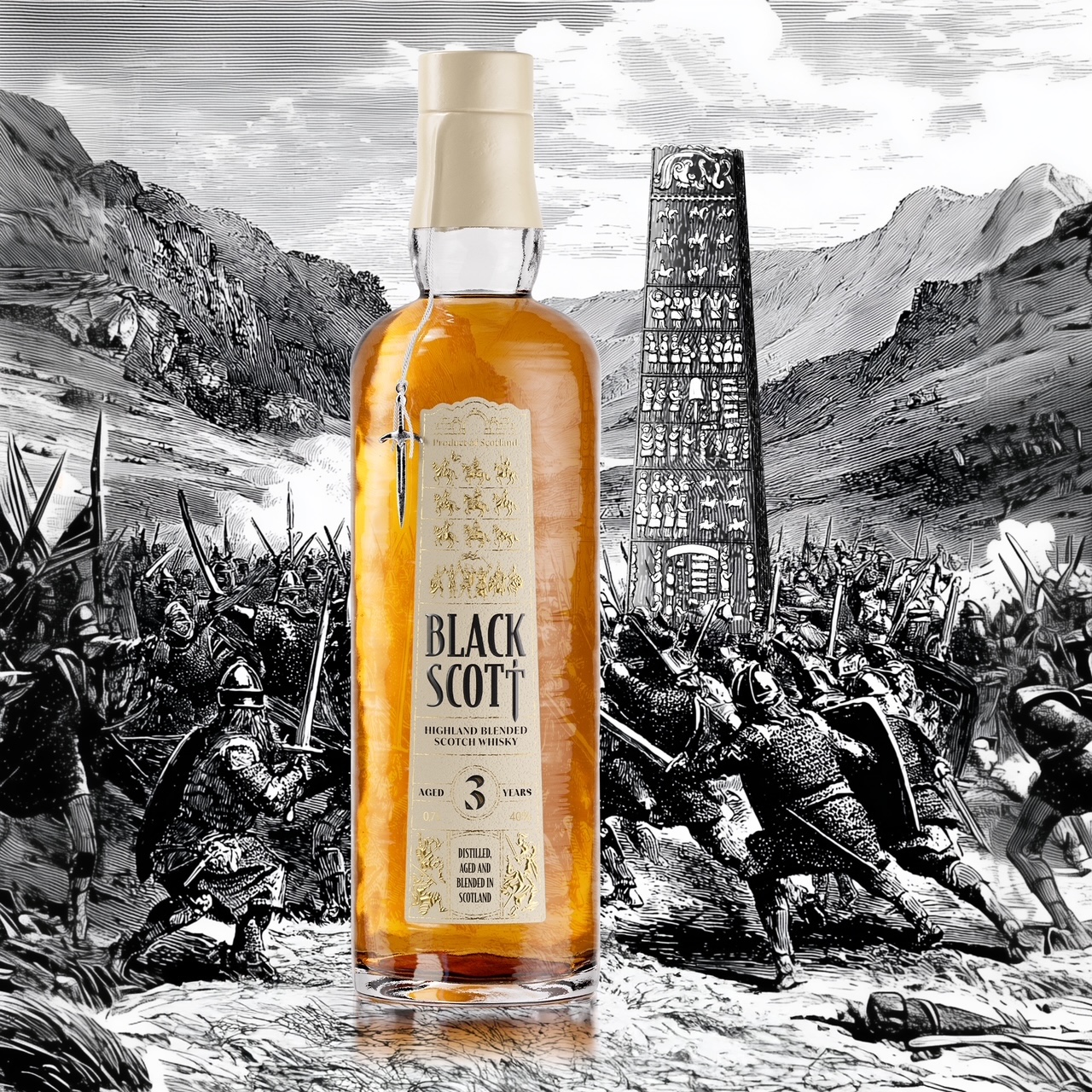
In 966 AD, the Scottish King Dubh (known as the “Black” or “Dark” king) secured Scotland’s dominion over the ancient land of Morray with a victory.
His success was so envied that he was killed in battle at Forres Scotland. His murder and secret burial, under a bridge, caused a solar eclipse on July 20th 966, plunging the land into darkness until he was reburied in the light the following year. His legacy faded into legend in the Highlands.
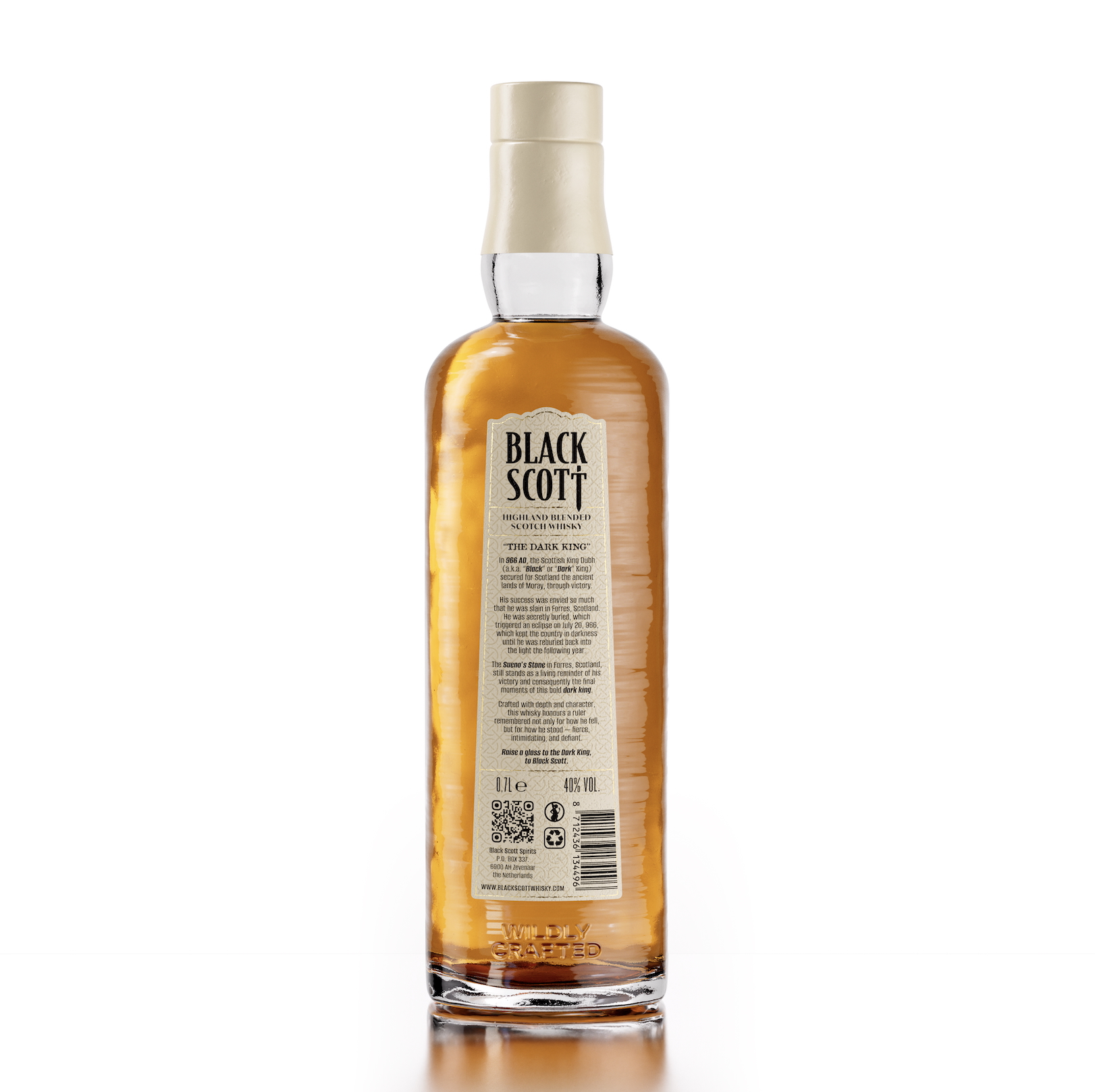
The Sueno’s Stone in Forres, Scotland, still stands as a living reminder of this victory and thus the final moments of this bold, dark king.
What a story to work with as designers…. where we used history and legend to craft the design for this Black Scott Whiskey.
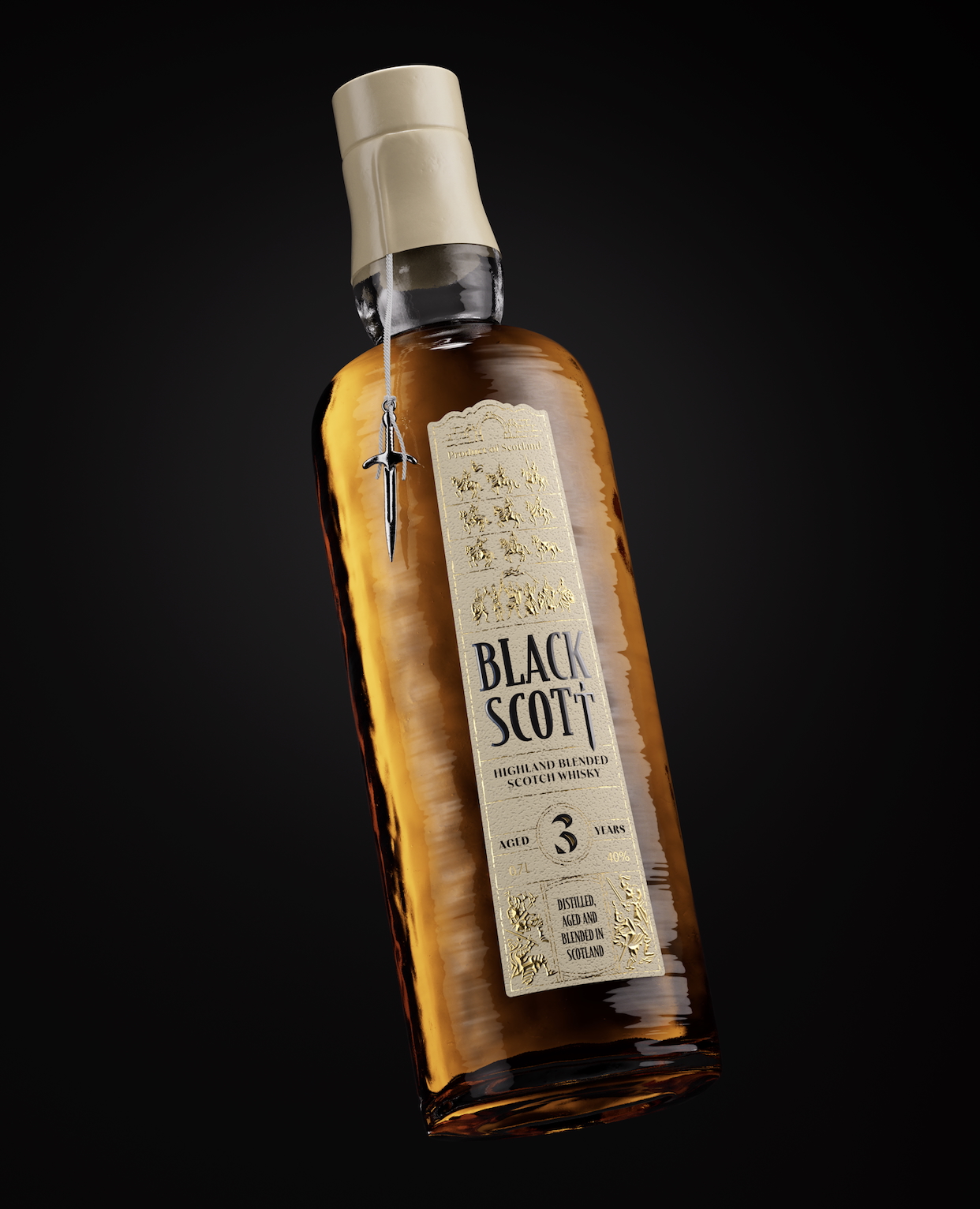
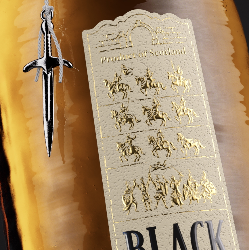
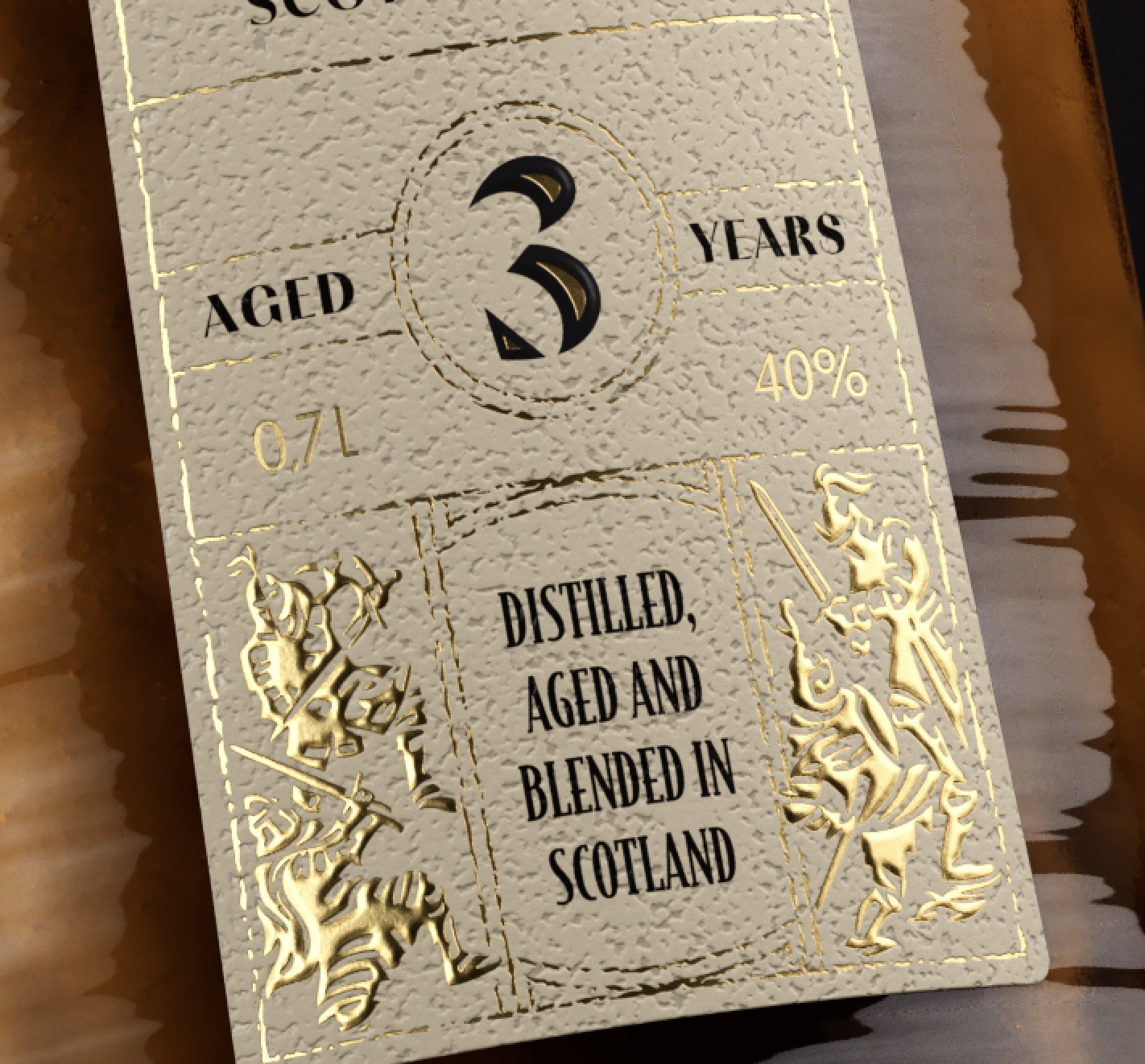
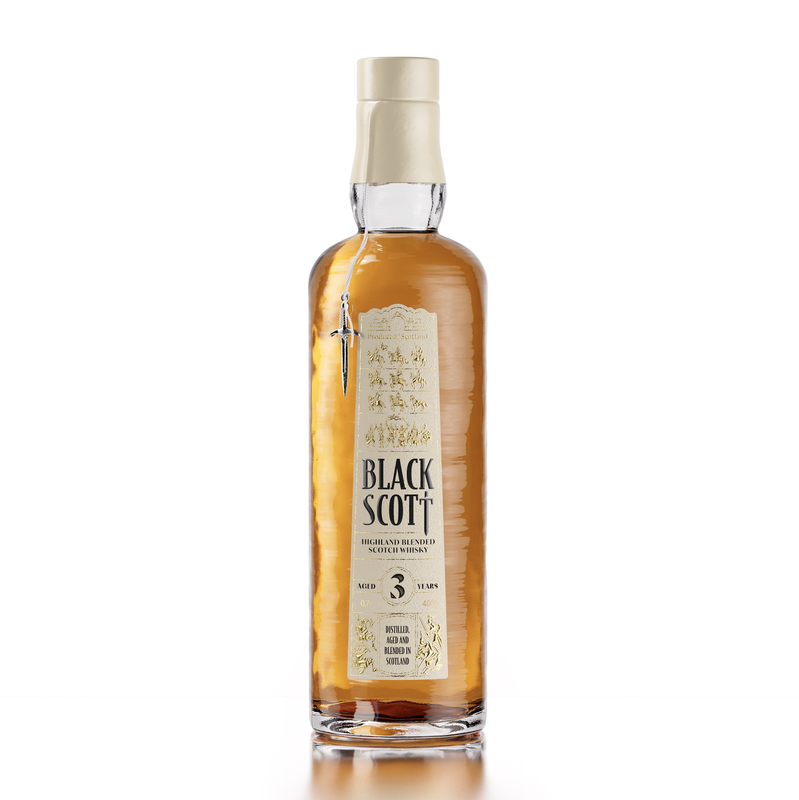
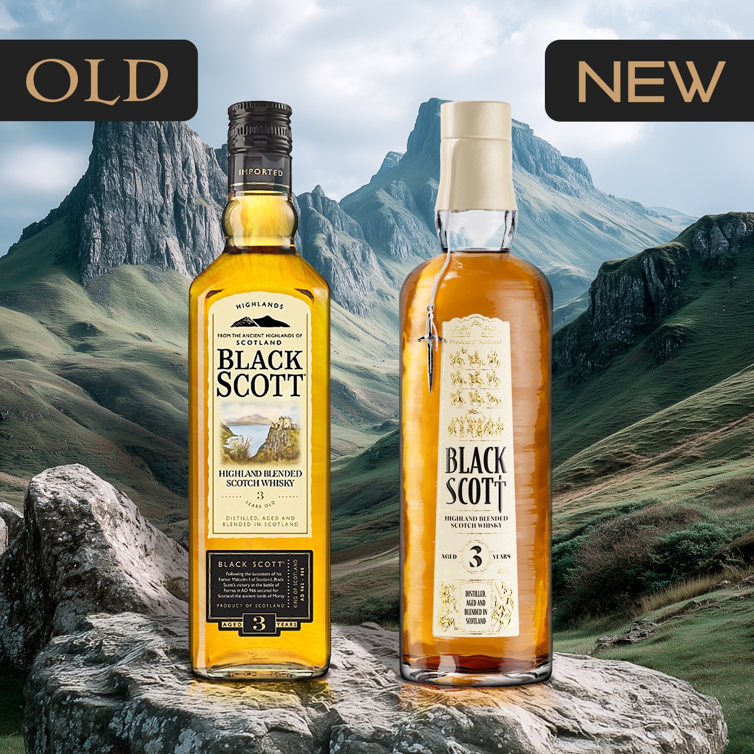
We literally used the Sueno’s Stone as our main inspiration for the bottle, label shape and label design. We selected a bottle shaped like the Stone and with a rough surface. For the label shape, we used the front view of the Stone and for the design of the label we worked with battles and knights engraved on the real stone. Richly illustrating battles, knights on horses, a one-armed knight or even a horse that lost his knight (for some humor). The complete battle and legend rule the label design telling the story to the consumer and create a visual standout on shelve.
The bridge, the dark king was secretly buried under, can be found on top of the label as well.
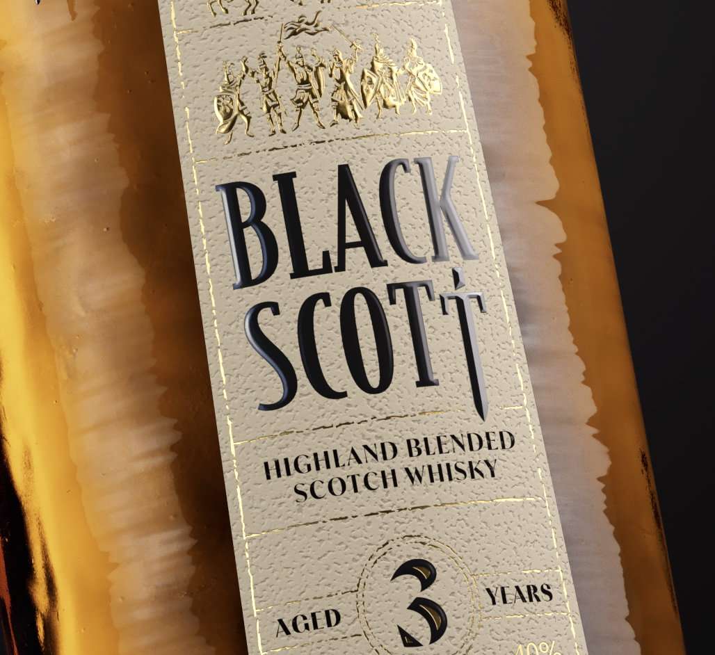
In the middle fiercely stands the logo Black Scott, firmly embossed. For the trained eye you will see the embossing is flat, except for the last T which is embossed in a pointy style representing the sword of the dark king.
To visually be in line with the Stone, we needed to keep the top knights as small as possible, but we still wanted to get them hot foiled and embossed, for standout. So, to make this work we involved the production partners in an early stage. Working together on the production side, you can really challenge production boundaries, not alone. Wo we involved the printer, hot foil supplier and embossing stamp producer.
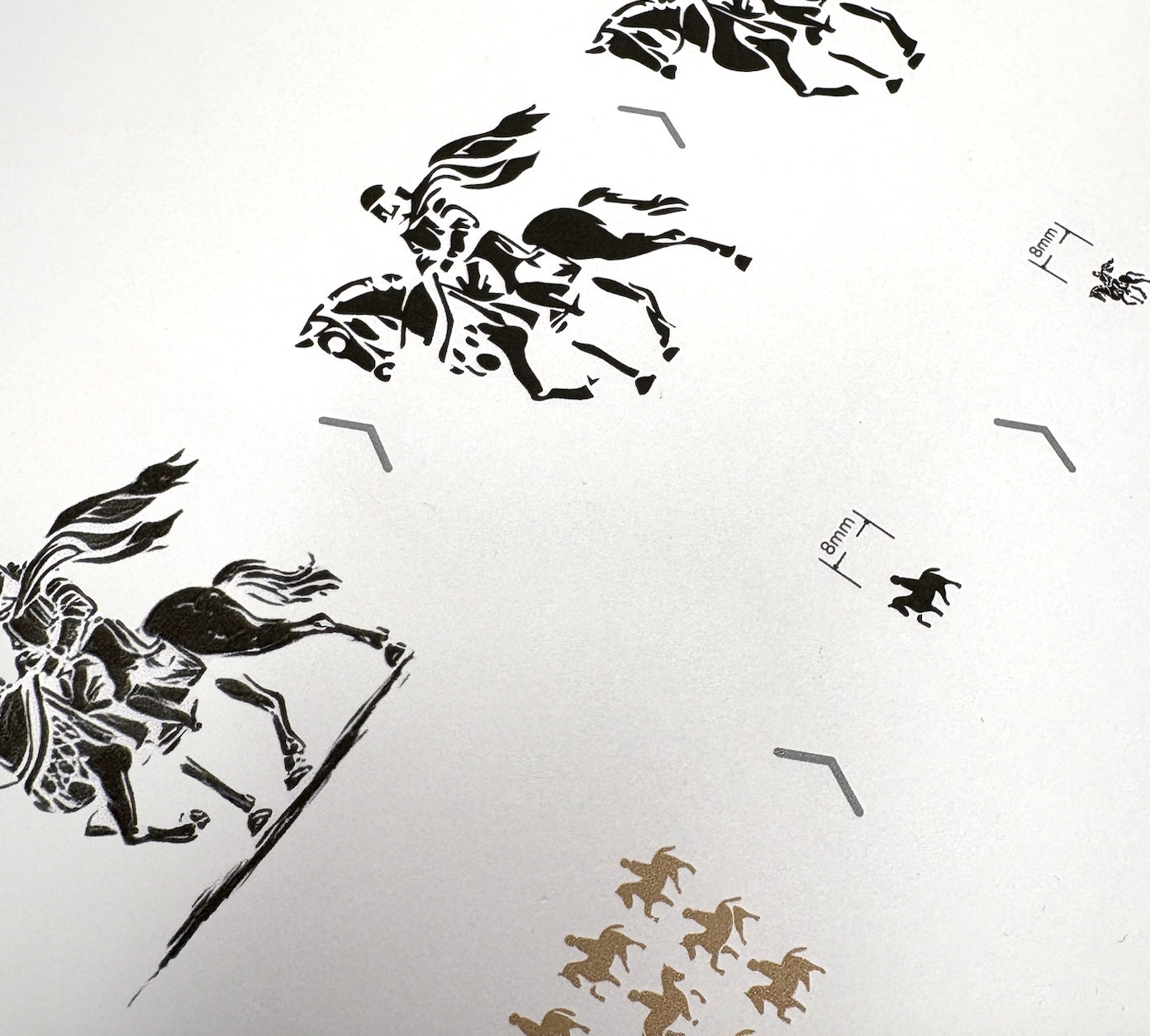
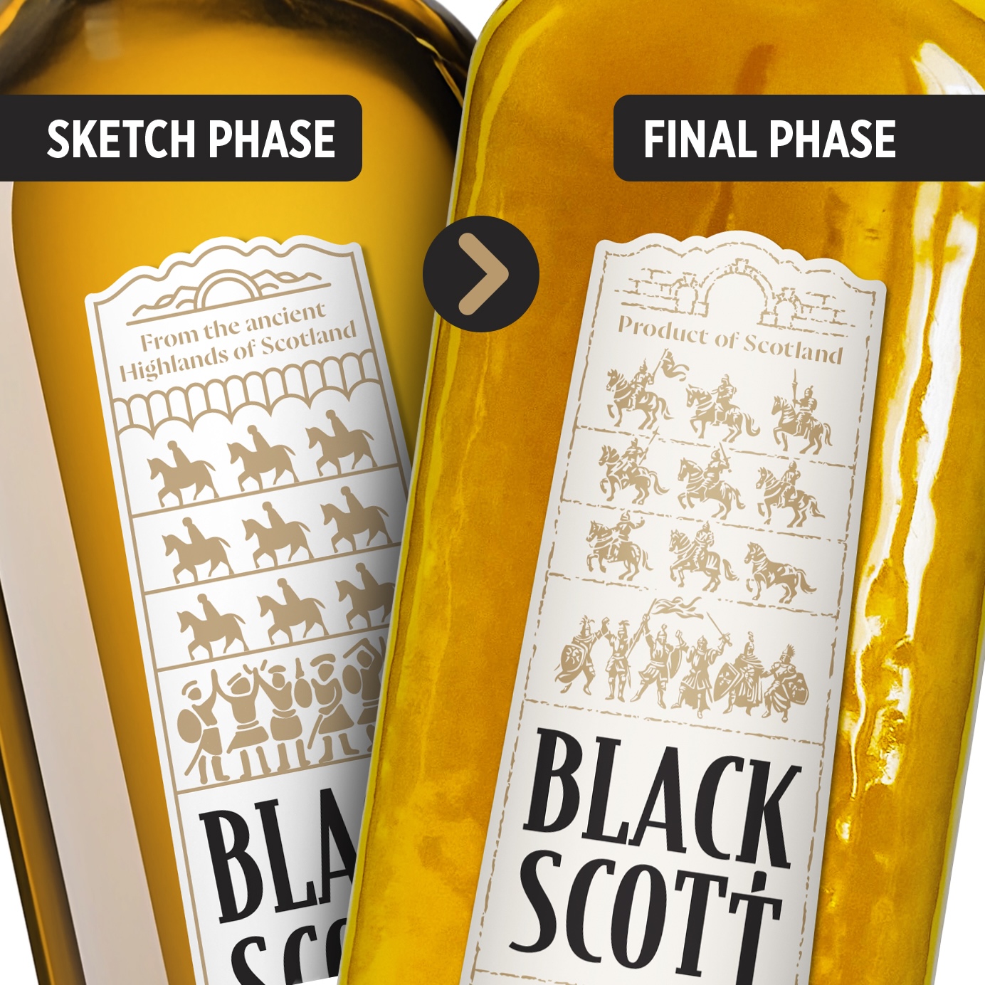
After design concept approval, by the client, in the “sketch phase”, there were several steps to get to the “final phase”, with the main question; how small and detailed can we go?!
From the rough conceptual knight illustrations, we transformed them into detailed illustrative work. Really focussing on detailing, so the outcome is what you would expect from a detailed illustration. But after this we needed to put on our hot foil stamping hat. Simplifying from the detailed illustration to bigger surfaces and deleting very thin lines, and so on. All to get shapes that are expected to be best for hot foil applications. In this stage there is lots of communication with our partners on what can be done, how can we get the best result, embossing, micro embossing or even nano embossing… what can be made, what not. Etc.
In the end all fell together in the perfect design. Raise your sword to the Dark King!! – Slàinte mhath
CREDIT
- Agency/Creative: Van Heertum Design VHD
- Article Title: Van Heertum Design VHD Introduces Black Scott Whiskey with a Legend-Fueled Dark King Identity
- Organisation/Entity: Agency
- Project Type: Packaging
- Project Status: Published
- Agency/Creative Country: Netherlands
- Agency/Creative City: Tilburg
- Market Region: Global
- Project Deliverables: Art Direction, Brand Design, Brand Redesign, Illustration, Packaging Design
- Format: Bottle
- Industry: Food/Beverage
- Keywords: WBDS Agency Design Awards 2025/26 , Spirits, Whiskey, labeldesign, illustration, heritage, legends
-
Credits:
Creative team: Van Heertum Design VHD


