


About the Brand
Wakame began as a simple idea: a Pan-Asian restaurant that feels calm, grounded, and rooted in nature. A place where flavours are crafted with intention, plating feels poetic, and the experience lingers long after the meal ends.
The name comes from Wakame seaweed, an ingredient that is delicate, nutritious, and deeply connected to Asian culinary traditions. What inspired us most was the world within this ingredient: its organic forms, its softness, its quiet movement underwater. Wakame felt like a story waiting to be told visually.
The brand needed to express this world in a way that felt modern, warm, and premium without falling into predictable Pan-Asian design clichés. That became the heart of our challenge and our opportunity.
Our Role
We were asked to bring Wakame’s philosophy to life through a complete visual identity system. Our responsibility was to translate the brand’s culinary soul – its balance, precision, and nature-led approach into a design language that people could feel the moment they saw it.
We handled everything from brand strategy to visual identity, colour direction, pattern creation, logo design, and the overall mood that would define Wakame.
Design Process
Our process began where the brand began with Wakame seaweed itself. We spent time studying its colours, its microscopic textures, and the gentle way it moves underwater. Every close-up revealed something new: dots, waves, tiny clusters, earthy tones, nature’s own design system.
At the same time, we explored common patterns in Pan-Asian branding. We noticed a landscape filled with loud reds, heavy symbolism, and motifs that felt overused. Wakame deserved something that honoured Asian craft without repeating stereotypes.
So we built our approach around three principles:
– Stay close to nature. Let real textures and forms guide the visuals.
– Keep it calm. The brand should feel like a breath of fresh air in a noisy category.
– Craft every detail. The design should reflect the same precision found in Wakame’s food.
We developed moodboards of coastal landscapes, soft seaweed hues, and meditative textures. We experimented with patterns that felt alive, colours that felt honest, and typography that carried the grace of Asian calligraphy without being literal.
Slowly, the Wakame world began to take shape, calm, textural, modern, and deeply connected to nature.
Brand Strategy
Wakame’s strategy was built around creating emotional resonance, not just visual appeal.
1. Redefining Pan-Asian Premium
Instead of high-contrast and loud tones, we wanted Wakame to feel grounded and contemporary. The strategy was to express Asian influence through form and texture, not predictable symbols.
2. Building a Sensory Identity
We wanted the brand to feel like something you could almost touch, warm, soft, and soothing. Wakame is as much about the feeling of the space as it is about the food.
3. Establishing Signature Elements
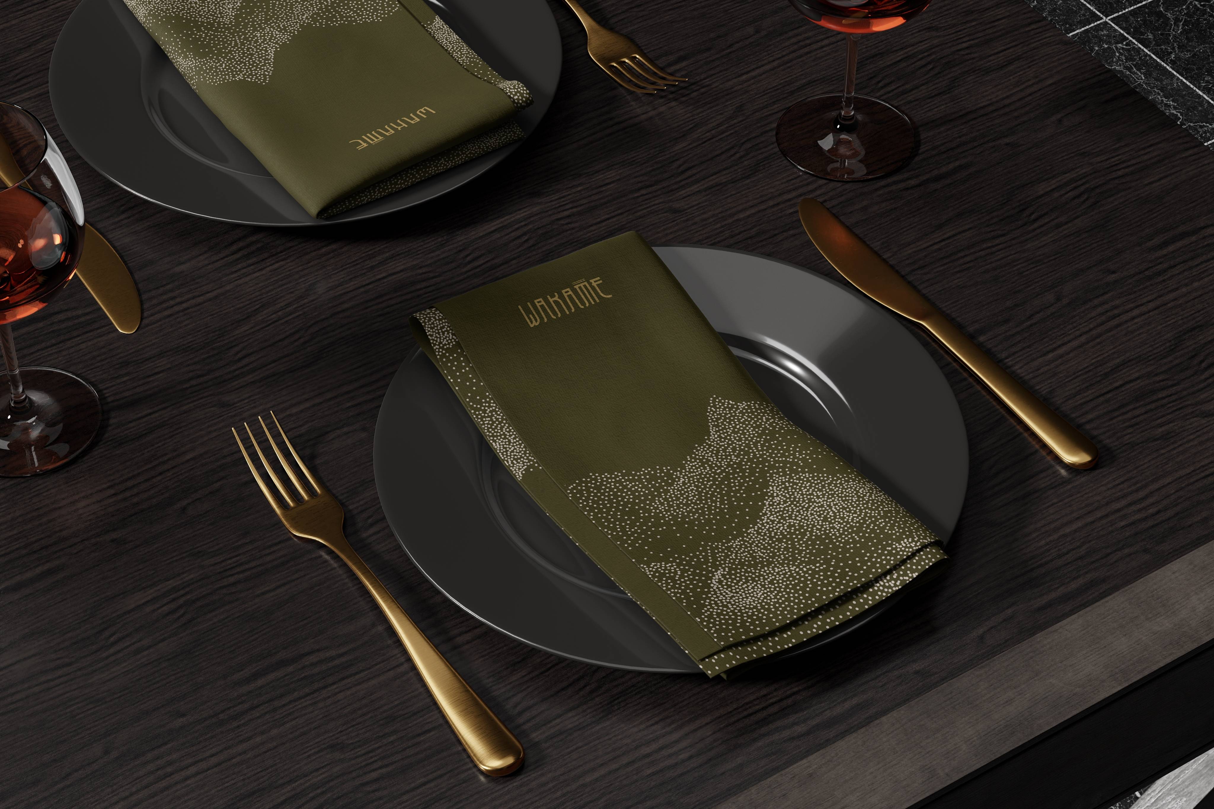
The dotted pattern, the olive-driven palette, and the custom wordmark became instantly recognisable anchors that could grow with the brand.
In short, the strategy aimed to make Wakame feel crafted and intentional, just like the cuisine it serves.
Visual Identity
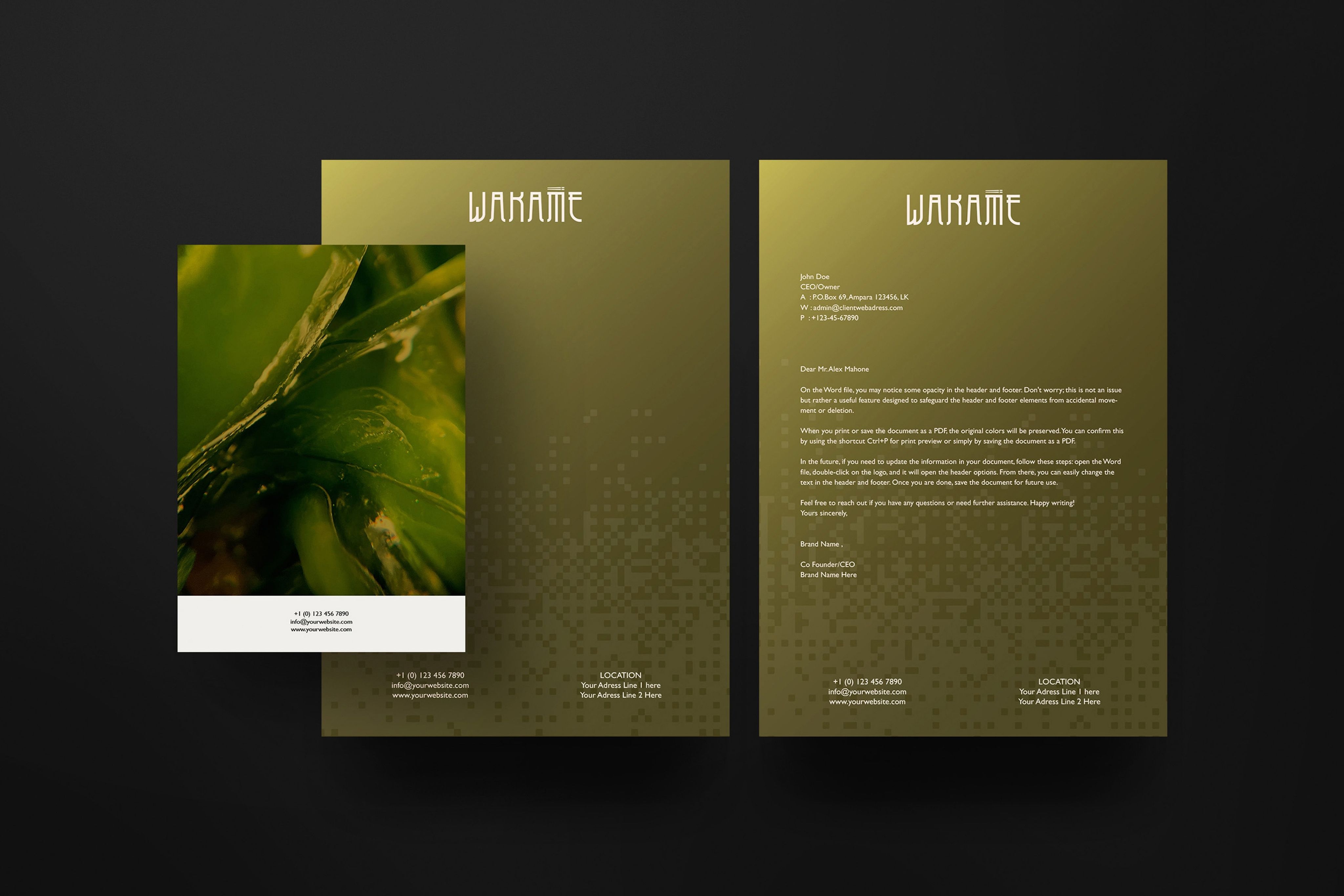
Colour Palette
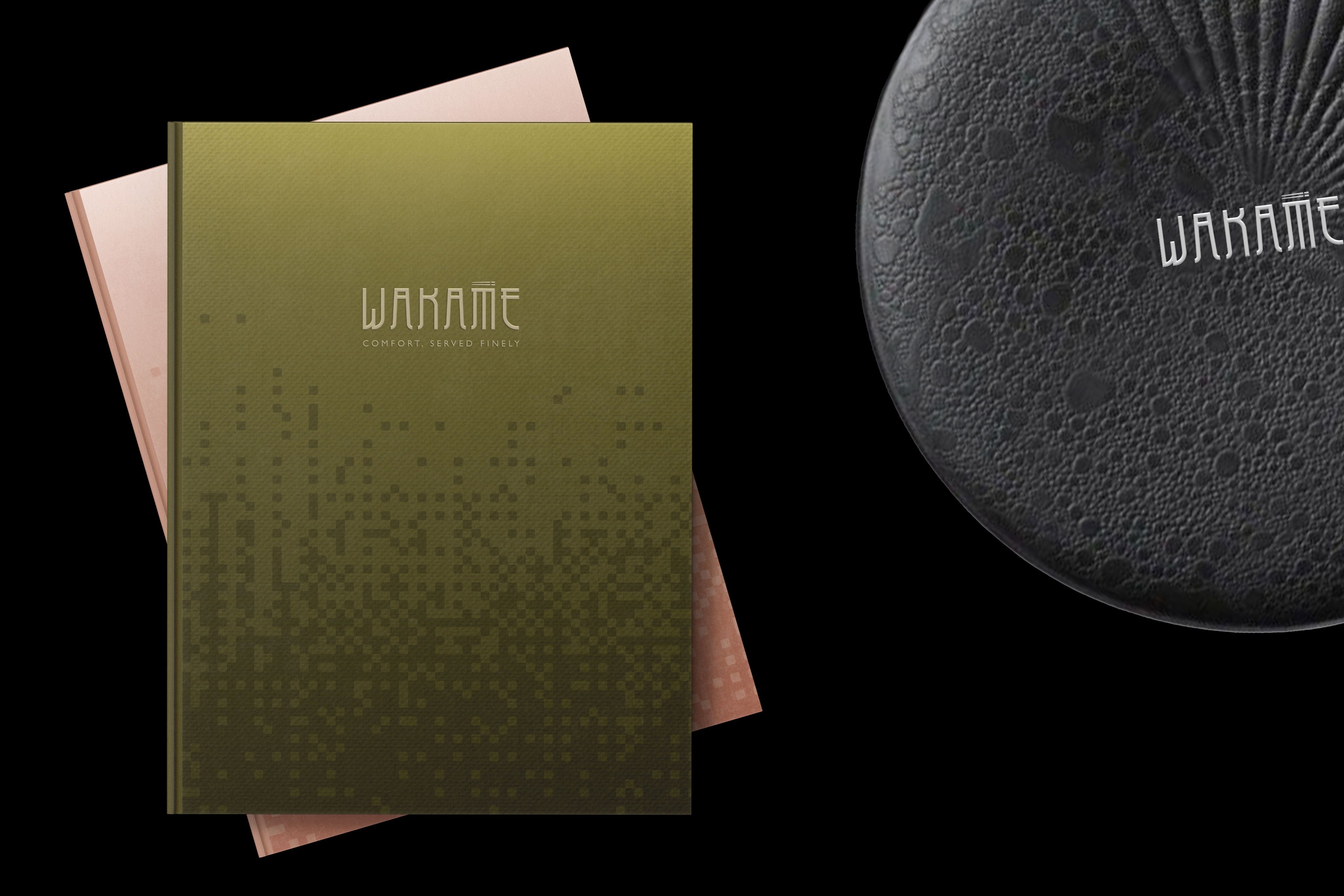
The colours come straight from Wakame’s natural world. Rich olive greens, earthy browns, and gentle neutrals create a palette that feels organic, peaceful, and premium. These tones evoke seaweed, driftwood, sand, and stone, elements you might find along a quiet coastline.
The palette doesn’t shout; it whispers. And that’s exactly the mood Wakame wants to create.
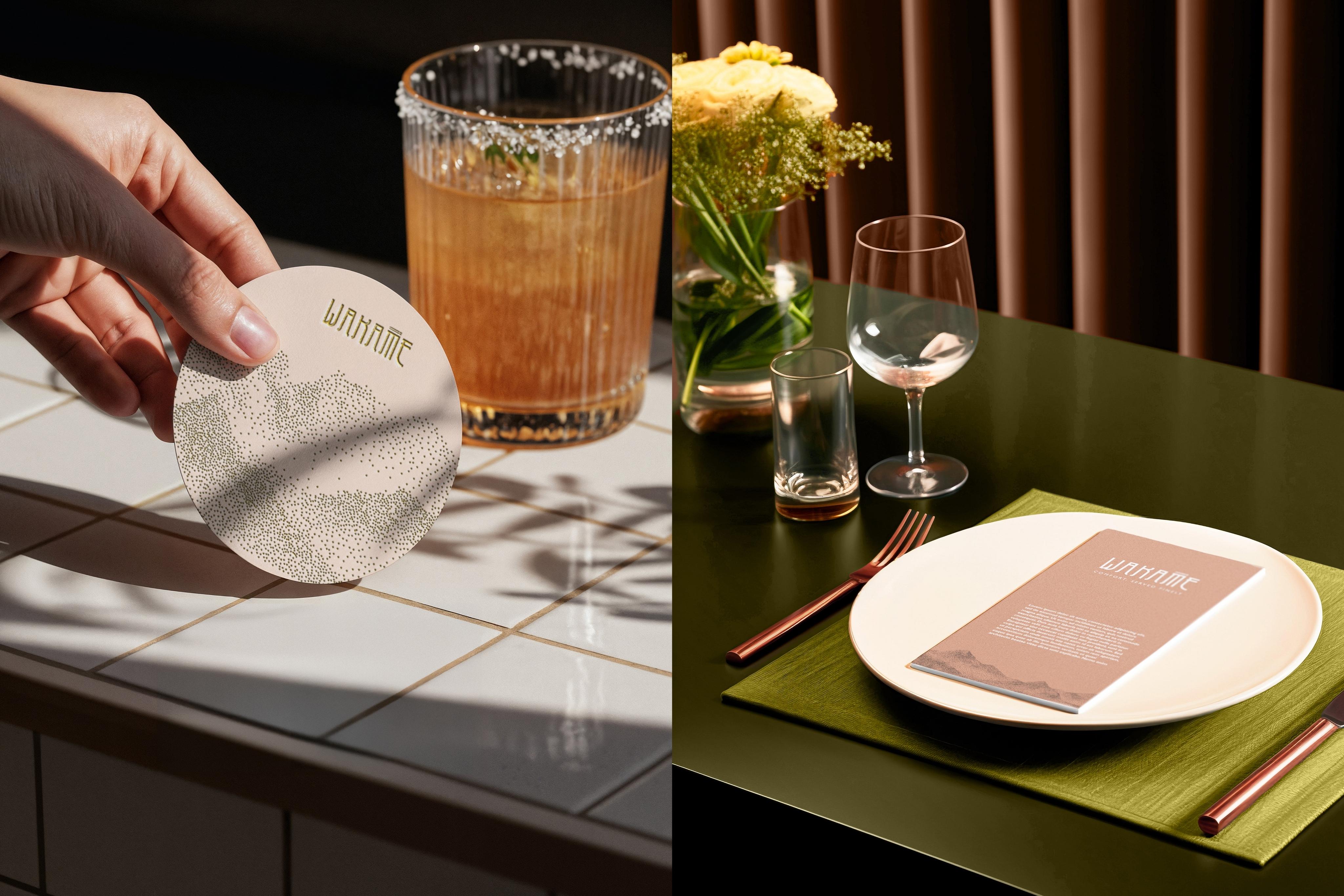
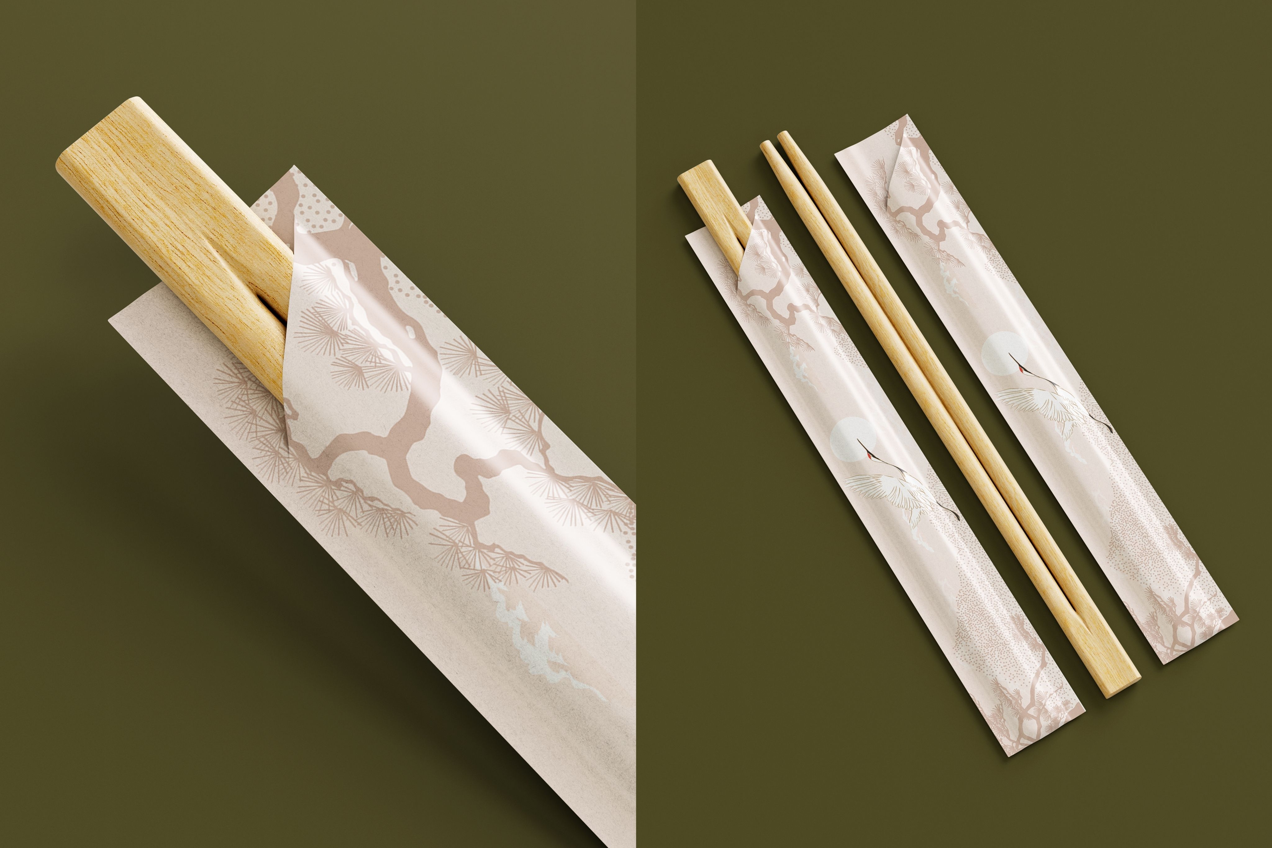
Pattern Language
One of our favourite parts of the identity is the signature dotted pattern. It comes from looking at Wakame up close, its tiny clusters, its textured surfaces, its rhythmic movement.
The dots create a visual rhythm that feels calming and almost meditative. They represent gentle tides, rolling landscapes, and the microscopic beauty of the ocean. Unlike traditional motifs, this system feels fresh, modern, and quietly expressive.
It’s subtle enough to blend in, yet distinctive enough to become Wakame’s visual DNA.
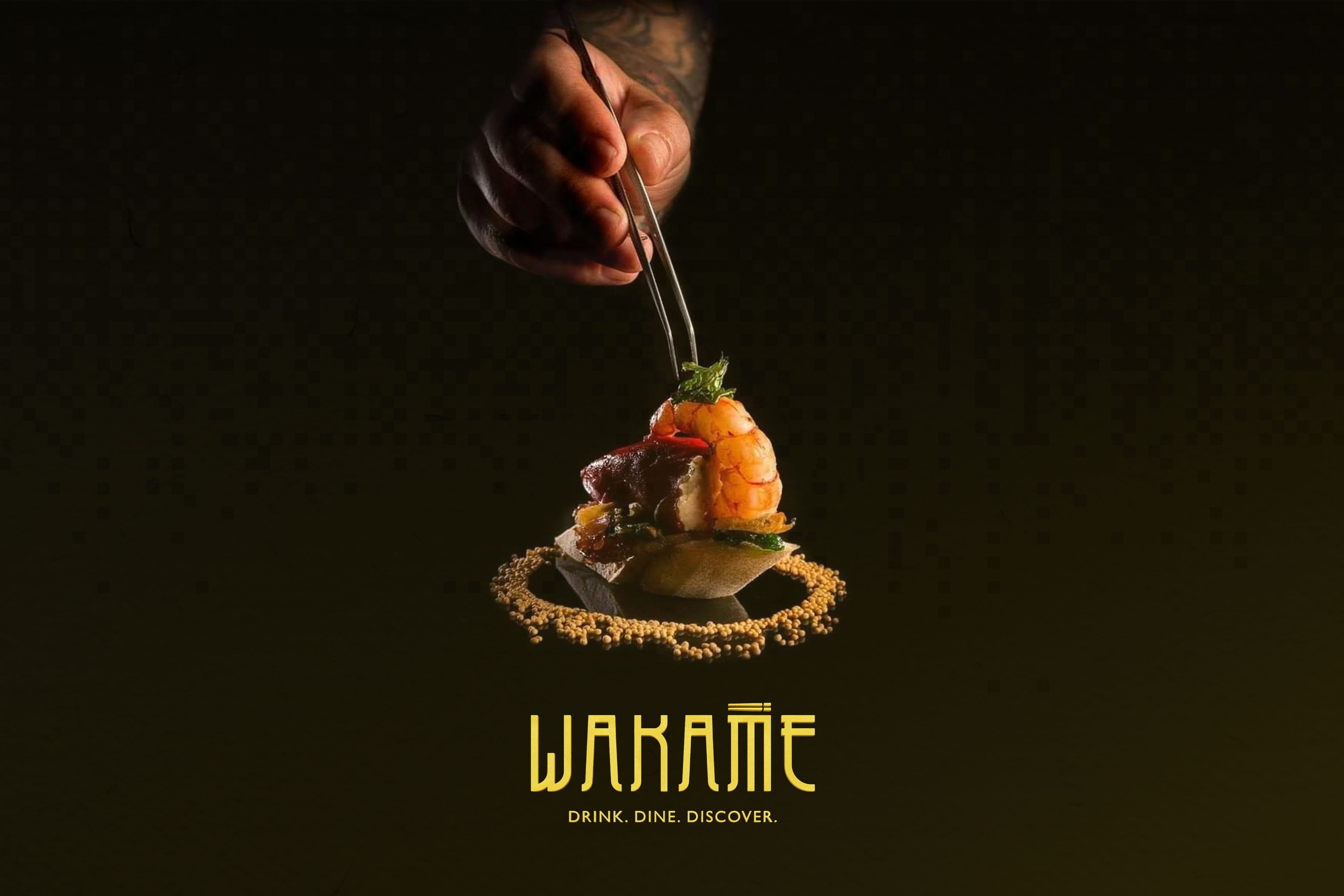
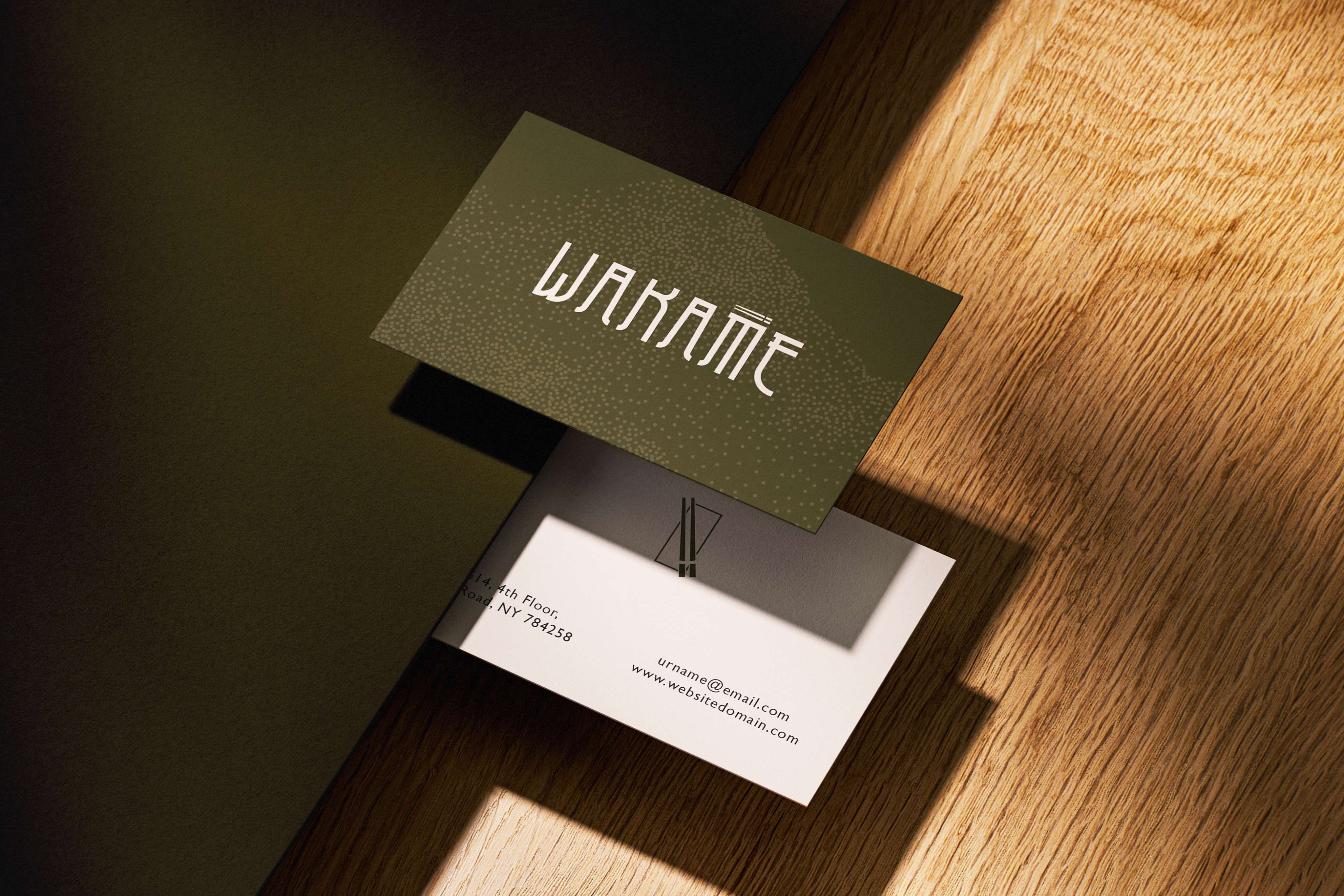
Logo & Typography
The Wakame logo is a custom wordmark inspired by the flow of Asian calligraphy. The elongated strokes feel elegant and fluid, hinting at cultural roots without being literal.
A small, refined chopstick motif sits above the “A.” It’s not a loud icon, just a simple graphic accent that completes the story and connects the wordmark to Wakame’s culinary world.
The typography throughout the brand complements this with spacious, modern letterforms that feel premium yet approachable.
Materiality & Touch
Wakame’s identity is also built through touch.
Matte textures, tactile papers, soft contrasts, and minimal compositions bring a sense of craft to menus, packaging, and signage. The brand feels like something shaped by hand, calm, intentional, and beautifully understated.
Outcome
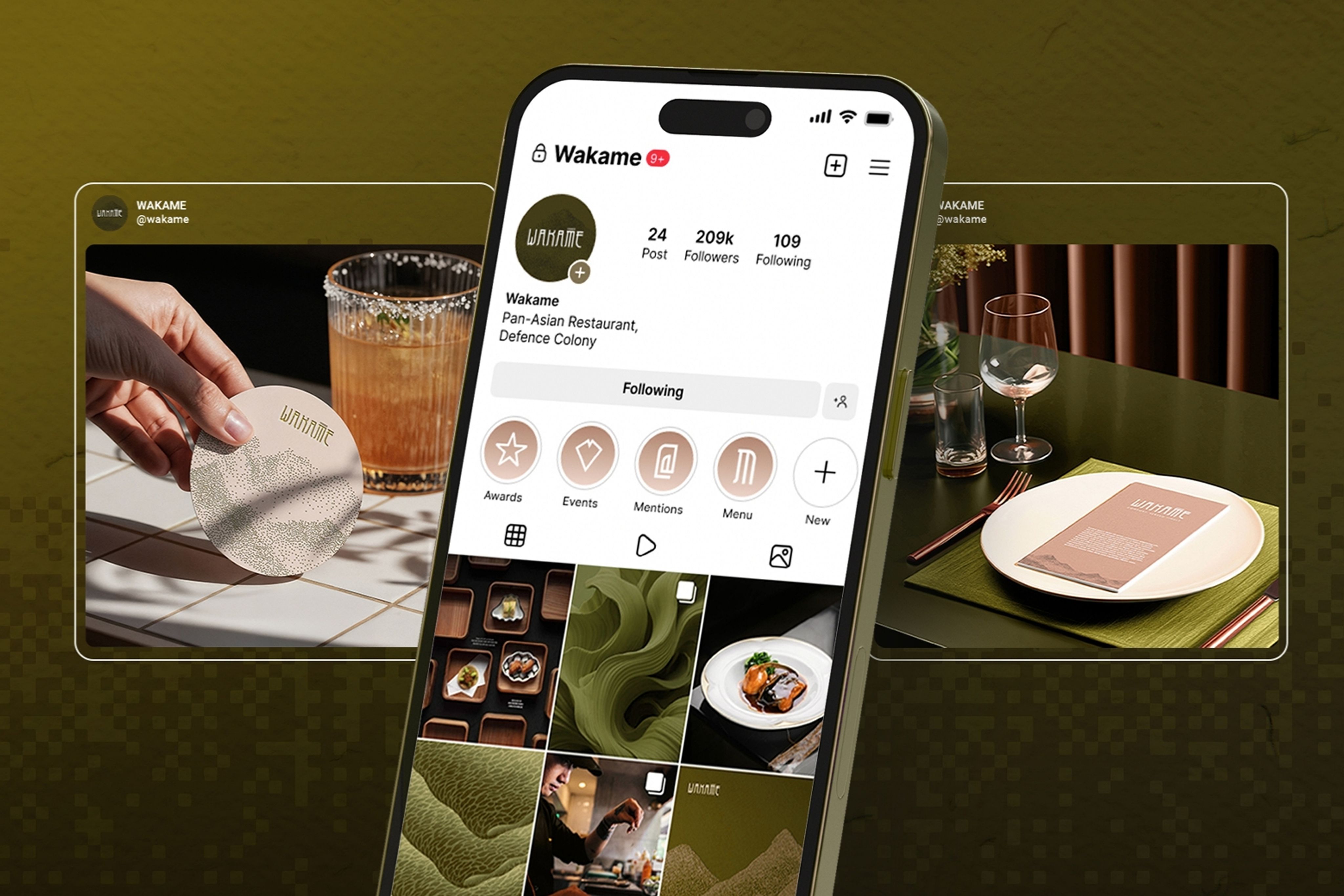
The final identity system for Wakame creates a world that feels serene, refined, and rooted in nature. The colours, patterns, logo, and textures come together to form a cohesive aesthetic that elevates the dining experience from the moment someone sees the brand.
Wakame now stands apart in the Pan-Asian category, not by being loud, but by being thoughtful. The identity honours tradition subtly while embracing a modern, globally relevant design language.
The result is a brand that feels alive yet composed, artistic yet functional, premium yet warm. A brand that mirrors the restaurant’s culinary philosophy: contemporary Pan-Asian cuisine crafted with intention, inspired by nature, and presented with quiet sophistication.

CREDIT
- Agency/Creative: HMLC
- Article Title: HMLC Translates Wakame’s Culinary Philosophy into a Living Brand
- Organisation/Entity: Agency
- Project Type: Identity
- Project Status: Published
- Agency/Creative Country: India
- Agency/Creative City: Gurgaon
- Market Region: Asia
- Project Deliverables: Brand Identity
- Industry: Food/Beverage
- Keywords: Branding, Luxury branding, Hospitality branding, Brand identity, Identity design, Brand strategy, Strategy, Brand voice, Brand guidelines, Brand development, Logo design, Branding for hospitality, Minimal luxury design, Creative direction
-
Credits:
CEO & FOunder: Harsh Mann


