


“Mooneva” is a Swedish brand founded by a capable Iranian woman entrepreneur. Operating in the menstrual health category, the brand redefines a healthy, unrestricted, and sustainability-minded experience for women. Mooneva is built on respect for individual choices and on creating a judgment-free space for women seeking a new, reliable, natural, and barrier-free experience, whether for restful sleep, unrestricted swimming and exercise, or worry-free intimacy during their period. “Every woman has her own unique need.”
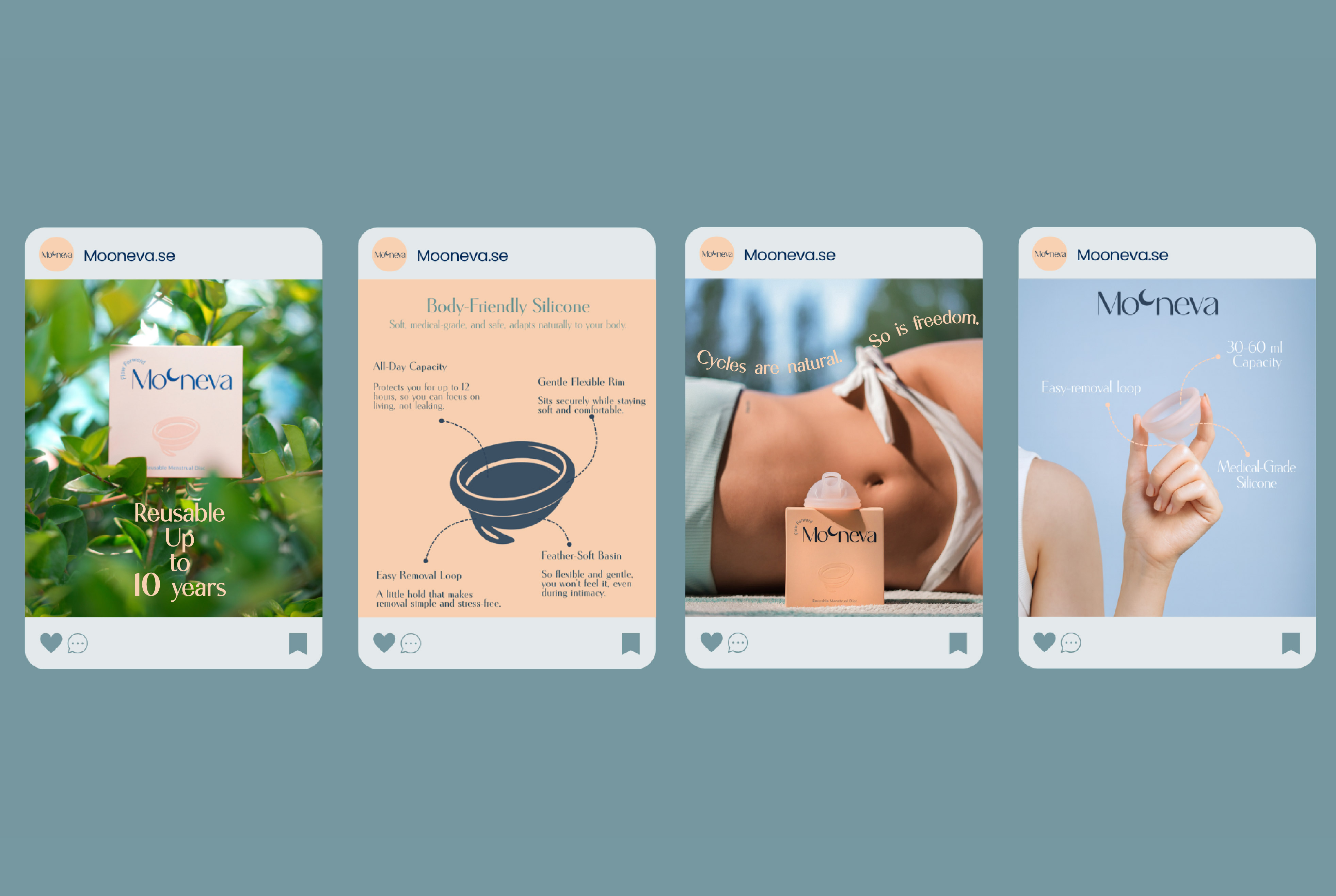
The Mooneva menstrual disc is a reusable product designed to minimize waste, particularly period-related waste. The brand has been developed with a fully design-driven approach across every touchpoint, from product to identity and from the purchasing journey to daily use.
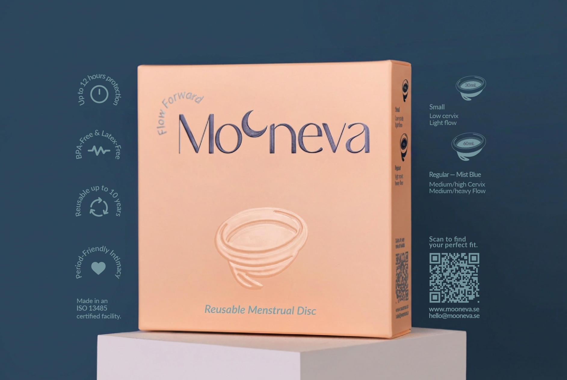
The visual identity begins with the logotype. Incorporating a Moon symbol into the second “O” in Mooneva was a strategic choice, as some words inherently carry visual meaning, and introducing unrelated symbols risks misinterpretation. Beyond its direct connection to the brand name, the moon symbolises natural rhythms of cycles. The different moon phases are used throughout the identity and packaging to create a clear link between the menstrual cycle, the lunar cycle, and the tagline “Flow Forward”: a movement that is natural, continuous, and free of pressure.
The design strategy is rooted in the brand’s personality. Mooneva brand personality is “sincere”, aiming with calm honesty to transform menstruation from a hidden, tension-filled experience into one that is predictable, gentle, and low-stress, Without overlooking the real, everyday experience of a period. The moon and its cyclical rhythm reinforce this personality and appear across every design layer, from posters and social media to the website and packaging.
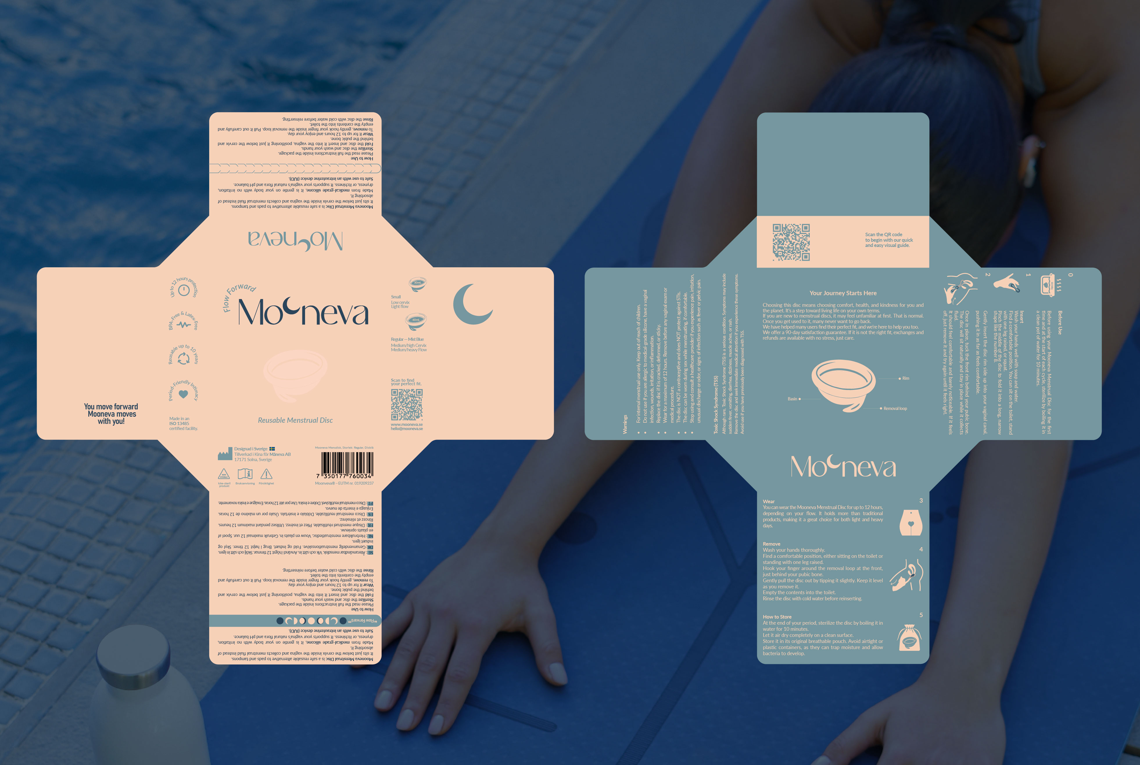
In the packaging, the focus is on multisensory design. The logo and disc form are raised using 3D UV. The disc illustration is colorless yet fully embossed and transparent, creating a tactile, authentic connection that allows the user to sense the product’s quality at every touchpoint. The soft-touch velvet lamination adds smoothness and comfort aligned with the product’s gentle materiality. The perforated opening mechanism creates an intimate, simple, and slightly playful moment, allowing the user to interact with the packaging effortlessly. The extremely lightweight box communicates the disc’s barely-there feeling and its comfort throughout the menstrual cycle.
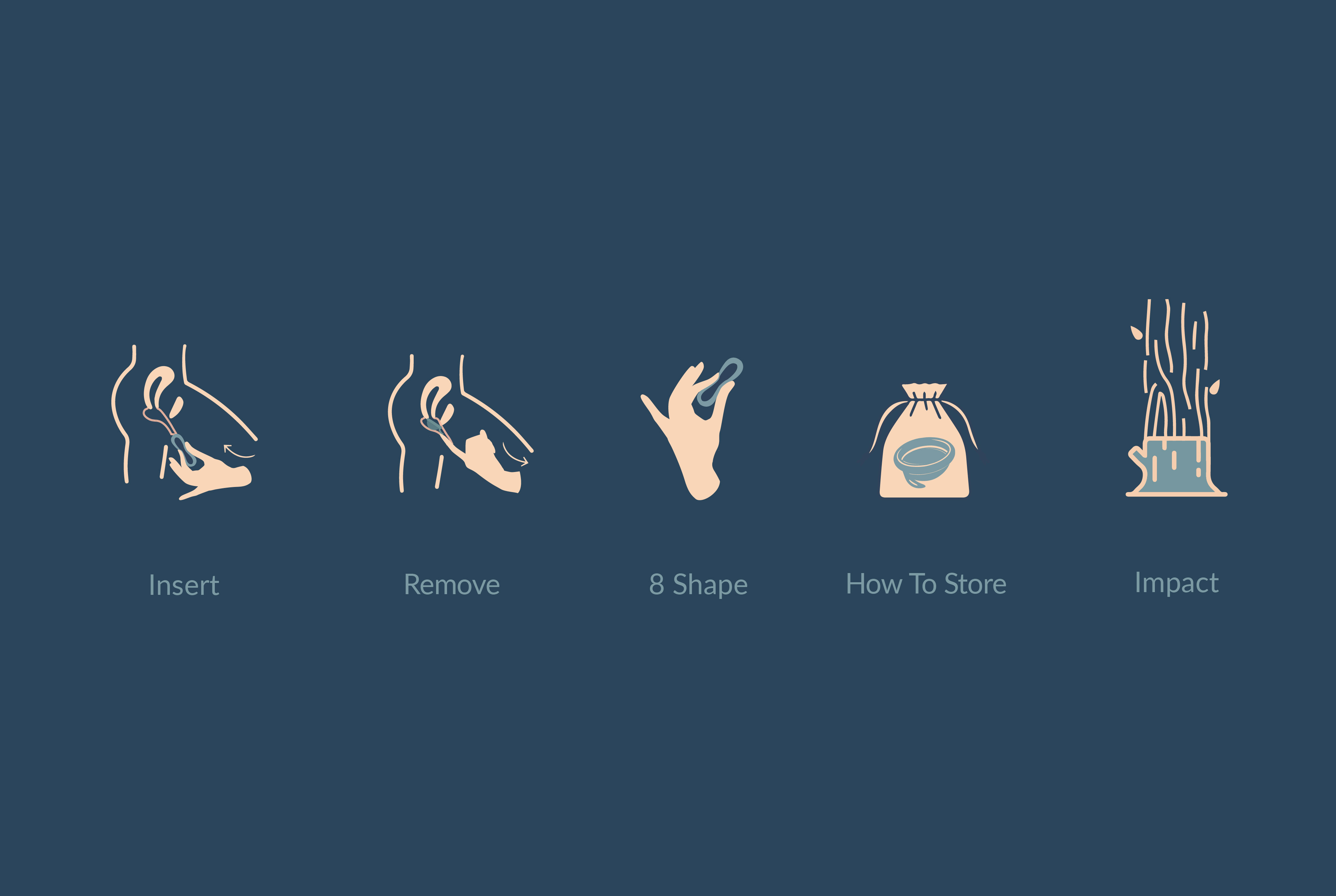
In accordance with ISO 13485, which requires clear medical and usage instructions, custom icons and pictograms were developed. The internal layout and illustrations are structured so that all information is immediately visible, legible, and easy to understand.
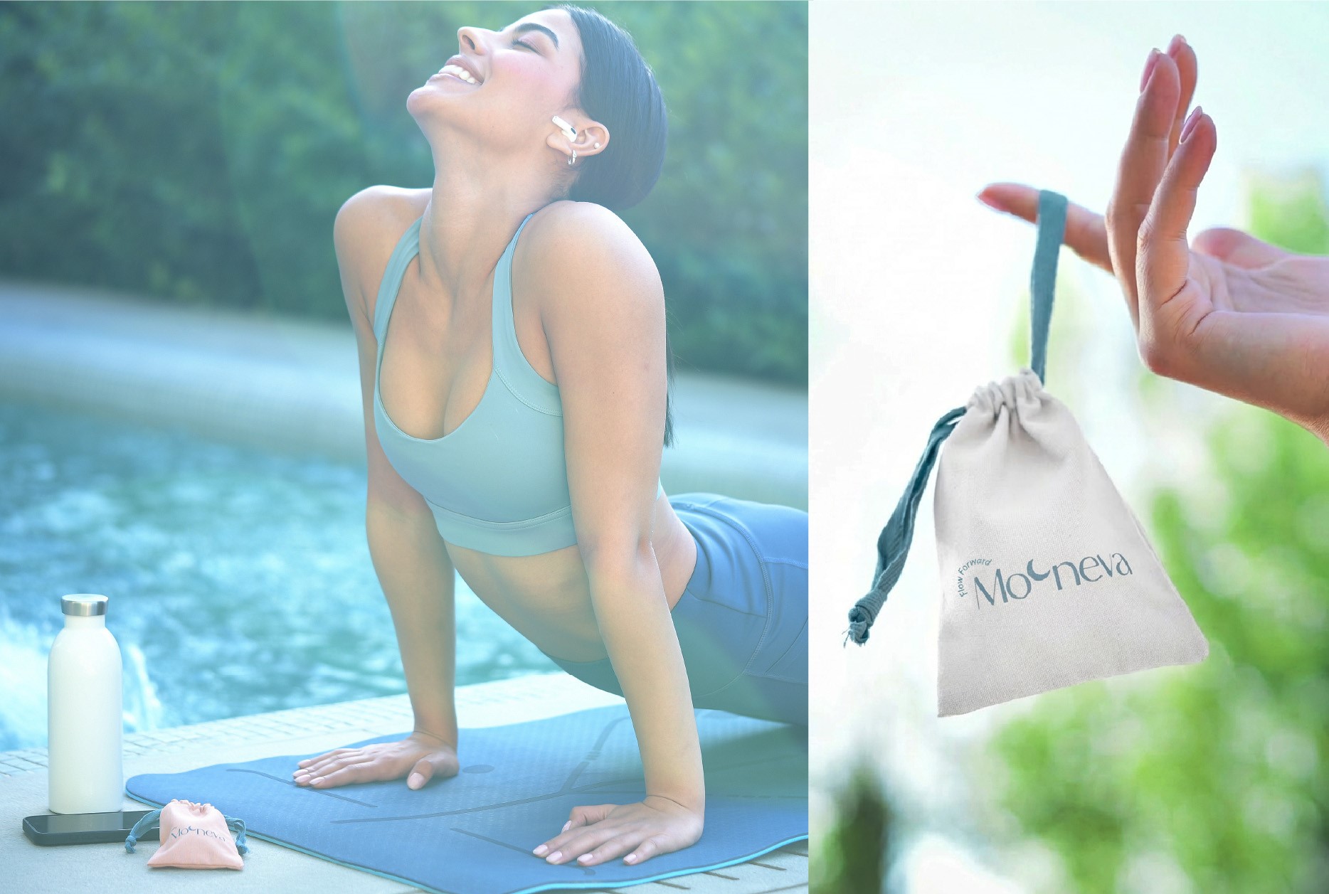
The disc is placed inside a linen fabric pouch, a hygienic choice that also reinforces the brand’s natural and sustainable character.
The color palette avoids gender stereotypes, conventional feminine pinks and reds, and literal references such as blood, pads, or anatomical visuals. The intention is to create a clear, approachable, and calming visual language; a modern, quiet space that conveys safety and comfort. Meaning ultimately forms in the mind of the viewer, so the design ensures that the intended message is easily and intuitively decoded.
A soft nude-peach tone paired with shades of blue reinforces the brand’s calm and unfiltered personality. Colors do not carry meaning on their own; meaning is created through the brand’s identity and expression.
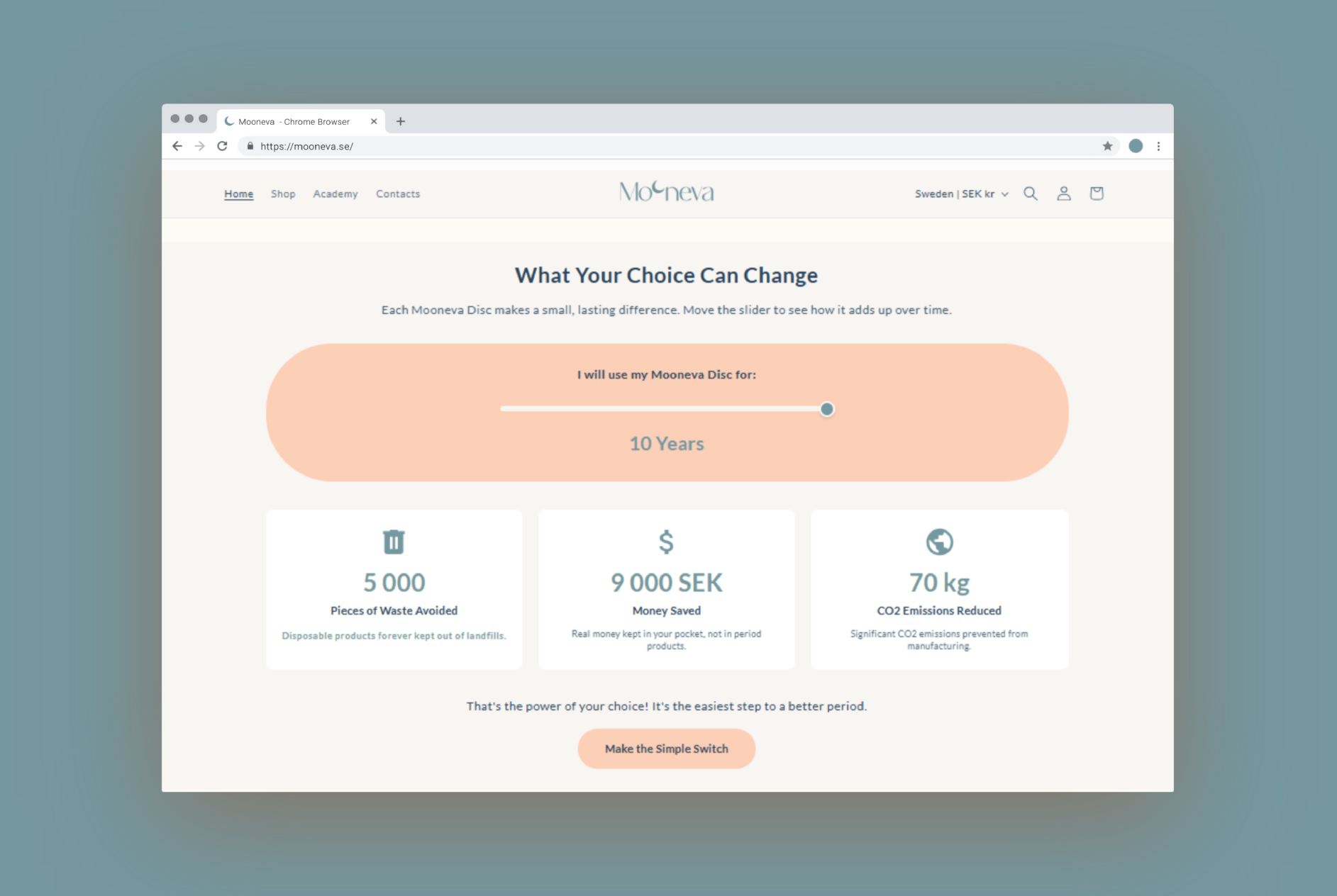
Mooneva is a “sustainable” brand, not through unrealistic claims of full sustainability, but through a design philosophy consistently focused on reducing harm: “To be less bad.”
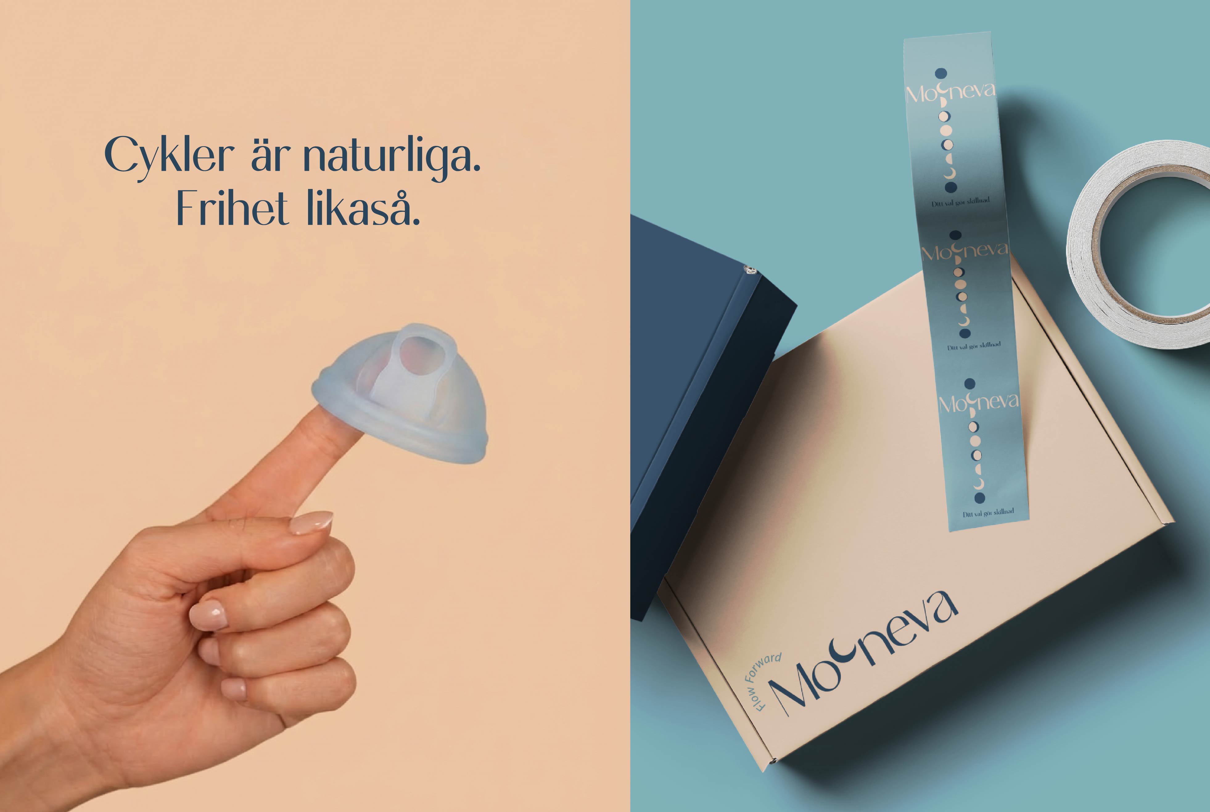
The posters and selected phrases were developed for a Swedish-speaking audience, shaped in alignment with the tone, spirit, and identity of the brand:
Posters from right to left: Poster 1:
Freedom in every movement
“With the Mooneva menstrual disc, you can live fully: swim, sleep, work and play for 12 hours.”
Experience a new kind of freedom in period care.
Poster 2:
“Invisible, yet life changing.”
Discover the future of period care.
Up to 12 hours of protection. No strings. No interruptions. Just live.
Poster 3:
Periods are part of life. With the Mooneva menstrual disc, you keep your natural cycle without interruptions.
Cycles are natural. So is freedom.
Secondary Packaging Label: Your choice makes a difference.
CREDIT
- Agency/Creative: Mahshad Ghotb
- Article Title: Mooneva Reusable Menstrual Disc Brand Identity Design By Mahshad Ghotb
- Organisation/Entity: Freelance
- Project Type: Identity
- Project Status: Published
- Agency/Creative Country: Iran
- Agency/Creative City: Tehran
- Market Region: Europe
- Project Deliverables: Brand Design, Brand Identity, Brand Strategy, Brand Tone of Voice, Creative Direction, Packaging Design, Packaging Guidelines, Web Design
- Industry: Health Care
- Keywords: WBDS Creative Design Awards 2025/26 , Brand Identity, Brand Design, Creative Packaging, Design Direction, Healthcare, Menstrual hygiene, Women's empowerment, Period product
-
Credits:
Brand Identity Designer & Creative Director: Mahshad Ghotb
Brand Founder: Bita Baghestani
Videographer & Photographer: Maryam Ghale


