


Reigniting snacking with street-food swagger.
Kettle® set out to shake up the crinkle-cut chip aisle with Ridge Cut; a bold new expression designed to bring bigger crunch, bolder flavour, and real craft back into a tired corner of the category. The mission was clear: attract a younger, flavour-hunting audience and give the segment a long-overdue glow-up while still honouring Kettle®’s premium, slow-crafted DNA.
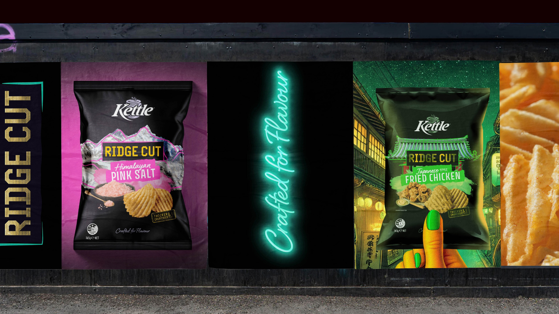
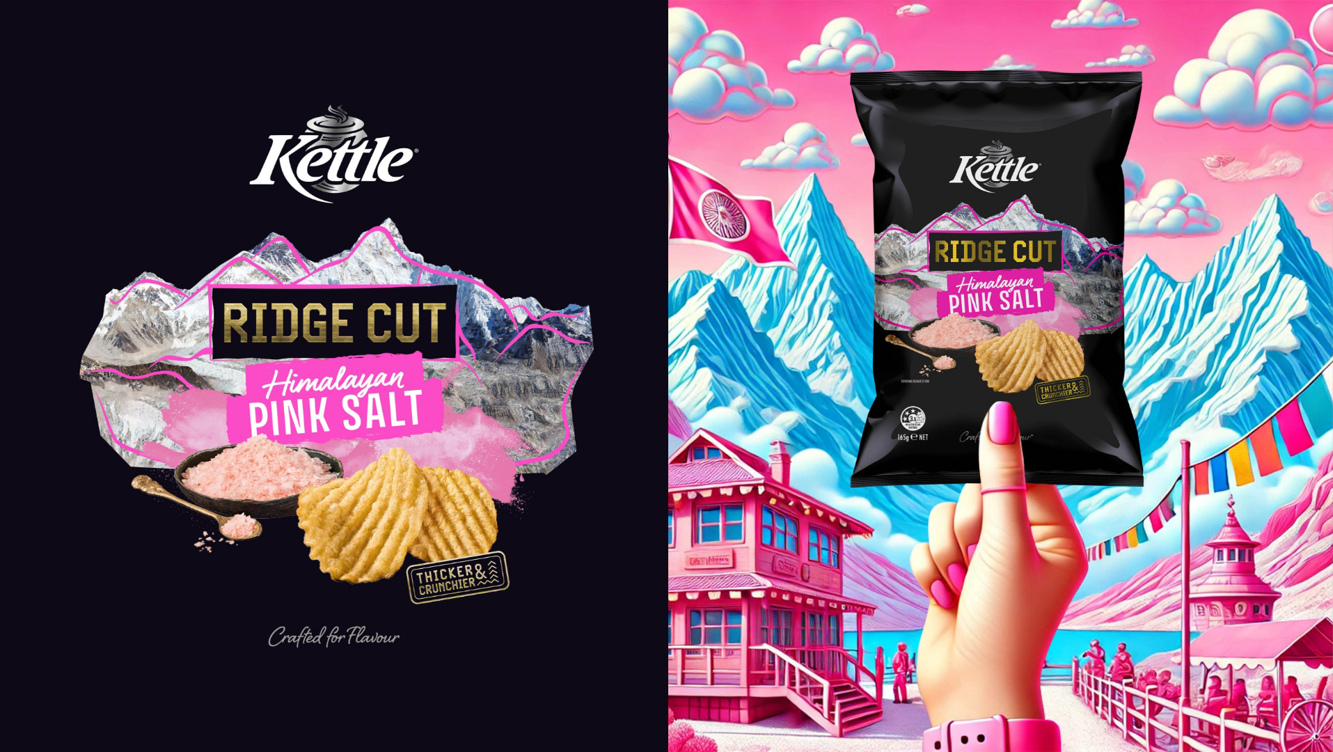
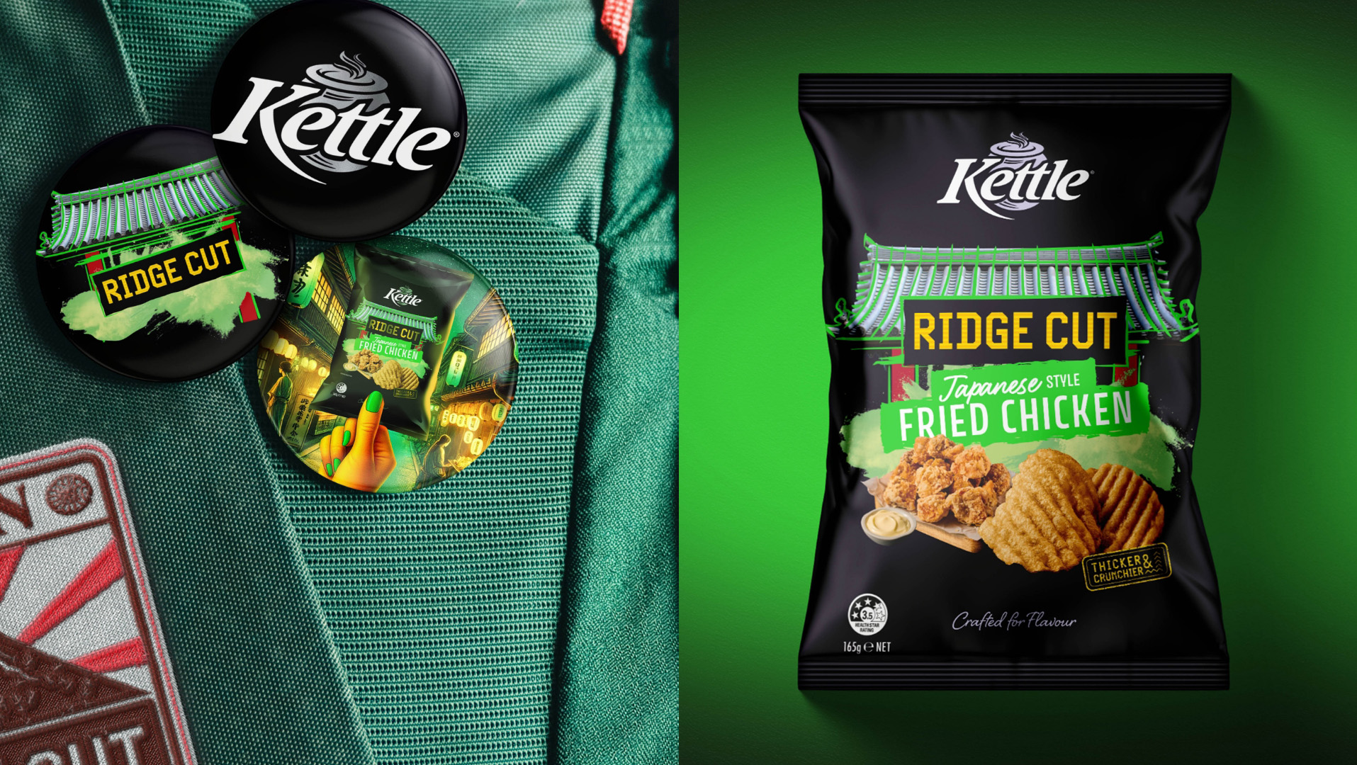
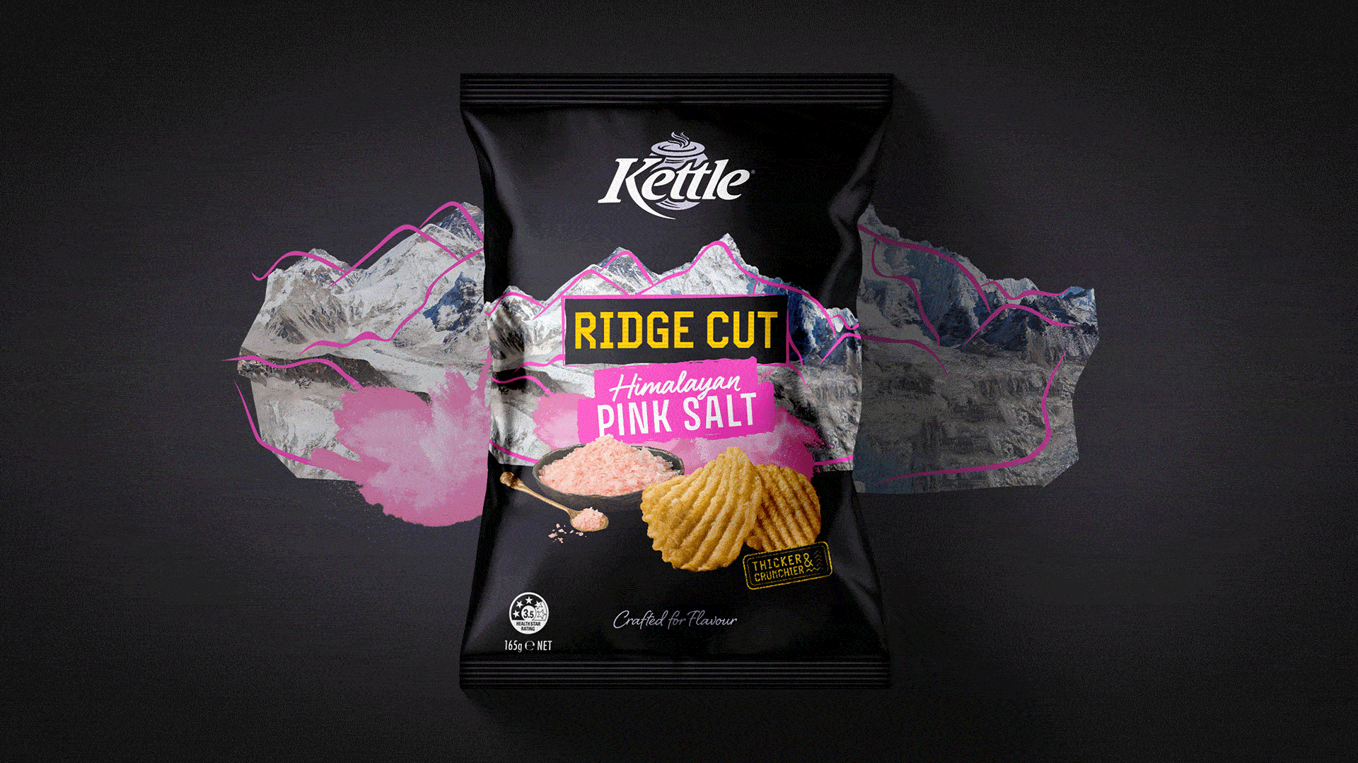
To get there, we immersed ourselves in the colour, attitude and sensory punch of global street food; the kind that hits you with aroma before it hits your tastebuds. Think Japanese Fried Chicken, Himalayan Pink Salt, and high-energy flavour cues that spark instant curiosity. These references became the backbone of a visual and verbal world that celebrates adventure, originality and the unapologetic joy of trying something new.
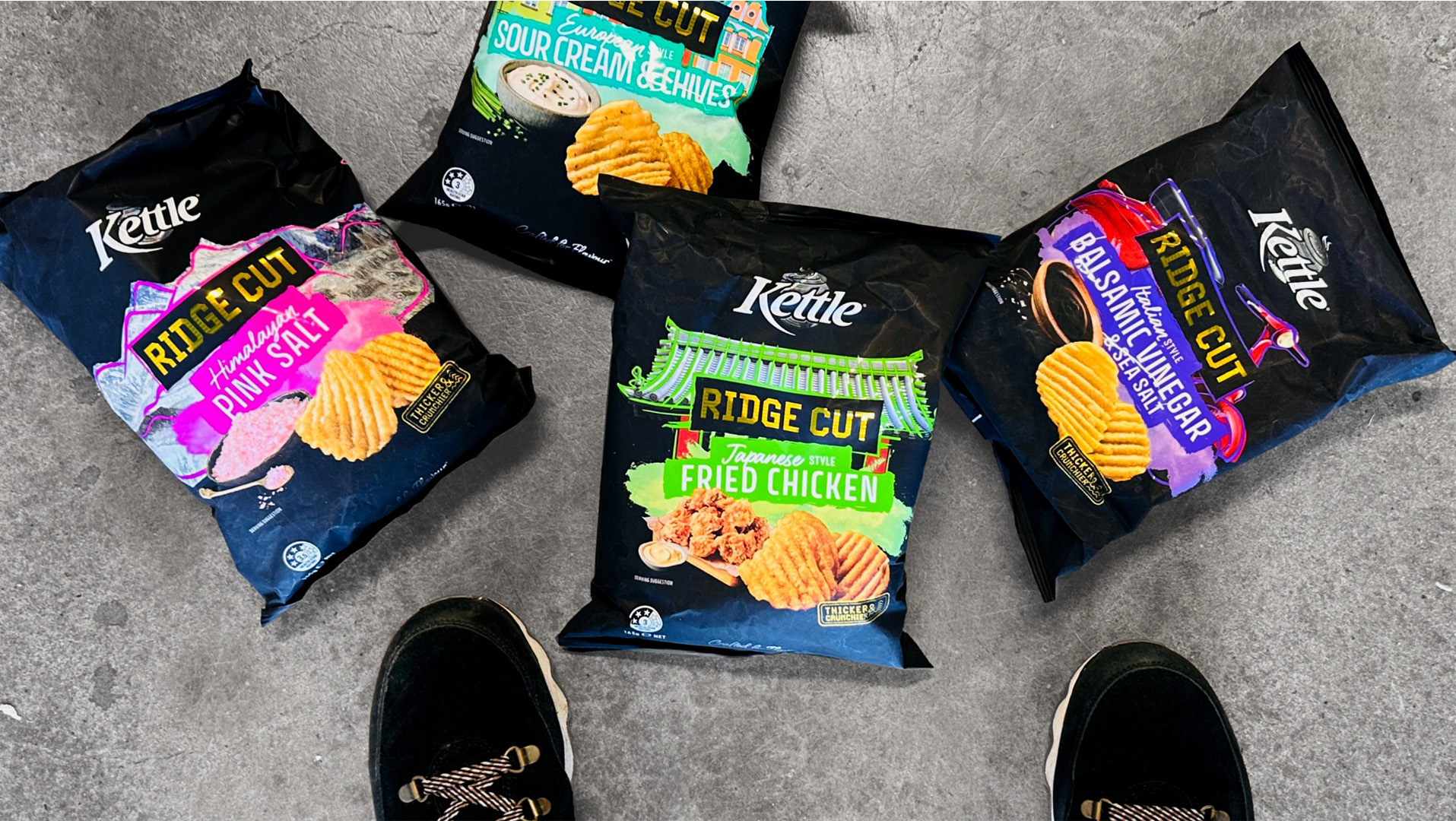
Every design decision served that ambition. The pack architecture amps up vibrancy and energy without losing Kettle®’s premium cues. Typography is punchier, more expressive, and deliberately breaks from the soft, wholesome language common in the category. Photography and flavour cues were sharpened to feel more textural, more sensorial, and more like something you’d discover at a late-night market than a supermarket aisle. Shelf presence went from familiar to unmissable.
And the chip itself? A thicker, deeper ridged cut engineered to hold onto bigger, more intense flavours while delivering a seriously satisfying crunch. A textural hit you can hear before you taste. It’s snacking with confidence, craft and the kind of sensory payoff younger consumers actively seek.
By blending bold innovation with street-savvy design, Kettle® Ridge Cut pushes the brand into fresh territory. It meets the moment for modern snackers, elevates the entire segment, and reminds the category what flavour-forward really looks like: punchy, proud and impossible to ignore.

CREDIT
- Agency/Creative: The Edison Agency
- Article Title: The Edison Agency Delivers a Vibrant Visual World for Kettle Ridge Cut That Amplifies Crunch, Character, and Category Impact
- Organisation/Entity: Agency
- Project Type: Packaging
- Project Status: Published
- Agency/Creative Country: Australia
- Agency/Creative City: Melbourne
- Market Region: Oceania
- Project Deliverables: Brand Identity, Brand Strategy, Packaging Design
- Format: Bag
- Industry: Food/Beverage
- Keywords: Potato Chips, Innovative flavours, Crafted for Flavour, Travel Destinations
-
Credits:
Principle Creative Director: Amber Bonney
Strategist: Calin Barker
Project Manager: Niki Beeston
Designer: Stephanie Ehrlich
Head of Production: Matt O'Connor
Client: James Deysel
Client: Keara Deignan
Photographer: Pete Dillon
Stylist: Caronline Velik


