


The nicotine pouch category has been dominated by big tobacco subsidiaries and competitors trading in juvenile messaging. Truffl saw an opportunity to reposition the category entirely.
Working with Sesh+, the fastest-growing independent brand in the category, Truffl developed a strategy centered on a single powerful idea: “Nicotine. Upgraded.” The rebrand transforms how the category is perceived – from lifestyle theater to functional quality and from youth culture to quality culture.
The strategy connects unrivaled product benefits (precision strength, superior flavors, extended satisfaction) to real emotional goals: focus, achievement, and the moments that matter most. Copy is restrained and direct, proving that simplicity can outperform hype.
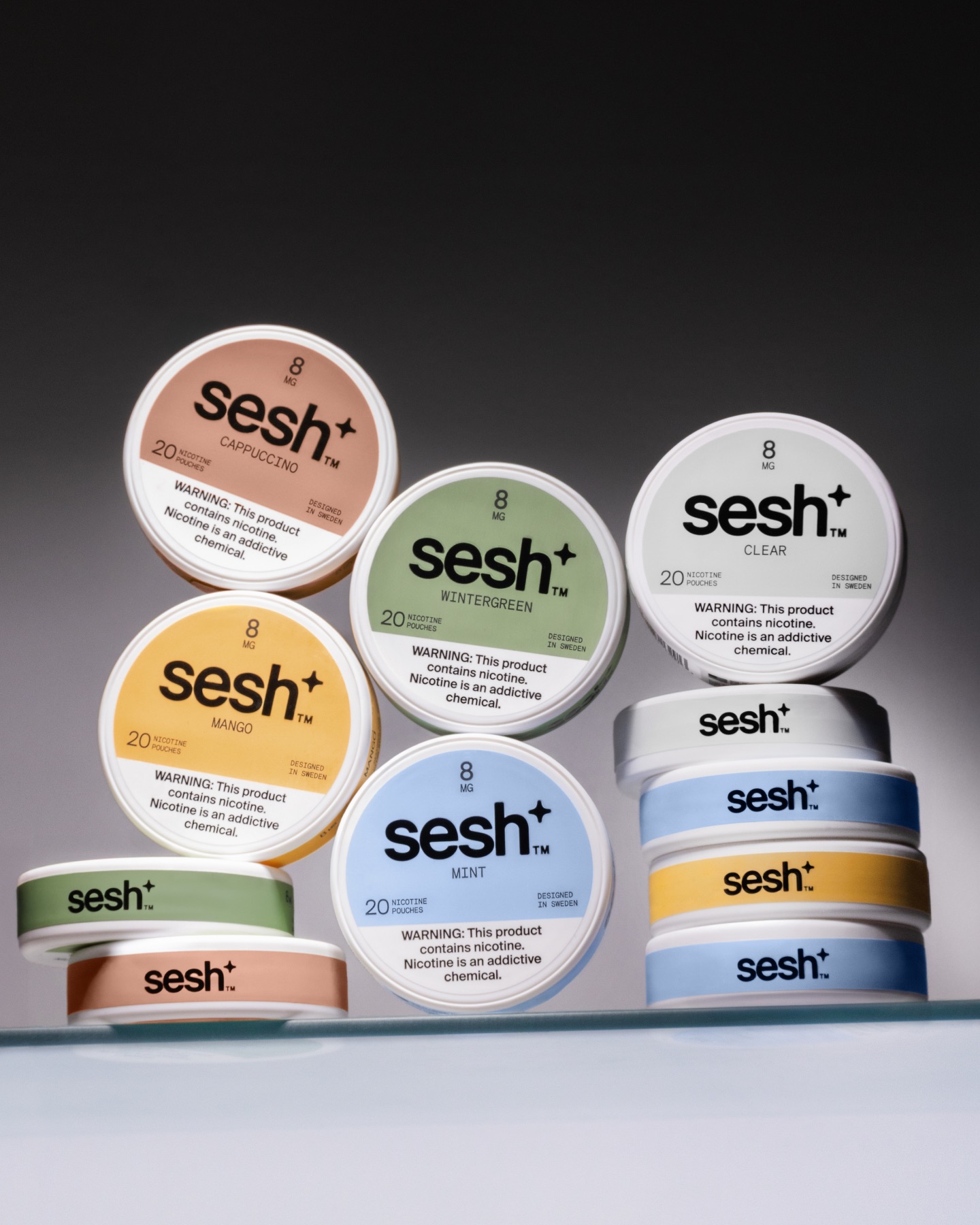
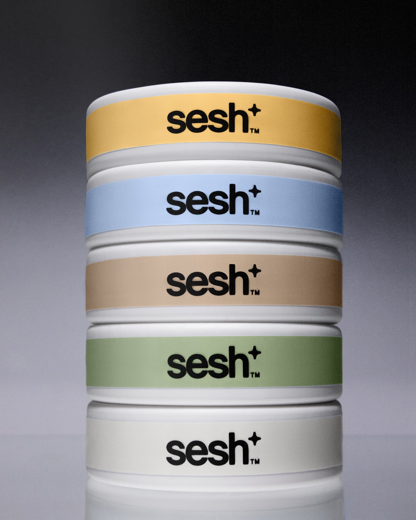
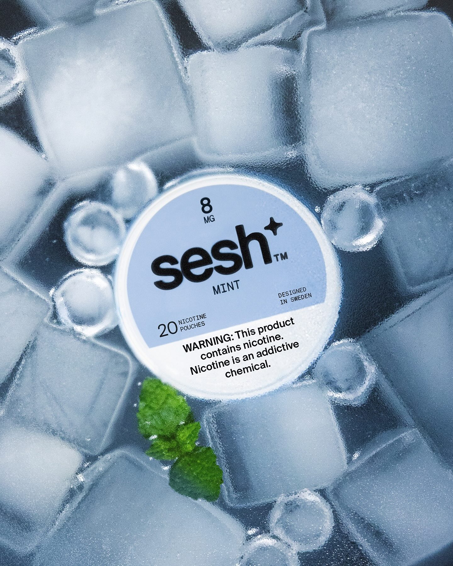
The visual identity mirrors this philosophy. Clean, minimal, and intentional, every design choice communicates the product itself. The core mark, “sesh+,” uses the plus symbol to signal both “plus nicotine” and upgrade. Typography employs Suisse Int’l and Basis Mono – clean, pedagogical typefaces that prioritize clarity over personality. The color palette assigns each flavor its own deliberate hue: warm yellows for Mango, soft periwinkles for Mint, warm taupes for Cappuccino, sage greens for Wintergreen, crisp whites for Clear. Restraint is the sophistication.
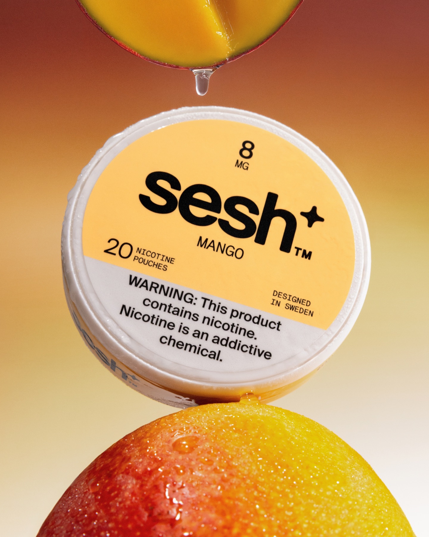
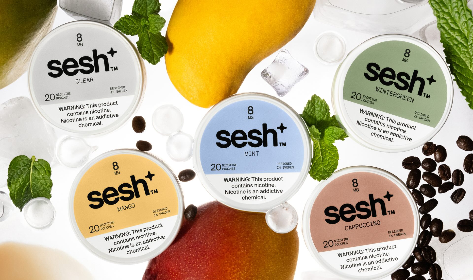
Packaging design is intentionally minimal. The circular pouch features bold, centered branding with the color field in the upper portion, creating neutral, elevated shelf presence that stands apart from the category’s visual noise. Photography is equally understated – sparse, carefully composed contexts with ice, fresh herbs, and citrus, free from false promise or hedonistic energy.
The result positions Sesh+ as the independent, uncompromising choice in a category with a brand that respects its audience enough to deliver real quality instead of marketing theater.
CREDIT
- Agency/Creative: Truffl
- Article Title: Truffl Presents a Minimal, High-Clarity Identity for Sesh+ That Redefines the Nicotine Pouch Category
- Organisation/Entity: Agency
- Project Type: Identity
- Project Status: Published
- Agency/Creative Country: United States
- Agency/Creative City: Los Angeles
- Market Region: North America
- Project Deliverables: Animation, Art Direction, Brand Guidelines, Brand Identity, Brand Redesign, Brand Strategy, Brand Tone of Voice, Branding, Creative Direction, Design, Identity System, Motion Graphics, Packaging Design, Packaging Guidelines, Photography, Photography Styling, Rebranding
- Industry: Food/Beverage
- Keywords: Nicotine Pouch, Nicotine Branding, Sesh+, Truffl, Truffl Branding Agency
-
Credits:
Creative Director: Raphael Farasat
Brand Strategist: Raphael Farasat
Art Director: Matti Vandersee
Art Director: Frankie Dineen


