


Introduction
Zapz is a bold new entry into the energy product space, designed for a generation that demands rapid performance, convenience, and personality. This is not your average caffeine fix. Zapz introduces flavorful, fruit-forward caffeine pouches in a compact, playful format that makes energy more accessible, fun, and instantly engaging. From gym-goers to night-shift warriors, Zapz was built to energize fast and stand out even faster.
Zapz underwent a new launch to look appetizing, energizing, and informative, spotlighting each pouch and drink stick’s robust energy content. Their new visual identity relies on vibrant colors, a strategic hierarchy, and engaging illustrations, highlighting flavor, energy, and key details. Every package tells a clear story of what customers can expect, captivating them with vivid flavor elements, color palettes, and icons that bring each variety to life.
Utilizing vibrant colors, focusing on strategic visual hierarchy, and implementing illustrative elements into each design we were able to bring more focus to the flavor, energy, and product information that define this brand. Each package tells a clear story explaining what to expect with each product, while captivating them with unique design elements per flavor. Since launch, the results have been profound, excitement has surged in both wholesale and retail stores, and Zapz is poised for outstanding success.
Brand Concept
At the heart of Zapz is the idea of controlled chaos – energetic, bold, and full of flavor. Every detail, from the lightning bolt in the logo to the vibrant flavor names, speaks to high-energy momentum. The brand doesn’t whisper. It charges in with intention. Rapid energy. Loud design. Zero apologies.
Visual Identity
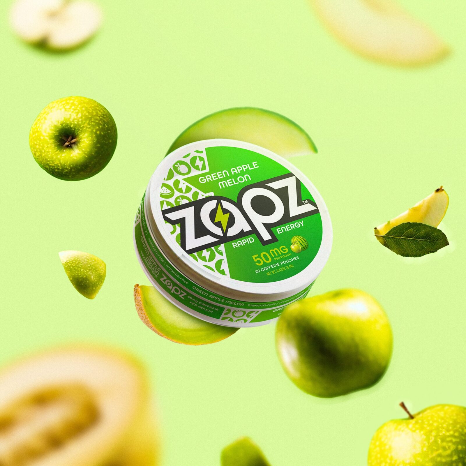
The Zapz logo is intentionally sharp and stylized. It blends thick, modern sans-serif characters with a central lightning bolt that splits the name like a jolt of caffeine. This signature element becomes a recurring brand motif across packs, digital materials, and background patterns.
The typography is set in bold black against flavor-coded backdrops to ensure instant shelf readability. The clean, circular tins give a sleek, futuristic feel while keeping portability in mind.
Colur Flavour System
Zapz uses color like a weapon. Each flavor has its own vibrant scheme that reflects its taste profile and energy:
– Blue Razz features cool electric blues with juicy berry visuals
– Green Apple Watermelon pairs fresh green tones with crisp red accents
– Melon Berry Bubble Gum explodes in energetic pinks and reds
– Ice Pop is a fusion of patriotic blue and red, evoking summer nostalgia
– Hot Tropic leans into fiery reds and exotic vibes
These flavors are more than ingredients. They are identities, each telling its own story through color, type, and iconography.
Photography and Motion
Photography for Zapz embraces movement, energy, and bold contrast. Cans appear mid-air, spinning above hands, or floating in rippling water. Ingredients burst through splashes of color, emphasizing flavor in motion. These visuals reinforce the product’s rapid activation and keep energy central to every frame.
Packaging Details
Each Zapz tin contains 20 pouches, clearly stated with 50 mg caffeine callouts. The design ensures easy identification of strength, flavor, and caffeine source. Rounded icons on the side reinforce key attributes like “nicotine-free” and “sugar-free,” while playful patterns (fruits, lightning bolts, capsules) create visual texture without clutter.
Target Audience
Zapz is crafted for active, socially engaged consumers who want energy on demand. They don’t want pills, powders, or awkward cans. They want something that slips into a pocket, hits fast, and tastes good while doing it. Think Gen Z students, fitness lovers, creatives, gamers, and gig workers.
Brand Voice
Zapz speaks in short, punchy bursts. The tone is direct, hype-charged, and unfiltered. Phrases like “Rapid Energy” and “Zap the Drag” reflect this energy. It’s a brand that understands momentum, and its messaging is just as caffeinated as its product.
user Experience and Shelf Appeal
Visually, Zapz dominates the shelf through color blocking, bold logo size, and high-contrast design. The circular shape breaks away from the typical rectangles in the energy category, offering novelty and freshness. In-hand, the tin feels sleek, pocketable, and reusable.
From vending machines to Instagram flat lays, Zapz maintains consistent shelf impact. It is designed for shareability and fast recognition, especially in crowded convenience retail environments.
Conclusion
Zapz reinvents energy delivery through smart design, flavor-forward thinking, and unapologetic brand expression. Every element — from logo and label to photography and flavor naming — is aligned to energize both body and brand recall. Zapz is not just another functional product. It’s a lifestyle charge. It’s rapid energy, with style.


CREDIT
- Agency/Creative: NUEX Creative
- Article Title: Zapz Revamping the Brand and Packaging Design and Narrative
- Organisation/Entity: Agency
- Project Status: Published
- Agency/Creative Country: United States of America
- Agency/Creative City: San Francisco
- Project Deliverables: 2D Design, 3D Design, 3D Modelling, Art Direction, Brand Creation, Brand Design, Brand Naming, Brand Strategy, Brand Tone of Voice, Branding, Character Design, Design, Label Design, Packaging Design, Packaging Guidelines, Product Design, Product Naming
- Industry: Food/Beverage
- Keywords: WBDS Agency Design Awards 2025/26 Branding, Logo, Packaging Design, 3D Modeling, 3D Design
-
Credits:
Founder, Creative Director: Sanders Sanders
Art Director: Ismail Taibouta
Designer: Vasyl Perozhak


