


Music is a highly personal form of artistic expression that can be difficult to cater to all audiences. Companies that sell music equipment to general audiences tend to center their design around appearing as professional as possible to communicate to consumers that their products are professional and high quality. However, in these design decisions, these companies can neglect their ability to appeal to the individuality and expression of these musicians.
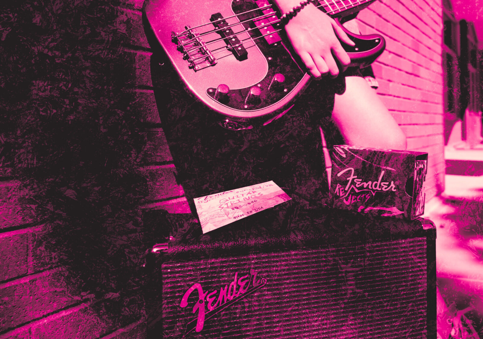
Fender Rejects comes in to fill this void of expression through heavy stylization. This theoretical line of Fender products is meant to appeal to musicians who feel that their approach doesn’t fit with a cleaner aesthetic–with musicians that would appreciate as much character and expression put into a product’s design as they put into their music. In essence, our goal was to design for the “rejects.”
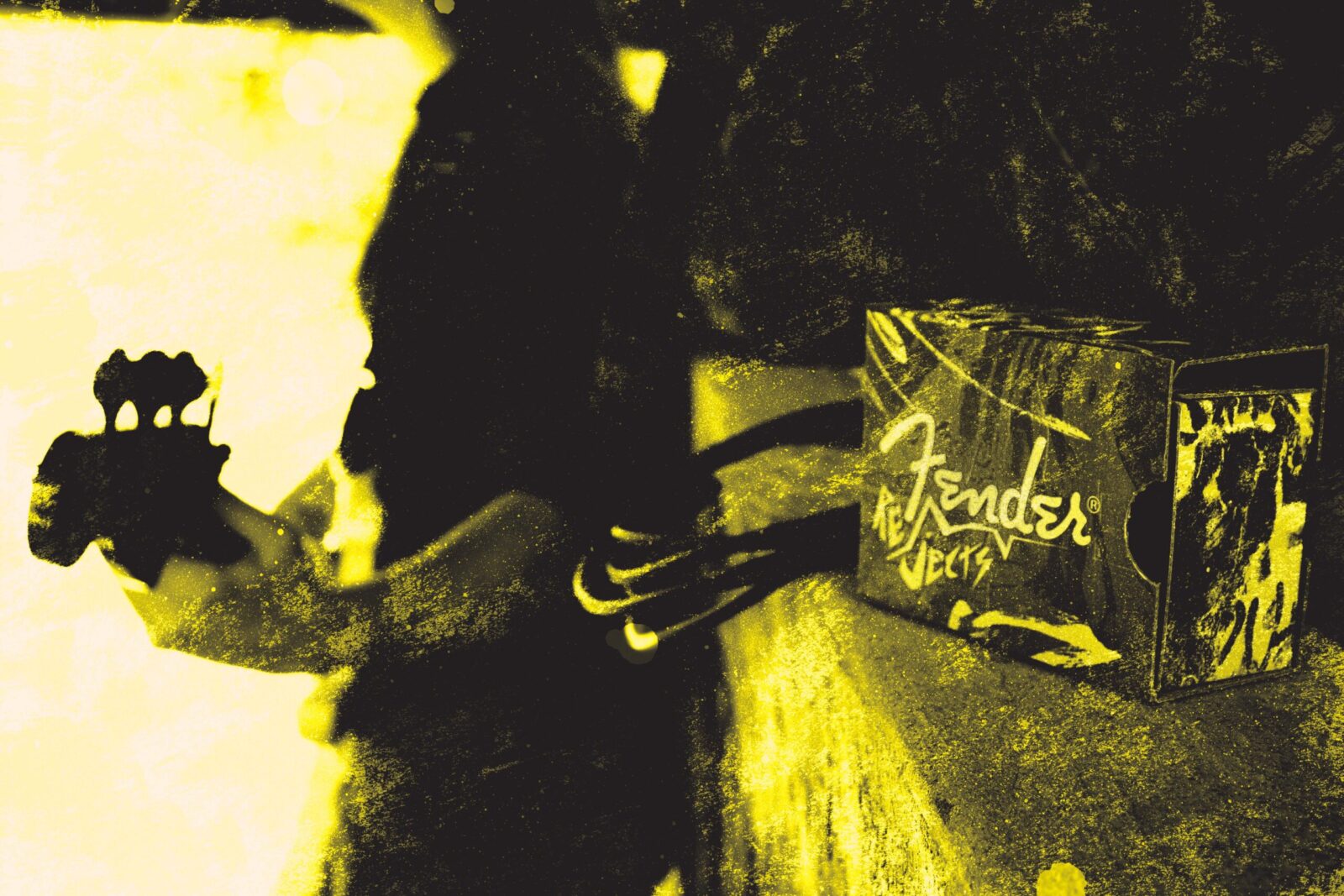
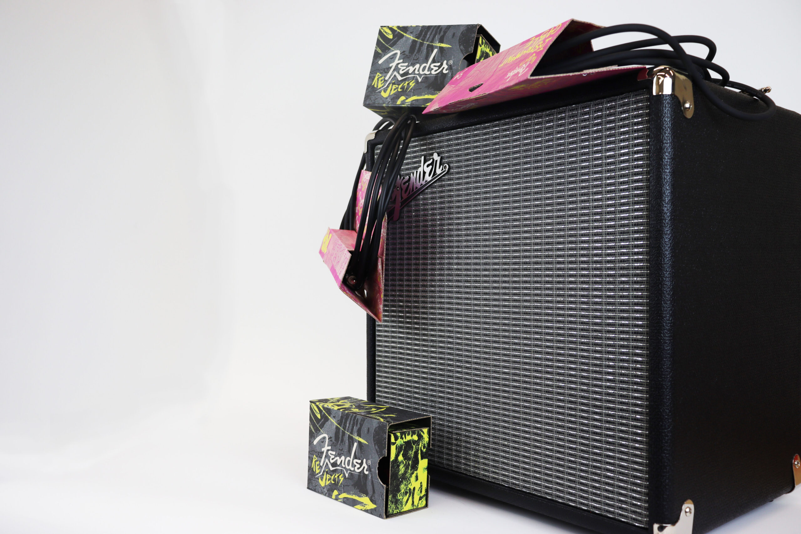
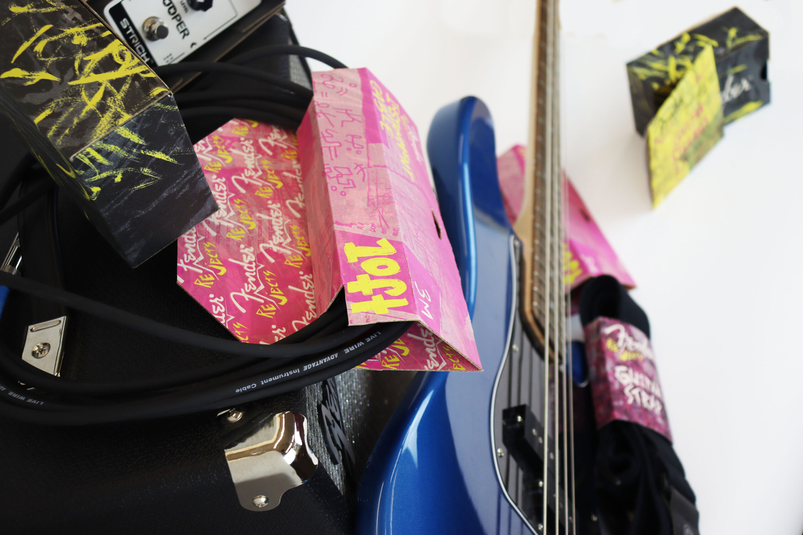
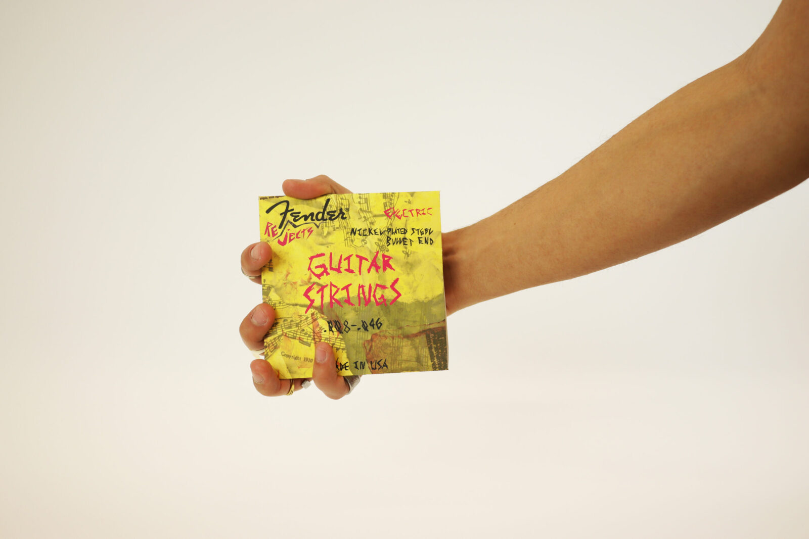
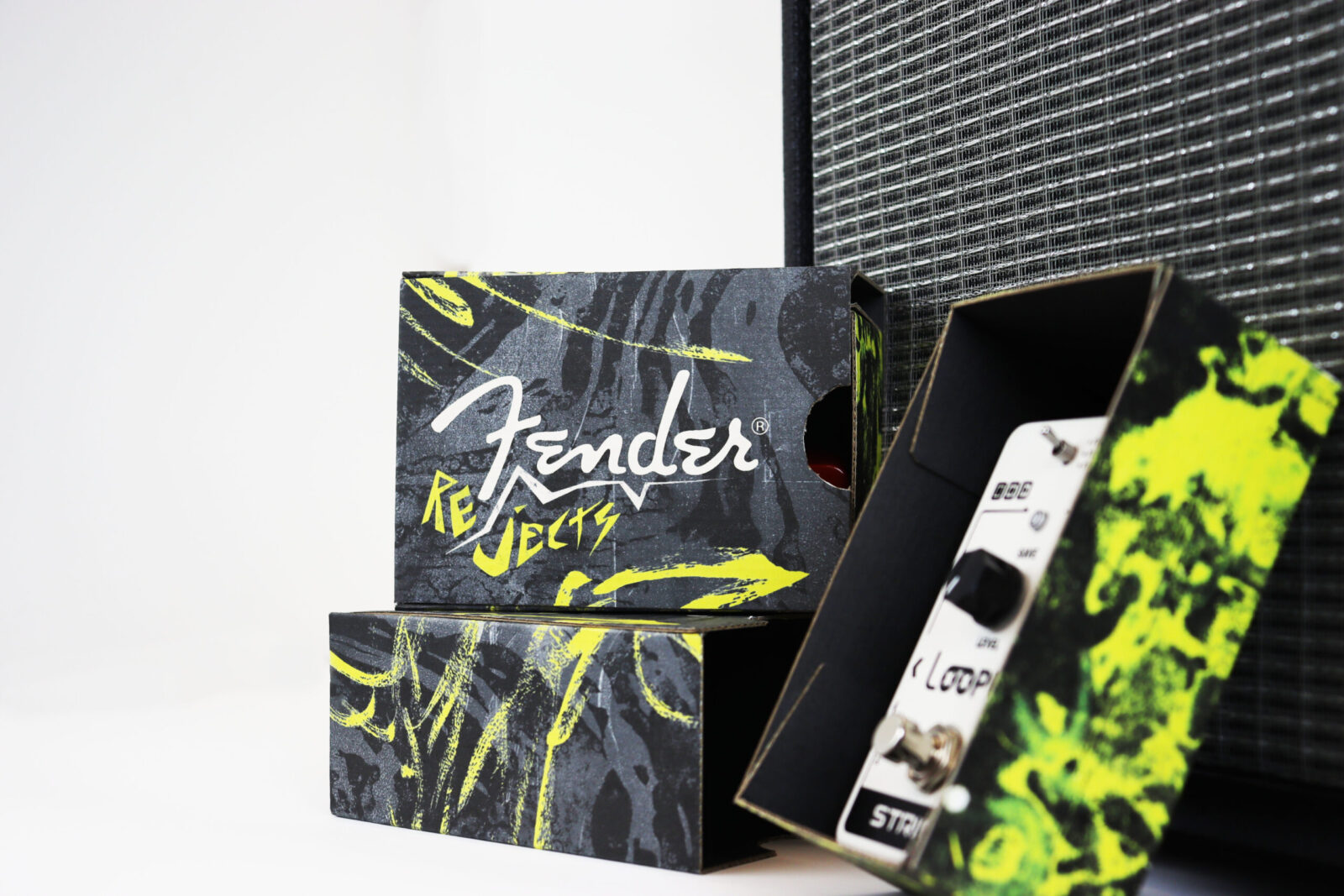
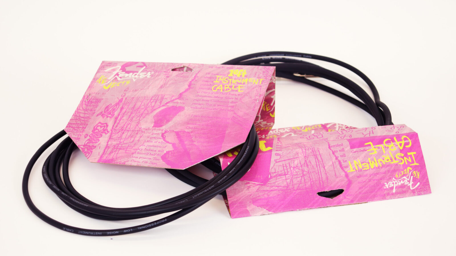
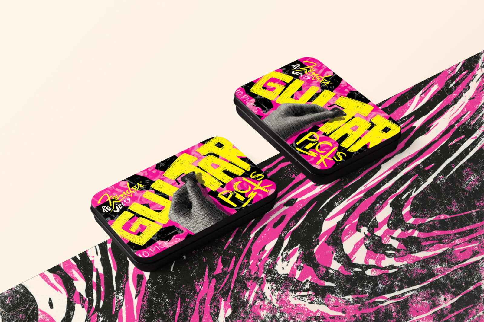
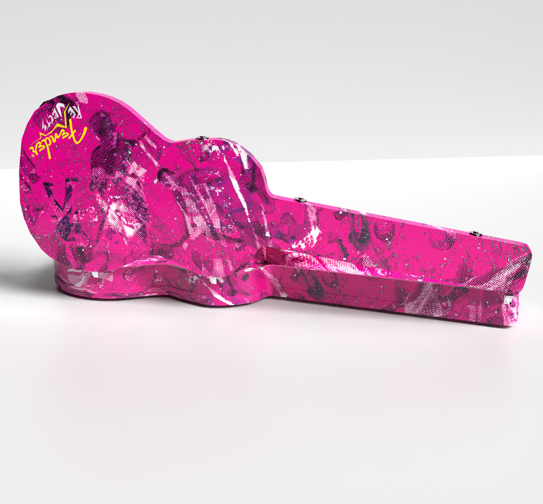
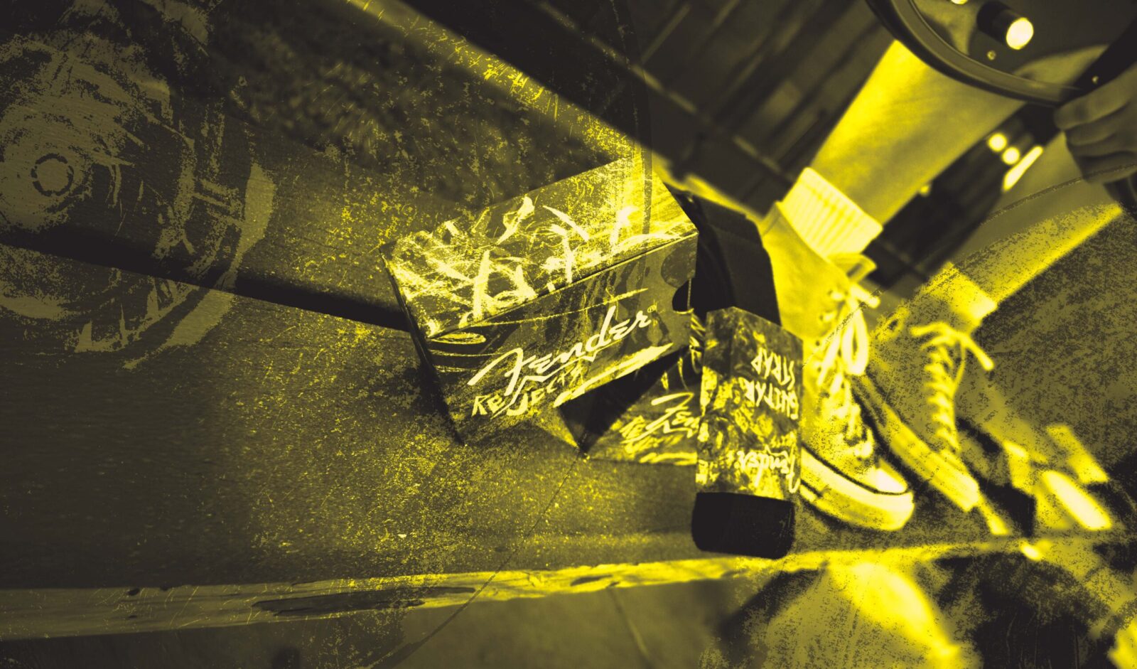
Thus was born ‘Fender Rejects,’ a project that attempted to capture both the professionalism and high-quality nature of a music brand like Fender while adding as much personality and character as possible. So our minds went to punk. Our art direction not only pulled heavily from punk art and design, but from the “do-it-yourself” ethos of punk as well. Punk as a genre is known for its rough-around-the-edges style and its authenticity, which makes it the perfect source of inspiration for a line whose purpose is to cater to the authentic.
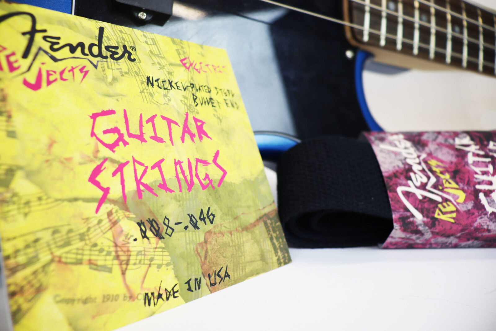
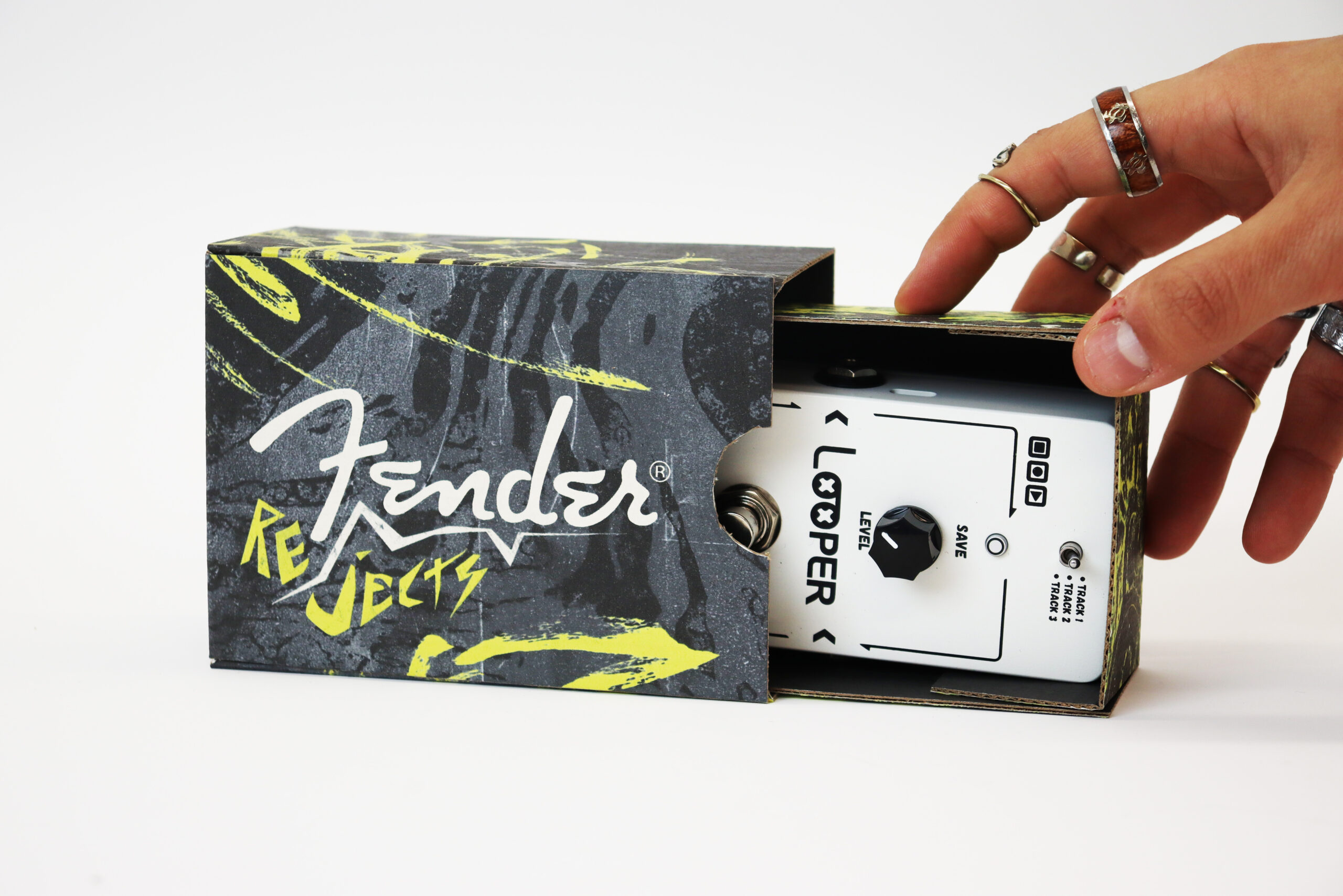
From here we really gave into the punk process by putting a strong emphasis on “hand-done” design: having all of our typography be done by hand, making textures and collages to act as imagery, and utilizing traditional printing techniques such as letterpress to enhance that authentic feel. Through this process, we embraced the idea of finding “beauty in the mess.” Traditional and hand-done methods are always going to be messy in some way, but those imperfections are exactly what make these techniques appealing.
This appeal–the beauty in the mess–is exactly what this line is meant to represent. Musicians (especially those that are early in their artistic development) are constantly wading through a deluge of musical concepts and ideas and are trying to create something beautiful from it. They, too, are trying to find beauty in the mess. And as music equipment becomes more accessible and more musicians are willing to experiment, these musicians need products that are as unique and expressive as the music that they make.
CREDIT
- Agency/Creative: Damian Cervantes
- Article Title: Students Damian Cervantes and EJ Williams’ Concept for Fender Rejects
- Organisation/Entity: Student
- Project Status: Non Published
- Agency/Creative Country: United States of America
- Agency/Creative City: Cedar City
- Project Deliverables: Art Direction, Branding, Design, Graphic Design, Motion Graphics, Packaging Design, Photography, Product Photography
- Industry: Entertainment
- Keywords: WBDS Student Design Awards 2025/26 , guitar, alternative, packaging, music, branding,


