


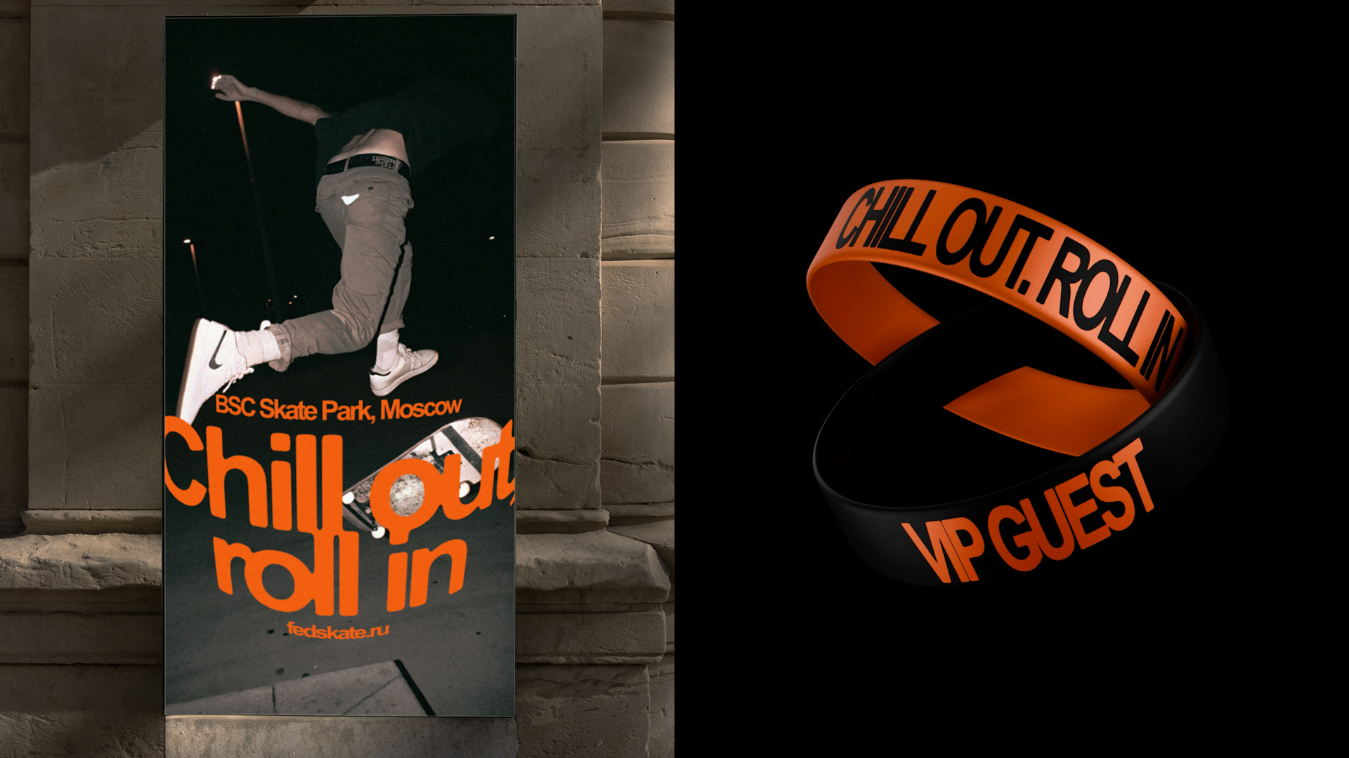
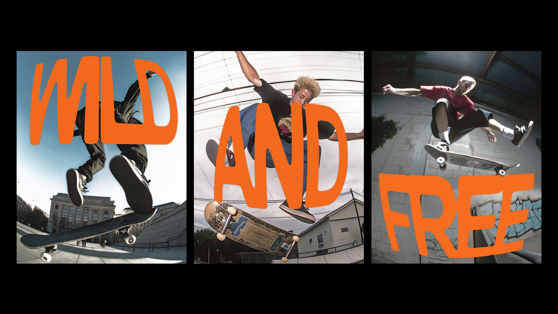
BRICS Skate Cup is the largest international skateboarding festival of the BRICS countries. Both amateurs and professionals, including international champions, come to participate in this festival. Its main values are authenticity and underground subculture, alongside with freedom of self-expression. The rebranding project combines the true subcultural character and official sportiveness and is aimed to attract amateur and professional skateboarders, as well as a young audience of viewers and visitors.
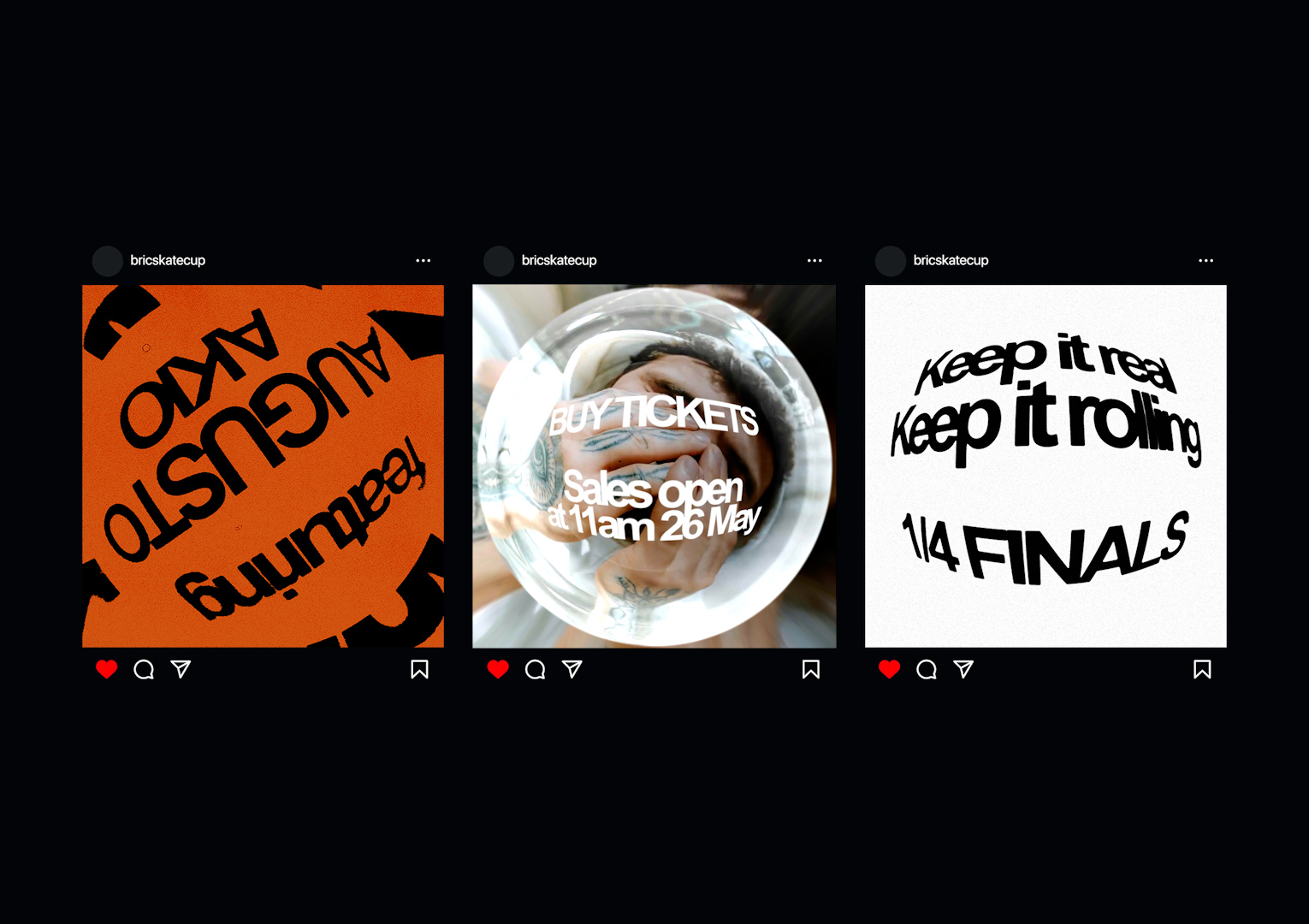
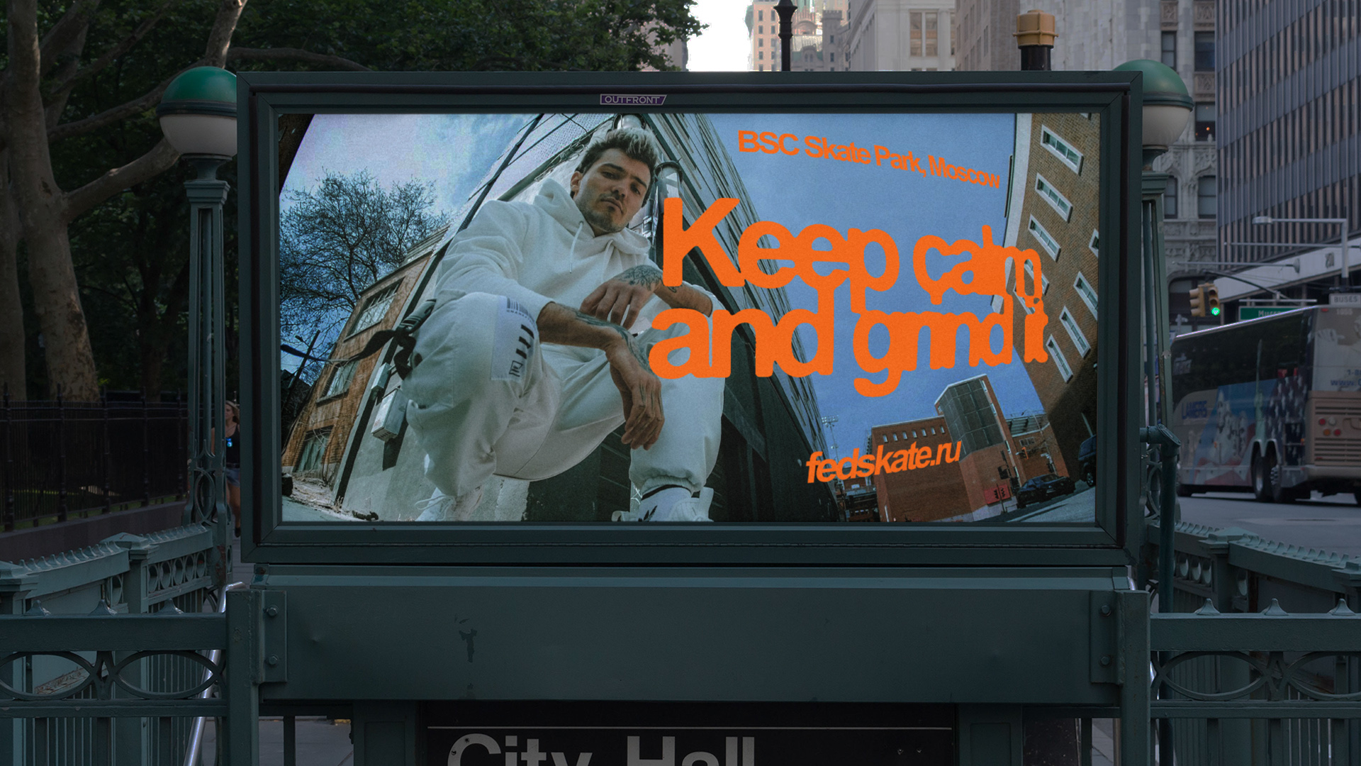
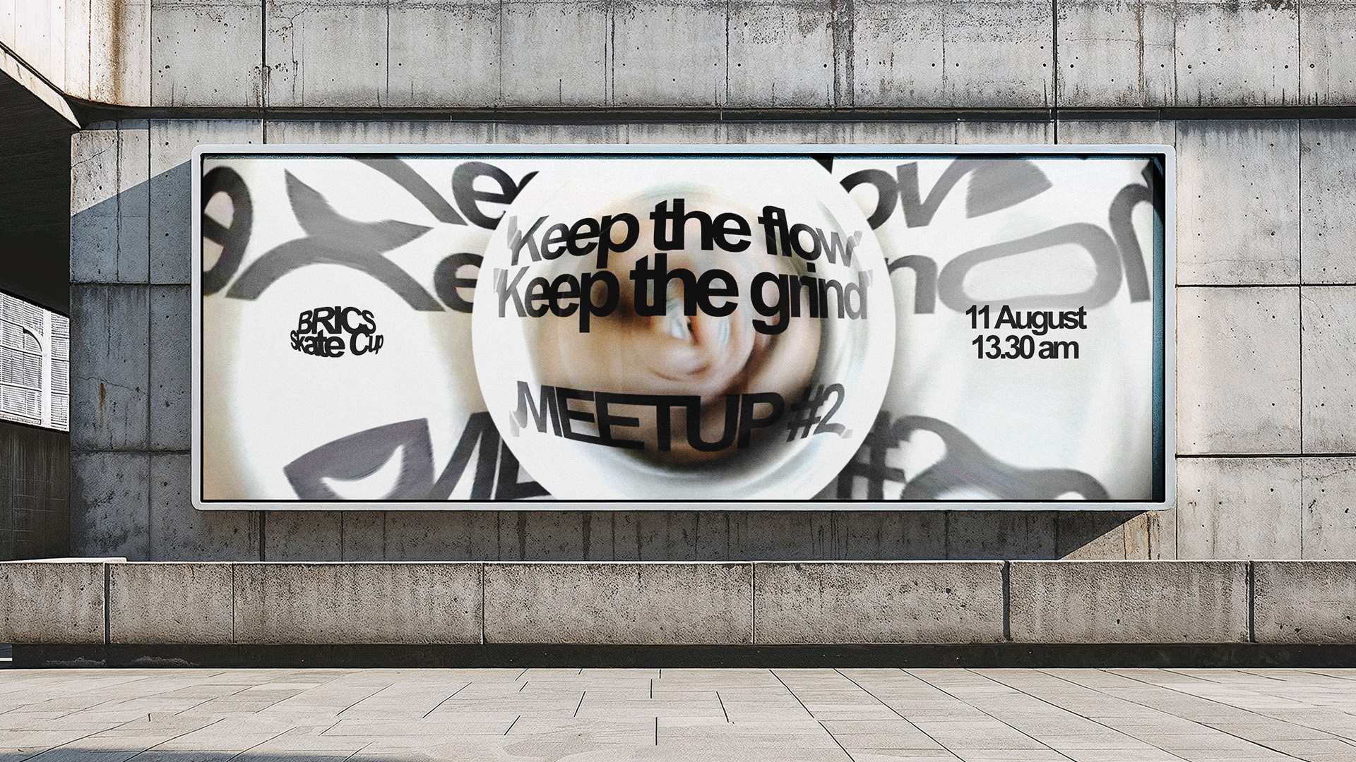
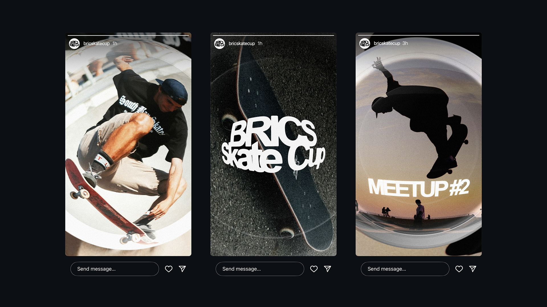
The heart of style comprises the fisheye lens. Skateboarders have been using it for centuries in their video materials, and over time it has become an unspoken symbol of the subculture. The lens is a flexible image: sometimes it appears on its own as a part of branded graphics, and sometimes its presence is implied through the distorted space in which the brand elements are placed. Even when only part of the lens is visible, its characteristic “texture” is recognizable.
A multinational focus group was brought in to develop the design strategy. In one of the interviews with two-time Olympic games participant and skateboarding legend Dallas Oberholzer, he shared that skateboarders “love to see forms that they can skate on” in design. Fisheye distorts the image in a way that it becomes “spherical”. Another participant of the focus group—Ilya Vdovin, president of the Russian Skateboarding Federation—suggested a phrase that conveys the identity of the festival: “Skateboarding in sports is what rock was in music”. This idea formed the basis of a project that aims to preserve the underground nature and authenticity of the subculture. That is the main reason why the fisheye lens is used as a style-defining element.
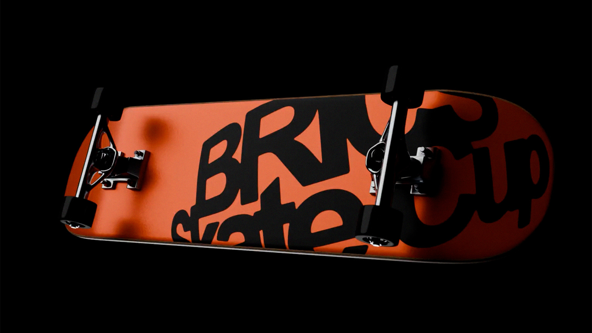
The motion design is inspired by the movements of a skateboard (e.g. by its wheels). In other cases it resembles the specific movements of an action camera with a fisheye lens in the hands of a cameraman.

CREDIT
- Agency/Creative: Konstantin Aydinov
- Article Title: Brics Skate Cup Festival Rebranding by Student Konstantin Aydinov
- Organisation/Entity: Student
- Project Type: Identity
- Project Status: Non Published
- Agency/Creative Country: Russia
- Agency/Creative City: Moscow
- Market Region: Global
- Project Deliverables: 2D Design, 3D Design, 3D Motion, Advertising, Brand Design, Brand Identity, Brand Redesign, Graphic Design, Identity System, Logo Design
- Industry: Entertainment
- Keywords: WBDS Student Design Awards 2025/26 , skateboarding festival rebranding identity BRICS
-
Credits:
Designer: Konstantin Aydinov
Art director: Natalia Burdenkova


