


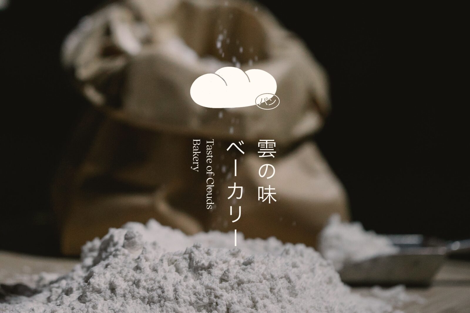
Taste of Clouds Bakery 雲の味ベーカリー
Taste of Clouds Bakery is a brand inspired by the delicate textures and sensory nostalgia of Japanese bread. Unlike the dense, mass-produced bread commonly found in North America, Japanese bread is known for its airy softness, subtle sweetness, and meticulous craftsmanship. The goal of this branding is to translate that sensory experience into a visual identity—where even before taking a bite, customers can feel the lightness, structure, and refinement of the bread itself.
The name “Taste of Clouds” reflects the weightless, dreamlike softness of Japanese bread, evoking both the fleeting beauty of a passing cloud and the deep-rooted nostalgia of familiar flavours. The brand takes inspiration from cloud formations, using them as a storytelling device to distinguish its product range:
• Fluffy white clouds (original bread) – classic and comforting.
• Warm-hued sunrise clouds (red bean bread) – rich, nostalgic, slightly sweet.
• Heavy storm clouds (rye bread) – deeper, darker, denser.
• Sharp thunderclouds (yuzu bread) – vibrant, citrusy, and bold.
The visual identity of Taste of Clouds Bakery is built on contrast and harmony, balancing softness with structure, airiness with intention. The Latin typography is rounded and delicate, reinforcing the bread’s gentle textures, while the Japanese typography is more angular and precise, reflecting the technical skill behind traditional baking. This juxtaposition mirrors the product itself: bread that is soft to the touch yet requires meticulous skill to perfect.
The colour palette is directly inspired by clouds, capturing their lightness, shifting hues, and fleeting presence. White and blue form the foundation, mirroring the soft, ever-changing nature of the sky. Gold accents add a refined touch, elevating the simplicity of the palette while reinforcing the artistry and attention to detail behind the brand.
Beyond visuals, Taste of Clouds Bakery’s identity is a full sensory experience. It is designed to present the brand beyond a logo or packaging. From the delicate balance of softness and structure to the way flavours are reflected in design, every detail is crafted to be felt as much as it is seen. It is an atmosphere, a memory, and an invitation to experience the essence of Japanese baking.


CREDIT
- Agency/Creative: Ange Chuang
- Article Title: Creative Ange Chuang Introduces Taste of Clouds Bakery with a Dreamlike Japanese Bread Identity
- Organisation/Entity: Creative
- Project Status: Non Published
- Agency/Creative Country: Canada
- Agency/Creative City: Vancouver
- Project Deliverables: 2D Design, Advertising, Art Direction, Brand Creation, Brand Design, Brand Identity, Brand Naming, Brand Strategy, Branding, Creative Direction, Design, Graphic Design, Illustration, Logo Design, Packaging Design, Poster Design, T-Shirt Design
- Industry: Food/Beverage
- Keywords: WBDS Creative Design Awards 2025/26 , Japanese, bakery, bread, branding, sensory, packaging, identity, clouds, minimal, refined, soft, textures, nostalgia, cultural, storytelling, contrast, typography, edible, experience, artisanal, flavour, concept, design, visual, delicate, emotive, atmospheric, modern, crafted, elevated


