Revel Brand Design – Four In Hand California Red Wine
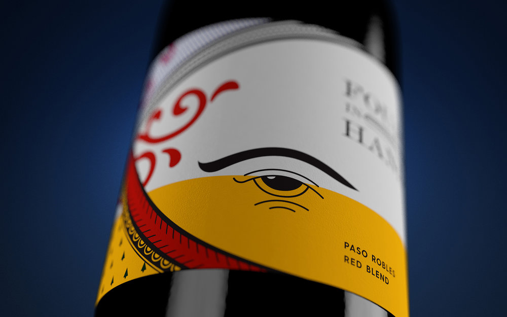
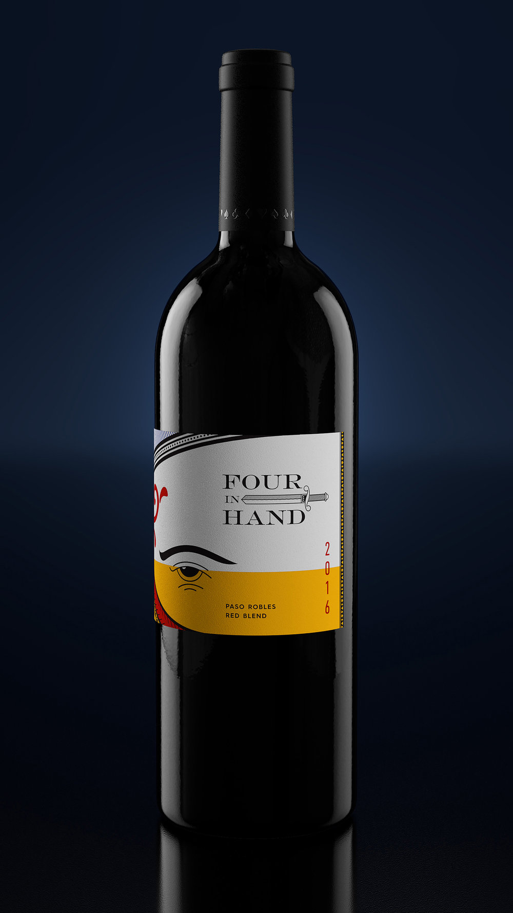
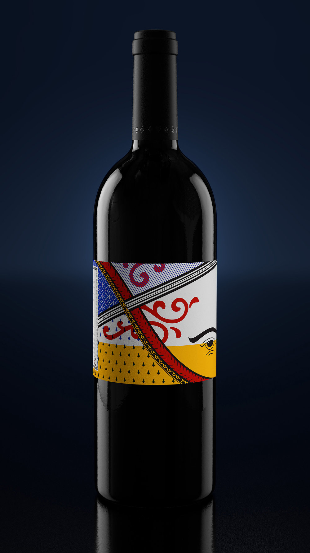
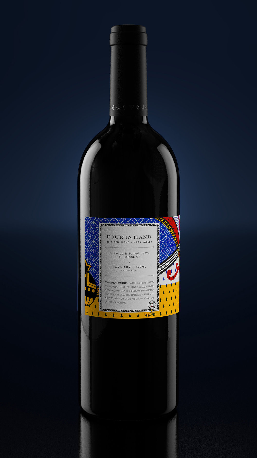
We were tasked with redesigning the existing label for Four In Hand wine, a California Red Blend. The client was interested in exploring a masculine and modern look that nodded to playing cards and parlor games. We delivered a variety of concepts, with one of them winning out – however, we still have not been able to forget this label. The concept of this label deconstructs a playing card in a surrealist way. We wanted to rearrange the normal visual hierarchy of a playing card to celebrate graphic elements in card artwork that often go unnoticed. The color palette is bold, primary and unique for the wine space. There is also an asymmetrical wrap on where the label begins and ends – creating a visual mystery that urges you to pick this wine up off the shelf and explore deeper.


CREDIT
- Agency/Creative: Revel Brand Design
- Article Title: Label Concept Design for California Red Wine
- Organisation/Entity: Agency Concept, Non Published
- Project Type: Packaging
- Agency/Creative Country: United States America
- Market Region: North America
- Format: Bottle
- Substrate: Glass, Pulp Paper


