


Challenge:
Agri Food is one of Uzbekistan’s largest exporters of legumes, supplying thousands of tons of red kidney beans and moong beans to international B2B clients. With ambitions to scale beyond bulk supply and increase product value, the company decided to transition into the European retail market under its own consumer-facing brand.
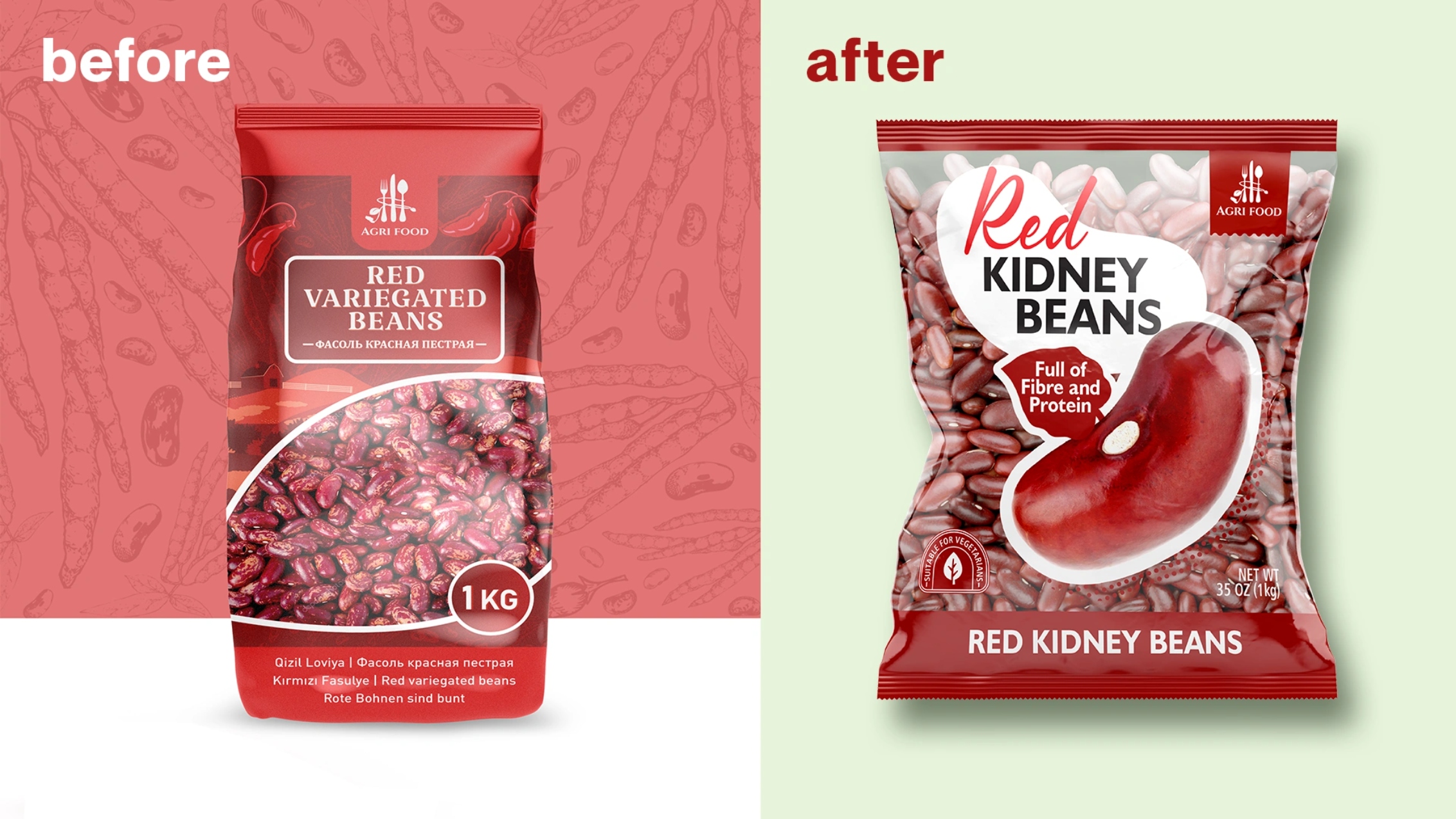
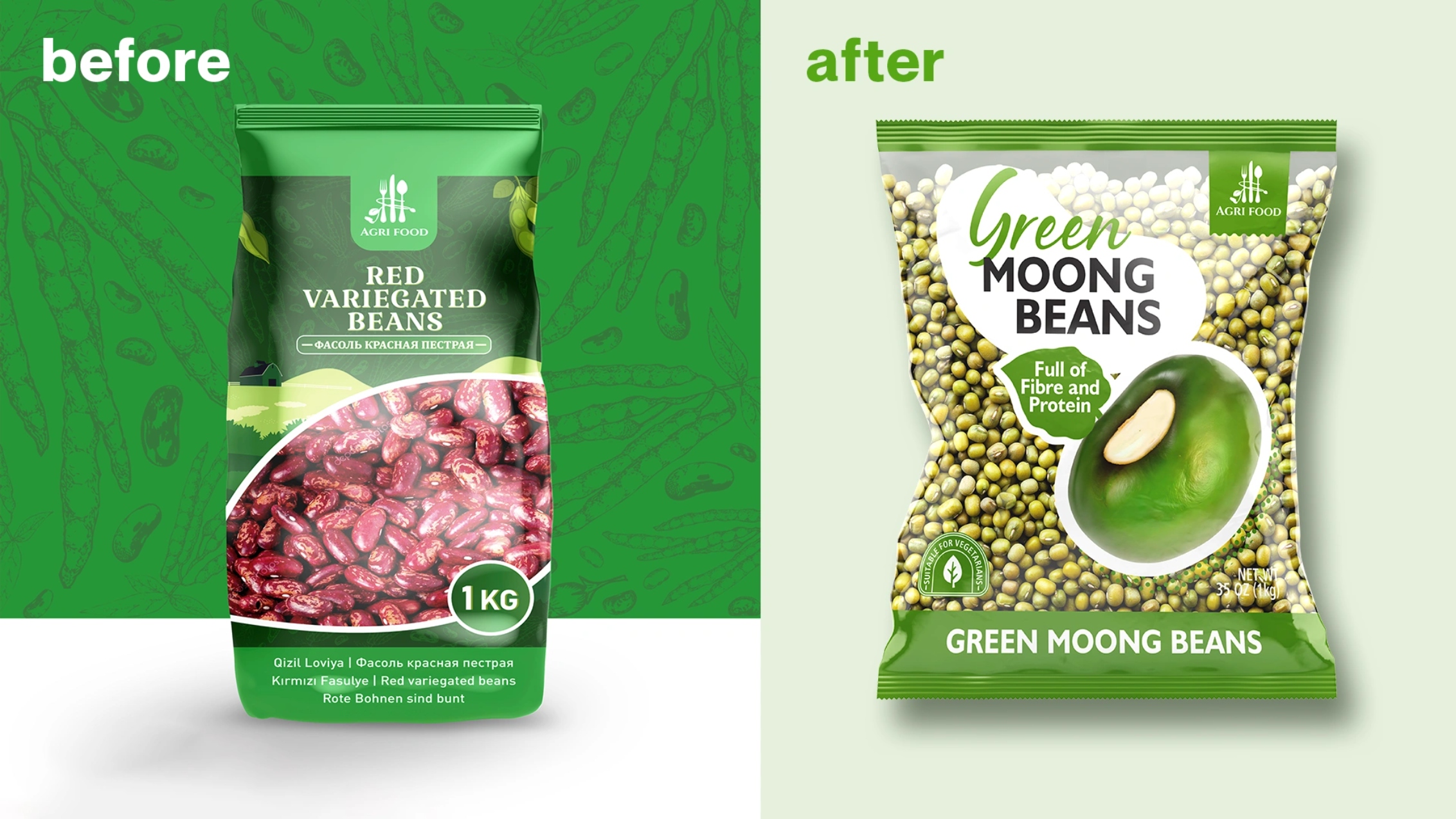
However, the existing packaging was designed for local markets — overloaded with multilingual text, visually outdated, and unsuitable for the expectations of UK and German consumers. Our task was to create a European-ready packaging system that would allow Agri Food to confidently enter competitive supermarket shelves and stand alongside established retail brands.
Research & Insights:
Shelf audits in the UK and Germany revealed two dominant, but flawed, packaging types in the category: “Blind” Packaging — opaque boxes/pouches hiding the product entirely, forcing buyers to trust the brand. “No-Name” Bags — low-cost transparent bags presenting legumes as raw commodities, lacking brand value and quality cues.
European consumers, however, reward honesty, sustainability, minimalism, and product visibility. This led to a key insight: Do not hide the product — elevate it. Let the beans themselves become the core of the design.
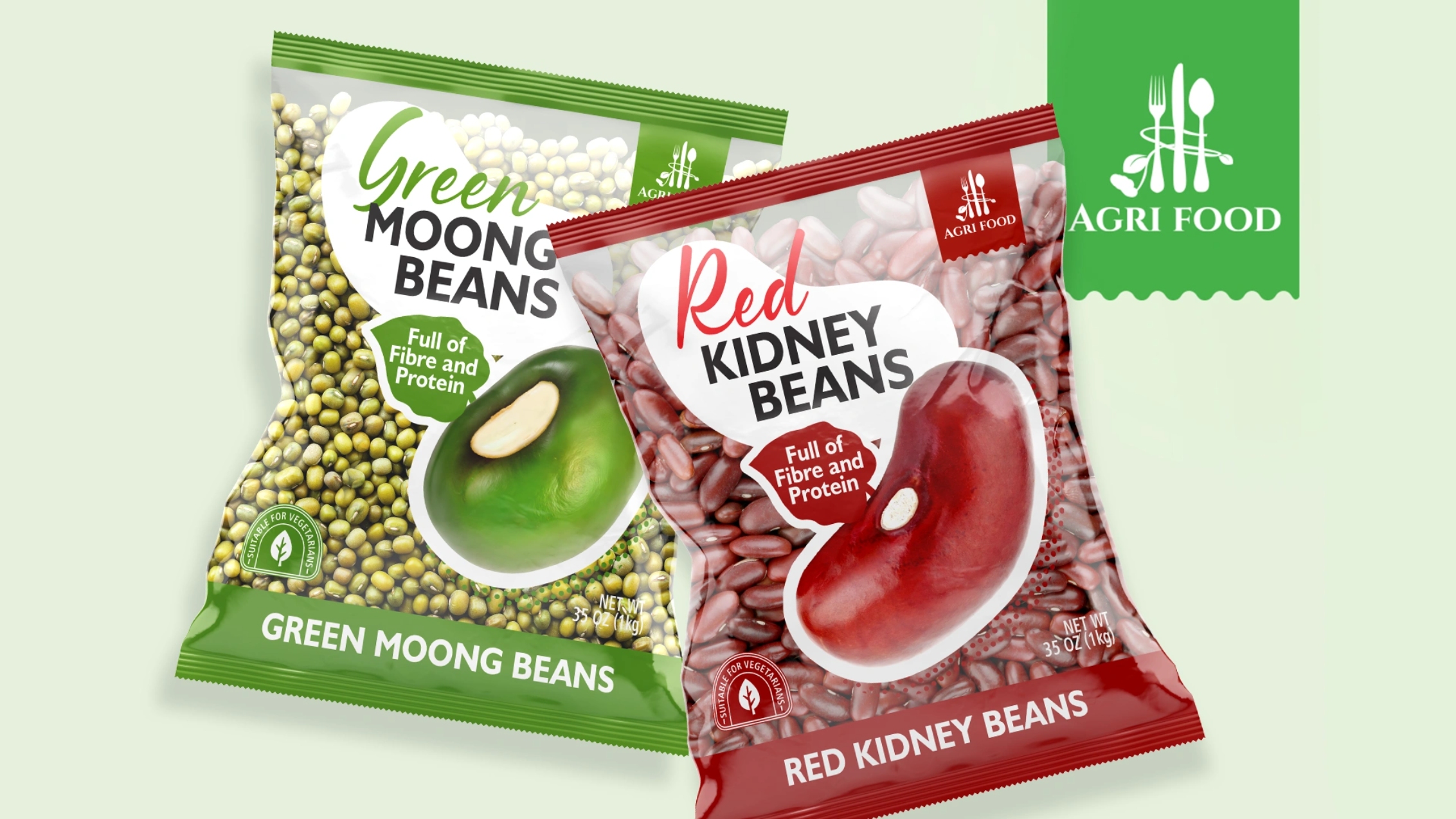
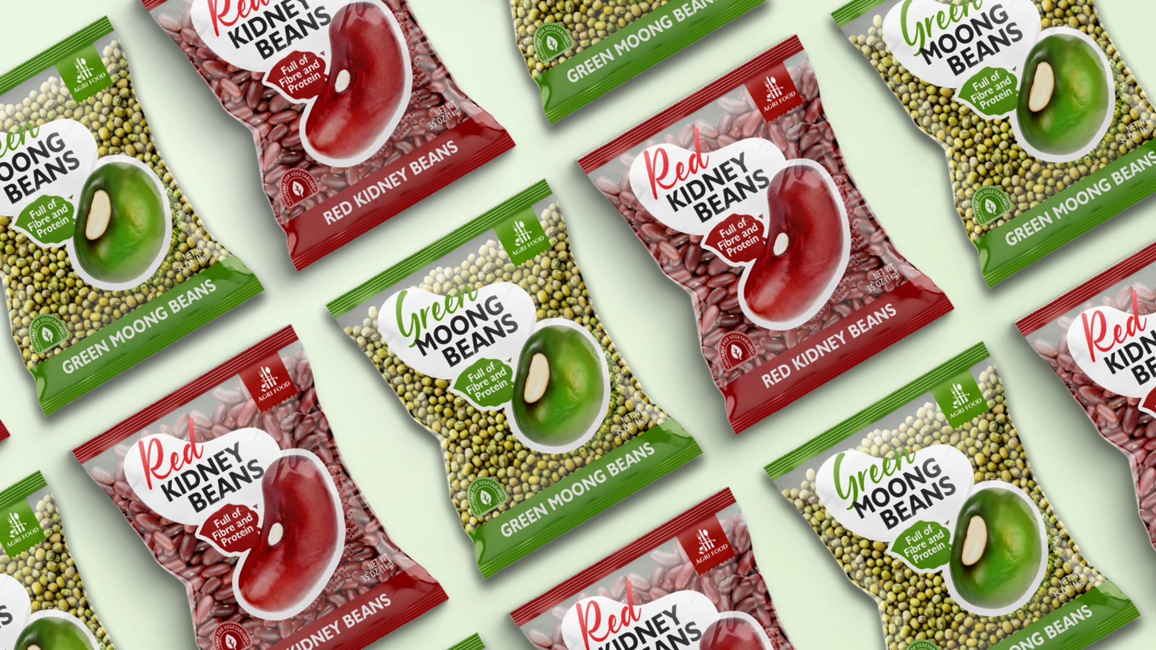
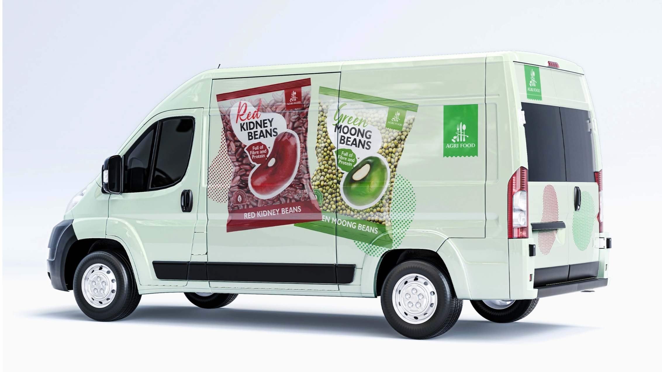
Creative Solution: We created a clean, minimalist, European-style visual identity built around the product as the hero.
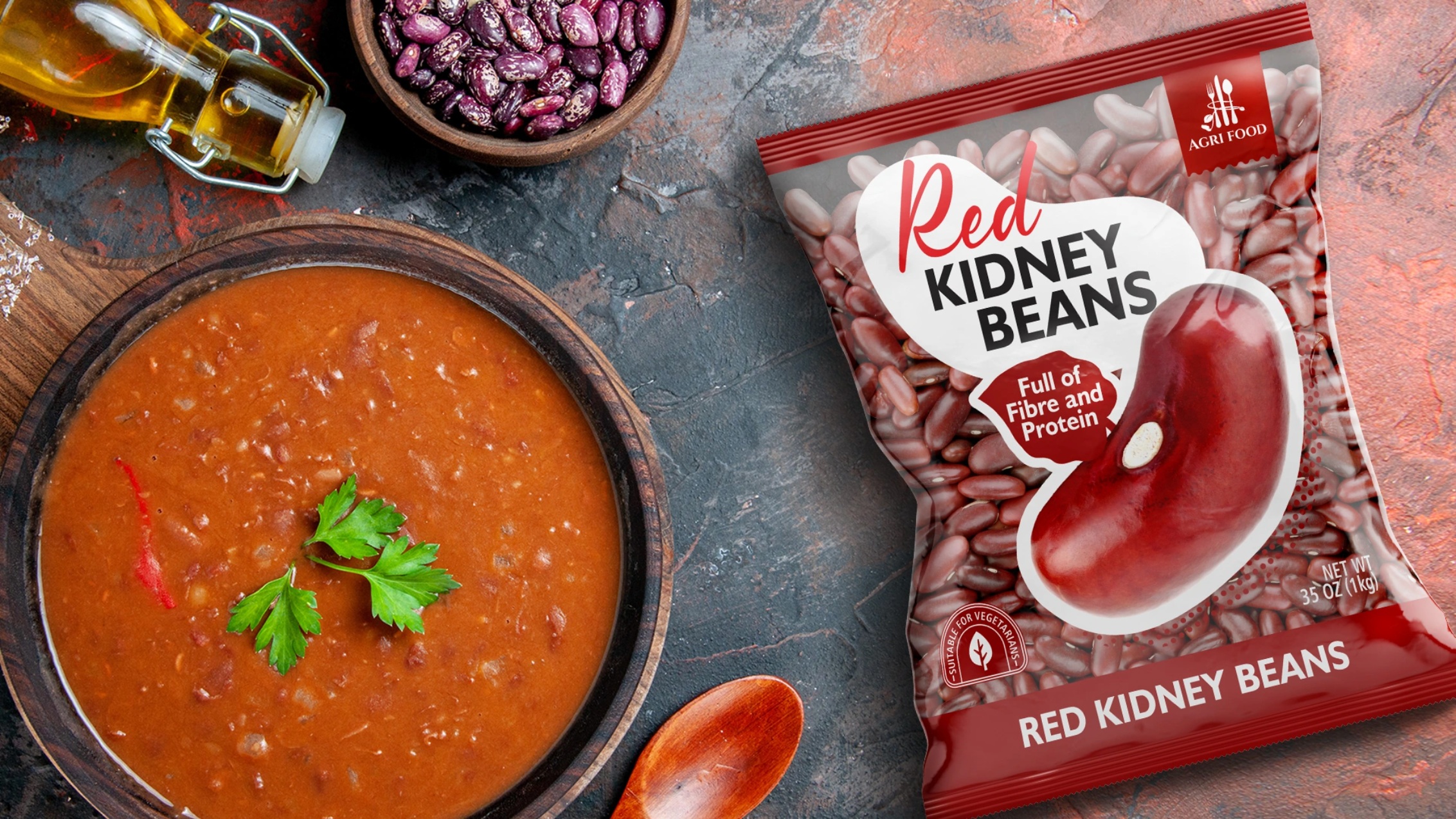
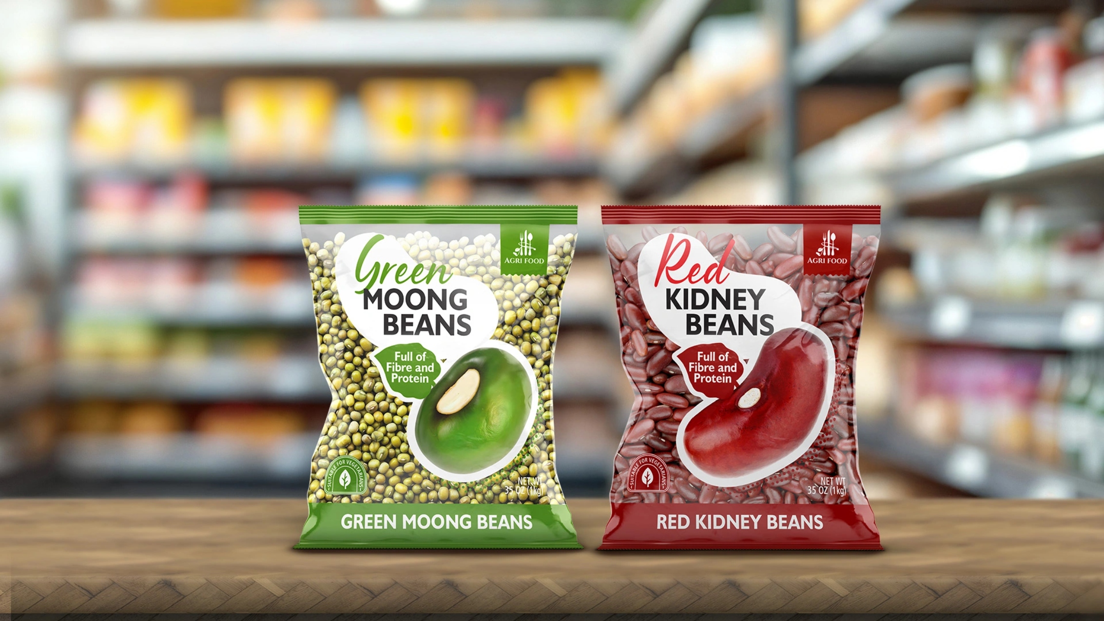
Barrier-Free Transparency
Nearly the entire front face is transparent, showcasing 100% of the product. This creates immediate trust and highlights the natural quality of Uzbek-grown legumes.
Floating Central Label
A modern branding device that organizes all key information — logo, name, product features — without covering the beans. This label provides structure and clean hierarchy.
Typography for European Consumers
Soft, natural handwritten-style type for product names.
Clean sans-serif fonts for nutritional triggers:
“Full of Fibre and Protein”
“Suitable for Vegetarians”
Appetizing Photo Zone
Each SKU features a realistic, mouth-watering illustration of the legumes in cooked form, helping with flavor recognition and shelf standout.
Results:
The new packaging elevated Agri Food from a raw commodity supplier to a retail-ready, trust-driven B2C brand. The product now aligns with European aesthetics and consumer expectations, enabling the company to enter negotiations with distributors in the UK and Germany with confidence. This project marked a strategic shift toward value-added export branding — transforming Uzbekistan’s agricultural potential into a globally competitive product.
CREDIT
- Agency/Creative: Minim Design Agency
- Article Title: Agri Food – European Packaging Design for Pulses from Uzbekistan by Minim Design
- Organisation/Entity: Agency
- Project Type: Packaging
- Project Status: Published
- Agency/Creative Country: Uzbekistan
- Agency/Creative City: Tashkent
- Market Region: Asia
- Project Deliverables: Brand Identity, Packaging Design
- Format: Flow-Pack, Wrap
- Industry: Food/Beverage
- Keywords: Packaging Design, Pulses, Legumes, Minimalism, Transparent Packaging, European Retail, Export Branding, Food Packaging, Retail Shelf Impact, Uzbekistan, B2B to B2C Transition, Clean Design, Healthy Food
-
Credits:
Agency: Minim Design


