


Rugby TV has been the dedicated home of Georgian rugby since 2016, broadcasting matches and rugby content to fans across the country. For years the channel played a key role in shaping how people experienced the sport, but its visual identity never fully matched the passion on the field. In 2025, Rugby TV partnered with Vice Versa to build a new brand from the ground up – one that felt bold, fast and modern, and could live confidently across TV, digital and social platforms.
This project was led by Vice Versa’s head of design, Tanitta Gongadze, and developed over several months from summer to November 2025. From the beginning, the goal wasn’t to “refresh” a logo or polish a few screens. The previous branding was almost non-existent as a system: outdated graphics, little consistency and no clear personality. The task was to create a complete visual identity that would finally give Rugby TV its own soul and a recognisable voice in the world of sports media.
The starting point was to understand what Rugby TV means for its audience. The channel speaks to hardcore fans who follow every tackle and statistic, but also to casual viewers who tune in for big matches and national team moments. The identity needed to respect both: excited enough for dedicated supporters, and clear enough for anyone who might be seeing a rugby broadcast for the first time. That balance between emotion and information became a key guideline for every design decision.
The strategy centred around one simple idea: rugby as pure entertainment. On screen, the brand should feel as dynamic as the game itself. On top of that, it had to be practical. Scores, schedules and match information had to be instantly readable on a TV screen, a phone, a social media feed or a poster in the street. Eyes should be entertained, but never confused. The brand had to stand out, look serious and official, and still keep that feeling of speed and impact that defines rugby.
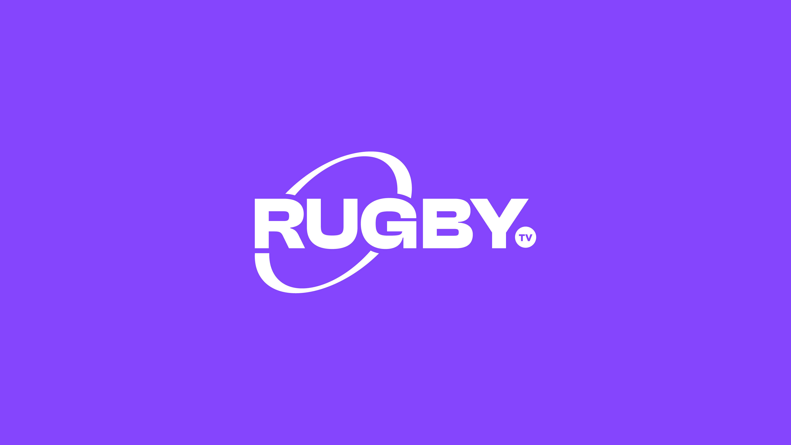
One of the most important decisions was to move from a symbol-based logo to a clean wordmark. With a direct name like “Rugby TV”, the identity didn’t need a complex emblem to explain itself. Instead, the logo focuses on clarity and legibility. The new wordmark is minimal, bold and straightforward, designed to be instantly understood at any size. On a busy broadcast graphic or a small social avatar, viewers should be able to read it in a split second and immediately know what they are watching. The construction avoids unnecessary details so it remains strong even in fast-moving on-air situations.
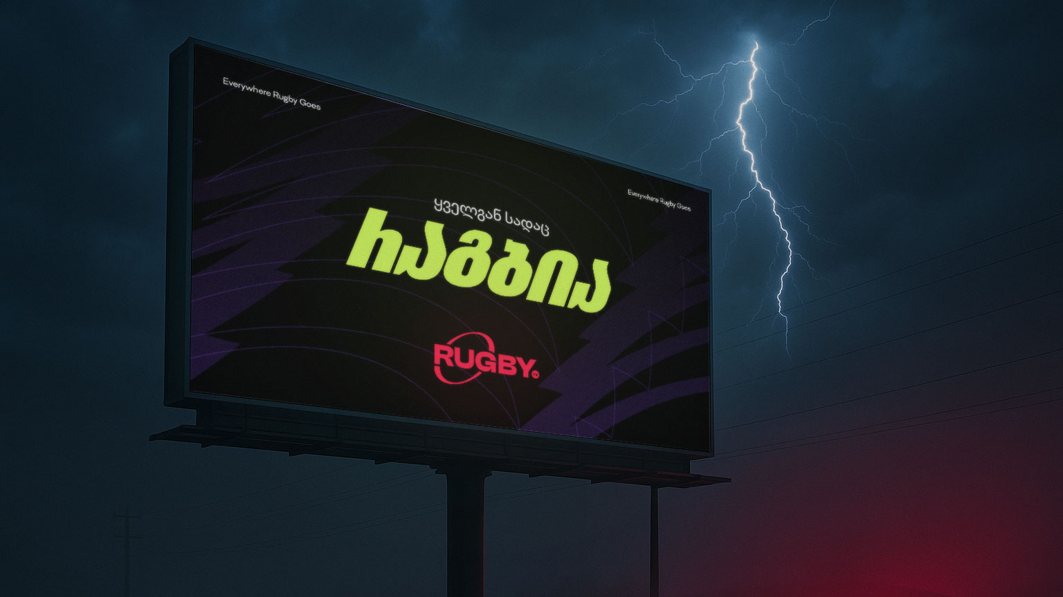
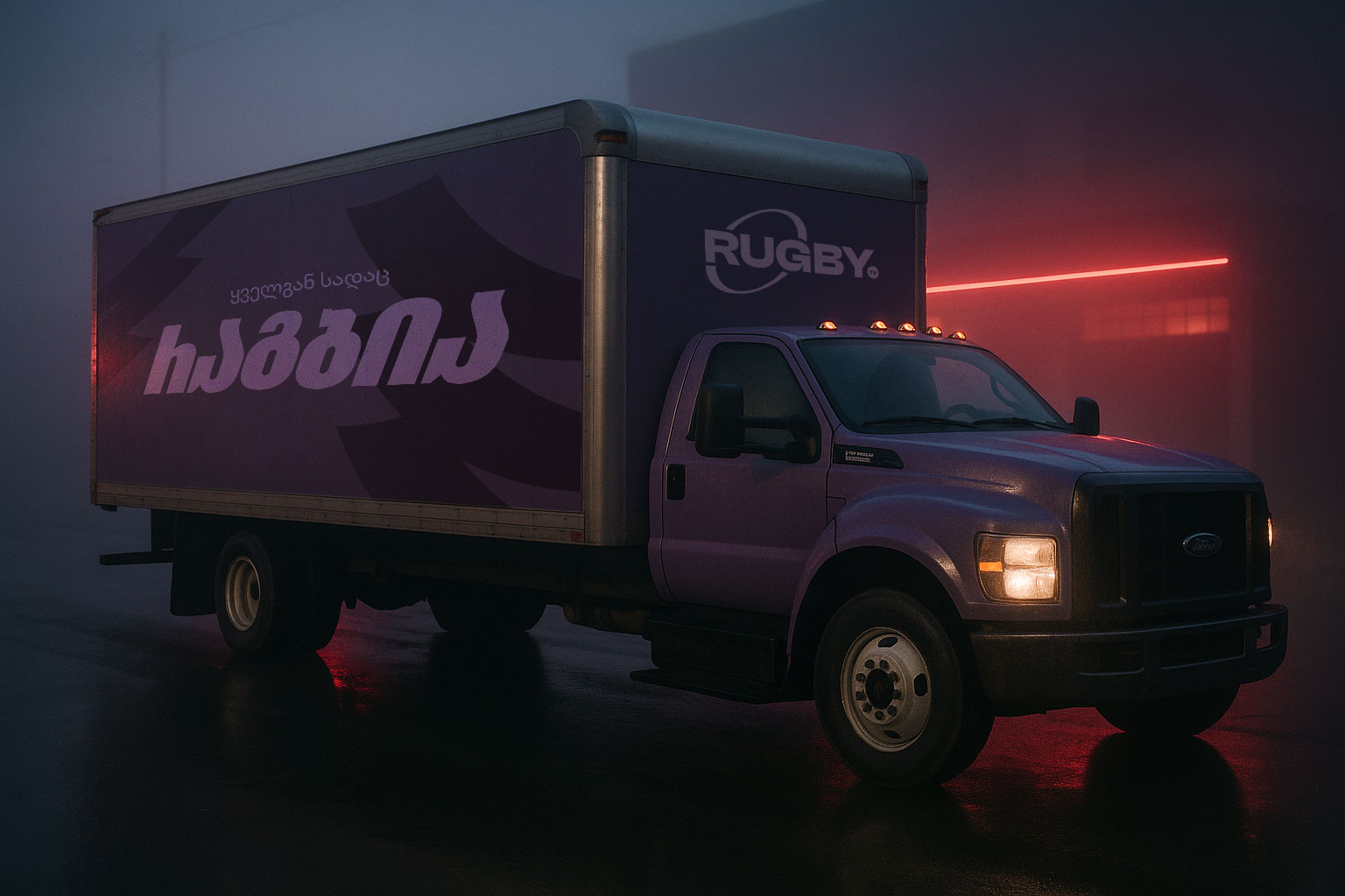
While the logo brings simplicity, the brand’s personality comes through a key graphic element that runs through the entire system: the motion path. This curved, dynamic shape traces the trajectory of a rugby ball and becomes the signature pattern of the identity. It appears in different scales and compositions – sometimes as a large background gesture, sometimes as a framing element around images and text. Overlapping, rotating and cropping it creates rhythm and movement across layouts, tying together every application under one recognisable visual language.
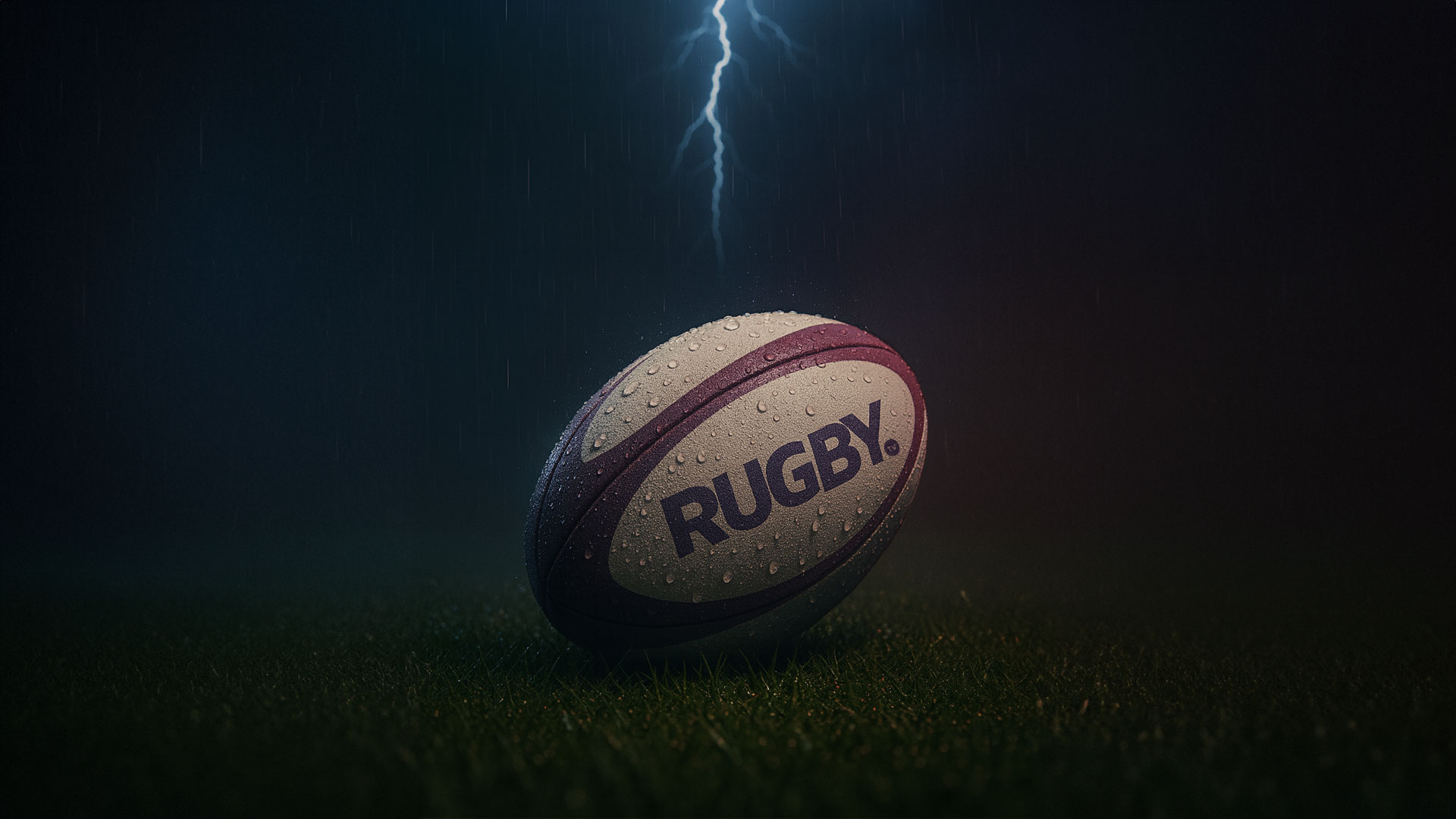
Visually, the motion path also has a second reading. When used at sharper angles or repeated, it begins to resemble a lightning bolt, adding a sense of thunder, power and explosive speed. This dual meaning makes the element feel both conceptual and emotional: it represents the path of the ball in play, but it also stands for the energy and intensity of rugby itself. Whether it is used softly in the background or aggressively in the foreground, the purple shape is always there as a sign of Rugby TV.
Because this element is so central, it was designed to work in multiple colors and settings. In some layouts it appears in the core purple, in others it picks up accent colors from the palette to create depth and variety. It can behave like a highlight, a divider, a container or a full pattern. This flexibility allows the brand to stay consistent without becoming repetitive: the exact same shape can feel calm on one page and explosive on another, depending on how it is cropped and combined with typography and imagery.
The color palette was built with digital-first impact in mind. The identity uses strong, saturated tones that cut through the noise on screens and feel different from what other sports channels are using. Instead of safe, conservative colors, Rugby TV adopts a bolder mix designed to stand out in feeds, apps and live broadcasts. The main purple works as a hero color for the motion path and key highlights, supported by high-contrast secondary colors that keep information readable and striking. The palette is carefully chosen so text remains legible over imagery and graphics, especially in fast-moving TV environments.
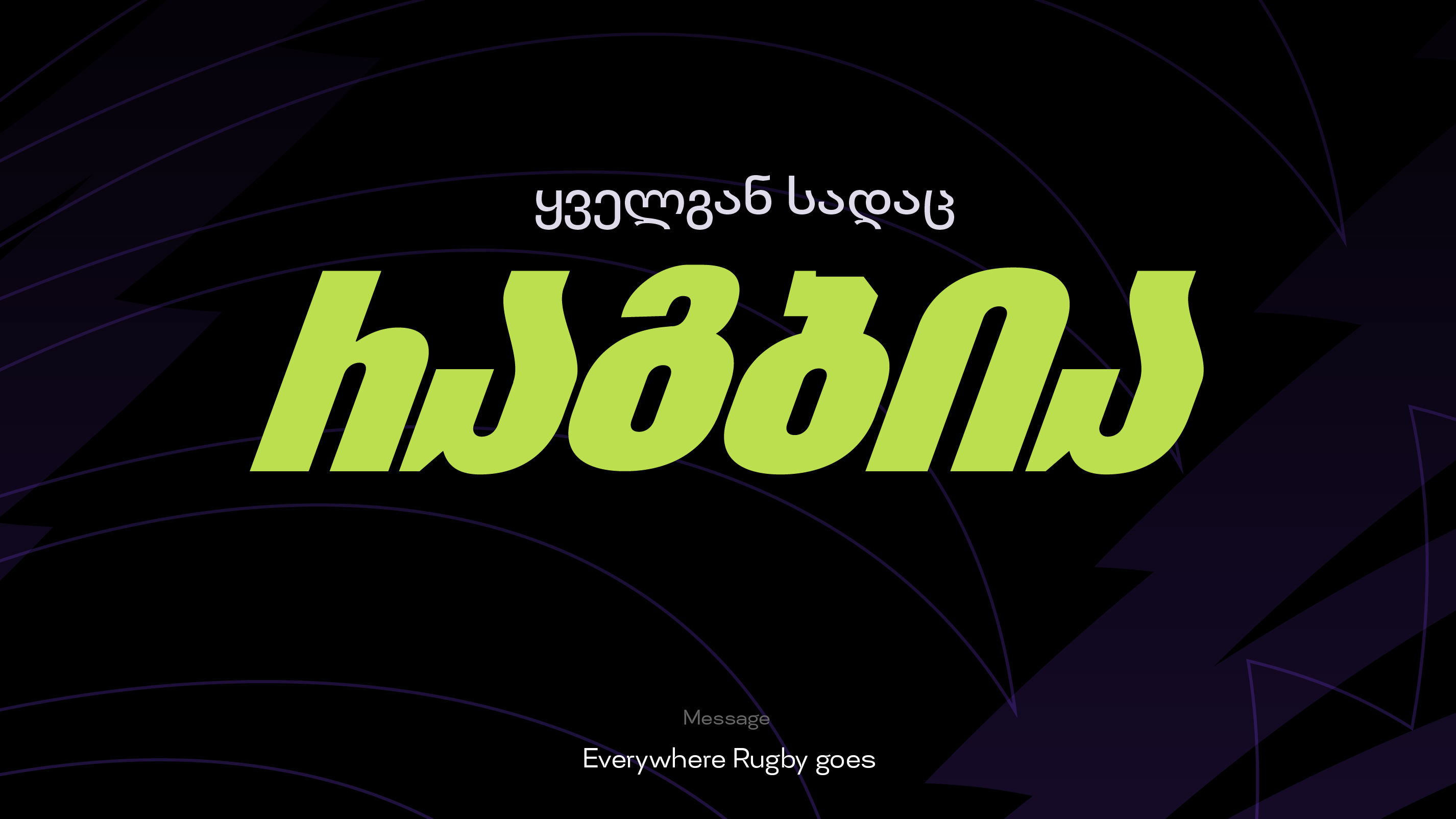
Typography plays a crucial role in making the system informative and fast. The type choices are bold, clear and highly readable, with a straightforward structure that keeps everything easy to scan. Strong hierarchy between headlines, match details and supporting text helps the viewer understand what matters first. In match announcements, the team names and dates are oversized so viewers can understand the essentials in a moment, whether they see the layout on a phone or across a street. In social and schedule graphics, the typography stays consistent and structured, creating a stable grid that supports the more expressive motion-path shapes.
To support that, a modular layout system was built around simple grids and clear margins. Each component – logos, scores, teams, dates, channels, sponsors – has a defined place, which makes it easier to build new graphics while staying on-brand. Designers and content teams can change information quickly without breaking the visual logic. This system thinking is essential for a channel that has to communicate many matches, tournaments and updates throughout a season.
The identity really comes to life in application. On social media, templates are built to be quick to use and hard to miss. The motion path frames scores, fixtures and player highlights, while bold typography keeps information clear and direct. The layouts are designed to work as a system: change the image, update the numbers and copy, and the post is ready without losing the Rugby TV look. This balance of flexibility and consistency is key for channels that publish content at a high pace and in multiple formats.
Match announcement posters bring the brand into both urban and digital environments. Oversized typography, player photography and the motion-path pattern focus attention on the essentials: who plays, when and where. The compositions are minimal but powerful, using color blocks and the purple curve to create tension and movement. These posters are meant to work from a distance in metro stations, stadium surroundings or busy streets, but also as assets adapted to online banners and stories. One visual language can jump from a large print surface to a small screen without losing impact.
The upcoming fixtures are presented as bold schedule cards that are easy to scan. Large dates, clear team pairings and simple icons make sure viewers can quickly understand the next matches. Active and inactive states help highlight the most relevant game while still showing the full schedule. This system is designed to adapt across platforms – from web and mobile to social carousels and TV graphics – always staying readable and on-brand. Even when there is a lot of information, the hierarchy remains clear.
Beyond these hero applications, the identity is designed to extend into any touchpoint Rugby TV might need, from on-air overlays to promotional materials. Because the core elements are simple – a wordmark, a motion path, a bold palette and a clear typographic system – they can be rearranged and scaled without losing recognition. The same ingredients can build a calm information screen, an energetic highlight reel frame or a serious news-style announcement.
Throughout the project, the focus was on building an identity that doesn’t just look good in static mockups, but can truly live in motion and in real-world situations. That means clean shapes, strong contrast and layouts that can survive different kinds of content, from high-energy action shots to simple text-only information. The Rugby TV brand has to work hard every day: live broadcasts, quick updates, last-minute scores, news and long-form content. The new system gives the channel tools that are strong enough to handle that pressure.
From a design perspective, the most rewarding part of the process was seeing how a few clear ideas could grow into a complete language. Starting from almost no existing identity, the project moved through research, sketching and testing to arrive at a system that feels both simple and expressive. The motion path, in particular, became the element that ties everything together – from a small social icon to a full match campaign. It shows how one strong graphic decision, supported by solid typography and color, can define an entire brand.
For Vice Versa, this rebrand was an opportunity to define what a modern sports channel from Georgia could look and feel like. Rather than imitate international trends, the identity focuses on building something specific and individual for Rugby TV: a bold wordmark, a unique motion-path pattern, a sharp color palette and a clear typographic system. Together, they give the channel a serious and official presence while keeping the energy and entertainment value of the sport at the centre.
The result is a brand that is fast, informative, modern and distinctly sports-driven. Rugby TV now has a visual voice that matches the level of the game it covers – confident, intense and ready for impact across every platform where fans follow their team.


CREDIT
- Agency/Creative: Vice Versa
- Article Title: Vice Versa Enhances Rugby TV with a Vibrant Identity Focused on Speed, Structure and Impact
- Organisation/Entity: Agency
- Project Type: Graphic
- Project Status: Published
- Agency/Creative Country: Georgia
- Agency/Creative City: Tbilisi
- Market Region: Europe
- Project Deliverables: 2D Design
- Industry: Entertainment
- Keywords: Sport, Rugby, TV
-
Credits:
Head of Design: Tanitta Gongadze


