


Gutenburg is a themed artisan burger restaurant that pays homage to the genius of Johannes Gutenberg, the visionary who revolutionized the world with the invention of the movable type printing press, making ideas accessible and transforming the way we connect to knowledge.
Just as Gutenberg shaped letters, we shape flavor. Gutenburg combines design, creativity, and gastronomy in an experience that stimulates all the senses. Every detail has been designed to reflect the world of design, creating an atmosphere where aesthetics and flavor complement each other naturally.
Gutenburg is, above all, a celebration of creativity. A place where design becomes an experience and flavor becomes part of the identity.
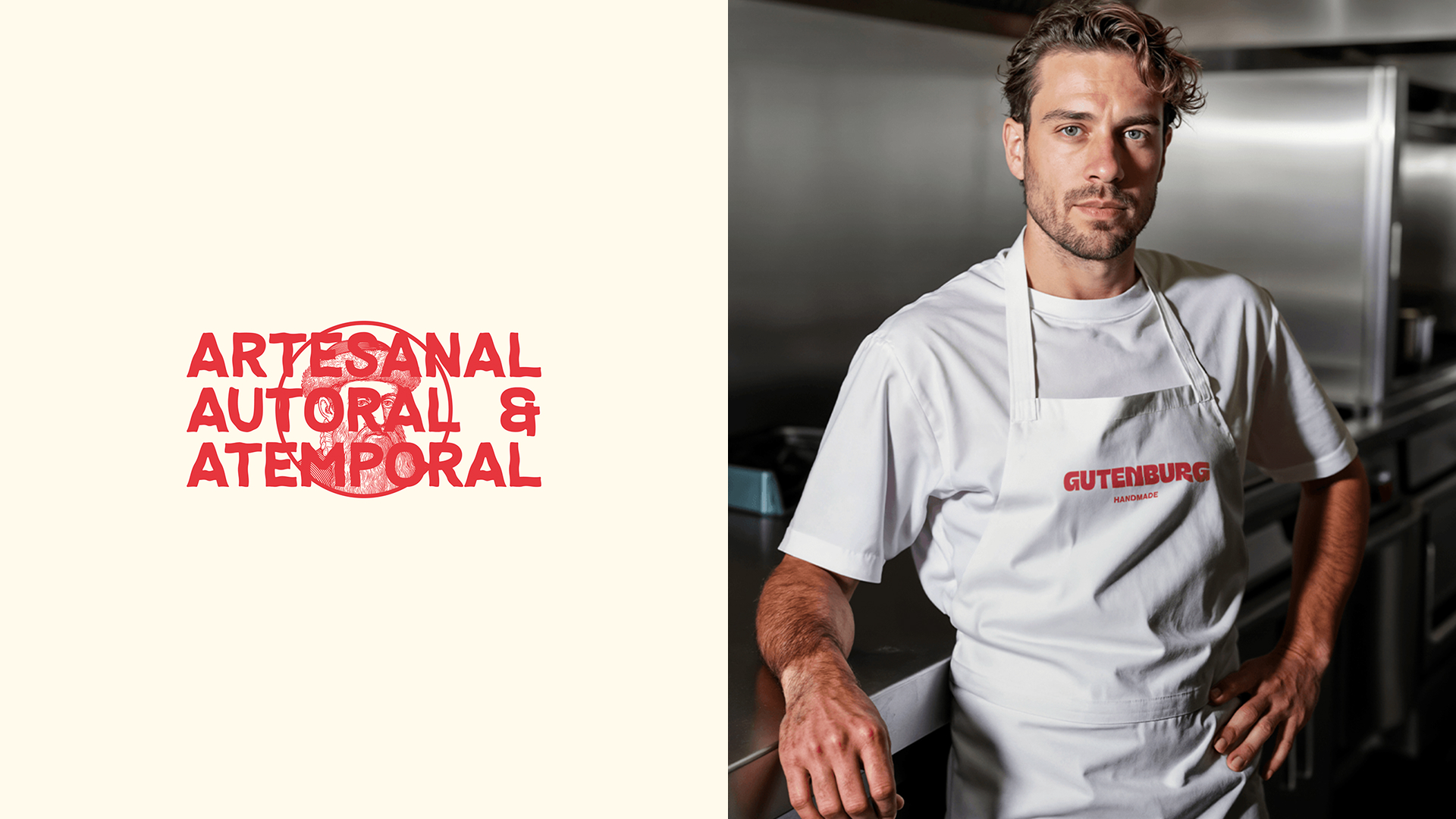
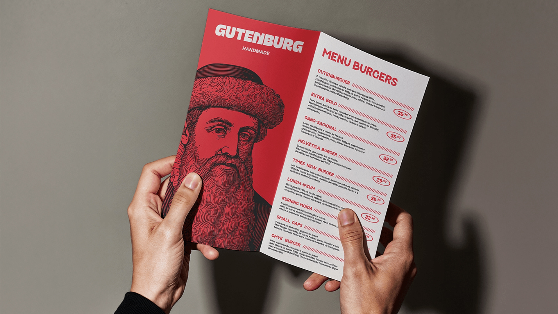
The visual identity was born out of a desire to connect with the creative community. The goal was to create an environment where design could be felt in every corner, without needing to be explained. Even the names on the menu were strategically chosen to reinforce this relationship with the typographic and visual world. The brand needed to convey creativity, boldness, and a slight rebelliousness, making the space a meeting point for designers and those passionate about ideas.
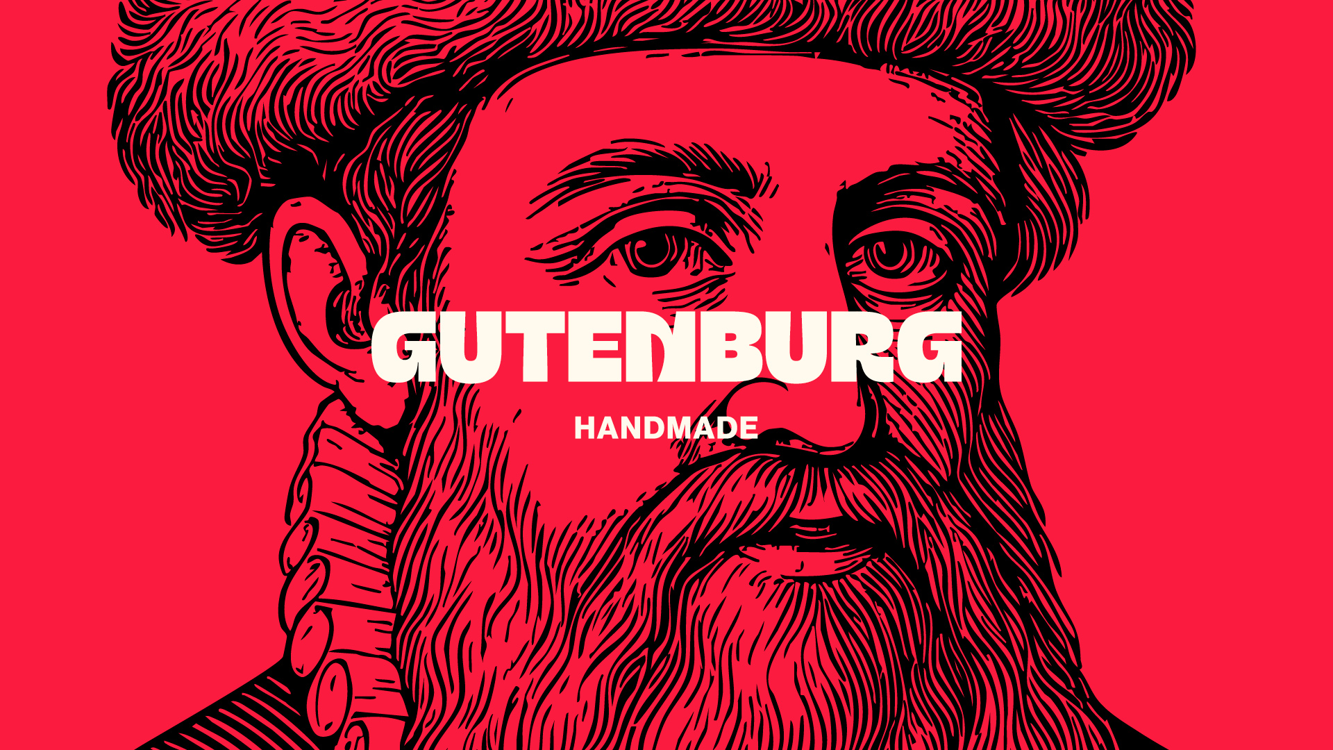
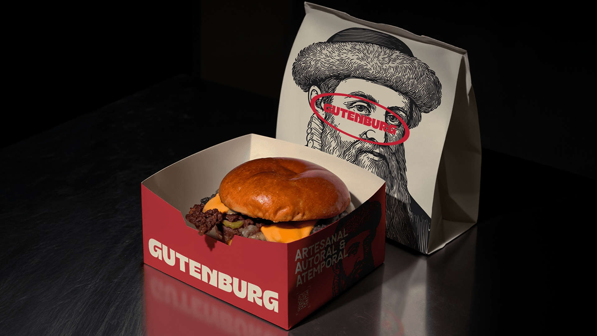
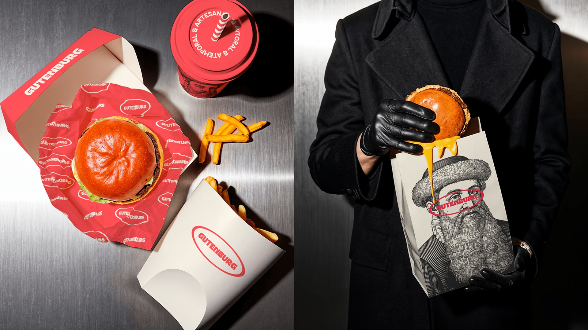
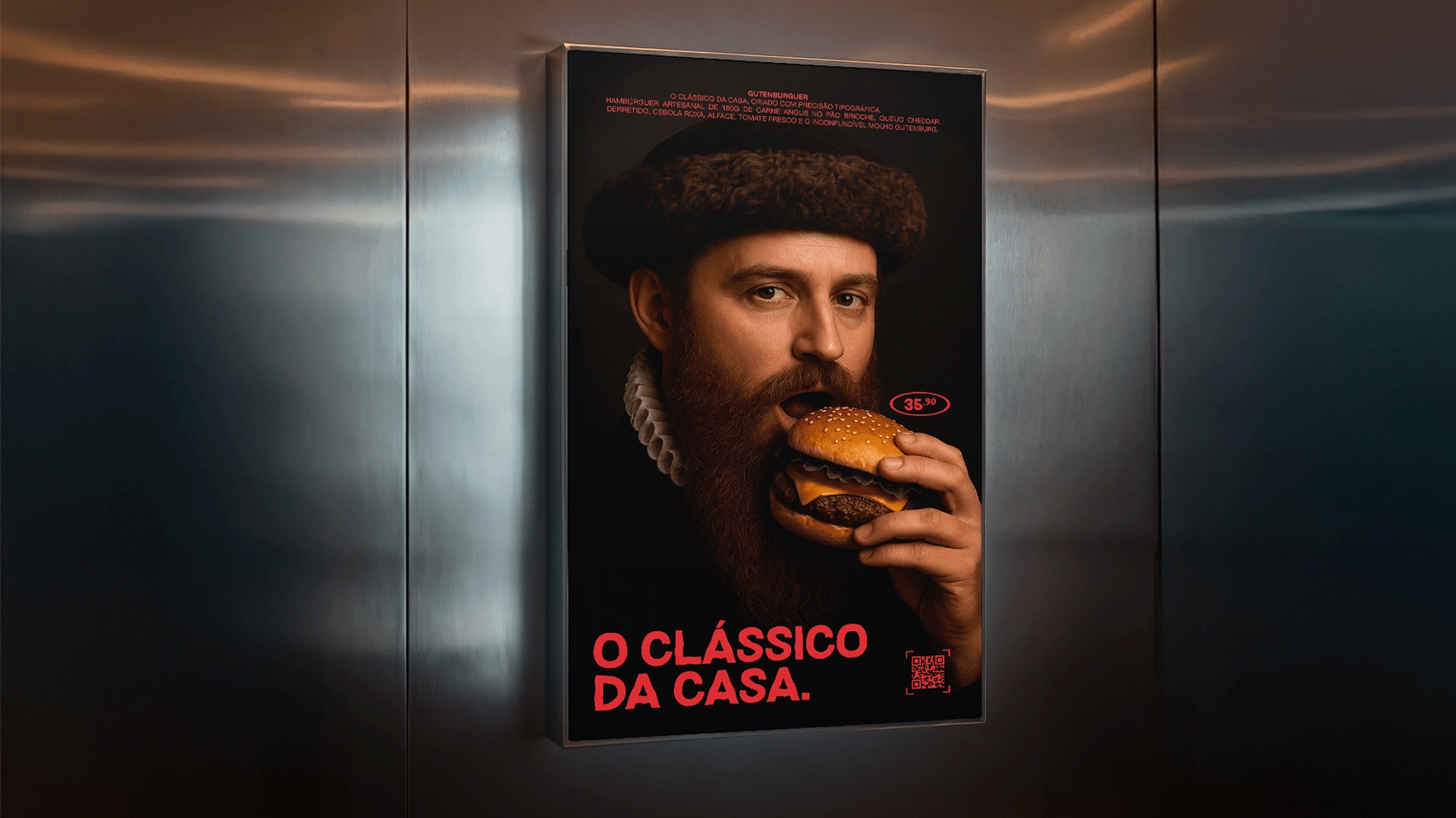
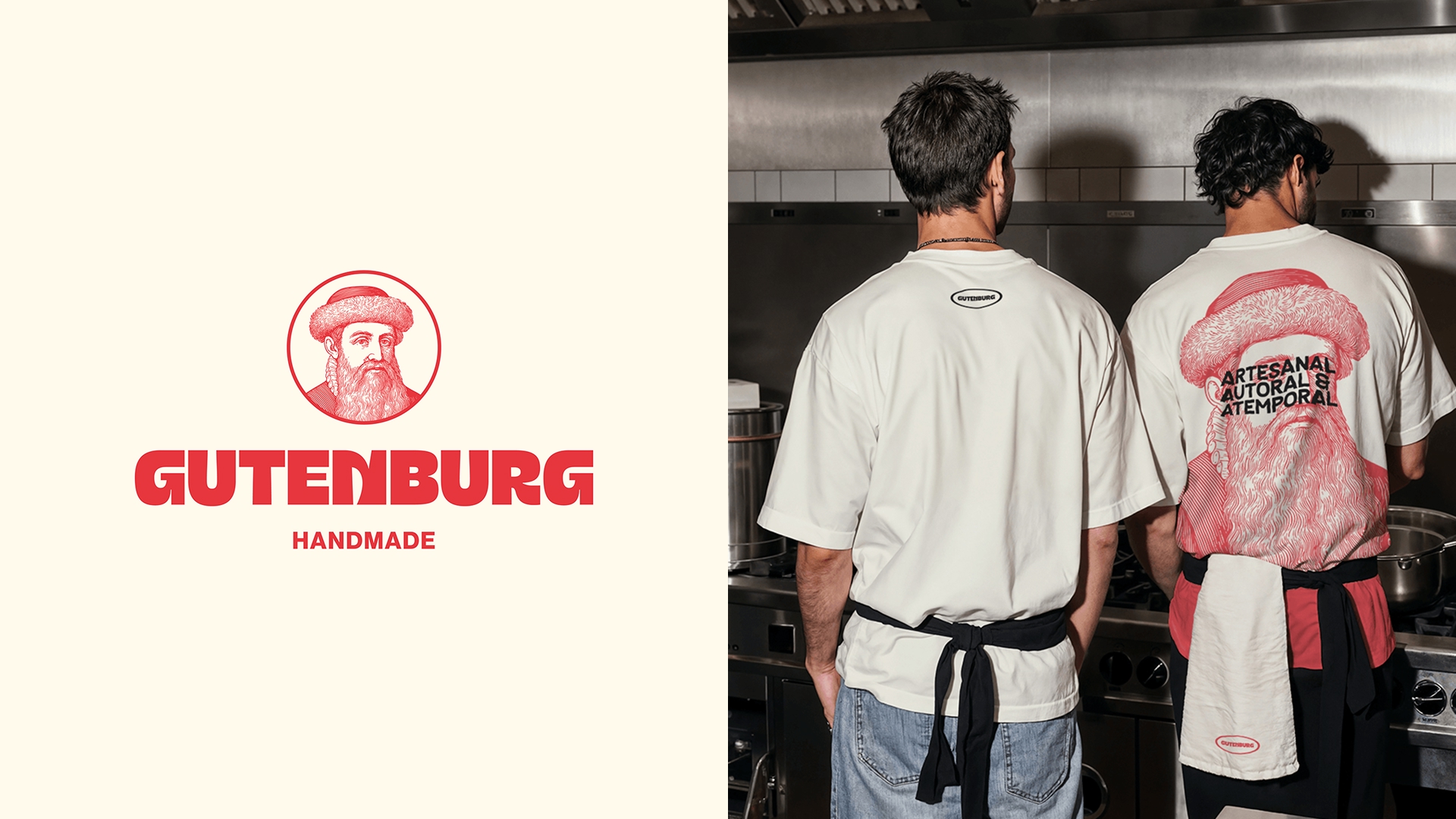
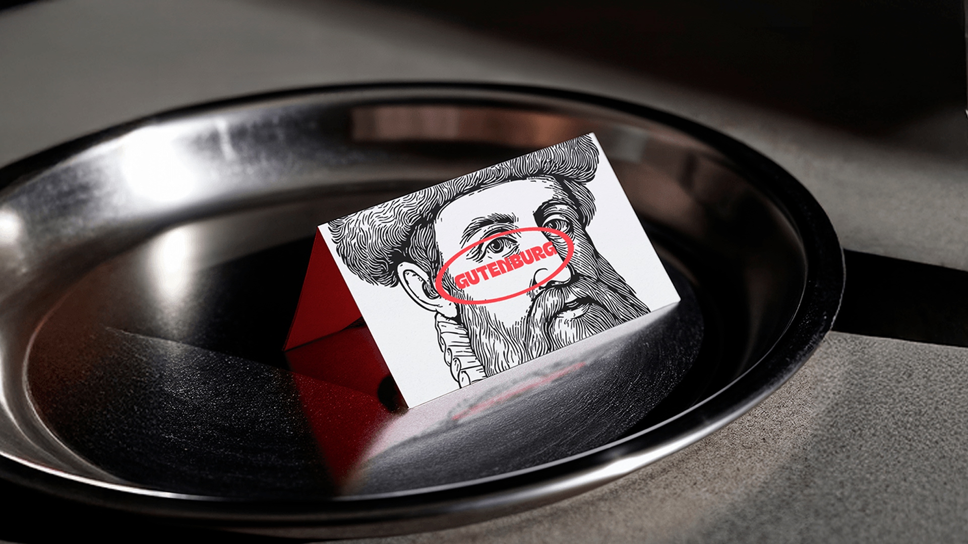
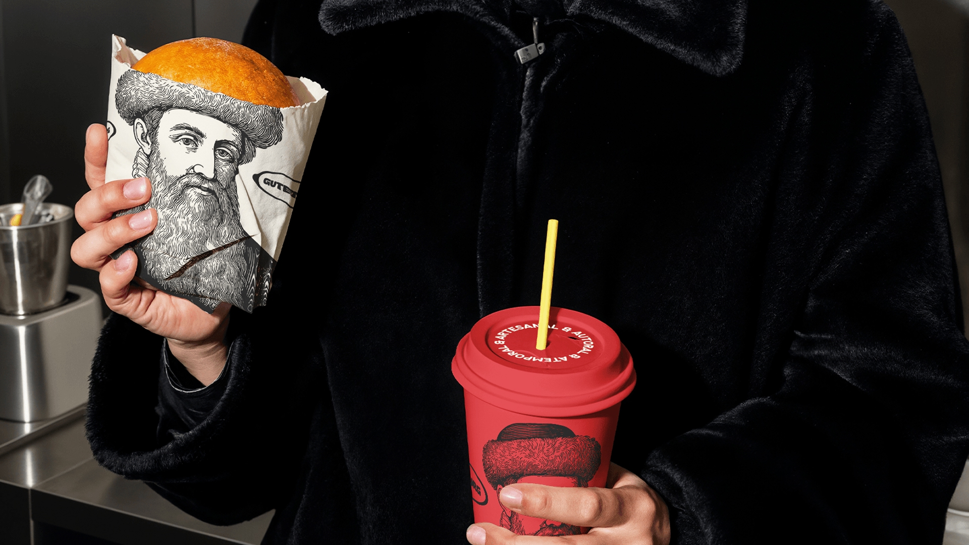
Red was highlighted as a reference to the markings in Gutenberg’s Bible, the first book printed in 1455. To balance and soften the impact of this color, the palette was complemented with shades of off-white and black, creating contrast and elegance.
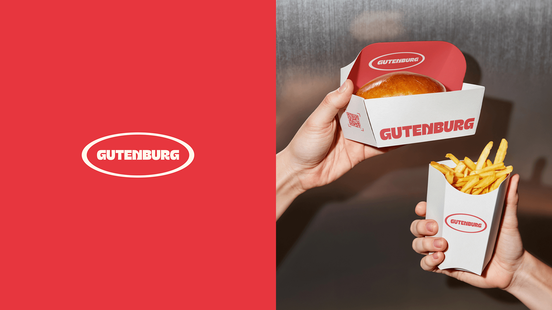
The logo reinforces Gutenburg’s bold personality. The uppercase display typography conveys authority and attitude, with a slight movement in the shapes that brings dynamism and modernity. The detail in the “N” creates a visual play between ‘Guten’ and “Burger,” symbolizing the fusion between design and gastronomy.
In visual communication, the typographic choice reflects the brand’s artisanal character. A rough and organic-looking font conveys authenticity, while a grotesque typography balances the whole, bringing strength and clarity to the reading.
Gutenberg’s illustration revives the style of classic engravings, such as those used on banknotes and old books. The monochromatic line ensures a timeless look, serving as a supporting element that adds visual value without making the brand childish or exaggerated.
CREDIT
- Agency/Creative: Estúdio Lippi
- Article Title: Estúdio Lippi Refreshes Gutenburg with a Modern Typographic Aesthetic Blending Flavor and Design
- Organisation/Entity: Agency
- Project Type: Identity
- Project Status: Published
- Agency/Creative Country: Portugal
- Agency/Creative City: Porto
- Market Region: Europe
- Project Deliverables: Brand Identity, Brand Naming, Brand Strategy, Packaging Design
- Industry: Food/Beverage
- Keywords: Food, Restaurant, Burger, Brazil
-
Credits:
Creative Director: Kauan Lippi


