


From gut health to good energy, purposeful eating makes all the difference.
Eat Purposefully is a granola brand born from family tradition and a belief in intentional eating. Founded by Mackenzie and inspired by her mother, Hope, the recipe uses sourdough fermentation with prebiotics to create granola that nourishes the gut and uplifts everyday wellness. When Mackenzie approached Devalok Design & Strategy Studio, the brand was still known as Kenz Crunch. Our challenge was to reimagine it into a brand that could reflect its unique science, heartfelt story, and premium positioning while staying approachable.
Most wellness food brands either lean too clinical or too playful, leaving little room for warmth and credibility to coexist. The old name and packaging felt functional but lacked emotional connection. For a product rooted in both science and care, the brand needed to strike the right balance—credible, wholesome, and personal.
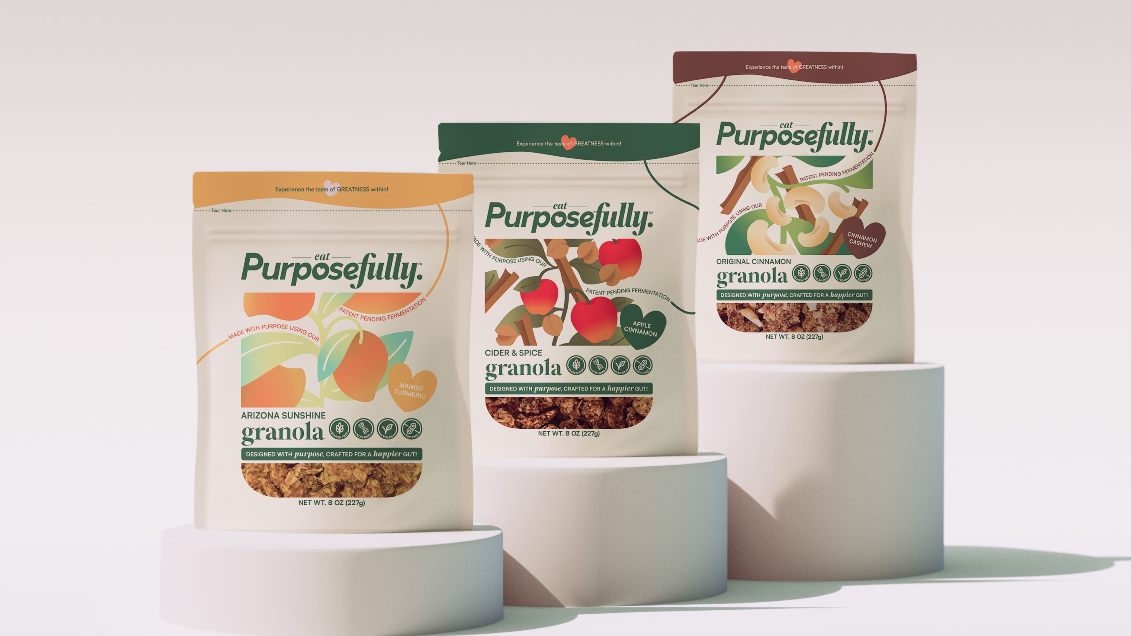
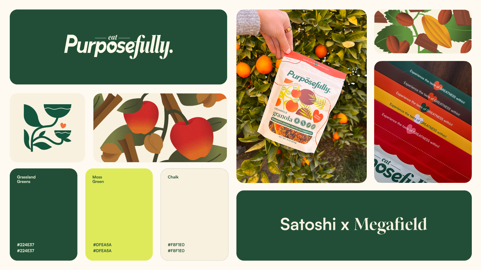
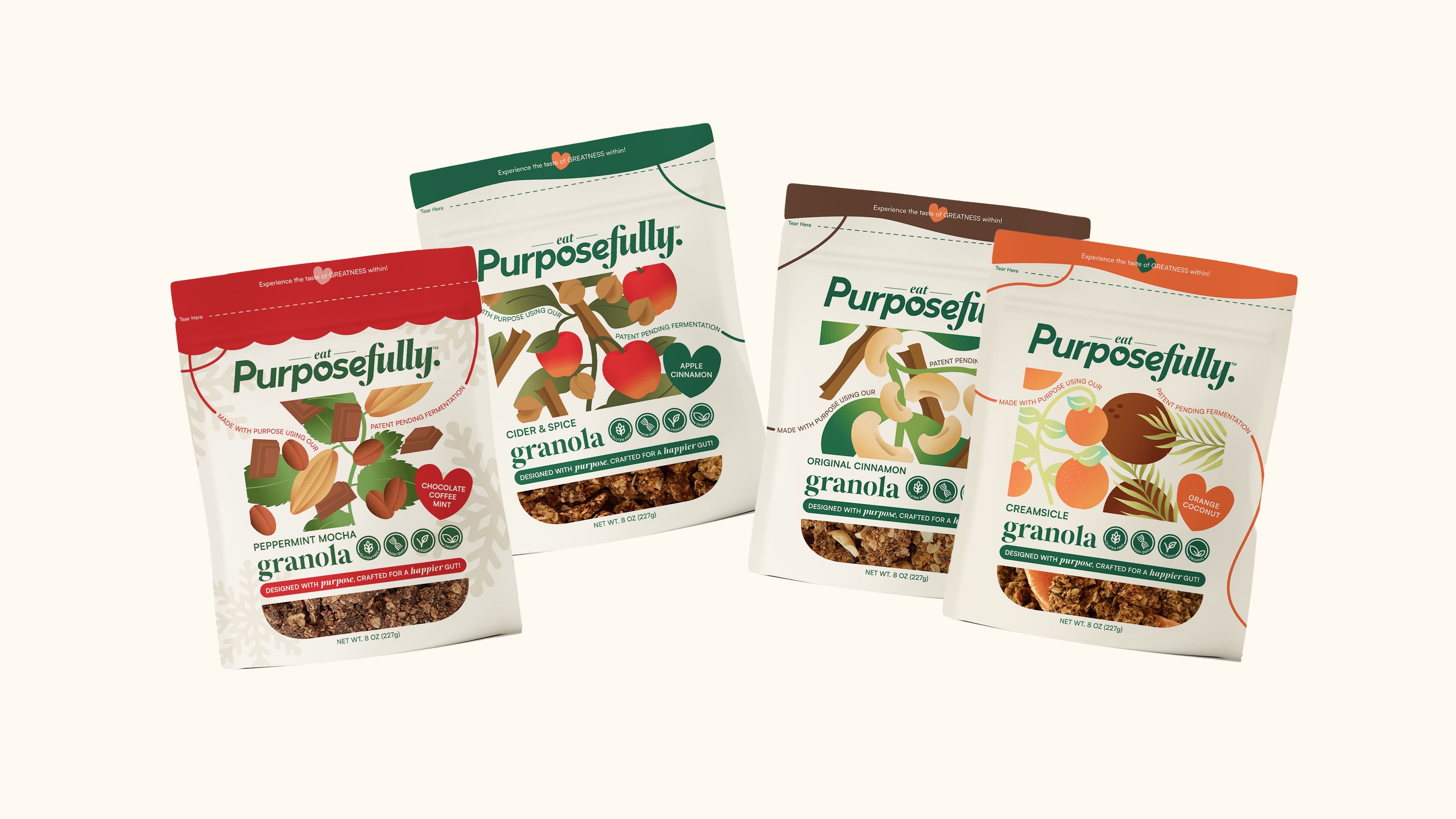
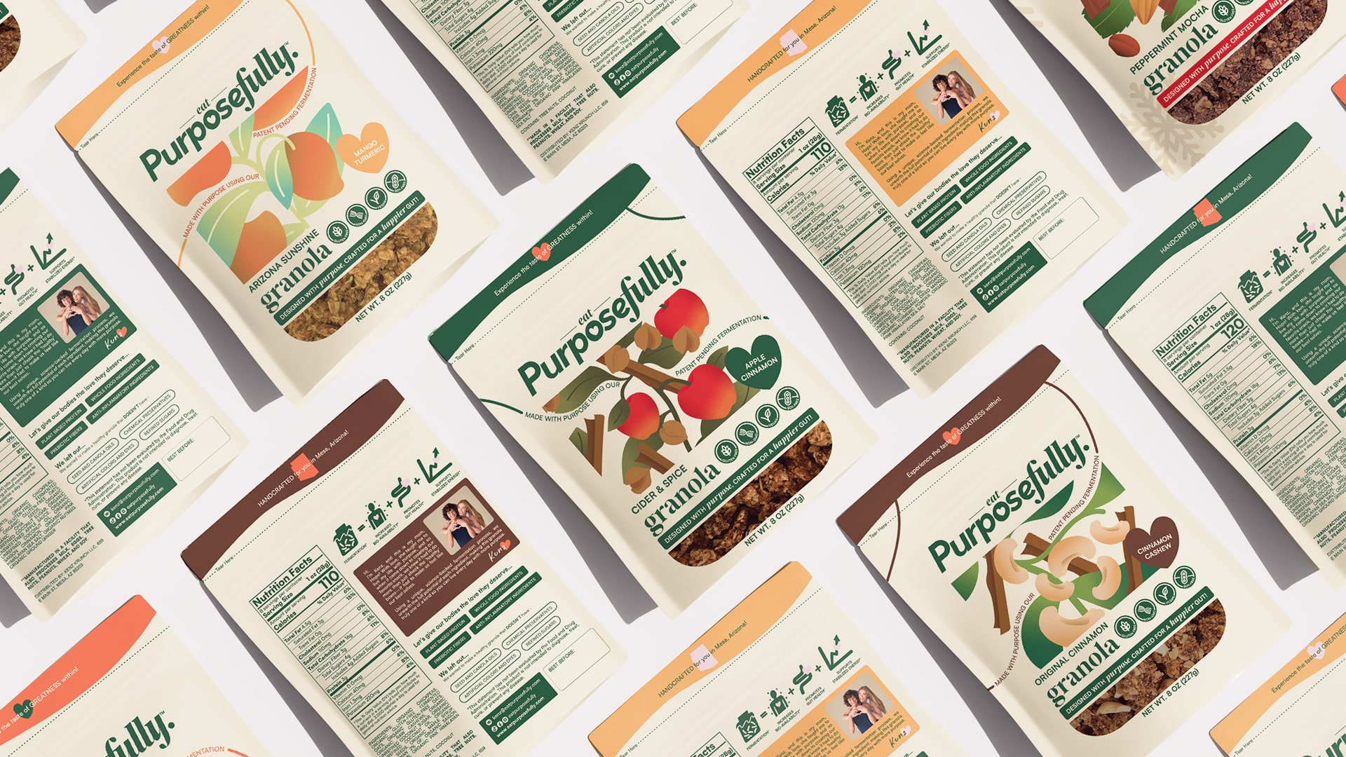
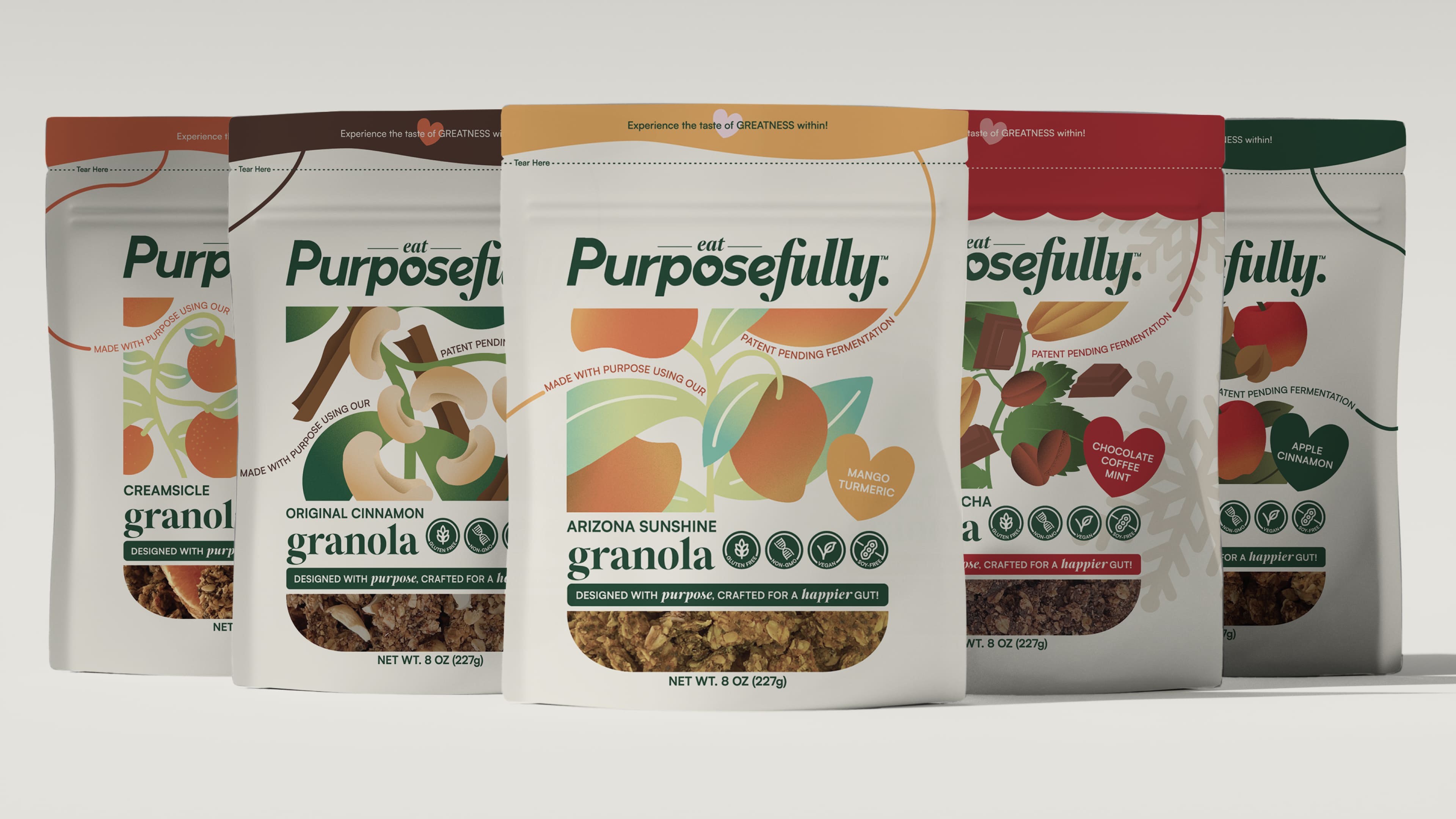
We began by renaming the brand to Eat Purposefully, a name that carried Mackenzie’s philosophy forward. From there, we crafted a visual identity that was human and heartfelt. The logo uses a refined serif with subtle organic curves, paired with a small heart detail inside the letter “o.” It reflects both warmth and structure, making it versatile for future growth.
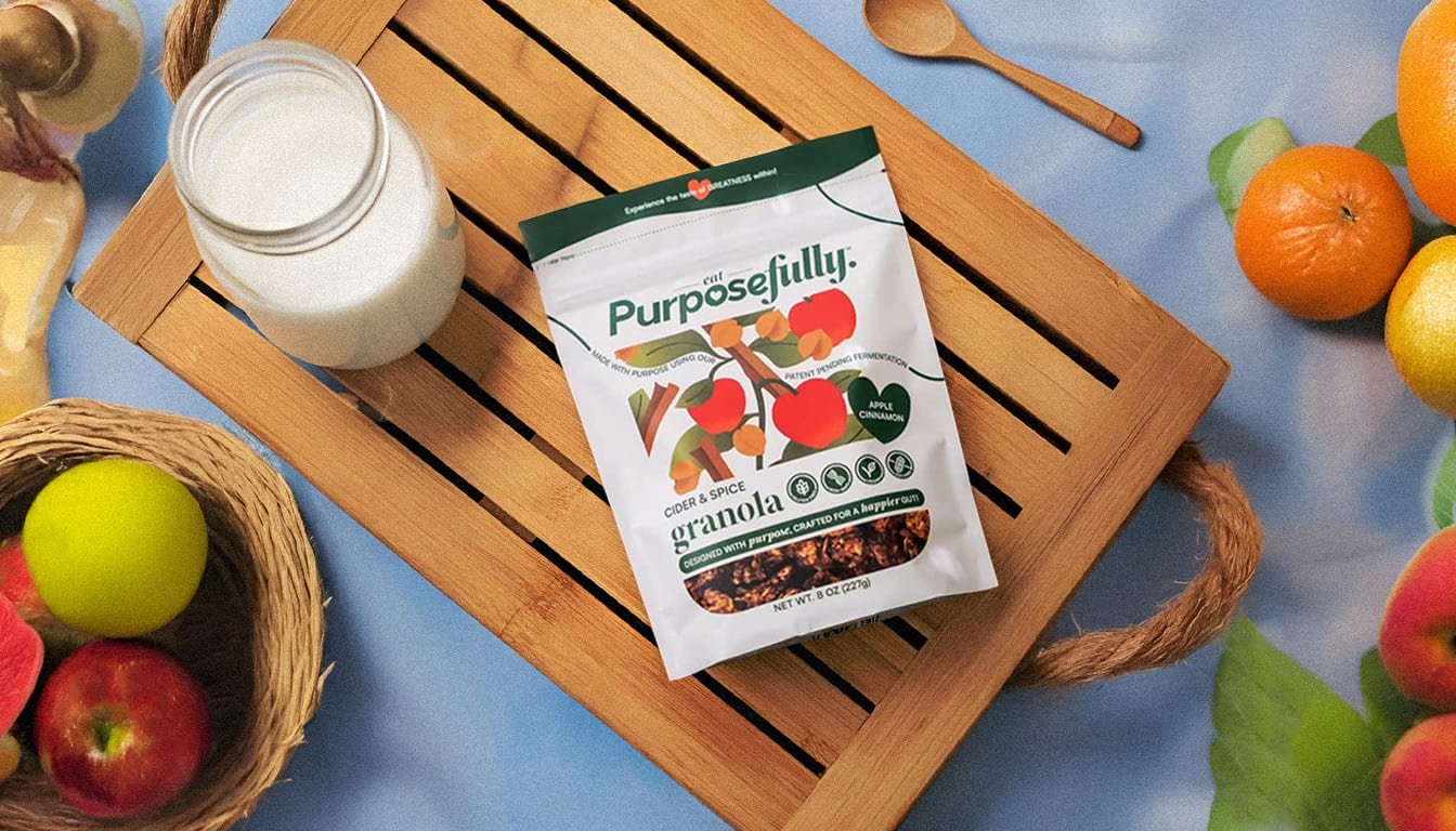
For the packaging, we refined the existing pouch format, keeping it minimal but adding personality through hand-drawn ingredient illustrations. Each flavor carries its own motif, creating variety while keeping the system consistent. The color palette was carefully chosen: soft oranges and light blues add freshness and appetite appeal, while greens and neutrals ground the design in organic authenticity. Small but meaningful details, like the “tear here” phrases with our brand elements and Mackenzie’s note with a photo of her and her mom, brought the brand’s homegrown essence to life.
The result is packaging that feels elevated yet personal. It tells Mackenzie’s story while standing confidently on the shelf. Every touchpoint from the logo to the back-of-pack messaging was designed to feel intentional and warm, turning granola into more than a snack.
Eat Purposefully is now positioned as a brand that resonates with people seeking nourishment, care, and joy in their daily meals. It is a granola brand that feels like it came from someone’s kitchen, not a lab.
CREDIT
- Agency/Creative: Devalok Design & Strategy Studio
- Article Title: Devalok Shapes Eat Purposefully Into a Science-Backed Granola Brand With Heart
- Organisation/Entity: Agency
- Project Type: Packaging
- Project Status: Published
- Agency/Creative Country: India
- Agency/Creative City: Lucknow
- Market Region: North America
- Project Deliverables: Brand Identity, Brand Strategy, Illustration, Packaging Design, Packaging Guidelines
- Format: Pouch
- Industry: Food/Beverage
- Keywords: Packaging Design, Brand Identity, Packaging Illustration, Brand Guidelines, Dieline Design
-
Credits:
Project Director: Mudit Lal
Brand & Packaging Designer: Chhavi Priya Gaur
Brand & Packaging Designer: Ayursha Nimse
Motion Designer: Parth Dake
Content Writer: Arundhati Thakur
Agency: Devalok


