


From the outside, it might just look like a wine label, but if you stop for a moment, you realise that El Guardián de la Viña is much more than that: it is a tribute, a bridge between generations, a family story told through design.
And it was precisely this honest approach that won over the Larrea family, eight siblings who wanted to use El Guardián de la Viña to pay tribute to their father through a new wine, but also through the label, a unique design for their most special wine. A way to preserve memories, feelings and emotions forever, a way to be more united than ever.
We knew that first we had to learn the story. So, on the slopes of Mount Miralobueno, where the Larrea family tends a vineyard planted in 1979, we delved into the history of this unique vineyard, worked with a care and patience that can only be learned by looking at the land.
There, among the vines and dry stone walls, we chatted and got to know the Larrea family and the “guardaviñas” (a small stone building that serves as a shelter for farmers when it rains or for storing work tools) that watches over everything from the hillside. Their symbol, their memory, their presence.
With the 2020 harvest, they decided to produce a very limited edition wine of only 1,956 bottles, and they wanted the label to reflect their history and pay tribute to the father and founder of the winery. The commission arrived at the studio loaded with sensitivity.
We knew that it wasn’t only about creating a nice label, but about telling a story with soul. One that could reflect what the wine already conveyed. That’s why the work began in the vineyard itself, walking the land, touching the stones of the vineyard, listening to the family. Only then so many feelings can be captured in a design.
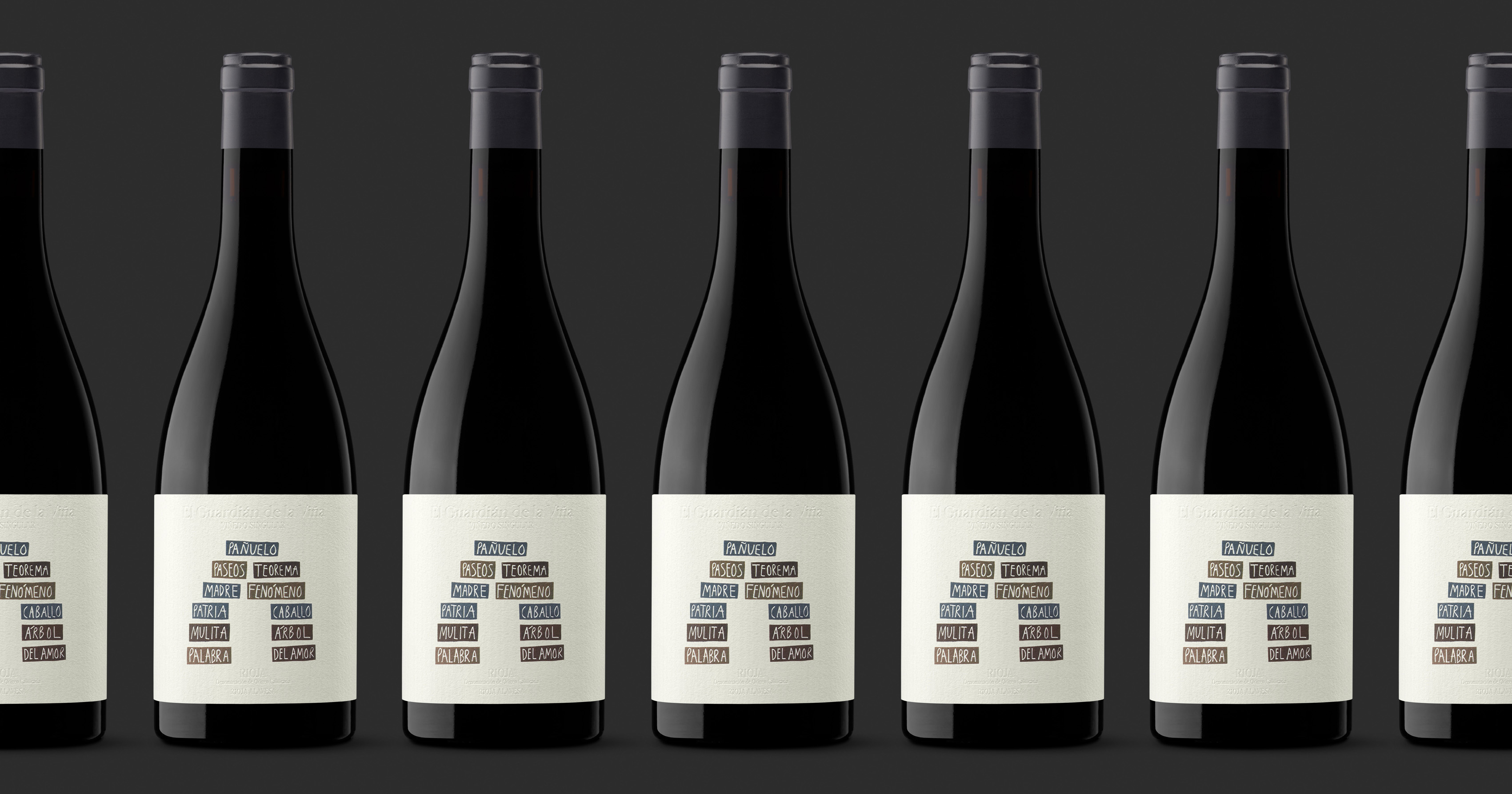
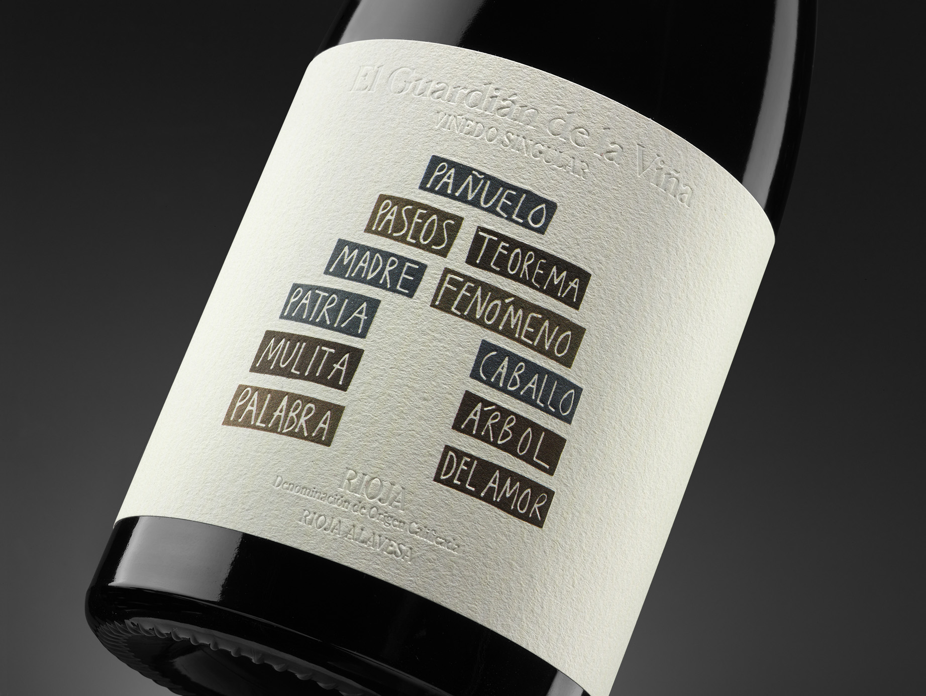
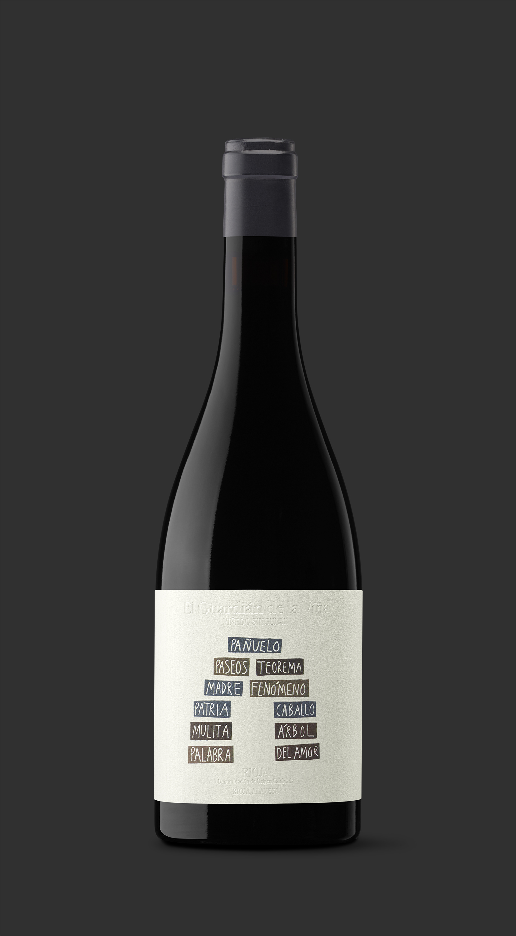
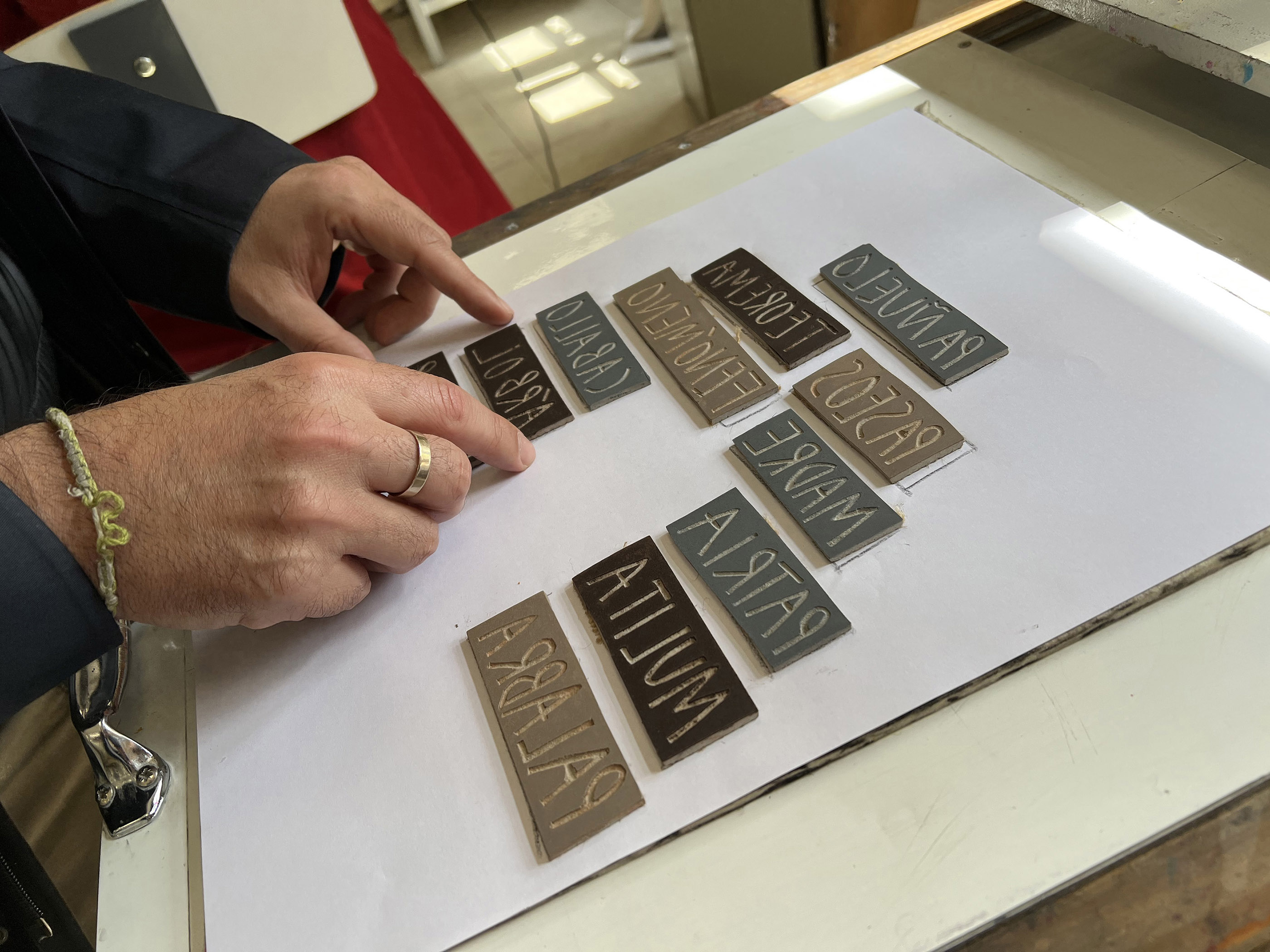
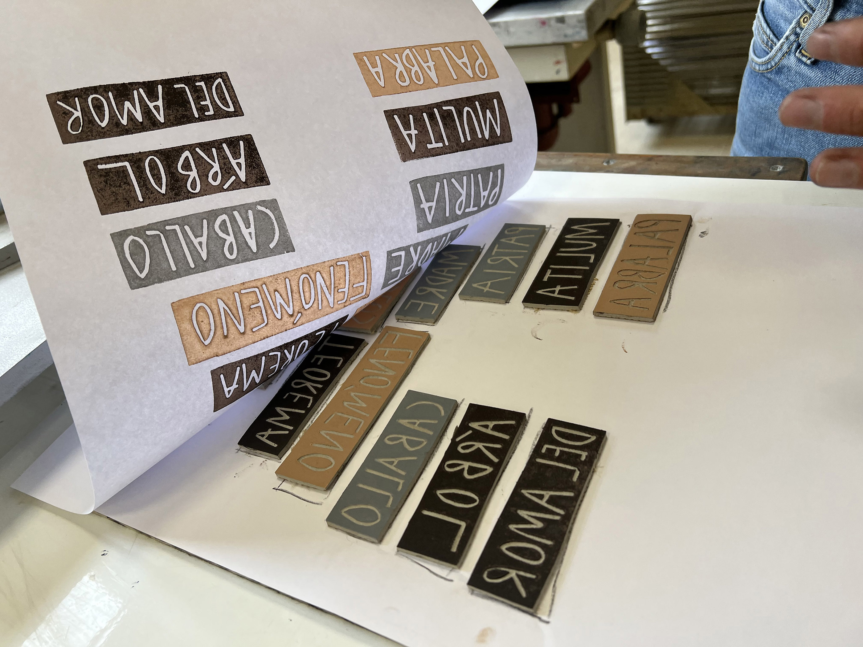
During this process, the idea that shaped the project was born: to ask each of the eight siblings and their mother for one or two words that summed up their memories of their father. No long sentences or descriptions. Just that: a term that captured the essence.
The result was a flood of memories and emotions: “handkerchief”, “walks”, “theorem”, “phenomenon”… different words, but united by the same invisible thread that binds everything together in families. Each one represented a glance, a moment; together they constructed the figure of the “guardaviñas”, of the memory, of the stones that hold everything together.
From there, we came up with a powerful concept: to create a symbolic “guardaviñas” made of words, with family memories as stones, the closest representation of an emotional shelter. We realised that we were building a “guardaviñas” of memories, a structure in which each word was a stone of memory.
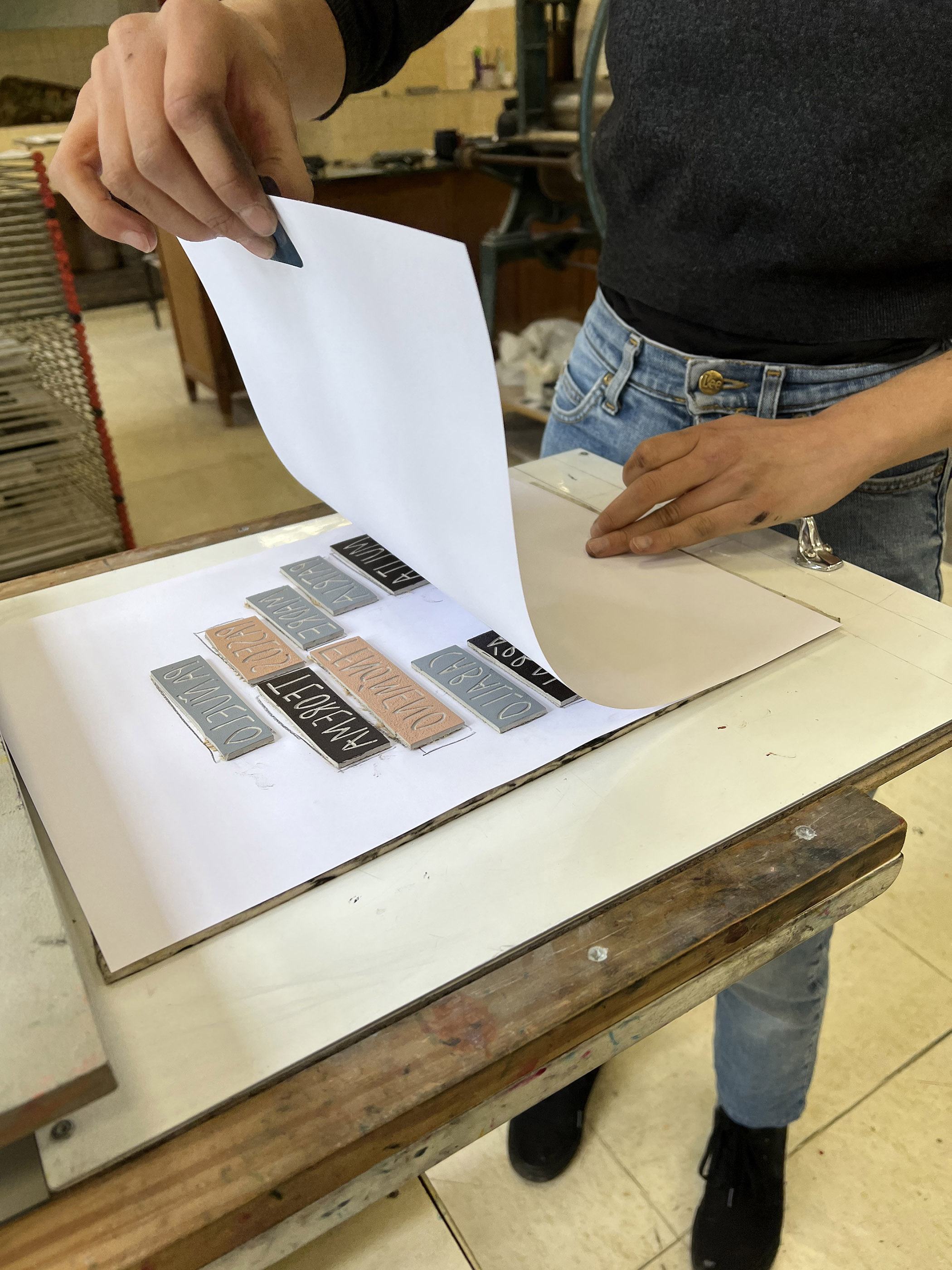
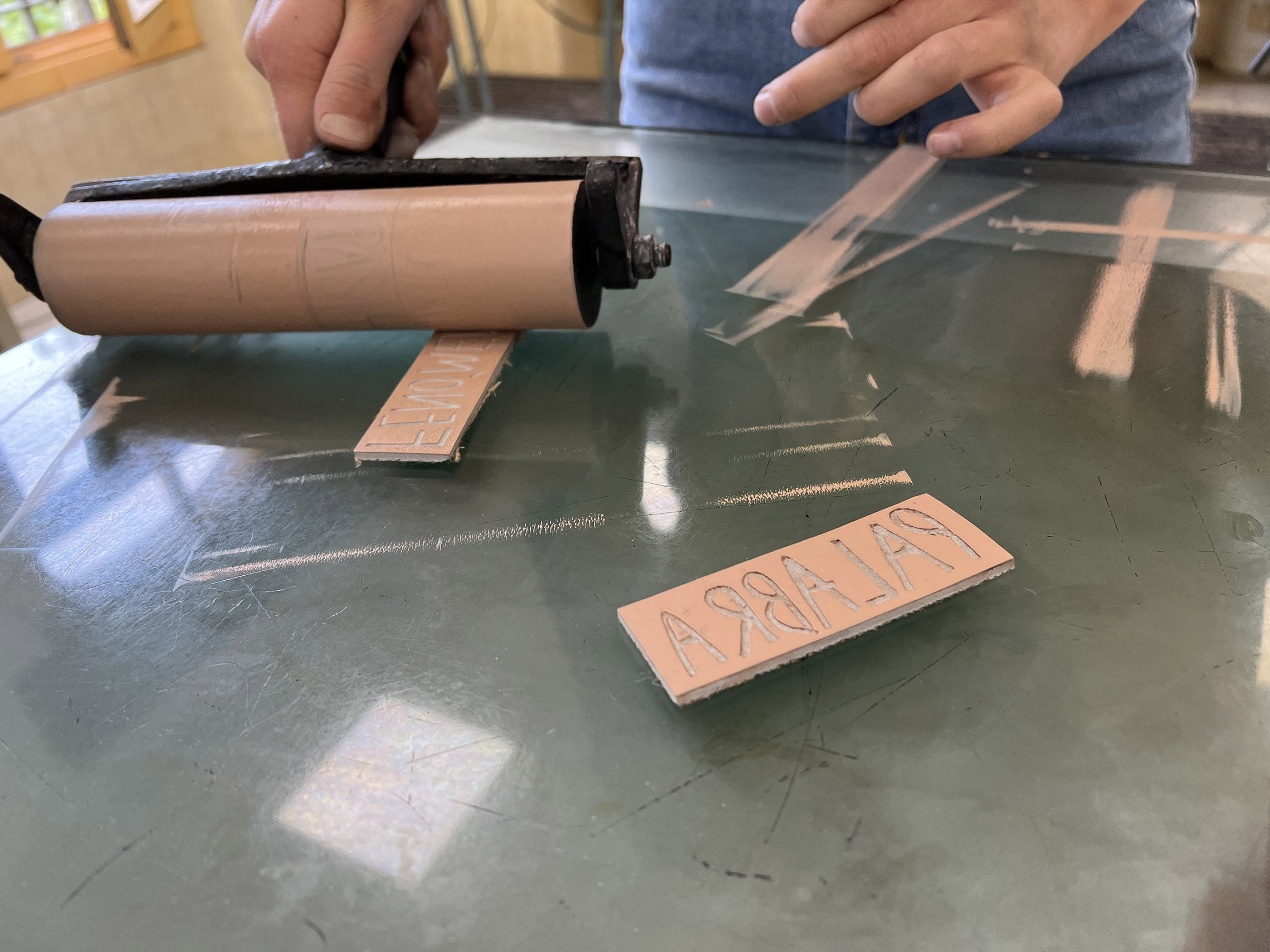
Once the concept was clear, it was time to bring it to life. We decided that the form should match the content. If the wine was made with care and using traditional methods, the label should also be printed in the same way, by hand. The technique of linoleum printing was rescued, a form of manual engraving that requires time, precision and patience. Each word was carved and printed by hand, as if it were a Renaissance masterpiece. It was the only way to make the process consistent with the history and the wine.
Each print is different: the texture, pressure and ink edge vary. And it is in this imperfection that its beauty lies. The way it becomes something unique, as if it were a one-off work of art. Limited copies were made. One for each brother, another for their mother and another for the label.
The result is a simple, serene, but above all, an emotive design, with colours that evoke the stones of the “guardaviñas” and a typography that seems ethereal. The name of the wine is discreet, almost intuited. Those who see the bottle want to touch it. And those who touch it cannot part with it. Once again, that invisible thread works its magic.
A project that defends pause, craftsmanship and authenticity. There are no filters or artifice, just emotion translated onto paper. After all, we don’t design labels, we tell stories and we go as far as the client lets us go.
CREDIT
- Agency/Creative: Moruba
- Article Title: El Guardian De La Viña by Moruba, When Words Build a Family Tribute
- Organisation/Entity: Agency
- Project Type: Packaging
- Project Status: Published
- Agency/Creative Country: Spain
- Agency/Creative City: Logroño
- Market Region: Europe
- Project Deliverables: Branding, Craft, Lettering, Packaging Design
- Format: Bottle
- Industry: Food/Beverage
- Keywords: Moruba, Pago de Larrea, El Guardian de la Viña, Wine, Rioja
-
Credits:
Moruba co-owner and creative director: Javier Euba
Moruba co-owner and creative director: Daniel Morales


