


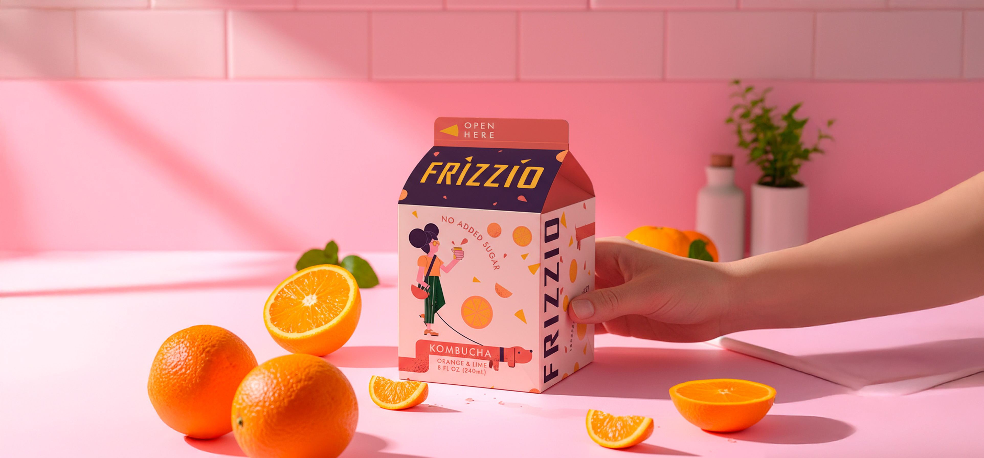
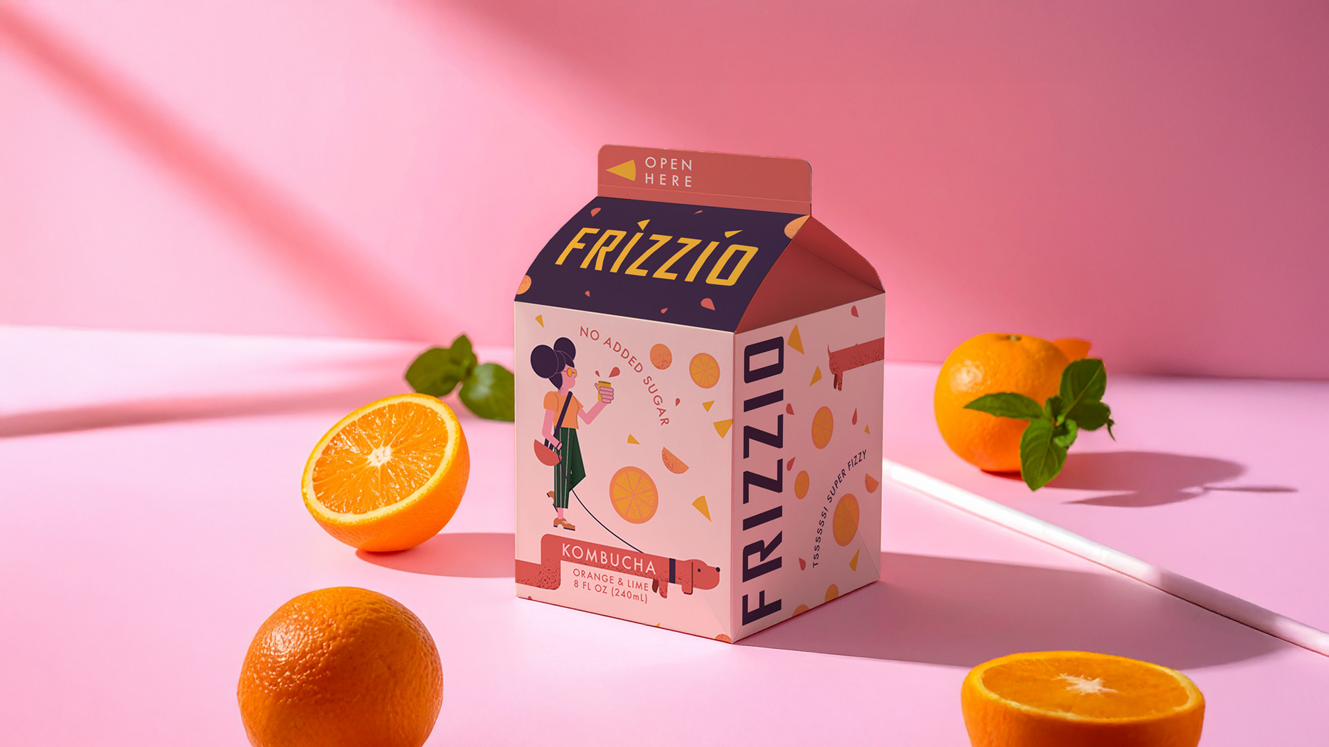
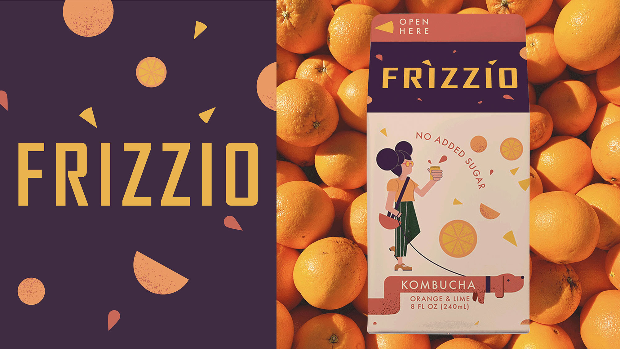
Frizzio is a kombucha that reinterprets the nostalgic world of vintage juice cartons — packaged in eco-friendly recycled Tetra Pak and designed to feel like it came straight out of another era, yet infused with a bold, contemporary Gen Z twist. It is more than a beverage; it is a playful cultural statement, a bridge between past and present, and a sparkling invitation to explore a world where memories you never lived feel familiar and comforting.
Frizzio was born from a cultural shift, where Gen Z looks backward in order to move forward. This generation is reshaping nostalgia, gathering fragments of the past — whether it’s grainy illustrations, retro color palettes, or familiar typefaces — and remixing them into something wholly new. Nostalgia here isn’t about repeating history; it’s about creating a sense of belonging to moments and aesthetics you never actually experienced, yet instinctively recognize. It’s a reminder that memory, imagination, and identity can coexist in a single sip.
In a market dominated by kombucha brands that lean heavily into green, minimalist, and “clean” design codes, Frizzio dares to be different. It celebrates imperfection, creativity, and self-expression, giving its audience a reason to pause and engage. This is a kombucha that refuses to blend in on the wellness shelf — instead, it fizzes outward, bursting with color, character, and a sense of irreverent fun.
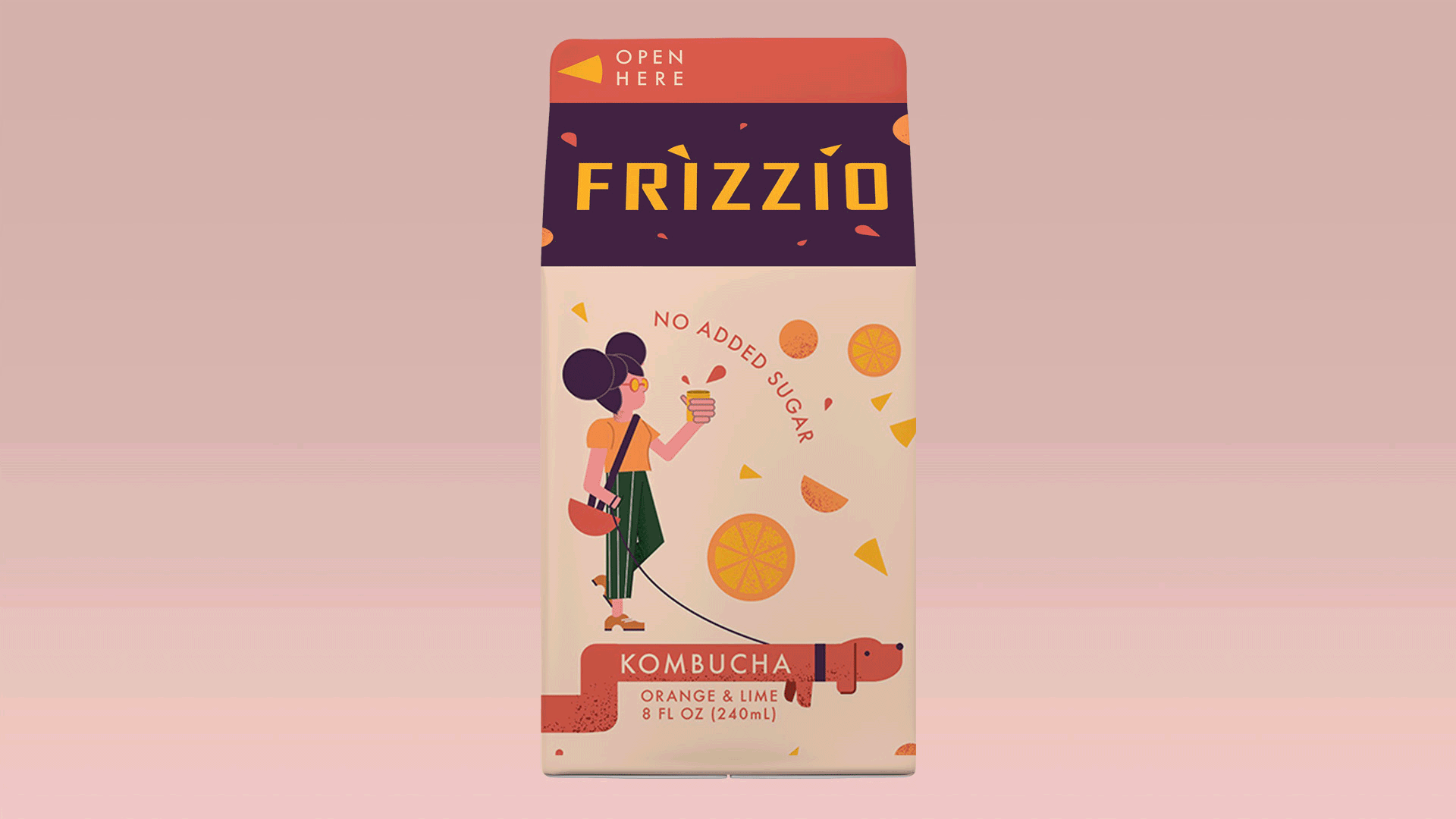
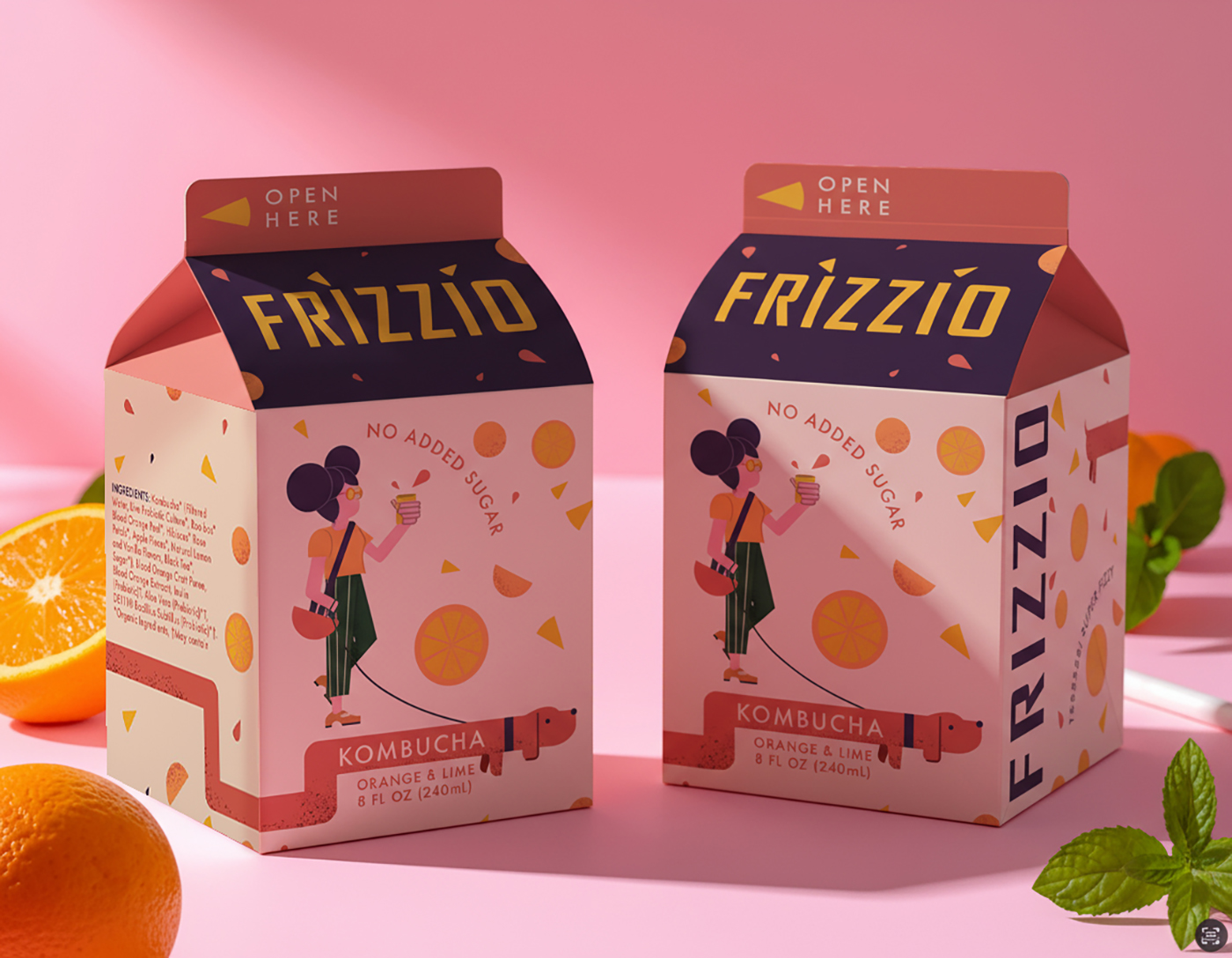
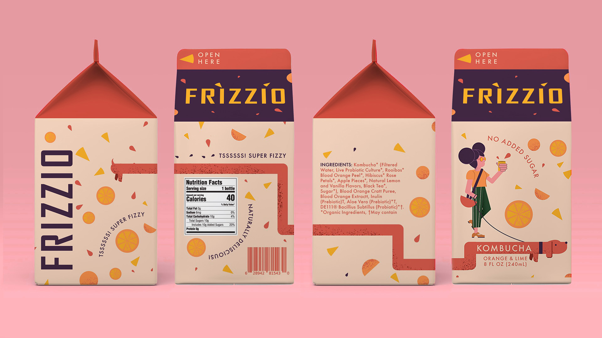
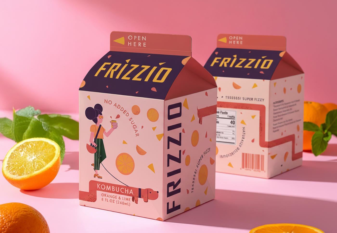
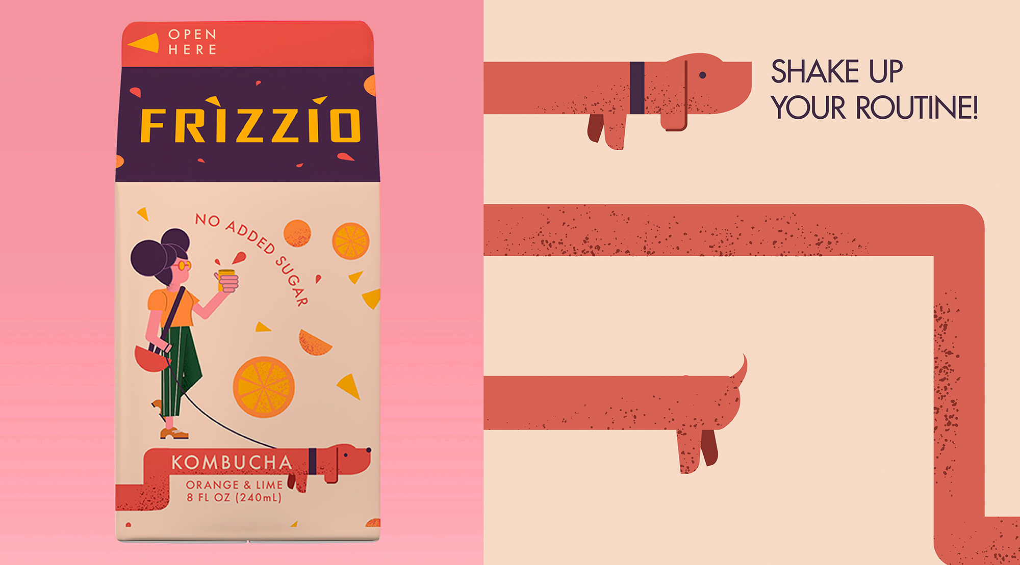
The brand identity is a careful blend of old and new. Grainy, tactile illustrations meet a warm, vintage-inspired color palette, while bold, confident typography ensures a modern edge. Adding to the charm is a quirky dog character, playfully wrapping around the packaging with its tail wagging, making appearances on the front and back — a collectible element that sparks curiosity, engagement, and delight with every bottle.
Frizzio embodies a neo-vintage aesthetic — a love letter to the tactile, the imperfect, and the joyfully human. It speaks to a generation that finds comfort in the past but lives unapologetically in the present. Here, nostalgia is not a retreat but a form of rebellion, a reminder that the past can be reshaped, reimagined, and infused with personality. Its debut flavor, Orange, sets the tone: bright, cheeky, and full of character, ready to shake up the kombucha category with style, attitude, and unapologetic individuality. Frizzio doesn’t just quench thirst; it invites a playful, sensory, and emotional experience with every sip, turning drinking kombucha into a ritual of discovery, connection, and joyful rebellion.
CREDIT
- Agency/Creative: Studio Zak
- Article Title: Studio Zak Channels Gen Z Nostalgia Through Frizzio’s Playful Kombucha Packaging
- Organisation/Entity: Agency
- Project Type: Packaging
- Project Status: Published
- Agency/Creative Country: Italy
- Agency/Creative City: Rome
- Market Region: North America
- Project Deliverables: Brand Design, Branding, Label Design, Packaging Design, Packaging Guidelines
- Format: Bottle
- Industry: Food/Beverage
- Keywords: Tetrapack, juice, kombucha, packaging, packaging design, bottle, food and beverage, dog, illustration
-
Credits:
Creative Director: Paula Pozza


