


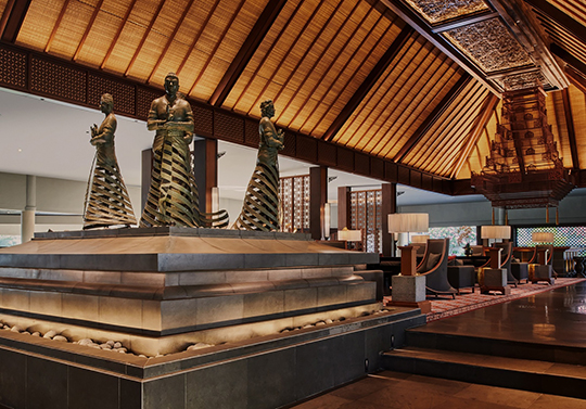
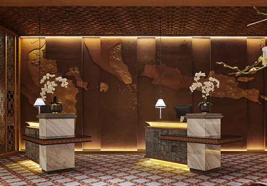
Singhasari Resort stands as the first five–star resort in East Java, Indonesia, spanning 9.8 hectares at an elevation of 1,250 meters above sea level. Surrounded by the majestic mountains and rolling hills of Batu, the property embodies the essence of a true hidden gem—secluded, serene, and naturally captivating.
The name Singhasari is derived from an ancient East Javanese kingdom, historically linked to the great Majapahit empire. This cultural heritage carries with it a sense of nobility, legacy, and regional pride—values that the resort seeks to honor in its modern identity.
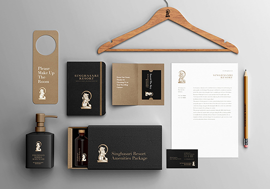
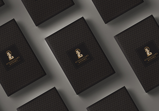
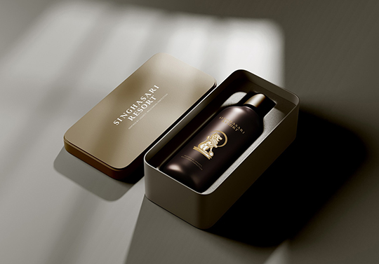
Today, Singhasari Resort is embarking on a full redesign, from the logo to its entire visual identity system. The previous logo, while rich in detail, felt overly intricate and failed to communicate the luxury, elegance, and quiet confidence expected of a five–star destination. Through this rebranding, the resort aims to present a clearer, more sophisticated visual language that reflects its stature, heritage, and world–class hospitality.
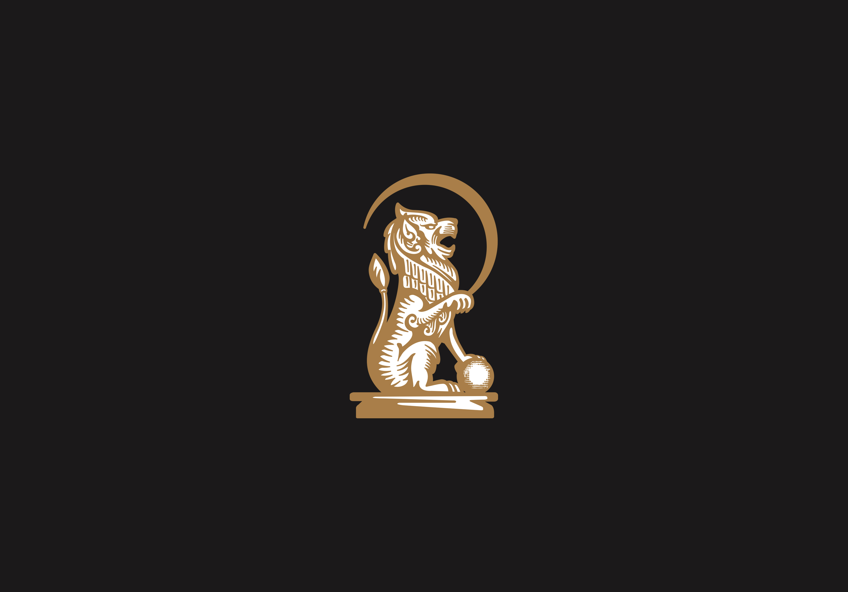
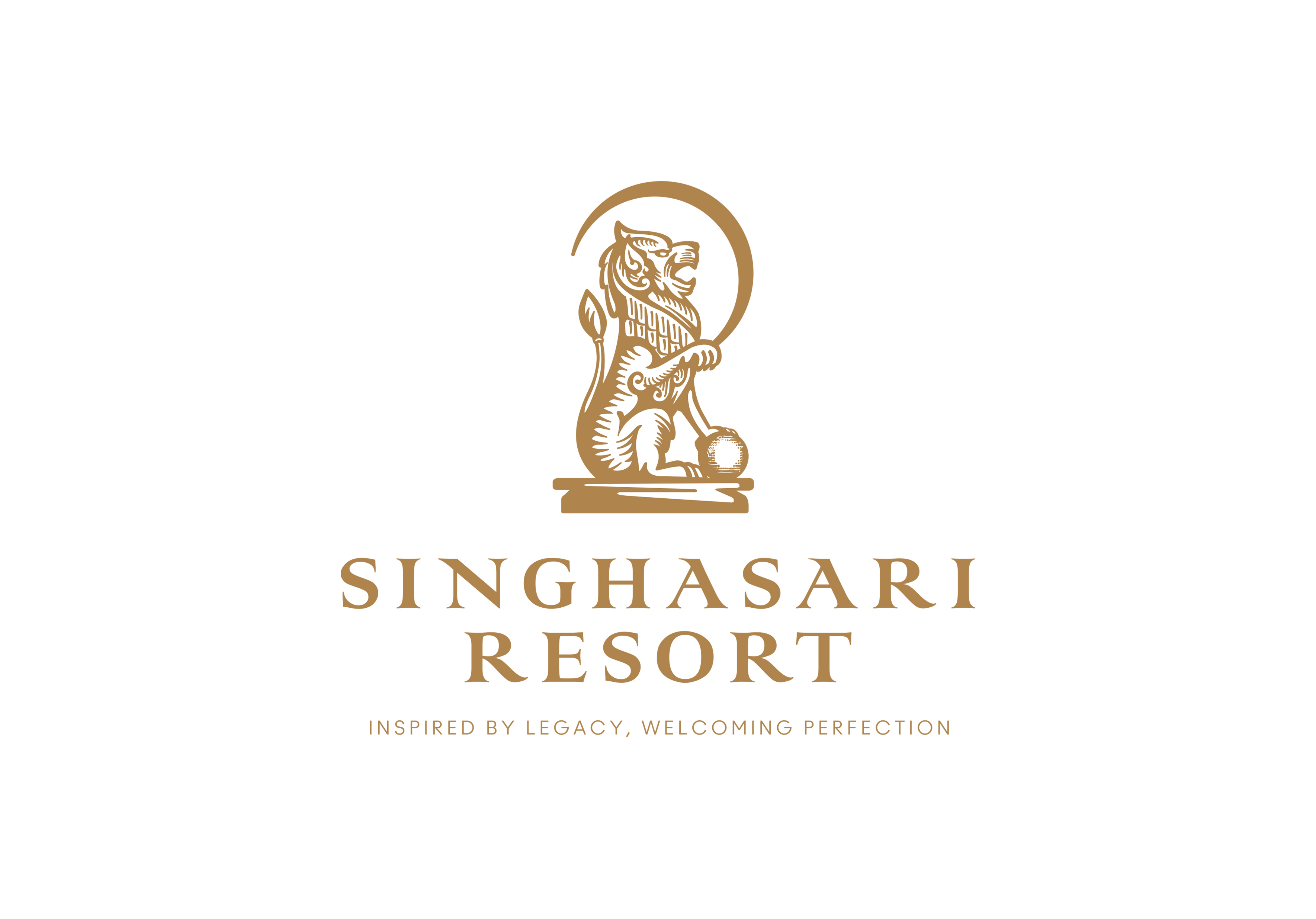
The logo draws its essence from the Singha, the iconic symbol that defines Singhasari. In ancient Javanese culture, the Singha embodies nobility, courage, guardianship, and unwavering presence—values that closely parallel the role of the Foo Dog in Chinese tradition. Both stand as timeless protectors, figures of strength that greet visitors with dignity and assurance.
In our interpretation, the Singha stands firmly atop a sphere. This sphere symbolizes both the world and the human ego. By placing the world under its steady paw, the design conveys an important philosophy: Singhasari Resort chooses to rise above ego and self-interest, dedicating itself fully to service, hospitality, and the creation of meaningful guest experiences. Every stay, every interaction, and every moment is centered around the needs of the guest, not the pride of the host.
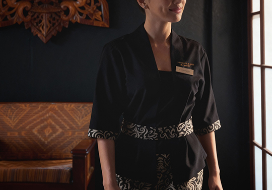
The color palette of gold and black further amplifies this identity. Gold represents grace, prestige, and refined luxury, while black conveys strength, confidence, and timeless sophistication. Together, they form a visual language that reflects the resort’s five-star character—elegant, powerful, and deeply rooted in cultural heritage.
CREDIT
- Agency/Creative: mmad graphic
- Article Title: mmad graphic Reimagines Singhasari Resort with a Refined Identity Rooted in East Javanese Heritage
- Organisation/Entity: Freelance
- Project Type: Identity
- Project Status: Published
- Agency/Creative Country: Indonesia
- Agency/Creative City: malang
- Market Region: Asia
- Project Deliverables: Brand Guidelines, Brand Identity, Brand Mark, Branding, Interior Design, Logo Design
- Industry: Hospitality
- Keywords: luxury,hospitality, singha
-
Credits:
art director: ronny andreas


