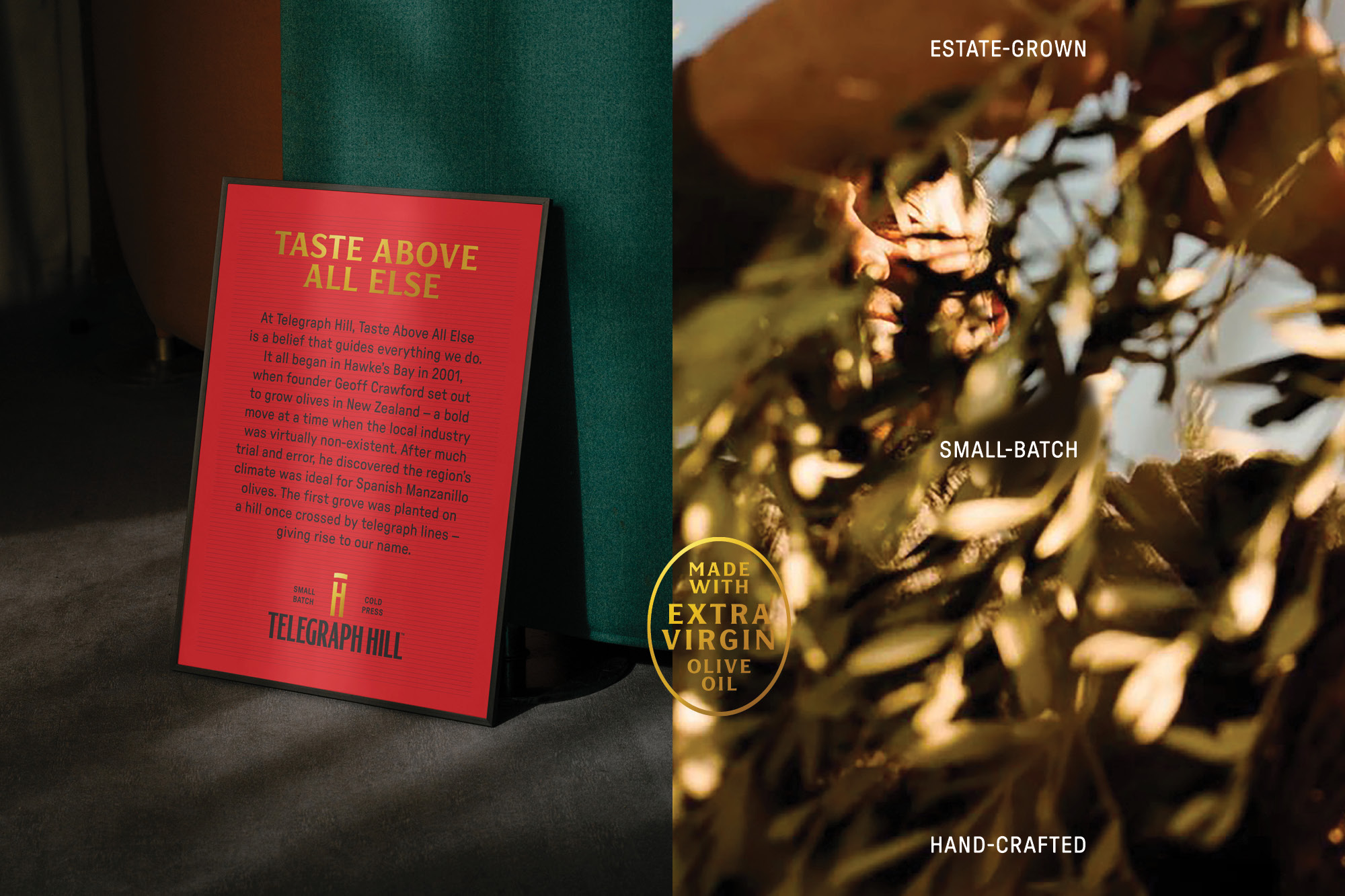
When Telegraph Hill first planted olive trees in Hawke’s Bay in 2001, New Zealand’s olive industry was barely taking root. Founder Geoff Crawford saw potential in the region’s dry summers and coastal breezes, proving that Spanish Manzanillo olives could thrive there. The first grove, set atop a hill once crossed by telegraph lines, gave the brand both its name and its pioneering spirit. Over time, Telegraph Hill became a local favourite celebrated for its exceptional extra-virgin olive oils and inventive dressings crafted with small-batch care.
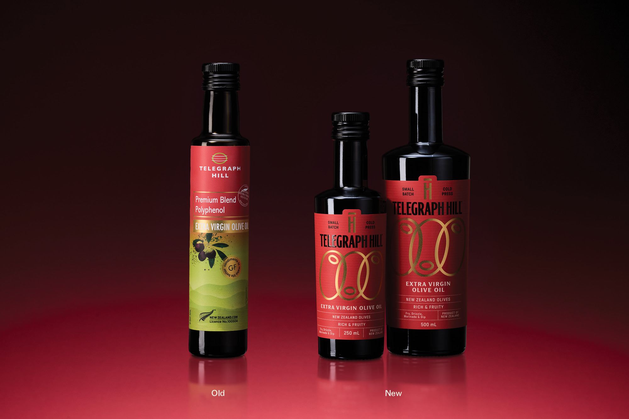
Two decades on, the brand entered a new chapter. With Geoff stepping back, a new team set out to reimagine Telegraph Hill for today’s premium-mainstream audience — staying true to its Hawke’s Bay roots while elevating it for national retail. The challenge: to build a cohesive masterbrand and visual playbook that could flex across categories, anchored by one unifying idea — “Taste above all else.” A philosophy designed to make the brand more memorable, more inspiring, and to encourage consumers to be a little more flavour-curious.
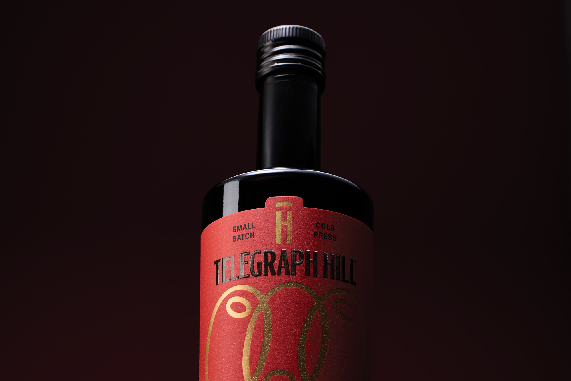
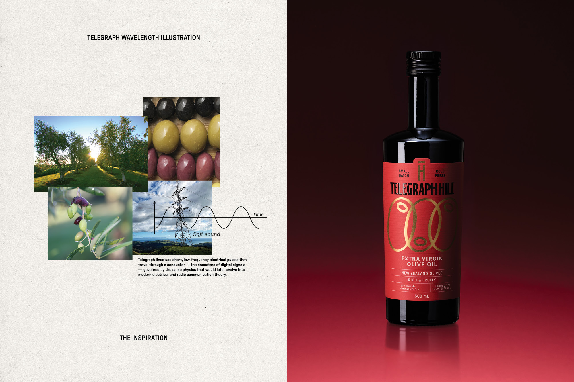
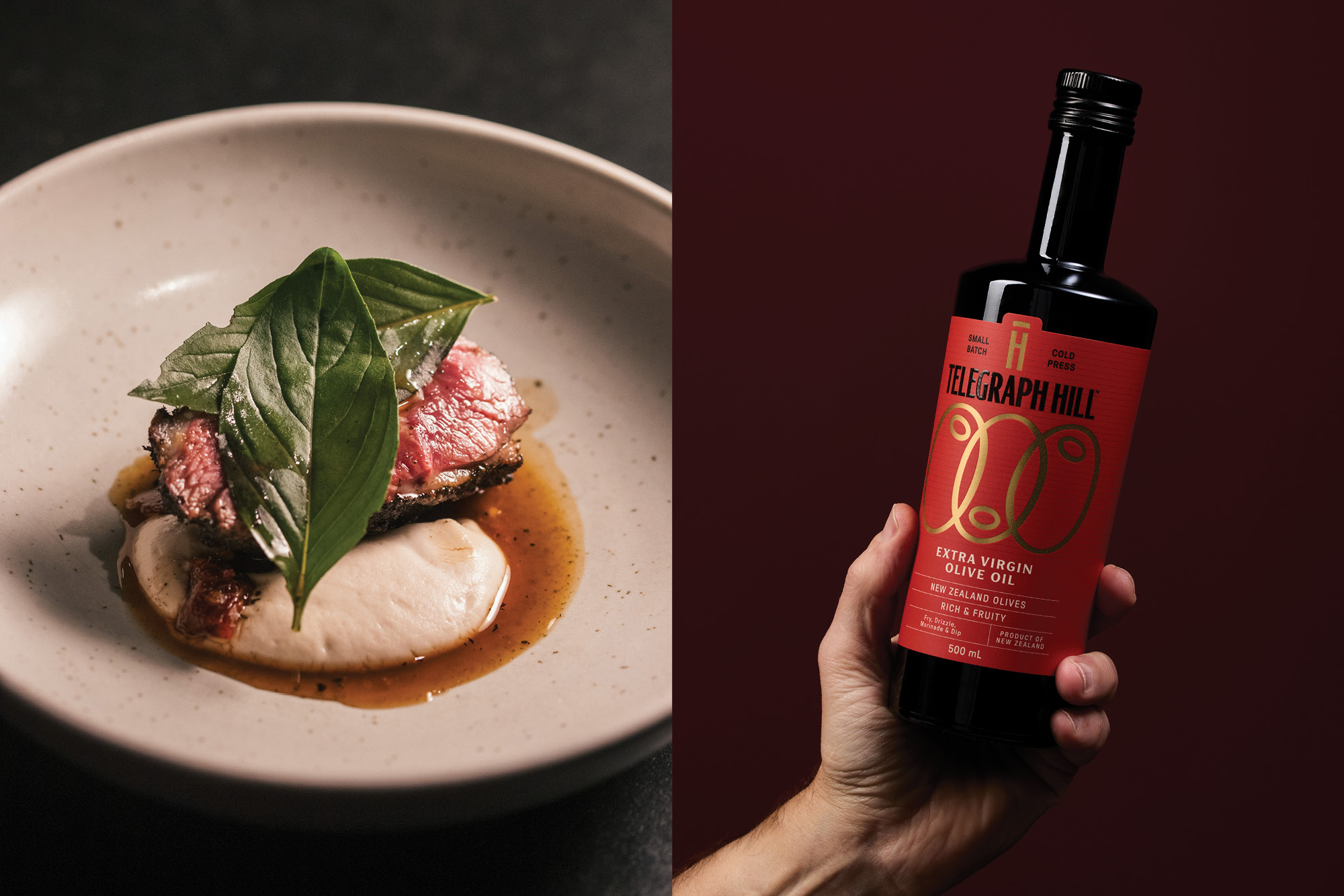
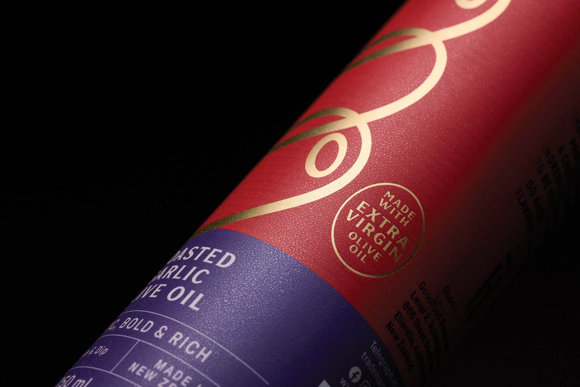
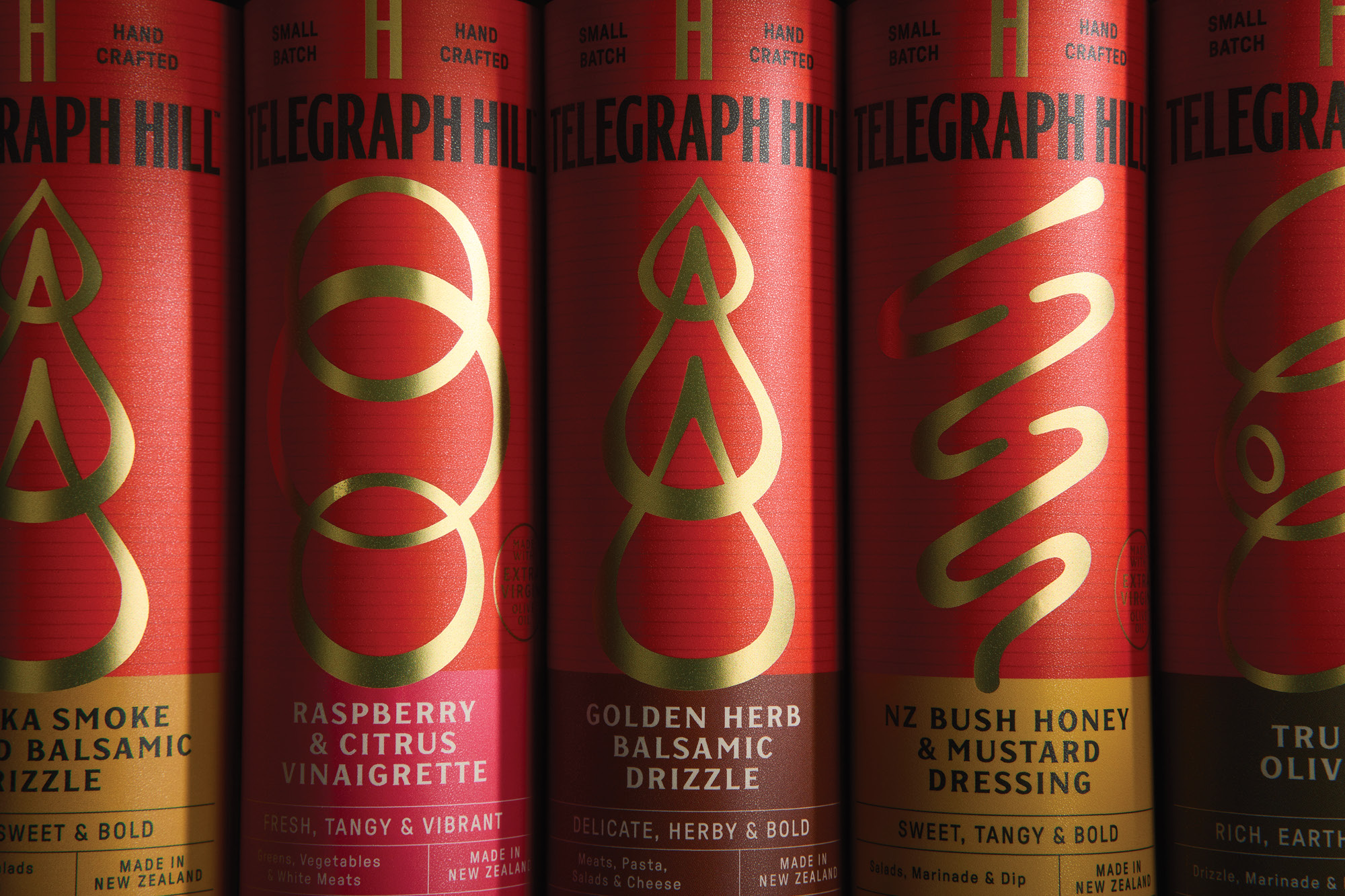
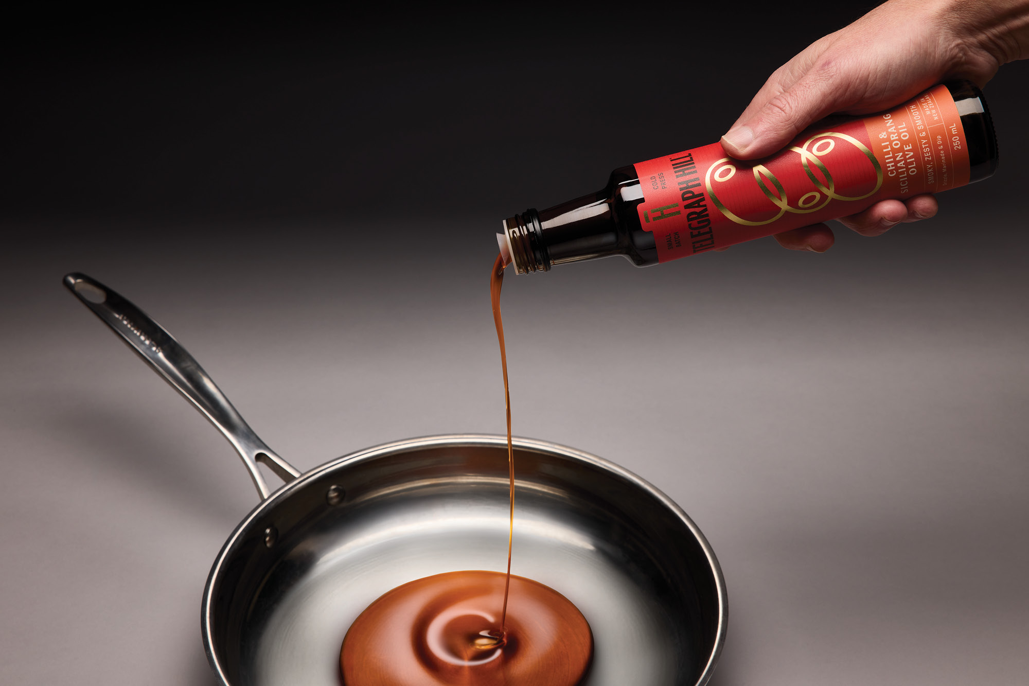
That ethos guided every design decision. The familiar Telegraph Hill red was elevated as the hero a bold block of colour symbolising flavour, passion, and the joy of making. A new illustration system unites two brand truths: the natural oval of an olive and the rhythmic signal waves of telegraph transmission. The resulting pattern — printed in refined gold foil — is both icon and metaphor, capturing craft, connection, and the love of the olive at the brand’s core. A curious fusion of electromagnetic movement and nature, it radiates warmth and chef-level confidence.
The refreshed wordmark takes cues from the vertical stature of telegraph towers, its tall, elegant letterforms paired with a balanced TH monogram that evokes wine-label sophistication. Fine linear detailing nods to transmission wires, while the typographic structure borrows cues from modern gastronomy — refined, orderly, and assured.
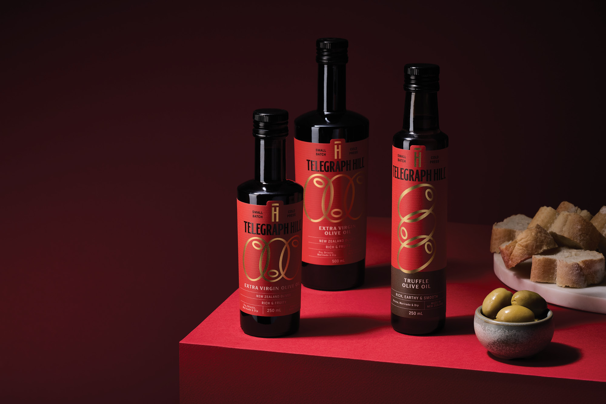
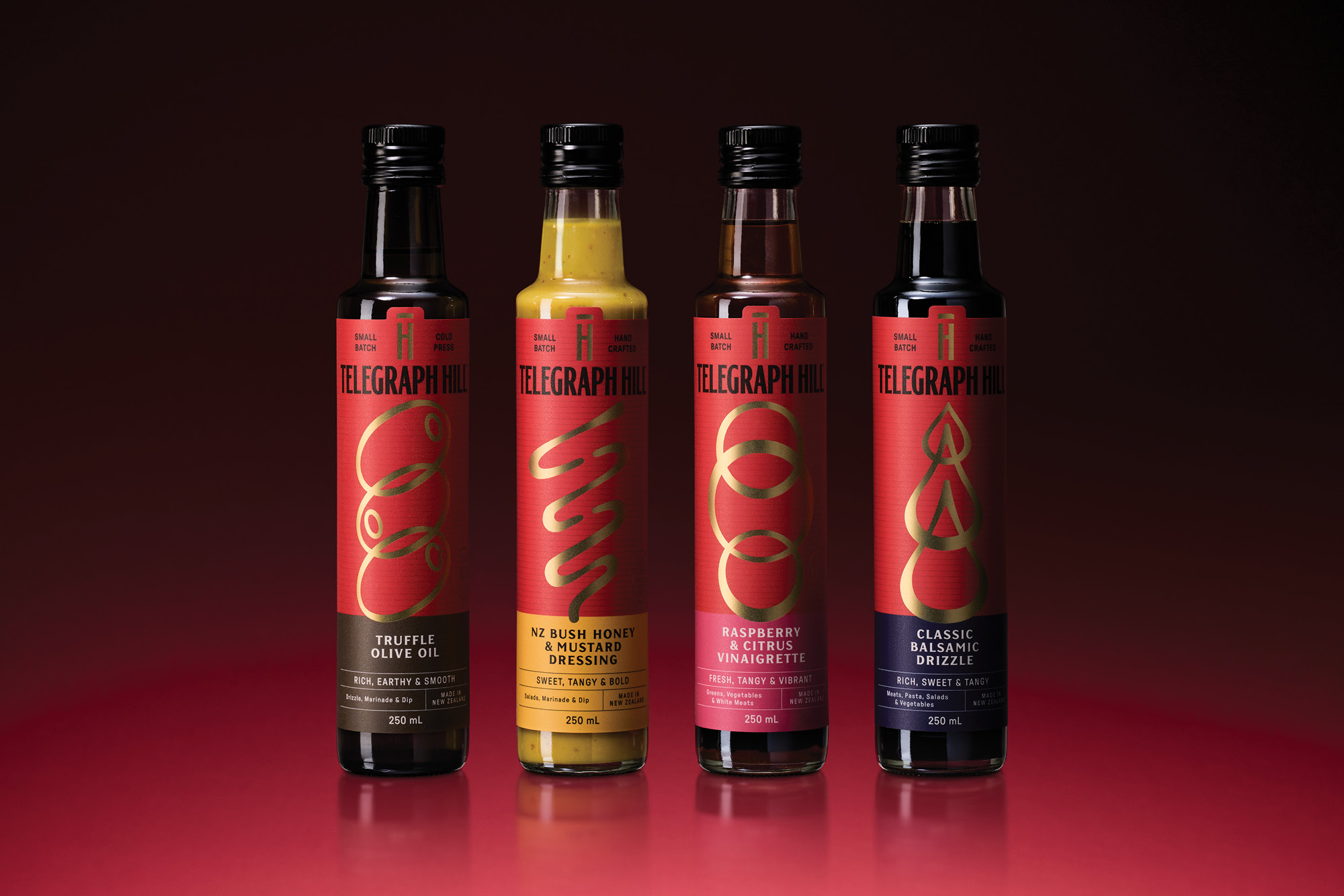
Across the range, the system flexes seamlessly. Colour bands aid navigation, while tailored illustrations hint at texture and usage — a creamy pour for dressings, droplets for richer drizzles, rippling waves for fine vinaigrettes — each one composed with three rhythmic elements and finished with gold foil.
The result is a mature, confident rebrand that elevates Telegraph Hill from beloved local to modern New Zealand icon — a celebration of provenance, craft, and the enduring pursuit of flavour.
CREDIT
- Agency/Creative: Onfire Design
- Article Title: Onfire Design Brings Telegraph Hill’s Spirit of Flavour and Connection to Life with Modern Refinement
- Organisation/Entity: Agency
- Project Type: Packaging
- Project Status: Published
- Agency/Creative Country: New Zealand
- Agency/Creative City: Auckland
- Market Region: Oceania
- Project Deliverables: Brand Redesign, Brand Refinement, Brand Strategy, Brand Tone of Voice, Brand World, Illustration, Packaging Design
- Format: Bottle
- Industry: Food/Beverage
- Keywords: WBDS Agency Design Awards 2025/26 , Packaging, Premium, Brand refresh, Colour, Typography, Foil
-
Credits:
Creative Director: Matt Grantham
Design Director: Natasha Alimova
Art Director: Sam Allan
Creative: Kendal Dunlop
Acc Management: Jane Allan


