


Independent agency Brandon Consultants is pleased to share its latest work with Caudwell Children: a new visual brand identity that reflects the charity’s new direction.
“One of our missions as a business is to ‘Build a Better Brandon’, and one of the ways we do this is by using our skills and resources to partner with causes that we care about. Caudwell Children is one of those partners. A charity dedicated to empowering disabled and neurodivergent children, Caudwell Children came to us with a new brand positioning and a design challenge: translate their future vision into a visual brand identity that reflected the organisation’s new direction. What a beautiful challenge to accept.” – Richard Taylor, Co-Founder of Brandon Consultants.
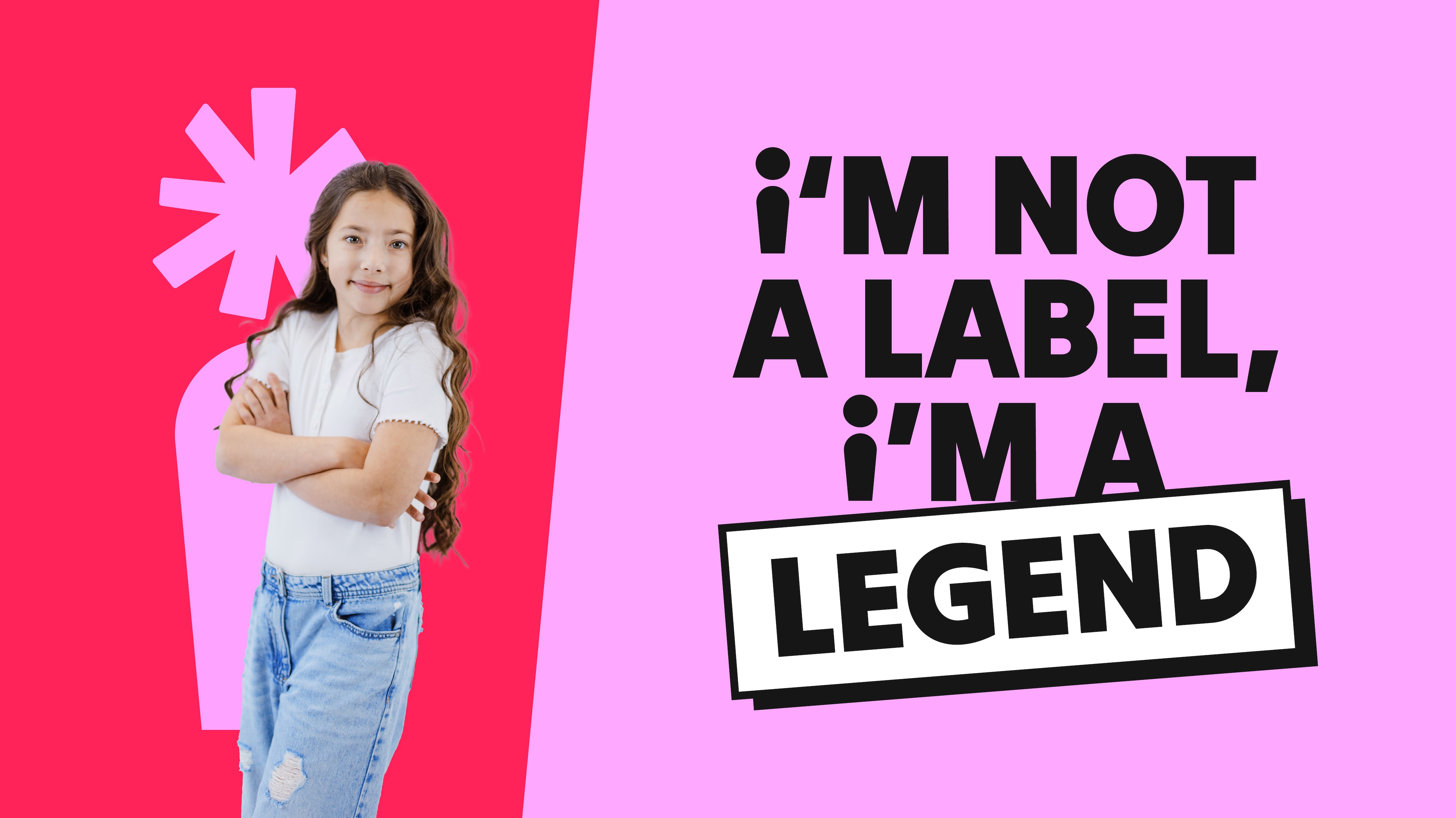
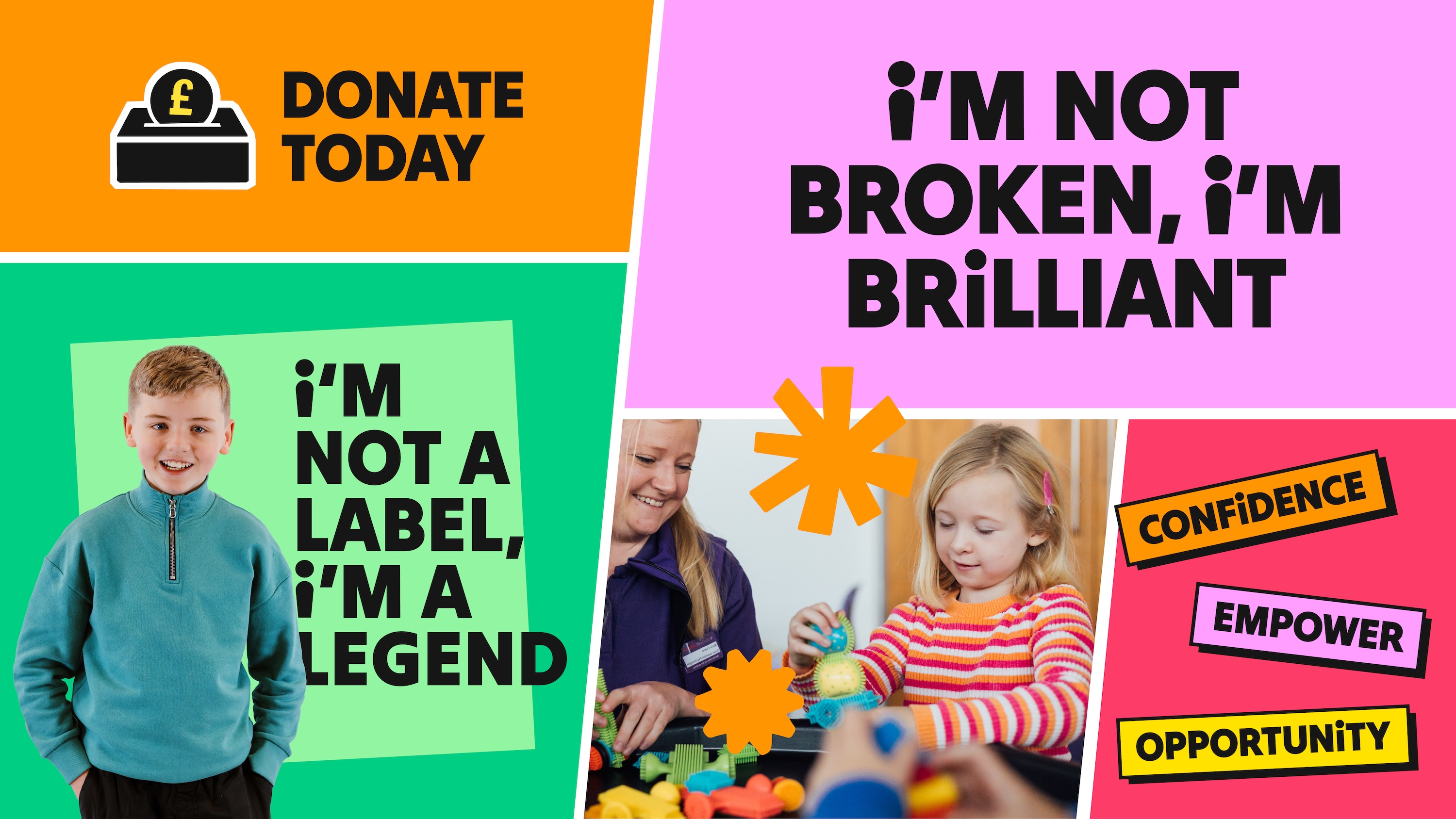
Caudwell Children’s new brand purpose is built around a simple yet powerful idea – every child is born with their own unique potential – and the charity’s mission is to support disabled and neurodivergent children and young people in achieving this. Brandon Consultants’ design idea unlocks the meaning of ‘potential’ to champion the individuality of each and every child.
“At the heart of our new visual brand identity is a new ‘i’ key brand asset. More than just a lowercase letterform in the brand’s logo, we’ve transformed it into a positive visual representation of the unique potential and personality of every child. The tittle (aka the dot) has the flexibility to evolve and reflect different expressions of individuality. It can be brought to life in all sorts of creative ways, but it always retains a radiating shape to symbolise thriving growth and shining a light on each child’s personal journey.” – Tom Mitchell, Design Director at Brandon Consultants.
The new ‘i’ asset forms part of the new master logo. Bold and confident in its stamp-like style, Brandon put it on a gentle tilt to add a spark of childlike curiosity. A secondary version adds the organisation’s new strapline, creating a powerful visual statement that is revolutionary for the brand. Everything is set on a vibrant new colour palette that takes Caudwell Children out of its previous restricted world of purples and reds and into a more playful space filled with warmth, diversity and positivity.
Other design details within the new visual brand identity system include:
– Tilt War as the headline typeface for its balance of personality and professionalism that works in harmony with the ‘i’ asset.
– The more stripped back Work Sans, chosen as the secondary typeface for absolute clarity when longer form copy is required.
– A distinctive iconography style and initial suite of icons that combine playfulness with approachable simplicity to help audiences navigate information with ease.
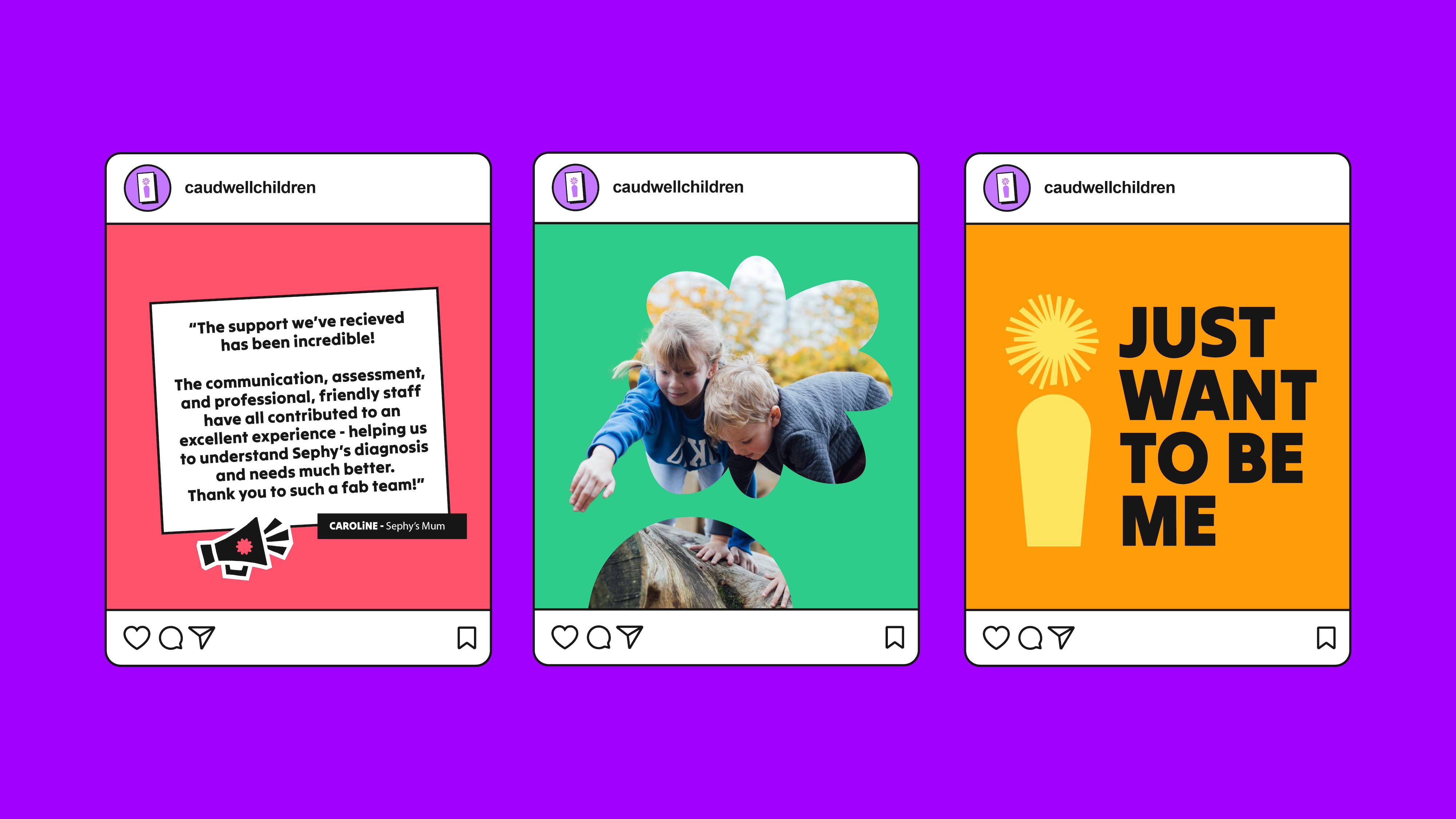
– A photography style that focuses on showing real children in a confident, empowered way. Low camera angles portray each child as strong and heroic, and the use of natural poses and expressions ensures that nothing feels forced or staged.
Alongside a comprehensive set of brand guidelines, Brandon Consultants provided a series of suggested layouts based on the shapes used in the new visual brand identity, plus examples of executions to inspire Caudwell Children’s internal team with ways to use the new design elements and bring their new brand to life.
“My team and I are loving using our new visual brand identity system. Brandon Consultants has created something truly special for us, making even the most basic or mundane touchpoint exciting. Everything the Brandon team has considered and designed is reflective of our new positioning and the young people we serve, and they have armed us with the tools to confidently communicate our new vision to our corporate partners and donors, too. We couldn’t have asked for better creative partners to help us take our charity to the next level and ultimately make a real difference to the children we support.” – Mike Harper, Director of Marketing & Communications at Caudwell Children.
Caudwell Children launched its new brand positioning, visual brand identity system, and ‘My Potential My Way’ brand campaign in October 2025.
CREDIT
- Agency/Creative: Brandon Consultants
- Article Title: Brandon Consultants Brings Caudwell Children’s New Brand Positioning to Life With a Visual Brand Identity Rooted in Potential
- Organisation/Entity: Agency
- Project Type: Identity
- Project Status: Published
- Agency/Creative Country: United Kingdom
- Agency/Creative City: Manchester
- Market Region: Europe
- Project Deliverables: Brand Design, Brand Guidelines, Brand Identity, Brand Mark, Brand Redesign, Branding, Design, Graphic Design, Icon Design, Identity System, Logo Design, Typography
- Industry: Non-Profit
- Keywords: charity, non-profit, brand identity, redesign, logo design, brand identity system, branding, brand design
-
Credits:
Agency: Brandon Consultants
Client: Caudwell Children


