


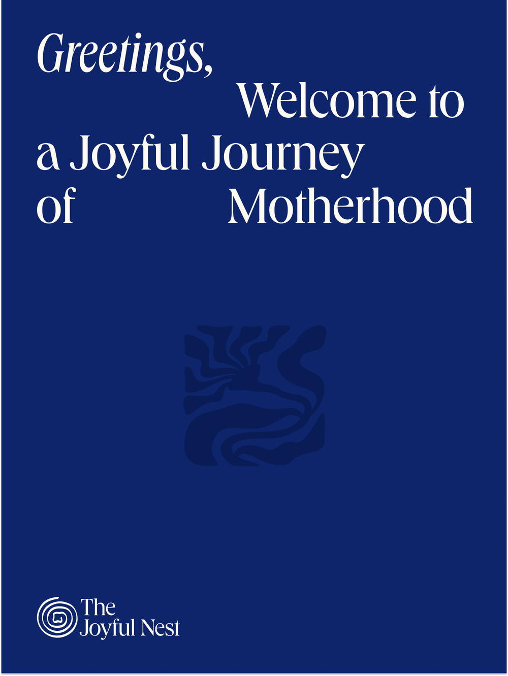
xolve x The Joyful Nest: “Design must build trust through emotional truth”
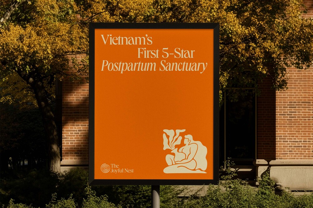
The Joyful Nest is one of Vietnam’s first luxury postpartum sanctuaries, blending medical science with heartfelt care to help mothers heal, rest, and rediscover joy after childbirth. Founded by Kun and Ruby, two women who have personally walked the journey of early motherhood, The Joyful Nest was born from a deep and heartfelt belief: recovery after giving birth deserves the same level of attention, comfort, and beauty as any other milestone in a woman’s life.
When the founders envisioned this haven, they knew it had to feel more than just professional. They approached xolve with a clear mission: to transform their vision of a five-star postpartum experience into a brand that embodies warmth, trust, and emotional renewal. From the brand strategy to the visual language, xolve helped The Joyful Nest articulate its essence as a place of healing through nurture.
Motherhood finds its voice
For too long, postpartum care in Vietnam had hovered between medical routine and traditional practice, rarely offering both professional trust and emotional sanctuary. The Joyful Nest sought to bring these worlds together, turning recovery into something visible, tangible, and deeply felt. With the founders’ vision as its compass, xolve branding shaped a visual language that embodies the calm, strength, and quiet devotion of motherhood. The identity holds both the warmth of a home and the assurance of a medical haven.
For xolve, The Joyful Nest was an opportunity to help define an entirely new category in Vietnam – five-star postpartum hospitality. From the very first conversation, both teams were aligned by a shared belief that motherhood deserves to be met with the same level of artistry, empathy, and excellence as any other form of care. At its core, The Joyful Nest became a study in contrast, beautifully resolved. Preserving this delicate balance through every design decision allowed xolve to craft a distinctive identity: a living symbol of modern motherhood.
The harmony of “Mẹ Tròn, Con Vuông”
At the heart of The Joyful Nest lies a single, powerful idea: healing through nurture. The nest became the central symbol. The design system was built around this philosophy: every organic illustration, elegant typeface, and spacious layout was intentionally crafted to evoke stillness, softness, and deep emotional calm. Together, these elements were orchestrated to create a moment of pause to slow the heartbeat, help mothers breathe, and remind them that they are held in care.
Every pioneering idea carries its own paradox, and The Joyful Nest had to embody medical precision while remaining tender, to feel luxurious without losing its soul. The answer revealed itself through a timeless Vietnamese wish, “Mẹ tròn, con vuông” or “Mother round, child square.”
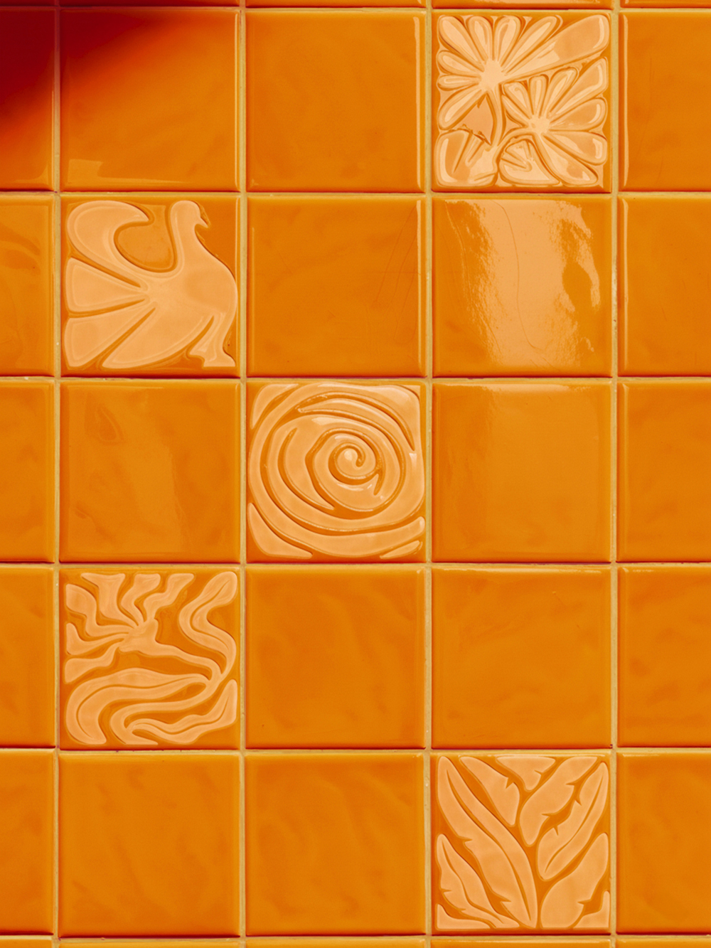
Beyond the idiom itself, xolve drew from broader Asian symbolism, particularly the spiral motif, which represents continuity and transformation in nature. The gentle dialogue between circle and square became a visual metaphor for balance between body and mind, mother and child, science and soul.
Translating this philosophy into design required a delicate equilibrium. The warm sunrise palette brings optimism and renewal, soft curves and open compositions evoke peace and reassurance, and the tone of voice, both verbal and visual, remains gentle, confident, and restorative. Every creative choice was made to feel like a quiet embrace, guiding mothers through one of life’s most vulnerable yet beautiful transitions.
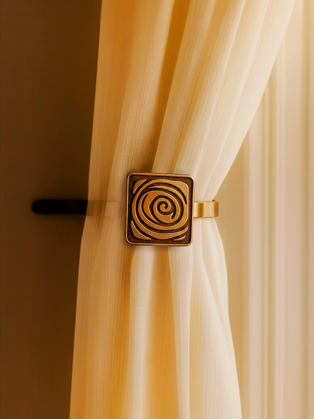
Beneath the surface, subtle layers of meaning deepen the story. The brand’s inspiration came first and foremost from the founders’ lived experiences: their memories of vulnerability, and their desire to turn that need into joy. Even within the logo, the spiraling lines subtly form the shape of a fetus nestled within the mother’s womb.
“Our goal was to create more than a brand; it’s an emotional sanctuary. Every curve, color, and word was designed to slow the heartbeat, to bring calm into what is often the most overwhelming chapter of a woman’s life.” shared by Khoa Huynh, Creative Director of xolve.
Designing the language of motherhood
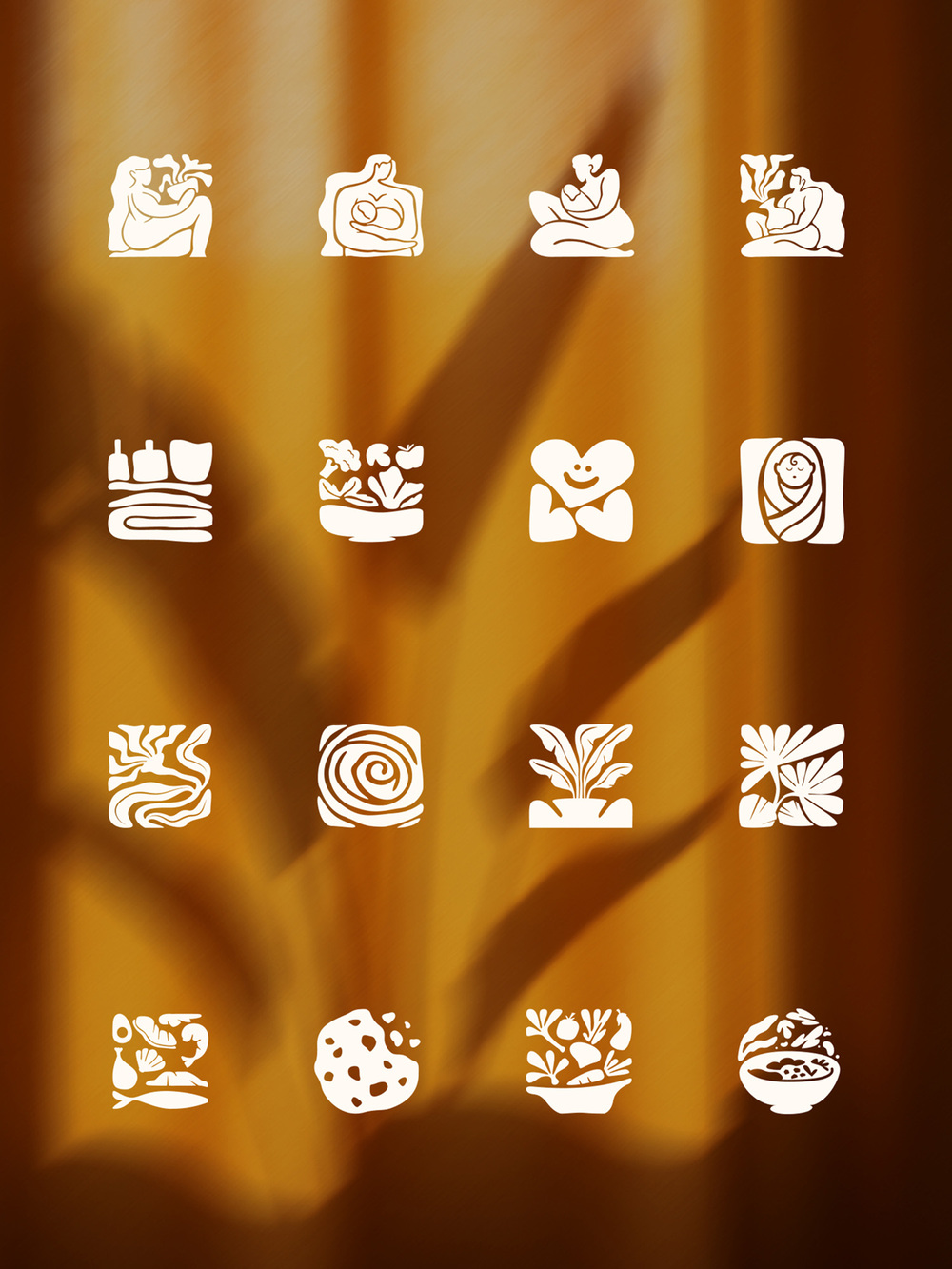
The visual identity of The Joyful Nest was built to express a delicate balance. At its core lies the nest symbol, reimagined not as a literal form but as an abstract, continuous line that loops and spirals in fluid motion. This single gesture captures the essence of protection, growth, and the infinite embrace of motherhood. Its simplicity carries emotional weight, a visual metaphor for safety, calm, and continuity.
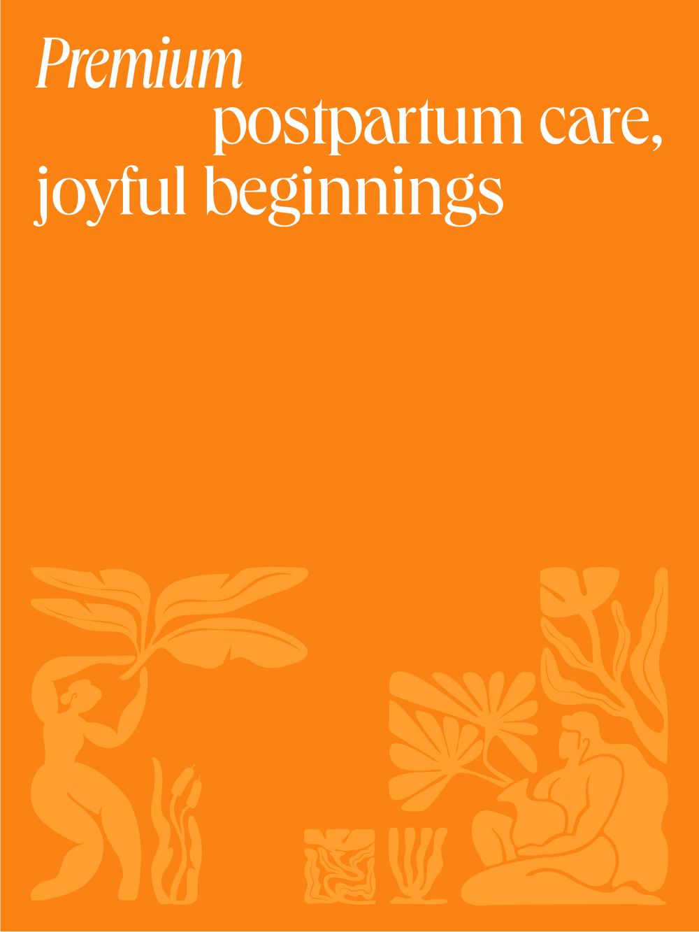
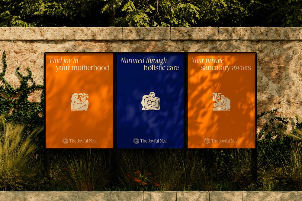
The color palette draws inspiration from the moment of sunrise, the universal symbol of renewal and gentle awakening. Shades of Butter Yellow and Bird of Paradise Orange convey warmth, optimism, and joy, while Deep Blue introduces serenity and trust. Together, these tones create a visual harmony that is both uplifting and reassuring.
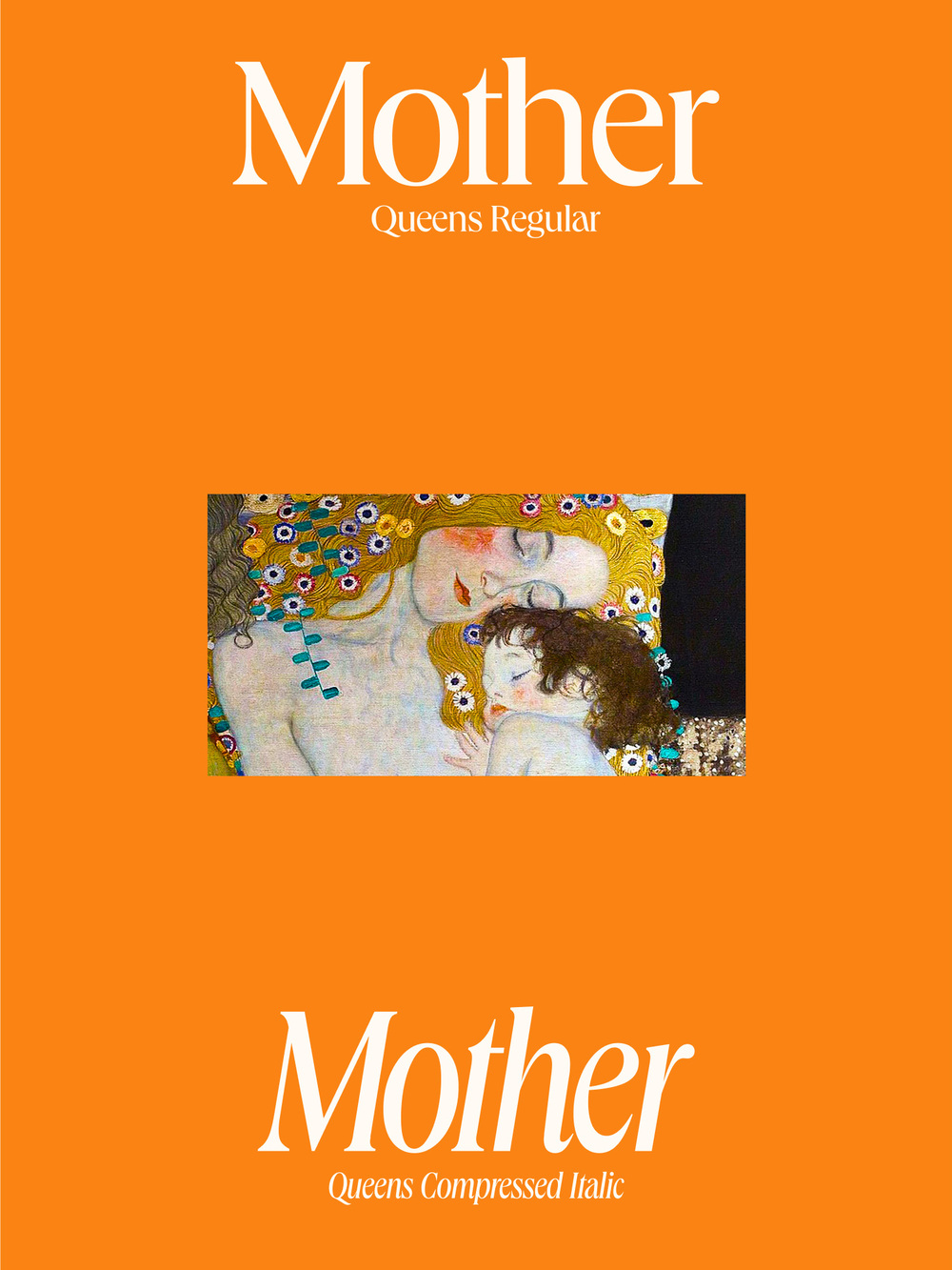
The choice of typography further strengthens this duality. The Queens typeface was deliberately selected for its ability to communicate both grace and stability. Its refined serifs and soft curvature lend an air of timeless elegance, while its structural balance evokes quiet confidence.
Completing the system, the hand-drawn illustrations bring humanity into a space that could easily feel clinical. Their organic, fluid strokes capture the rhythm of care. Together, these visual elements form a language that feels scientifically grounded yet emotionally alive, turning The Joyful Nest into a living sanctuary expressed through design.
Building trust through emotional truth
Among the most rewarding moments was seeing everything come together, when the visual identity, tone of voice, and physical environment began to speak in unison. The calm atmosphere of the sanctuary mirrored the design philosophy perfectly, and the heartfelt feedback from mothers affirmed that the brand had achieved what it set out to do: to connect on a deeply human level.
The response to The Joyful Nest has been overwhelmingly positive. The brand has become a symbol of emotional trust, resonating deeply with mothers who feel understood even before setting foot inside. Its success has resonated not only with clients but has also gained recognition from KOLs and healthcare partners alike, affirming its role in setting a new benchmark for postpartum care in Vietnam.
For xolve, this collaboration perfectly embodies their creative philosophy that design built on empathy and truth can transcend aesthetics to create genuine human connection. It reflects xolve’s core mission: to build impactful brands that inspire trust, evoke emotion, and create lasting value through real human stories. The Joyful Nest is a living story of that belief, showing how design, when rooted in empathy, can change not just how people see a brand, but how they truly experience care itself.
The Joyful Nest tells a new story of care, one written not in words, but in light, touch, and feeling. It challenges the divide between comfort and credibility, showing that postpartum care can be both. In every way, it reflects the belief that design can hold space for healing. That beauty can comfort. That empathy can be built, shaped, and shared.


CREDIT
- Agency/Creative: xolve
- Article Title: Xolve X the Joyful Nest: “design Must Build Trust Through Emotional Truth”
- Organisation/Entity: Agency
- Project Type: Campaign
- Project Status: Published
- Agency/Creative Country: Vietnam
- Agency/Creative City: Ho Chi Minh
- Market Region: Asia
- Project Deliverables: Brand Design, Branding
- Industry: Health Care
- Keywords: the joyful nest, xolve, rebranding
-
Credits:
Creative Director: Khoa Huynh


