A bright future: Sol radiates optimism through new global identity, packaging and premiumisation designed by LOVE. to connect with a younger adult audience
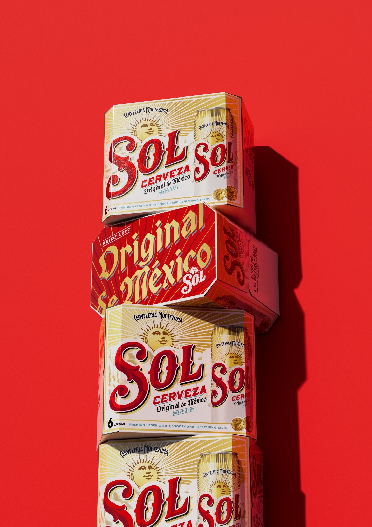
Manchester-based creative agency LOVE. has partnered with Sol to create a new global identity and packaging for the original Mexican lager. The redesign aims to position it as the beer of choice with young adult consumers and re-establish its status as the original through craft and premiumisation.
Through cultural insight, design and detail, the work brings the brand’s heritage back to the fore, to attract a wider audience looking for quality and authenticity.
The direction marks a significant evolution in Sol’s marketing approach – from broad messaging that ‘targets’ consumers, to creating a genuine youth culture brand that builds fandom through unpretentious and authentic behaviour.
In an increasingly competitive drinks market, heritage brands need to work harder to stay relevant. The rebrand and new packaging creates connections with consumers on a deeper, more meaningful level, shifting the perception of Sol and the wider mainstream beer category. It positions Sol as a premium choice for younger drinkers, built on authentic Mexican roots and refreshed for today’s generation.
A brand world based on positivity
Originally created in 1899, Sol was once a craft pioneer, championing its Mexican provenance and its sun namesake. Over the years, however, its use of this heritage as a strategic asset had become diluted, making it difficult to maintain visibility and relevance in a crowded market.
Eric Halgand, Global Brand Lead for Sol, says: “Sol is the original Mexican lager, and features a unique history – and this striking new visual identity honours this heritage whilst staying true to its uplifting, sunny positioning. After meticulous development, we’re thrilled to unveil the new look for the brand across the world, alongside the smooth, refreshing taste of Sol, perfect for consumers to enjoy whilst they unwind and recharge”.
This refresh achieves that by reinforcing the brand belief that embracing positivity is the key to truly enjoying life. It positions Sol as a brand full of energy and vibrancy, appealing to young adults that increasingly navigate uncertainty with positivity and action.
“The young adult consumer expects brands to be authentic, culturally relevant, and visually compelling,” says Eve Warren, Design Director at LOVE. “Leaning into young adults’ appreciation of ‘newstalgia’ (using the past to inspire something new), we dialled up Sol’s heritage, presenting it in a fresh, modern and more premium way.”
Elevating an icon
The project was fuelled by a deep dive into Sol’s extensive archive, a treasure trove of labels, faded signage and campaigns full of intricate detail. The new work revives some of those original cues of authenticity that had been lost over the years.
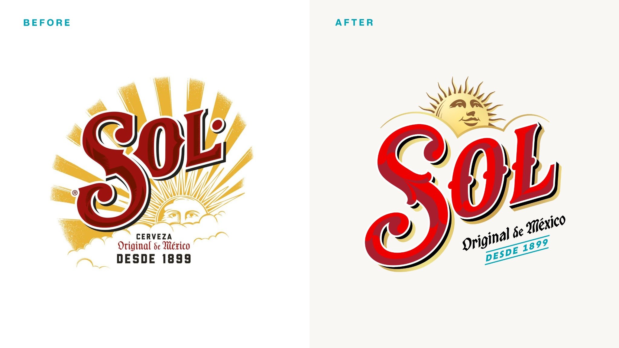
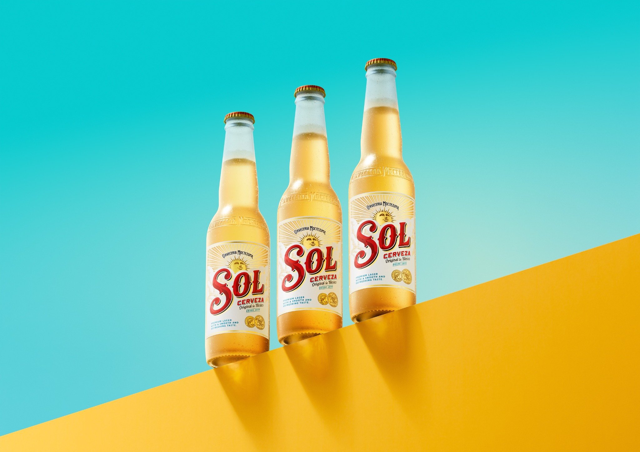
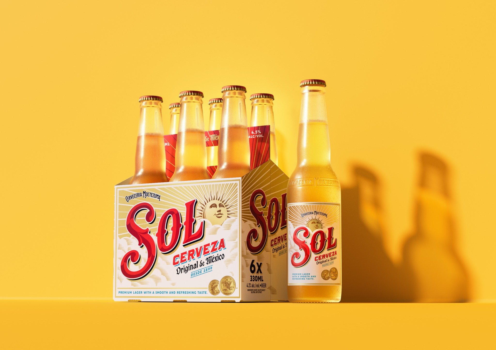
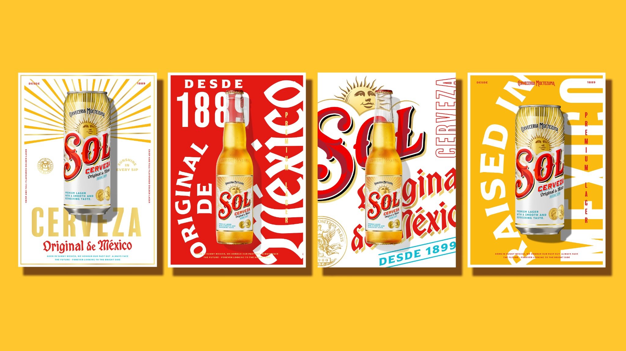
As part of the redesign and overall premiumisation, the LOVE team worked with acclaimed illustrator and lettering artist Tobias Hall to redraw all key design elements on the bottle label, from the Sol wordmark to the background clouds, secondary lettering and iconic sun face. For the new wordmark, for example, Hall looked to the beautifully idiosyncratic and evocative lettering of Sol’s historic labels, breathing new life into the letterforms with richly crafted detailing.
The central sun icon has also been enriched with deeper storytelling, elevating it from its previous role as a mere functional background. Showing its full face for the first time, with an open, upward gaze toward a bright future, it has been recast as a radiant, optimistic symbol of Sol’s heritage.
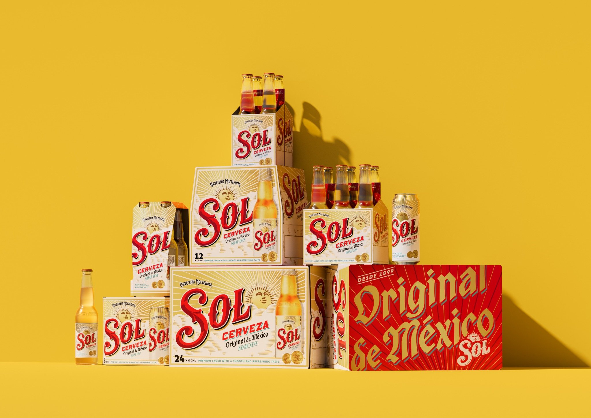
A vibrant colour palette dials up Sol’s iconic red and gold, while introducing teal to represent a crisp, clear blue sky and the liquid’s freshness. Full of life and energy, it now more effectively reflects a brand that was born from a culture synonymous with bold, vibrant colour, while delivering a more high-end look and feel.
Bespoke supporting type reflects the brand’s origin story through a diverse mix of font styles reminiscent of ornate archive labels. The illustration of the Paris Exposition gold medal won by the brand in the early 1900s has also been fine tuned in a contemporary style that heightens its significance on pack.
A holistic approach
The redesign goes beyond packaging, creating a fully realised brand world that can evolve with changing consumer expectations. It positions Sol as a dynamic brand that young adults want to engage with.
Warren adds: “By focusing on design that is both emotionally resonant and commercially impactful, we aim to set Sol apart from competitors. The new identity marks a bold return of Sol’s authenticity and heritage, shaped for young adult beer drinkers.”
The new identity will roll out globally across multiple platforms over the coming months with different markets creating bespoke launch campaigns. It will also feature in the global communication campaign ‘Welcome to the Sunny Side’.
CREDIT
- Agency/Creative: LOVE.
- Article Title: Sol Radiates Optimism with a New Global Identity and Packaging by LOVE
- Organisation/Entity: Agency
- Project Type: Identity
- Project Status: Published
- Agency/Creative Country: United Kingdom
- Agency/Creative City: LOVE. Manchester
- Market Region: Global
- Project Deliverables: Brand Design, Brand Identity, Packaging Design
- Industry: Food/Beverage
- Keywords: visual idendity, beer, beer design
-
Credits:
Client: Sol


