


Marketing Agency DVIGA – Sports retail chain “Olimp”
The Olymp company has existed for more than 20 years and has 8 sports stores . The client decided that it was high time for a visual update, but we had a feeling that we first needed to understand why the brand should change and how exactly they should do it, before developing a new logo and a brand book.
DVIGA executed a comprehensive rebranding for Olympus, a sports retail chain seeking to refresh their market positioning and visual identity.
The Olympus sports retail chain needed retail branding and logo design that would appeal to their target demographic while differentiating them from competitors.
Our tasks were to look at the business from the outside and understand how customers make purchasing decisions, what they pay attention to, what things they doubt about, and how we can overcome these objections.
Our approach to the Olympus rebranding included market research, competitor analysis, and customer persona development to ensure the new identity would resonate with the sports retail chain’s customer base.
This is the basis for the development of any company. We checked the current brand positioning against its real state and identified the values that are important for customers. Now the design reflects the mission and advantages of the brand, which benefits the company, employees and customers.
Logo
We have worked on 4 different concepts of corporate identity and presented them. The logo design process for Olympus incorporated elements that reflected activity, energy, and sporting excellence, creating a visual identity that effectively communicated the retail branding objectives.
Each of the options was good in its own way, but it was decided to opt for a stylized mountain made of dots. “Olimp” is about conquering new frontiers, health, hobbies and a community of active people.
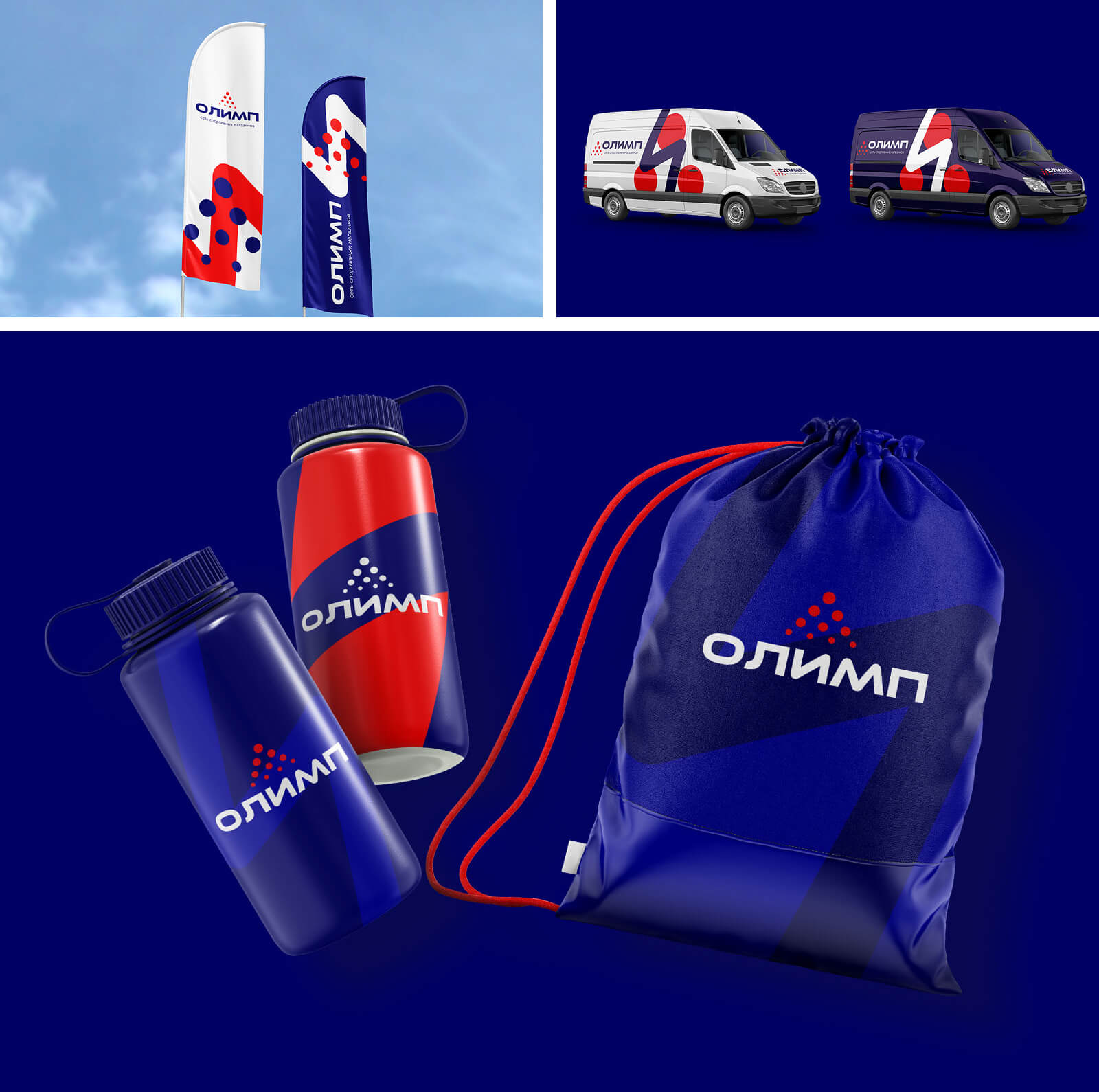
The main idea of the logo is to reach new heights in sports and at the same time be surrounded by people with similar interests. The love of sports unites many people, including our target audience. Additionally, we suggested stylizing the letter “И”, which is a part of the name, which can be used in advertising banners.
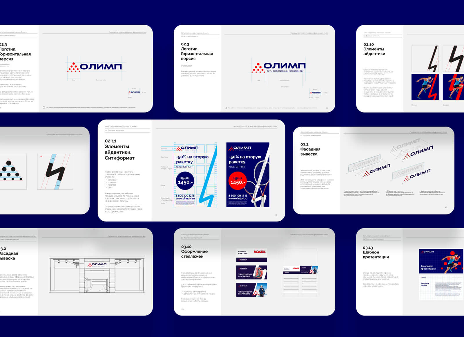
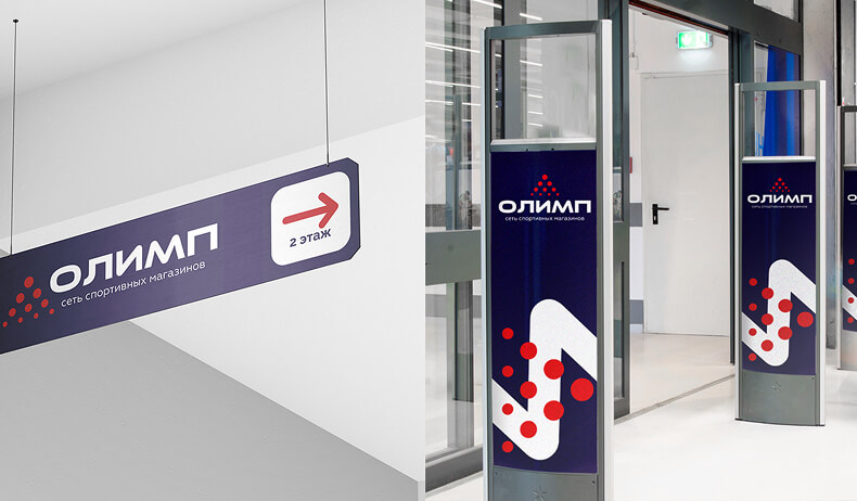
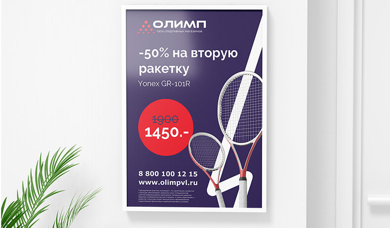
To create a brand book, we analysed every corner of the store and left the customer with ready-made layouts for almost all occasions. Every sign and every price tag conveys the strong qualities of the Olympus brand: when you enter the store, you immediately understand what it is about and who it is for. Even the Raleway font speaks of the company’s solidity and willingness to solve each client’s problem.
CREDIT
- Agency/Creative: Marketing Agency DVIGA
- Article Title: Marketing Agency DVIGA Redefines Olimp with a Dynamic Rebrand That Inspires Active Living
- Organisation/Entity: Agency
- Project Type: Identity
- Project Status: Published
- Agency/Creative Country: Singapore
- Agency/Creative City: Singapore
- Market Region: Europe
- Project Deliverables: Brand Design
- Industry: Retail
- Keywords: branding
-
Credits:
management and creative: Timofey Beloglazov
art director: Egor Suslin


