


Quatre Mains – Nutty Thins by Baru
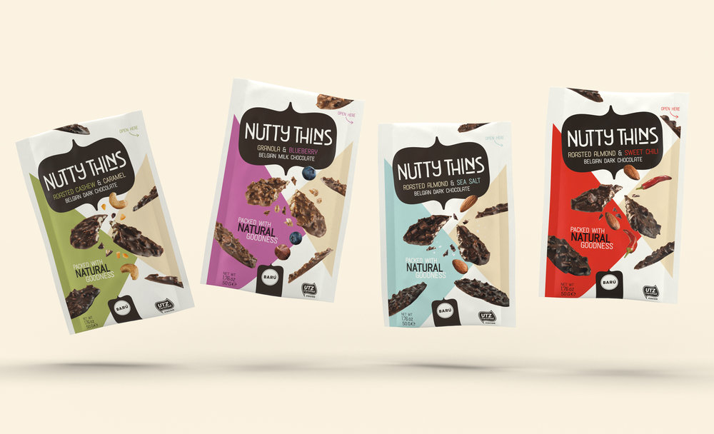
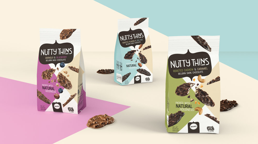
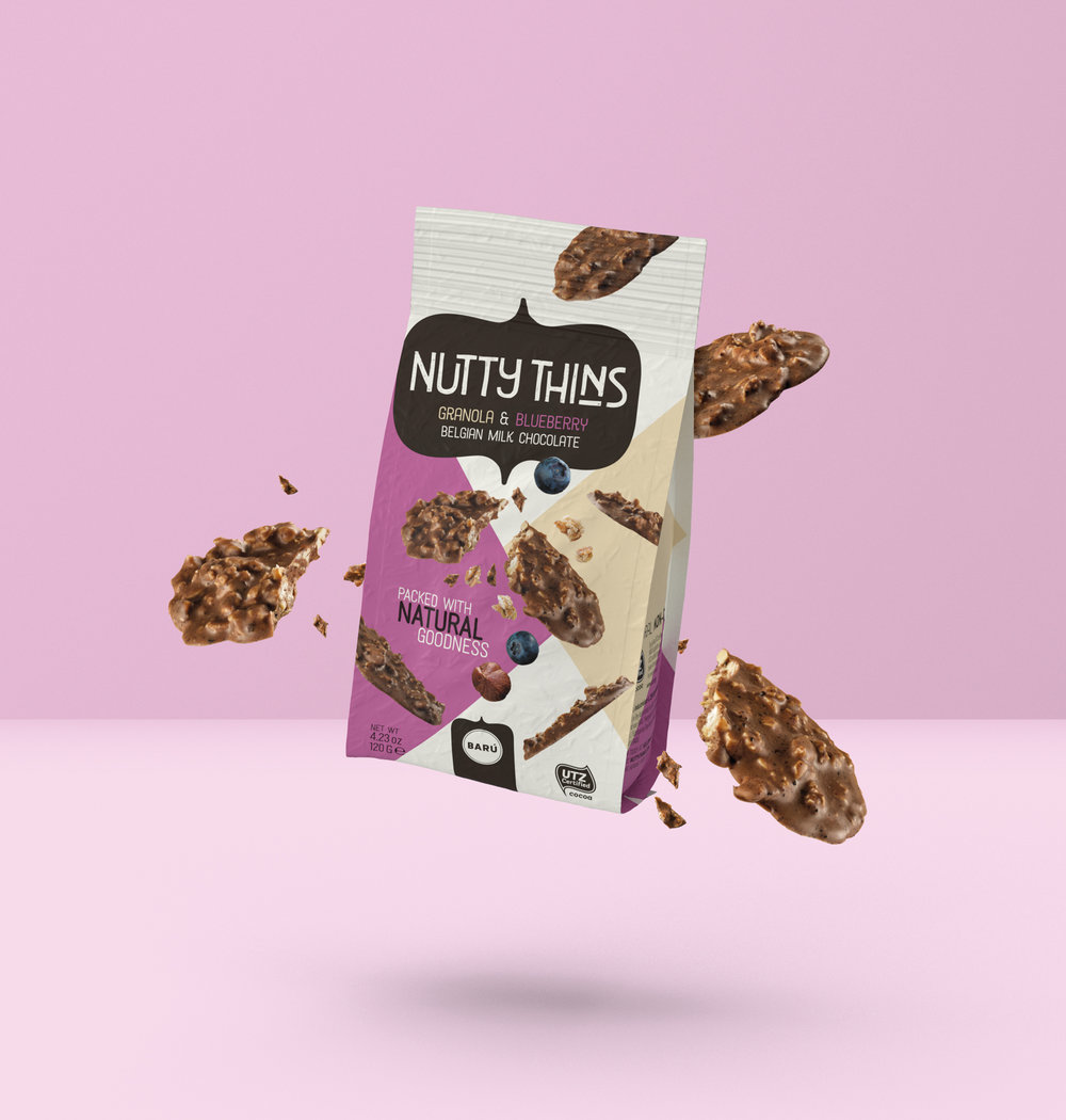
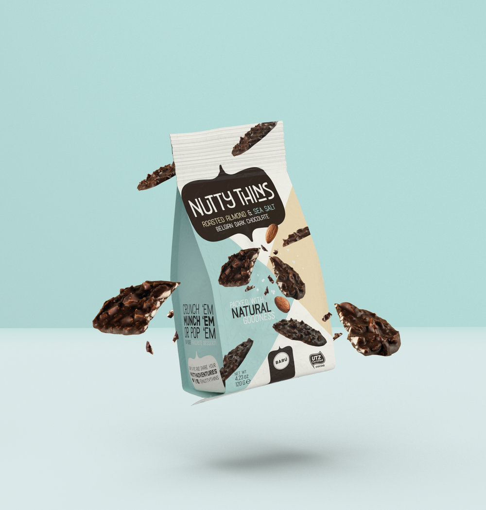
BARÚ is an up and coming Belgian company that builds on their national chocolate heritage in a playful and original way. They are whimsical, extremely stylish, a little rebellious and big fans of Belgian surrealism, with an ultimate goal to continuously surprise and amaze their fans with innovative and loveable treats. Exploring the ever-innovating chocolate market, BARÚ saw an opportunity to launch a premium snacking product based on a bitesize chocolate thin. This ultimate indulgence innovation looked to realize a new standard in an ever competitive category.Their brief was to create a packaging that differs significantly from their basic range, focusing more snacking and indulgence, with that crispy and light touch. Using the sub-brand range name ‘Nutty Thins’ they targeted a more quality seeking consumer, missing something within the snacking world. We gave BARÚ that extra bit of punch, an energetic design that really animates the product innovation and brand name whilst communicating delicious taste characteristics.Creating impact with a touch of class.
CREDIT
- Agency/Creative: Quatre Mains
- Article Title: BARÚ Releases New Packaging Design for ‘Nutty Thins’ Packed With Nutty Crunchiness
- Organisation/Entity: Agency Commercial, Published
- Project Type: Packaging
- Agency/Creative Country: Belgium
- Market Region: Europe
- Format: Pouch
- Substrate: Plastic


