


Port Pùck Distillery by Sparrow Design
Port Pùck Distillery is based in the town of Puck in the Pomeranian Province of Poland. The distillery was founded with the aim of showcasing the culture, adventure, and spirit of Puck and the Kashubian Coast. It draws inspiration from the depths of the sea, the depths of the heart, and nature. It carefully combines selected ingredients in its spirits, striving to achieve a unique taste and aroma of distillates. Their recipes are unique, and production is carried out by hand, in small quantities, ensuring the highest quality.
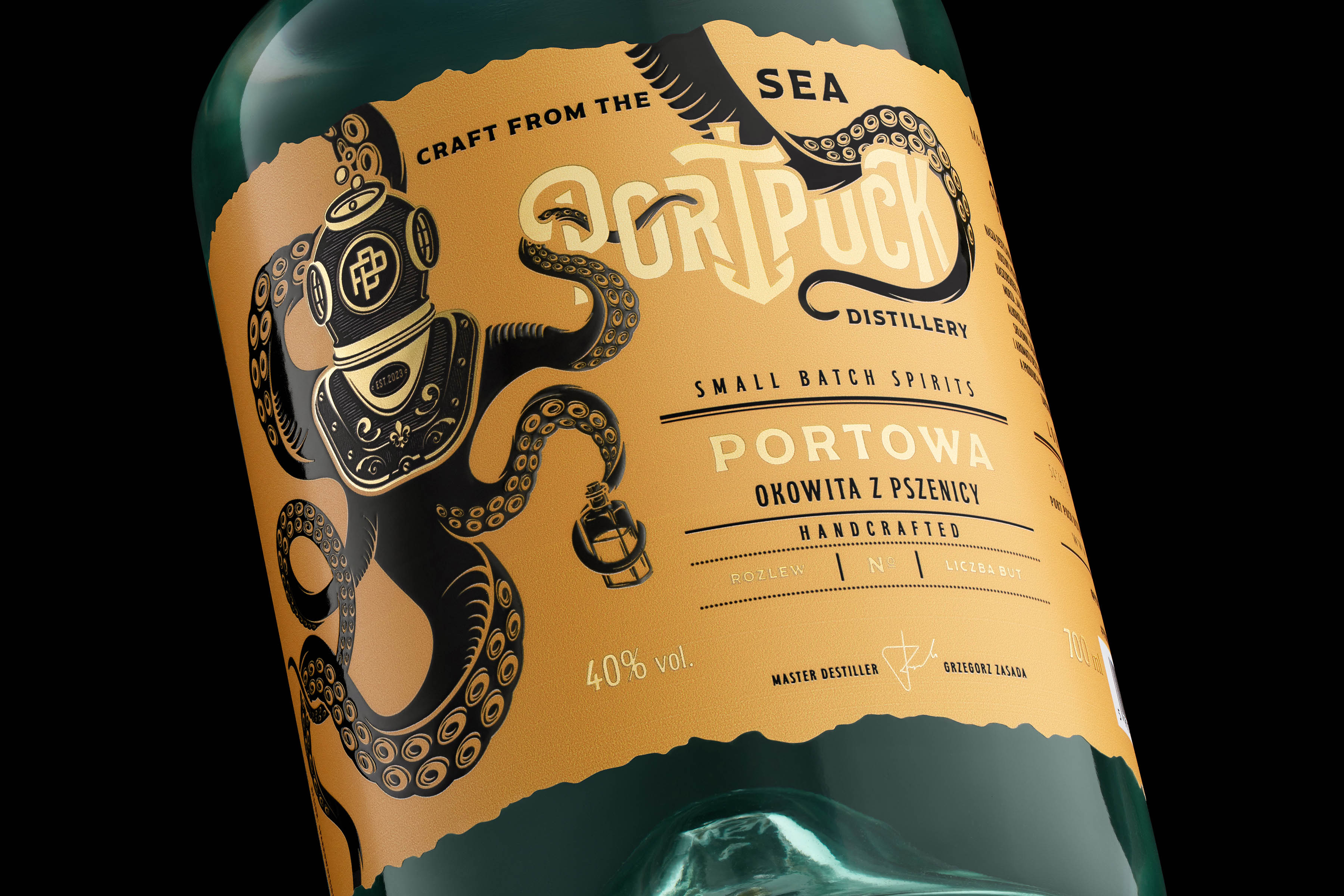
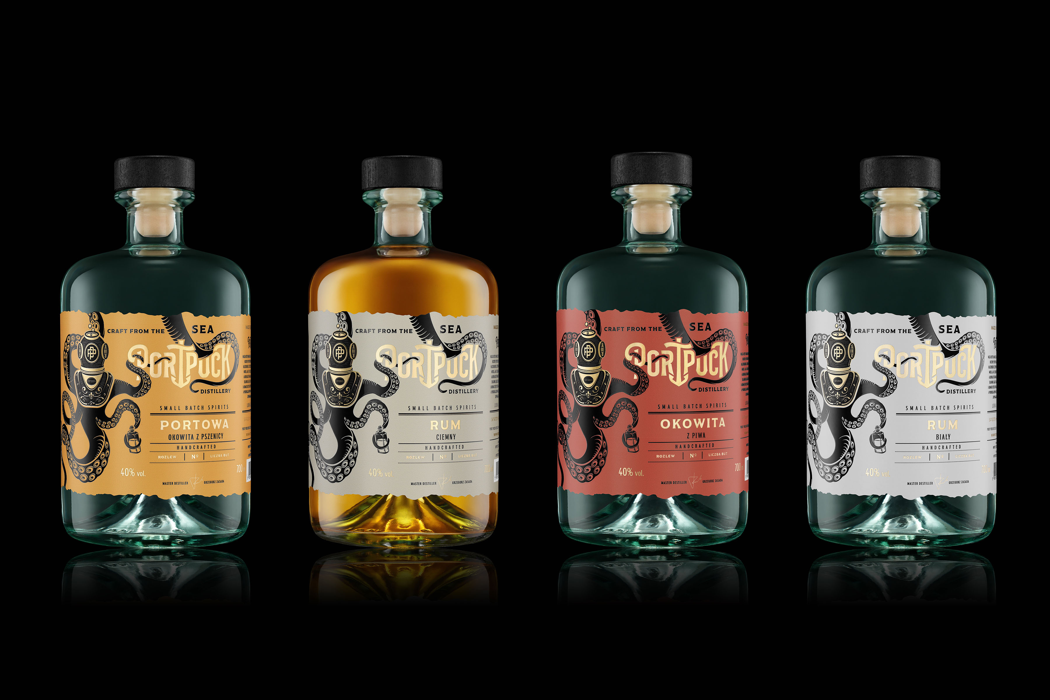
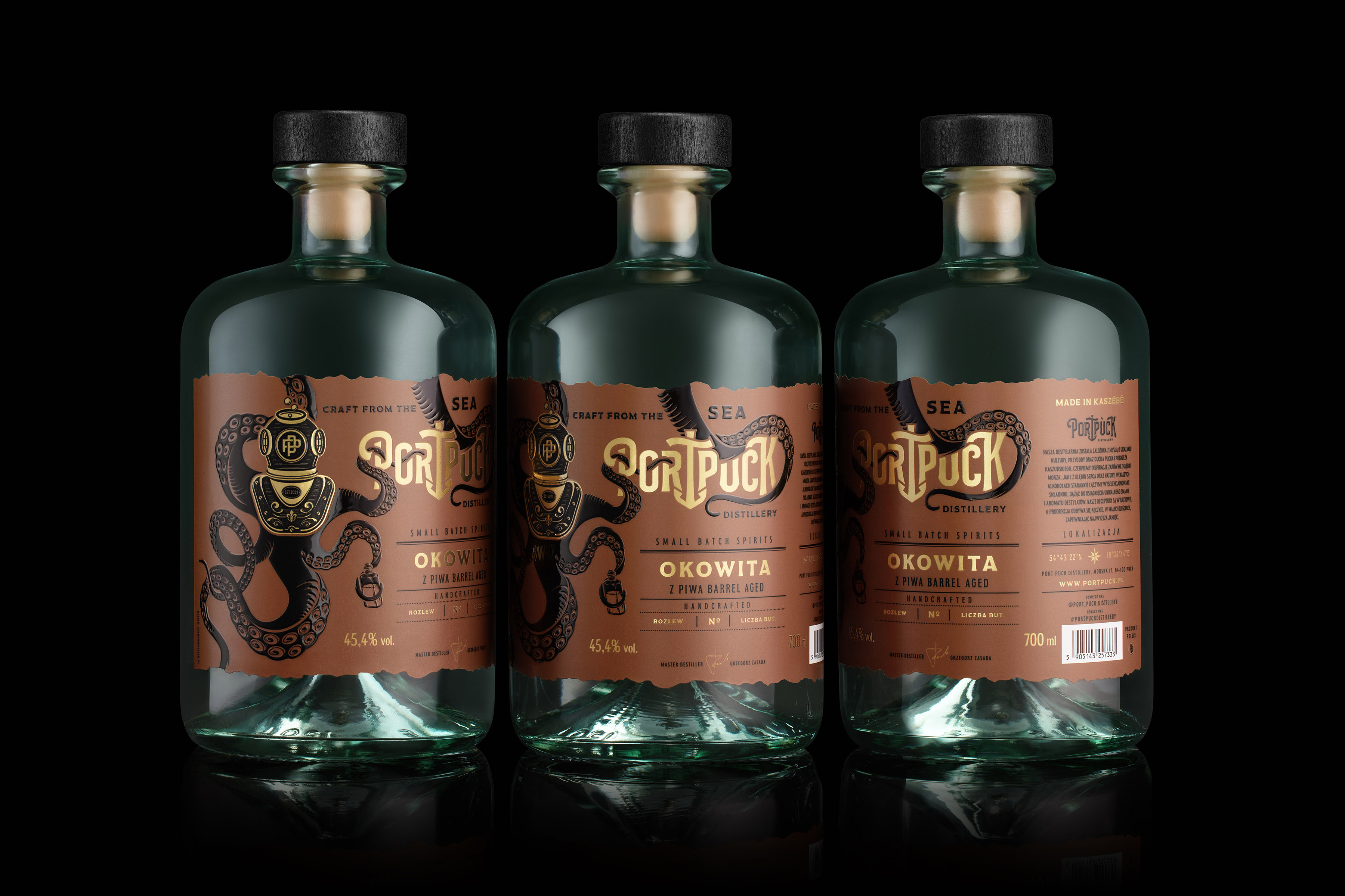
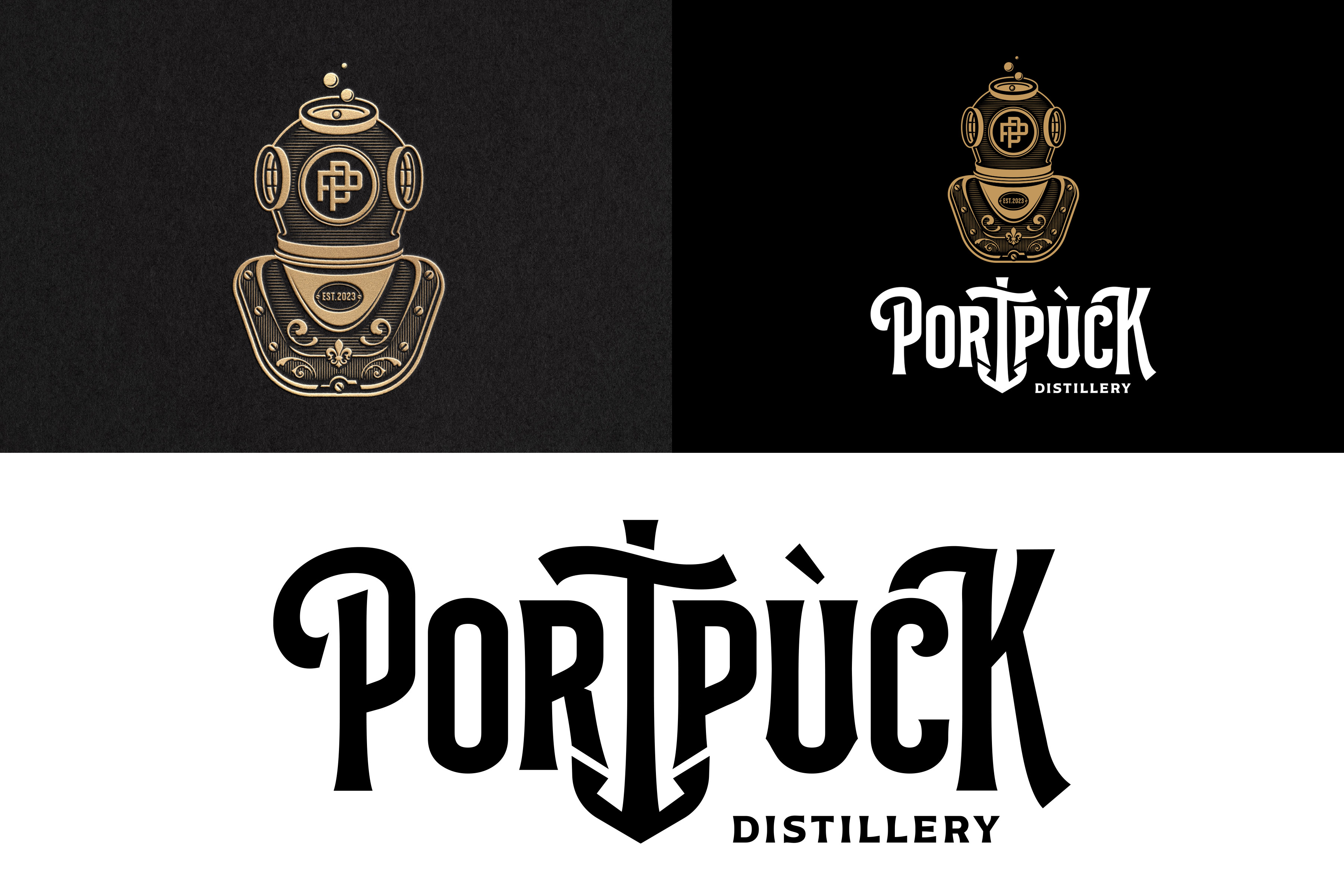
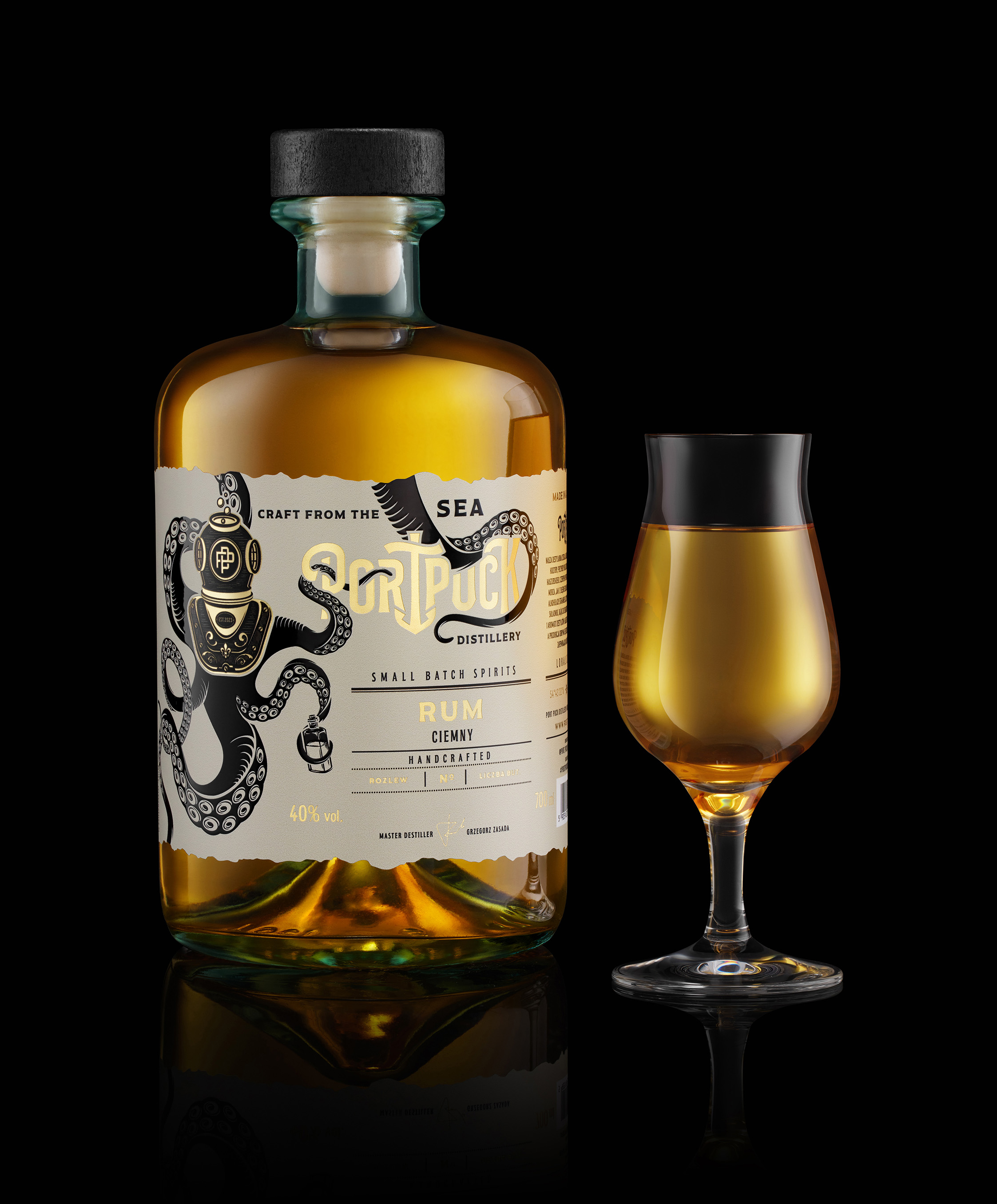
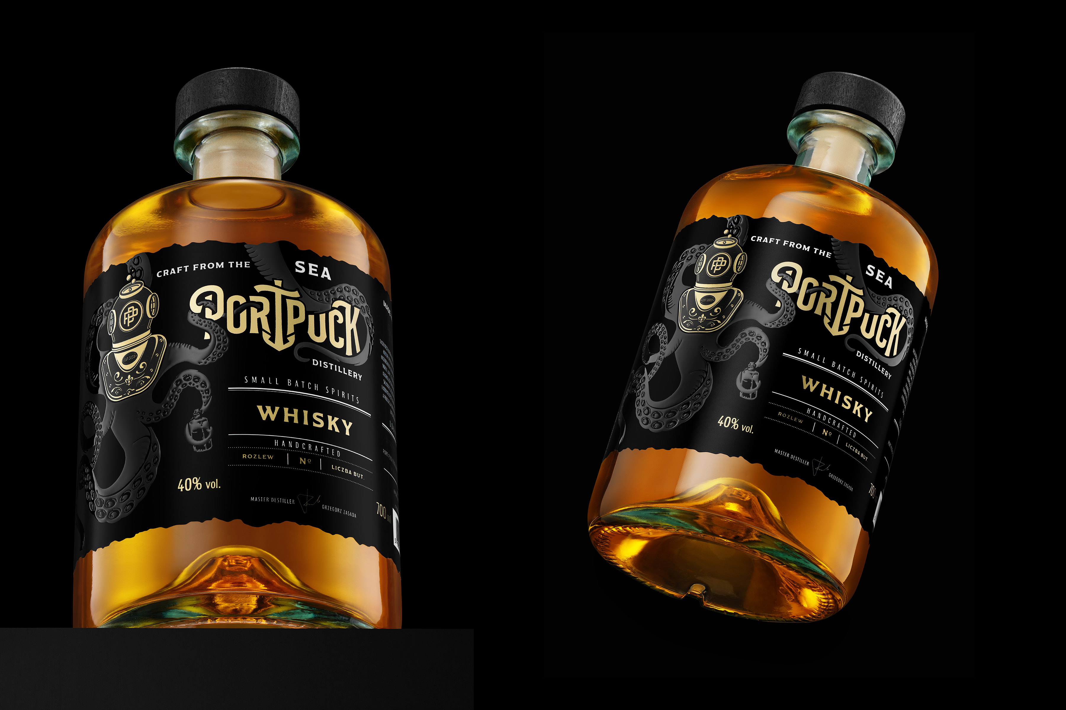
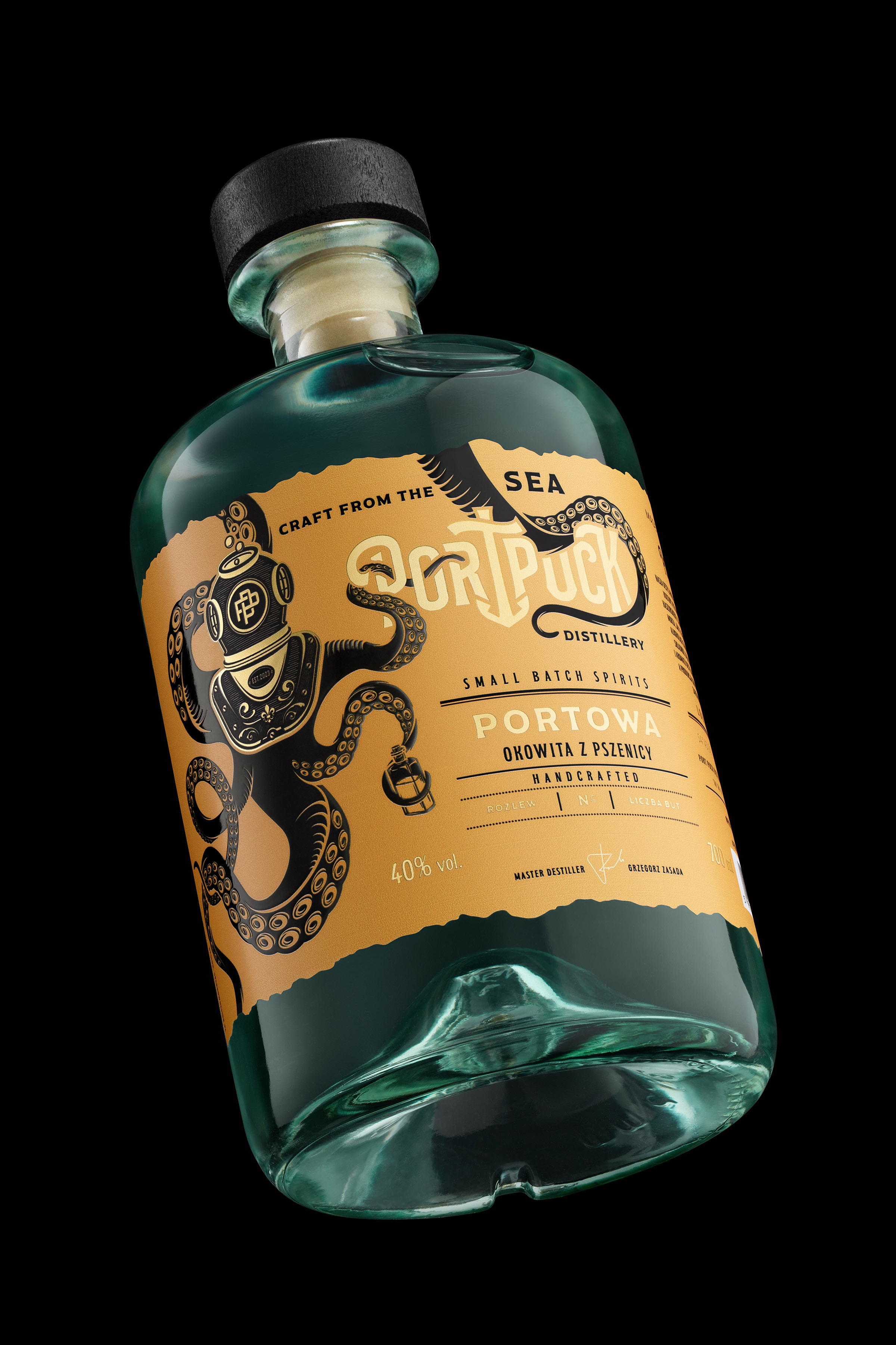
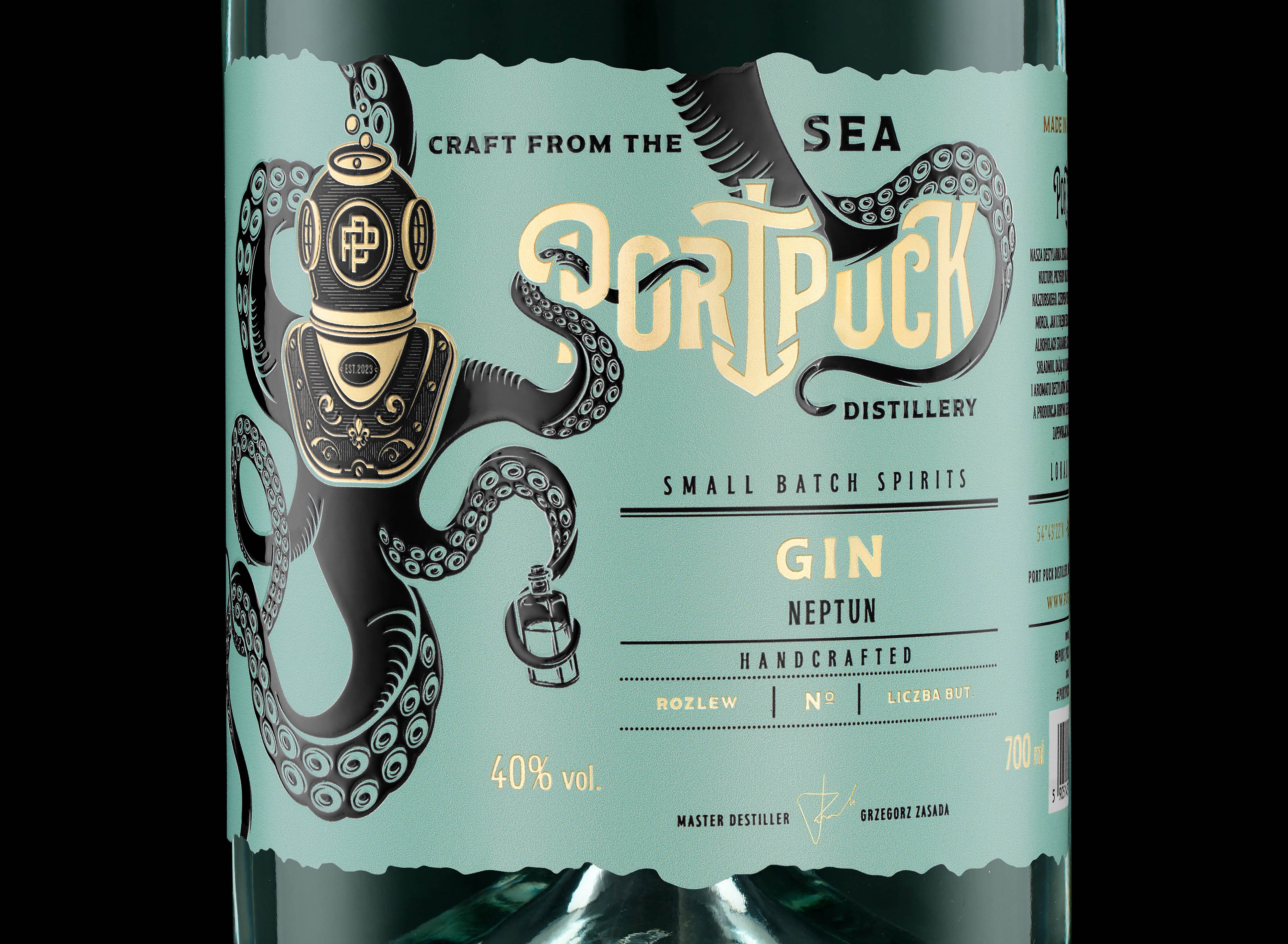
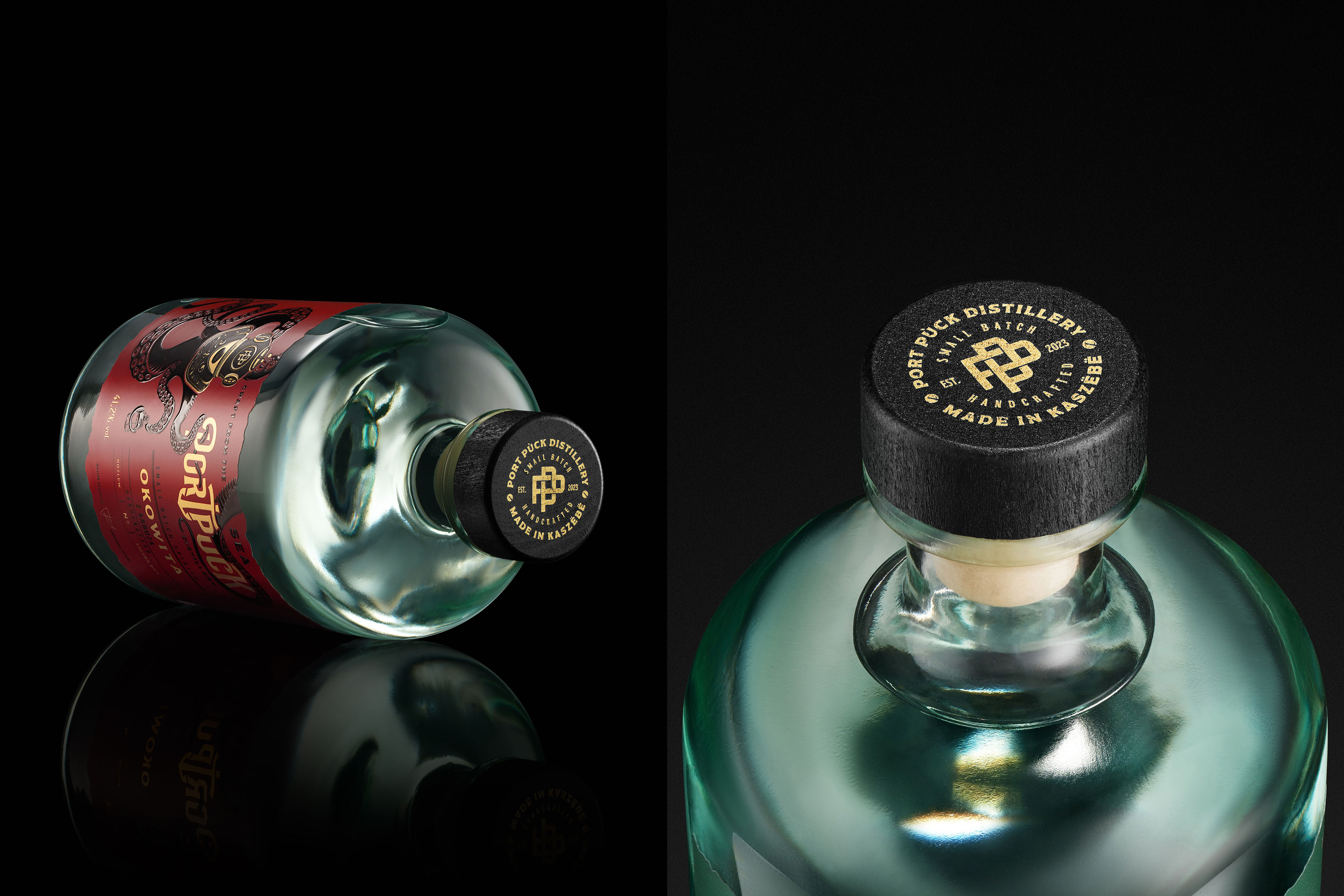
Studio Sparrow Design created a comprehensive branding strategy. We started with the design of the Port Pùck Distillery logo, which is inspired by a diver’s helmet and distillation equipment, while also referring to the maritime character and location of the distillery in Puck. In addition, the shape of the helmet itself refers to the Alembic – a distiller in which unique spirits are prepared. The main character on the label is an octopus with tentacles that wrap around the typographic version of the PORT PÙCK logo, adding uniqueness and depth to the design. The design was developed with a clear intention to give the bottle a unique story and an elegant personality full of nuances, just like the liquid it contains. These spirits are for daredevils and explorers who are not afraid of the depths of the sea, adventure, and encounters with sea monsters. The sensory elements of the label, such as the 3D UV varnish finish, emphasize the personality and identity of our distillery, adding a unique character to the design.
We used Estel bottles from the Wild Flint Glass® series, which are made from 100% transparent, recycled PCR glass that uses its imperfections to create unique and eco-friendly packaging. This collection combines the authentic look of handcrafted glass with the precision of modern manufacturing, ensuring minimal waste. Wild Flint Glass® is ideal for spirits, wines, and gourmet products, meeting the requirements for environmentally friendly design with the highest quality color and material.
The stopper was designed with a “badge” style print by Tapi Group.
CREDIT
- Agency/Creative: Sparrow Design
- Article Title: Sparrow Design Redefines Port Pùck Distillery with an Ocean-Inspired Brand Identity
- Organisation/Entity: Agency
- Project Type: Packaging
- Project Status: Published
- Agency/Creative Country: Poland
- Agency/Creative City: Bełchatów
- Market Region: Europe
- Project Deliverables: Brand Design, Copywriting, Creative Direction, Design, Illustration, Label Design, Logo Design, Packaging Design
- Format: Bottle
- Industry: Food/Beverage
- Keywords: WBDS Agency Design Awards 2025/26 , Logo, Packaging Design, Port Puck Distillery, Label Design, Whisky, Sparrow Design,
-
Credits:
Art Director: Marek Kowalczyk
Photography: u0141ukasz Mazurkiewicz


