


Context: José Antonio and Emilio Santías, second generation of the family-owned mill founded by their father Emilio in 1990. We have always been committed to pursuing the highest quality product — one that values our environment, history, and traditional olive groves through continuous improvement, innovation, and the dedication of those who craft it.
However, we felt it was time to evolve. With our experience, we identified the opportunity to offer more — designing blends and compositions that achieve richer nuances and aromas, while adding greater stability and antioxidants to our olive oils. We interpret olive varieties as primary colors that allow us to create more complex, unique, and distinctive compositions compared to what currently exists. “Single-varietal oils are excellent for discovering aromas and flavors in their pure state, but with the right combination, you can achieve unique and more sophisticated aromas.”
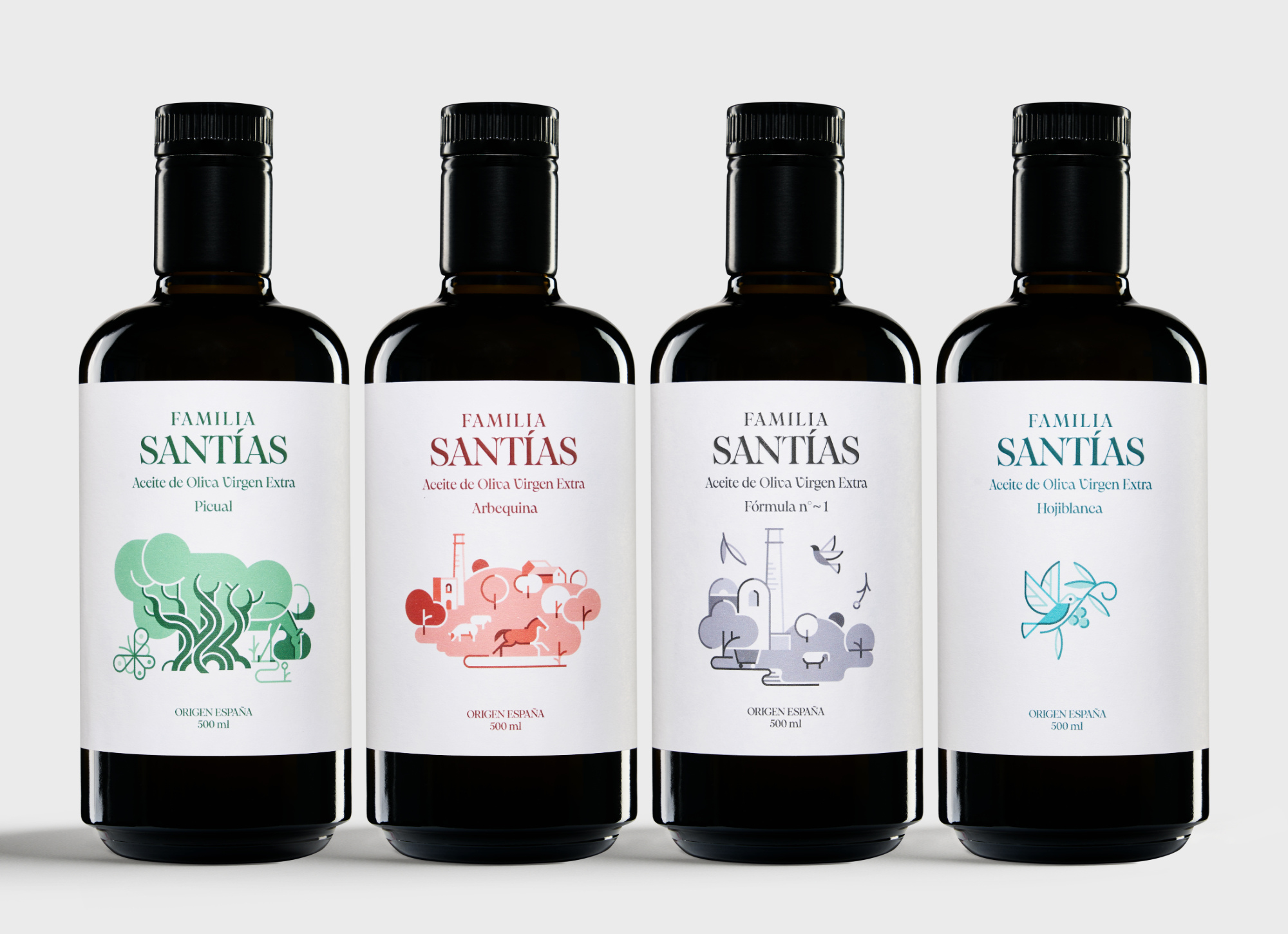
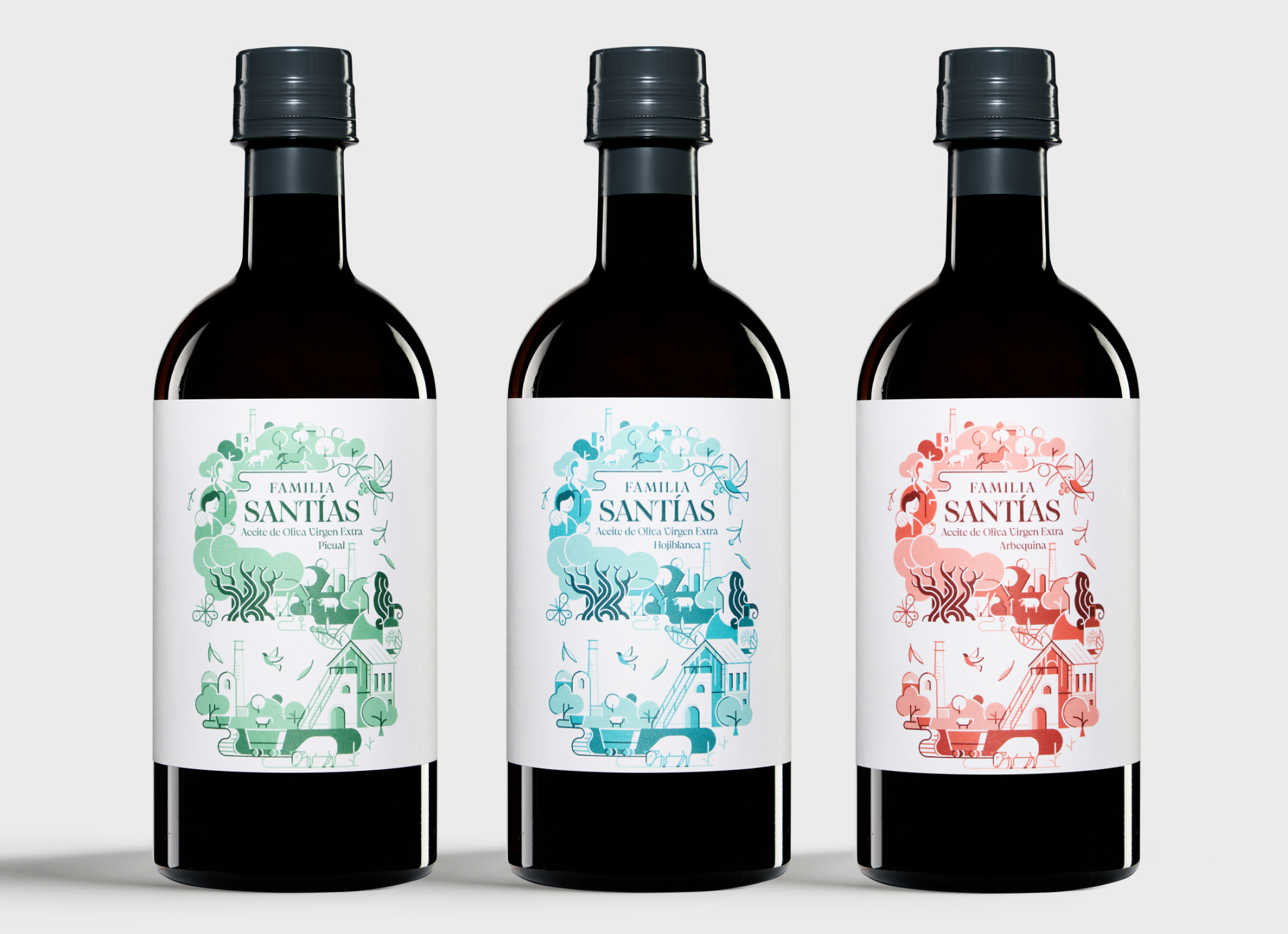
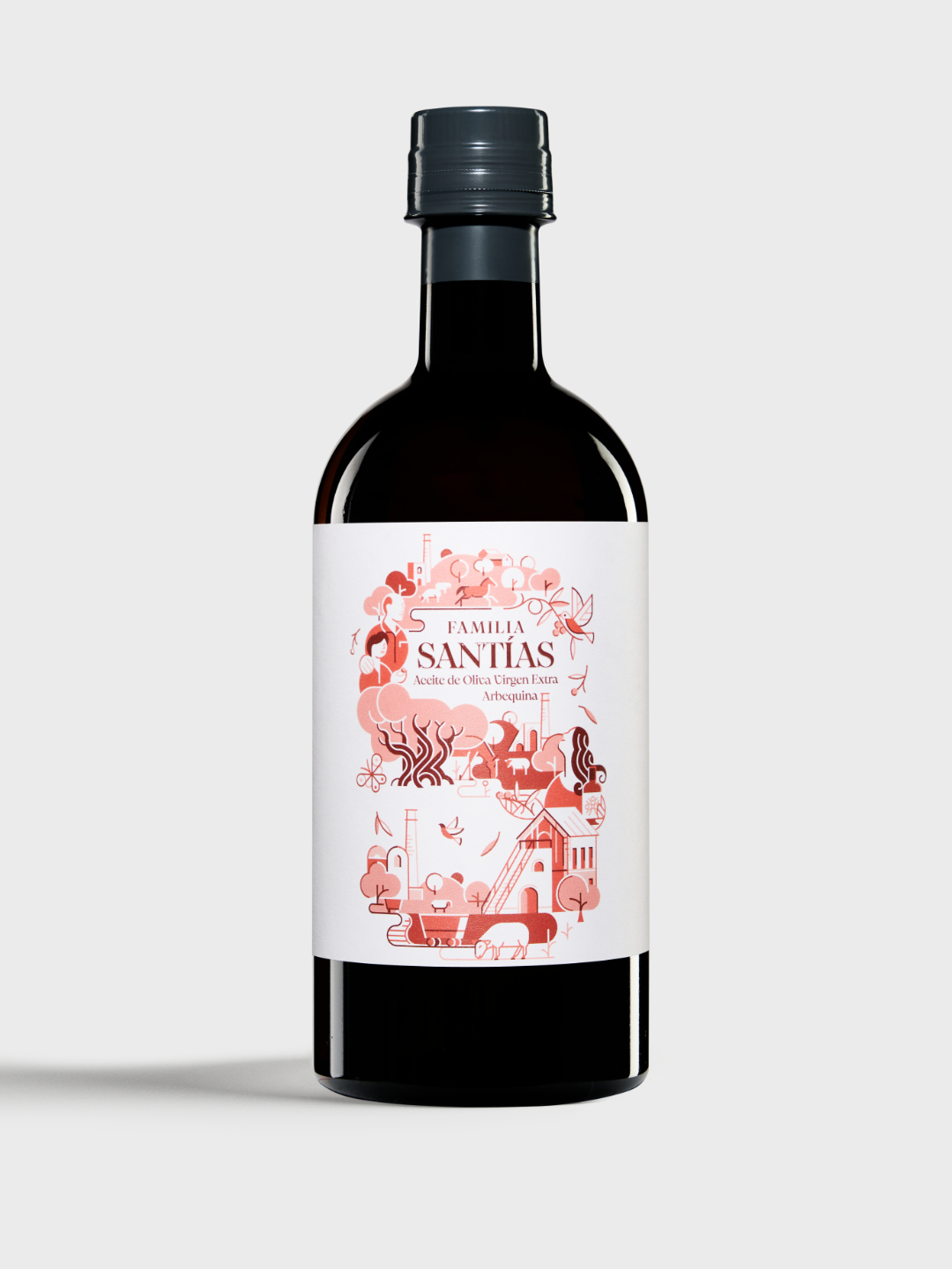
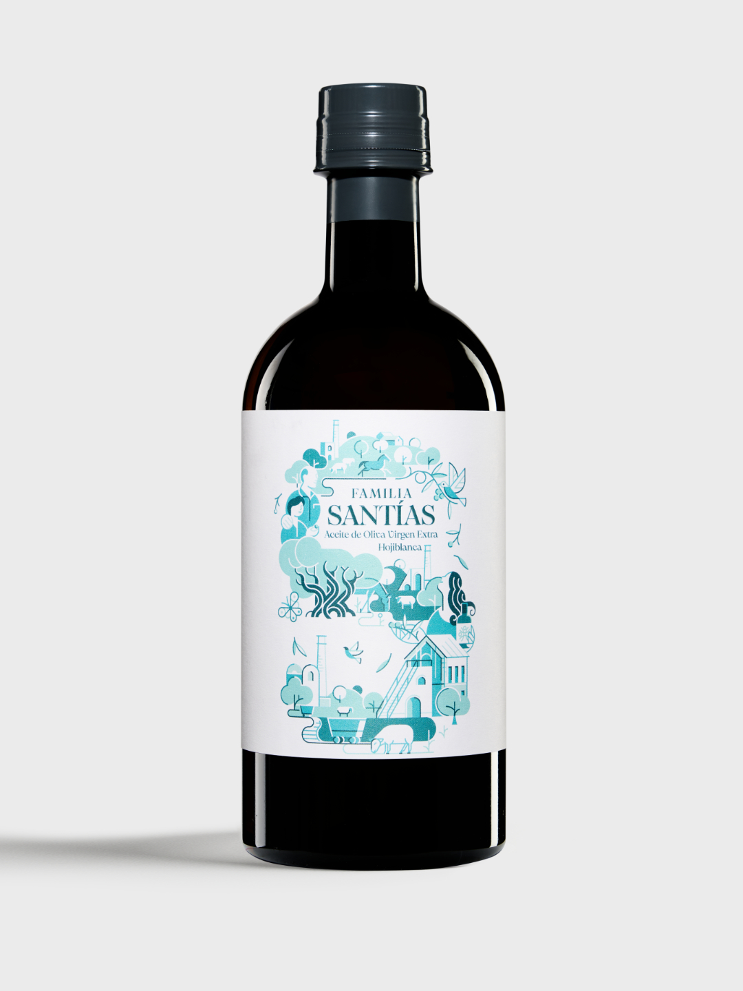
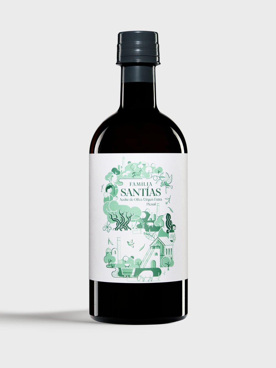
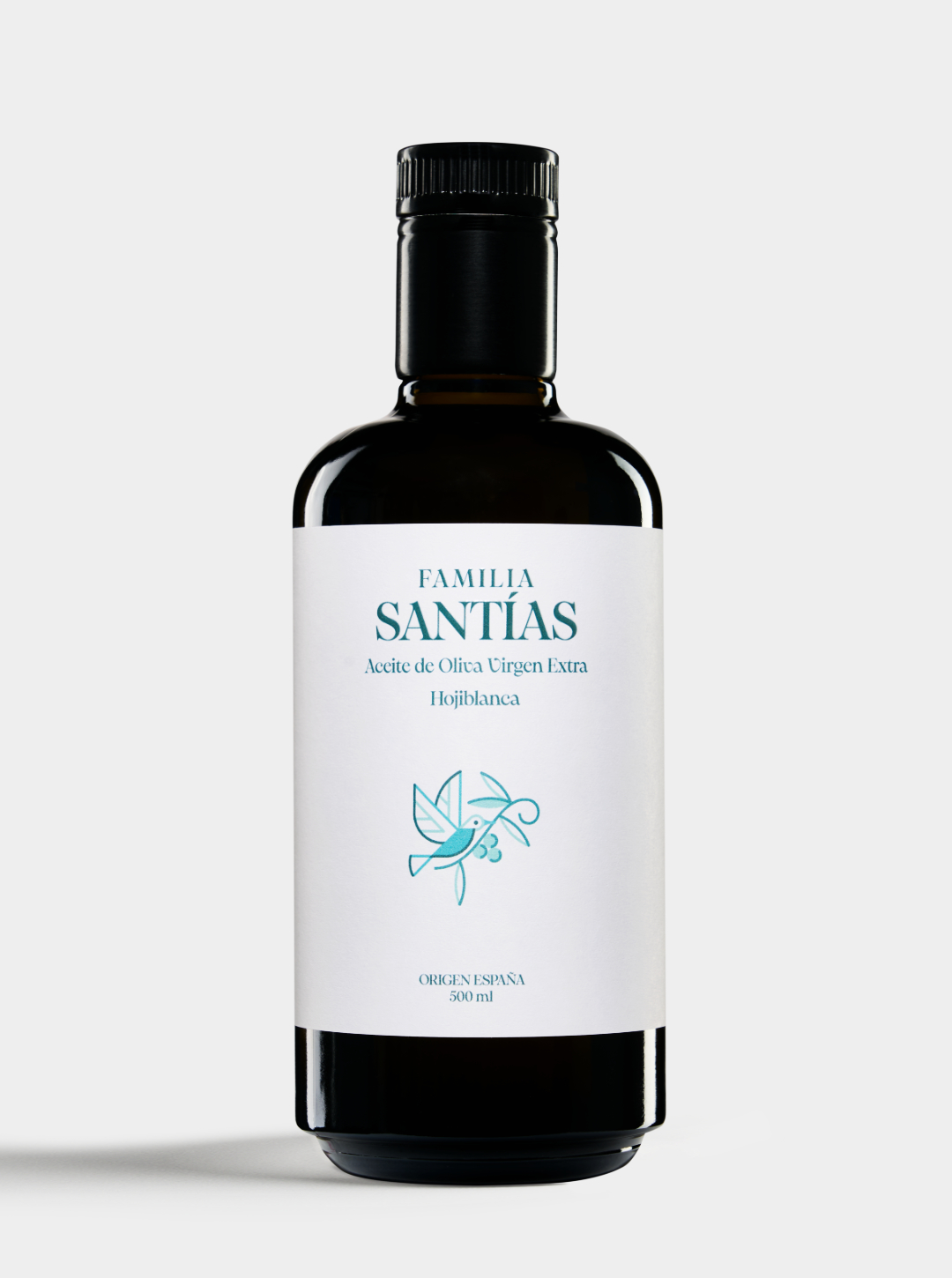
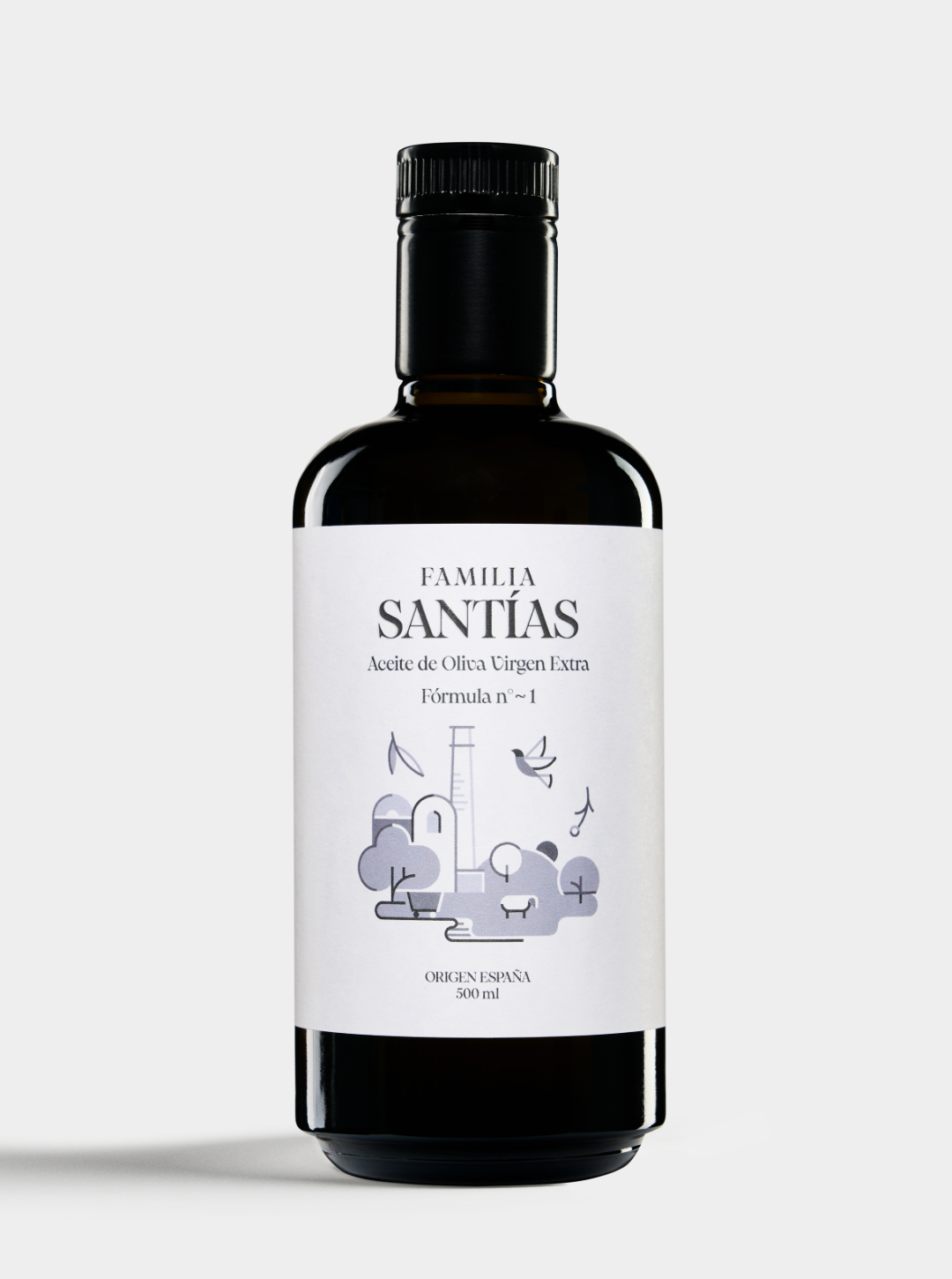
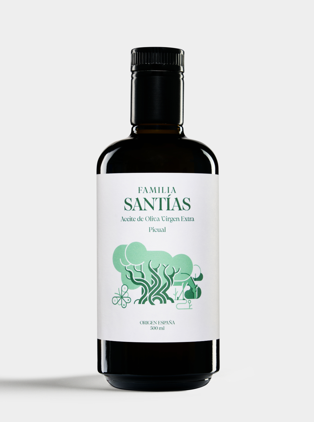
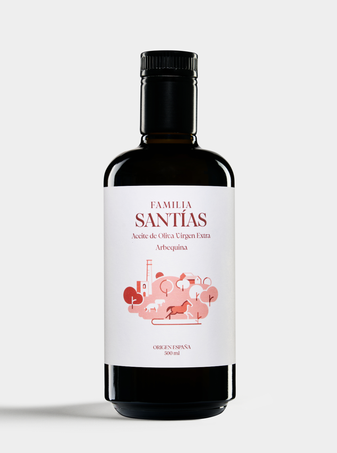
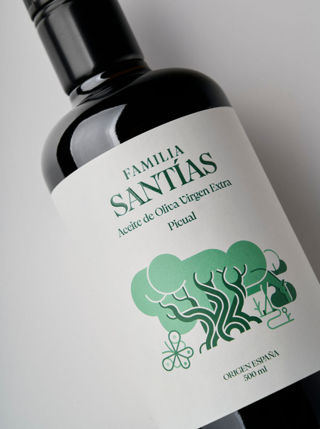
Solution: Creative direction, brand redesign, and packaging for familiasantias. The goal was to update the brand image and olive oil range to convey the product’s true quality, encouraging purchase decisions on the shelf without losing the brand’s family-rooted identity or resorting to classic visual codes.We created a visual language that reflects the ecosystem where their oils are produced: pastureland, olive groves, livestock, and mining. We wanted this singularity to connect like pieces of a puzzle through illustrations. Each piece links to the next, forming an iconic “S” — a direct reference to the name and instantly recognizable. For medium-fruity oils, the “S” appears complete, with each color playing a distinctive role to differentiate the product lines chromatically. For intense-fruity oils, each piece stands alone, representing each variety individually.A clean, elegant, and timeless design that embodies the heart of Familia Santías: authenticity, quality, and a deep commitment to origin.
CREDIT
- Agency/Creative: Superfluido
- Article Title: Superfluido Redesigns Familia Santías to Reflect Heritage and Modern Excellence
- Organisation/Entity: Freelance
- Project Type: Packaging
- Project Status: Published
- Agency/Creative Country: Spain
- Agency/Creative City: Superfluido
- Market Region: Europe
- Project Deliverables: Advertising Photography, Brand Design, Logo Design, Packaging Design
- Format: Bottle
- Industry: Food/Beverage
- Keywords: #packaging #packagingdesign #branding #evoopackagingg
-
Credits:
Illustrator: Carlos Arrojo
Photo: Juan Antonio Partal


