


Wild Nectar — A Brand Story Told Through Design
From the very beginning, our vision for Wild Nectar was clear: to capture the unrefined beauty of Australian honey in its purest form, not through ornamentation, but through storytelling. This wasn’t a brand that needed to shout to be heard. It needed to hum, quietly and confidently, like the gentle rhythm of bees at work in the warmth of the afternoon sun. Our role as designers was to translate that hum into a visual language one that would speak of authenticity, connection, and respect for the natural world.
We began with the idea that honey, in its truest form, tells a story long before it reaches the jar. It’s the story of hives nestled among wildflowers, of sunlight filtering through eucalyptus branches, of beekeepers who rise early to check their frames and listen to the health of their colonies. It’s a story written not in words but in scent, in taste, and in time. Our design process sought to honour that narrative, crafting a brand identity that felt honest, grounded, and deeply Australian.
Listening to the Land
Our journey started, quite literally, in the field. Where Wild Nectar sources much of its honey is a landscape alive with contrasts: golden light spilling over dry earth, bursts of native blooms amid rugged bushland, and the constant hum of life moving unseen. Standing among the hives, we were reminded that design doesn’t begin with decoration; it begins with observation.
We sketched textures of bark, traced the soft geometry of honeycomb, and studied the subtle palette of the land, ochres, ambers, soft greys, and the green-gold shimmer of eucalypt leaves. These observations became our foundation. Rather than impose a design on the product, we allowed the environment to inform every choice, colour, type, texture, and illustration.
We wanted the brand to feel like it belonged to the landscape, not to a boardroom. That meant stripping away anything superfluous and focusing instead on the essence: purity, warmth, and connection.
Designing the Narrative
Every project begins with a story. For Wild Nectar, that story wasn’t one of invention, but of distillation, finding the truest way to represent what already existed. We explored a variety of narrative directions before landing on one central theme: “from hive to jar.”
This simple phrase became our design compass. Every decision had to answer the same question: Does this feel true to the journey of the honey itself?
We imagined the path of the nectar from wild blossoms to bees, from combs to careful extraction, and finally into the jar that would sit on a breakfast table somewhere far from the bush. That continuity of care, from nature to hand to home, became the heartbeat of the brand.
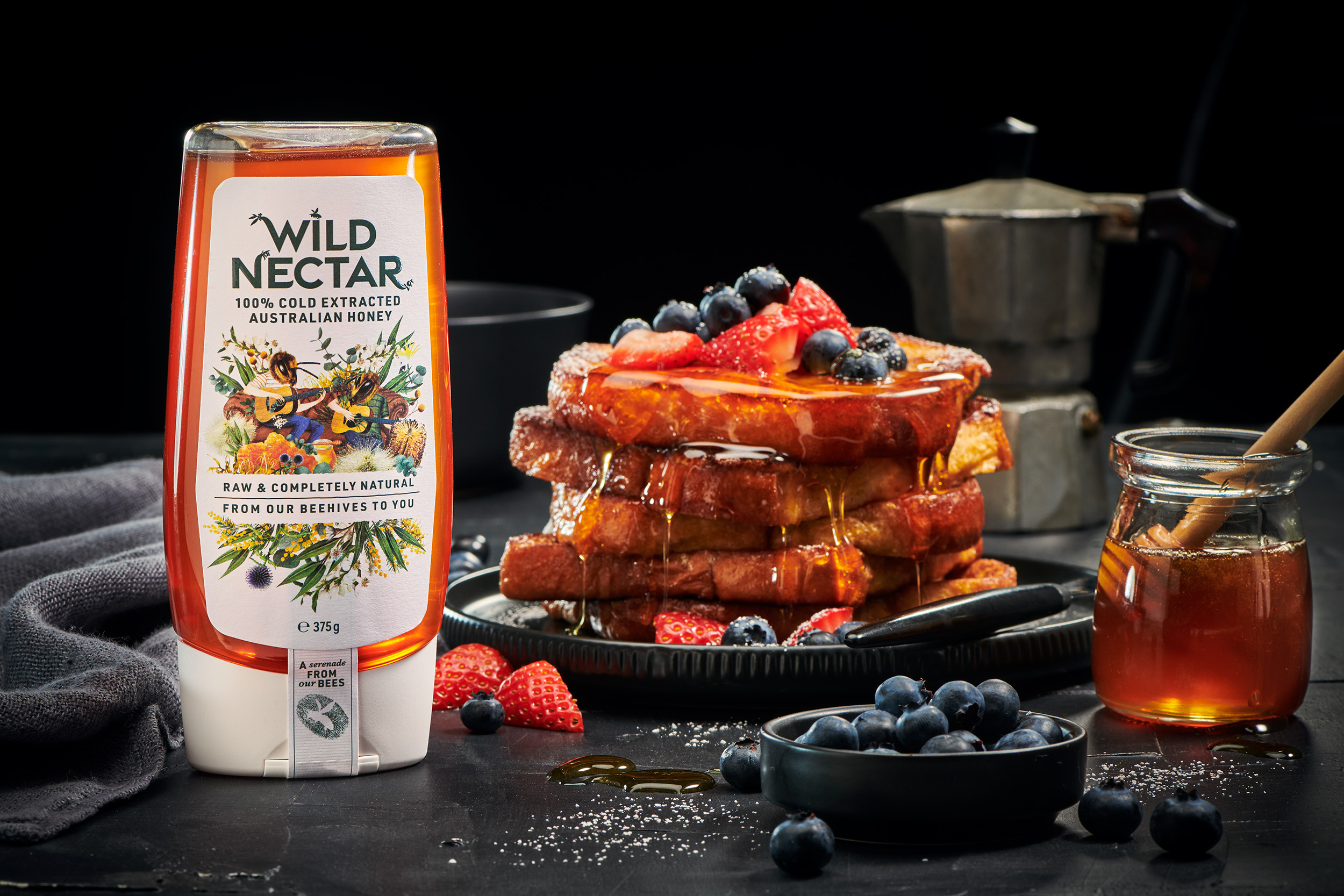
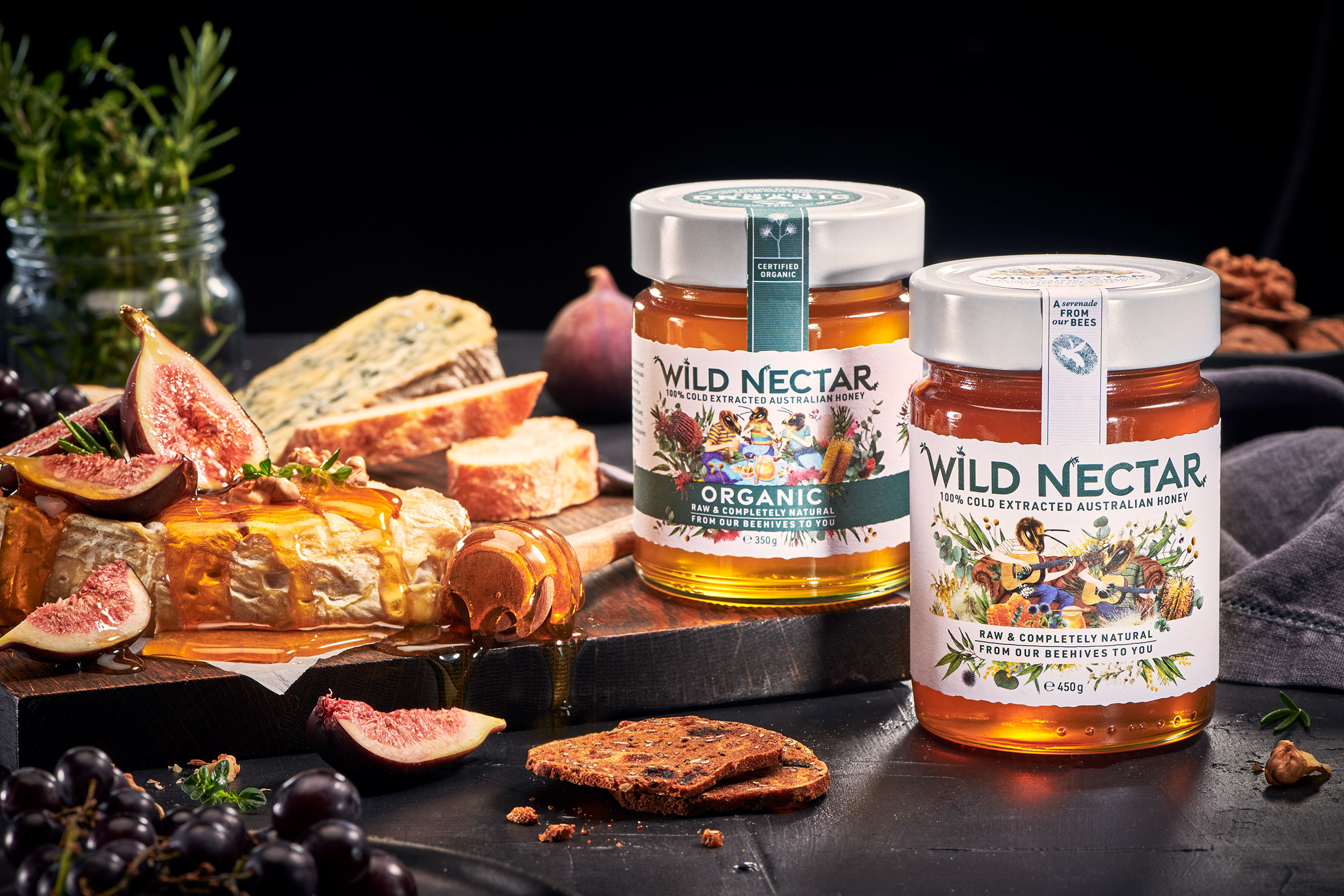
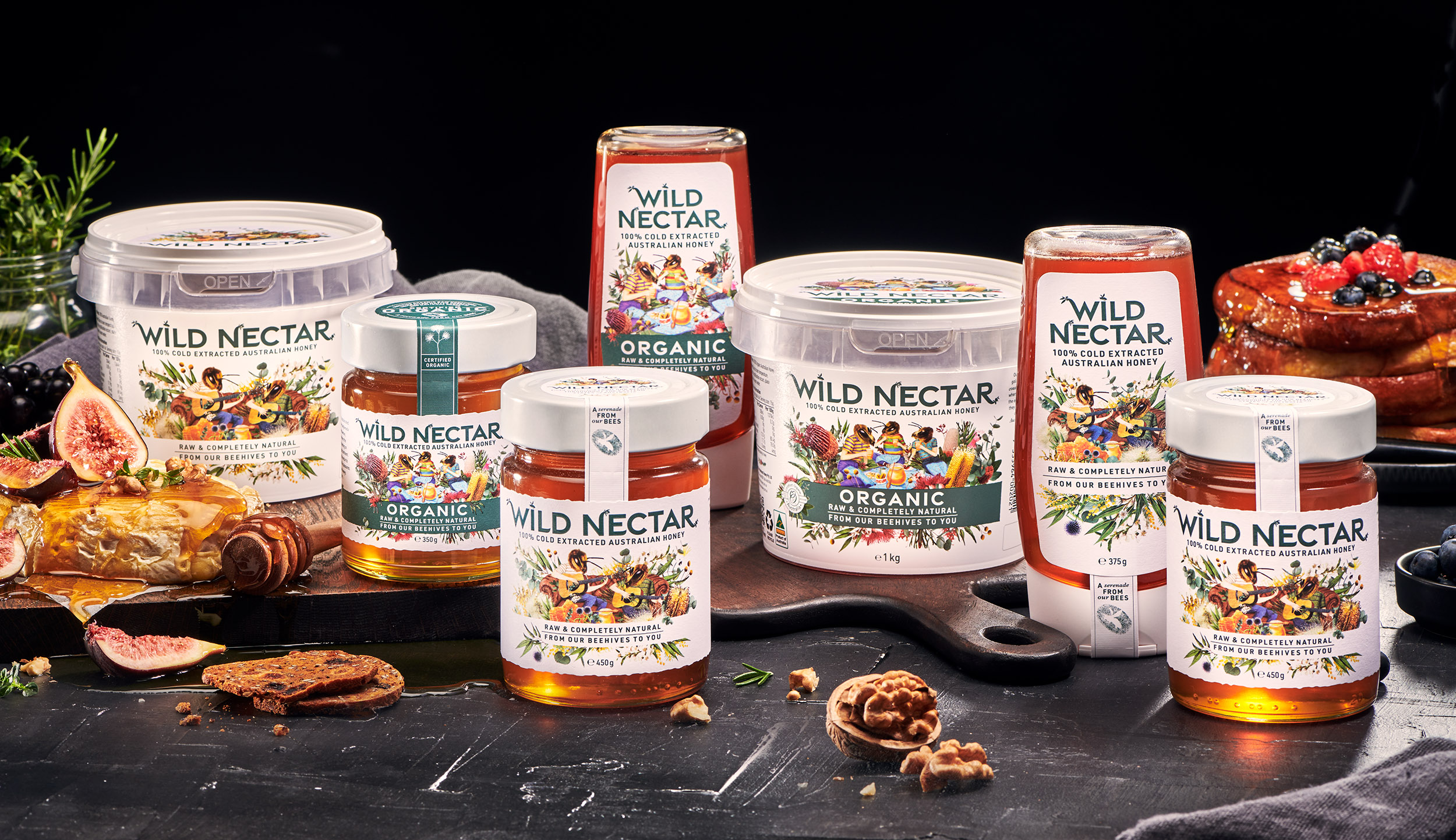
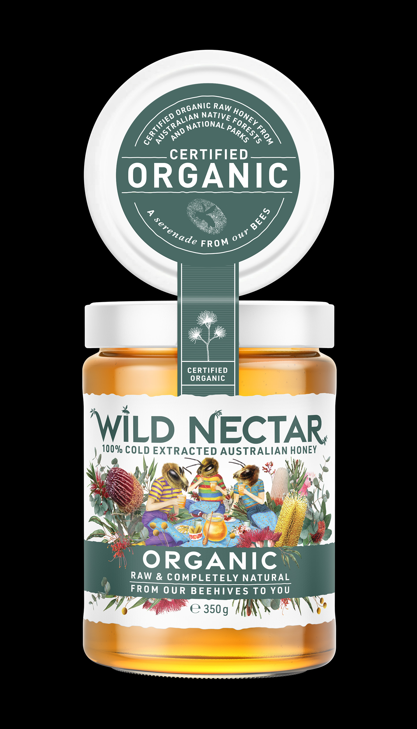
The logo, inspired by the organic symmetry of a hive, uses clean, modern typography to reflect transparency and contemporary appeal, while subtle letter spacing gives it a sense of breath, the same kind of quiet rhythm found in nature. There’s nothing forced or overly ornamental about it. It’s confident in its simplicity, much like the product it represents.
Illustration as Storytelling
If the typography provided the brand’s clarity, the illustrations gave it its soul.
We collaborated with an artist to create hand-rendered drawings of native flora, banksia, wattle, and gum blossoms, alongside delicate sketches of bees in motion. These illustrations became the visual storytelling elements that tied everything together. Each jar tells a slightly different story through these details: bees hovering near blossoms, flowers bursting with life, and the gentle suggestion of wind and movement.
Rather than appearing decorative, these illustrations serve a deeper purpose. They remind the consumer that honey is not a commodity it’s the product of a complex, living ecosystem. Every line and brushstroke evokes the fragile harmony between the bees, the land, and the people who care for both.
To preserve their authenticity, delicate line work printed in warm, muted tones drawn directly from the Australian palette: the amber of raw honey, the soft brown of timber hives, the pale cream of wax comb. The result is both artisanal and modern, timeless yet rooted in place.
The Colour of the Land
The colour palette for Wild Nectar is intentionally restrained. When working with a product as naturally rich and golden as honey, it felt unnecessary, even disrespectful, to compete with its inherent beauty. Instead, we chose hues that frame and complement the product within the jar.
Warm neutrals, gentle earth tones, and the occasional pop of colour bring a quiet sophistication to the packaging. The use of matte finishes on the labels and lids offers a tactile contrast to the gloss of the honey inside, creating a sensory experience that begins even before the jar is opened.
Each tone has meaning:
• Amber represents the golden heart of the honey itself.
• Eucalyptus green evokes the natural landscapes of the Barossa.
• Soft cream speaks to purity and simplicity.
• Charcoal black adds grounding, a nod to the dark, fertile soil and the timeless craft of beekeeping.
Together, these colours form a visual harmony that feels organic, deliberate, and deeply connected to the product’s origin.
Materials that Tell a Story
The physical materials of Wild Nectar’s packaging were chosen as carefully as its visual design. Sustainability wasn’t treated as a marketing statement but as a design principle. The jars are glass, fully recyclable, reusable, and intentionally weighty in the hand to convey substance and quality. The labels are printed on uncoated, textured paper stock that invites touch and subtly recalls the tactile feel of a beehive frame.
Even the adhesive was selected with environmental sensitivity in mind. These small details might go unnoticed by many consumers, but to us, they are the essence of honest design, every element working quietly to reinforce the brand’s integrity.
We also designed custom embossed over-stickers featuring a minimal motif. This small, almost hidden detail rewards those who take a closer look — much like nature itself does when you slow down long enough to notice.
Craft Meets Contemporary
Balancing rustic authenticity with modern appeal is always a delicate dance. Too rustic, and a brand can feel nostalgic or dated; too modern, and it risks losing the warmth and humanity that make artisanal products special. For Wild Nectar, the balance was found in contrast.
The illustrations carry the texture of the handmade, while the typography anchors the design in contemporary clarity. The layout is clean and spacious, allowing the art to breathe. The result feels intentional and confident — a reflection of a brand that doesn’t need to overstate its worth.
We wanted Wild Nectar to look as at home in a boutique grocer or as it would in a farmhouse kitchen in the country. Its aesthetic is elevated yet accessible, refined but deeply familiar.
The Human Element
Throughout the process, we were continually inspired by the beekeepers themselves. Their hands tell stories — of care, of patience, of seasons spent tending to something both fragile and resilient. In conversation with them, we found a shared philosophy: that true craft lies in restraint.
That ethos shaped not only the design but also the language of the brand. The tone of voice we developed for Wild Nectar is humble and sincere. It speaks softly, with confidence rooted in authenticity rather than marketing polish. Phrases like “purely gathered, carefully bottled” and “from the wild to your table” reflect this quiet pride.
We worked closely with the founders to ensure that their own connection to the land and bees was visible throughout the storytelling, on the labels, in the website, and across collateral materials. Every touchpoint needed to feel like a continuation of the same story: a love letter to nature’s generosity.
A Design of Integrity
In the end, the design of Wild Nectar is an exercise in restraint — an invitation to look closer, to appreciate detail, and to feel something genuine. There’s no gloss for gloss’s sake, no forced rusticity, no unnecessary embellishment. Every choice was made to serve a single purpose: to honour the product and the people behind it.
It’s easy in modern branding to overcomplicate, to chase trends, to add layers, to fill the silence. But Wild Nectar reminded us of the power of quiet design. The kind that breathes, that invites trust, that earns its place not through noise but through integrity.
The Result — A Story in a Jar
When we finally held the finished jar in our hands, there was a moment of stillness. The label’s textured paper, the soft glint of foil catching the light, the honey glowing golden beneath, it all felt complete. More than a product, it felt like a story contained. A collaboration between land, bee, and human craft.
We’ve seen Wild Nectar sit proudly on shelves, its design understated yet magnetic, drawing the eye through its warmth rather than through boldness. It resonates with consumers who value provenance, sustainability, and beauty made with care.
And that, ultimately, is what we set out to achieve.
Wild Nectar is more than a honey brand, it’s a reminder that design, at its best, doesn’t just package a product; it reveals its truth.
A Closing Reflection
Working on Wild Nectar reaffirmed something we’ve always believed as a studio: that the most meaningful brands are born from respect. Respect for the product, the craft, the environment, and the people who bring it to life. Our role is not to invent a story but to help it find its form, to translate values into visuals, purpose into presence.
Wild Nectar stands as an example of that philosophy. Every jar carries the essence of the land that inspired it, wild, generous, and deeply Australian. And in that, we find the truest kind of design success: when the visual language feels so honest, it disappears, leaving only the story, the craft, and the quiet hum of nature at work.
CREDIT
- Agency/Creative: The Spice Agency
- Article Title: The Spice Agency Shapes Wild Nectar into a Story of Authentic Australian Design
- Organisation/Entity: Agency
- Project Type: Packaging
- Project Status: Published
- Agency/Creative Country: Australia
- Agency/Creative City: Sydney
- Market Region: Oceania
- Project Deliverables: Brand Creation, Brand Design, Brand Identity, Brand Mark, Branding, Character Design, Design, Illustration, Lettering, Logo Design
- Format: Jar, Tube
- Industry: Food/Beverage
- Keywords: Honey, Natural, Organic, Bees, Cold Extracted
-
Credits:
Director: Dimity McDonald


