


Bond – Novelle Fresh — Redefining Everyday Freshness
We partnered with Hartwall, one of Finland’s most iconic and trusted beverage companies, to redesign the visual identity of Novelle Fresh — a light, sparkling drink that combines pure water with a splash of natural fruit juice. The collaboration was rooted in a shared ambition: to capture the brand’s true essence of freshness and naturalness, while creating a look and feel that would resonate with modern consumers.
The task was not only to refresh the packaging, but to reimagine what “fresh” could look like in today’s beverage landscape. Novelle Fresh already stood for simplicity and wellbeing — yet its visual world needed a stronger emotional connection. Our approach centered on clarity, vitality, and sensory appeal. We sought to translate the experience of drinking Novelle Fresh — that crisp, lightly sparkling, naturally fruity moment — into a visual and tactile language that feels clean, bright, and uplifting.
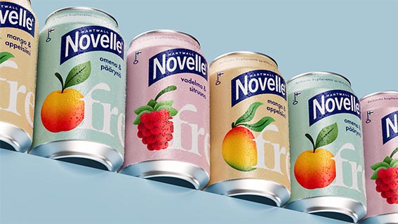
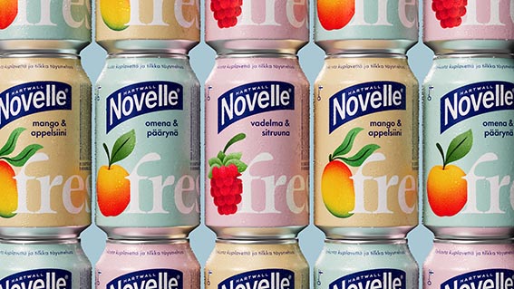
The design process began with a deep exploration of the core brand values. Freshness, purity, and modern wellbeing became our guiding principles. From there, we redefined the composition of the label: introducing airy layouts, a refined typographic hierarchy, and a more balanced interplay between fruit imagery and transparency. The result is a design that feels light yet expressive — celebrating the natural colours of the ingredients while maintaining a clear connection to the Novelle master brand.
Colour played a central role in creating shelf impact. Each flavour was given a distinctive tone, carefully calibrated to evoke taste while remaining elegant and understated. The new palette allows consumers to identify their favourite variant at a glance, while reinforcing the sense of natural variety across the range.
We also paid special attention to the material experience. Subtle finishes and a clean printing approach were chosen to ensure the product feels as refreshing in the hand as it looks on the shelf. The interplay of matte and gloss surfaces hints at the dual nature of Novelle Fresh — a product that’s both pure and indulgent, simple yet sensorial.
Beyond the bottle, the visual identity extends seamlessly into broader brand touchpoints — from digital communication to in-store presence. This holistic approach ensures that the refreshed design isn’t just a facelift, but a foundation for the brand’s future storytelling and growth.
Ultimately, the redesign of Novelle Fresh brings today’s wellbeing trend to life in a form that feels authentic, timeless, and irresistibly modern. It’s sparkling water with a splash of pure juice — crisp, vibrant, and naturally delicious. The new identity captures that refreshing moment in every detail, inviting consumers to experience freshness not only as a flavour, but as a feeling.
Feeling thirsty? Go ahead — grab a bottle of Novelle Fresh and taste the design.
CREDIT
- Agency/Creative: BOND
- Article Title: Bond Transforms Novelle Fresh into a New Symbol of Natural Vitality
- Organisation/Entity: Agency
- Project Type: Packaging
- Project Status: Published
- Agency/Creative Country: Finland
- Agency/Creative City: Helsinki
- Market Region: Europe
- Project Deliverables: Packaging Design
- Format: Can
- Industry: Food/Beverage
- Keywords: #packagingdesign #branding
-
Credits:
Chief Design Officer: Jesper Bange


