


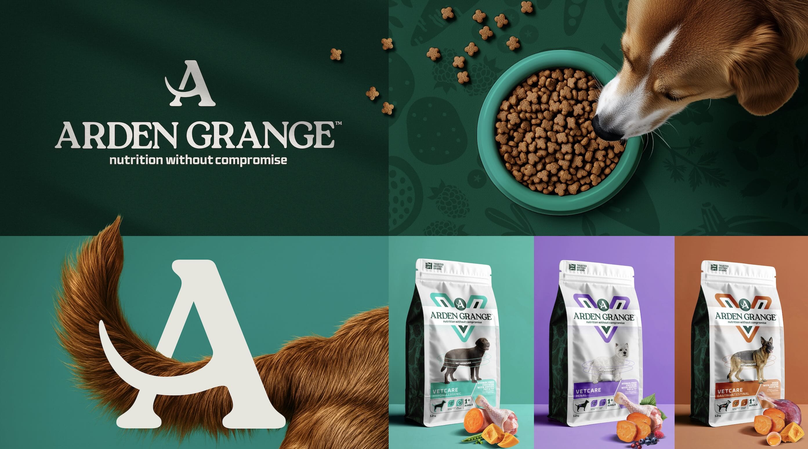
Founded in the UK in 1996, Arden Grange has been a trusted and respected brand in premium petfood for 30 years, recommended by vets and with a loyal consumer base. However, over the last decade the petfood market has evolved with a host of new entrants and formats, and the brand was starting to look dated. It needed an evolutionary modernisation that would pass the ‘squint test’ with current consumers but equally attract new ones. The parent company AlphaPet chose independent studio Into the Light for the job.
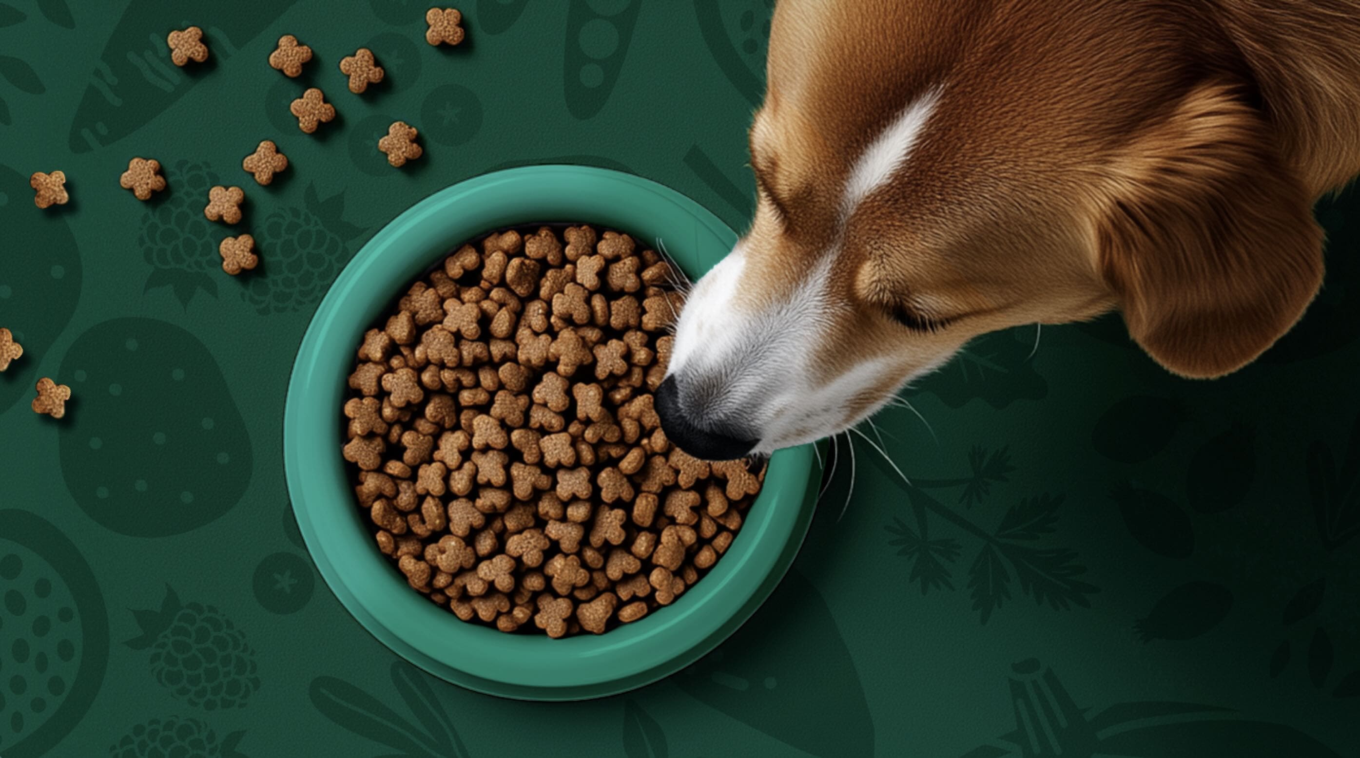
Consumers already knew, recognised and trusted the Arden Grange brand logo so the team had to tread with care- a total revamp was definitely not the way forward here. Into the Light retained the key layout, iconic green colour and white band on-pack. That way, people could find the product quickly in-store and online and feel reassured that the product quality was the same. Fonts were refreshed to feel cleaner and more modern, and the ‘A’ became more prominent with a wagging tail detail to reinforce what the brand is about: happy, thriving pets. New photography and simplified pack hierarchy increased shelf appeal. Along with a fresh set of icons, the team struck just the right balance between nature and science.
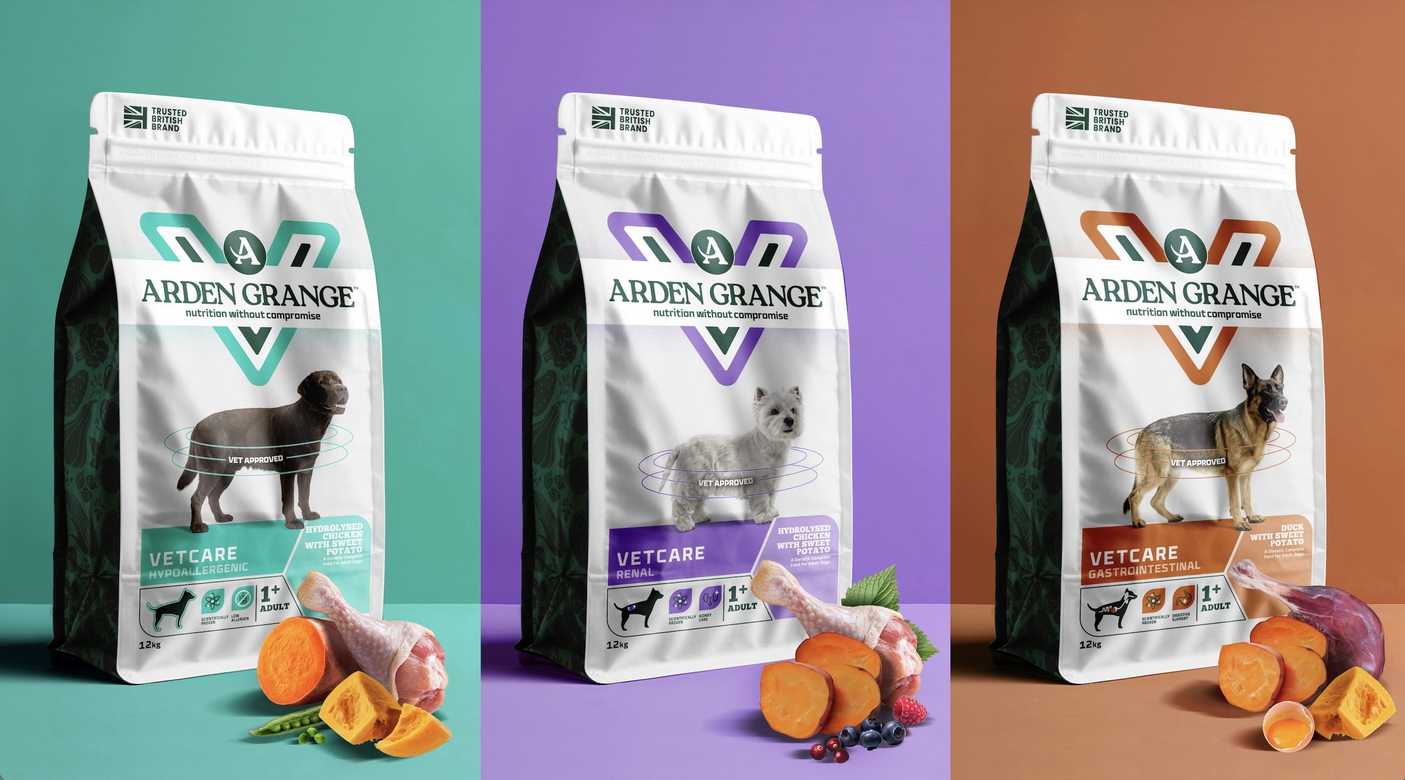
Vetcare was the first range to launch under the refreshed Masterbrand. The range targets four main health concerns, differentiated by colour. The design background has been kept white and clean in all cases and the strong central V lockup is front and centre, emphasising that the food is of vet-approved standard.
This project wasn’t about making something look new. It was about keeping what people already know and trust, while giving it just the right amount of fresh energy to future-proof it for years to come. It was also proof that even small changes require big thinking.
Robert Craig, MD at Arden Grange said: “Into The Light is a highly strategic and capable design agency that aligns closely with my views on consumer behaviour and design strategy. Their ability to understand the brand’s vision and bring it to life with exceptional creativity – while maintaining an enthusiastic and collaborative approach – is exactly what you hope for as a client. We are proud of what has been delivered and excited for consumers to experience it in market”


CREDIT
- Agency/Creative: Into the Light
- Article Title: Into the Light Uses Big Thinking to Make Small Changes to Arden Grange Petfood
- Organisation/Entity: Agency
- Project Type: Packaging
- Project Status: Published
- Agency/Creative Country: United Kingdom
- Agency/Creative City: Manchester
- Market Region: Europe
- Project Deliverables: Packaging Design
- Format: Bag
- Industry: Food/Beverage
- Keywords: Branding Masterbrand Packaging Brand refresh
-
Credits:
Creative Director: Linsey Hales


