


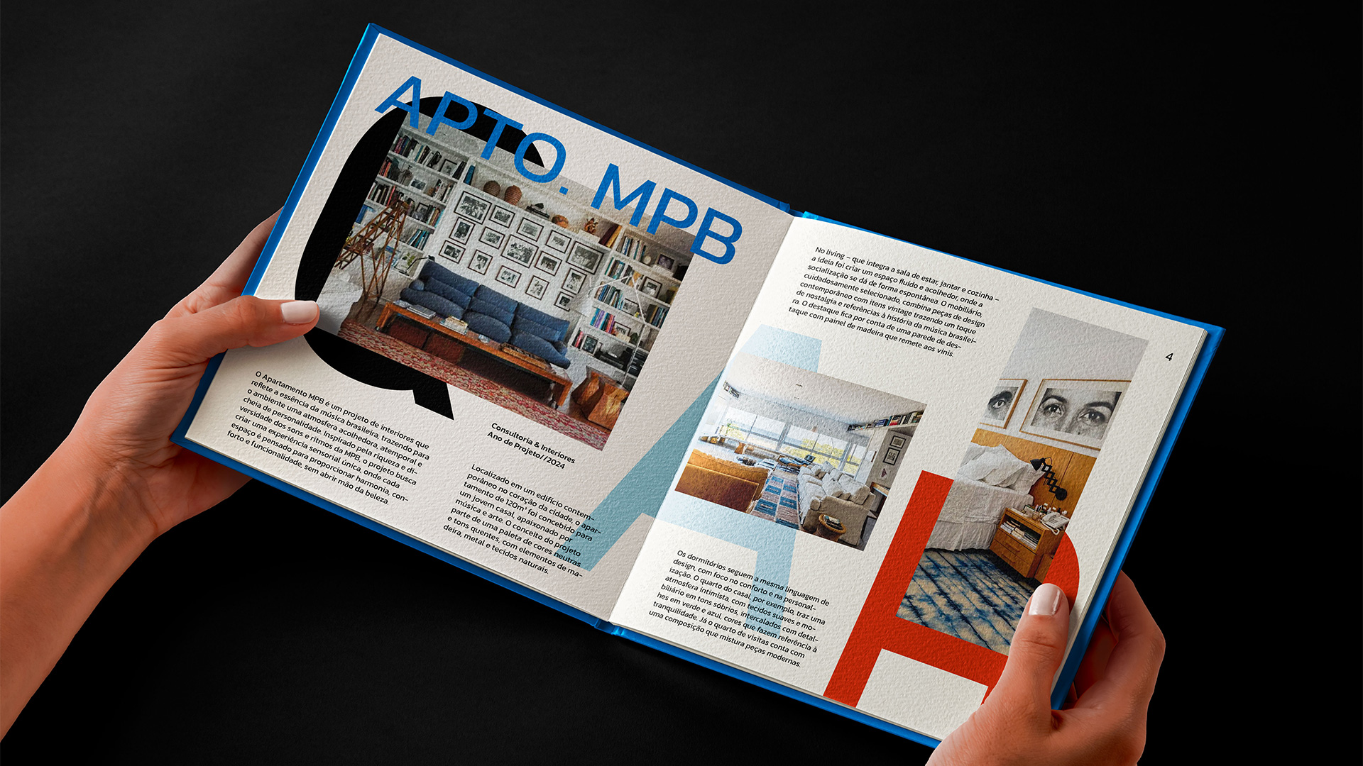
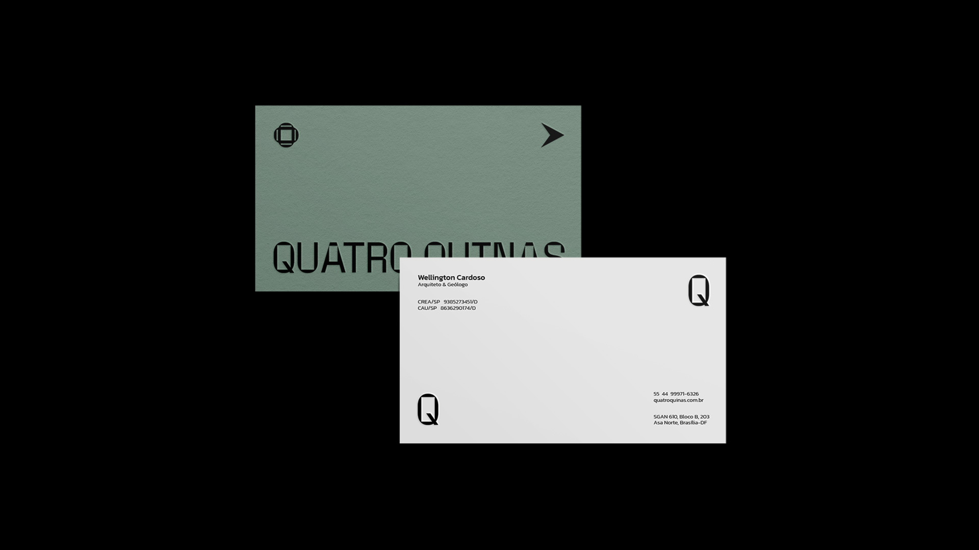
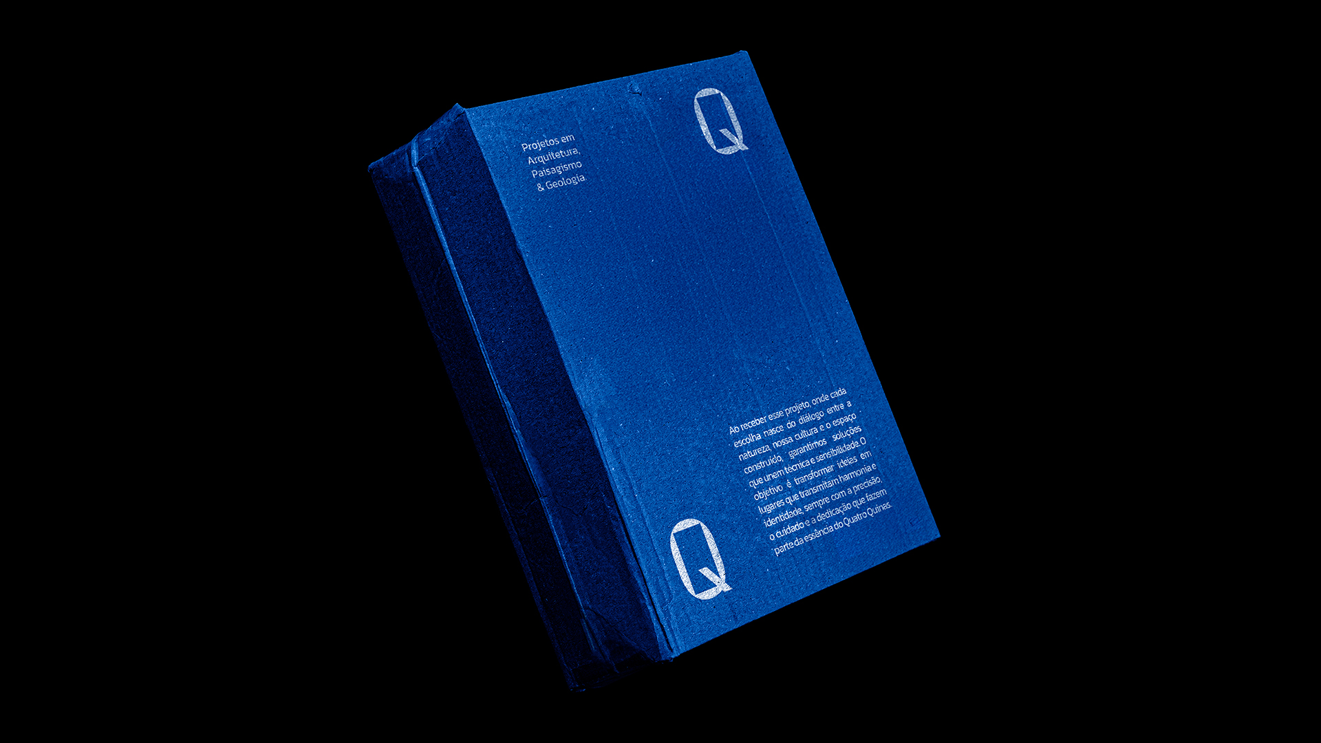
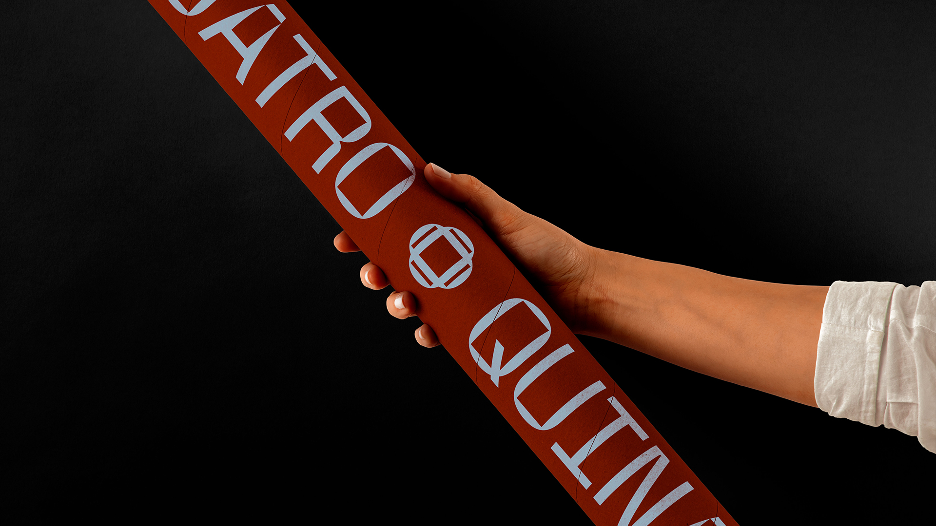
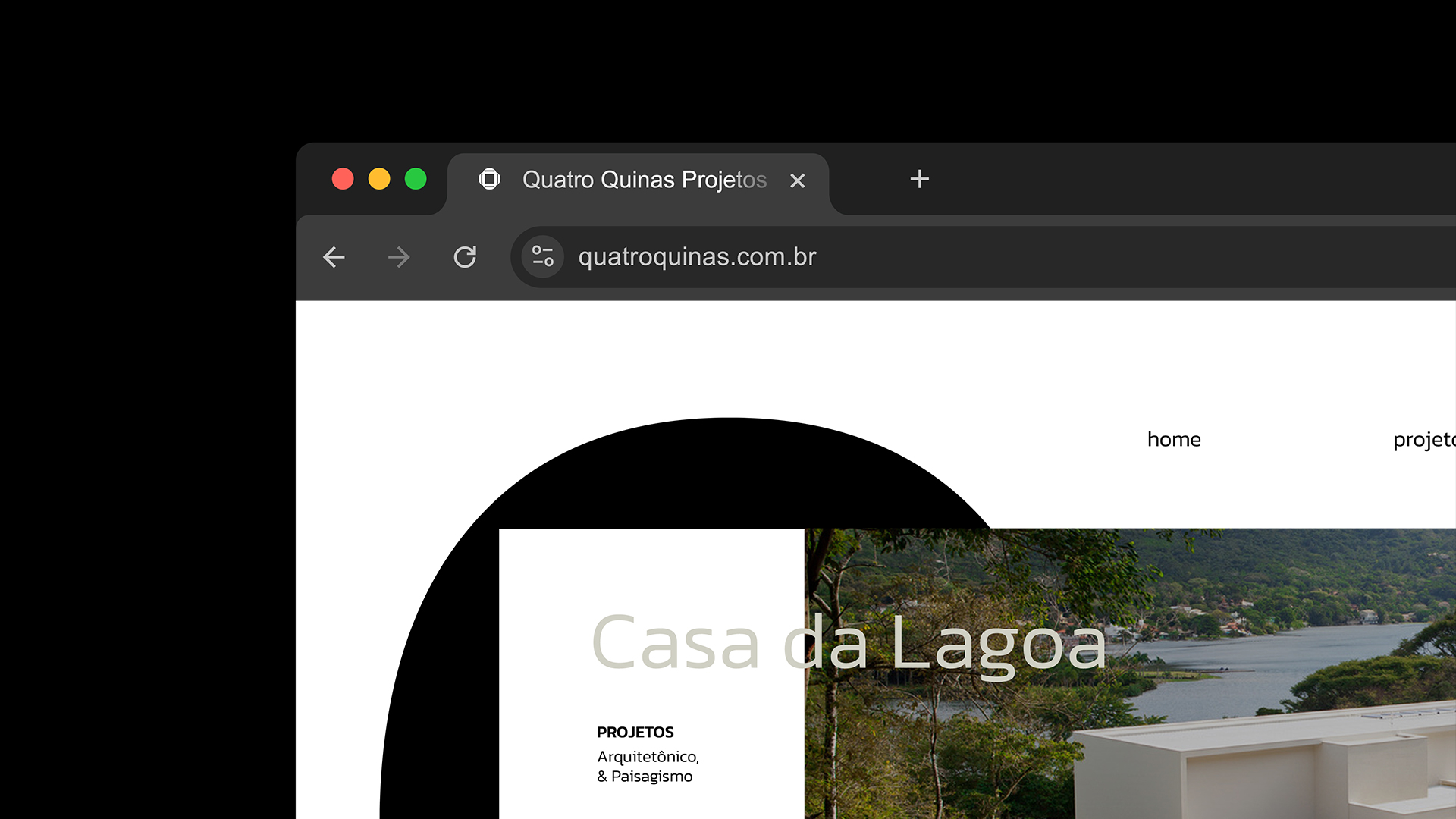
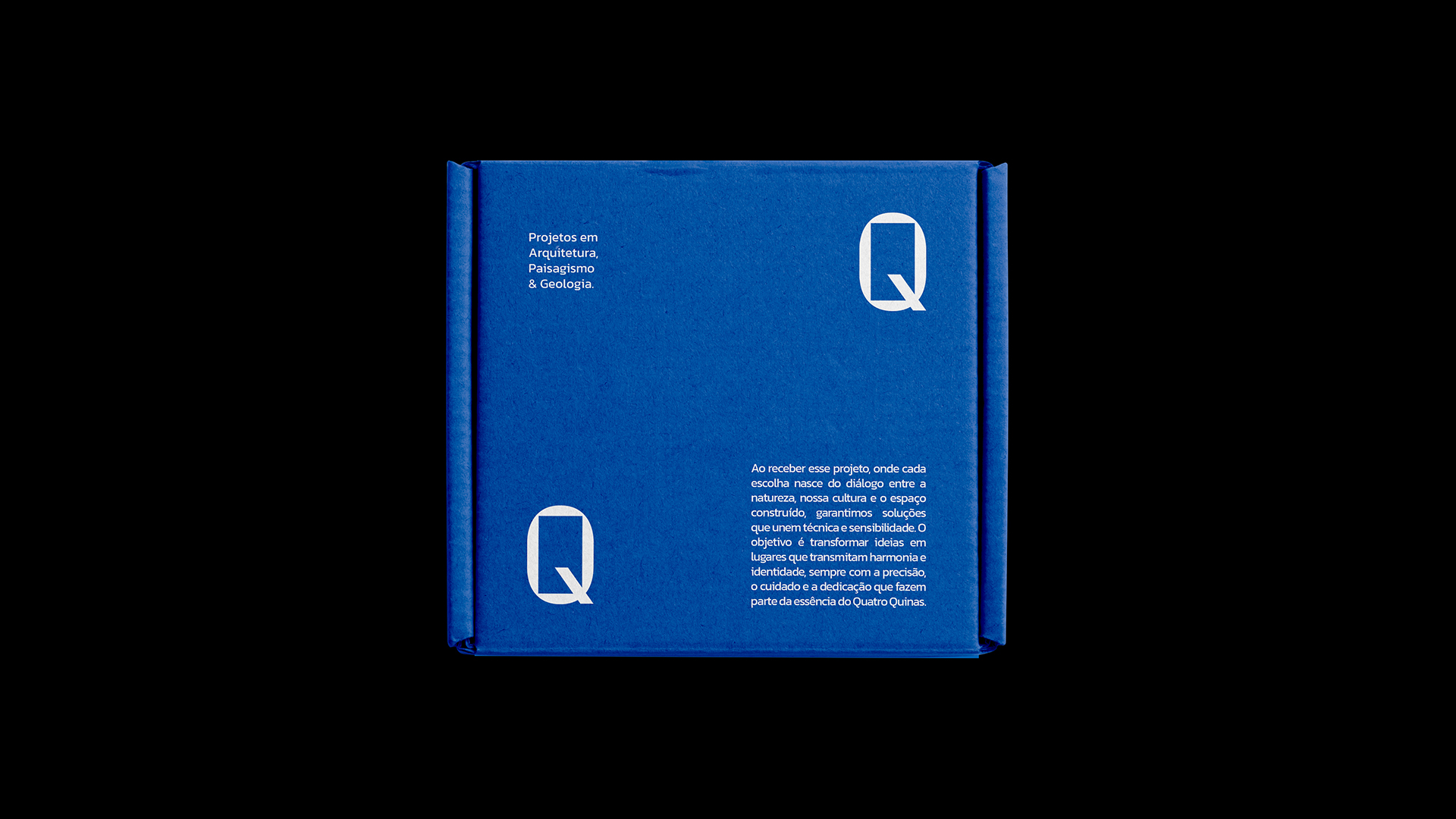
Quatro Quinas was founded by Wellington Cardoso, an architect and geologist, driven by the desire to integrate three complementary disciplines: architecture, landscaping, and geology. The name reflects this intersection by referencing the Ingá Quatro-Quinas tree, a species present in Brazilian urbanism and associated with the vitality of nature, and the architectural space defined by its corners, a symbol of structure, balance, and human intention. This duality expresses the brand’s essence and worldview, revealing an approach that seeks harmony between natural forces and the built environment.
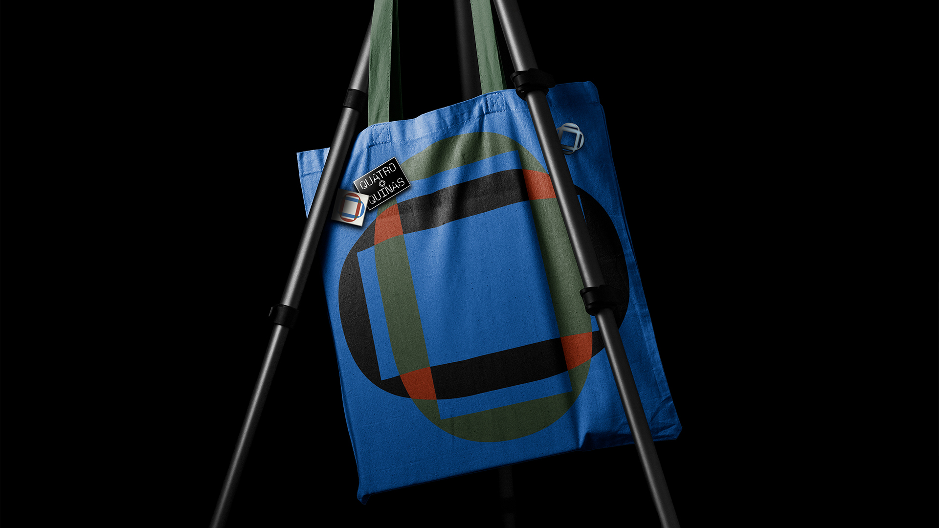
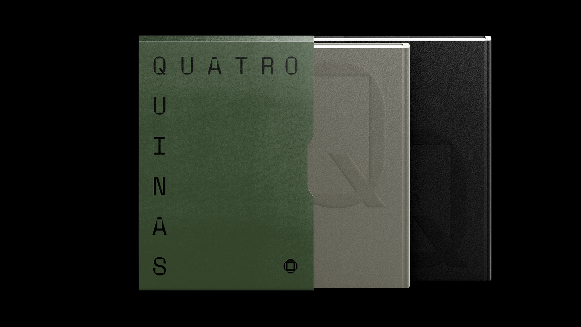
To translate this concept into a distinctive visual identity, the Space Mono typeface was adapted into symmetrical and modular compositions that reinforce order, rhythm, and the precision inherent to architectural thinking. The symbol, derived from the letter “O”, takes inspiration from tiles and ceramic patterns characteristic of Brazilian architecture, acting as a connecting unit between culture, territory, and collective memory. The graphic system was designed to be flexible, structured, and repeatable, mirroring the modularity and continuity found in architectural design.
The color palette, informed by natural and cultural references, combines tones of water, earth, and vegetation with subtle contemporary nuances. Together, these elements express Quatro Quinas’ vision of integrating functionality, culture, and nature. The result is an identity that feels timeless yet alive, capable of embodying both the solidity of architecture and the organic fluidity of the landscapes it inhabits.
CREDIT
- Agency/Creative: Paganini Studios
- Article Title: Framing Nature Within Design: The Visual Identity of Quatro Quinas by Paganini
- Organisation/Entity: Agency
- Project Type: Graphic
- Project Status: Published
- Agency/Creative Country: Brazil
- Agency/Creative City: Maringá
- Market Region: South America
- Project Deliverables: 3D Motion, Brand Identity, Brand Strategy, Branding
- Industry: Construction
- Keywords: architecture, branding, brazil, visual identity, strategy, culture
-
Credits:
Branding: Heloisa Paganini
Motion: MSL Studio Criativo


