


Finca La Pedrita, the discovery that becomes an icon
Finca La Pedrita is the expression and synthesis of a unique land and a know-how that elevates craftsmanship into an object of desire. Finca La Pedrita is the unique taken to its highest expression.
Bodegas Murua found, like a treasure, this centenary estate. Since its first vintage in 2021, it has shown itself to be an exceptional vineyard with a great deal of personality. Cultivated and cared for like a garden under regenerative agriculture criteria. This small plot produces just 329 bottles a year, crafted with a unique process that combines Viura, Malvasía, Tempranillo, and Graciano grapes and preserves their entire temperament. The result is a wine that represents the highest level of excellence of the winery and that turns rarity into a virtue: the limited, the delicate, the authentic.
In this context, the need arose to give Finca La Pedrita its own identity, one that not only communicated its exclusivity and narrated the extraordinary nature of this find, but also transmitted the magic of discovering a hidden treasure in Laguardia
Goals
– To create a narrative that reinforces the iconic character of this wine, elevating its perception as the most iconic of the winery.
– To transmit the uniqueness of the estate and the mastery of the enological work behind each bottle.
– To design a visual identity that captures the essence of what is small and exclusive, with a language that balances delicacy and strength.
– To generate desire, emotion, and prestige at every point of contact, anticipating the exceptionality of the wine from the label.
Proposal
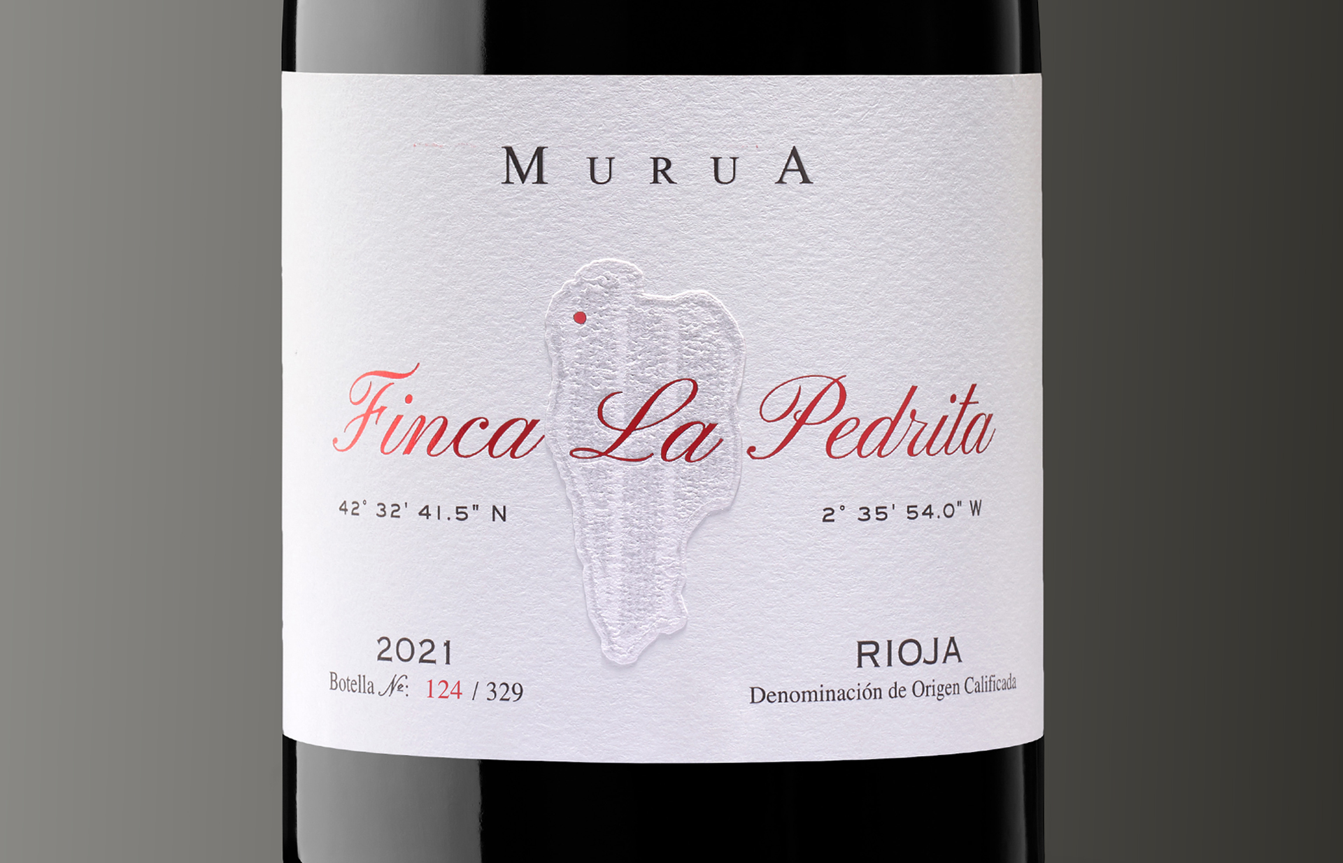
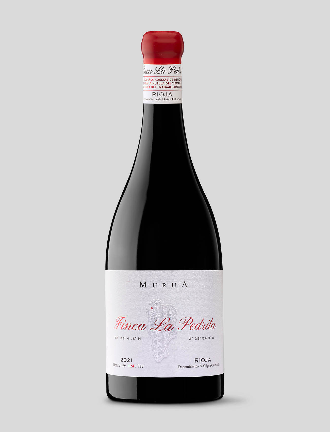
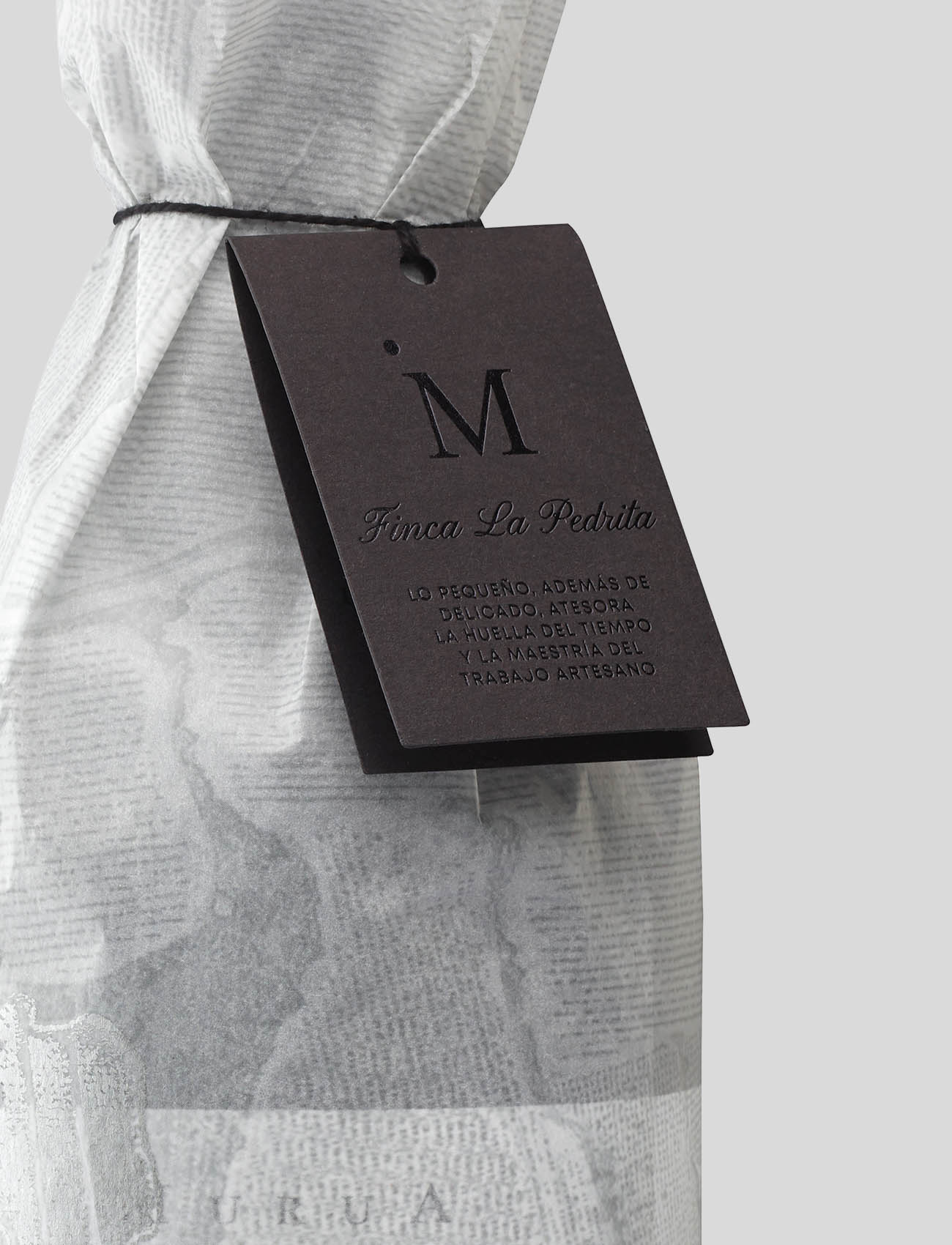
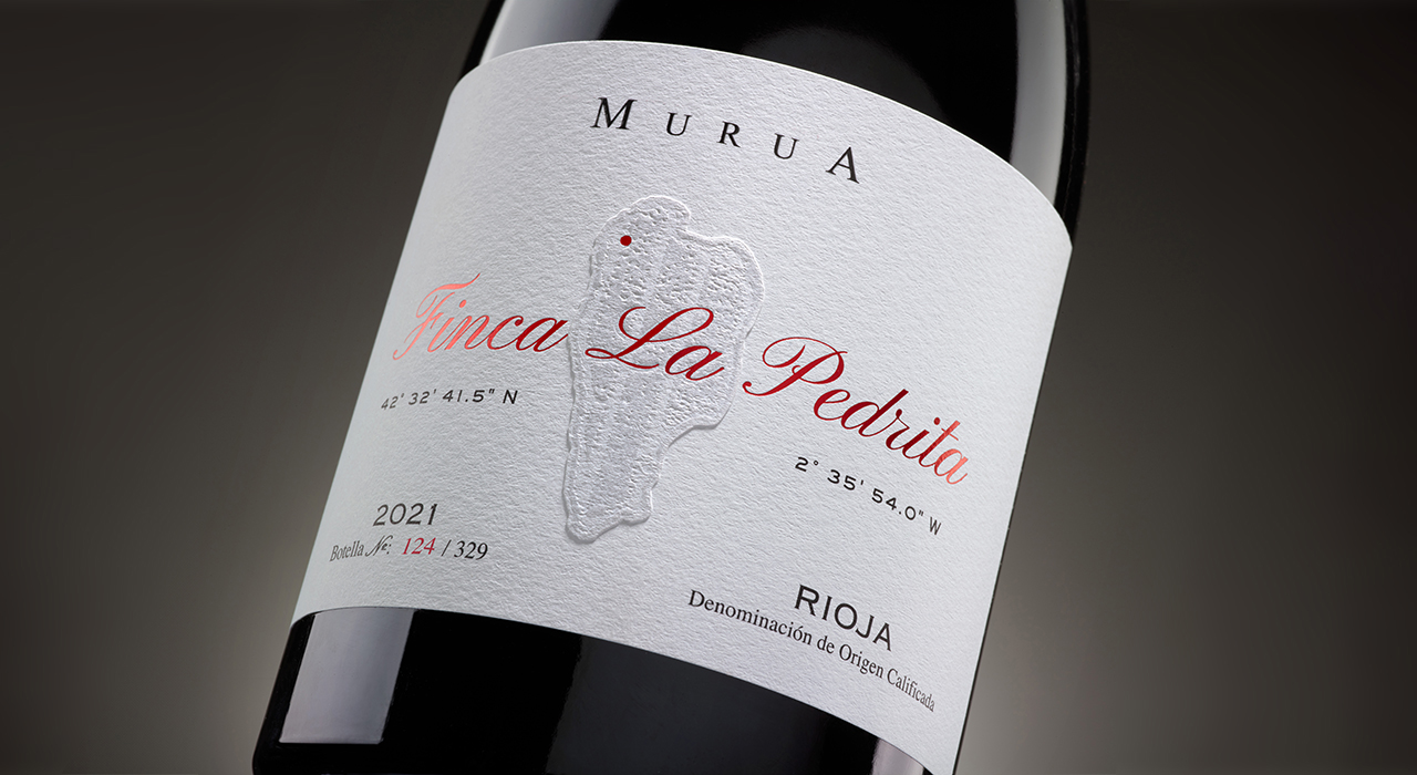
The creative concept is based on the idea of discovery. Just as the winemaker recognized an unexpected potential in this plot, we wanted each bottle to convey that sense of a find. The estate becomes the protagonist : its aerial view, the texture of its limestone soil, and the footprint of time inspire the label, the tissue paper, and the neck collar.
The design invites a journey that begins in the vineyard and culminates in the glass. The coordinates where it is located are pinpointed, marking the very spot where visits begin for those who come to this impressive plot.
Graphic Solution
The visual system of Finca La Pedrita is structured on three pillars:
– An aerial view of the estate: a visual metaphor for vastness, biodiversity, and the extraordinary.
– Reliefs and textures: conveying volume and attention to detail.
– A verbalization that transports us to the estate: “The small, in addition to being delicate, treasures the footprint of time and the mastery of artisanal work”.
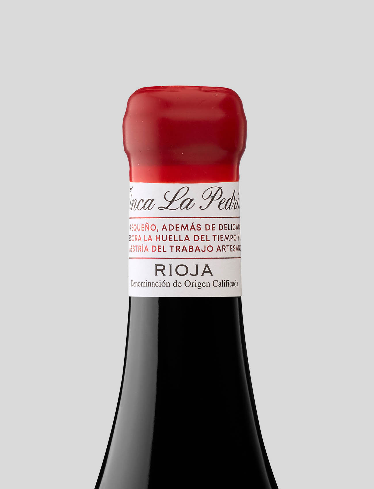
The selected typography reflects the delicacy of the wine, while the embossed finishes and overlapping layers help to convey the wine’s sophistication and iconic nature. All this encapsulates the project’s duality: nature and craftsmanship, tradition and exclusivity. The result is a graphic universe that elevates the experience, where each element contributes to reinforcing the wine’s premium and exclusive character.
Production
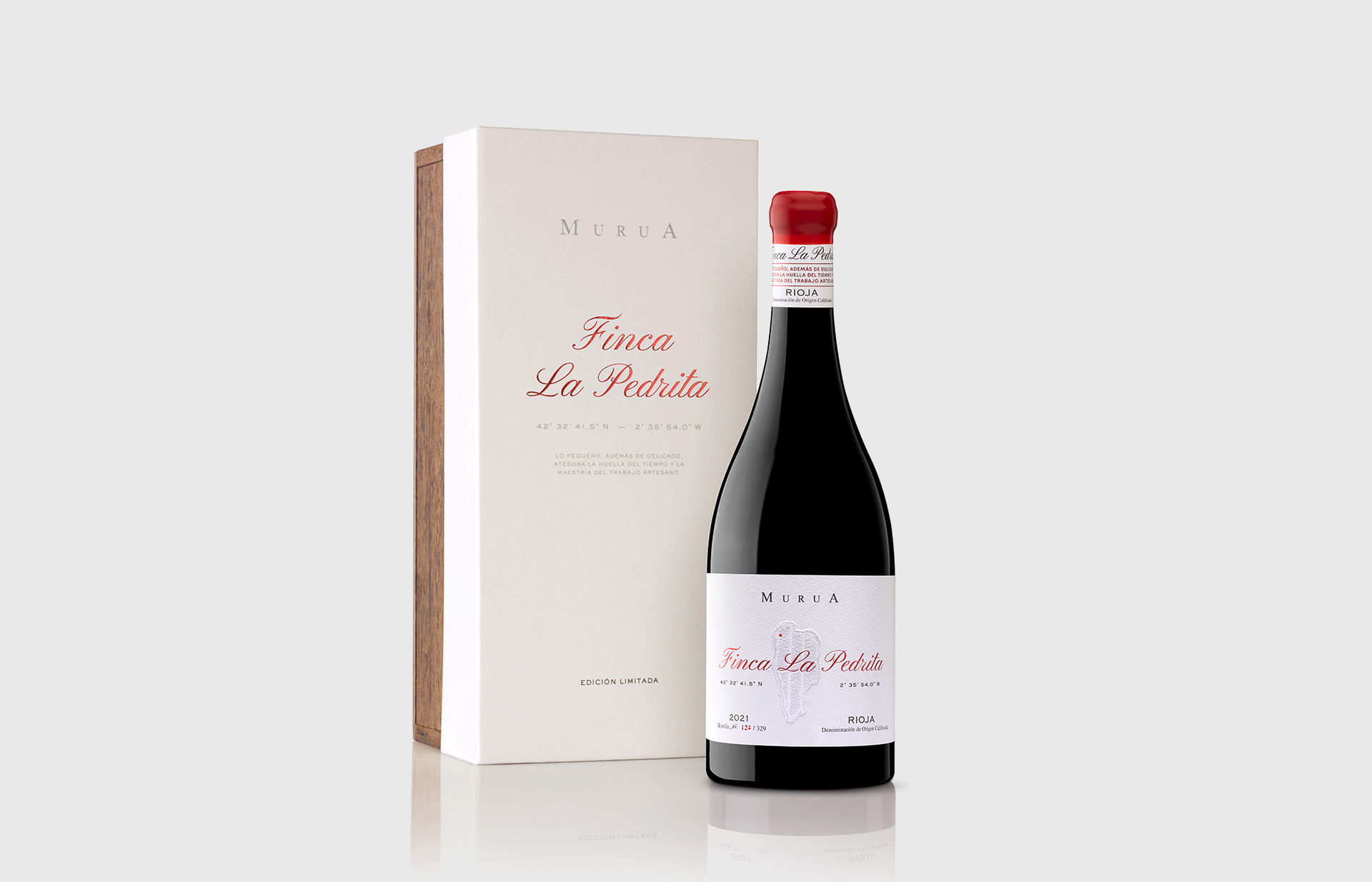
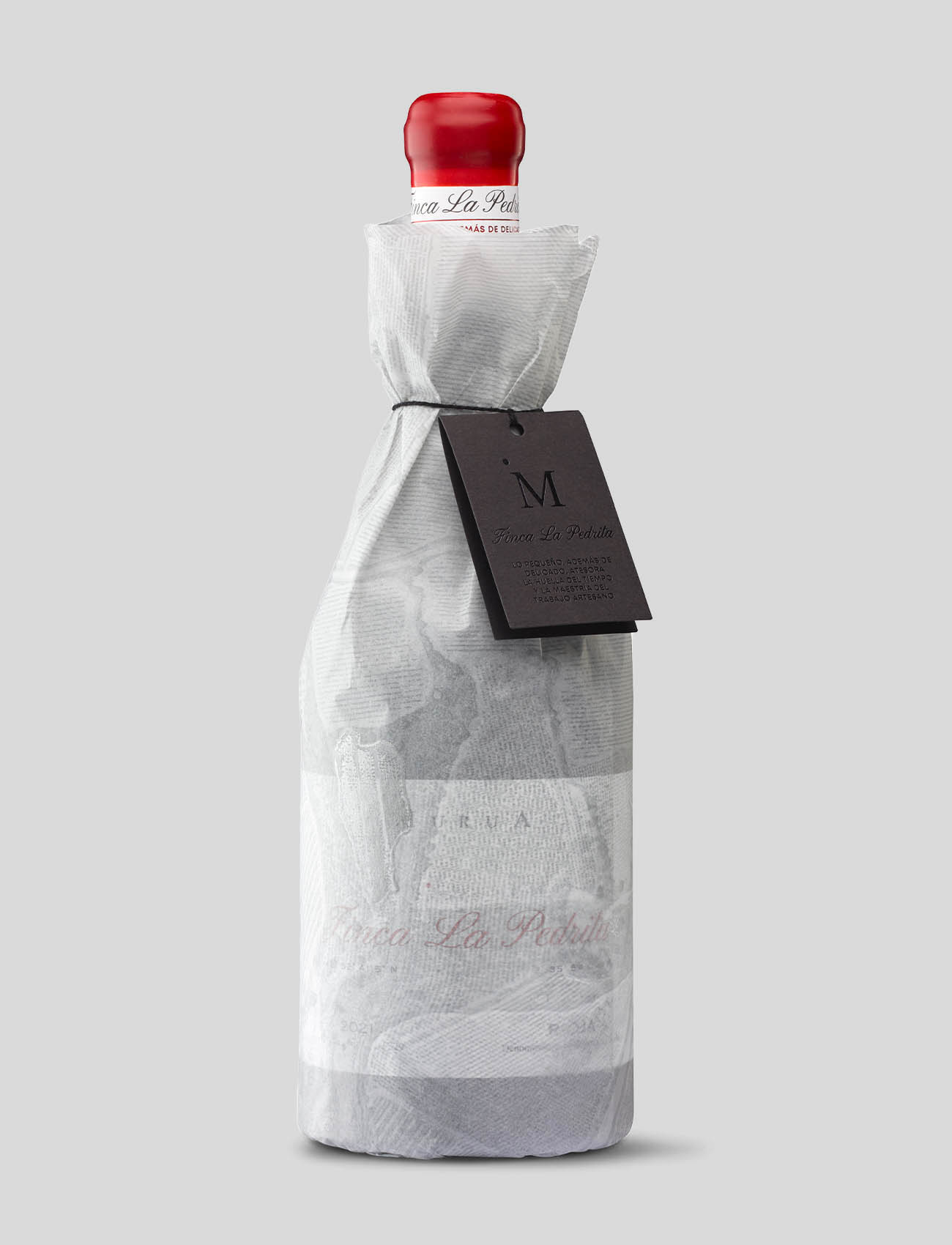
Starting with the first impression of the Finca La Pedrita case, which is more than just a wrapping: it is the first gesture of the experience, everything has been taken care of. Its production using wood and cotton paper—both noble materials—seeks to convey the same delicacy to the touch and the eye with which each bottle is born.
The finishes play with light and reliefs as if they were footprints of time on the earth. In it, the functional and the poetic coexist. It protects and also anticipates, because opening it reveals a discovery. Every detail, every fold, every technique is designed so that exclusivity is a tangible experience. The case thus becomes a bridge between the origin and the consumer, almost a ritual, reminding us that what is memorable begins before the first sip.
The label is an immaculate canvas on which the plot is superimposed with bluntness and forcefulness. Finca La Pedrita emerges with the strength and presence of that which deserves to be discovered and enjoyed.
CREDIT
- Agency/Creative: TSMGO | Brand consultants
- Article Title: TSMGO Brand Consultants Elevates Finca La Pedrita Into a Luxury Wine Icon
- Organisation/Entity: Agency
- Project Type: Packaging
- Project Status: Published
- Agency/Creative Country: Spain
- Agency/Creative City: TSMGO | Brand consultants. Logroño
- Market Region: Europe
- Project Deliverables: Brand Design, Brand Experience, Copywriting, Graphic Design, Packaging Design, Packaging Guidelines, Web Design
- Format: Bottle
- Industry: Food/Beverage
- Keywords: Wine ; Packaging ; Packaging Design ; Red Wine ; Bottle ; Label Design ; DOCa Rioja
-
Credits:
TSMGO | Brand Consultants: TSMGO | Brand Consultants


