


Introduction
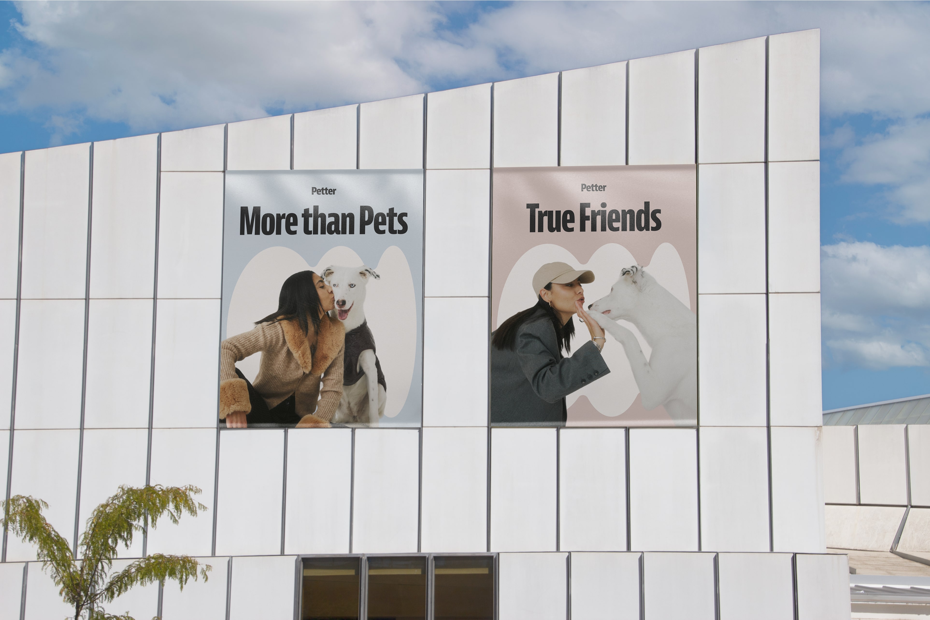
Petter is more than a pet wellness brand — it’s a tribute to the bond between humans and their animal companions. Born from the simple yet profound idea that pets are true friends, not just animals, Petter aims to elevate pet care to human standards, creating products that nurture the body and soul alike. Developed for discerning pet owners in the US and Canada, Petter’s range of human-grade, organic supplements supports overall health, stress relief, and joint mobility. But beyond the functional benefits, the brand speaks to something deeper: emotional connection, natural balance, and the joy of companionship. Chefthai Creative was entrusted with translating these values into a visual identity and packaging system that feels natural, premium, and profoundly human.
Brand Philosophy
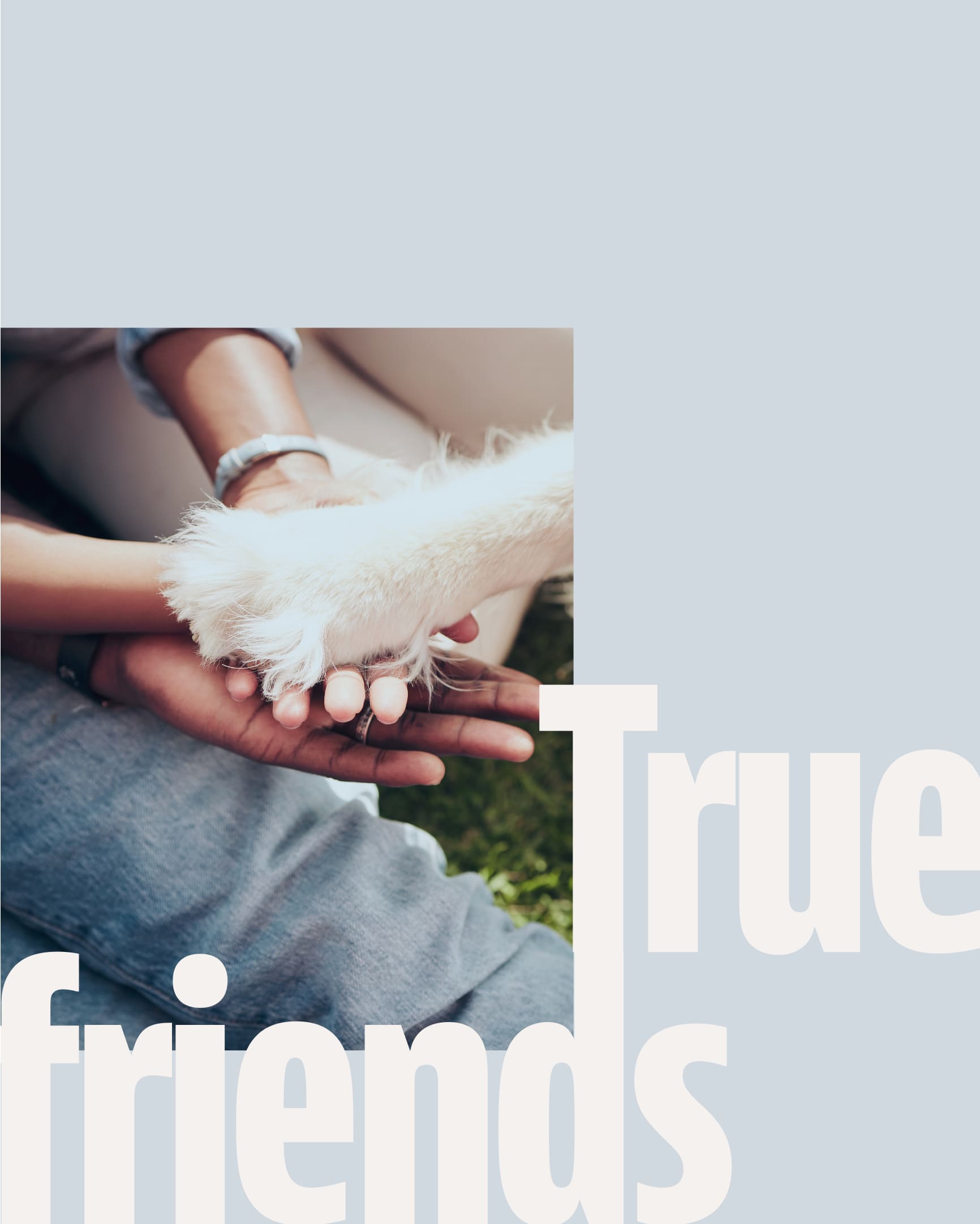
At the heart of Petter lies one question: What if pet care felt as genuine, loving, and thoughtful as how we care for ourselves? This philosophy inspired a design that goes beyond aesthetics — one that communicates care, purity, and trust at every touchpoint. We wanted Petter to reflect the emotional depth of its audience — individuals who live alone or treat their pets as family. For them, their dog or cat is not just a pet, but a companion, a confidant, and often, their closest emotional bond. Petter’s visual identity, therefore, was designed to feel warm yet refined, scientific yet soulful, and above all, honest.
Design Concept
The core creative direction was built upon three guiding pillars:
1. Human-Grade Purity – communicating the brand’s scientific integrity and natural ingredients.
2. Emotional Connection – capturing the loving relationship between humans and pets.
3. Modern Simplicity – balancing minimalism with organic warmth, suitable for an international audience.
From logo design to color palette, typography, and structural packaging, each detail was crafted to tell the story of care, love, and natural well-being.
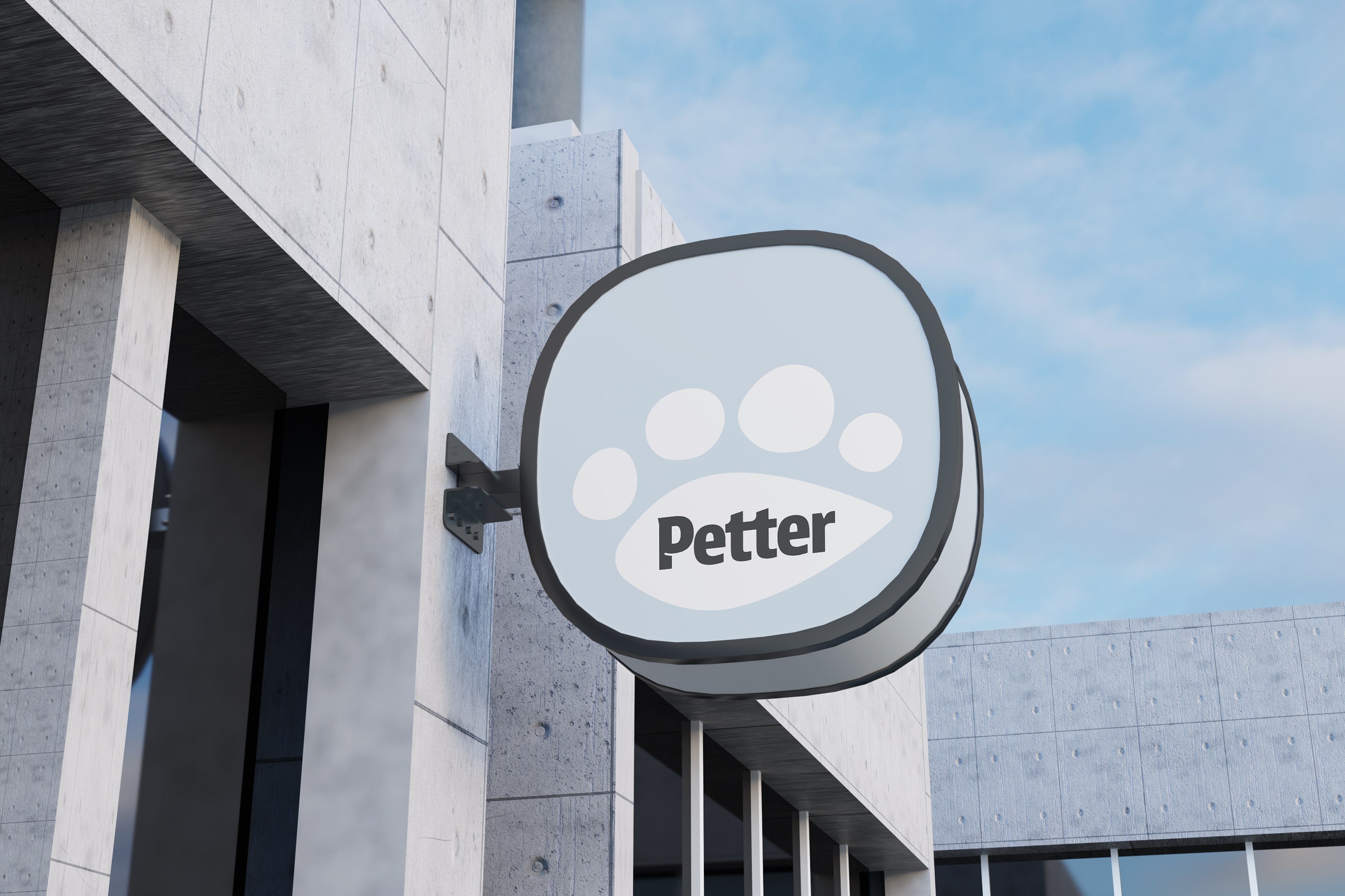
Logo Design: Where Emotion Meets Symbolism
The Petter logo is the heart of the brand. At first glance, it appears clean, modern, and balanced — but within its simplicity lies a network of thoughtful, emotional details.
Each curve and negative space in the logo was designed to subtly evoke elements of both cats and dogs, symbolizing inclusivity and harmony between species.
• The ‘P’ features a gentle ear-like curve, a nod to the recognizable silhouette of a pet’s ear — attentive, curious, and affectionate.
• The ‘E’ carries a tongue-inspired curve within its horizontal lines, referencing playfulness, trust, and joy — the universal language of pets.
• The ‘R’ extends with a tail-like flourish, dynamic and uplifting, representing energy, companionship, and the vitality that Petter promotes.
Together, these crafted details turn a minimalist wordmark into a living identity, full of personality and emotional resonance. The result is a logo that feels simultaneously premium and personal — human in its precision, yet heartwarming in its symbolism.
Organic Shapes and Symbolic Forms
Beyond the logo, the brand identity integrates a system of organic shapes that carry both aesthetic and conceptual meaning. One of the signature motifs is a leaf-shaped form, symbolizing nature, purity, and organic origins. This shape serves as the foundation for many secondary elements across the visual system — from background patterns to iconography and packaging accents. Building upon this, the design team developed a paw motif derived directly from the leaf shape — a fusion of nature and companionship.
Each paw print, when examined closely, subtly echoes the veins of a leaf, blending the brand’s two most important insights: natural care and emotional connection. This design detail reinforces Petter’s belief that nature and love are inseparable when it comes to true wellness.
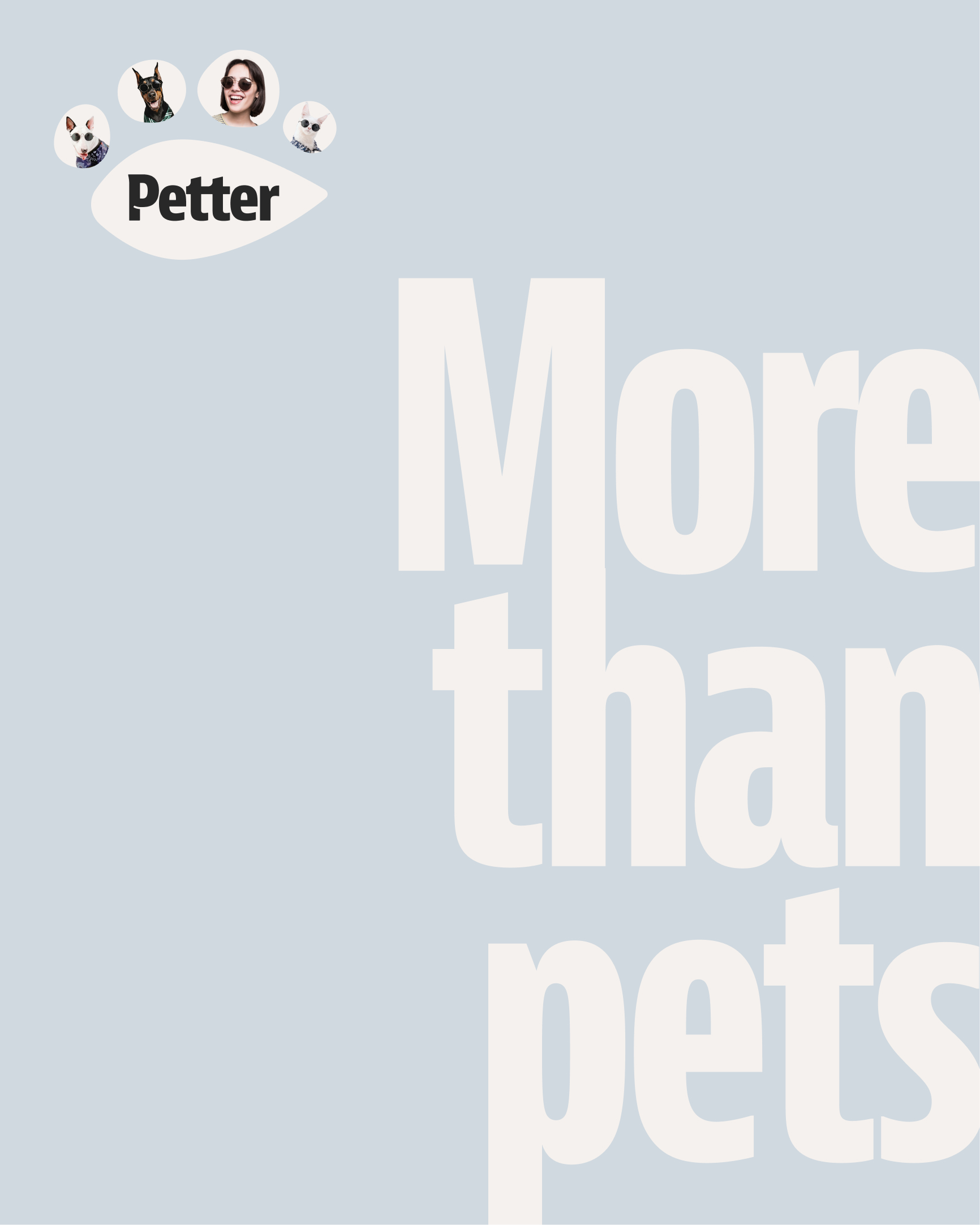
Colour Palette
The color direction was crafted to feel natural, sophisticated, and trustworthy. A calm blue-green hue serves as the primary tone — evoking serenity, cleanliness, and scientific reliability — balanced by warm beige and off-white neutrals that convey organic softness. The palette is intentionally understated, allowing the product itself — and the emotional connection it represents — to remain in focus. Accents of muted gold and soft gray add a touch of premium quality without sacrificing authenticity.
Typography
Typography plays a crucial role in expressing the brand’s balance between professionalism and warmth. A modern sans-serif typeface was chosen for its geometric clarity and readability, while subtle customizations soften the tone and reflect approachability. Headlines are confident yet calm, body text feels clean and breathable — mirroring the brand’s commitment to clarity, transparency, and natural integrity.
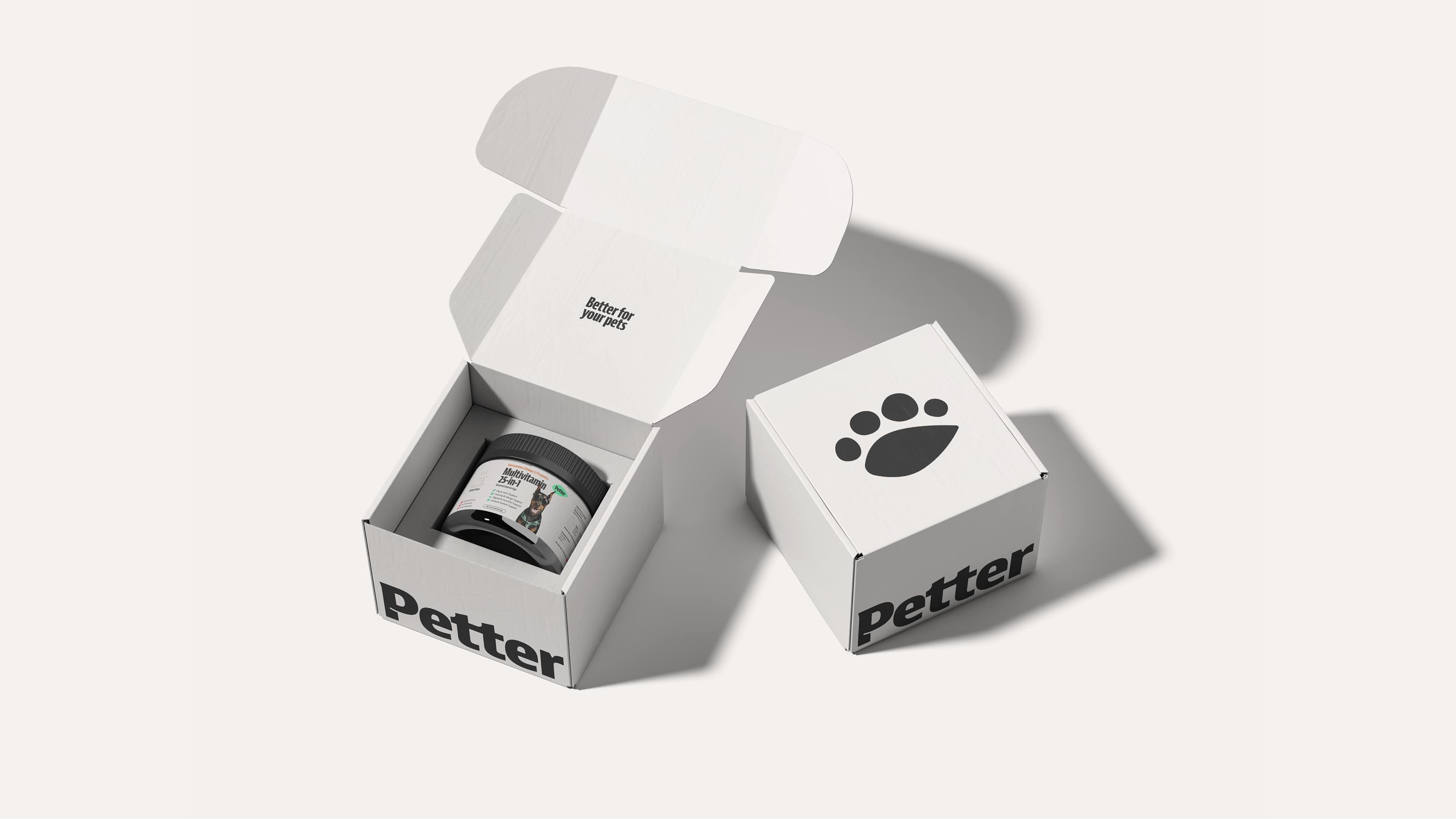
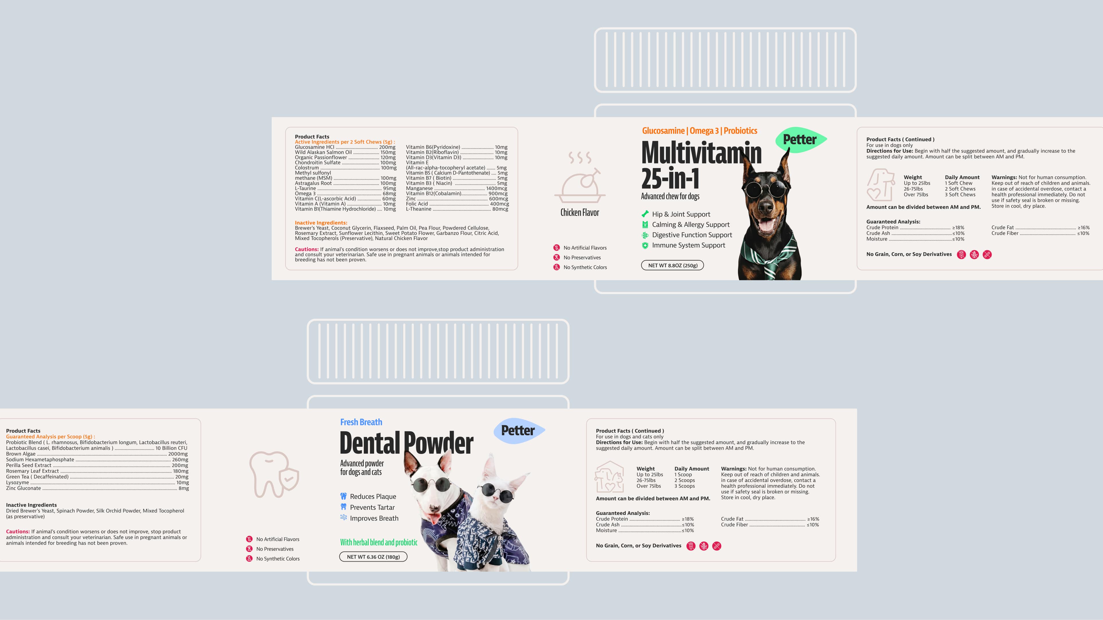
Packaging Design
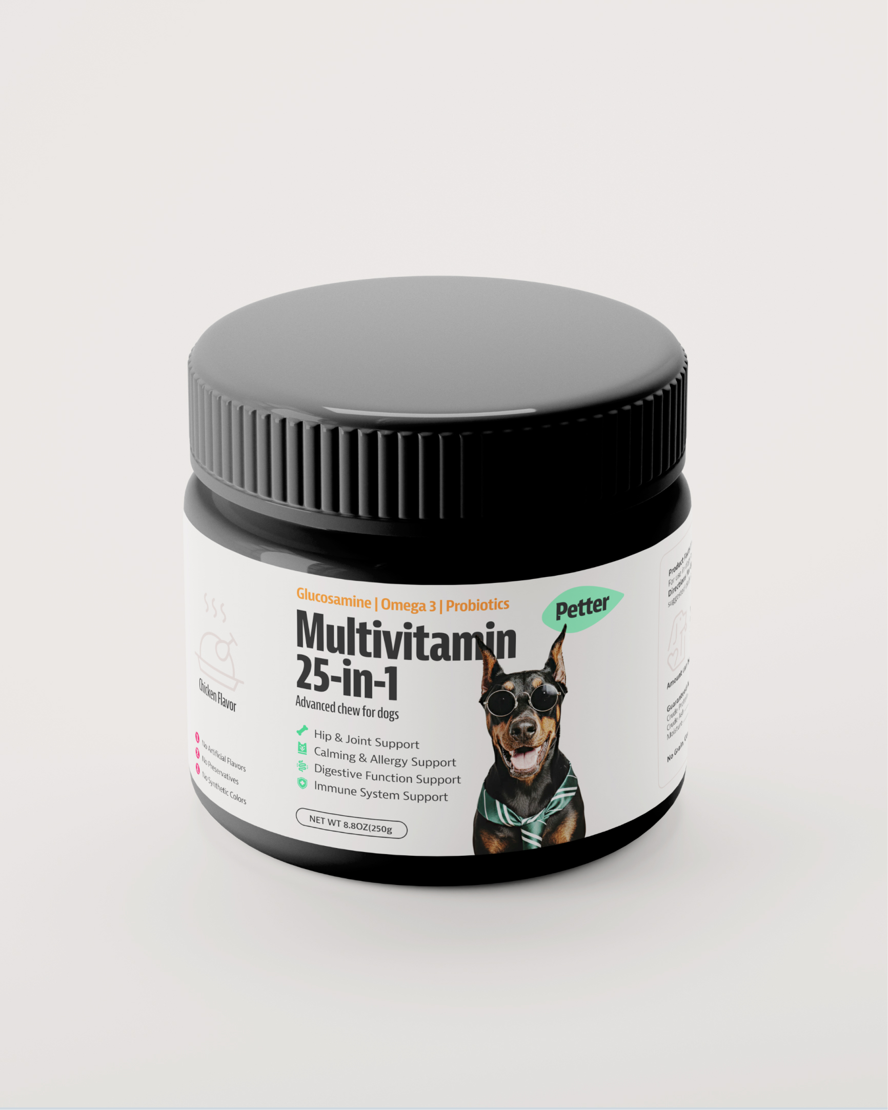
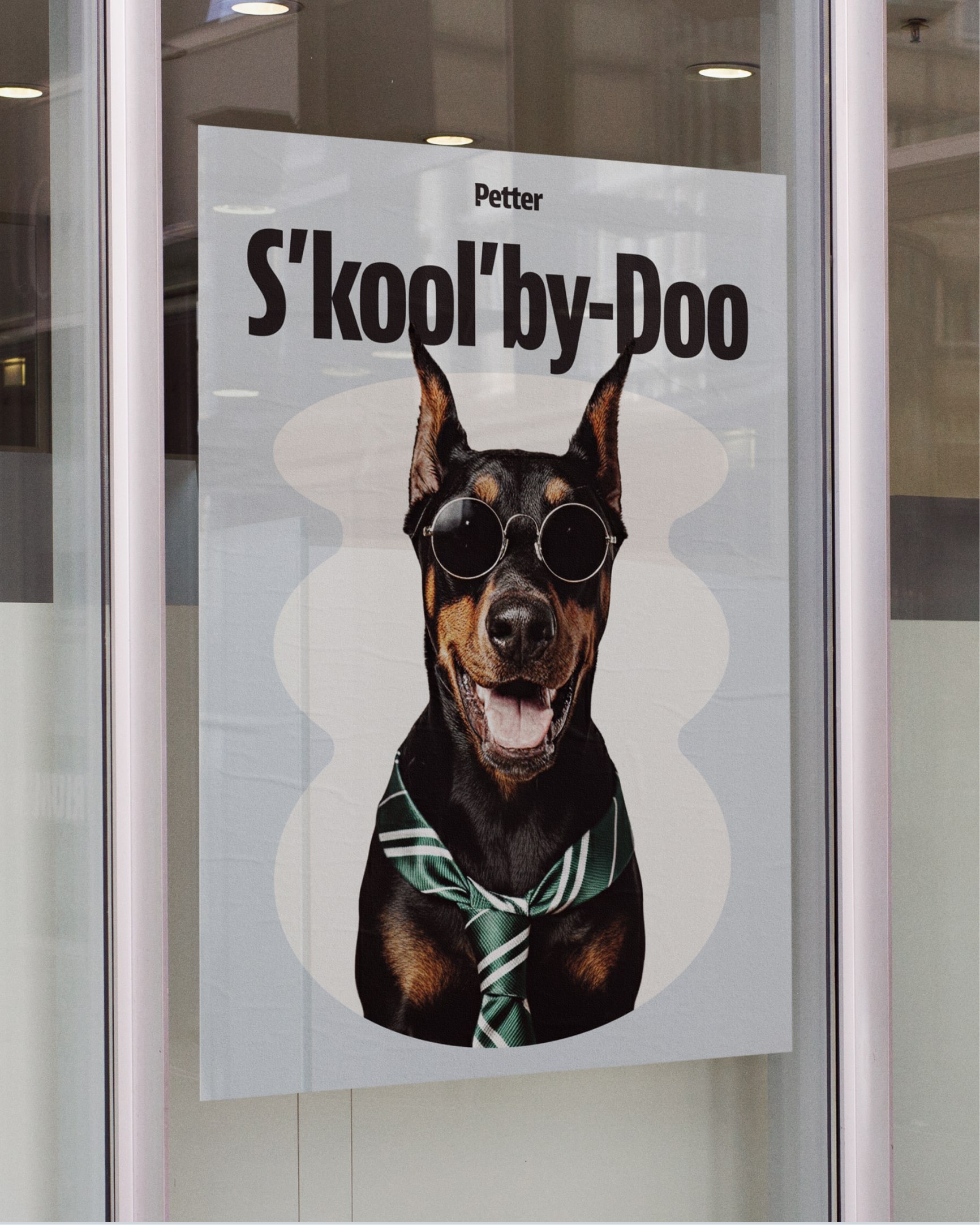
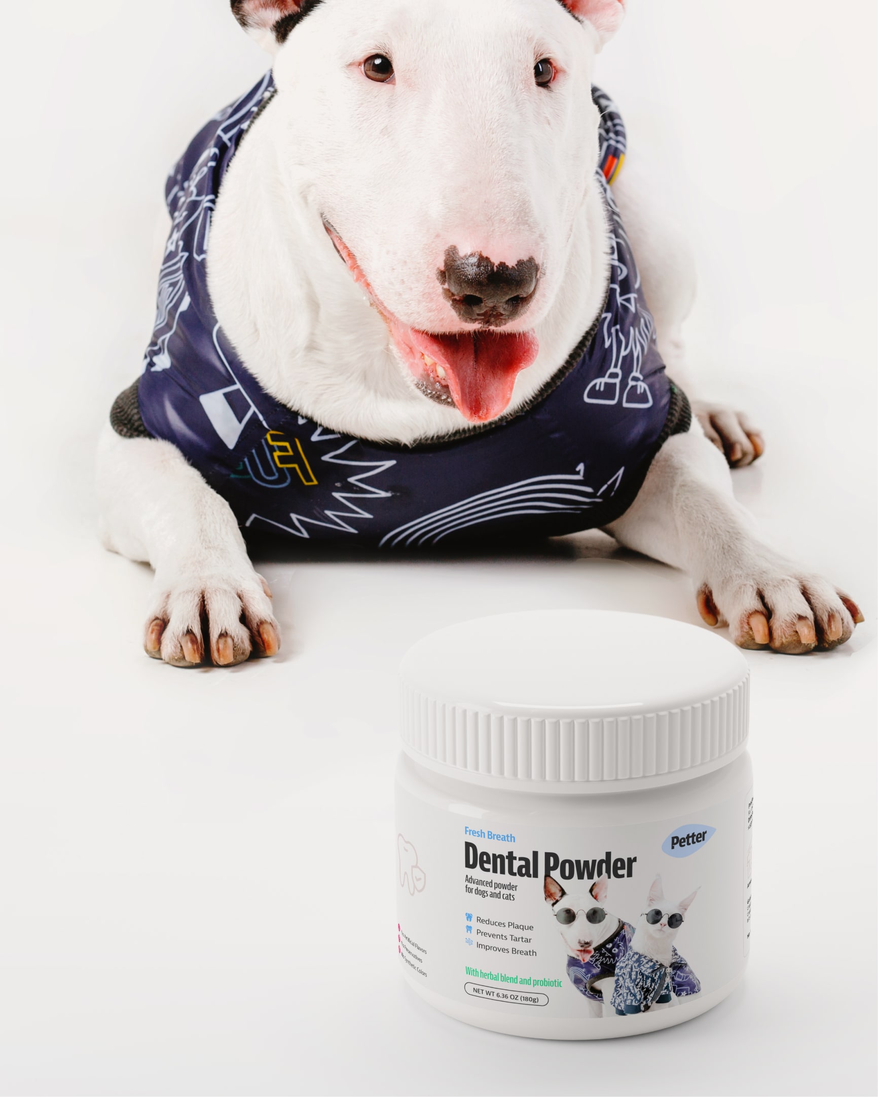
Petter’s packaging system was designed with precision and purpose. The structure is both modern and tactile, combining matte finishes with soft edges that feel welcoming to the touch. The side label (300x56mm) and top label (circular, radius 80mm) were optimized for legibility and consistency across product variants. Each product’s label features a prominent logo lockup, clean typography, and a calm color balance — communicating trust at first glance. Delicate organic shapes flow across the layout, referencing the leaf-paw motif, creating an emotional rhythm without clutter. Every label carries an implicit promise: this product was made with care, honesty, and love.
CREDIT
- Agency/Creative: Chefthai Creative
- Article Title: Petter – More than Pets, True Friends: Human-Grade Pet Wellness Branding by Chefthai Creative
- Organisation/Entity: Freelance
- Project Type: Identity
- Project Status: Published
- Agency/Creative Country: Vietnam
- Agency/Creative City: Hanoi
- Market Region: Europe, Global
- Project Deliverables: 2D Design, Art Direction, Brand Architecture, Brand Creation, Brand Design, Brand Identity, Brand Mark, Brand Tone of Voice, Branding, Creative Direction, Design, Graphic Design, Logo Design, Motion Graphics, Packaging Design
- Industry: Health Care
- Keywords: Pet, Petter, Dog, Cat, Chefthai Creative, Supplement, Organic, Natural, Wellness
-
Credits:
Client: Petter
Branding & Design: Chefthai Creative


