


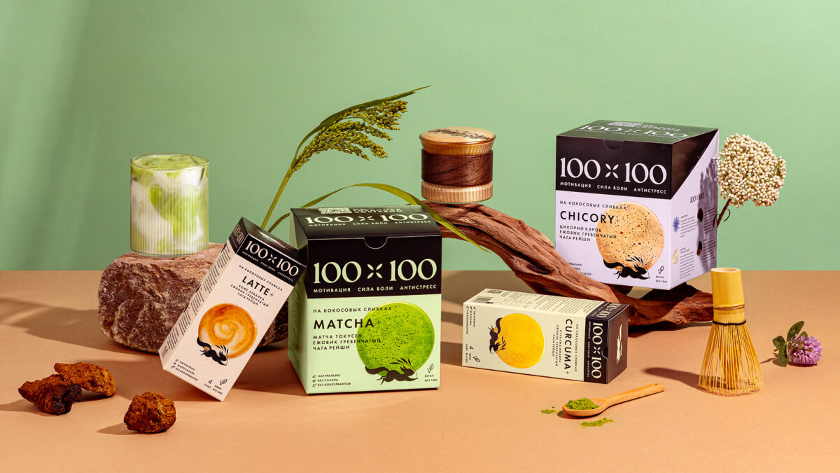
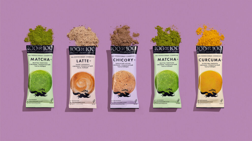
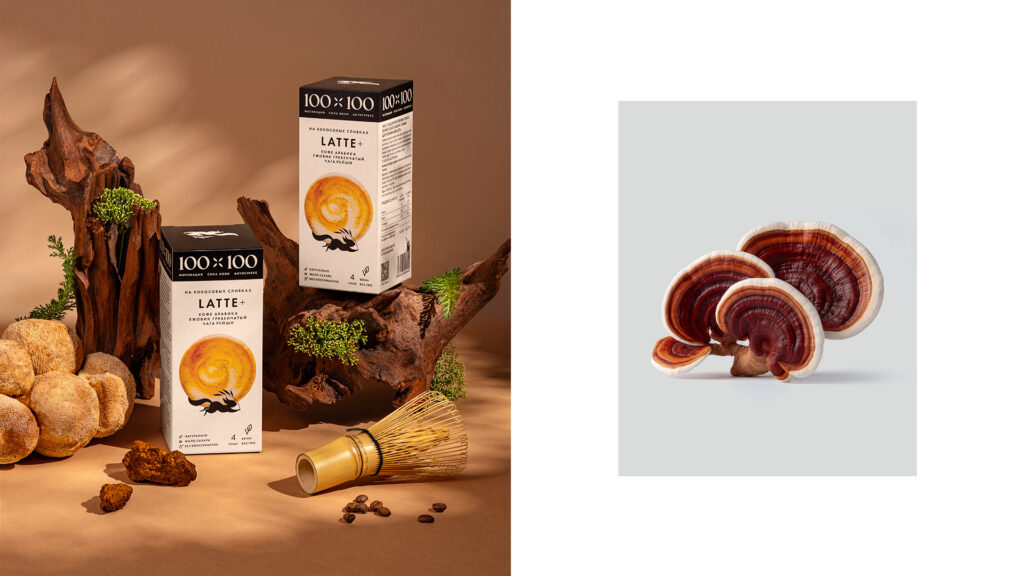
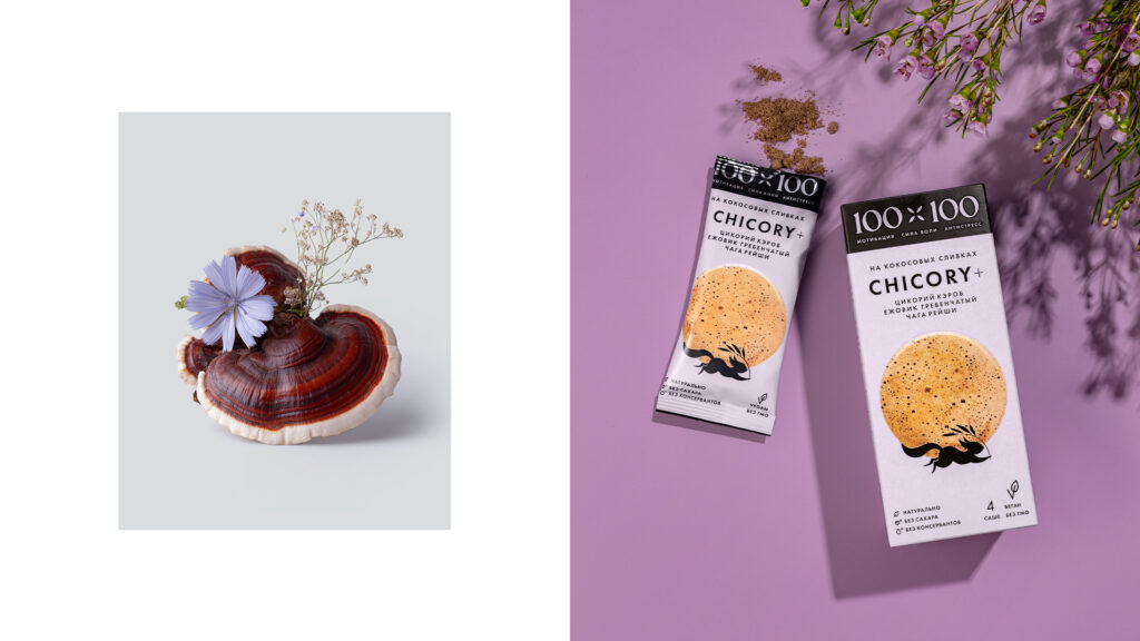
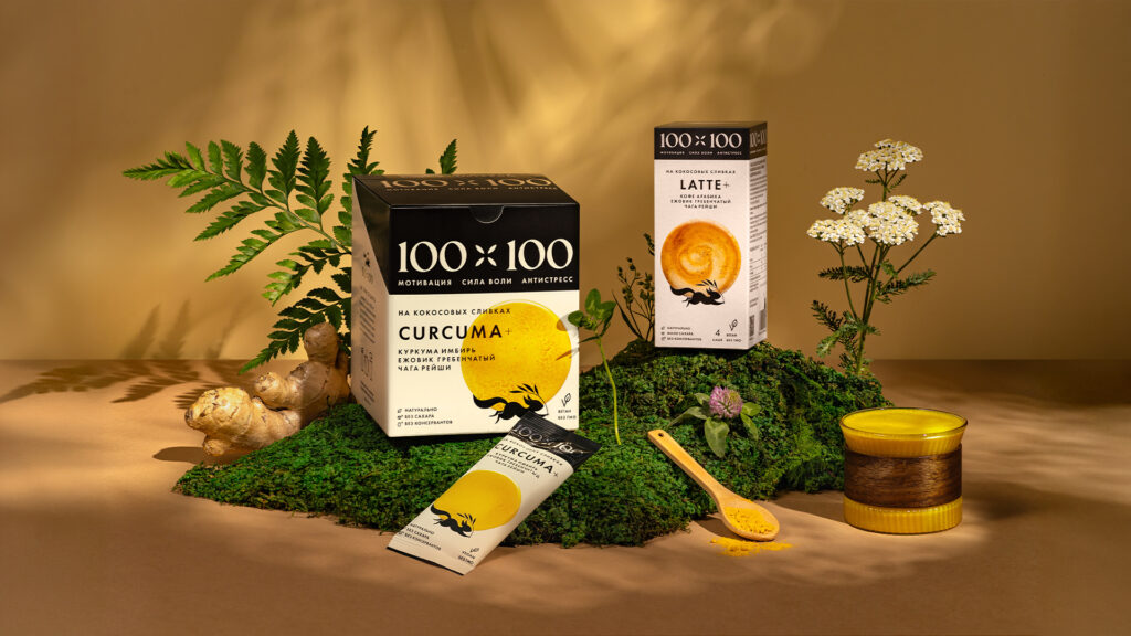
The challenge was to develop a complete packaging design for the 100×100 brand in the highly competitive functional beverage market. This involved creating a concept, metaphor, and visual identity that reflected a blend of modern, minimalist style and natural product benefits. Key tasks included designing packaging for various formats (stick packs, base boxes, showboxes) to ensure recognition and effectively communicate key advantages: functional composition, lactose-free nature, and low sugar content. The expected results were the establishment of a new brand with a memorable visual identity, strengthened market positioning, increased target audience loyalty, and the creation of an adaptive design system for future brand development.
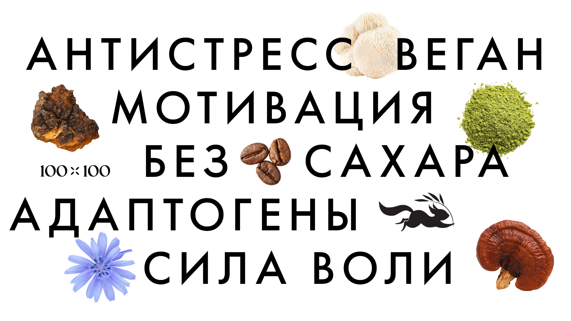
The brand responds to growing demand from urban audiences for products that combine convenience, familiar taste, and proven health benefits. In an era of increased stress, time constraints, and a trend toward conscious consumption, classic coffee and tonic drinks often contain excess sugar, lactose, or fail to address specific needs like immunity and cognitive support.
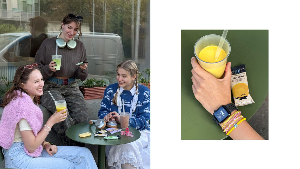
The campaign targets active urban residents aged 25-35, with a core audience of health-conscious, career-driven women who prioritize nutrition and self-development. This segment balances a fast-paced lifestyle with conscious consumption and seeks products that support productivity, immunity, and mental well-being without compromising on taste or convenience.
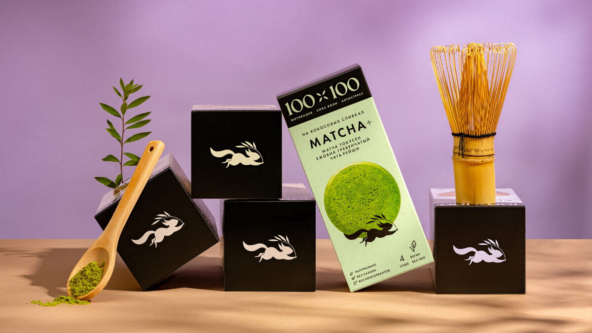
The key message, “Natural energy for the urban rhythm,” is embodied by a brand mascot—an elegant, swift, and graceful squirrel. This character personifies the target audience itself, symbolizing the balance between natural power and the dynamics of metropolitan life. It effectively translates the functional benefits of adaptogens and natural ingredients into a relatable urban context.
While the market is dominated by either minimalist, sporty, pharmaceutical-style brands or overly rustic “nature” packaging, the squirrel mascot creates a unique emotional connection. It adds personality and lightness, distinguishing the brand from competitors. This memorable image visually communicates natural benefits through an urban aesthetic, resonating with audience values and enhancing engagement and loyalty across both packaging and digital communication.
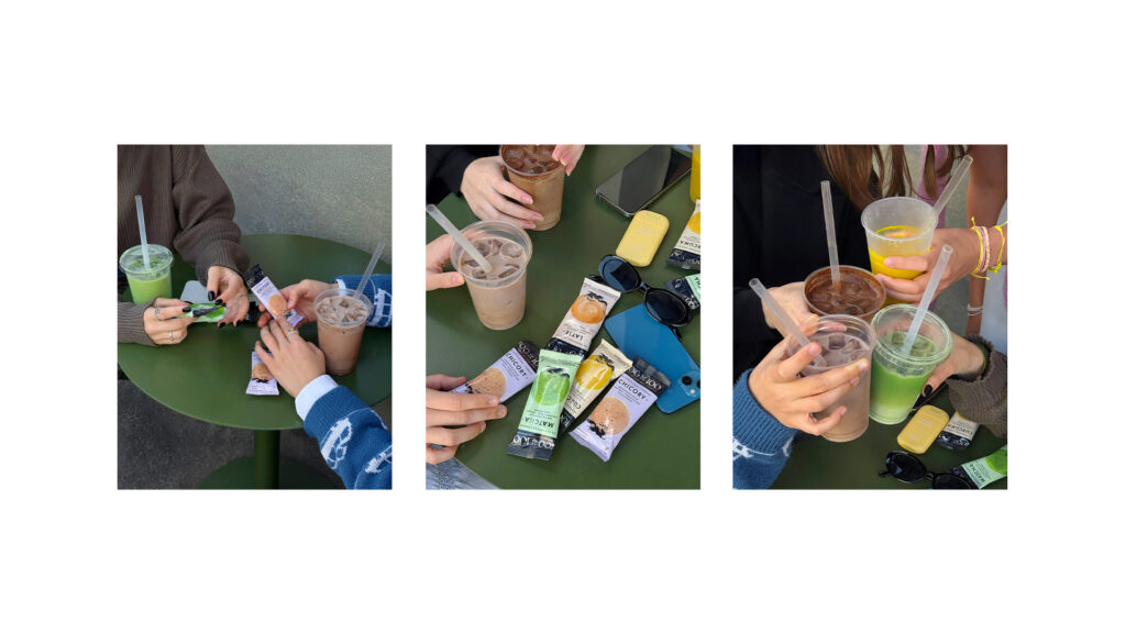
The campaign was executed using an integrated strategy combining digital and physical channels. The focus was on social networks (Instagram, Telegram) and partnerships with wellness influencers, as well as presence at wellness events (marathons, wellness breakfasts, yoga sessions, city festivals). The packaging’s visual design served as a central content element. To boost awareness, a series of educational materials on ingredient benefits was released, complemented by high-quality visuals and food photography that emphasized the product’s composition and modern style.
The brand has been successfully launched and is showing active growth in key markets. Participation in events in Sochi, Moscow, Samara, and other cities facilitated initial direct engagement with the target audience and provided valuable feedback. Integration into a partner coffee shop’s menu enhanced product credibility and allowed for testing by new consumer segments. The launch of a Telegram channel created a direct communication line with loyal customers, while the start of sales on Yandex Market significantly expanded product accessibility. These foundational steps have successfully laid the groundwork for growing brand recognition and organic audience expansion.
CREDIT
- Agency/Creative: Ohmybrand
- Article Title: 100×100: Vegan Functional Drinks with Adaptogenic Mushroom
- Organisation/Entity: Agency
- Project Type: Packaging
- Project Status: Published
- Agency/Creative Country: Russia
- Agency/Creative City: Moscow
- Market Region: Global
- Project Deliverables: Packaging Design
- Format: Box
- Industry: Food/Beverage
- Keywords: WBDS Agency Design Awards 2025/26 , packaging, design
-
Credits:
Creative Director: Nadie Parshina
Art Director: Alexandra Pershina
Senior Designer: Maria Egorova
Animation: Anastasia Panarina
Photographer: Elizaveta Elizarova
Project Manager: Natalia Kiryutenko


