


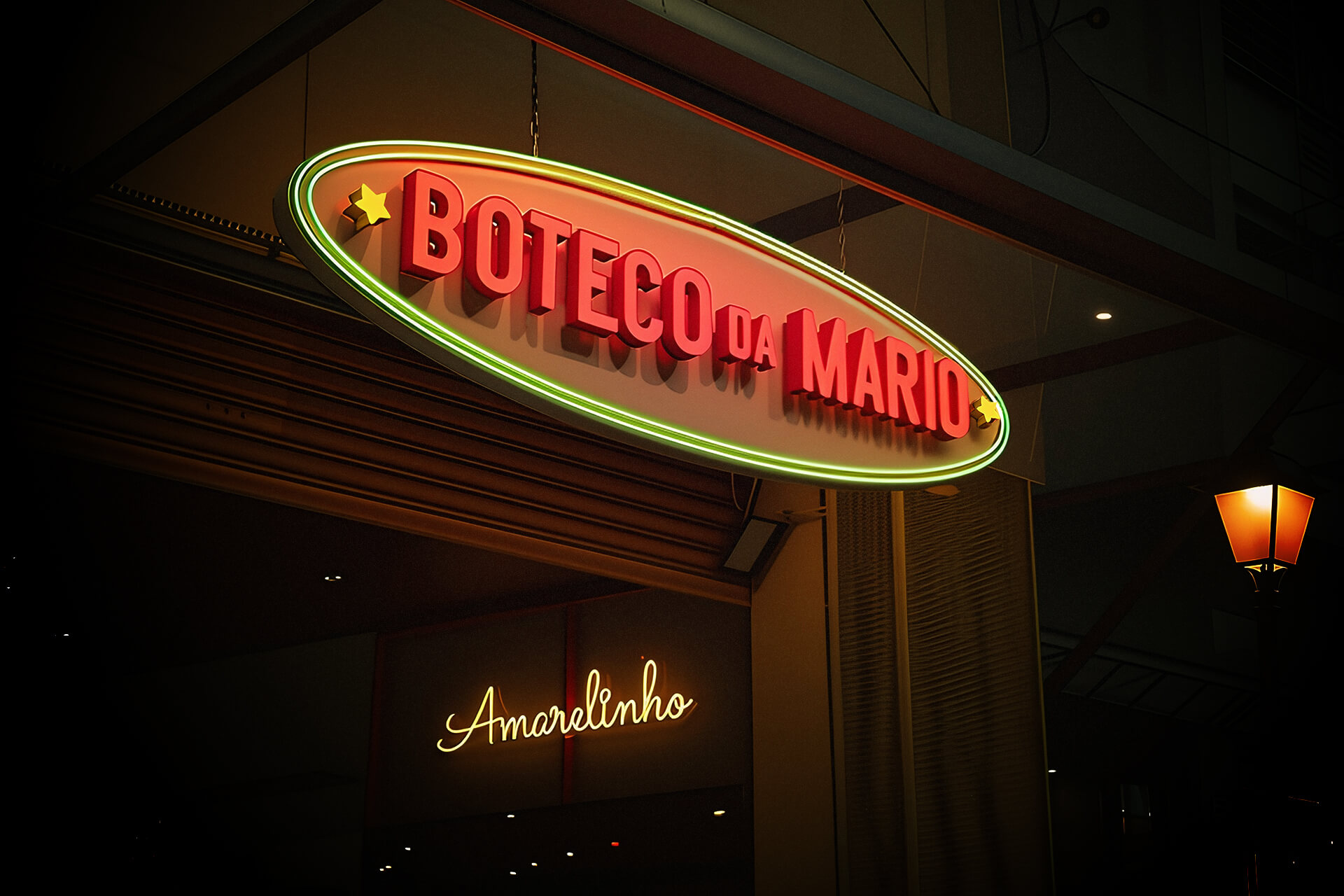
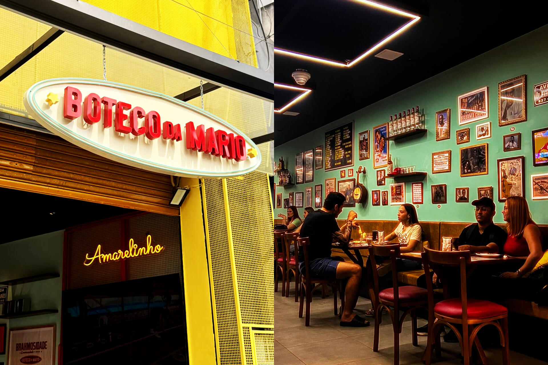
Boteco da Mario is a traditional Brazilian bar located in Nova Iguaçu, a lively city in the metropolitan area of Rio de Janeiro. Affectionately known by locals as “O Amarelinho” (“The Little Yellow One”), it stands out for its bright yellow facade and unmistakable atmosphere, a place where time slows down, music flows, and the joy of being together takes over the space.
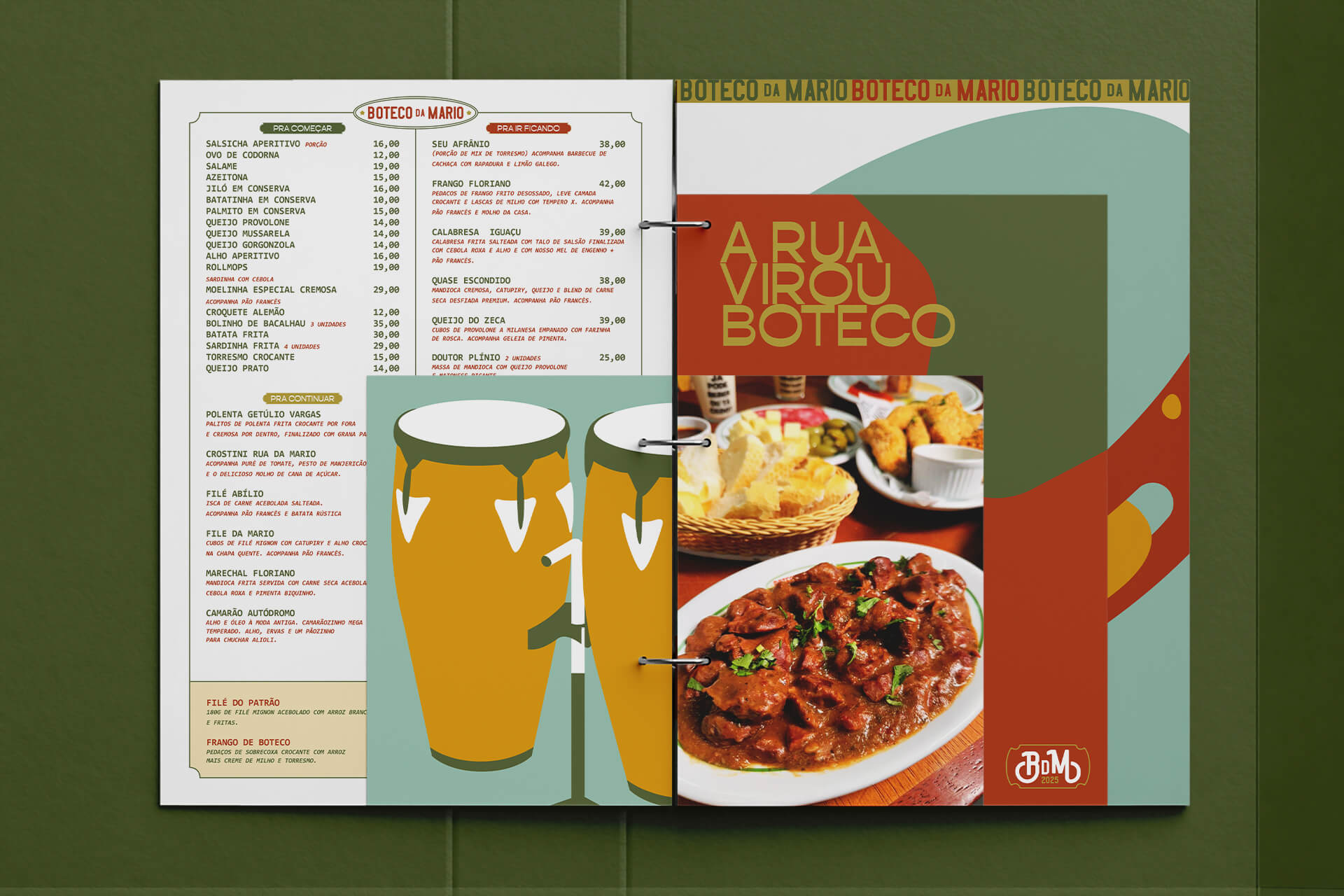
The bar’s slogan, “A Rua Virou Boteco” (“The Street Became a Bar”), expresses the essence of its identity: the street is not just outside, it’s part of the experience. The Boteco is a cultural extension of the sidewalk, where laughter, stories, and samba blend naturally with the clinking of glasses and the rhythm of conversation. This spirit guided the creation of a brand identity that celebrates everyday Brazilian life with honesty and warmth.
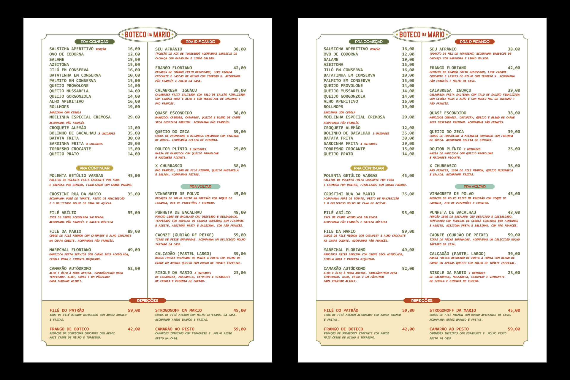
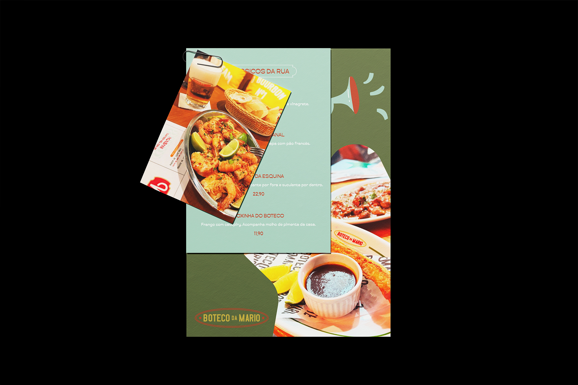
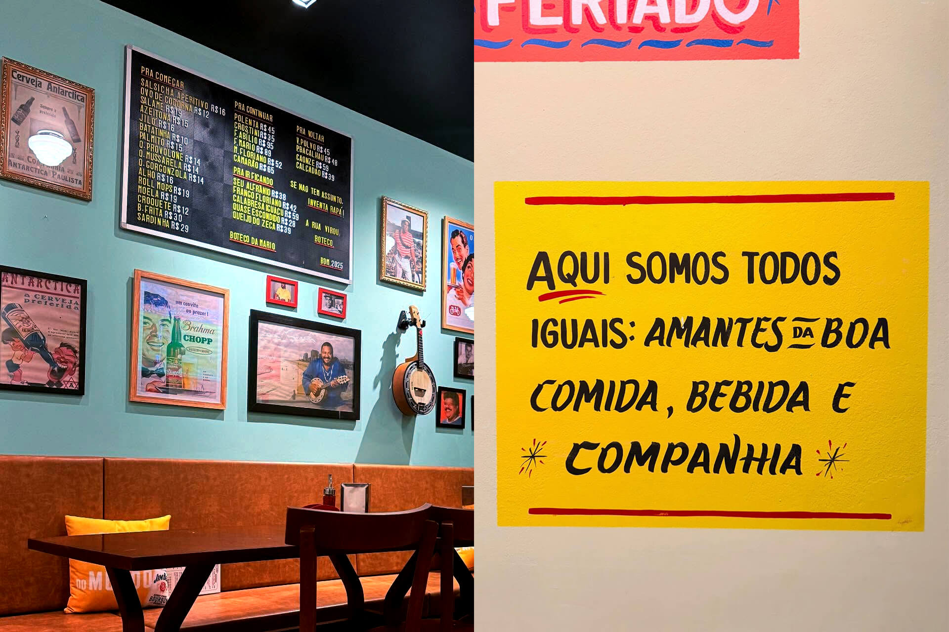
Developed by 268 Estúdio, the project sought to transform that atmosphere into a cohesive visual language, vibrant, spontaneous, and rooted in local culture. The design draws inspiration from the urban textures of Rio’s suburbs: hand-painted signage, worn-out tiles, uneven cobblestone streets, and the colorful chaos that defines the city’s popular bars. Each visual element, from typography to color palette, was carefully chosen to reflect the soul of the place: simple, direct, and full of character.
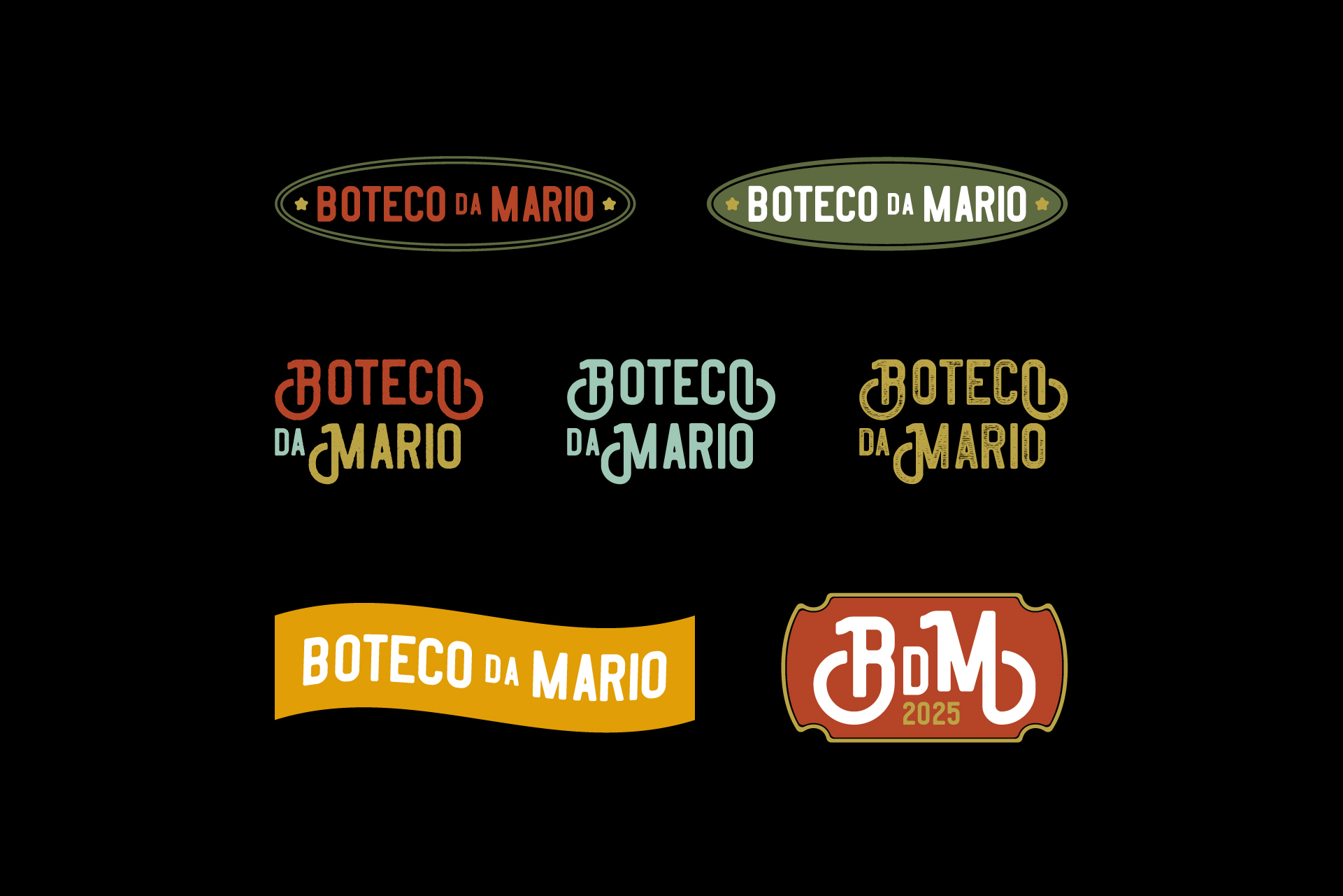
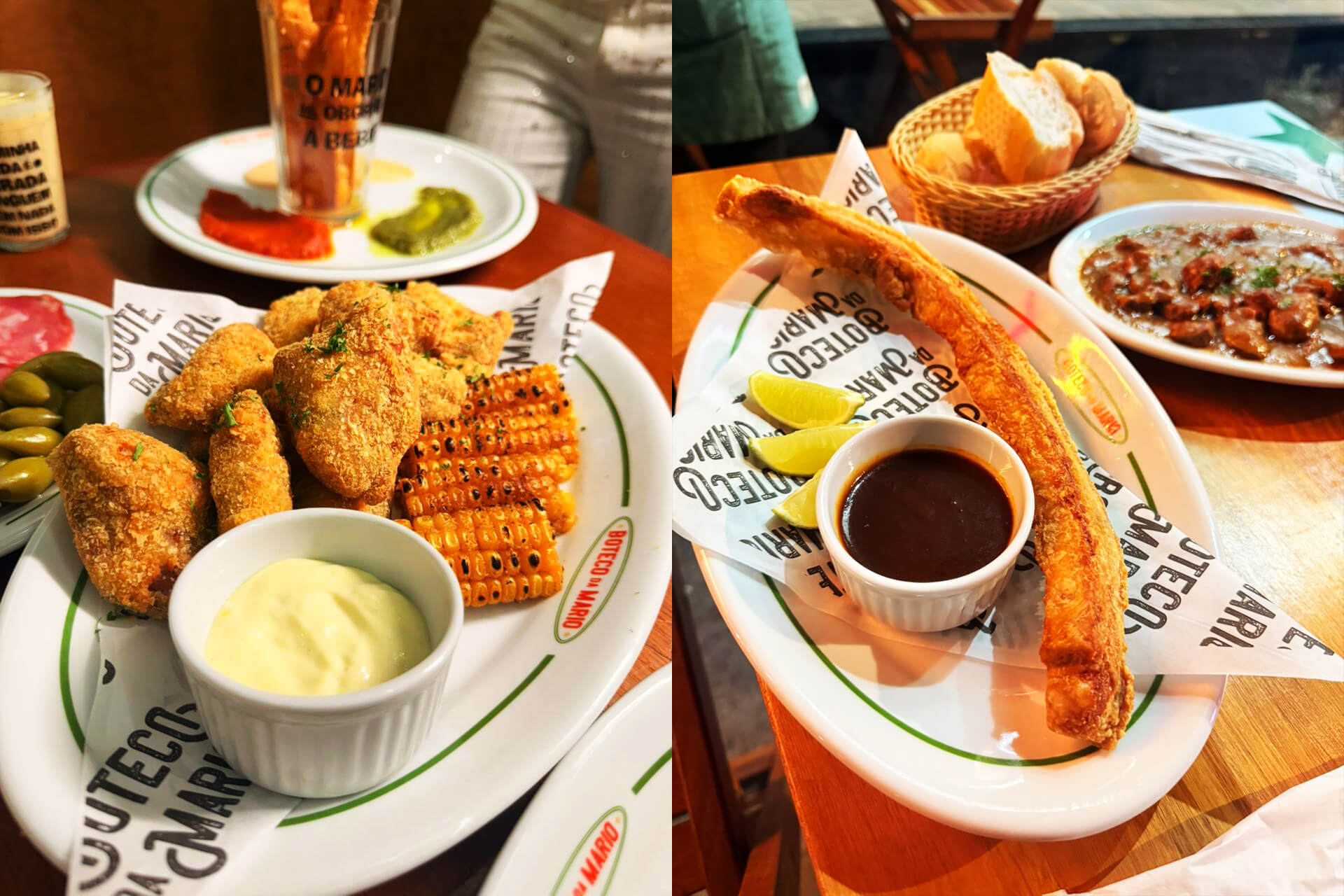
The logotype carries a handcrafted essence, resembling the informal lettering often seen on the façades of old Brazilian bars. The colors, dominated by yellow, mustard, and green-bottle tones, evoke the warmth of sunlight and the authenticity of traditional botecos. Complementary icons and patterns reference instruments, bottles, and geometric shapes found in the design of vintage tiles, reinforcing the sense of belonging and nostalgia.
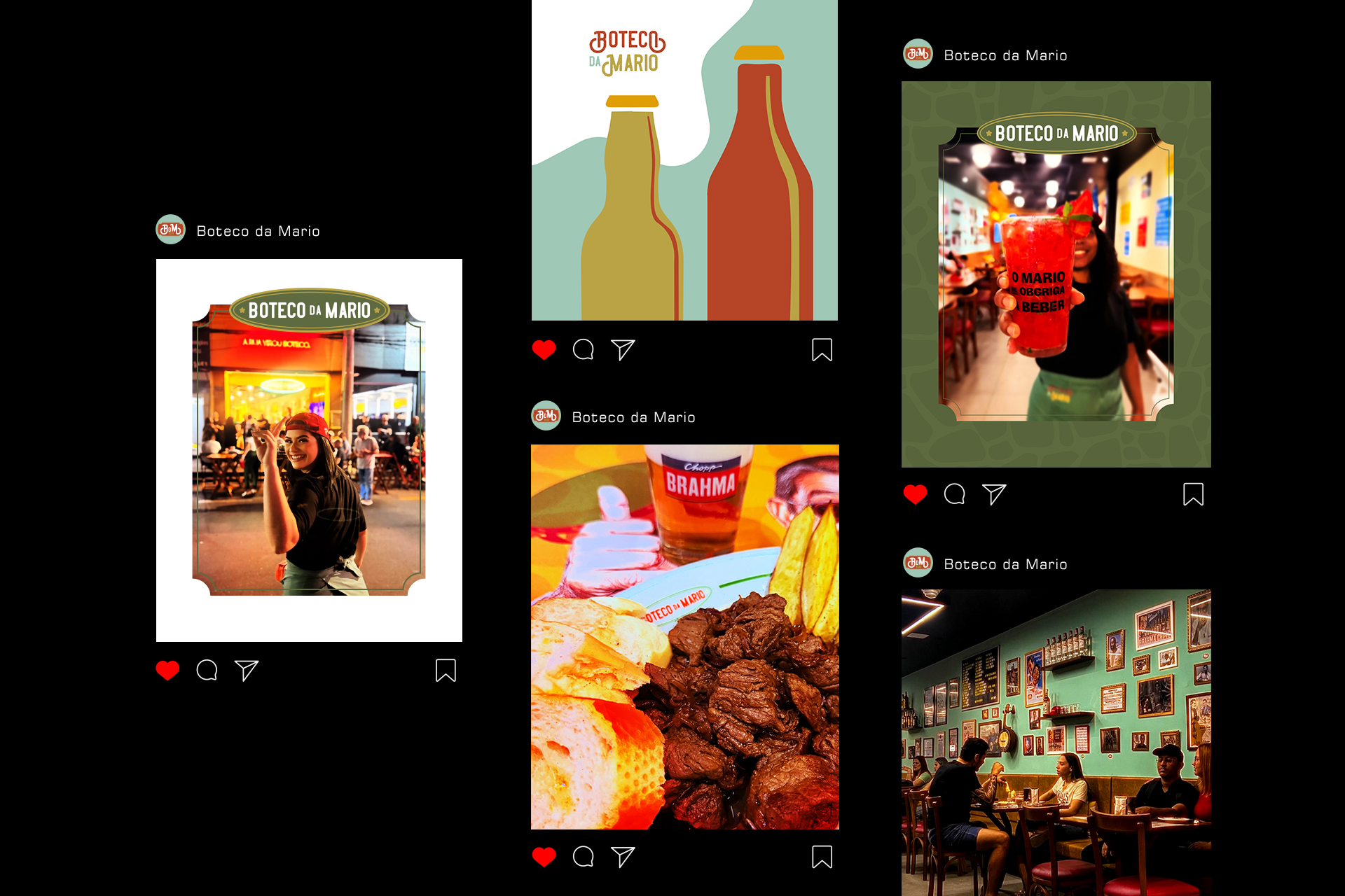
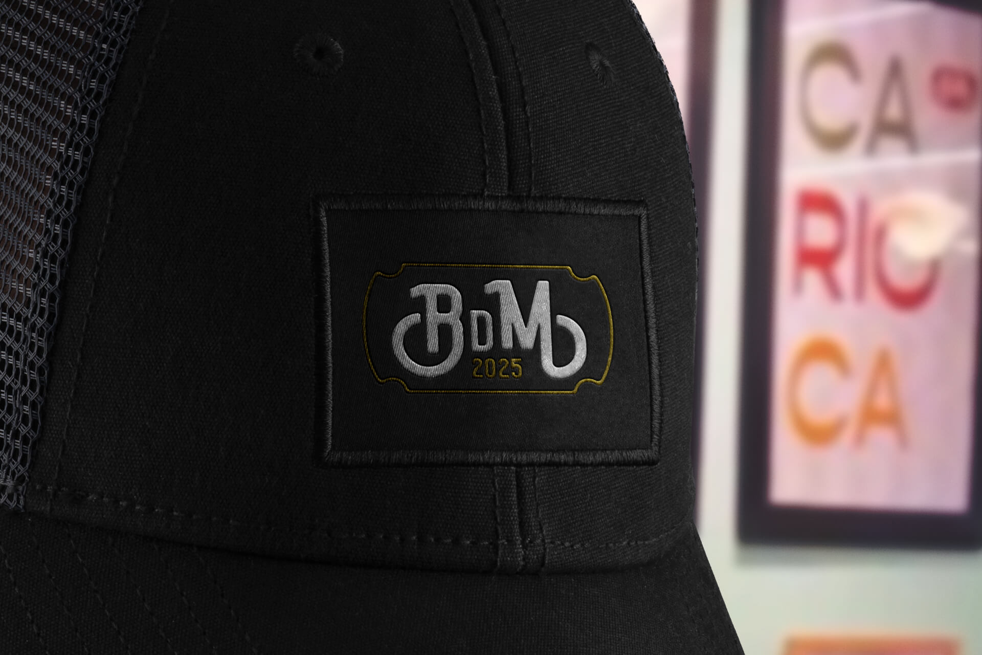
A special version of the logo, the “BdM tag”, was created as an expressive signature. It works as a stamp or label, applied freely across materials, menus, and signage. Rather than functioning as a symbol, it serves as a visual badge that strengthens the brand’s identity in an informal and playful way, consistent with the tone of the bar.
The identity system was completed with expressive typographic compositions, urban-inspired patterns, and a flexible visual grid that allows for endless reinterpretations. The result is a brand that feels alive, one that breathes with the rhythm of the city and embraces imperfection as part of its beauty.
Boteco da Mario is not just a design project, it’s a celebration of Brazil’s street culture. It pays homage to the country’s most genuine social ritual: gathering around the table to share laughter, music, and good company.
A tribute to the everyday, to simplicity well done, and to the timeless soul of the Brazilian boteco.
CREDIT
- Agency/Creative: 268 Estúdio Design
- Article Title: Boteco da Mario — The Street Became a Bar by 268 Estúdio Design
- Organisation/Entity: Agency
- Project Type: Identity
- Project Status: Published
- Agency/Creative Country: Brazil
- Agency/Creative City: Nova Iguaçu
- Market Region: Europe, North America, South America
- Project Deliverables: Brand Architecture, Brand Creation, Brand Design, Brand Identity, Brand Mark, Logo Design, Packaging Design
- Industry: Food/Beverage
- Keywords: logo, brand, branding, visual identity, boteco, restaurant, menu, beer, food
-
Credits:
Graphic Designer: Thiago Andrade Lima Campos


