


Let’s be honest: periods are totally natural, but talking about them still feels like a huge hurdle. That’s exactly why Period, a conceptual brand, was conceived. The brands mission is both simple and revolutionary: to absolutely smash the stigma around menstruation and transform period care into an experience people can proudly celebrate and embrace, instead of feeling the need to desperately hide it.
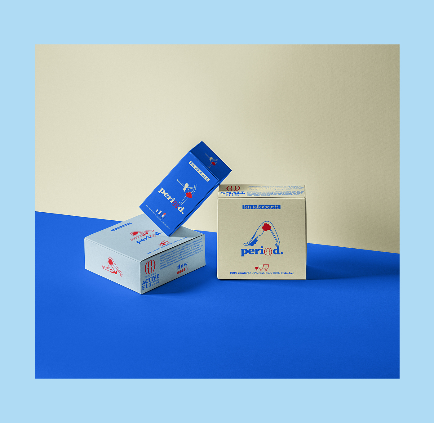
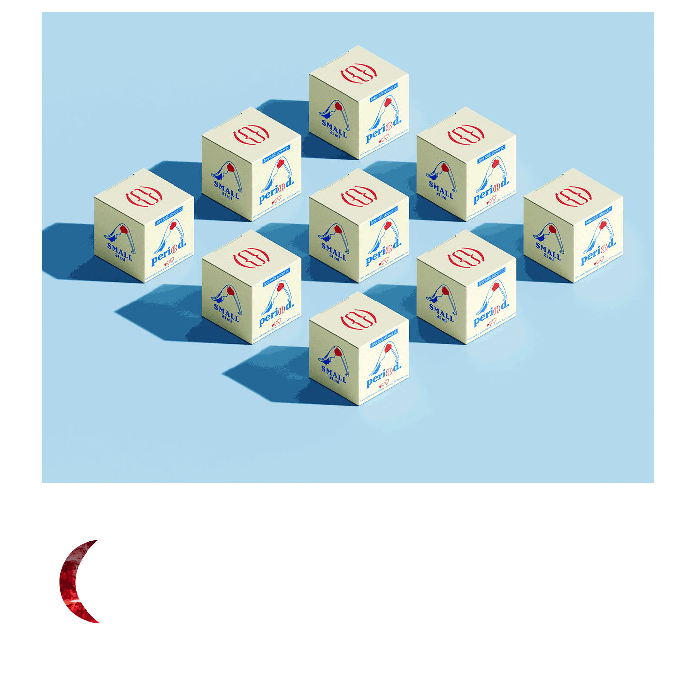
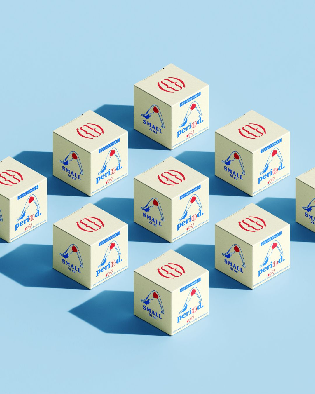
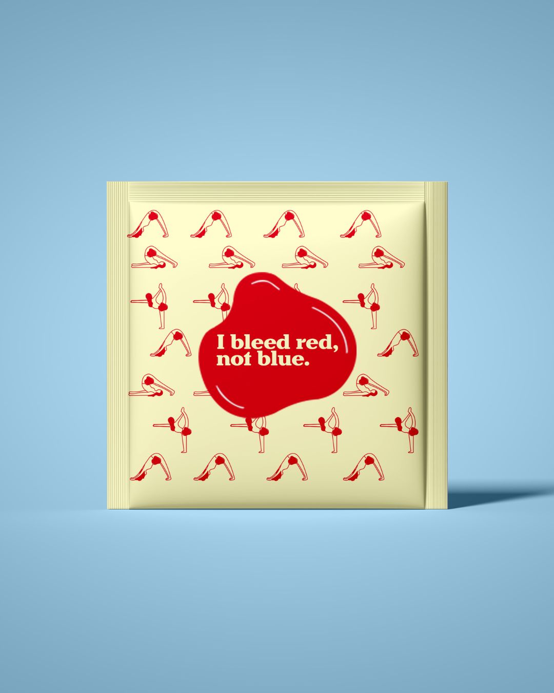
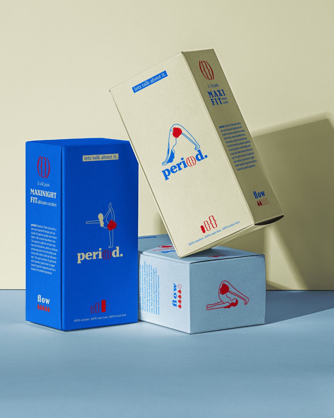
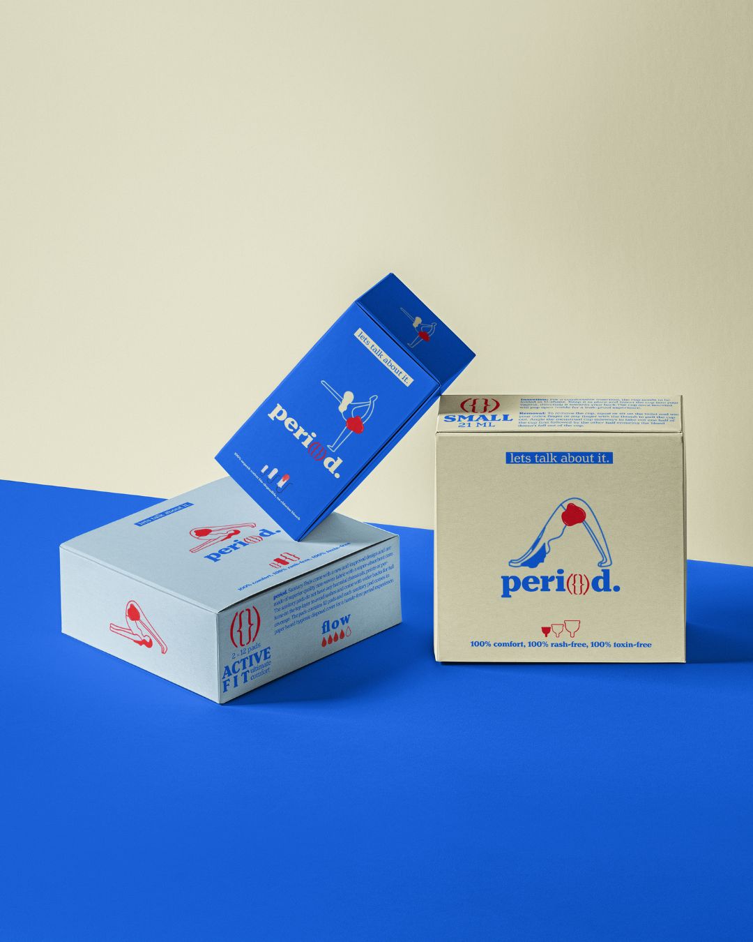
I deliberately rejected the bland, clinical industry standard and designed a brand identity/packaging that is distinctly vibrant, friendly, and genuinely empowering. You’ll immediately notice the energetic aesthetic the packaging utilizes a playful yet sophisticated mix of deep blue, blood red, and soft cream, all paired with modern, clean typefaces. The illustrations are figures in yoga poses (often marked with a blood stain), is specifically designed to spark a real, open conversation because menstrual health deserves complete transparency.
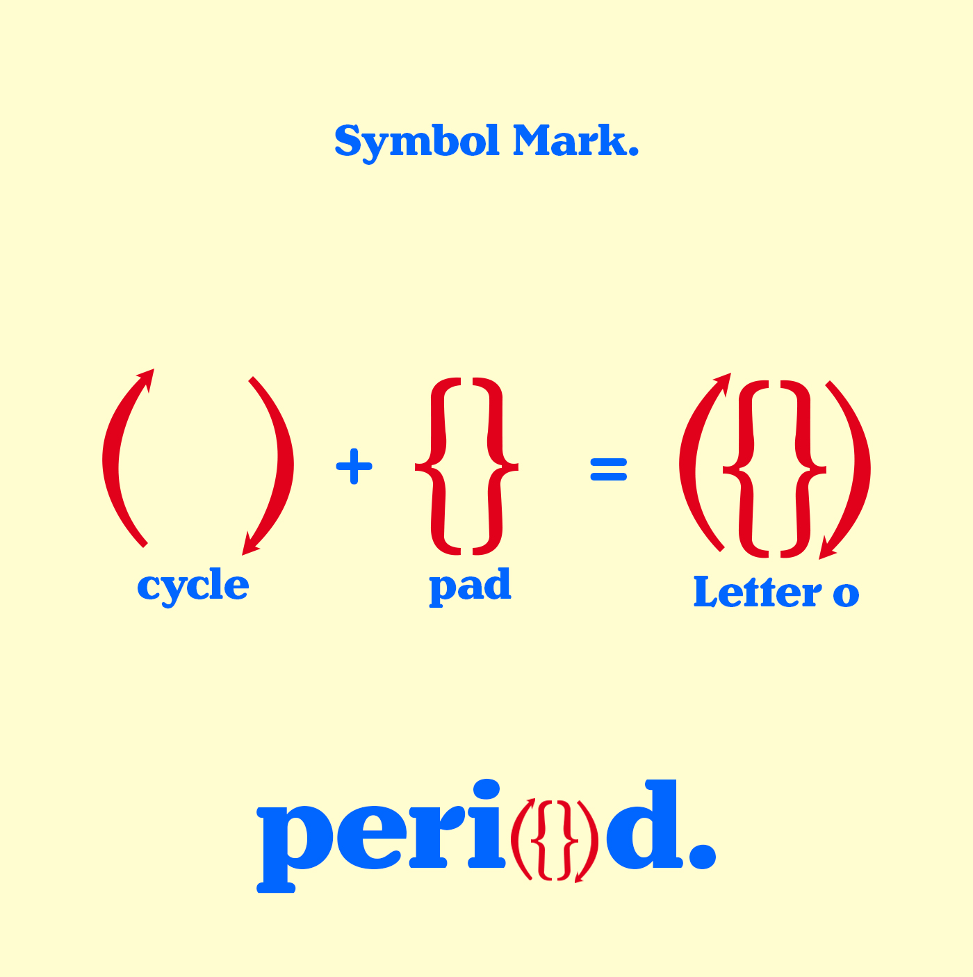
Every single visual and structural detail in the design was a deliberate, purposeful choice. For instance, look at the brilliant logo for peri{}d.; the letter ‘o’ is a clever visual merger of the symbol for a cycle and a pad. This is storytelling that elevates the brand, making the product feel undeniably confident, inclusive, and deeply engaging. Beyond the surface, sustainability was a crucial non-negotiable. The eco-friendly packaging is designed to feel as high-quality and premium in your hand as it looks on a shelf, reinforcing the idea that empowering people necessarily involves responsible stewardship of the planet.
Period isn’t merely designed to sit quietly on the shelf. It’s here to act as a powerful catalyst. It actively sparks essential dialogue, confronts those tired, outdated taboos, and wholeheartedly encourages all consumers to view menstruation for what it truly is: normal, natural, and even a joyful part of life. We openly challenge the historical status quo with bold, direct messaging like, “I bleed red, not blue.”
This conceptual project conclusively proves that feminine care branding can be radically more than simply functional; it can be fun, aesthetically bold, and profoundly socially impactful. By expertly blending a compelling narrative, awesome visual design, and responsible, eco-conscious packaging, Period crafts a holistic user experience that truly educates, inspires, and empowers. We assert that menstrual health is much more than just a product; it’s a full-fledged movement, a critical conversation starter, and a necessary statement.

CREDIT
- Agency/Creative: Deepti
- Article Title: Period: A Vibrant, Sustainable Approach to Menstrual Care
- Organisation/Entity: Freelance
- Project Type: Packaging
- Project Status: Non Published
- Agency/Creative Country: India
- Agency/Creative City: Chennai
- Market Region: Asia, Global
- Project Deliverables: Brand Design, Branding, Copywriting, Creative Direction, Logo Design, Packaging Design
- Format: Box, Sachet
- Industry: Health Care
- Keywords: Menstrual Health, Feminine Care, Sustainable Packaging, Healthcare, Brand Identity, Empowerment, Vibrant Design, Playful Typography, Stigma-Free, Eco-Friendly Products
-
Credits:
Brand/Packaging Designer: Deepti Khatri


