


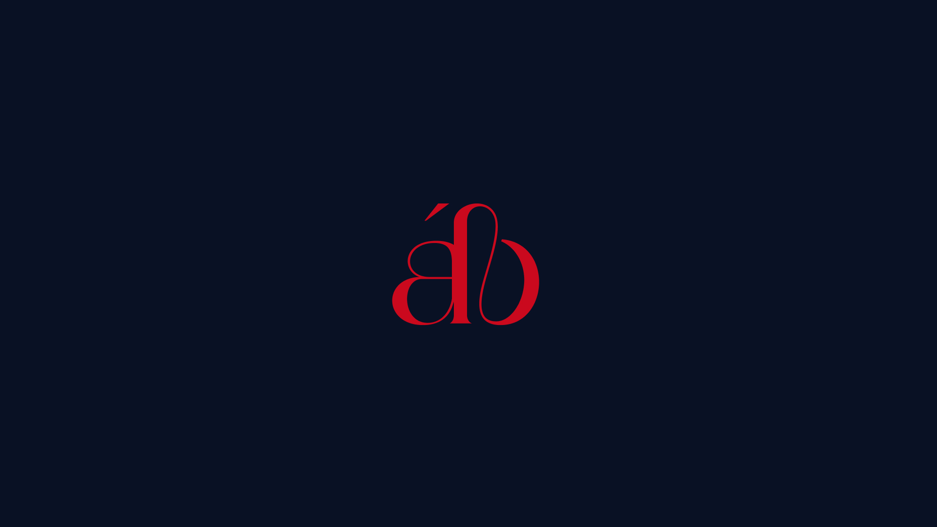
Alla Breve – Music Publishing House
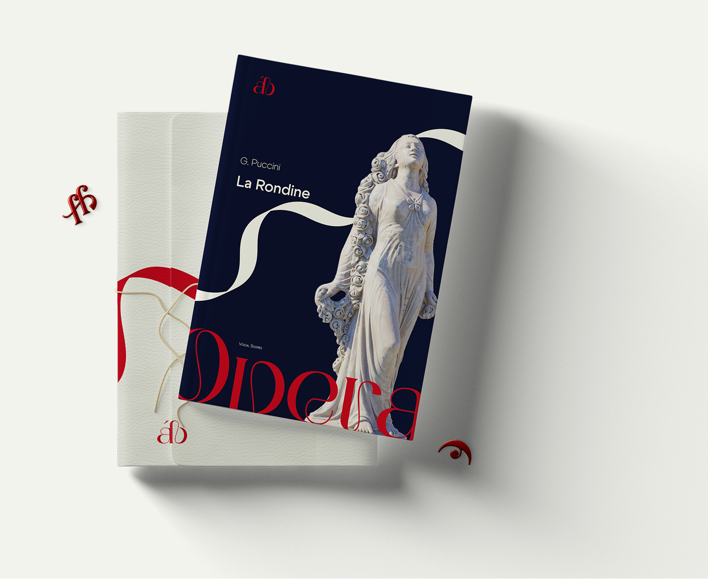
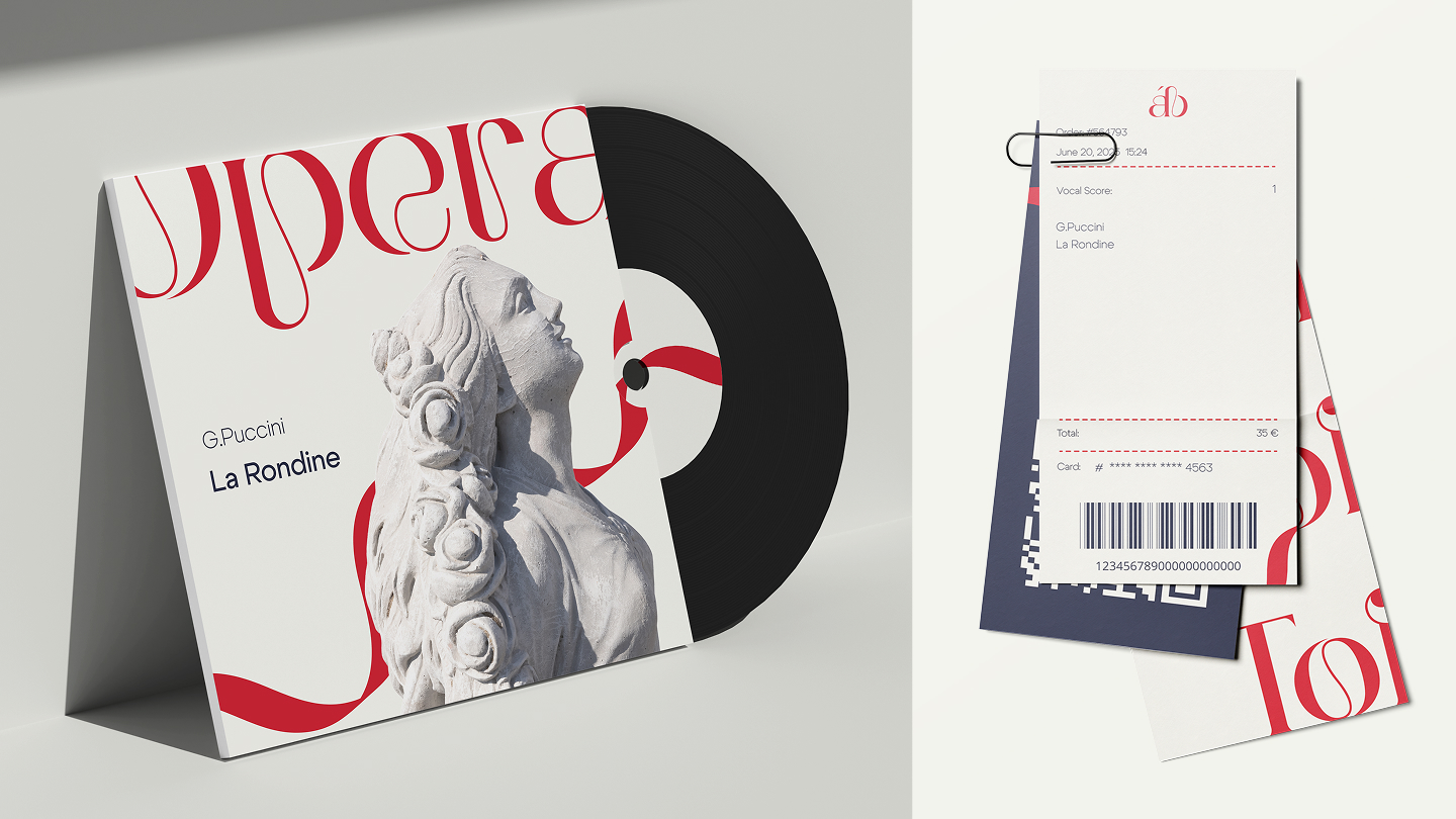
The Alla Breve music publishing project was created by musician for musicians. My goal was to capture the feeling of belonging to something eternal and beautiful. I also wanted to convey the sense of flight and freedom that arises when classical music begins to play. It envelops the ear and the heart like a crimson ribbon fluttering in the wind, expanding into space, weaving through and filling everything around it.
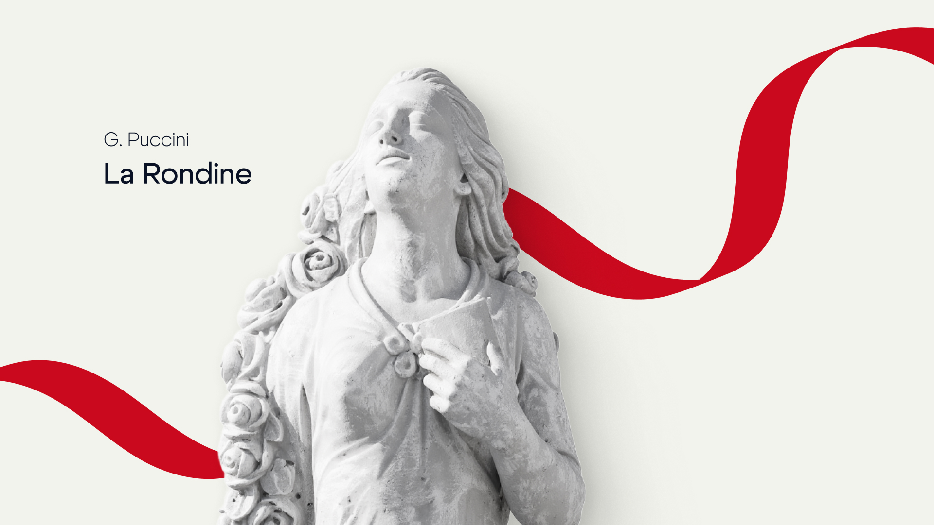
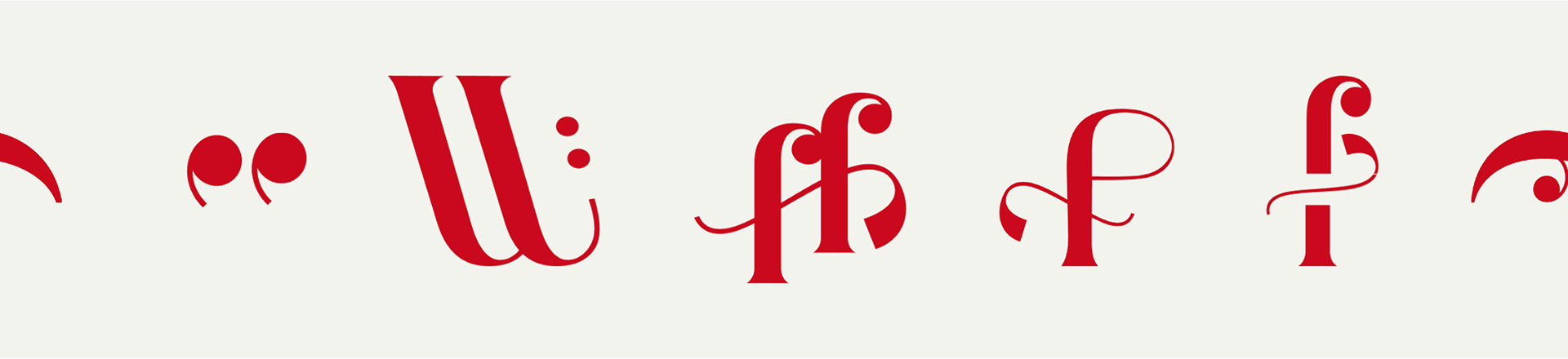
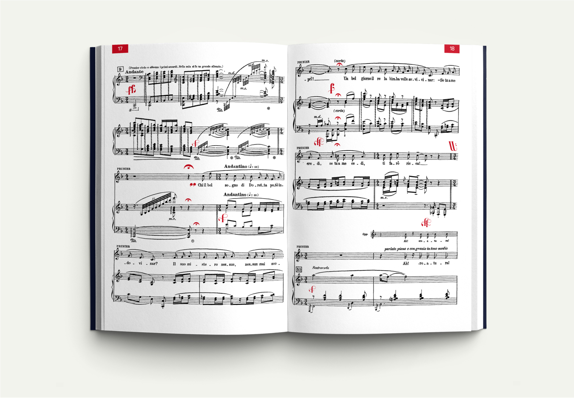
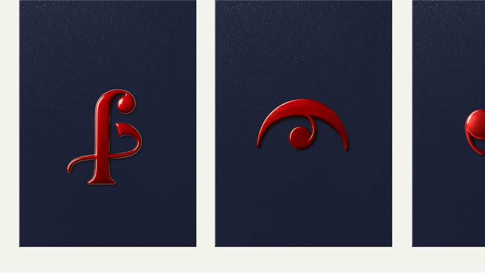
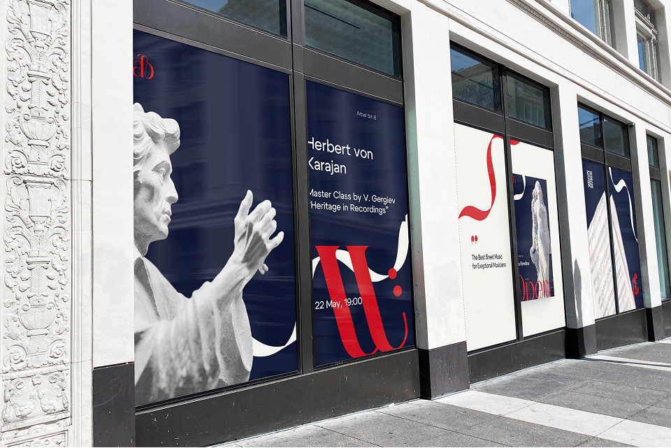
The red color symbolizes theater curtains, elegance, and luxury. Deep blue speaks of trust, reliability, and the brand’s high quality. The statues serve as a reminder of history—the foundation upon which our future is built—while preserving the grandeur of our heritage. I also developed new musical notations for elements like forte, piano, fortissimo, pianissimo, fermata, and accolade. These symbols are not merely decorative; they are incorporated directly into the sheet music to enhance musicians’ comfort and readability. Their clearer design makes them easier to recognize at a glance, allowing the brand to establish a unique connection—a direct dialogue with the musicians themselves.
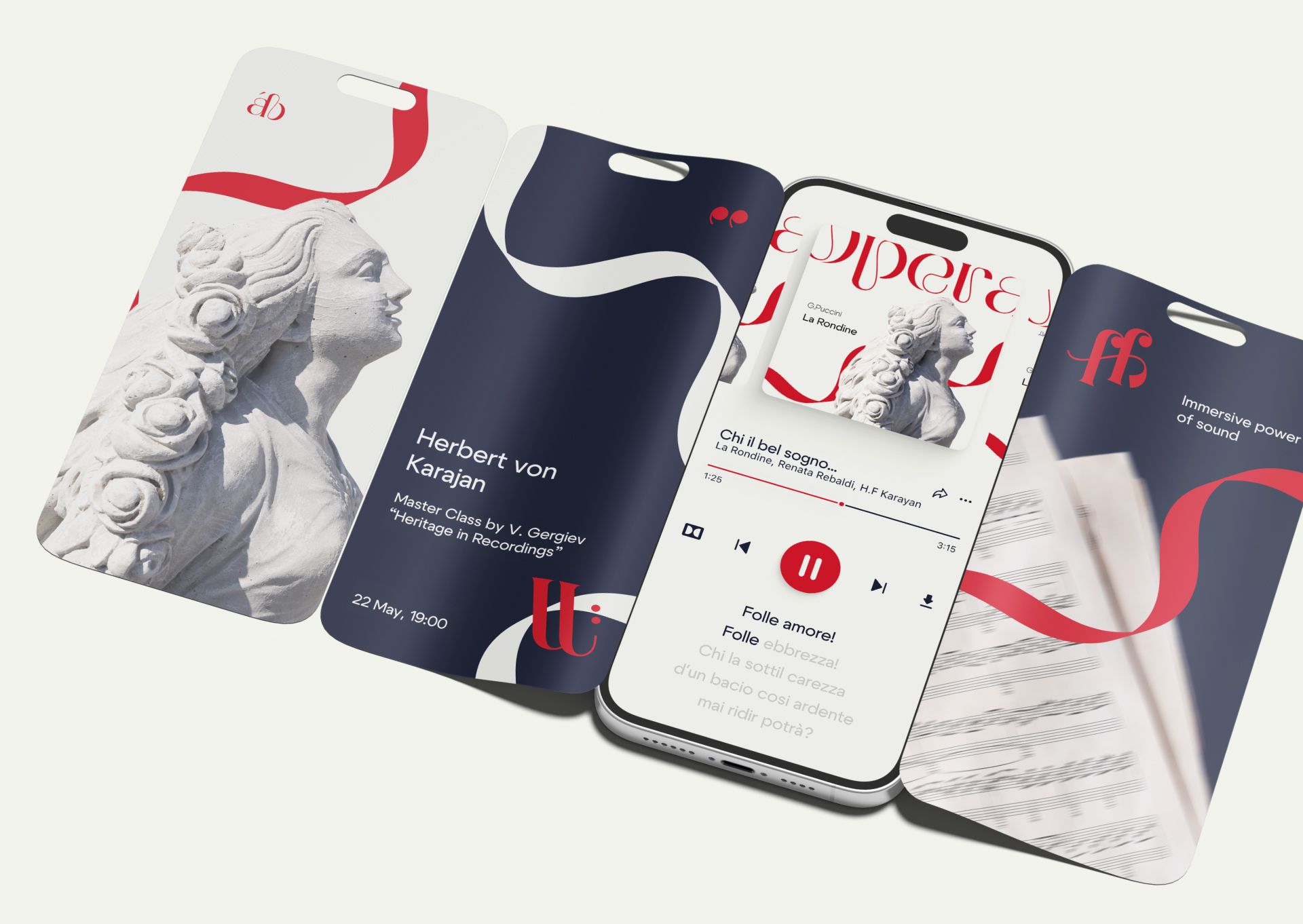
The brand’s mission is to support outstanding musicians on their challenging journey, offering a sense of belonging to something elevated, beautiful, and even a little unattainable. It provides this support not only through updated musical notation but also by fostering masterclasses and competitions. While the central musical work could be any opera or composition, I chose one of Giacomo Puccini’s most exquisite operas, La Rondine. The red ribbon, associated with the opera’s heroine Magda — depicted here as a stone statue — also embodies the arpeggio sign, whose shape mirrors that of the ribbon, serving as a key constant of the brand. Magda’s principal aria begins with an abundance of arpeggios, allowing us to almost hear the orchestra simply by looking at the visual form. Other notations created for the brand also carry communicative meaning. For instance, the repeat sign (reprise) not only signals multiple iterations for the musician but also perfectly reflects the spirit of recurring masterclasses.
Ultimately, it was essential for me to create something I would want to see in the world of classical music, not only as a designer but also as a musician. This work is infused with love and passion for music, using design as a language capable of expressing human emotion.
CREDIT
- Agency/Creative: Olga Krasavchikova
- Article Title: Alla Breve by Olga Krasavchikova Reimagines the Visual Language of Classical Music
- Organisation/Entity: Freelance
- Project Type: Identity
- Project Status: Non Published
- Agency/Creative Country: Spain
- Agency/Creative City: Valencia
- Market Region: Global
- Project Deliverables: Brand Design, Brand Identity, Graphic Design, Identity System, Music
- Industry: Entertainment
- Keywords: Brand identity, music publishing house, logo design, design, classical music
-
Credits:
Graphic Designer: Krasavchikova Olga


