


Mobiliza was born with the purpose of transforming the Training & Development (T&D) sector through technology and collaboration. At a decisive moment of evolution, shifting from a service-based company to establishing itself as a SaaS platform, it became necessary to reposition the brand and strengthen its identity.
With nearly two decades of history, Mobiliza faced a important transition: moving away from being perceived as a service provider and clearly claiming its place as software as a service.
Mobiliza was already recognized for its closeness and reliability. But it needed to adopt a bolder, more inspiring, and strategic stance. The challenge was to find the right balance between the new authoritative tone and the spontaneity that had always been part of its DNA.
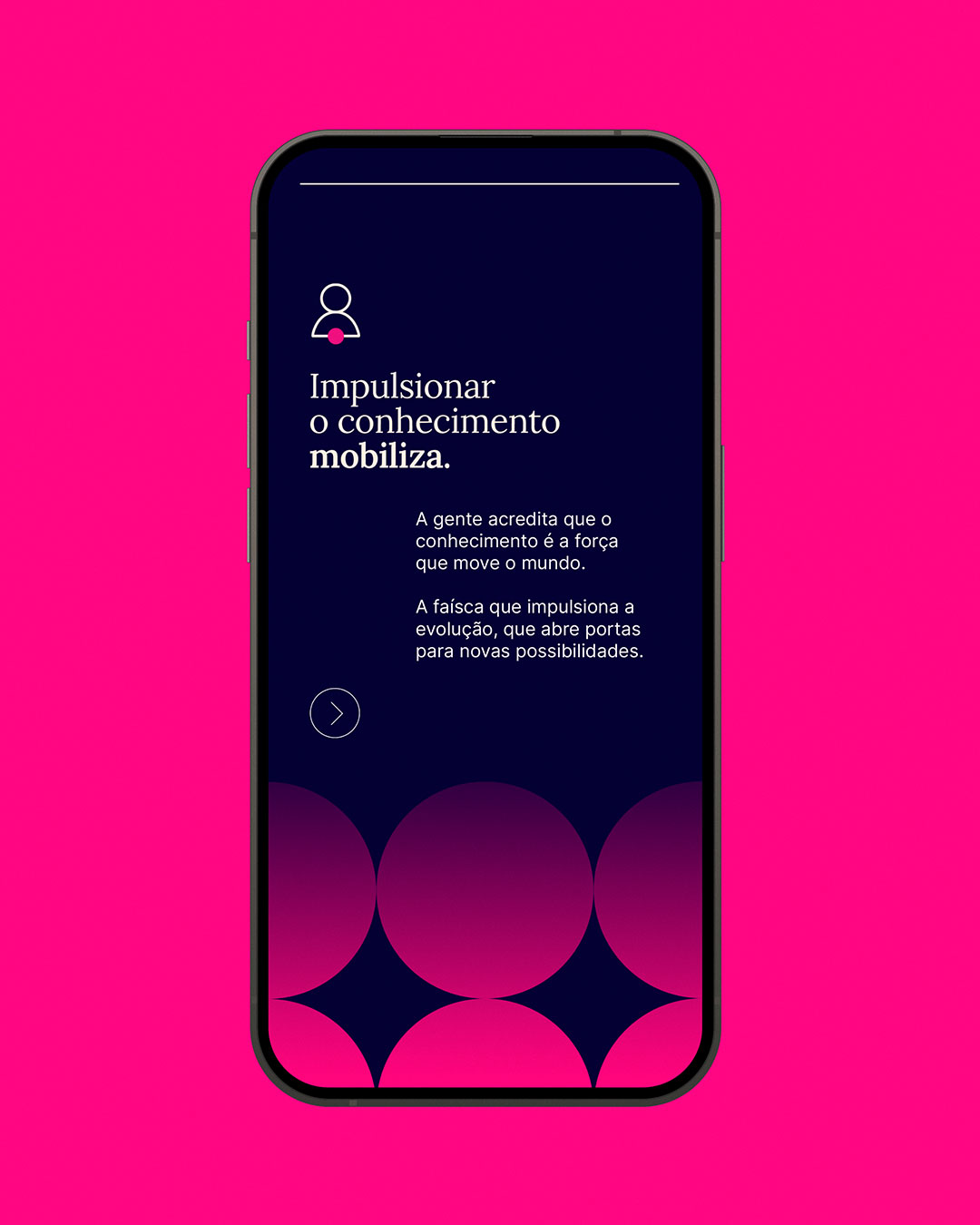
“Knowledge mobilizes” is the strategic axis of the brand positioning. It frames knowledge as a tool for evolution and mobilization as a collective action that engages and transforms. It also resonates with the brand’s purpose of involving people, sparking ideas, and driving real change.
If knowledge mobilizes, the brand’s visual identity needed to convey it not only through aesthetics but as a living, adaptable, and inviting system of expression. Mobiliza’s new identity emerges from its purpose and unfolds into shapes, colors, and compositions that express a single movement: learning in constant evolution.
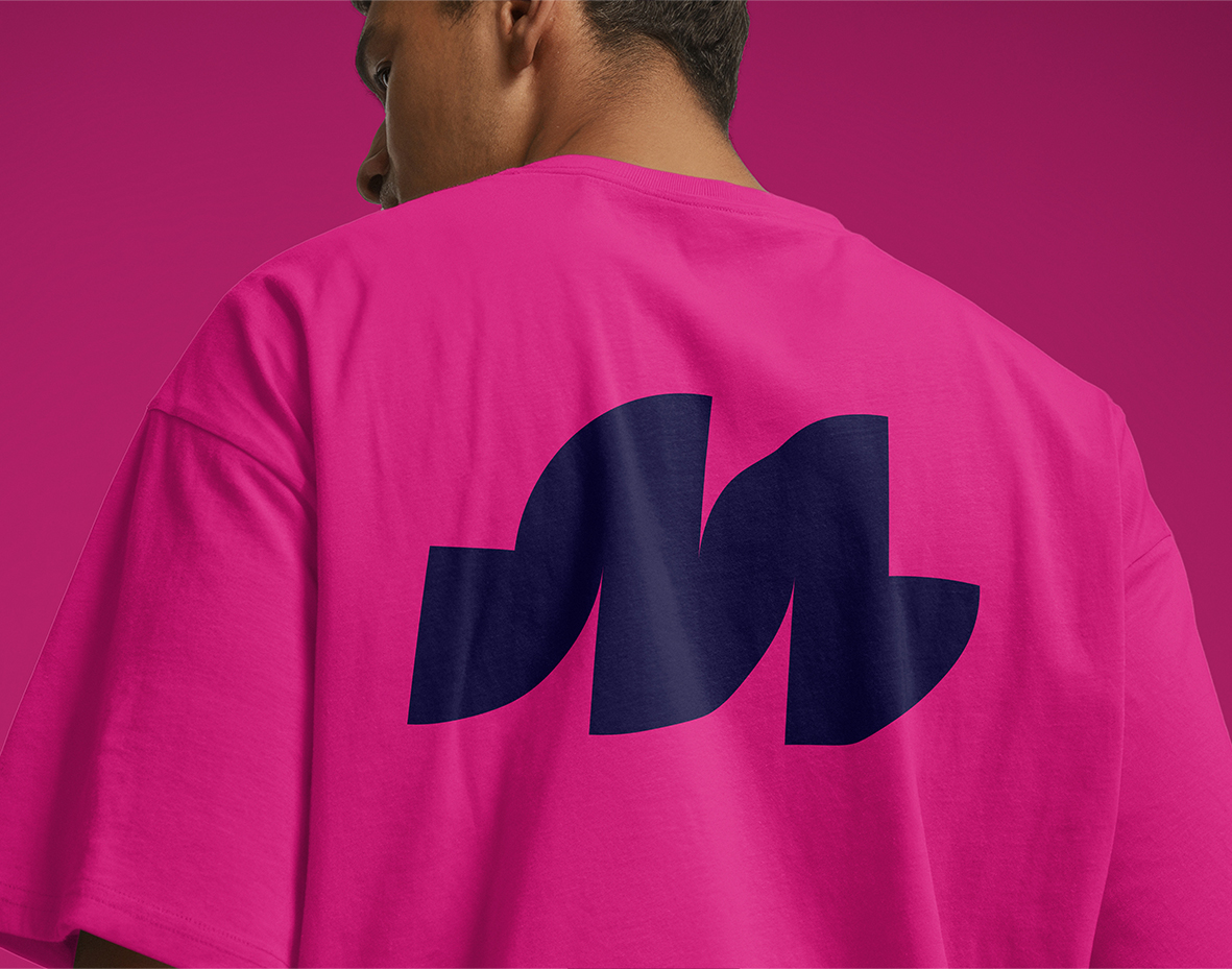
Mobiliza’s visual identity gained a symbol that reinforces its positioning as an innovative SaaS, ready for the future.
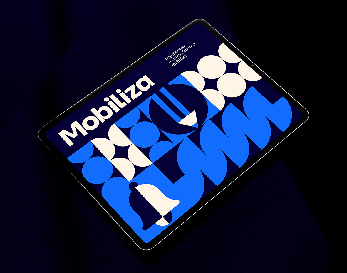
Formed by quarter circles, it creates a fluid and modern “m.” Its geometric circular shapes represent the continuous movement of knowledge, combining dynamism, innovation, and adaptability.
With smooth curves and a technological design, the symbol conveys warmth and versatility, working seamlessly across different platforms and applications.
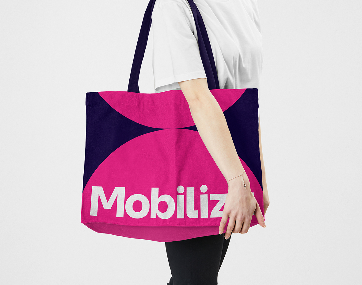
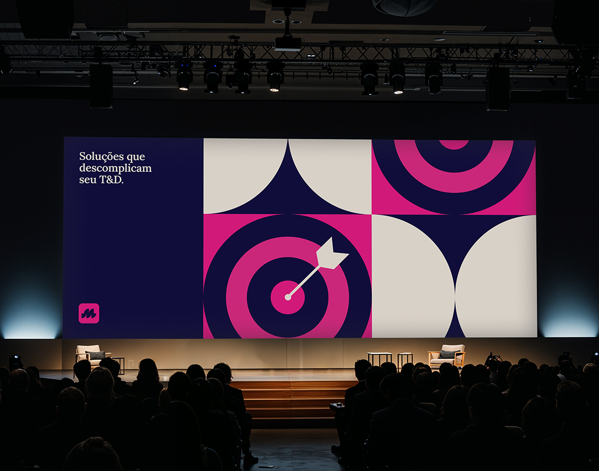
Mobiliza’s palette is led by the duo Mob Blue and Mob Pink. Mob Blue conveys trust, credibility, and expertise, while Mob Pink adds a touch of innovation, energy, and modernity.
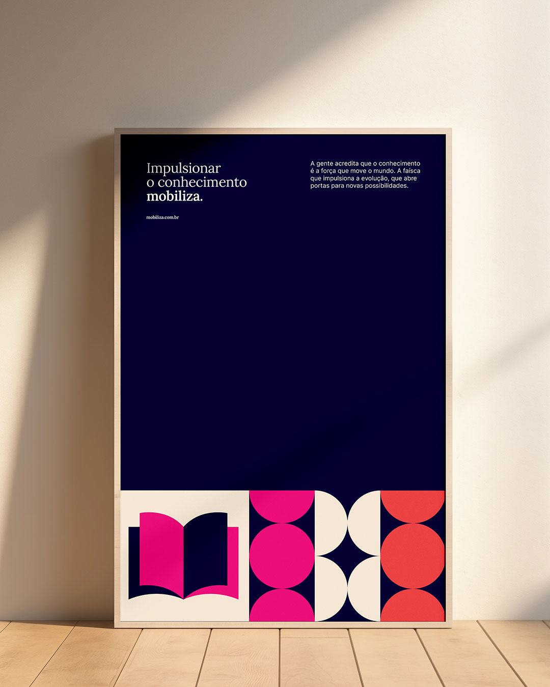
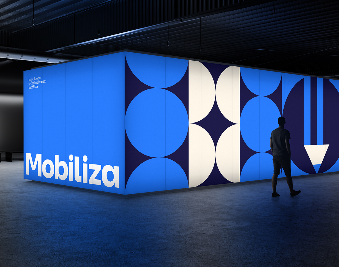
The visual identity comes to life through mosaics of circles and modular icons, arranged in grids that structure information in a harmonious way.
Everything connects to express a single concept: knowledge in motion, applied with lightness, flexibility, and a refined digital aesthetic.
Secondary tones, such as orange and lilac, expand the palette’s flexibility, highlighting content, creating visual hierarchies, and reinforcing the brand’s digital essence. Meanwhile, Mob Off White softens layouts, ensuring balance, legibility, and visual breathing space.

CREDIT
- Agency/Creative: Bradda Design
- Article Title: Bradda Design Elevates Mobiliza With A Modern SaaS Brand Identity
- Organisation/Entity: In-House
- Project Type: Identity
- Project Status: Published
- Agency/Creative Country: Brazil
- Agency/Creative City: Florianópolis
- Market Region: South America
- Project Deliverables: Brand Guidelines, Brand Identity, Brand Redesign, Brand Strategy
- Industry: Education
- Keywords: rebranding, branding, education
-
Credits:
Project Manage: Natalia Favero
Strategy: Rafaela Sotuyo
Strategy: Hemelyn Haertel
Art Direction & Design: Lucas Guidi
Motion: Lauro Henn


