


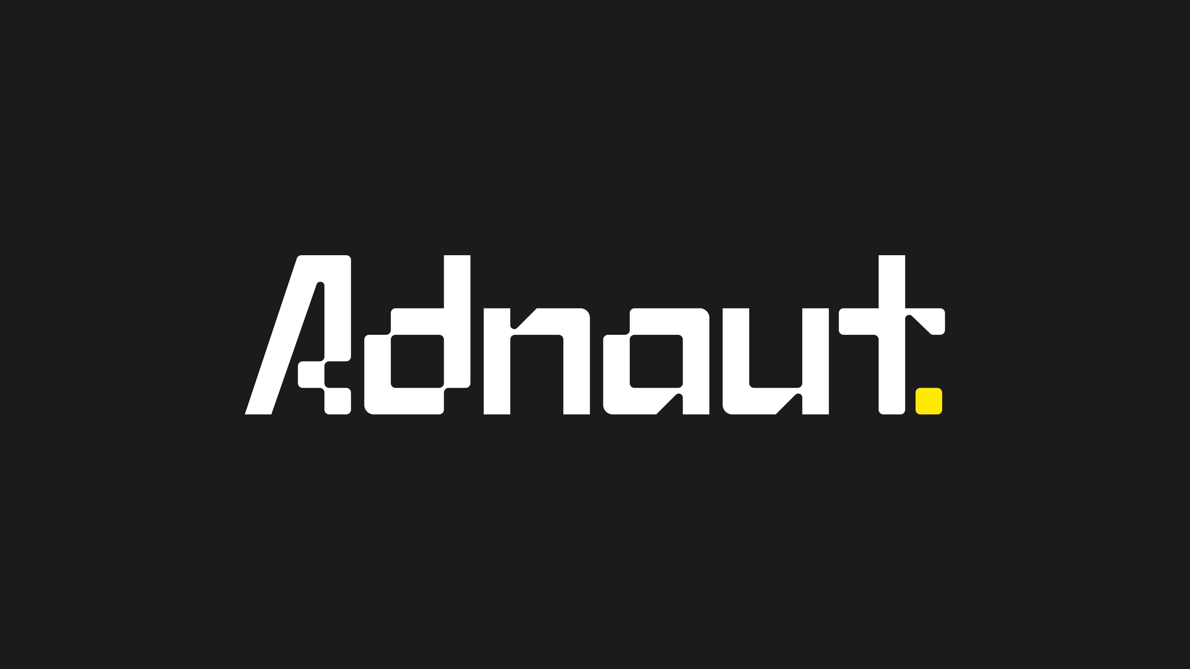
Adnaut is more than just a new name. It is the evolution of a company that began as RTB Analytica, a brand known for its deep expertise in programmatic advertising and data-driven media. Over the years, they’ve established themselves as a partner capable of delivering measurable results for advertisers. But the brand itself never fully reflected the scale of its ambition, the ingenuity of its technology, or the human intelligence behind its solutions. The rebrand to Adnaut was not a mere change of name; it was a bold, definitive stance. It was a chance to create a visual identity capable of capturing the company’s essence: mastery over the digital universe, vision, and the ability to turn abstract data into meaningful outcomes.
The challenge was immediate: how do you visualize the invisible? How do you give human dimension to a world built entirely of pixels, algorithms, and impressions? How do you communicate sophistication without alienation, authority without rigidity, and expertise without abstraction? The answer needed to be something tangible yet expansive, a visual language capable of holding the duality of intelligence and approachability, precision and exploration, grounded methodology and cosmic ambition.
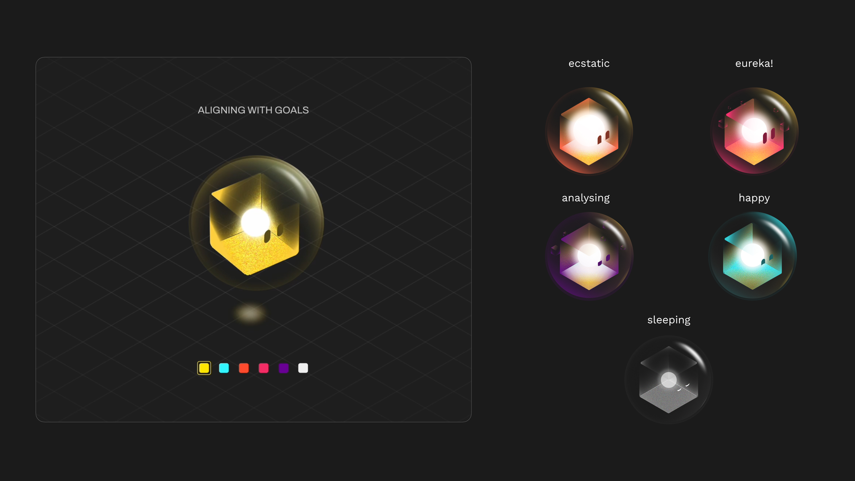
The solution emerged from the very fabric of the digital world: the pixel. Every interaction, every impression, every digital moment begins with a single pixel. It is the building block of online reality, but on its own, it is inert and abstract. Adnaut was born by imagining the pixel as alive, sentient, and capable of intelligence. More than a logo or a character, the Adnaut became the embodiment of the brand itself: a guide through the invisible landscape of digital media, a symbol of expertise, and a narrative device that could communicate the extraordinary power of Adnaut’s technology.
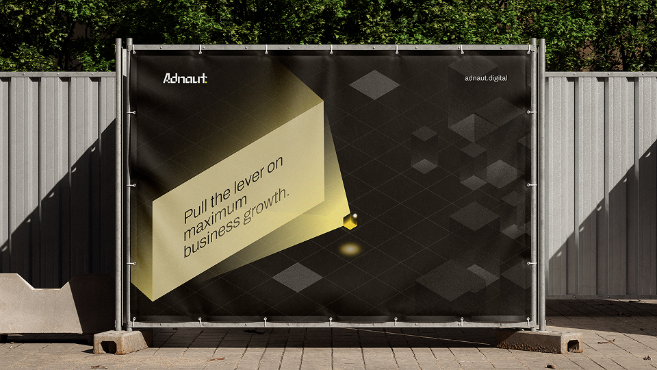
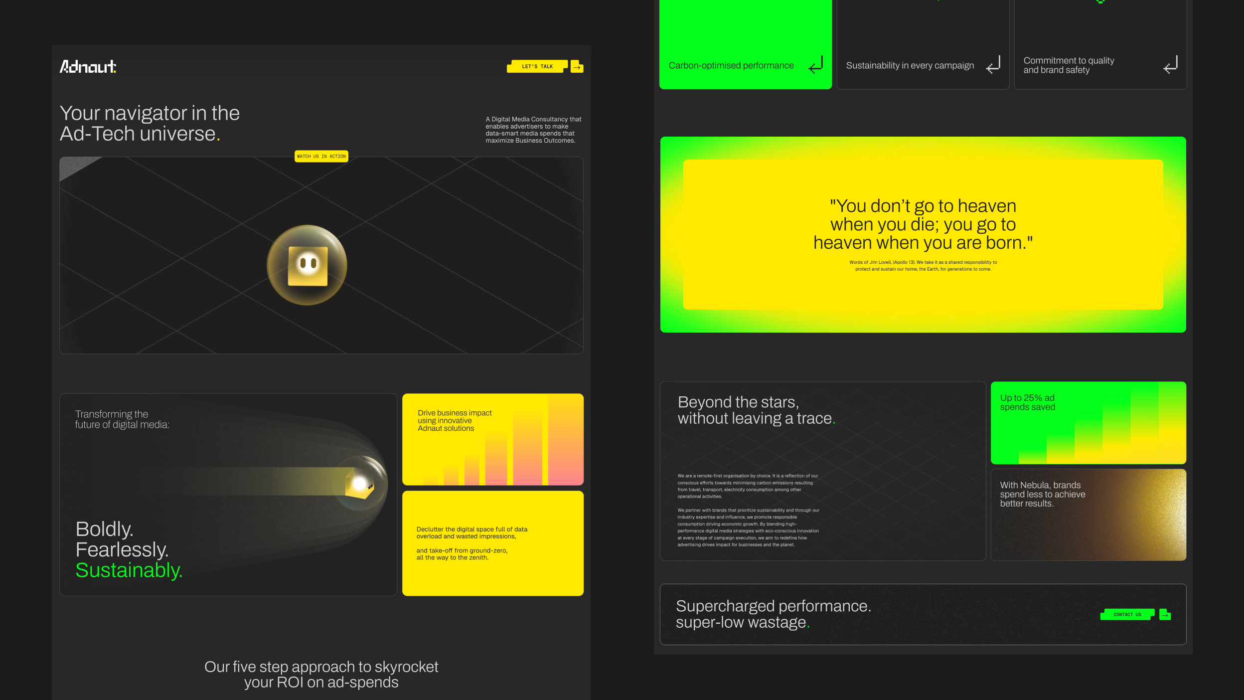
Adnaut exists as a luminous entity, a pixel given form and consciousness, floating within a sleek orb. Its core glows with energy, representing the proprietary technology and analytical rigor that power the company’s work.
Technology became the heart of it and constant innovation the blood stream; indicating that innovation is vital for the brand and Adnaut ceases to exist the moment the business stops innovating. Encased yet free, it moves effortlessly through its digital environment, scanning, analyzing, and projecting insights with an intelligence that mirrors the team itself. Its design is at once futuristic and inviting; rounded edges convey warmth and approachability, while geometric precision communicates mastery and technical sophistication. The Adnaut is a character of both logic and imagination, a guide capable of translating the invisible workings of digital media into a story that clients, partners, and audiences can grasp, trust, and engage with.
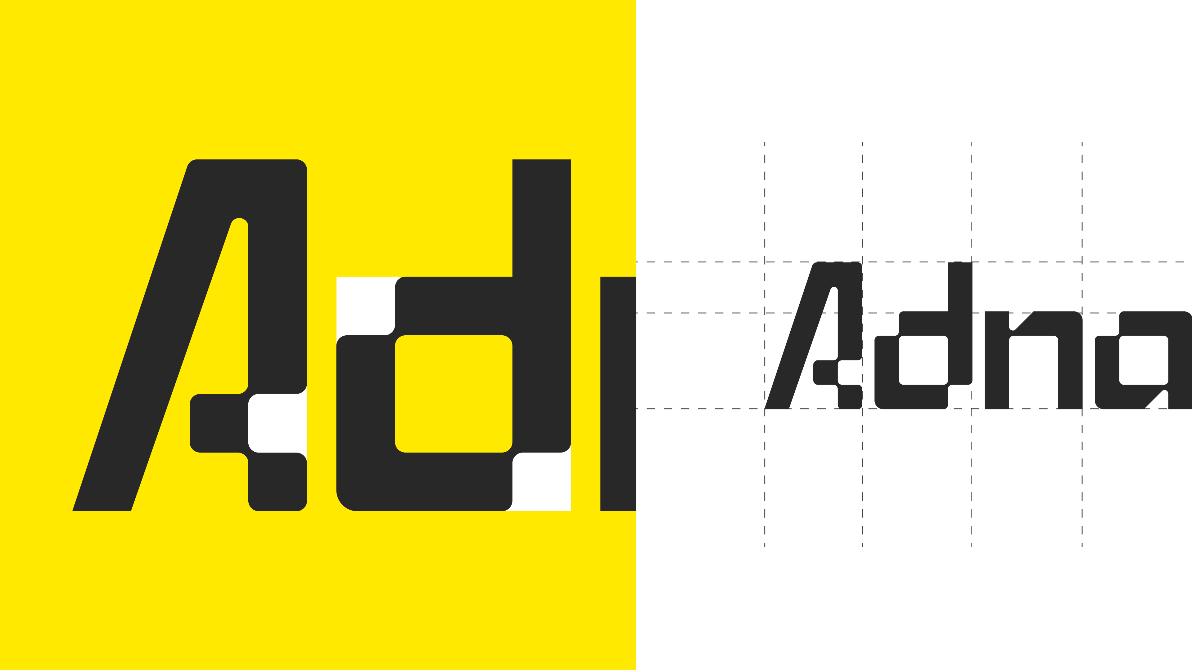
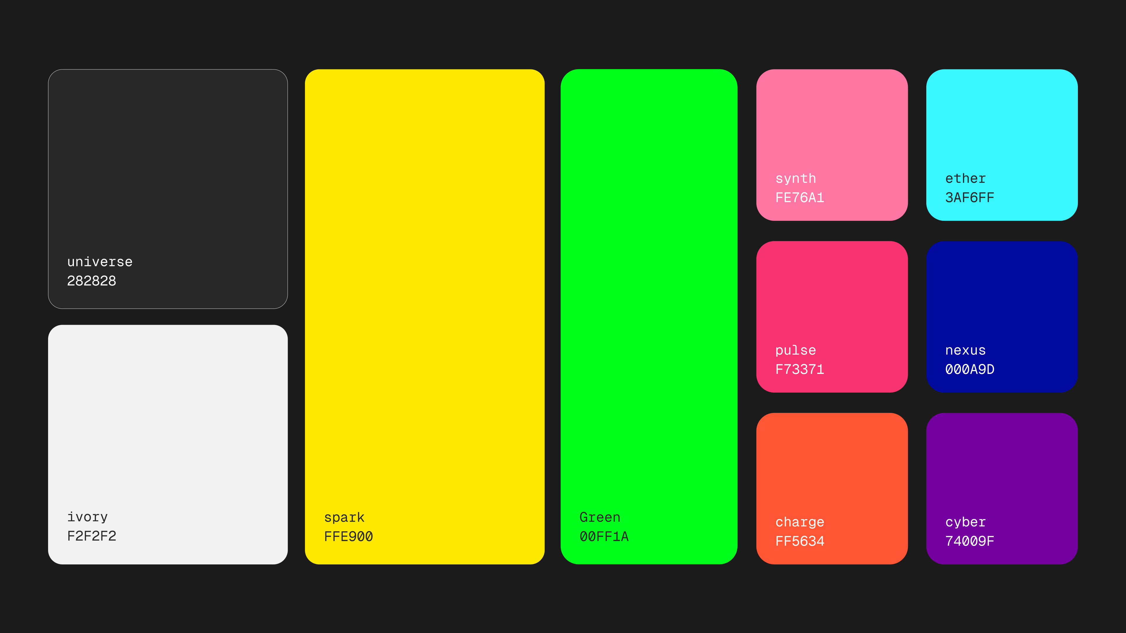
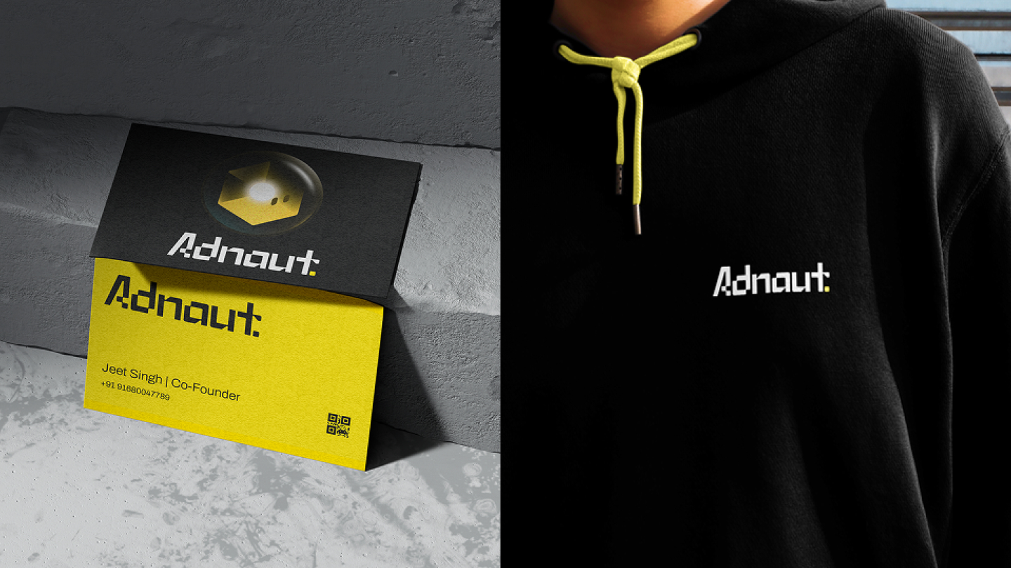
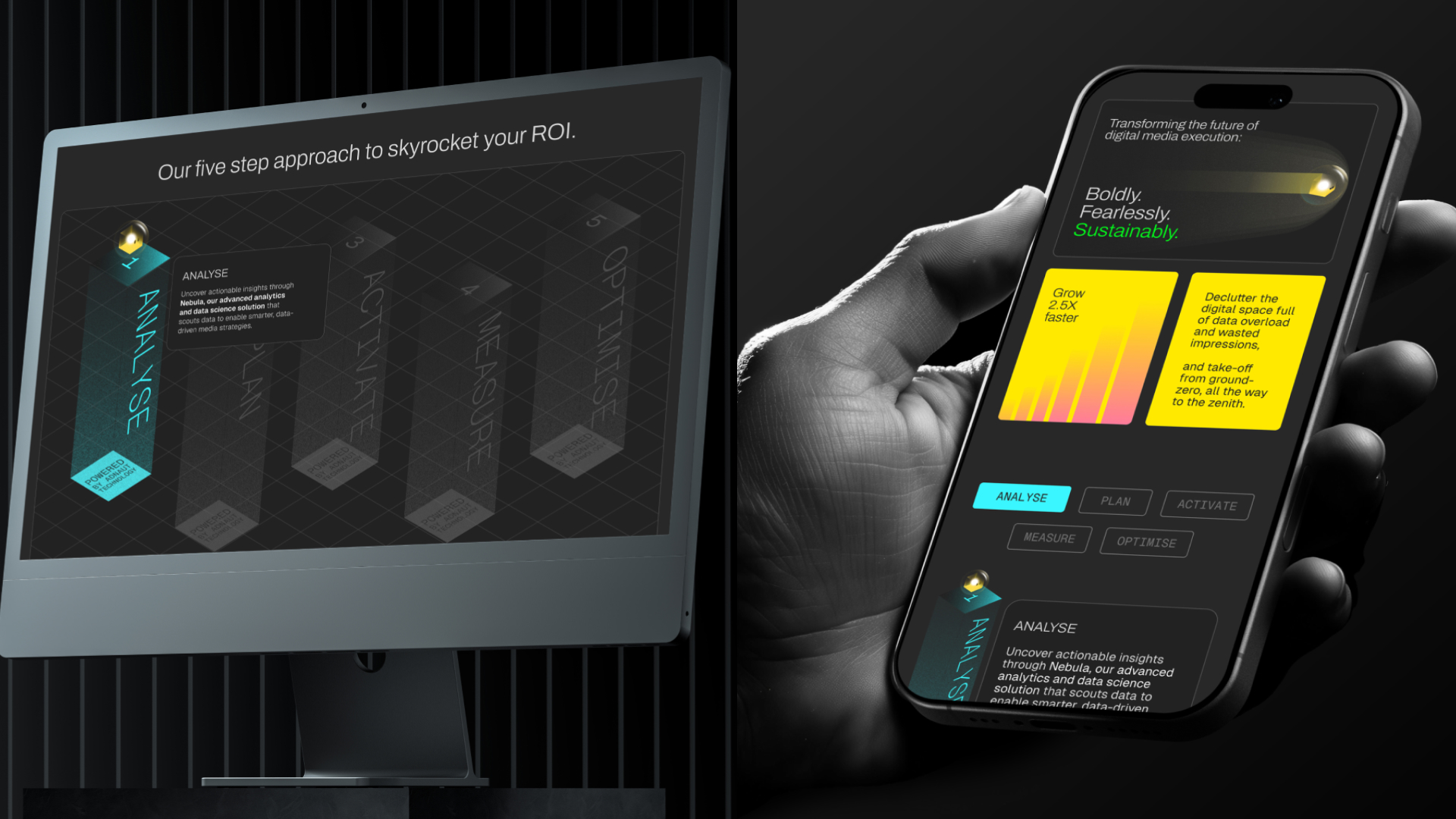
Beyond the character itself, the visual system extends into a flexible, cohesive identity. Inspired by the structure of pixels, counter-forms and modular patterns create a visual rhythm that echoes the digital universe while providing consistency across touchpoints. Typography balances clarity with personality; bold, geometric forms establish authority, while subtle curves create approachability and continuity with the mascot’s character. The color palette evokes both technology and exploration, combining deep cosmic blues and purples with vibrant neon accents, grounded by clean neutrals that provide space and hierarchy. Motion is integral: the Adnaut hovers, rotates, and interacts with its environment, transforming data-driven abstraction into visual storytelling that feels alive, deliberate, and human. Every movement, every form, every interaction reflects the values of intelligence, precision, and curiosity.
The power of this identity lies in its ability to tell a story without words. The Adnaut embodies expertise, agility, and insight, humanizing technology while giving the brand a personality that resonates. The pixel-based system anchors the visual language in the realities of digital media, providing both consistency and adaptability. Motion and interaction bring the identity to life, making the abstract tangible, the invisible visible, and the complex understandable. It is not a brand designed to fade into the background; it is a brand that asserts its presence, invites exploration, and inspires confidence.
Strategically, the identity differentiates Adnaut in a crowded market. The ad-tech industry is filled with faceless, technical, and overly abstract brands. By creating a mascot rooted in the foundational element of digital media (the pixel) Adnaut establishes a symbol that is meaningful, memorable, and distinct. It communicates intelligence and authority while remaining human, futuristic while approachable, and technical while imaginative. The identity positions the company as a thought leader, a pioneer, and a partner capable of guiding brands through the complex universe of digital advertising with clarity, creativity, and insight.
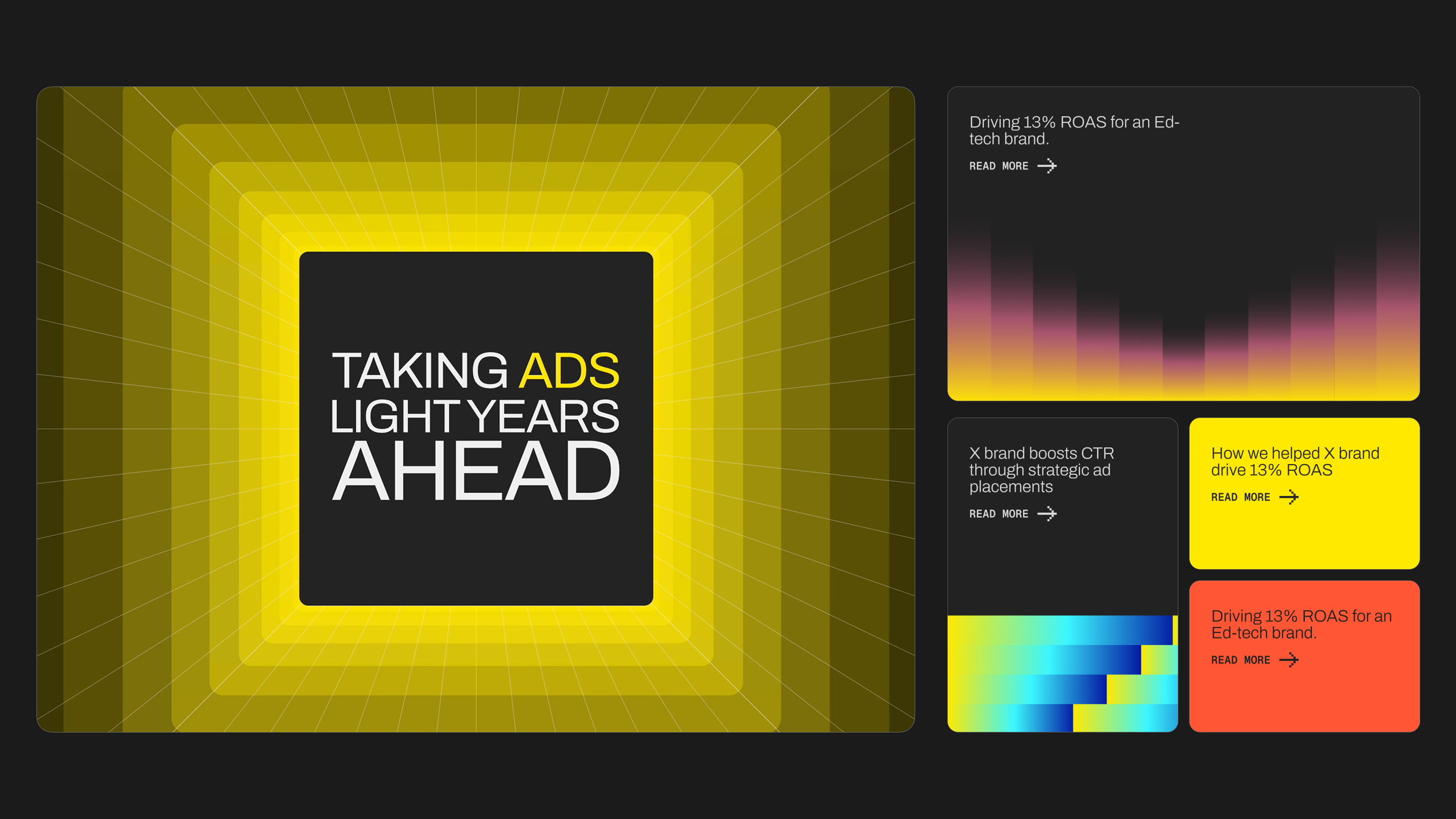
The outcome of the rebrand is transformational. Adnaut is no longer merely a company executing campaigns; it is a brand with presence, narrative, and personality. Its identity communicates ambition, expertise, and imagination. It signals to clients, partners, and the industry at large that they are engaging with a company that can navigate the most complex digital landscapes with precision and vision. The visual system is versatile and scalable, designed to adapt across digital interfaces, presentations, events, social media, and motion graphics, ensuring cohesion while allowing flexibility for expression. It is a living identity capable of growing with the brand, enduring in relevance, and resonating across touchpoints.
What makes this identity remarkable is the intentionality behind every decision. The Adnaut is a narrative device, a symbol of expertise, and a design system simultaneously. It turns the abstract into the tangible, the invisible into the visible, and complexity into clarity. It elevates the brand, transforming perception while building trust and recognition. It demonstrates that visual identity, when approached strategically, is more than aesthetic, it is a language, a story, and a tool for engagement and influence.
Ultimately, the Adnaut visual identity is about vision and exploration. It is a brand that turns the pixel into a protagonist, the algorithm into narrative, and the invisible infrastructure of digital media into a story that can be seen, felt, and understood. It is a design system that is modern, bold, and human, capable of communicating mastery without arrogance, sophistication without coldness, and imagination without chaos. Adnaut is a brand built for the future, a brand that navigates the digital universe with intelligence, precision, and personality, guiding its clients, its team, and the industry toward a new horizon of possibilities.
Branding at its most effective is transformative. It creates meaning, builds trust, and inspires action. With its new identity, Adnaut has achieved all three. It humanizes complex technology, makes the abstract tangible, and gives voice and presence to a company whose work already shapes the world of digital advertising. The Adnaut is a symbol of expertise, a narrative of exploration, and a visual language that communicates the brand’s essence. It is more than a logo or a mascot, it is a system, a story, and a universe that reflects the intelligence, imagination, and ambition at the heart of Adnaut.
The visual identity breathes new life and frames new perception that works in favor of the brand. It stands out, not for the sake of it, but truly as a reflection of their expertise and point of view. It is a bold statement of presence, a reflection of expertise, and a story that will continue to evolve as Adnaut charts the course of the digital advertising universe.
CREDIT
- Agency/Creative: Everything Design
- Article Title: Launching Adnaut With a Bold Visual Identity by Everything Design
- Organisation/Entity: Agency
- Project Type: Identity
- Project Status: Published
- Agency/Creative Country: India
- Agency/Creative City: Bengaluru
- Market Region: Global
- Project Deliverables: Brand Creation, Brand Design, Brand Guidelines, Brand Identity, Brand Naming, Brand Redesign, Brand Refinement, Brand Rejuvenation, Brand Strategy, Brand Tone of Voice, Branding, Design, Film, Logo Design, Rebranding, Research, User Experience, Web Design, Writing
- Industry: Technology
- Keywords: Brand Name, Brand Strategy, Logo Design, Ad tech, Branding, Content Strategy, Content Writing, Website Design, Website Development, Brand Launch Motion Video
-
Credits:
Co-Founder and Brand Strategist: Mejo Kuriachan
Principle Designer, Co-Founder: Ekta Manchanda
Lead Designer, Project Lead: Athira Krishnan
Associate Designer: Zakia Ali
Content Strategist: Swathi Mohan
Senior Webflow Developer: Jiyash AK
Motion Designer and Illustrator: Nanki Arora
Head of Motion Design: Felix Hartley
Mid-Weight Motion Designer: Deepanjan Laha
Chief of Staff and Project Manager: Arpan Sen
Project Manager: Akshay AD
Front End Developer: Rajashri Brahma
Webflow Developer: Sabareesh S
Head of Webflow Department: Saurabh Chakradhari
Mid Weight Motion Designer: Sreejith K
Motion Designer: Varsha P


