


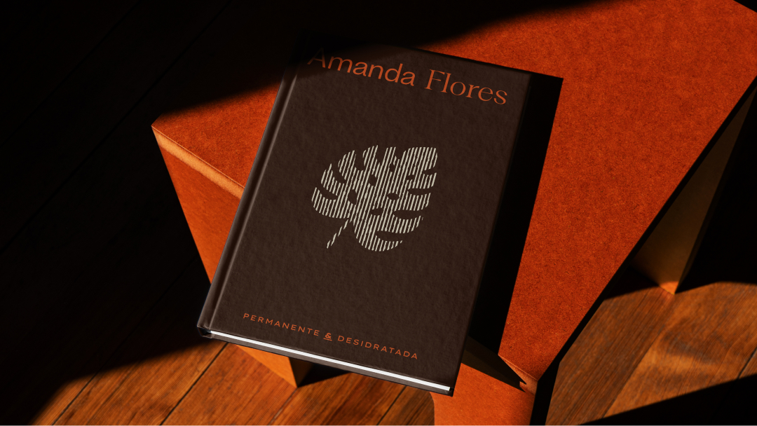
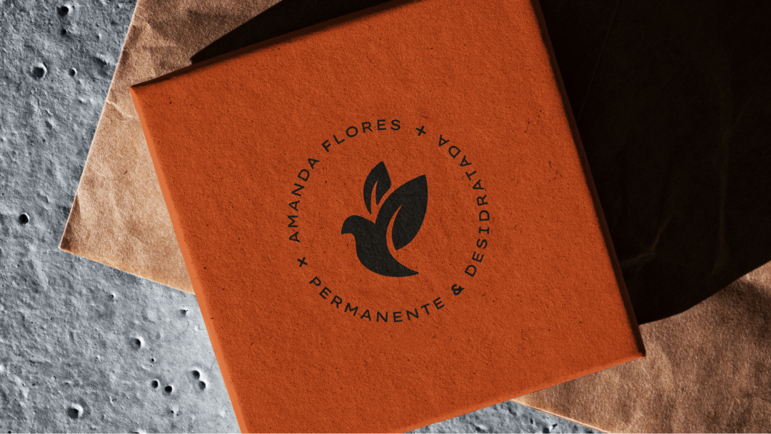
Amanda Flores is a permanent botanical art studio founded in 2009 in Barra da Tijuca, Rio de Janeiro. The main challenge was to renew the brand so it could speak to the premium segment without losing the sense of closeness that has always defined its service. The update needed to balance technique, care, and permanence. We also confirmed the preservation of the Holy Spirit symbol, an element of great emotional and institutional value. We were hired to develop the new brand positioning and visual identity, aligning language, graphic system, and implementation.
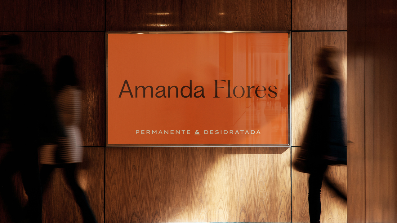
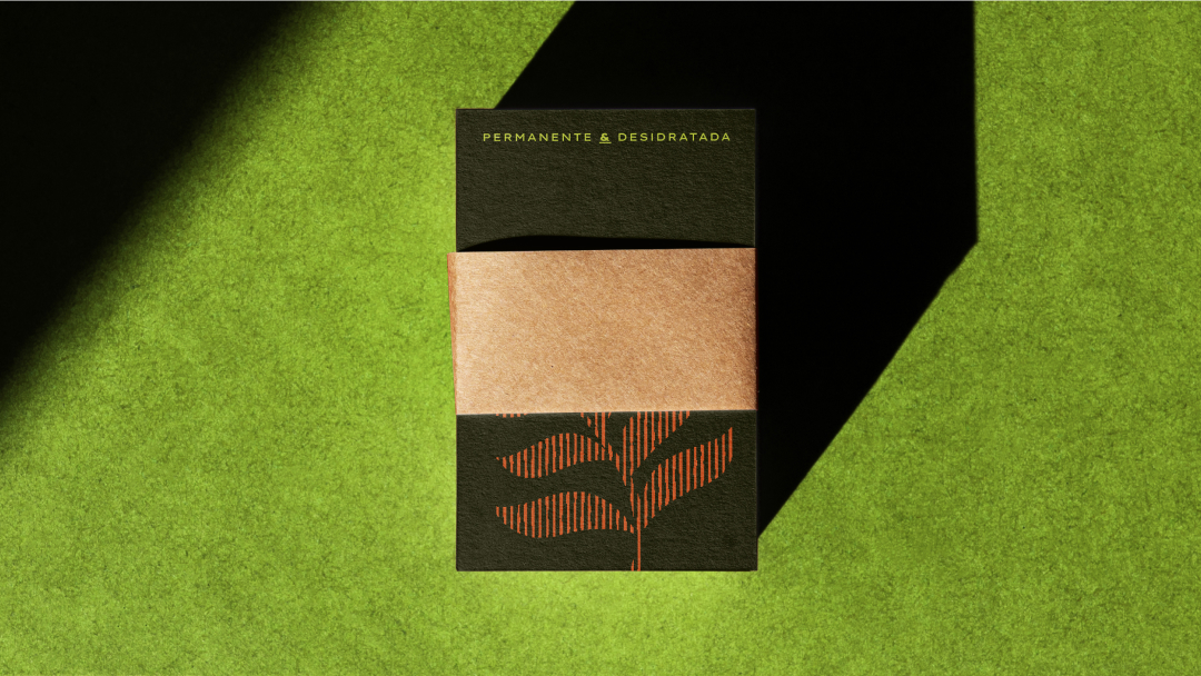
The project is built around four attributes that guide design and communication decisions: sustainability, exclusivity, sophistication, and naturalness. These attributes appear in practice across every component of the system. The color palette is grounded in natural tones that reinforce a conscious vision. Two vibrant accents bring contrast and energy without compromising elegance. This combination works effectively across product, environment, and digital contexts.
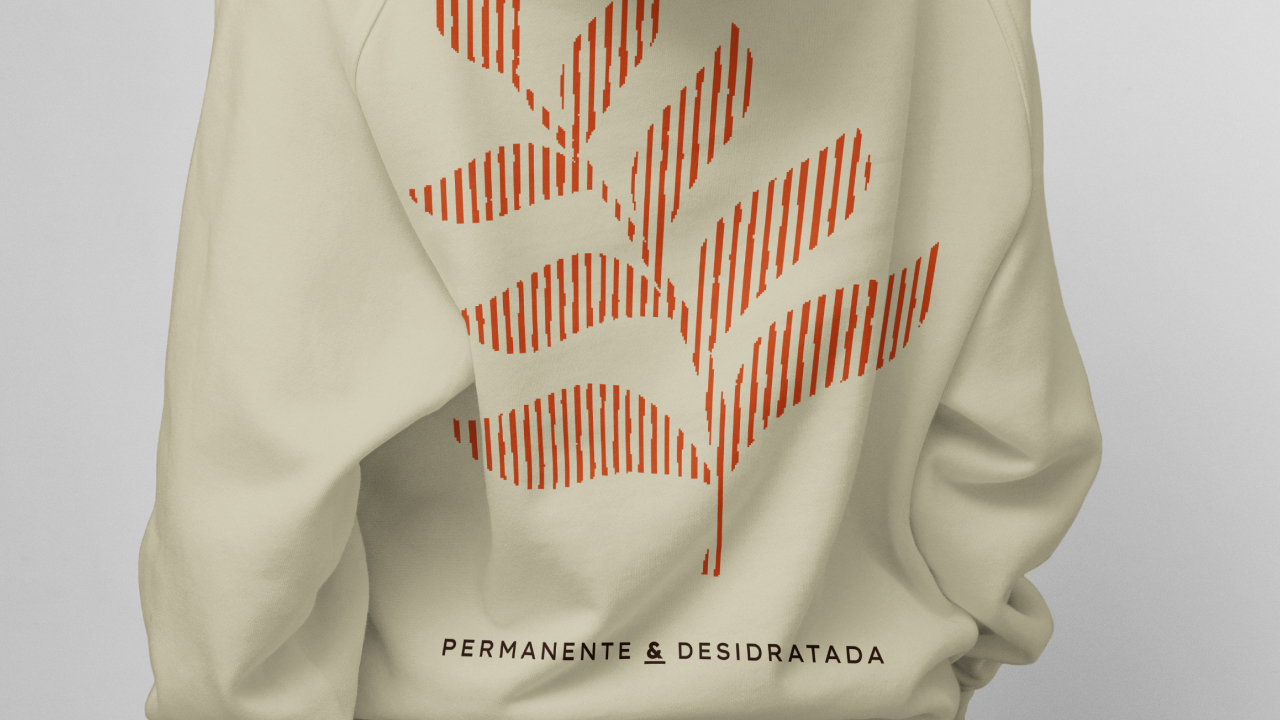
Typography was designed to balance presence and readability. Uppercase titles with generous spacing establish authority and rhythm. Body text uses a comfortable serif that supports catalogs, specification guides, and social media narratives. The graphic element is constructed from bitmap lines that resemble plant fibers and dried stems. The intention is to suggest texture and materiality without resorting to a literal floral illustration. This resource works at both macro and micro scales, in static and in motion.
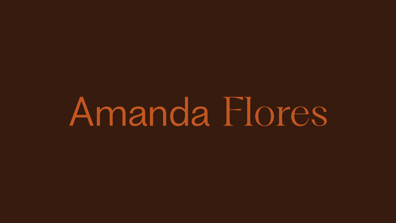
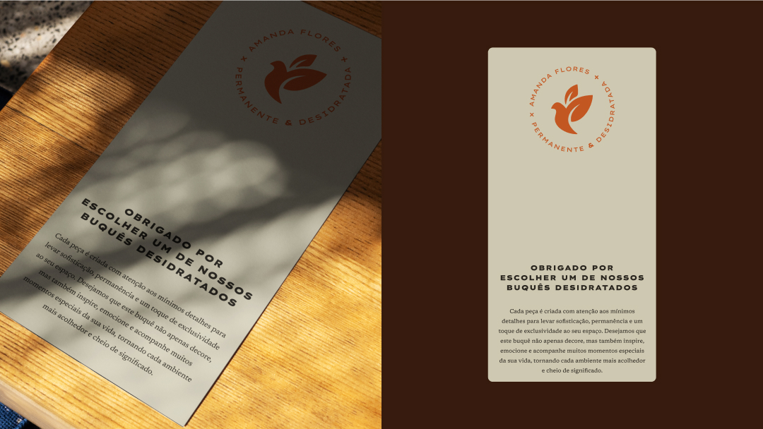
The highlight of the project lies in the logotype. The typographic union between Amanda and Flores concentrates the brand concept into a clear signature. In Amanda, the type conveys human closeness. In Flores, it communicates artistic sophistication. The contrast between these two readings gives the whole a sense of strength and memorability. This balance also ensures versatile applications. Extended versions work well in editorial contexts, while reduced versions are effective for seals, labels, and technical pieces.
The final system makes the work of architects and clients easier. It ensures consistency across catalogs, packaging, and point-of-sale materials. It reinforces the brand’s history and its relationship with faith, while preparing it for growth to serve homes, businesses, and events with delivery throughout Brazil.
CREDIT
- Agency/Creative: Will Gomes
- Article Title: Amanda Flores Rebranding by Will Gomes Elevates Botanical Art Into Timeless Design
- Organisation/Entity: Agency
- Project Type: Identity
- Project Status: Published
- Agency/Creative Country: Brazil
- Agency/Creative City: Ararangua
- Market Region: South America
- Project Deliverables: Brand Identity
- Industry: Construction
- Keywords: Botanical, Typographic, Sophistication
-
Credits:
Designer: Willian Gomes da Rosa


