


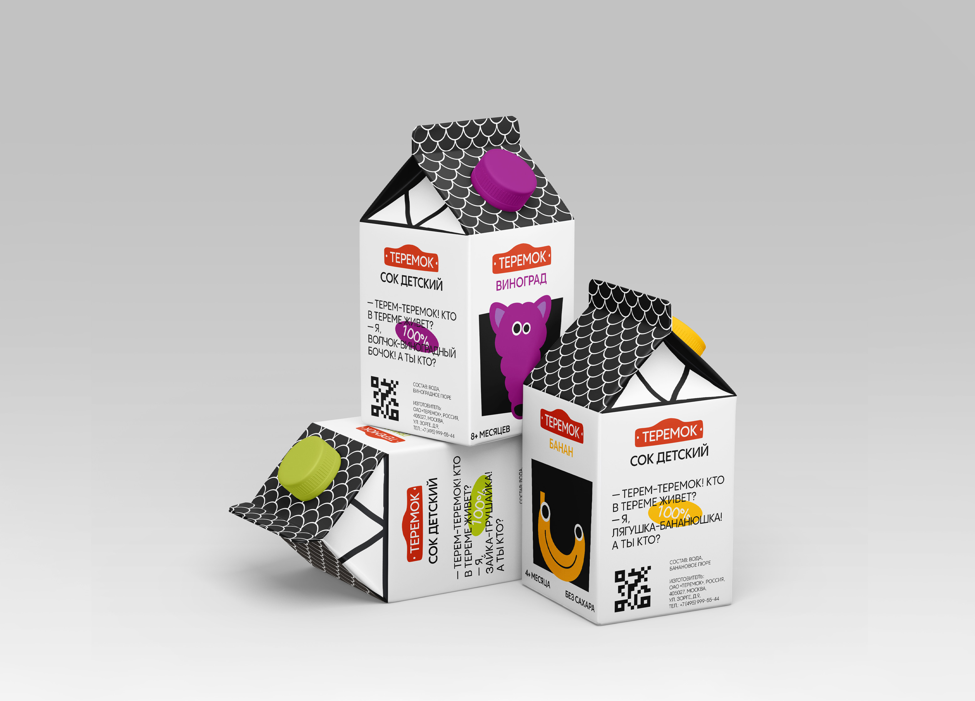
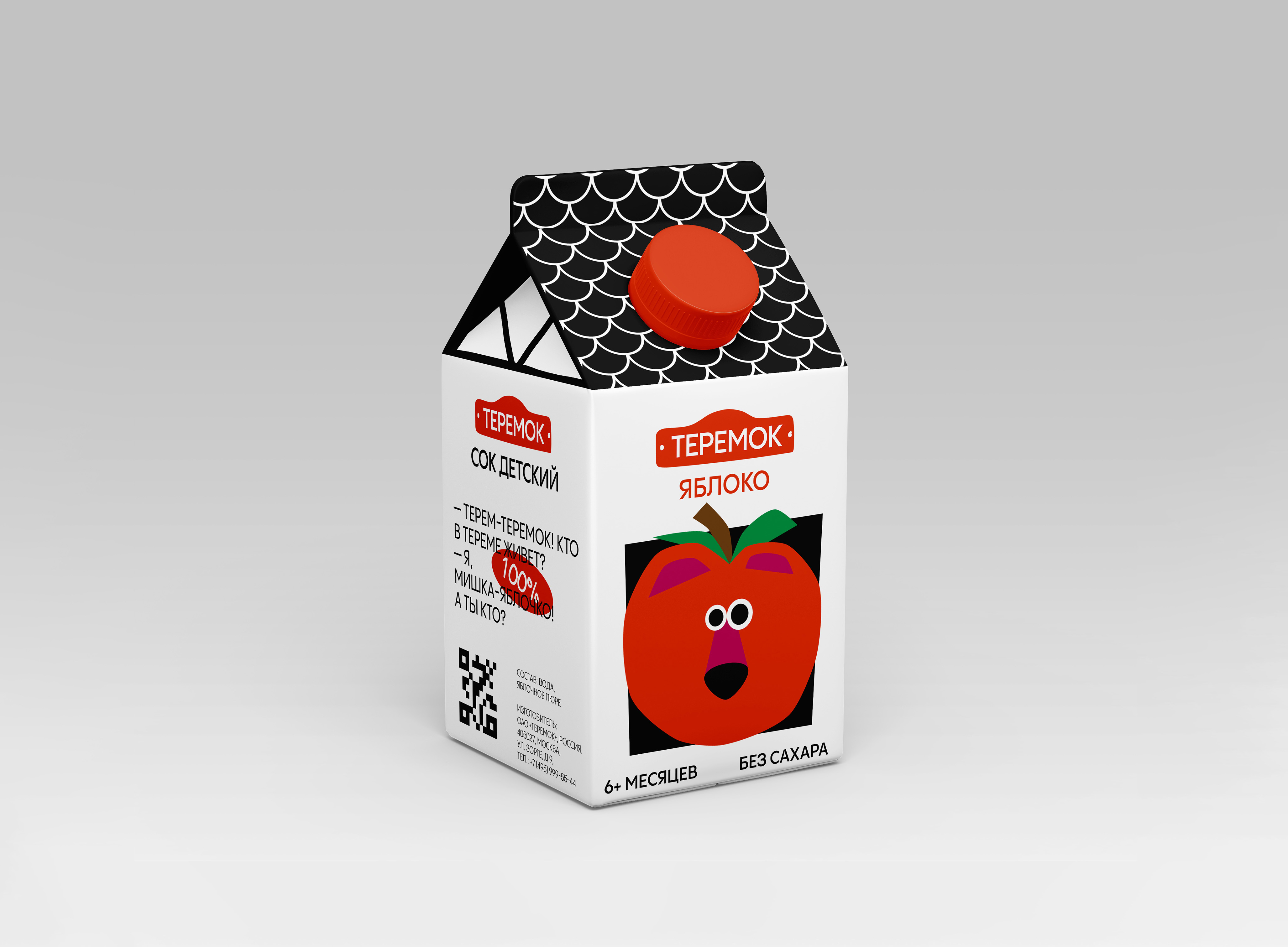
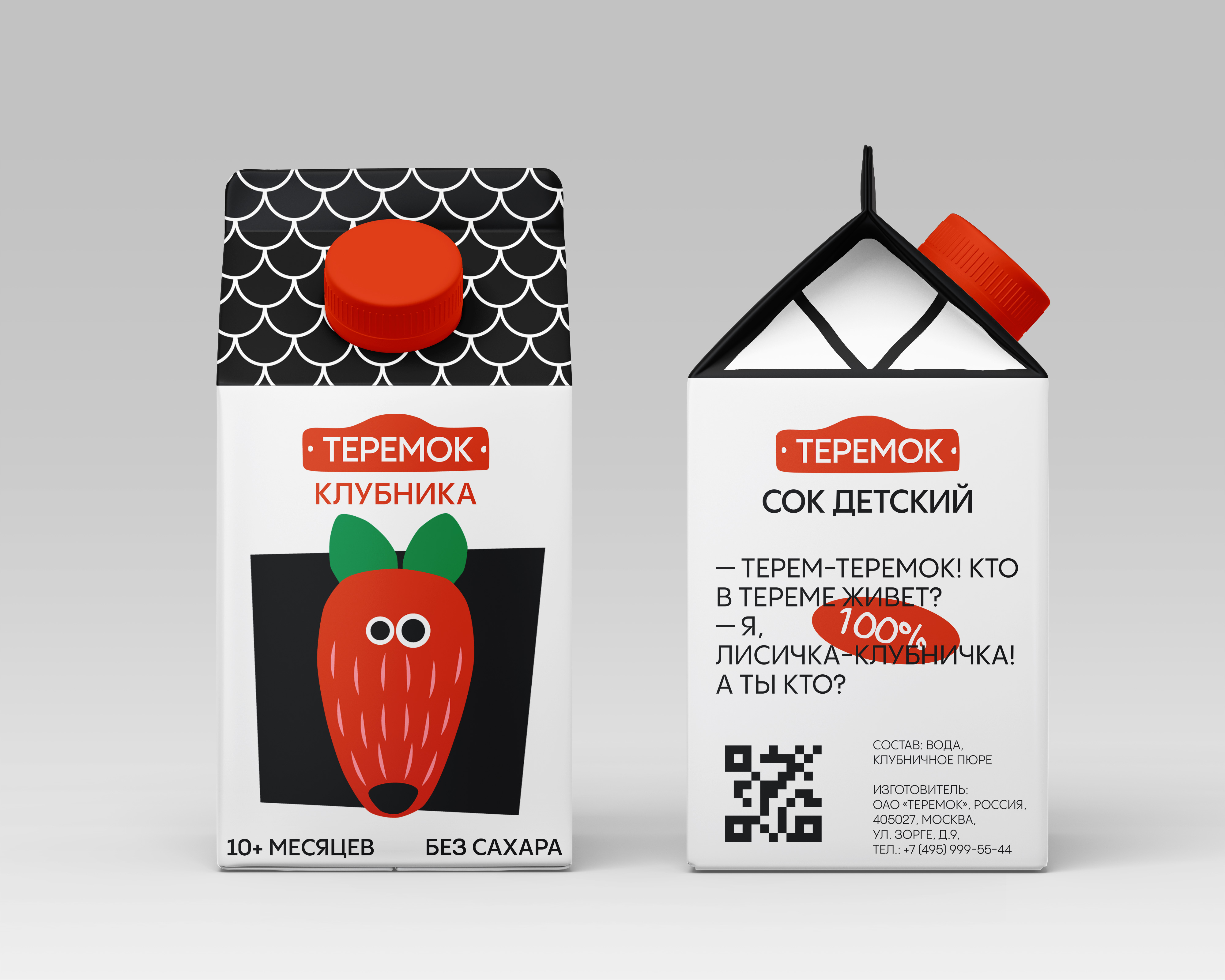
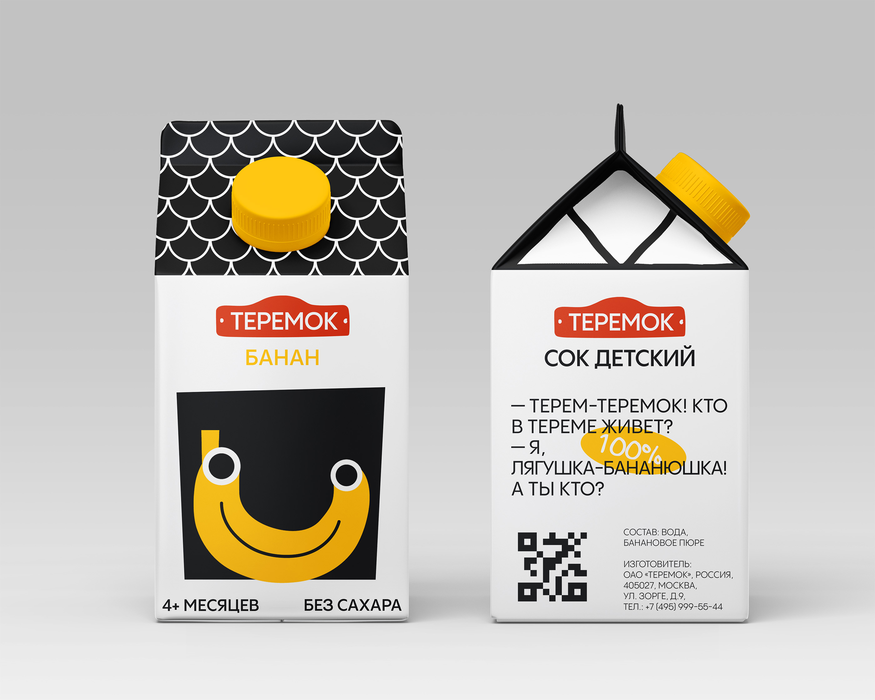
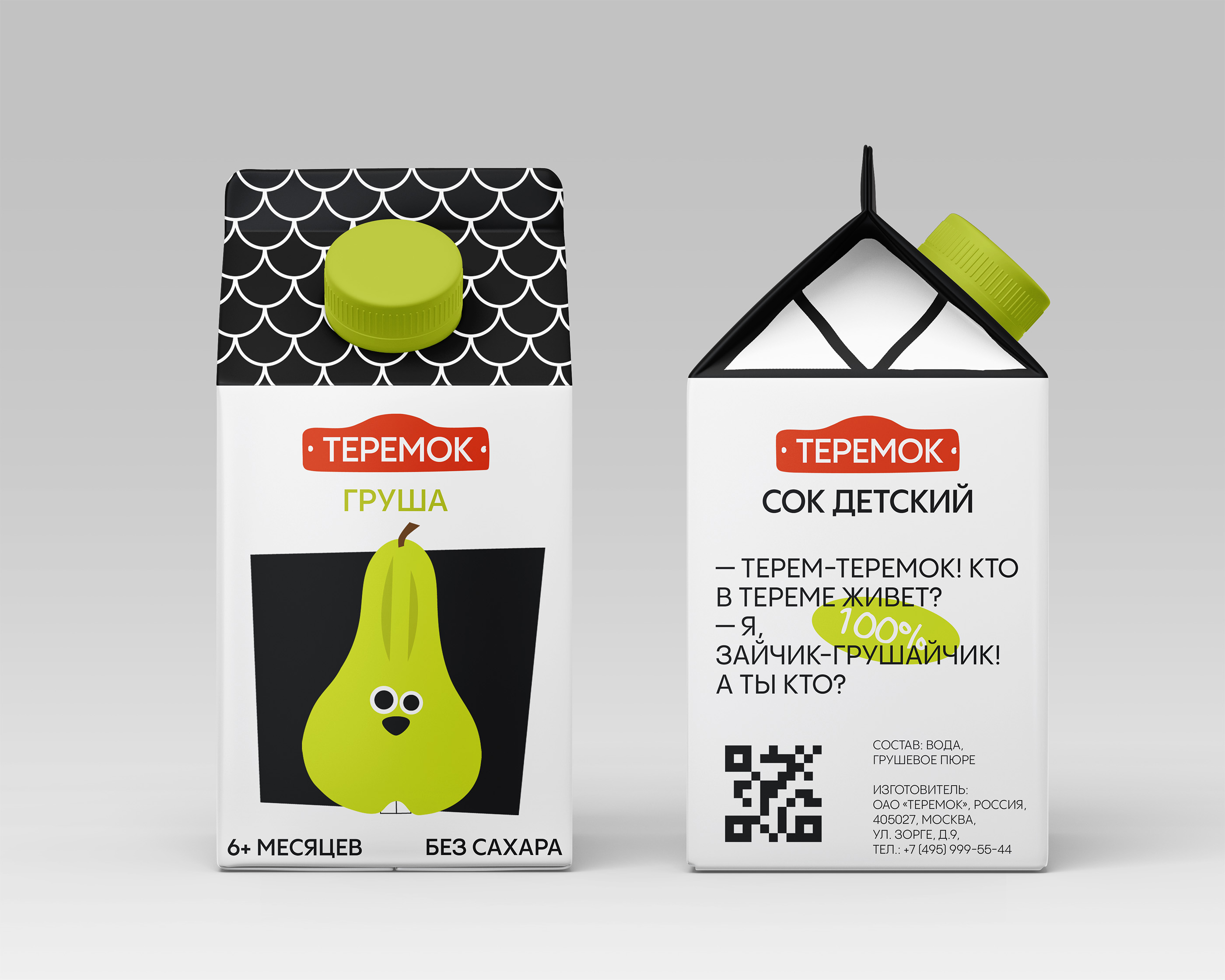
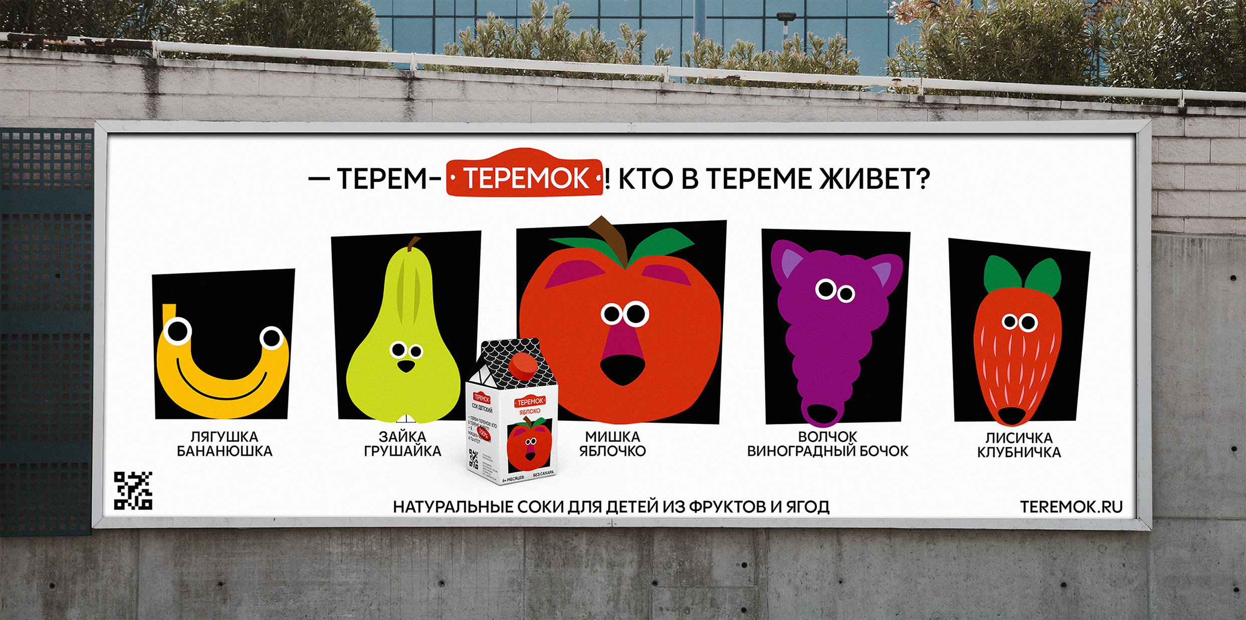
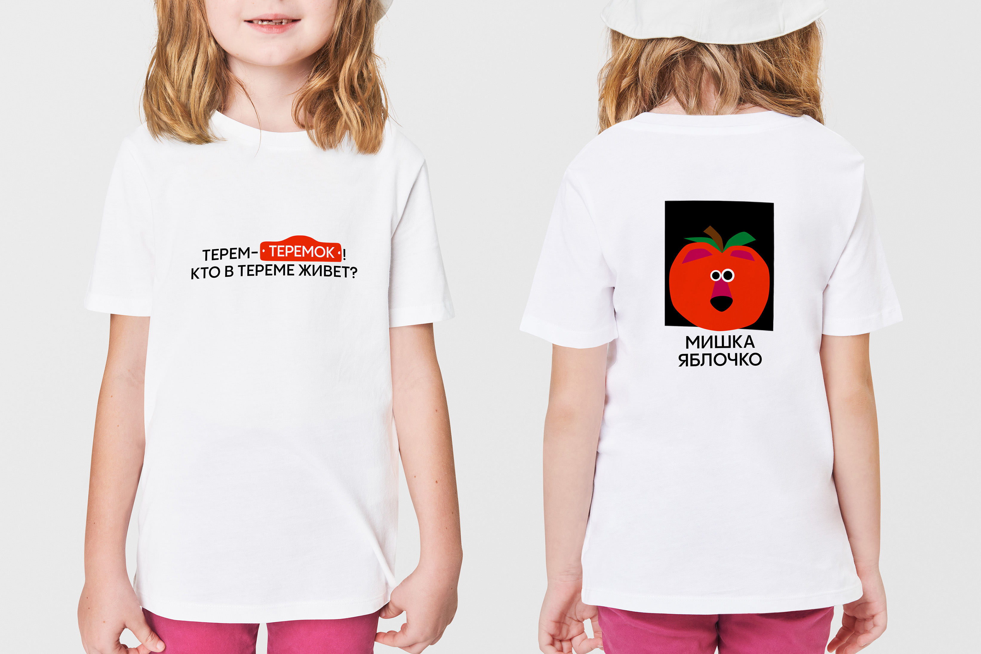
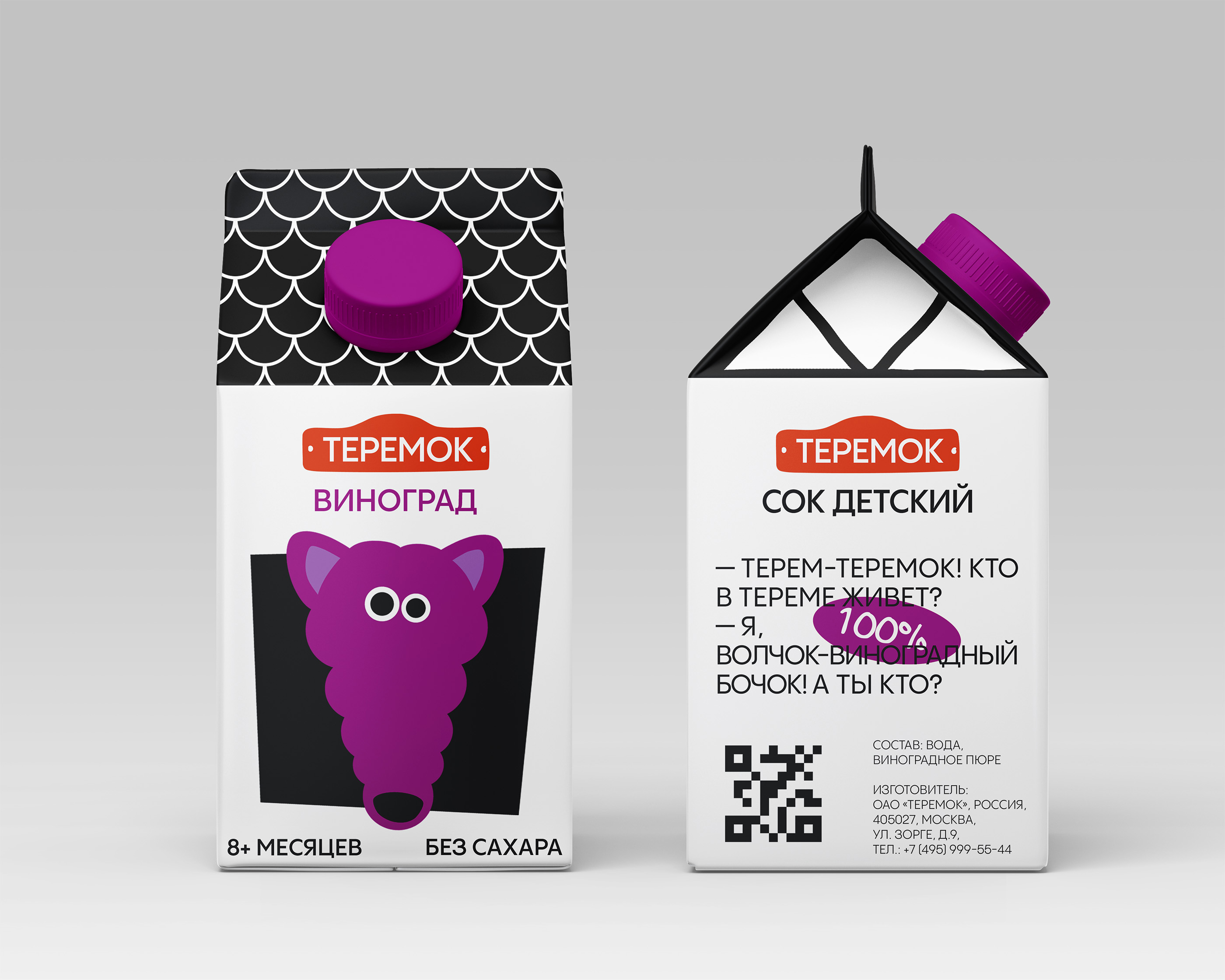
Teremok Juice is a children’s line of natural juices inspired by the Russian folk tale Teremok. In the story, a tiny hut stood in a field and became home to different animals. One by one they settled inside, asking, “Terem, Teremok! Who lives in the hut?”
In the same way, the packaging turns into a fairy-tale hut, inside which live the “fruity heroes” — playful characters that make the brand lively, fun, and engaging for kids. The brand logo takes the form of a bright red nameplate on the hut with the word Teremok. Just like the traditional plaques found on houses, it instantly marks the little hut as a home — warm, welcoming, and easy to recognize.
Each hero combines an animal with a fruit, highlighting the natural origin of the product and creating a memorable identity: Froggy Banana, Bunny Pear, Foxy Strawberry, Wolfy Grape Barrel, and Bear Apple. Character illustrations are bright, friendly, and cartoon-like, so kids can easily recognize “their” hero. The color palette is built on natural fruit tones (yellow banana, green pear, red strawberry, purple grape, red apple). These characters guide children into a whimsical and imaginative world where juice is not just a drink, but also part of storytelling, play, and joyful discovery.
The house-shaped packaging is easy to identify and instantly recognizable on the shelf. The color of the cap helps indicate which fruit it is, making the product simple, intuitive, and playful for both children and parents.
CREDIT
- Agency/Creative: Natalia Karpukhina
- Article Title: Student Natalia Karpukhina Brings Teremok Juice To Life With Playful Fairy-Tale Branding
- Organisation/Entity: Student
- Project Type: Packaging
- Project Status: Published
- Agency/Creative Country: Russia
- Agency/Creative City: HSE ART AND DESIGN SCHOOL
- Market Region: Europe, Global
- Project Deliverables: Packaging Design
- Format: Box
- Industry: Food/Beverage
- Keywords: WBDS Student Design Awards 2025/26 , package design kids children fairy tail folk tail playful fruit heroes
-
Credits:
Curator: Leonid Slavin


