


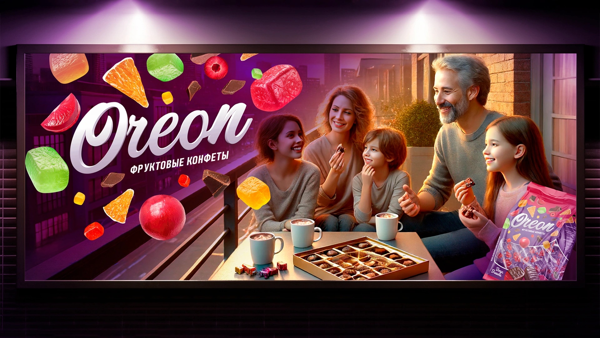
Challenge:
A Tajik confectionery brand approached Minim Design to create packaging for their new fruit candies in chocolate glaze. As a mass-market FMCG product, Oreon needed to compete with established brands in supermarkets, local shops, and bazaars. The packaging had to instantly attract attention, clearly communicate flavor, and establish a trustworthy brand identity that encourages repeat purchases.
Research & Insights:
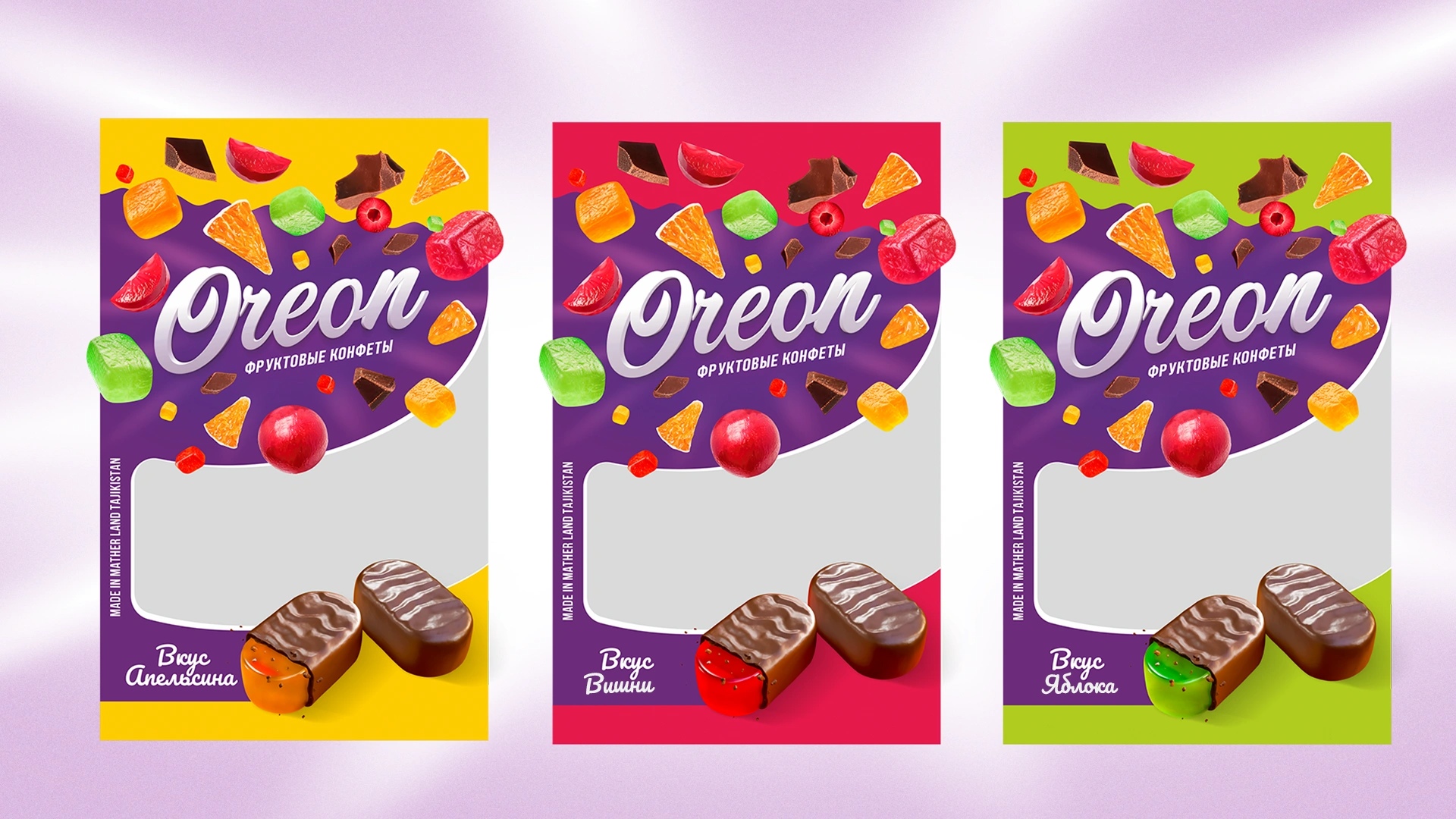
Our category analysis revealed several challenges and opportunities: Traditional Codes: Most candy packaging followed the “burgundy-and-gold classic,” making flavors indistinct and uninspiring. Purple as Differentiation: Rarely used locally, purple enhances fruit juiciness and provides strong shelf contrast without clashing with other colors.
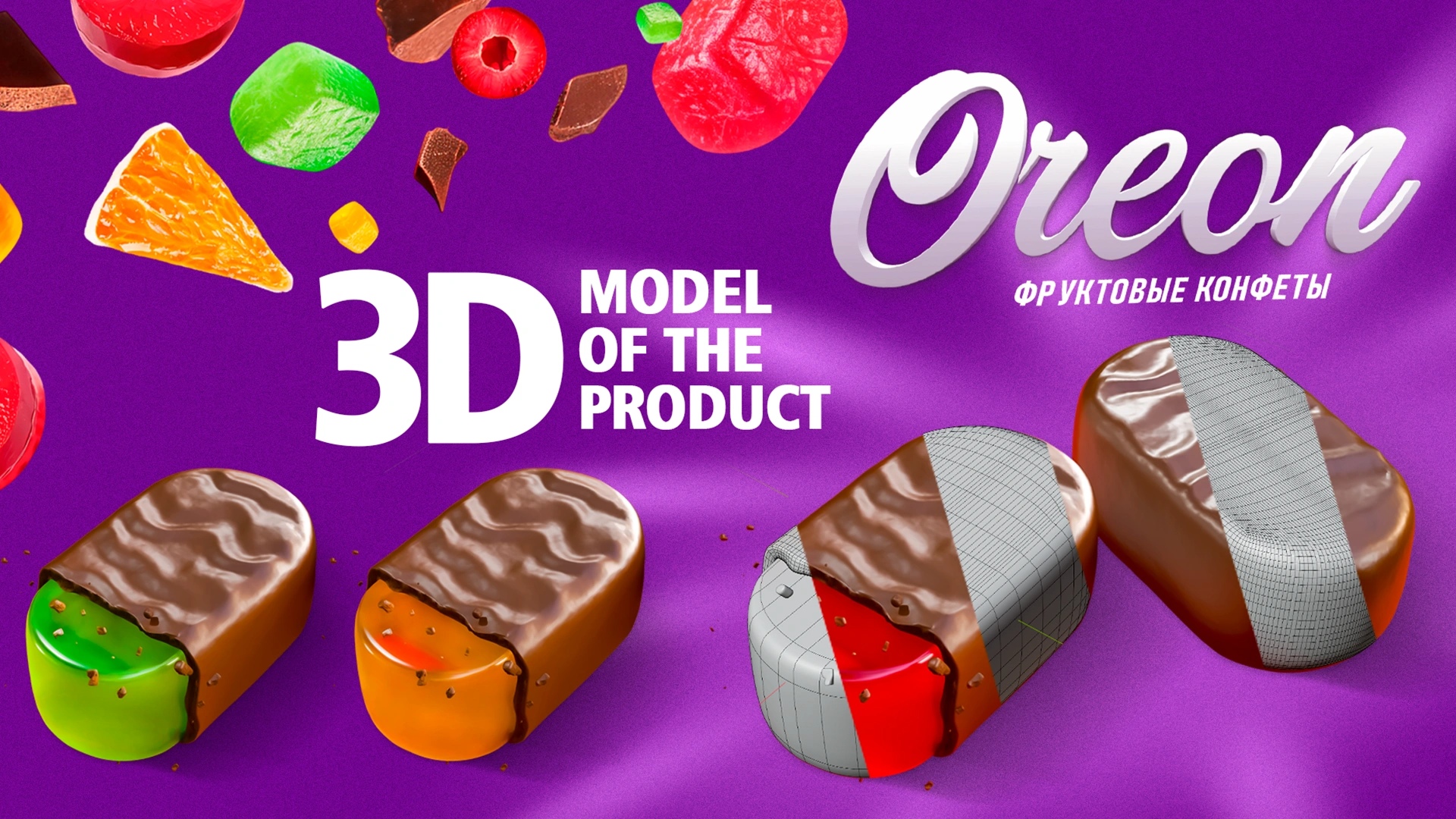
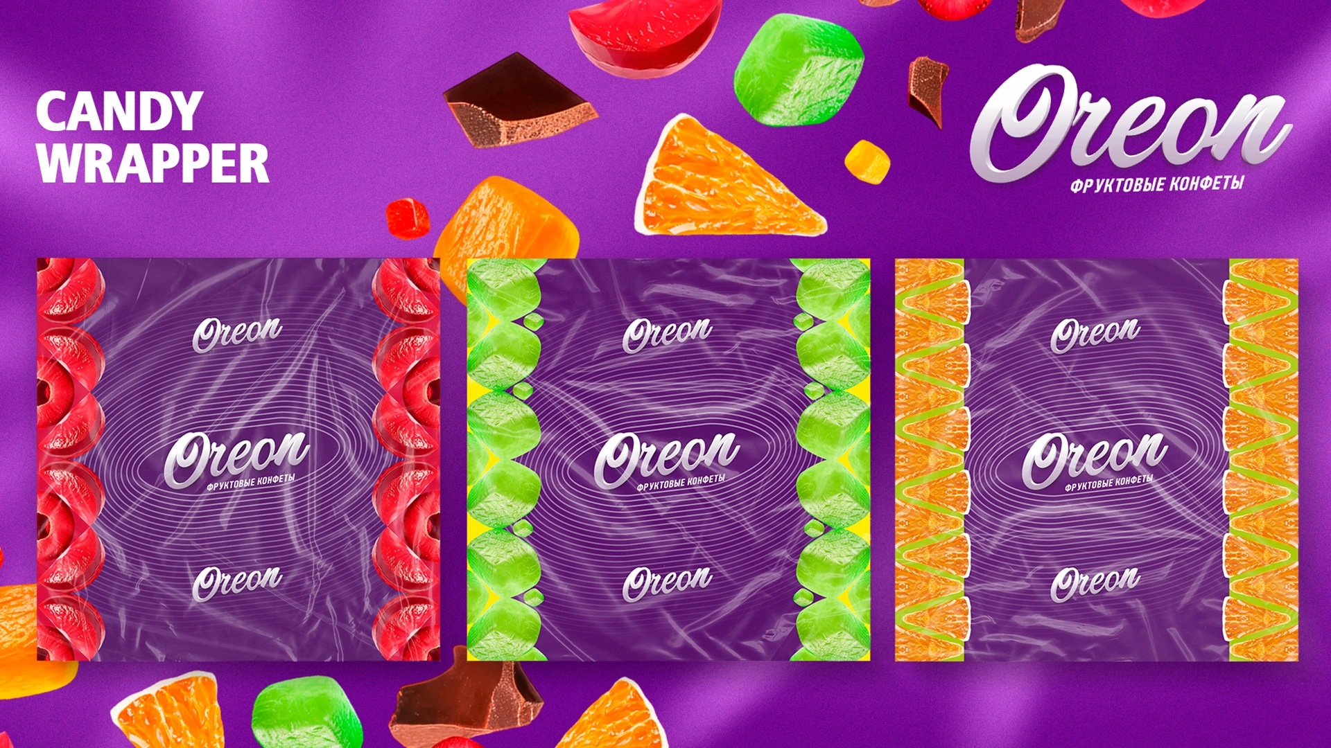
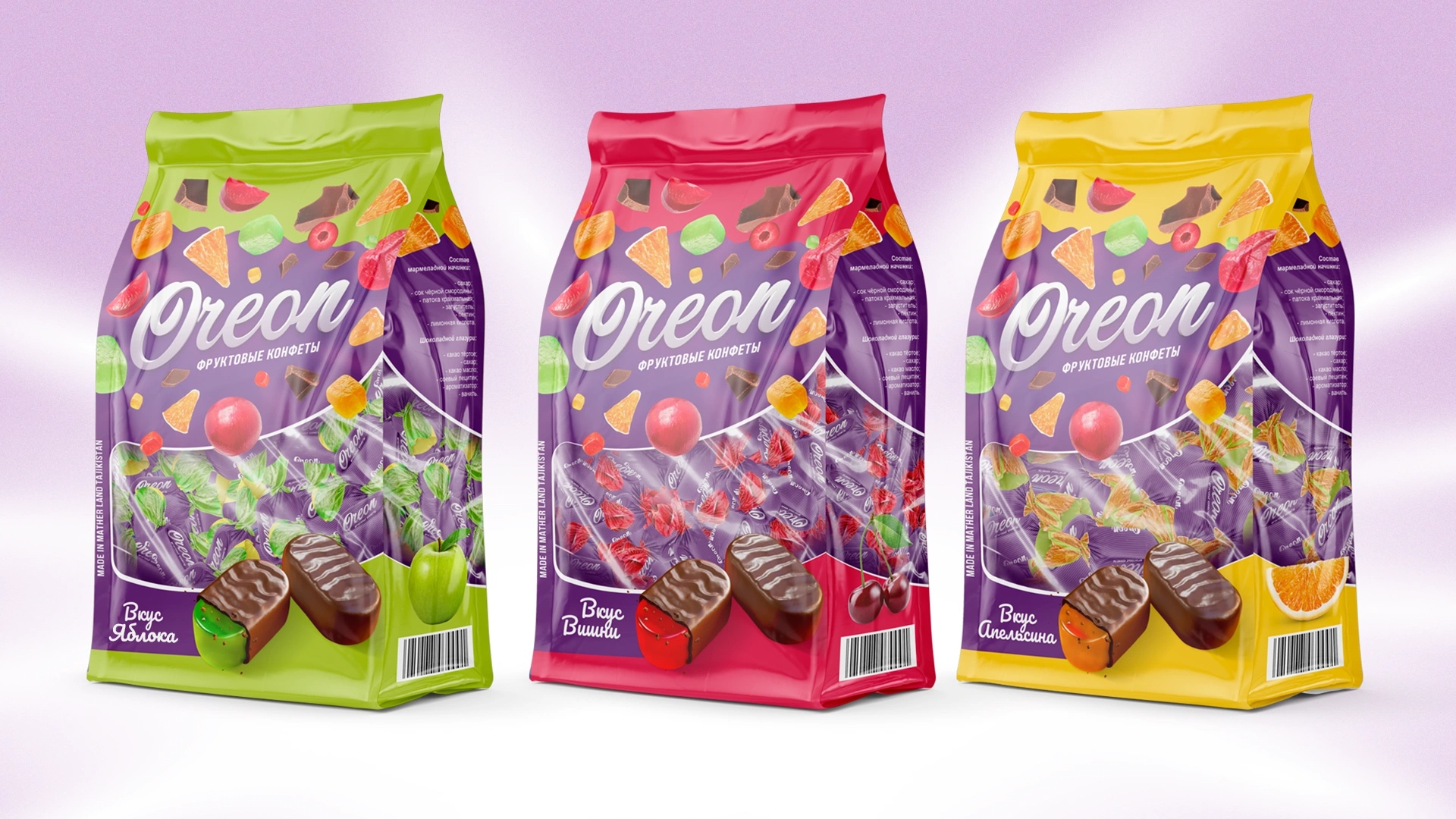
Faceless Candy Problem: Competitors often depicted generic cubes with no clear flavor cues. Consumers needed visible fruit textures, skins, and “bite” effects to trigger taste imagination. Disjointed Assortment: Bright outer packs often contrasted with inconsistent individual wrappers. Unified design across both was essential for brand perception.
Noise vs. Dynamics: Overly chaotic designs grab attention but fatigue consumers. Controlled energy, not clutter, was needed.
Creative Solution:
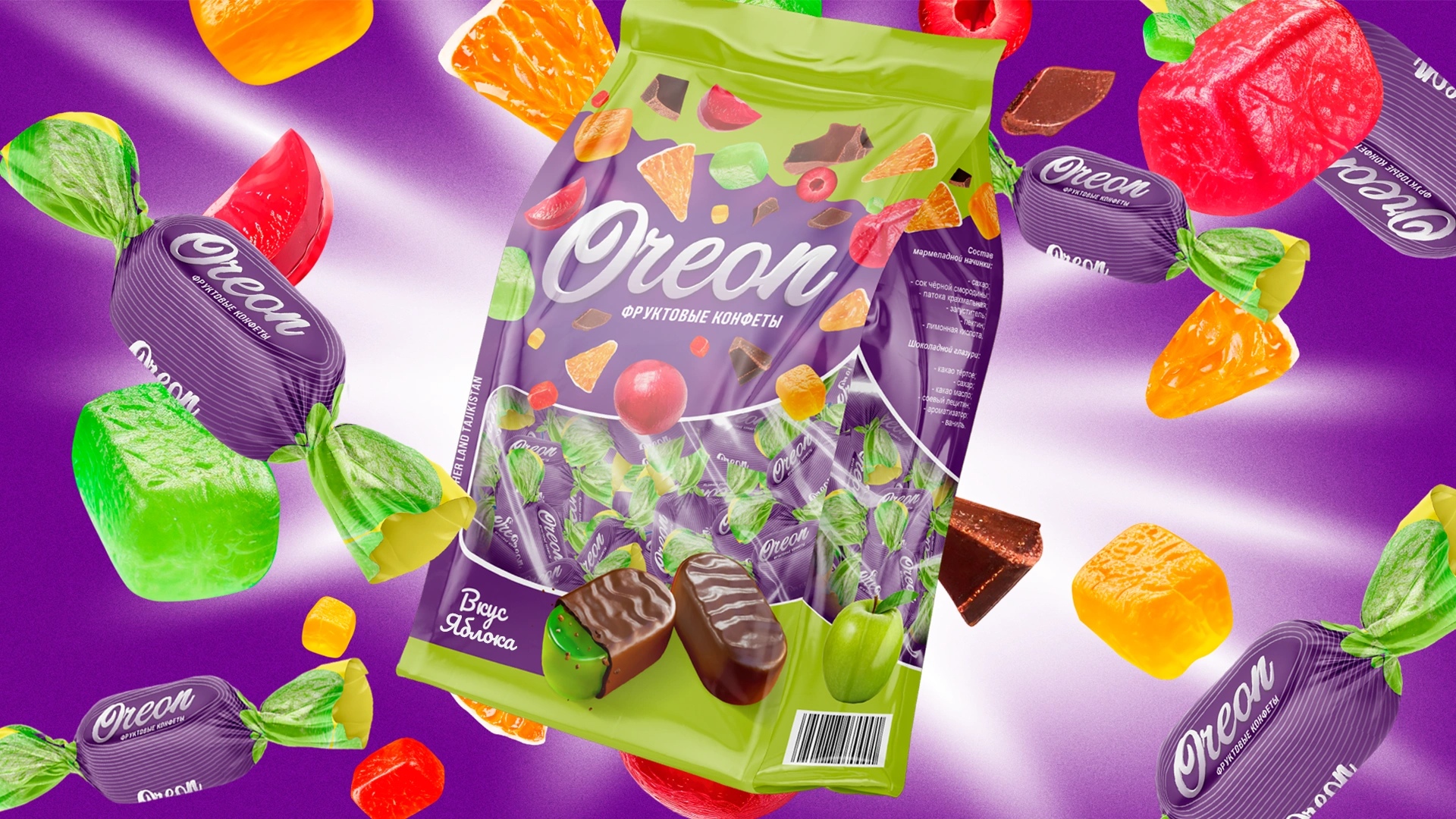
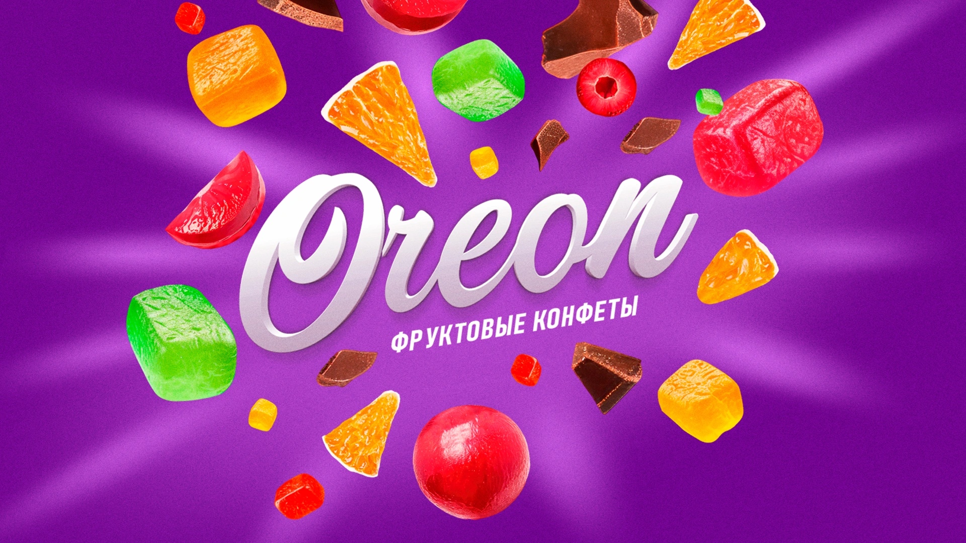
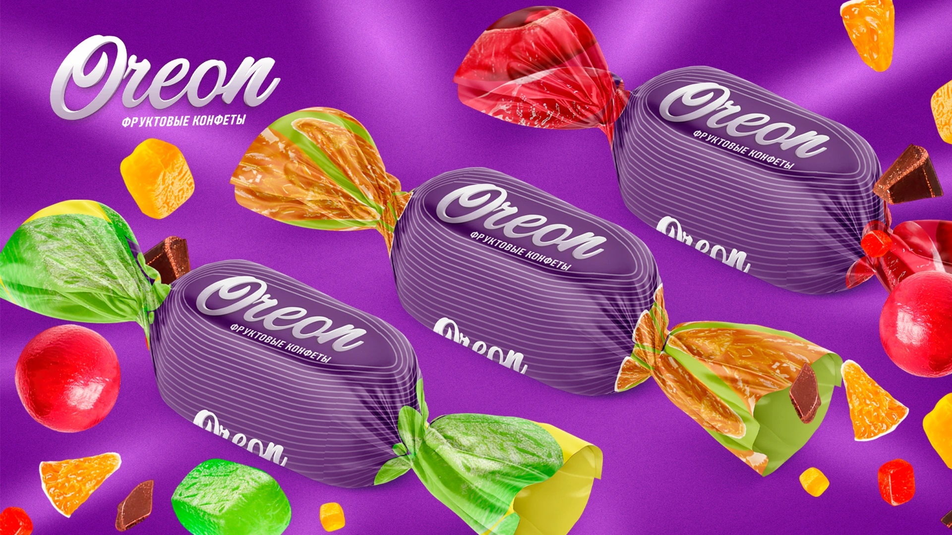
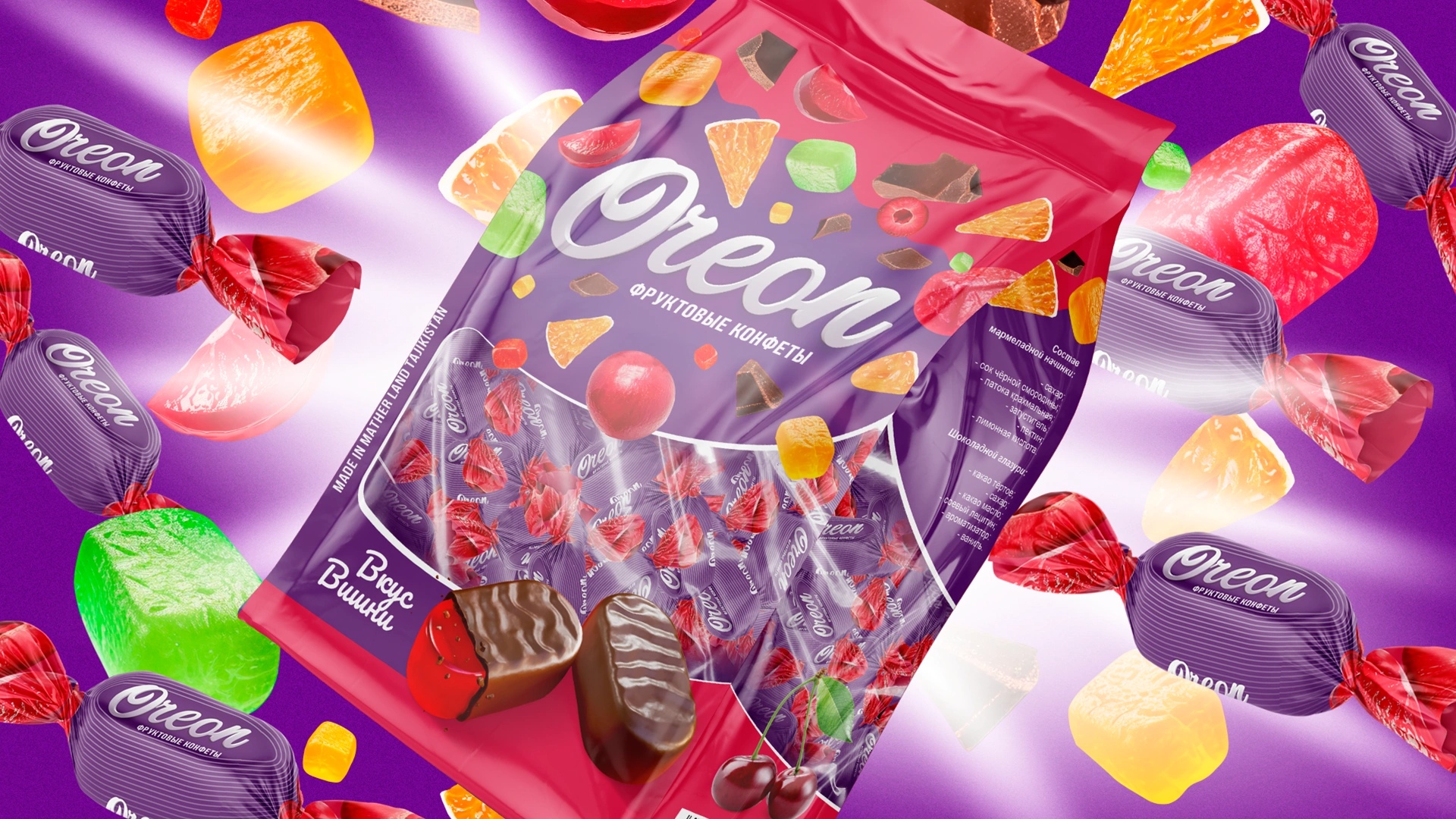
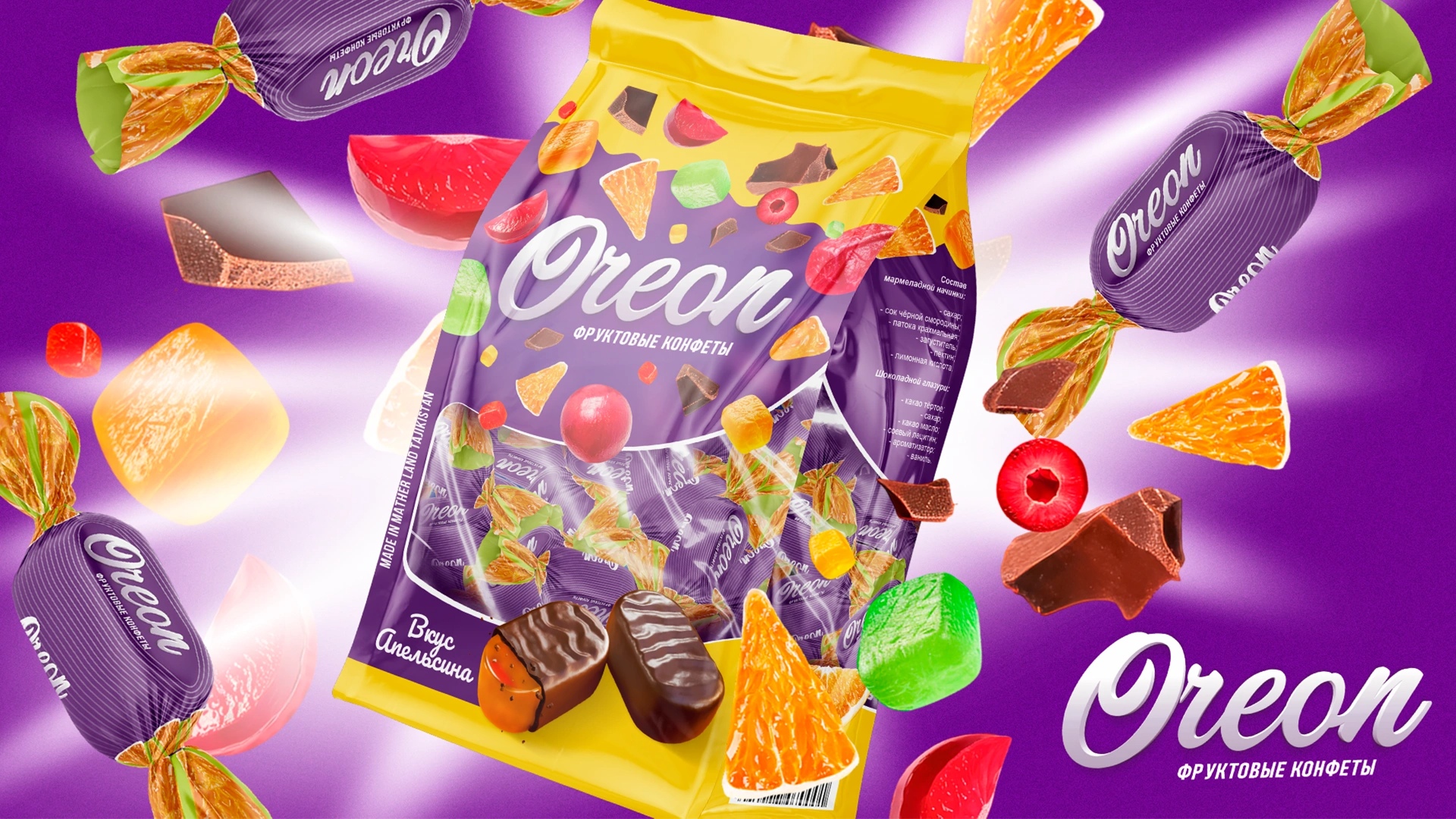
We built a modern and unified visual system: Background: Deep purple backdrop to highlight fruit vibrancy and differentiate on shelves. Graphics: Realistic 3D fruits and glossy chocolate-glazed candies with a “bite” effect to suggest juiciness. Dynamics: Fruits dynamically scatter around the central logo, conveying freshness and motion without chaos.
Logo: Bold, soft script with depth — large, legible, and memorable. Flavor Range: Cohesive system applied across all SKUs, with distinct accent colors for each flavor (orange, cherry, apple, etc.), ensuring family unity and easy recognition. Wrapper Consistency: The outer pack’s design language extends to individual wrappers, reinforcing brand quality.
Results:
Oreon now has a strong shelf presence with packaging that communicates flavor instantly and differentiates itself in a crowded confectionery category. Consumers recognize orange, cherry, or apple at first glance, while the consistent “pack + wrapper” system delivers a sense of European-level quality and trust. The scalable design ensures that future flavors and formats can seamlessly integrate while maintaining brand recognition.
CREDIT
- Agency/Creative: Minim Design Agency
- Article Title: Oreon Fruit Candy Packaging in Chocolate Glaze by Minim Design
- Organisation/Entity: Agency
- Project Type: Packaging
- Project Status: Published
- Agency/Creative Country: Uzbekistan
- Agency/Creative City: Tashkent
- Market Region: Asia
- Project Deliverables: Identity System, Logo Design, Packaging Design
- Format: Flow-Pack, Pouch, Wrap
- Industry: Food/Beverage
- Keywords: Packaging Design, Fruit Candy, Chocolate Glaze, Confectionery, Logo Design, Visual Identity, Shelf Impact, Wrapper Consistency, Flavor Differentiation, FMCG, Snacks, Branding, Tajikistan
-
Credits:
Agency: Minim Design


