


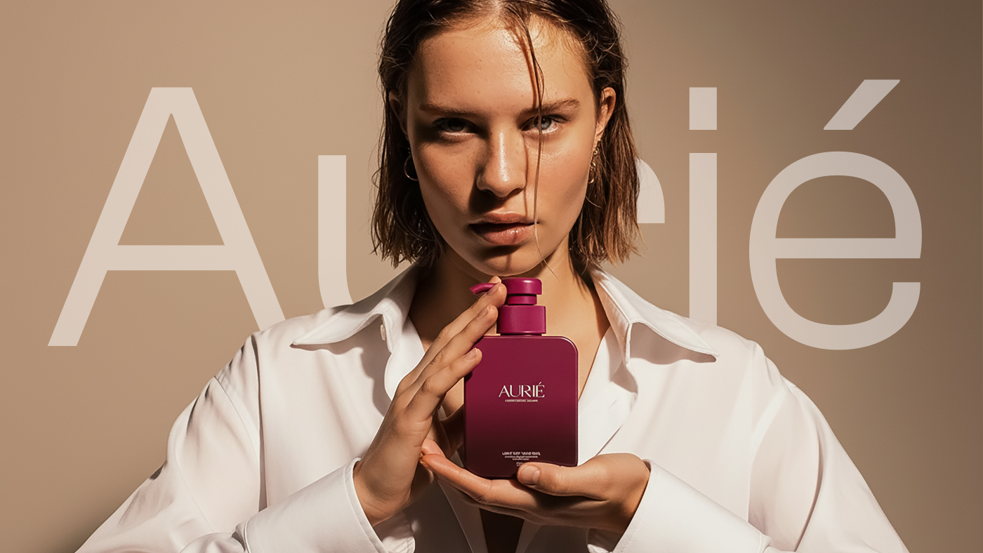
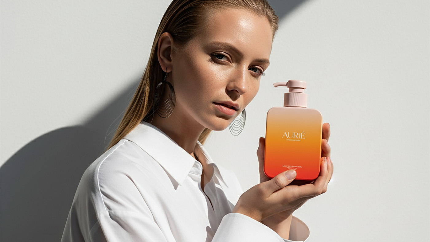
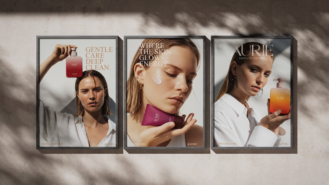
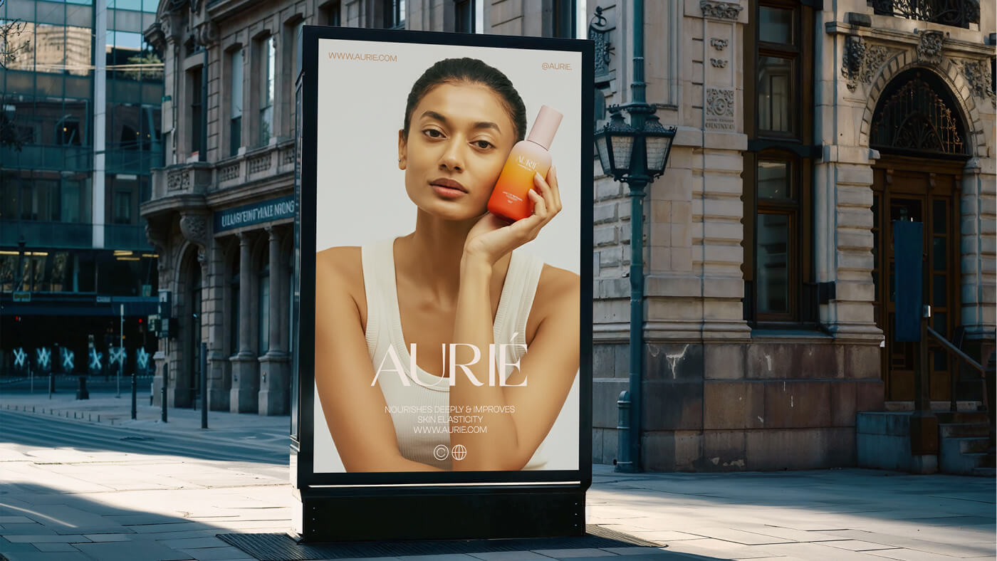
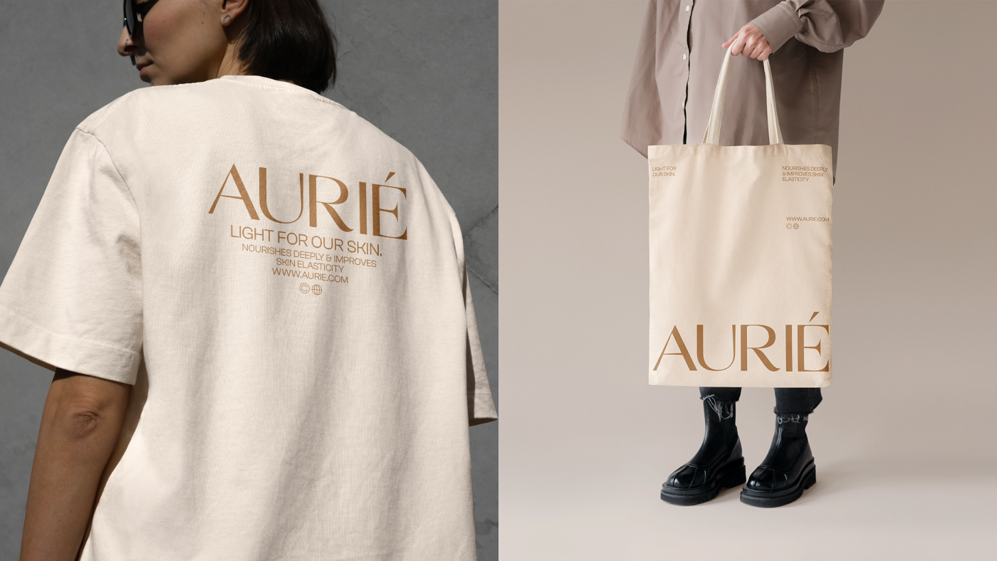
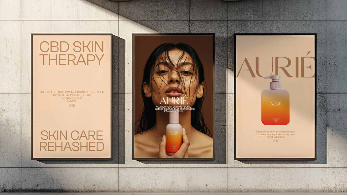
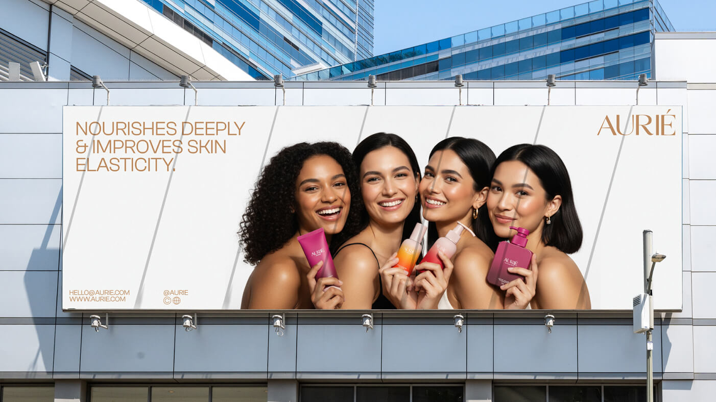
The idea for the brand came from a simple question: what does it feel like to capture sunlight on the skin? The story we wanted to tell was not about creating yet another minimal skincare line, but about building something that radiates warmth, optimism, and clarity. We wanted the brand to feel alive, approachable, and rooted in love for oneself. This narrative guided every creative decision, from colour choices to typography and packaging design.
Through research, it became evident that many skincare brands either lean heavily towards a clinical, scientific identity or position themselves as luxury, exclusive products. The opportunity here was to bridge the gap, creating a brand that was credible but also filled with character and emotion. We learned that younger audiences often reject the coldness of clinical branding and the unreachability of luxury aesthetics. They are searching for something that feels natural and trustworthy without being overly complicated or elitist.
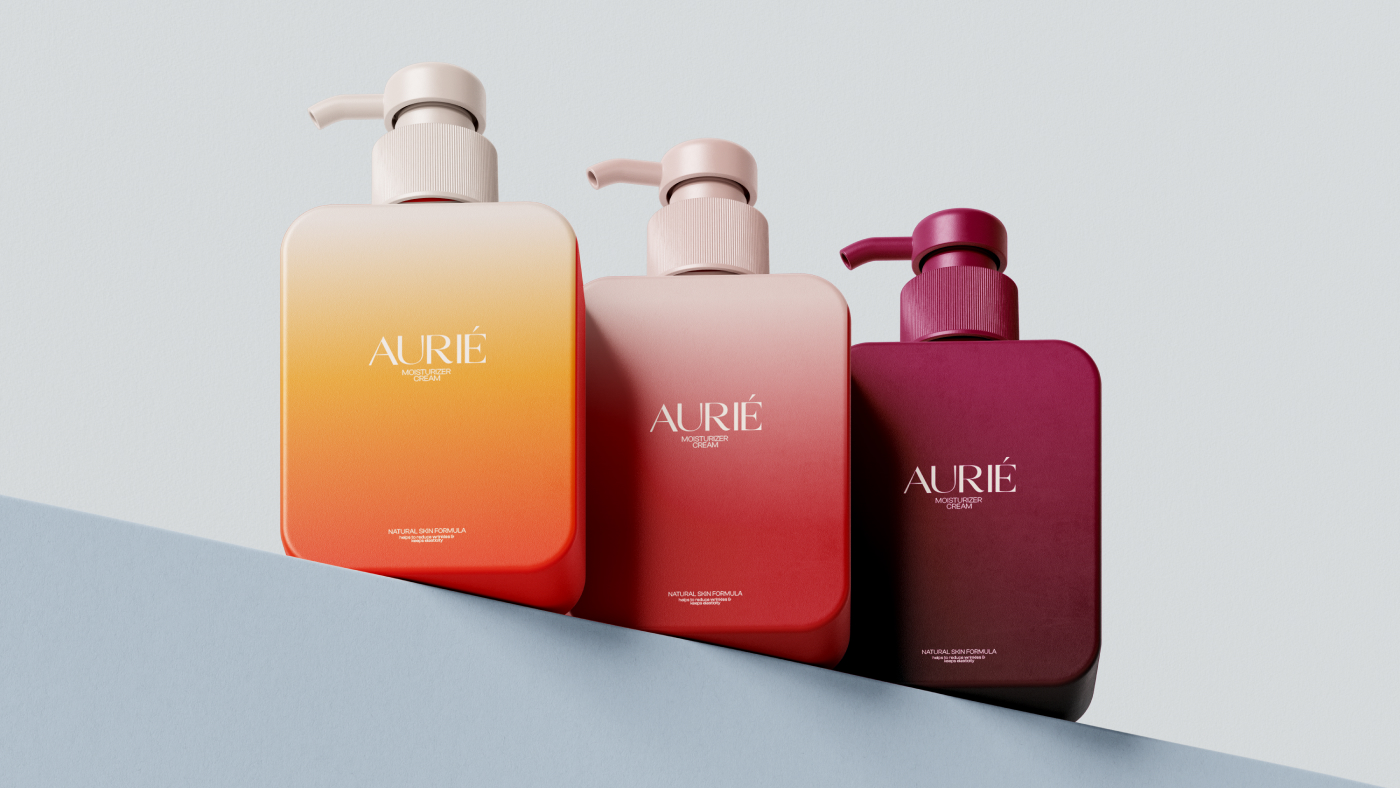
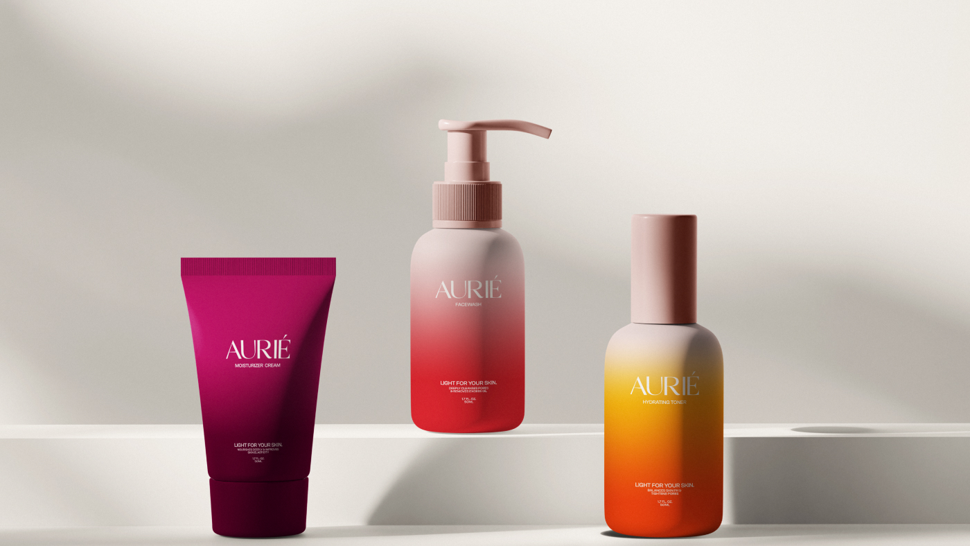
One of the biggest challenges in the process was striking the right balance between playfulness and seriousness. A brand that leans too much into play risks not being trusted, especially in an industry where credibility is crucial. On the other hand, leaning too clinical would strip away the warmth and emotional resonance that was central to the concept. Solving this challenge required careful consideration of design details: using clean typography paired with soft, sun-inspired colours; creating packaging that felt simple and modern without falling back on predictable natural motifs like leaves or flowers.
The project set out to create a skincare brand that embodies youth, radiance, and the warmth of the sun. From the very beginning, the goal was clear: build a brand identity that feels clean, modern, and emotionally connected to its audience. The vision was to develop a brand that speaks to those who see skincare not only as a daily routine but also as an act of love and self-expression.
The target audience for this brand is primarily younger consumers, individuals in their twenties and thirties who care deeply about what they put on their skin. They are informed, selective, and look for products that align with their values. This audience expects transparency, authenticity, and an aesthetic that reflects the optimism and simplicity they strive for in their everyday lives.
CREDIT
- Agency/Creative: Rivlic Studio
- Article Title: Rivlic Studio Brings Sunlit Warmth to Skincare With Radiant Packaging Identity
- Organisation/Entity: Agency
- Project Type: Identity
- Project Status: Published
- Agency/Creative Country: United States
- Agency/Creative City: Wyoming
- Market Region: Europe, Middle East, North America, South America
- Project Deliverables: Brand Design, Brand Identity, Branding, Packaging Design, Web Design
- Industry: Beauty/Cosmetics
- Keywords: Skincare, Branding, Beauty, Cosmetics, packaging, brand design
-
Credits:
Head Of Design: Nur Farhad
Creative Head: Shanaws Mahamud


